Chapter 4
Design analysis
Production UX on nokioapp.com, not Figma. Scores are for the job a visitor can finish on that screen — not visual polish alone. Phone layouts are cramped but mostly intentional. The broken range is tablet. Signing in unlocks profile chrome and a write-review composer; it does not deliver the social home the FAQ describes.
Screenshot galleries
Every capture from the production audit is linked here. This page keeps the scores, breakpoint analysis, and a session preview. Zip the report folder so the shots/ directory travels with the HTML.
Used as a member — session filmstrip
Desktop 1440×900 while actually using the product: trailers, watchlist, search, follow, review composer, profile. Watchlist went 0 → 1. Following went 1 → 4. Review submit stayed disabled.
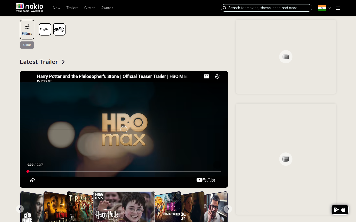
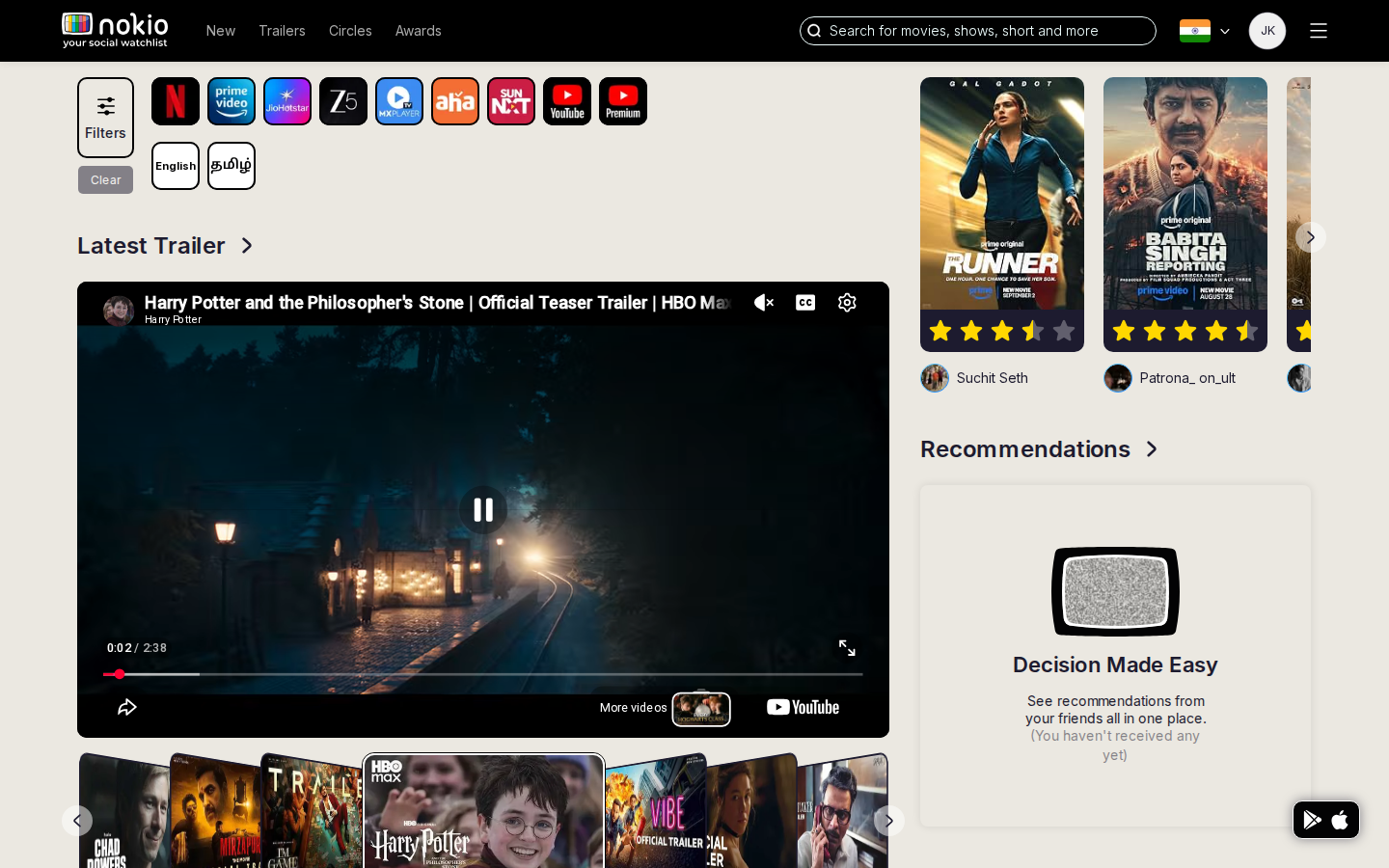
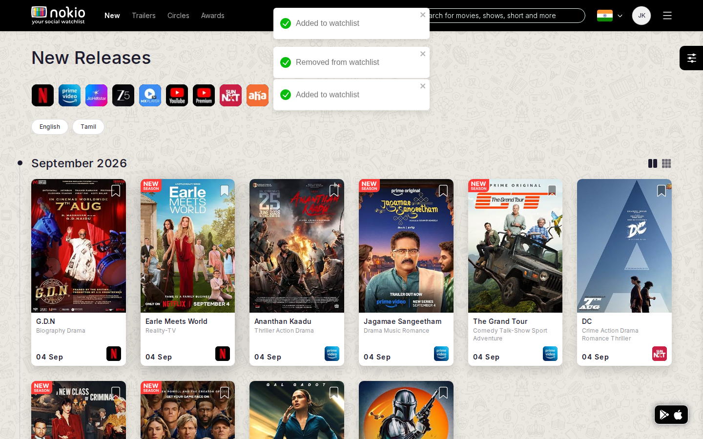
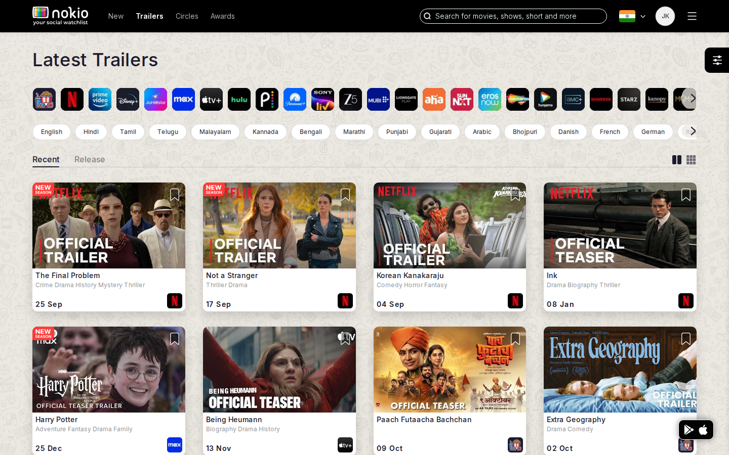
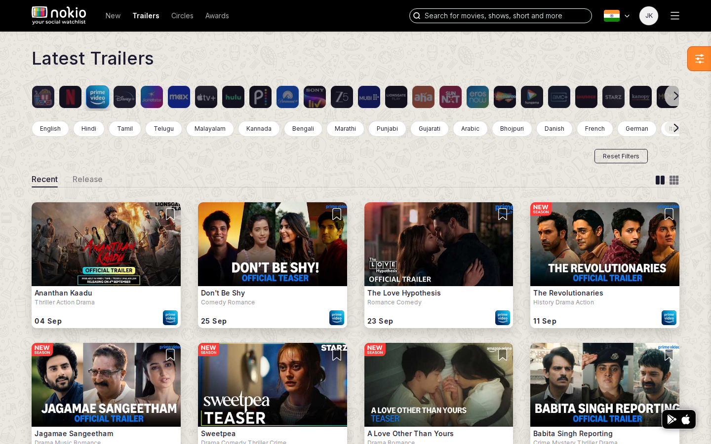
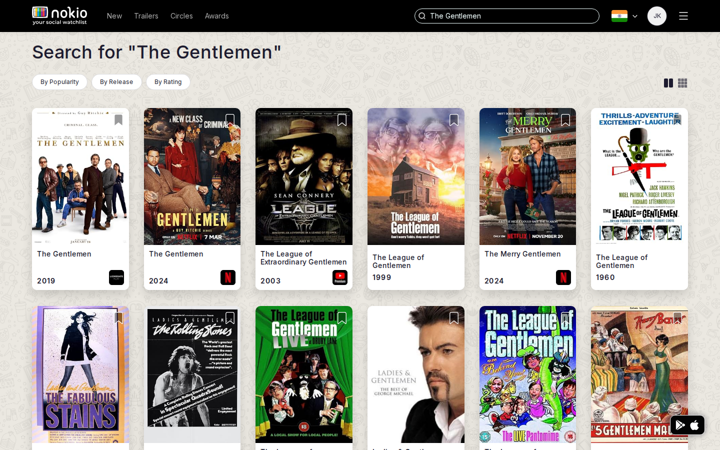
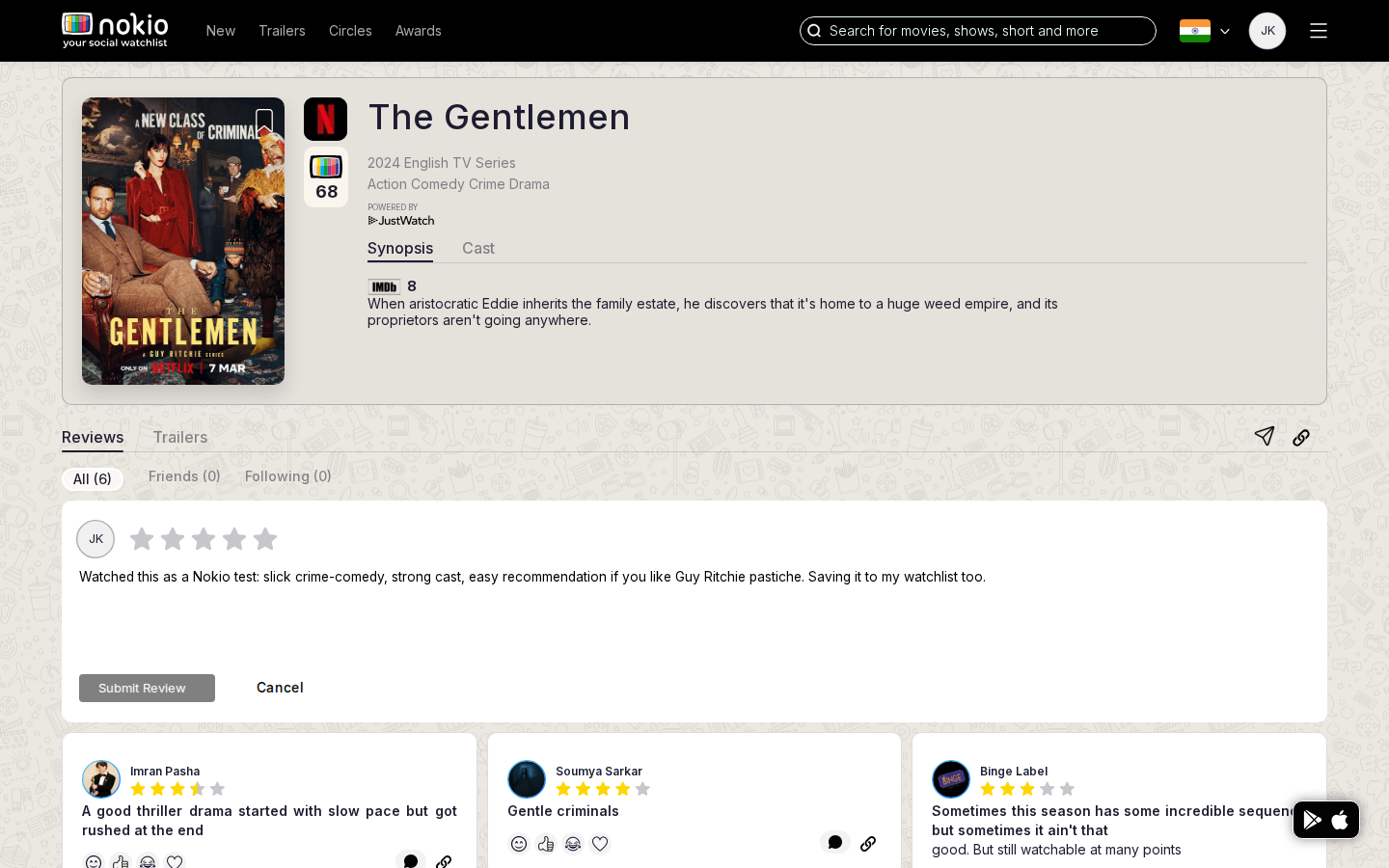
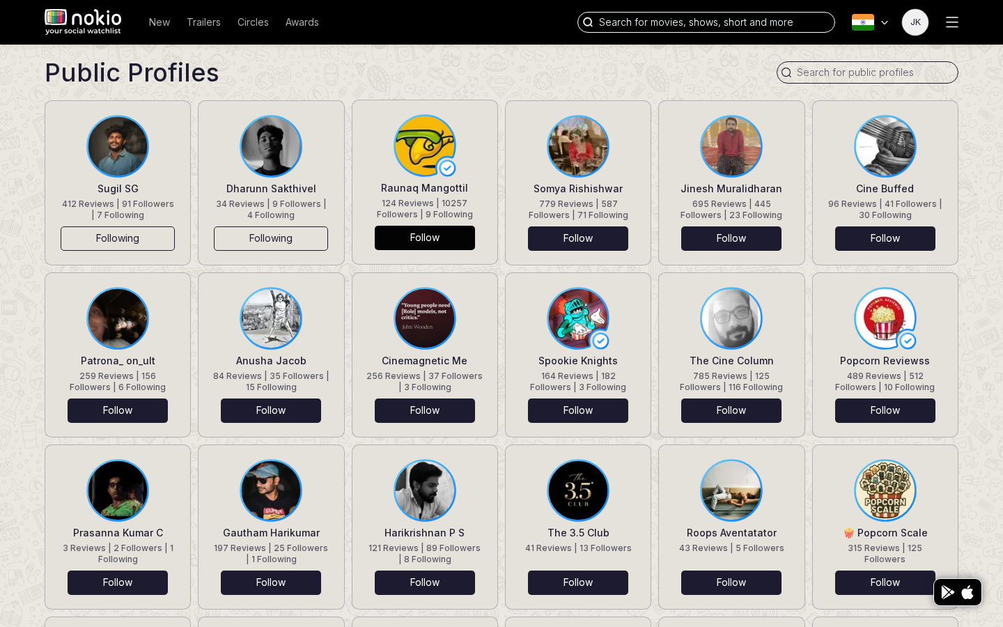
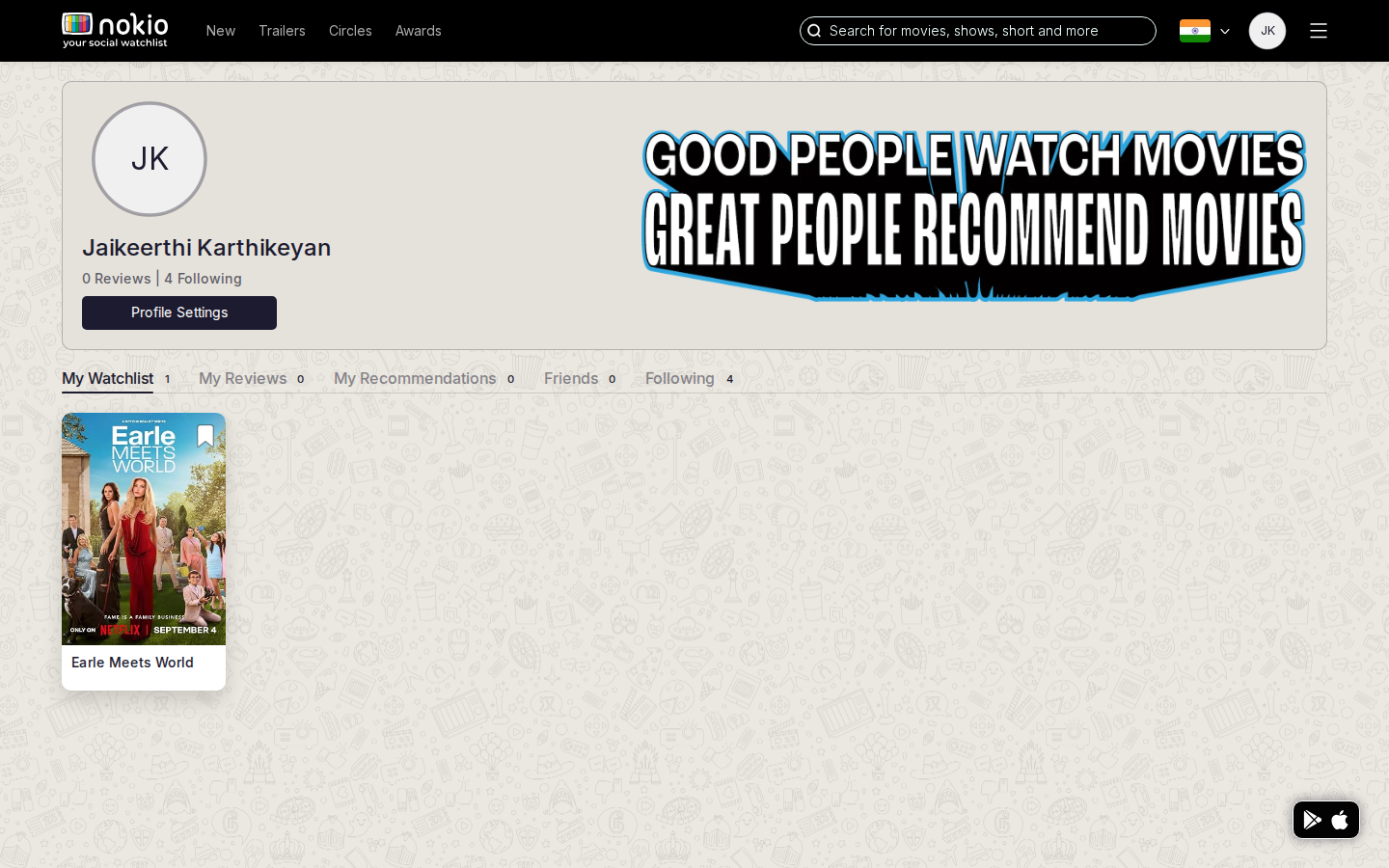
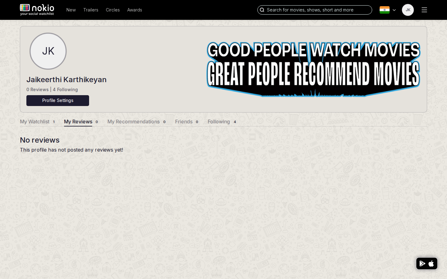
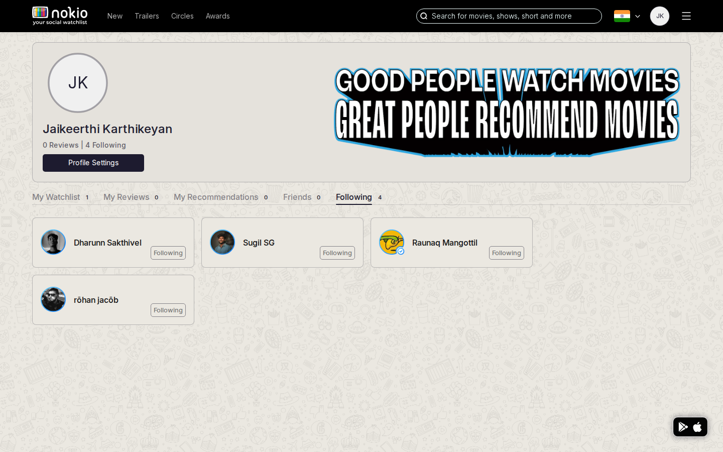
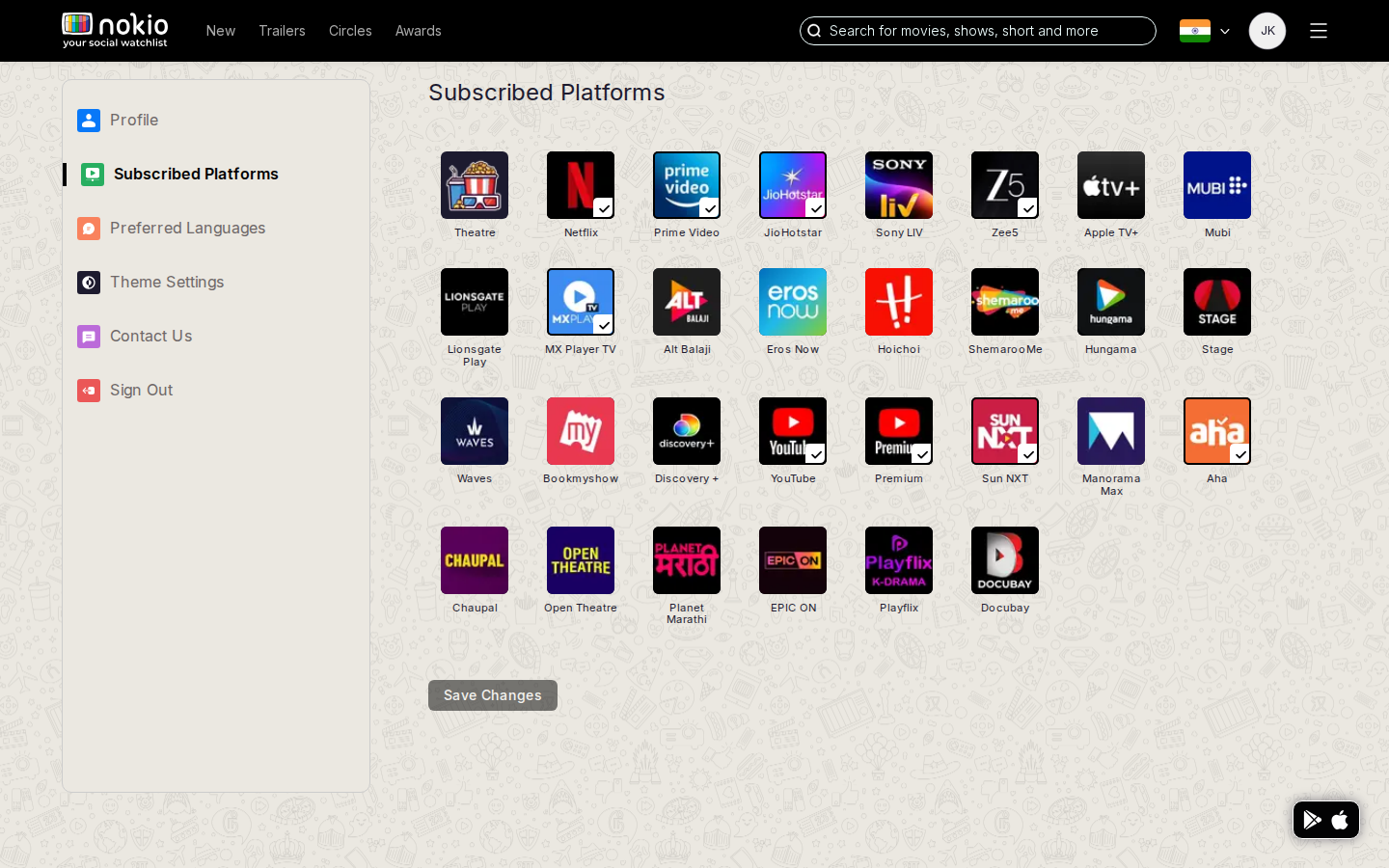
All 33 frames, with the action log, are on Member session.
Cross-cutting UX findings
- Persistent store FAB covers posters, FAQ, and legal text on phone. Hide it when signed in; put Get the App in the menu.
- Bookmark everywhere, watchlist nowhere for guests — saving is offered on every thumb;
/my-profile/my-watchlistis blank until login, with no sign-in prompt on the empty shell. - Search is hidden — header icon on phone; the Search page itself has no field and no results unless a query is already in the URL.
- Sign In vanishes on phone — main nav (New, Trailers, Circles, Awards) and Sign In hide when
isMobile. Guests must hit a gated action to authenticate. There is no bottom nav equivalent. - About us is a dead end — one sentence on black, navy-on-black contrast, no header, no links, no CTA (score 1.0).
- Followers / following for a public profile rendered an empty patterned shell — no list, no empty state (score 1.0 signed-out).
Signed-out page scores
Scale: 1 = broken promise, 5 = job done without friction. Discovery and movie pages are usable catalogs. Social and account pages break the product story.
| Page | Group | Score | Primary job |
|---|---|---|---|
| Home | Discovery | 2.5 | Decide what to watch tonight from trailers, new titles, and social proof |
| New releases | Discovery | 3.0 | Browse titles that just landed, by platform and language |
| Trailers (Recent / Release) | Discovery | 3.5 | Skim latest trailers and pick one to play |
| Movies search | Discovery | 1.5 | Find a specific title |
| About us | Marketing | 1.0 | Understand what Nokio is and how to start |
| FAQ | Marketing | 2.5 | Resolve confusion about Circles, privacy, and how the product works |
| Terms / Privacy | Legal | 3.0 | Read the agreement / data use |
| Public profiles | Social | 3.0 | Find critics to follow |
| Festival / awards | Festivals | 3.5 | Browse an awards slate |
| Festival panel | Festivals | 2.0 | Watch or read a festival panel |
| Movie — reviews | Movie | 3.0 | Decide if this title is worth watching |
| Movie — trailers | Movie | 3.5 | Play a trailer for this title |
| Public profile | Social | 3.5 | Evaluate a critic and follow them |
| Followers / Following | Social | 1.0 | See who follows this person / who they follow |
| Watchlist / Edit profile | Account | 1.0 | See saved titles / change account — empty chrome, no prompt |
What signing in actually changes
- Unlocks: My Profile (watchlist / reviews / recs / friends / following), Edit profile / platforms / languages, write-review composer, Friends/Following filters on movie reviews, header avatar.
- Does not unlock: a friends feed on Home, working empty-state for recs (empty/clipped cards until session settles), Search page results without a query, a populated Circles friends list when the user has no friends.
- Gets worse on phone: my-profile header — avatar covers name and Profile Settings; some settings pages show the sidebar instead of the form (SidePanel min-width 320px, height 740px, no mobile stack).
| Page | Signed-in score | Note |
|---|---|---|
| Home | 2.5 | Same public catalog; rail can paint empty grey cards before session |
| Trailers | 3.5 | Strongest discovery surface |
| Movies search | 1.5 | Still no field on the page |
| Circles friends / following / followers | 2.5 | Featured public profiles, not the user’s graph |
| My watchlist / reviews / recs / friends | 2.0 | Honest empty copy exists; profile chrome collides on phone |
| Edit platforms / languages | 3.0 | The onboarding job, done as settings |
| Movie — reviews | 4.0 | Best signed-in page — read and write a review |
| Public profile (in) | 1.5 | Regression vs signed-out critic page in the captured session |
Responsive: JS and CSS disagree on every breakpoint
Header, search, and several page layouts branch in useBreakpoints (pixel comparisons, no media query). CSS uses @custom-media in globals.css. Until useEffect runs, width defaults to DEFAULT_WIDTH = 1600, so the first paint on a phone is the desktop header.
| Token | CSS | JS (useBreakpoints) | Gap |
|---|---|---|---|
| Mobile | max-width 480 | width < 480 | Aligned. Desktop nav hides only here. |
| Mobile large | max-width 640 | 480–919 (extraSmall) | Home columns stack at 640 CSS; JS tablet is 920. |
| Tablet | max-width 960 | isUptoTablet: width < 920 | 40px hole. Search icon vs full bar disagree. |
| Small / laptop | max-width 1280 | isSmall: 480–1279 | JS treats 500px as “small desktop”. |
| SSR default | actual viewport | 1600px until hydrate | Layout flash: desktop chrome on mobile first paint. |
100rem (1600px) and padding 0 4rem until 480px. Flex shrink saves it from page scroll — used width shrinks, intended layout does not. Search Input.white is min-width 400px. At 768: logo, New / Trailers / Circles / Awards, a pill search whose placeholder clips to “Search for”, country flag, Sign In, and hamburger — all on one 64px-tall bar. Nav links measure 16px tall. WCAG 2.5.8 needs 24px on the short side.
Tap targets below 24px
| Control | Size |
|---|---|
| Hamburger / MenuPopup | 18 × 16 |
| Nav links @768 | 16px tall |
| Sign In @768 | 44 × 16 |
| Carousel arrows | 13 × 50 |
| Drawer close | 18 × 18 |
| See More (xs button) | 57 × 22 |
| Pagination dots | 8 × 8 |
Where overflow lives
Document scrollWidth never exceeded the viewport — pages set overflow hidden (home uses 100vw). Content is clipped instead of causing a page scroll.
| Surface | Viewport | Clipped | Cause |
|---|---|---|---|
| Public / Profiles grid | 375 / 430 | 96px | repeat(2, minmax(160px, 0.2fr)) |
| Movie recommend textarea | 375–1024 | 1129px | Off-canvas ContactList (positioned, not page scroll) |
| Public profile favorites | 768 | 29px | FavoriteMovies width 390px + ProfileInfo min-width 290px |
| Home New Releases dots | 375 | 32px | DotIndicators row wider than section header |
| Movies search list | 375 / 430 | 13px | Virtualized MovieList content-row 155–170px min |
Page-by-page layout
Discovery
Home CSS stacks the 2/3 + 1/3 columns only under 640px. At 768 and 1024 the trailer carousel is undersized next to a full-height recommendations column. Platform and language chips clip with no fade. New releases at 375 uses a 3-column poster grid — stamps, unreadable titles, bookmark icons on tiny art, filter FAB plus store FAB on the right edge. Movies search at 375 showed sort pills over an empty patterned body.
Movie
At 375 the hero truncates title, year/language, and genres. JustWatch “POWERED BY” is 0.52rem (8.3px). CreateReview YouTube field is min-width 25rem (400px) inside the mobile breakpoint. Recommend ContactList stays mounted off-canvas with min-width 350px. Best page in the product once signed in (score 4.0) — the composer works if the star rating registers.
Social
Public profile grid overflows 375 by 96px and gets clipped. Names ellipsize. Store FAB covers the bottom-right avatar. At 768 the public-profile header never stacks (690px min-width only yields at 480). Circles featured names truncate. Followers/following routes for a public profile were empty shells.
Marketing and legal
About us: full-viewport black, one sentence, 0 anchors, failing contrast. FAQ questions are the right ones; copy does not match signed-out (or signed-in) home; store FAB overlaps body; no accordion. Privacy effective date 23 Dec 2020 looks stale. Reset password close X is a sub-24px target; a mobile keyboard will cover the vertically centered submit.
Device agents — not resized desktop
Every route loaded with a real device descriptor: iPhone 14 Safari, Pixel 7 Chrome, iPad Pro 11 Safari, Galaxy Tab S9 Chrome, those devices in landscape, Desktop Chrome as control. That sets user agent, touch, DPR, and CSS viewport together.
window.innerWidth (480 / 920). The “Open App” bar uses navigator.userAgent after 5s (iPhone, iPad, Android). iPad Safari is a tablet that still gets desktop Nav, plus a mobile install prompt. Resizing a desktop window never showed that prompt. 160 of 203 loads showed Open App; 0 of the Desktop Chrome loads did.
| Agent | CSS viewport | Header | Search | Open App |
|---|---|---|---|---|
| iPhone 14 Safari | 390×664 · DPR 3 | Hamburger only (correct) | Icon | Yes |
| Pixel 7 Chrome | 412×839 · DPR 2.625 | Hamburger only | Icon | Yes — in the fold |
| iPhone 14 landscape | 750×340 | Desktop Nav + hamburger | Icon | Yes — covers the trailer |
| Galaxy Tab S9 | 640×1024 | Desktop Nav (16px) + hamburger | Icon | Yes |
| iPad Pro 11 Safari | 834×1194 | Desktop Nav + hamburger | Icon (834 < 920) | Yes |
| iPad Pro 11 landscape | 1194×834 | Desktop Nav + hamburger | Field (1194 ≥ 920) | Yes |
| Desktop Chrome | 1280×720 | Desktop Nav + hamburger | Field | No — store FAB only |
Phone landscape (844×390) is a different product: width 844 hits tablet CSS (≤960) with a 390px-tall viewport. Header + chips eat the trailer.
Interaction bugs found while using the product
| Result | Action | Detail |
|---|---|---|
| ok | Watchlist add | Clicked three bookmark controls; My Watchlist went 0 → 1. Hit targets are tiny; most clicks did not persist. |
| ok | Search with query | /movies?q=The+Gentlemen returns results. Empty /movies does not. |
| ok | Follow | Following 1 → 4 |
| fail | Review submit | Submit disabled — stars ignore a click that has no prior pointermove |
| fail | Trailer thumb | Applied a platform filter instead of playing |
Responsive fix order
| Priority | Change | Unlocks |
|---|---|---|
| 1 | One breakpoint map: CSS custom-media = JS useBreakpoints. Drop DEFAULT_WIDTH 1600 for layout. | Stops desktop-nav-on-tablet and hydrate flash |
| 2 | Header: hide Nav below 960; 44px min hit area; search min-width 0 / width 100%. | Every page |
| 3 | Stack home columns at tablet (960), not only 640. Replace 100vw with 100%. | Home / trailers / new releases |
| 4 | Profile grid: minmax(0, 1fr) two-col; stack profile header under 960. | Profiles + public profile |
| 5 | Movie hero wrap; drop CreateReview 25rem min-width; enlarge JustWatch type. | Movie reviews / trailers |