Chapter 4 · Design analysis
Device-wise screenshot report
Every route loaded with a real Playwright device descriptor: iPhone 14 Safari, Pixel 7 Chrome, iPad Pro 11 Safari, Galaxy Tab S9 Chrome, those devices in landscape, and Desktop Chrome. Use the sticky control to switch every page to Phone, Tablet, or Desktop. Each tab lists layout gaps and the UI controls that fail on that class of device.
How chrome differs by agent
Layout keys off width (Nav ≥480, search field ≥920). Open App keys off UA after 5s. That split is why iPad is a desktop layout with a mobile install nag.
| Agent | Screen | CSS viewport | Header | Search | Open App |
|---|---|---|---|---|---|
| iPhone 14 | phone | 390×664 | hamburger only | icon | yes |
| Pixel 7 | phone | 412×839 | hamburger only | icon | yes |
| iPhone 14 landscape | phone | 750×340 | desktop nav | icon | yes |
| iPad Pro 11 | tablet | 834×1194 | desktop nav | icon | yes |
| Galaxy Tab S9 | tablet | 640×1024 | desktop nav | icon | yes |
| iPad Pro 11 landscape | tablet | 1194×834 | desktop nav | field | yes |
| Desktop Chrome | desktop | 1280×720 | desktop nav | field | no |
Shared UI chrome (almost every page)
These controls repeat. Fix once; every section below still lists them where they hurt that page.
- P0Hamburger is three 2px strokes (~18×16), not a 44×44 target. Always shown, even next to desktop Nav.
- P0Open App (fixed, 90% width, z-index 9999, after 5s on iOS/Android/iPad UA) stacks on the store FAB (70×40, bottom-right). Two install CTAs, both covering content.
- P0Search is an icon below 920px CSS width and a pill field at or above — iPad portrait vs landscape disagree.
- P1Nav links are 0.875rem darkgrey, nowrap, ~16px tall. Flag+chevron and 32px JK share a 10.5px-gap header row on phone.
- P1Bookmark on posters is a corner glyph with no selected label. Filter sliders often float as a black square FAB.
- P2Tabs across the app are 0.8rem underlines (Circles, movie Reviews/Trailers, profile Watchlist…). Grid/list toggles are icon-only.
Home
Job: Decide what to watch from trailers, new titles, and people I follow.
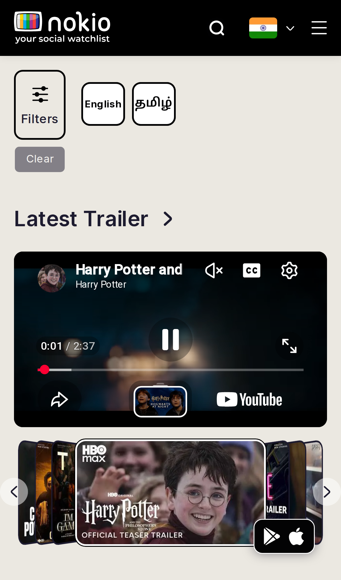
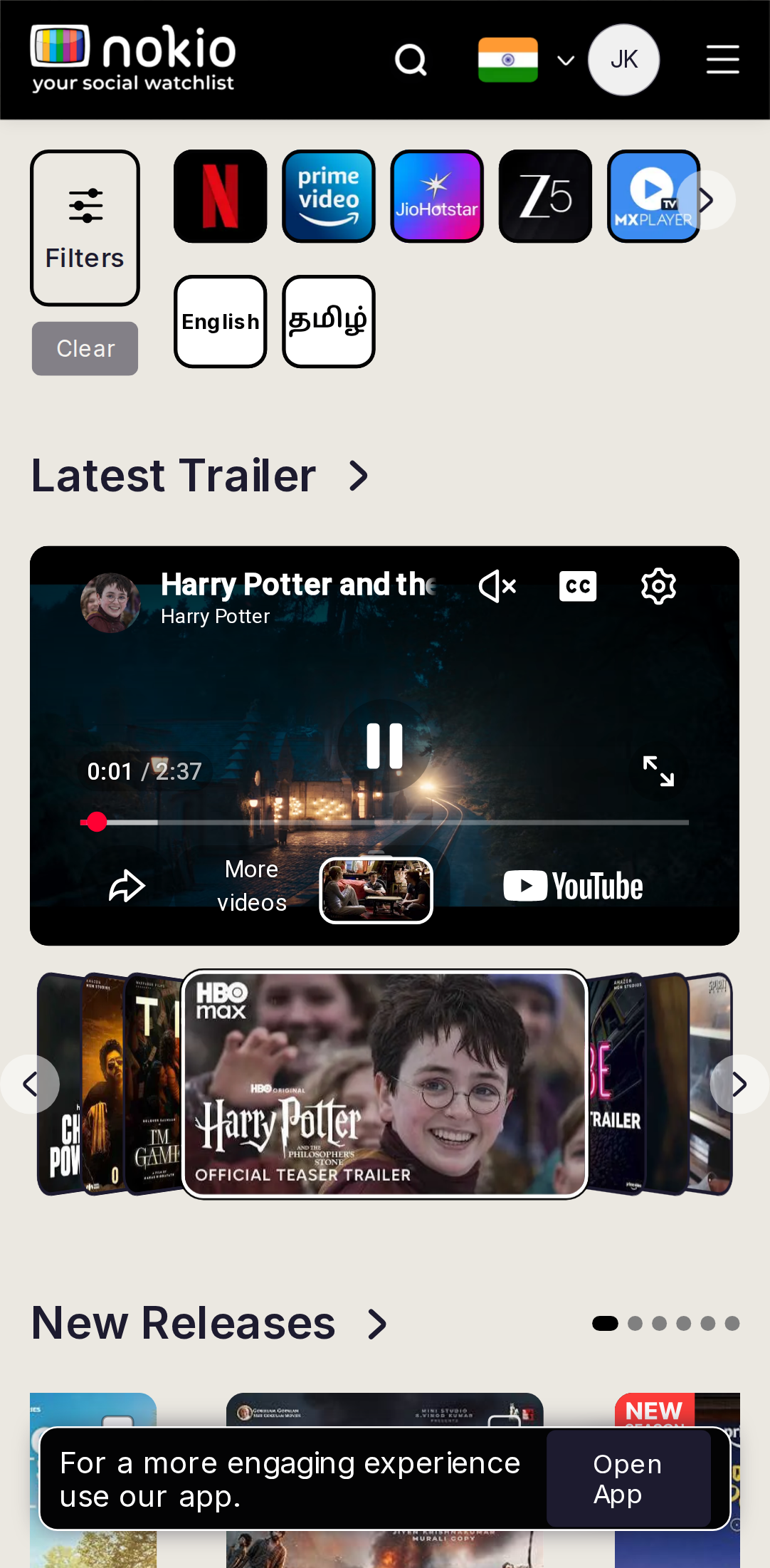
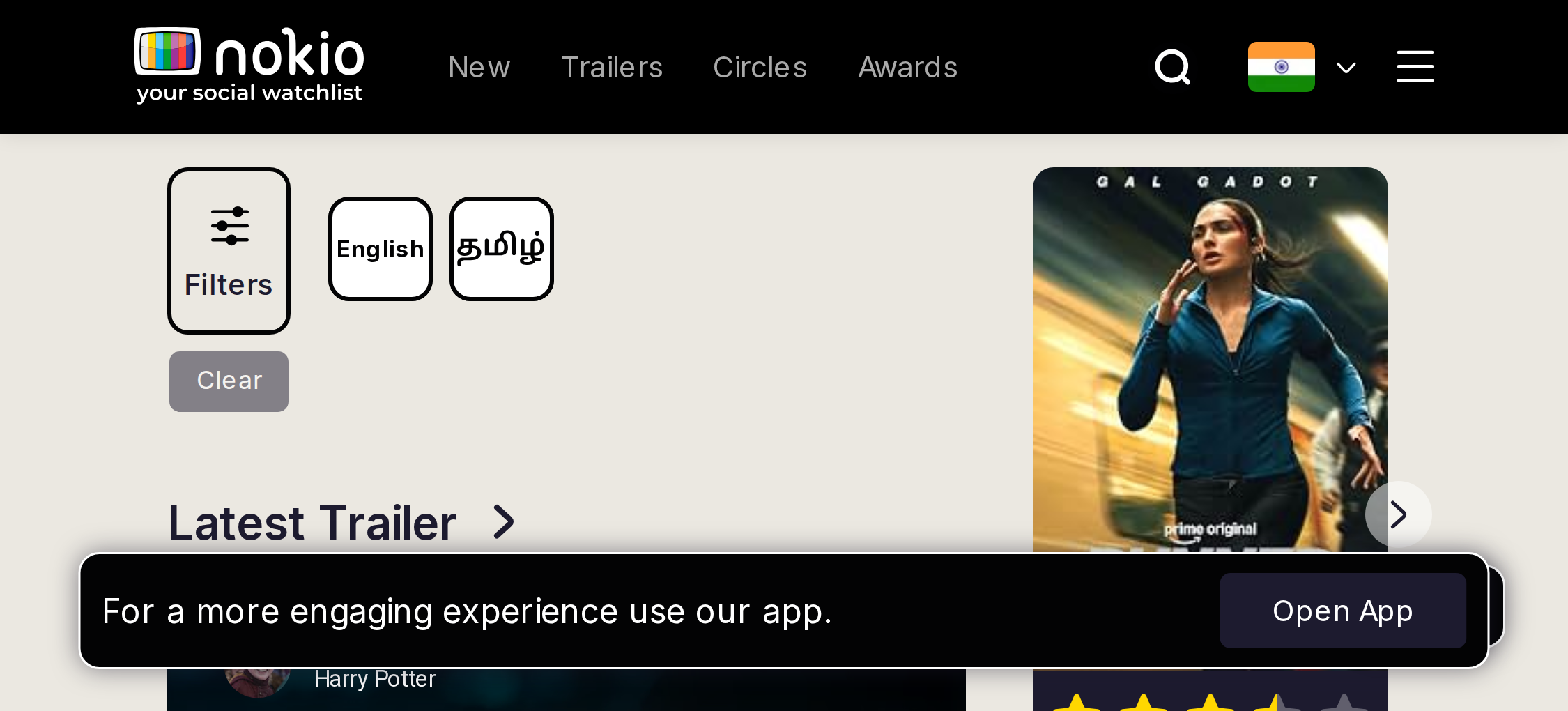
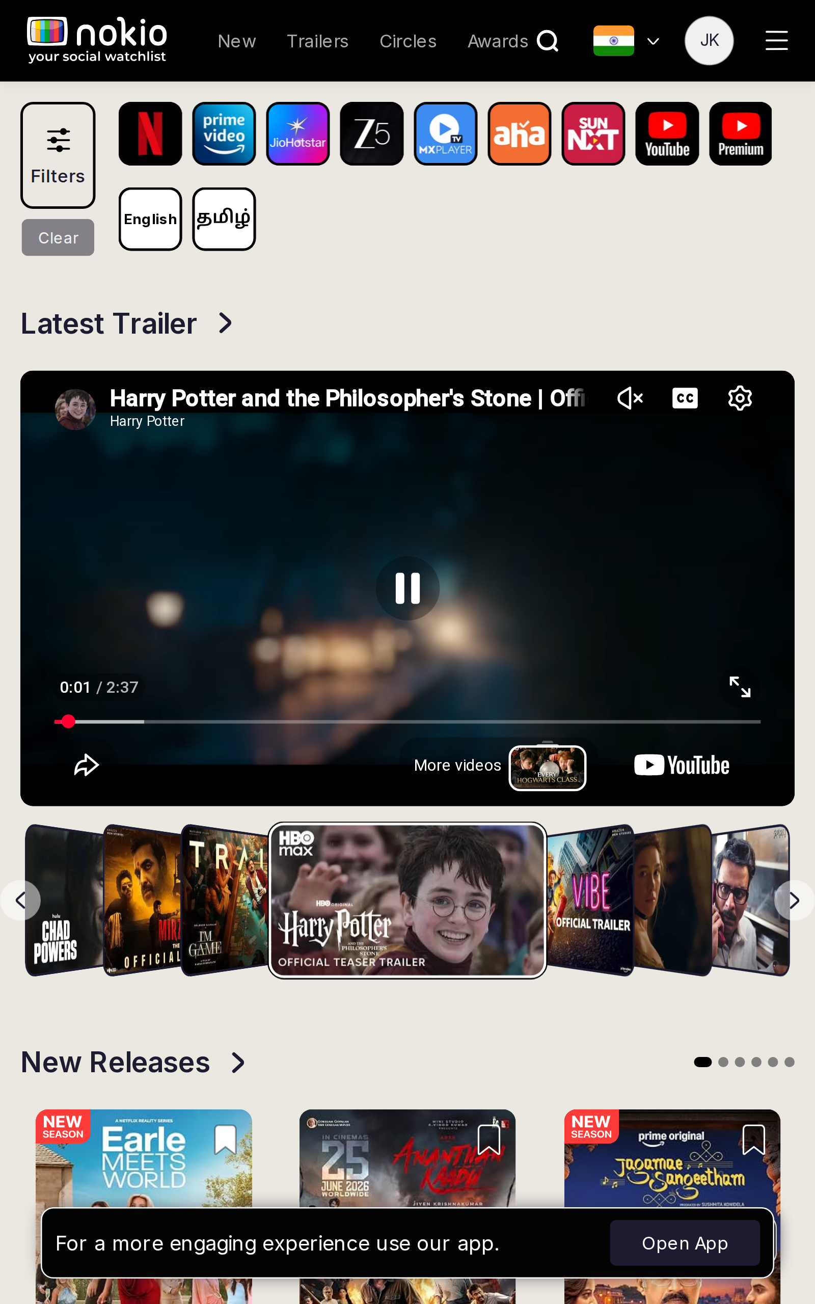
Gaps on phone
- P0iPhone 14 header is missing JK — Pixel 412 shows it. 22px should not drop the avatar.
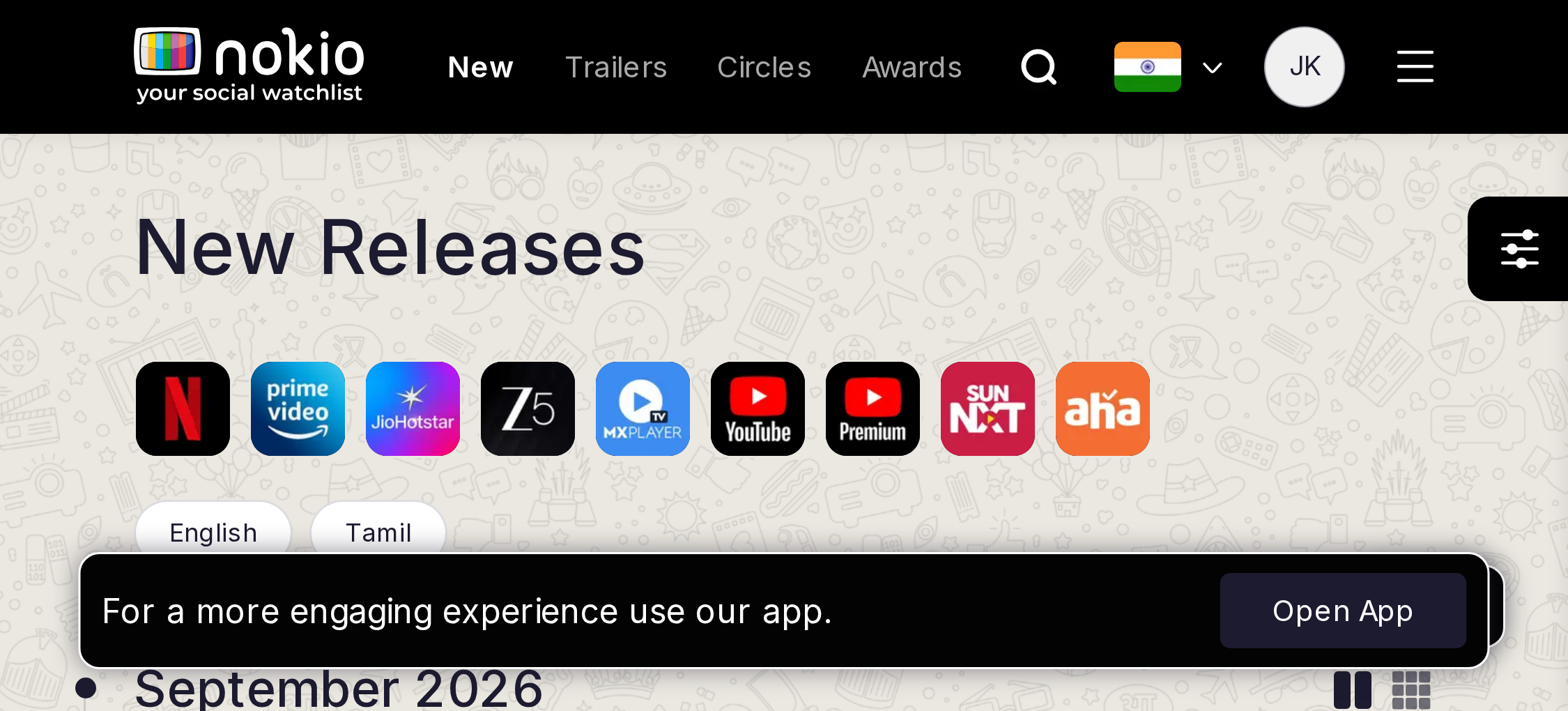
- P0Open App (5s, UA sniff) + store FAB both sit on New Releases. One install CTA, not two.
- P0Filters + language chips steal the fold; trailer should lead.
- P0Landscape (750×340): desktop Nav at 16px + Open App. Collapse chrome; player fills height.
- P1Pixel shows platform chips iPhone does not — same “phone” layout, inconsistent fold.
UI elements on phone
- P0Hamburger is ~18×16 (three 2px strokes) — make a 44×44 hit.
- P0Search is an icon in a grey blob, not a 44px control. Flag+chevron and 32px JK compete in the same 10.5px-gap row.
- P0Filters is a large bordered square; Clear sits under it, grey, looking disconnected and often disabled.
- P0Language chips (English / தமிழ்) are square buttons, not pills — easy to miss as toggles.
- P0Cover-flow arrows are thin circles over posters; YouTube’s own play/pause/mute/CC sit inside the embed with no Nokio play affordance.
- P0Store FAB (70×40, bottom-right) stacks on Open App (90% width, z-index 9999) — two install controls, both covering New Releases dots/posters.
- P1Landscape: New/Trailers/Circles/Awards render at 0.875rem darkgrey (~16px tall) next to the hamburger.
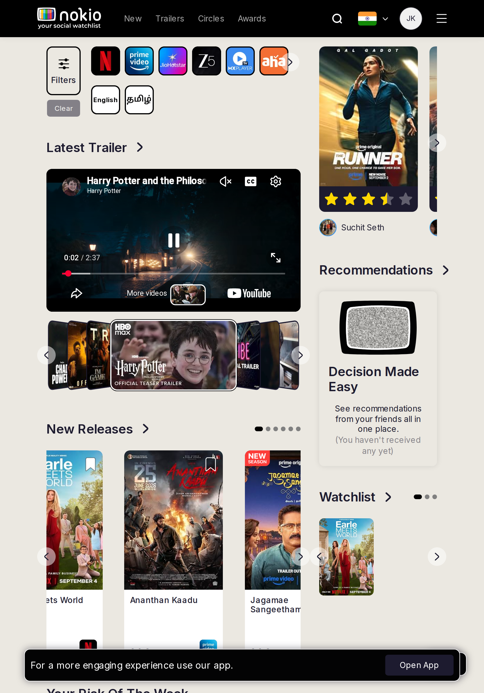
Gaps on tablet
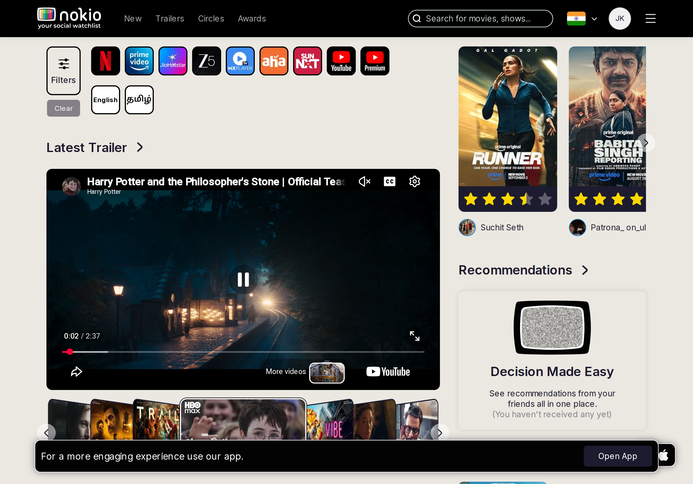
- P0iPad UA triggers Open App, but 834px width paints desktop Nav. Members get a desktop page with a mobile nag.
- P0Galaxy Tab S9 at 640px is the worst hybrid: unreadably small Nav, search icon, Open App, dense platform row.
- P1iPad portrait: search stays an icon (834 < 920) while the two-column rail is already desktop.
- P1iPad landscape finally gets the search field (1194 ≥ 920) — portrait should too.
UI elements on tablet
- P0Desktop Nav links (darkgrey, nowrap, 0.875rem) + hamburger + search icon + flag + JK all in one bar. Nav hits are 16px tall.
- P0Platform icon row (Netflix, Prime, …) is a horizontal scroller with a chevron over the last icon — looks like a platform, not “more”.
- P1Pagination dots on New Releases are ~6px; cover-flow arrows overlap thumbs.
- P1Open App bar + store FAB still both present (iPad UA).
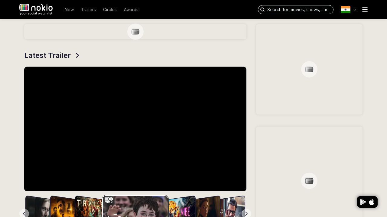
Gaps on desktop
- P1Hamburger still sits next to full Nav — hide it ≥960.
- P1Right rail was still skeleton at 2.8s; mobile waited 5.6s and filled. Don’t paint empty grey cards.
- P2Store FAB is fine here if Open App is UA-only — don’t add a third install path.
UI elements on desktop
- P1Search field is a wide pill; placeholder truncates at 1280 (“shows, sho…”). Hamburger remains beside full Nav.
- P1Sign In is 0.875rem / 50px-wide text in the header CSS — too short a hit when signed out.
- P2Latest Trailer “>” chevron is the only link affordance on an H3.
- P2Store FAB 70×40 with Play+Apple glyphs — no label.
New releases
Job: Scan titles that just landed and save a few.
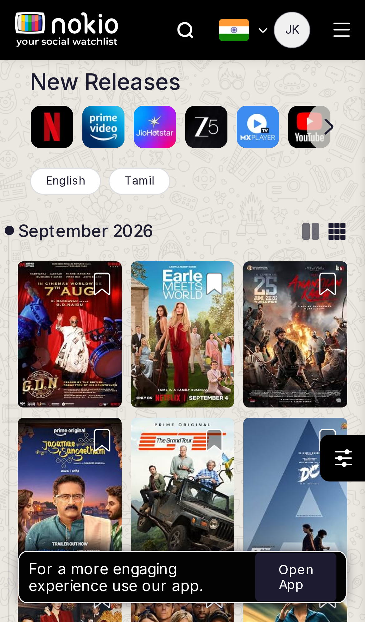
Gaps on phone
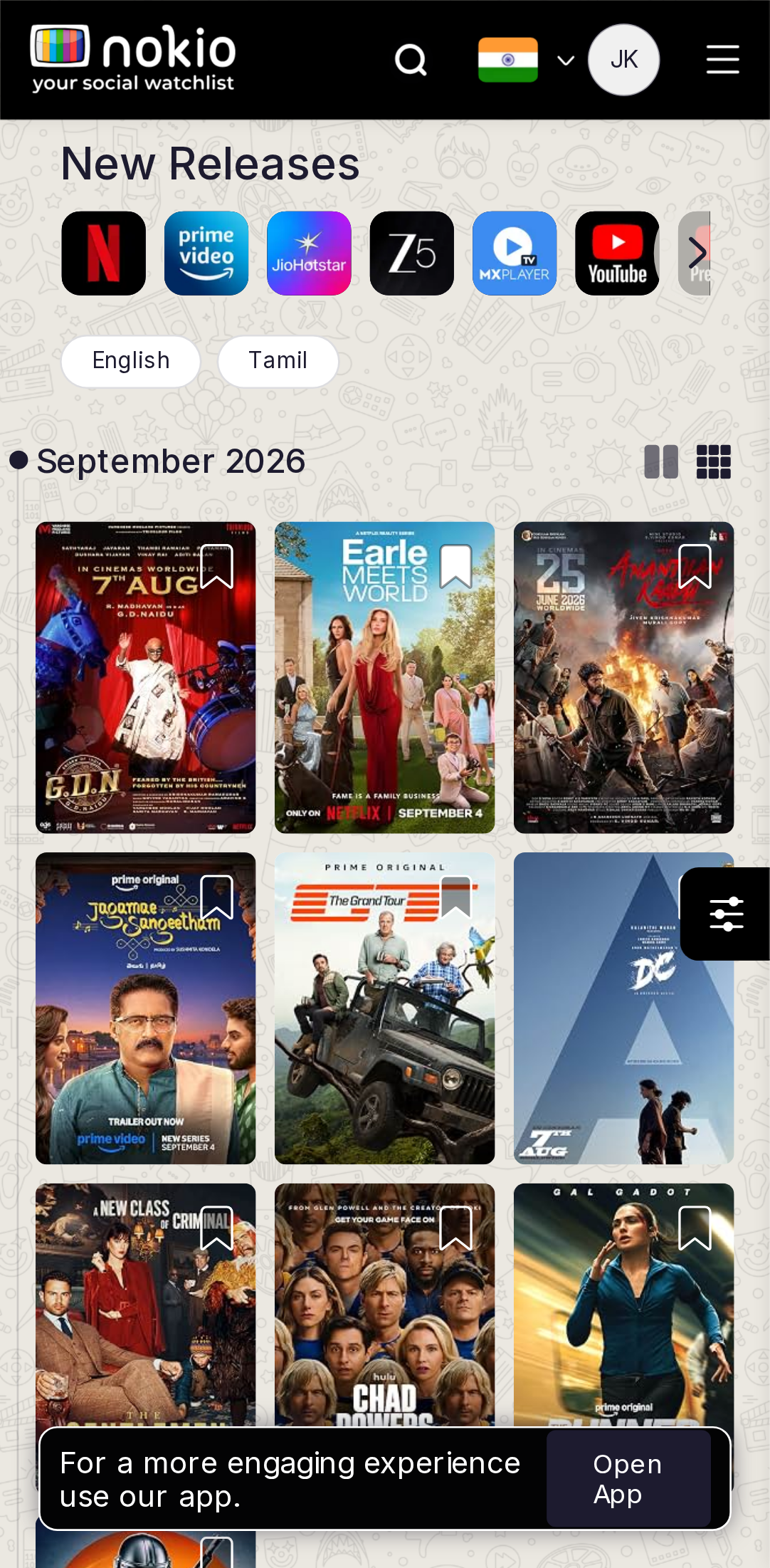
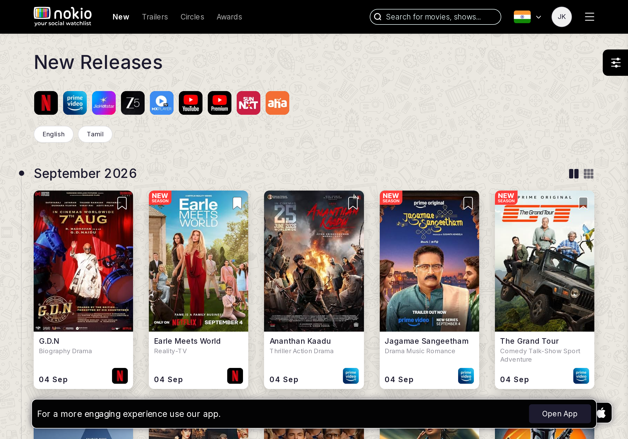
- P03-column posters on 390/412: titles unreadable, bookmarks <44px. Use 2 columns.
- P0Store FAB / Open App cover the last poster.
- P1Three bookmark taps only saved one title — confirm fill + toast.
UI elements on phone
- P0Bookmark on every poster is a small white glyph in the corner — not 44px; three taps saved one title.
- P0Floating sliders FAB (black square, right edge) overlaps the last column of posters.
- P0List/grid toggles are two tiny icons beside “September 2026”; grid is active with no text label.
- P0Platform row + language pills push the first posters below the fold; Open App then covers the bottom row.
- P1Month marker is a black dot + “September 2026” — not a jump control.
Gaps on tablet
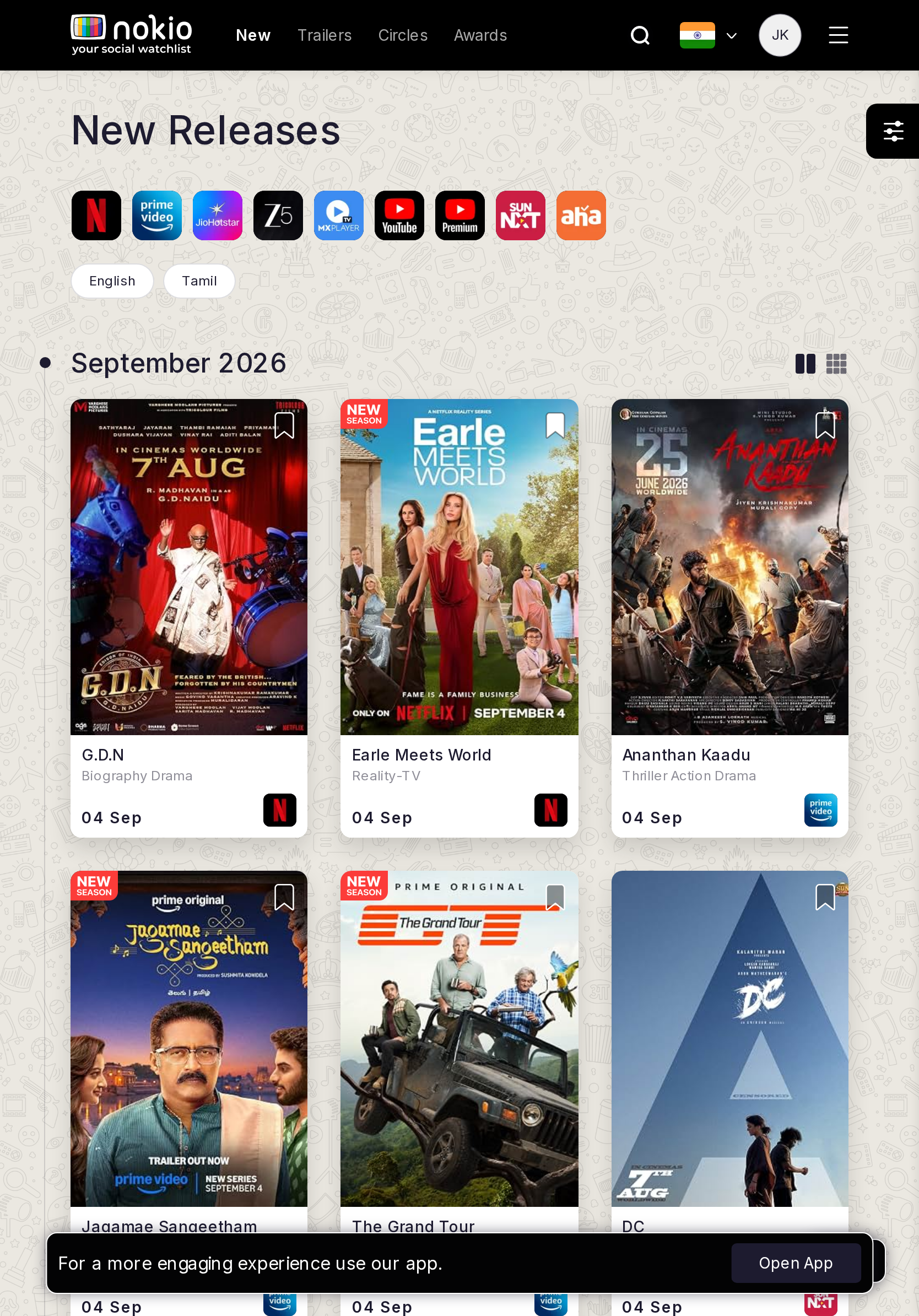
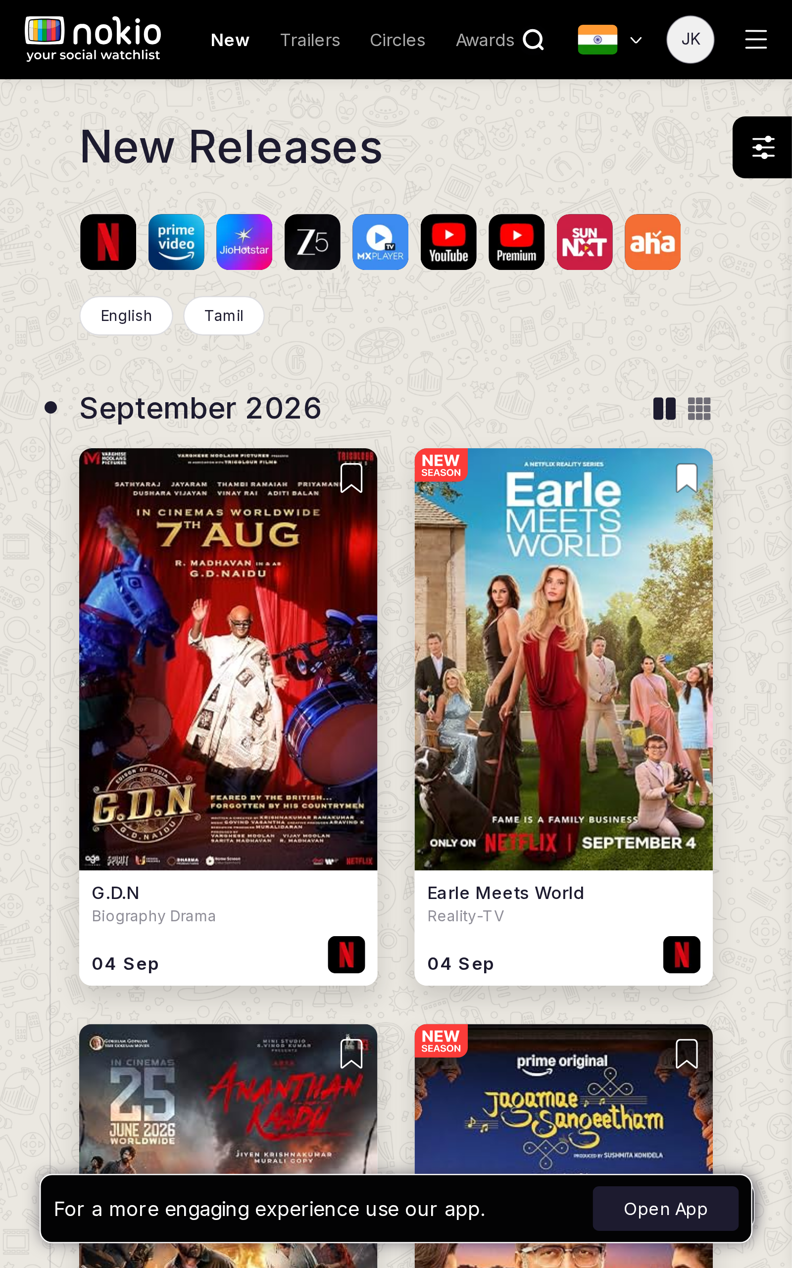
- P1Galaxy Tab 640: too many columns for a 640px touch grid.
- P1iPad: more columns but still search-icon chrome; filter FAB overlaps the grid.
UI elements on tablet
- P1Same sliders FAB + Open App. Platform icons stay scrollable with a chevron-on-icon.
- P1Grid/list icons remain unlabeled. Bookmarks still corner glyphs.
Gaps on desktop
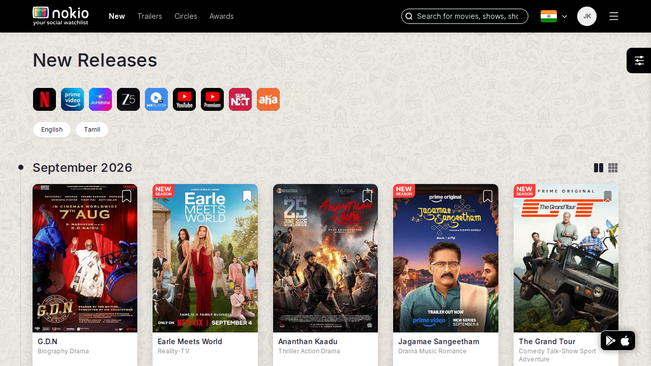
- P2Month grouping is good; list/grid toggles are easy to miss. Put filter in the month row.
UI elements on desktop
- P2Filter lives in a floating control instead of the month row. List/grid still icon-only.
- P2Bookmark has no selected/unselected label (aria often missing).
Trailers
Job: Skim latest trailers and play one.
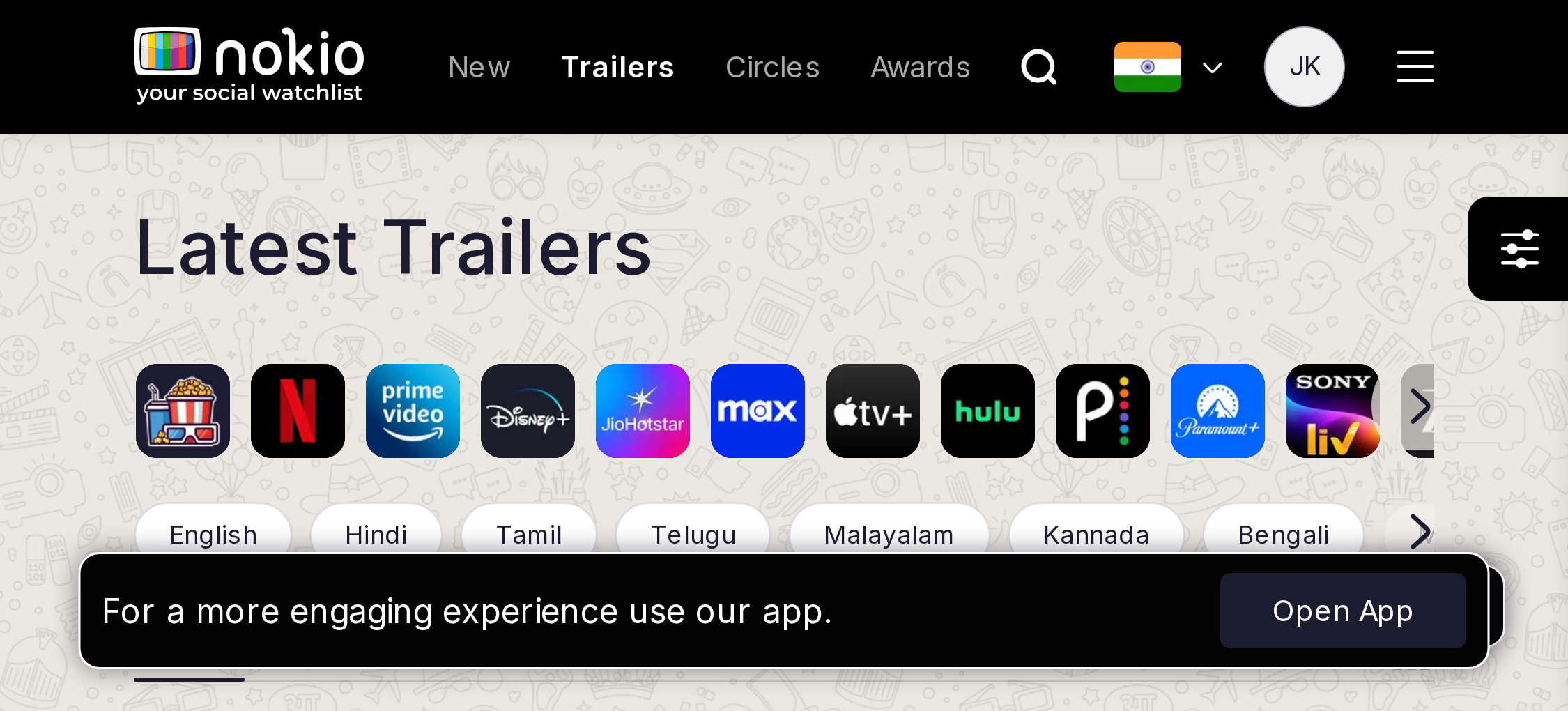
Gaps on phone
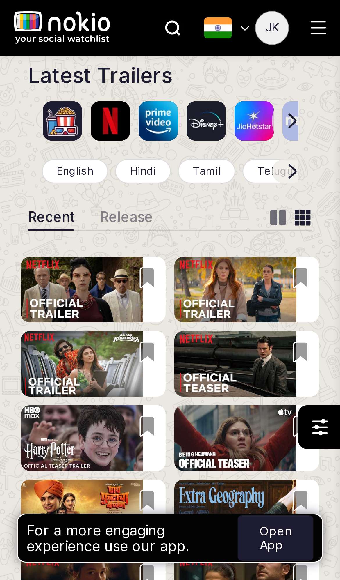
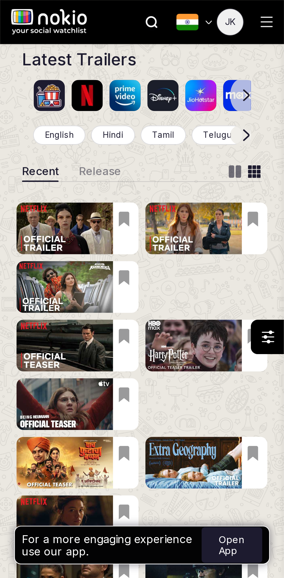
- P0Thumb tap applied a platform filter in the member session — first tap must play or open the title.
- P1Landscape: desktop Nav + one half-row of thumbs in 340px height. Use a horizontal reel.
- P1Filter FAB overlaps the right column.
UI elements on phone
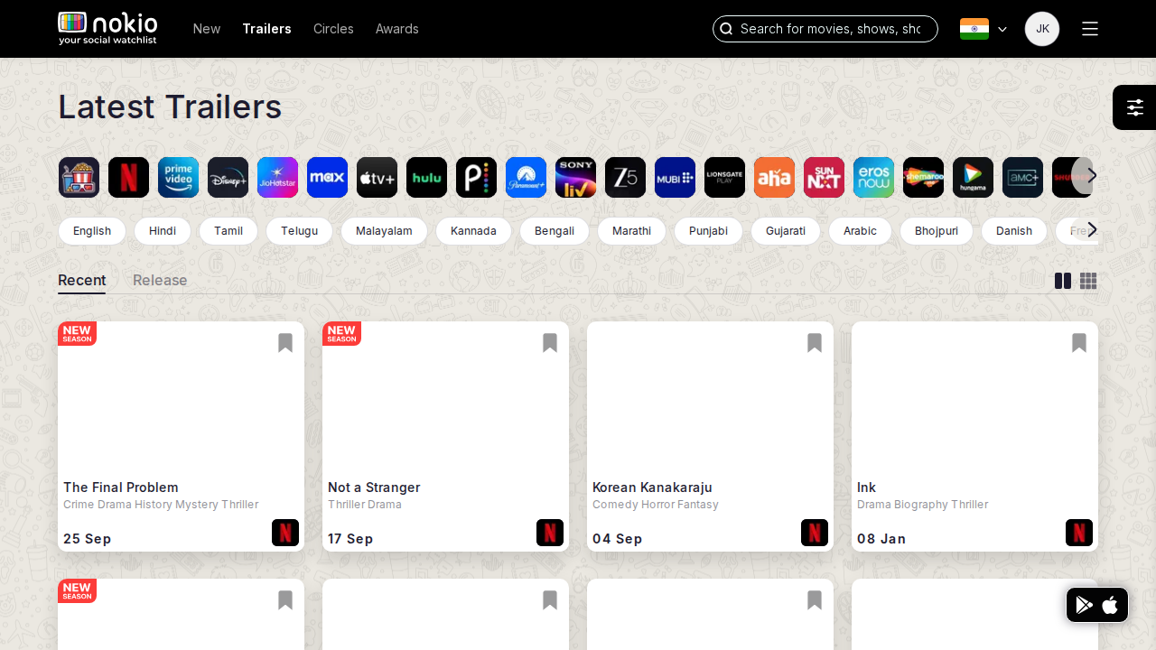
- P0Recent / Release are underline tabs with jargon labels — 0.8rem Tabs CSS.
- P0Bookmark glyph on every thumb competes with play; first tap hit a platform chip (?platforms=49).
- P0Filter sliders FAB overlaps the right column; Open App covers the last row.
- P1Language chips clip with a fade-less overflow.
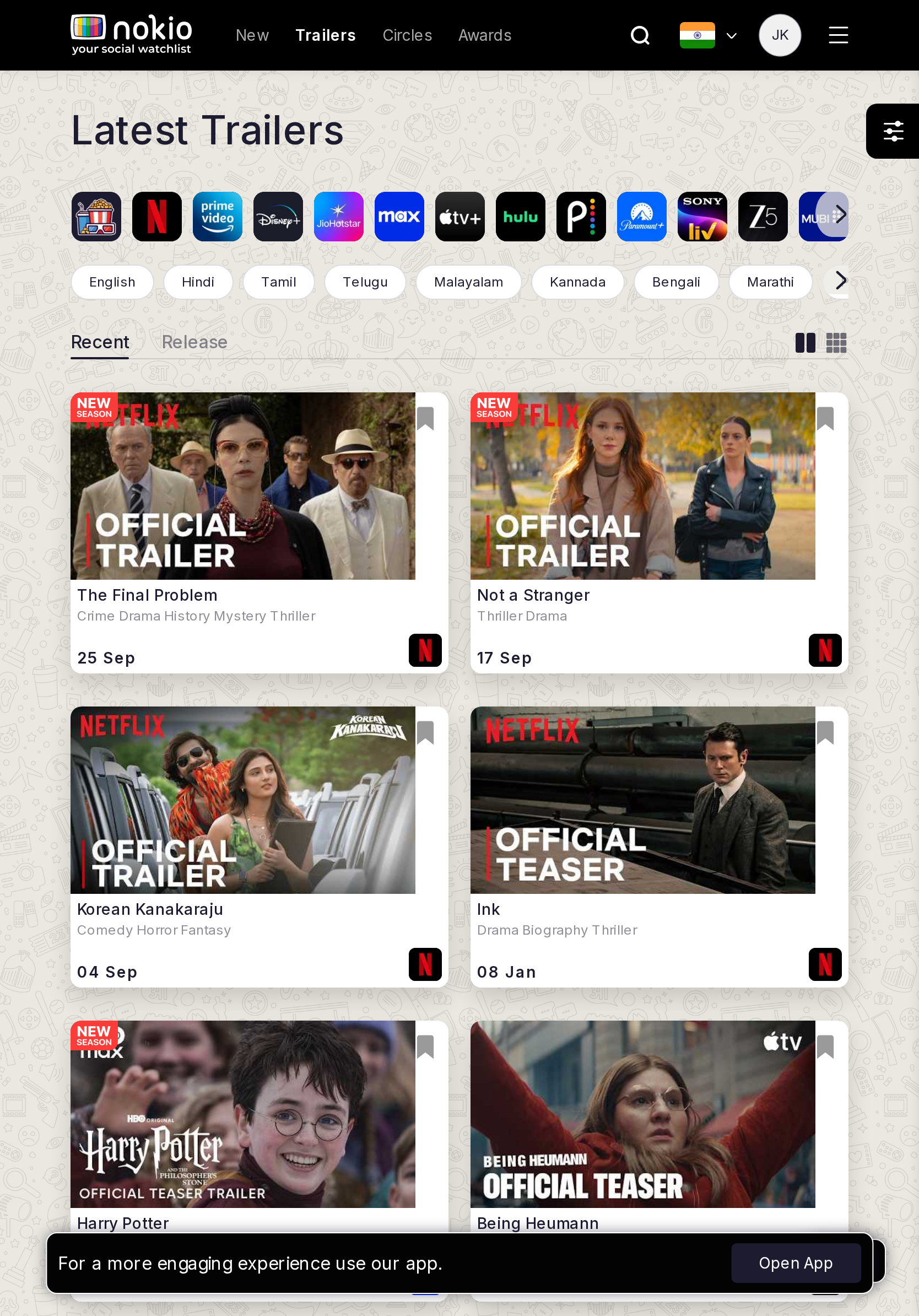
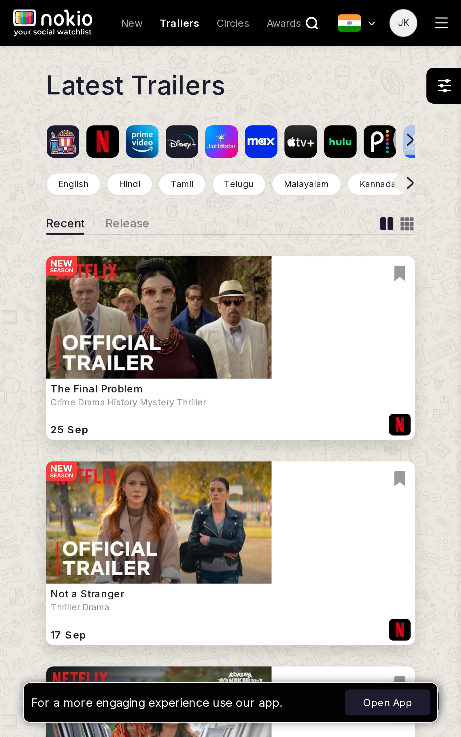
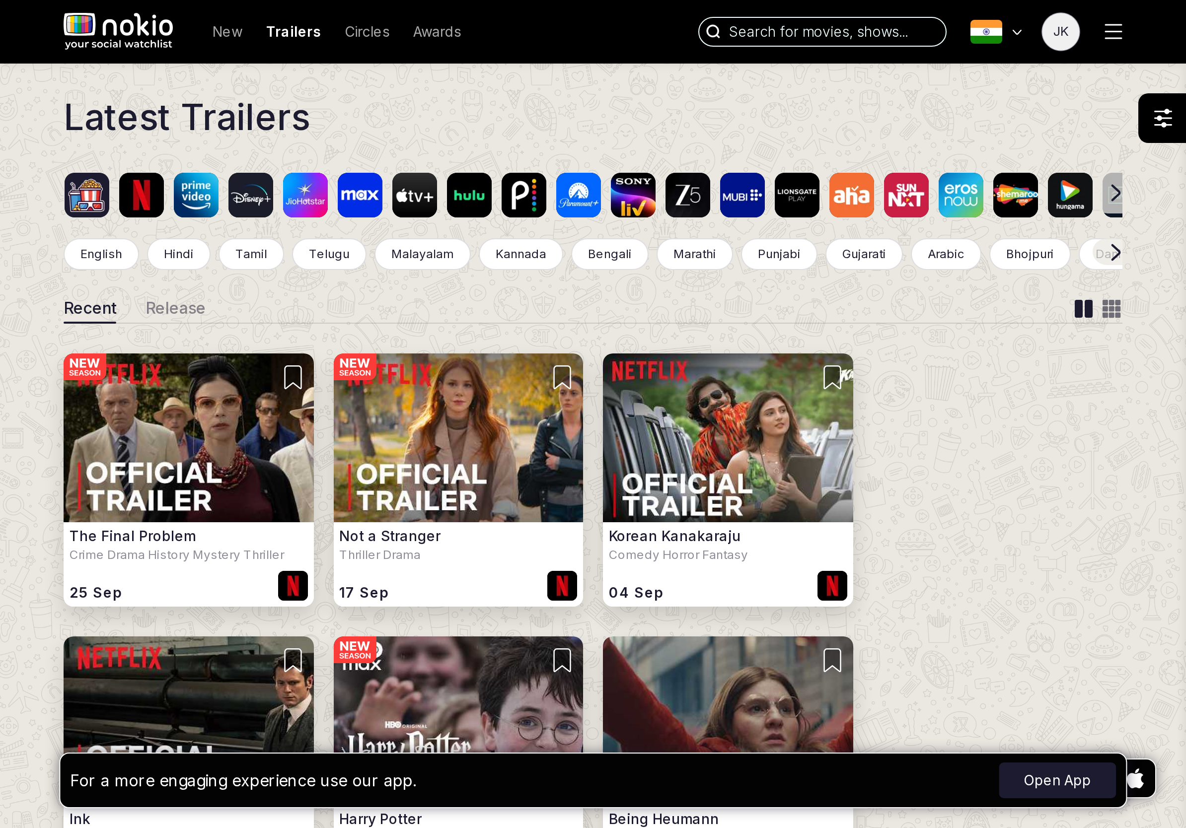
Gaps on tablet
- P1iPad landscape is almost desktop density with touch UA — keep 44px hits.
- P1Recent vs Release looks identical; H1 should change.
UI elements on tablet
- P1Same Recent/Release underline. Platform icon scroller + language pills + FAB + Open App = four competing chrome bands.
- P1Thumbnails have “OFFICIAL TRAILER” overlay type that fights the title below.
Gaps on desktop
- P1Rename tabs Latest / Coming soon. Play is the primary action, not bookmark-on-thumb.
UI elements on desktop
- P1Grid/list icon pair unlabeled. Bookmark still on the art.
- P2Date + platform logo on the card are 0.75rem — low contrast grey.
Trailers by release
Job: See trailers ordered by release date.
Gaps on phone
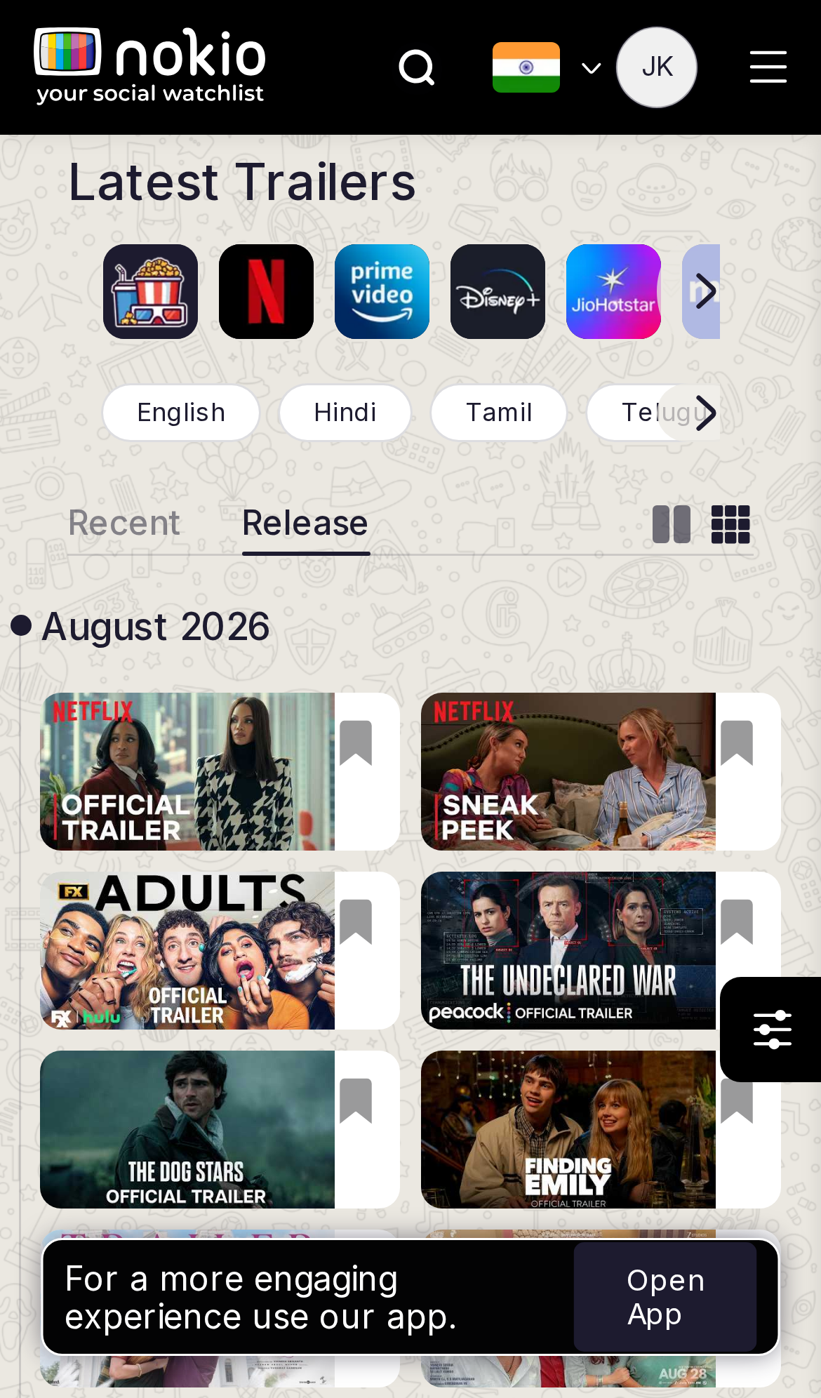
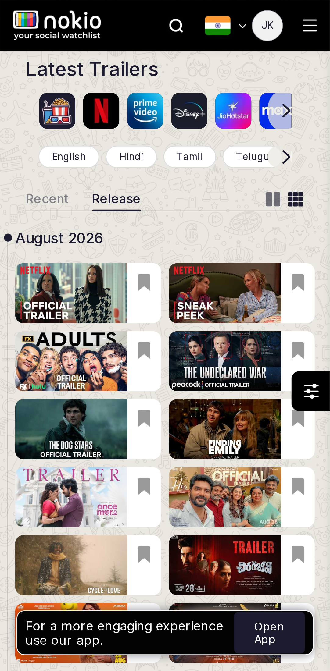
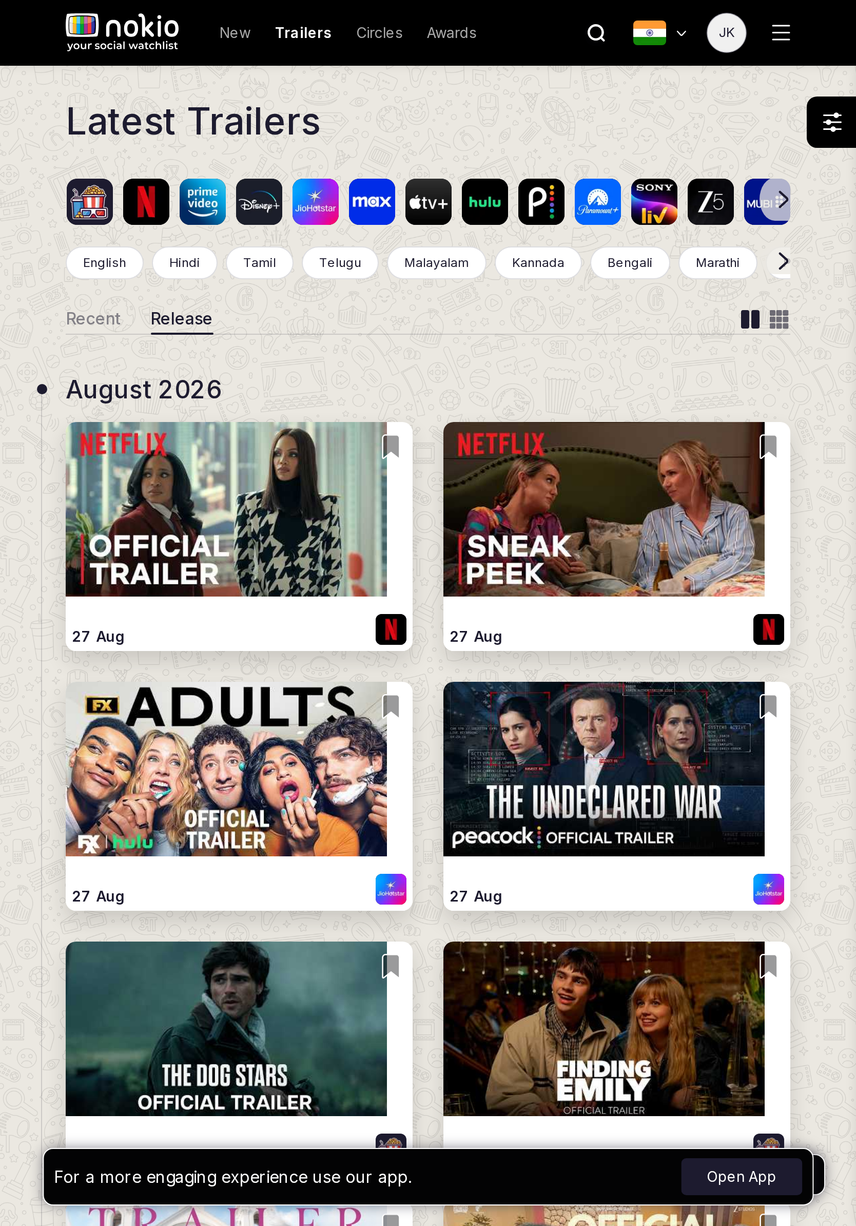
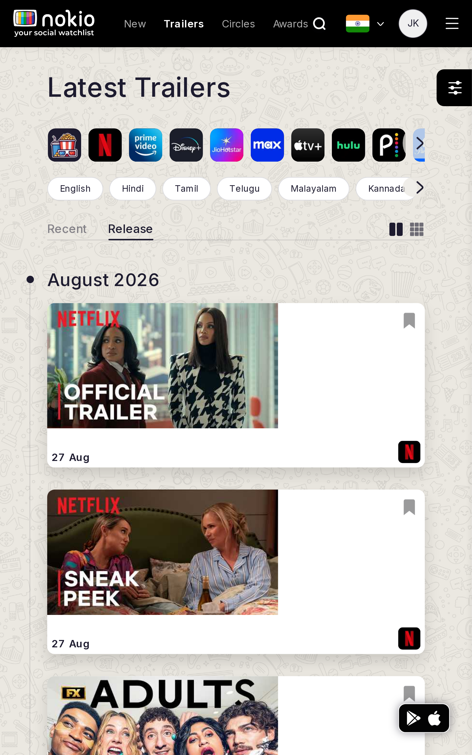
- P1Same as Recent on every phone agent — the tab click feels like a no-op.
- P1Open App still covers the last row.
UI elements on phone
- P1Identical controls to Recent — only the underline moves. No heading change, no sort chip.
- P1Same FAB + Open App + bookmark-on-thumb.
Gaps on tablet
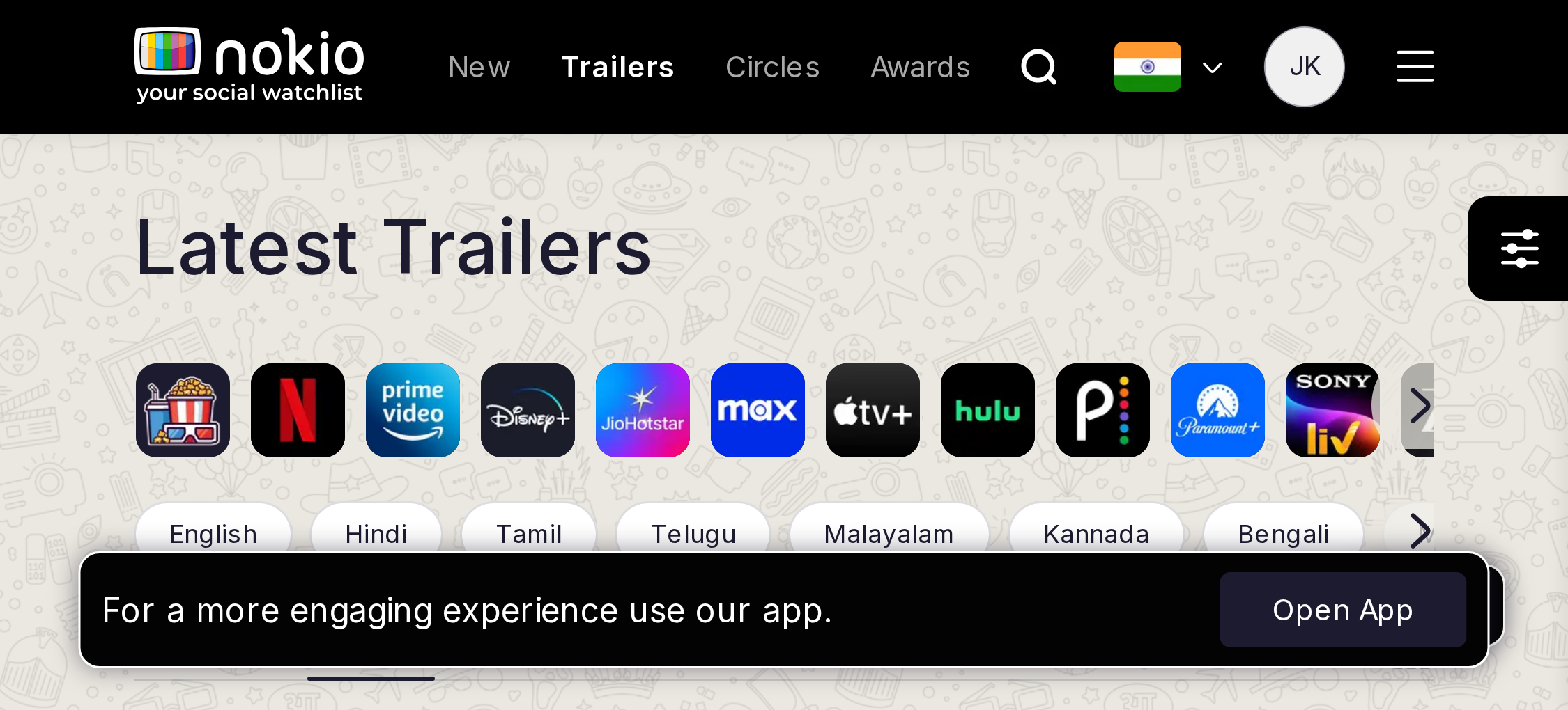
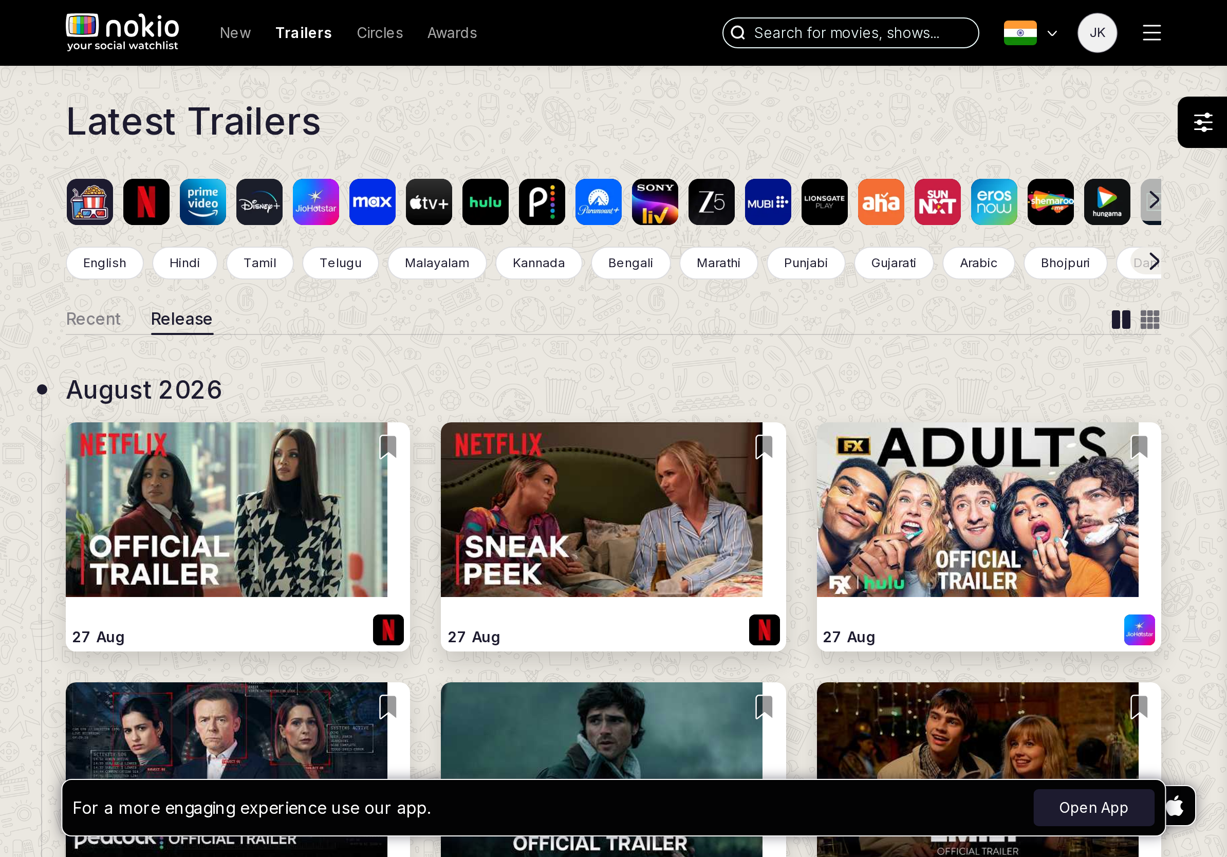
- P1Same chrome as Recent. Make sort visible in the heading.
UI elements on tablet
- P1Same control set as Recent. Need a visible “Coming soon” chip or H1.
Gaps on desktop
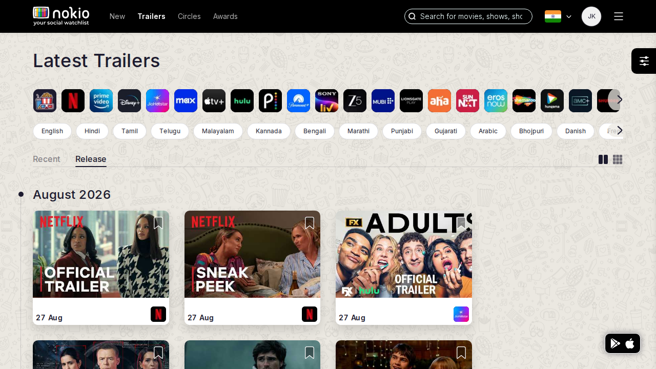
- P2One /trailers?sort= route would remove a duplicate page.
UI elements on desktop
- P2Duplicate page chrome. One sort control would replace the second route.
Search
Job: Find a specific title.
Gaps on phone
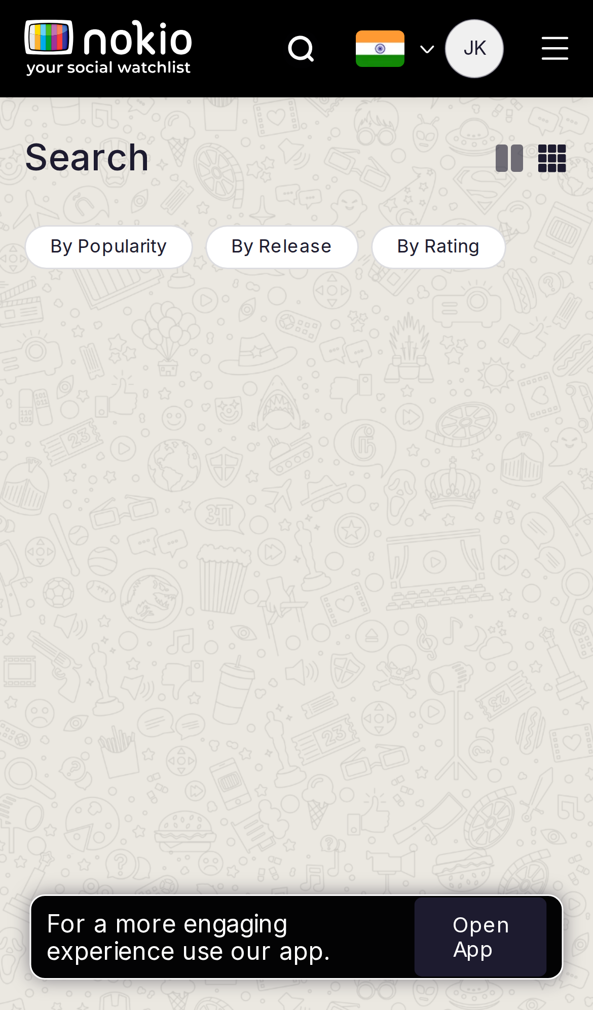
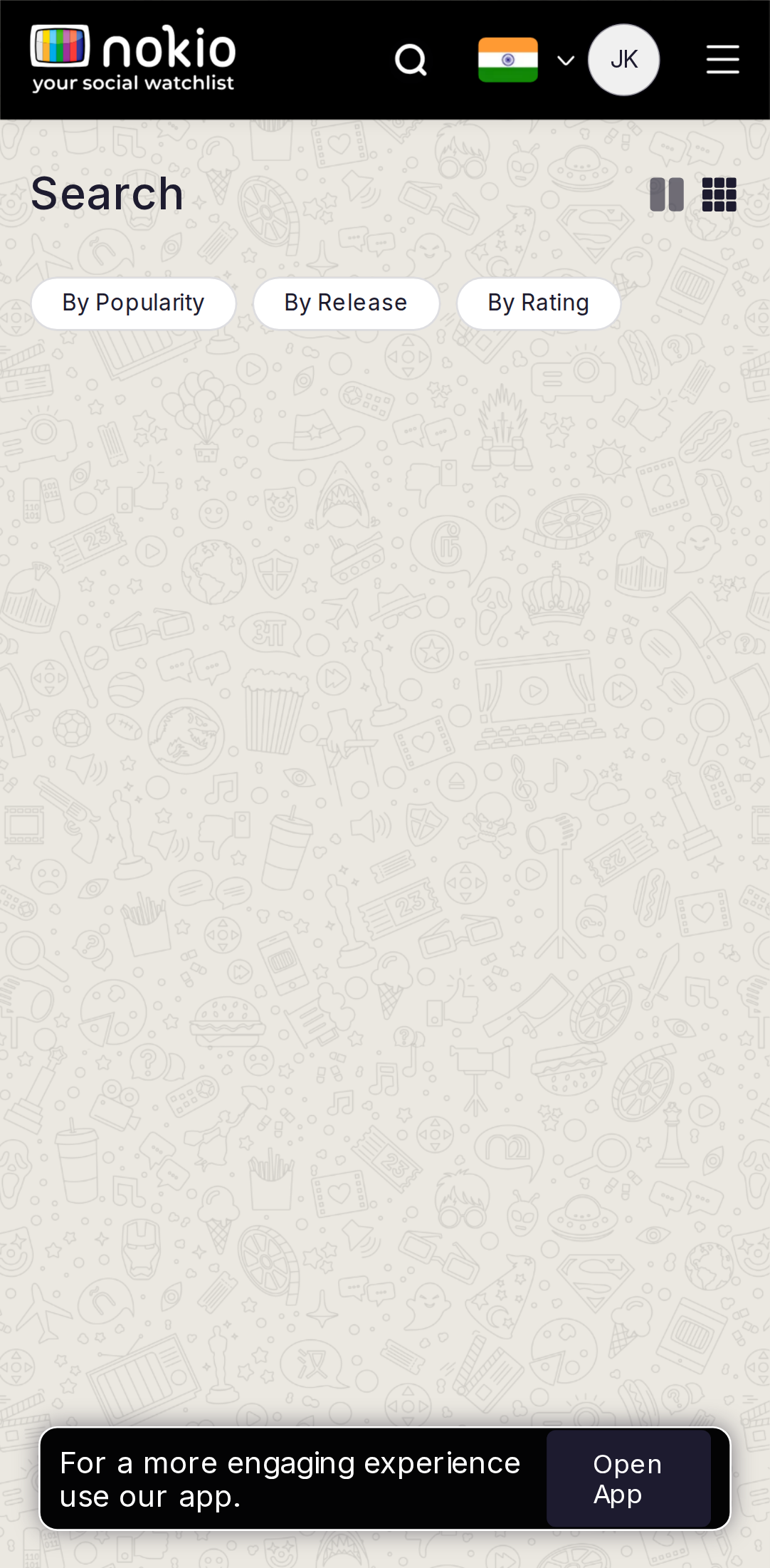
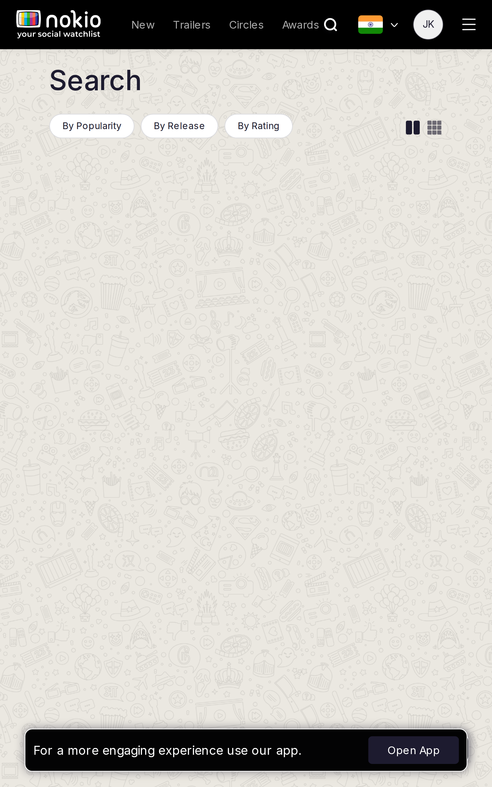
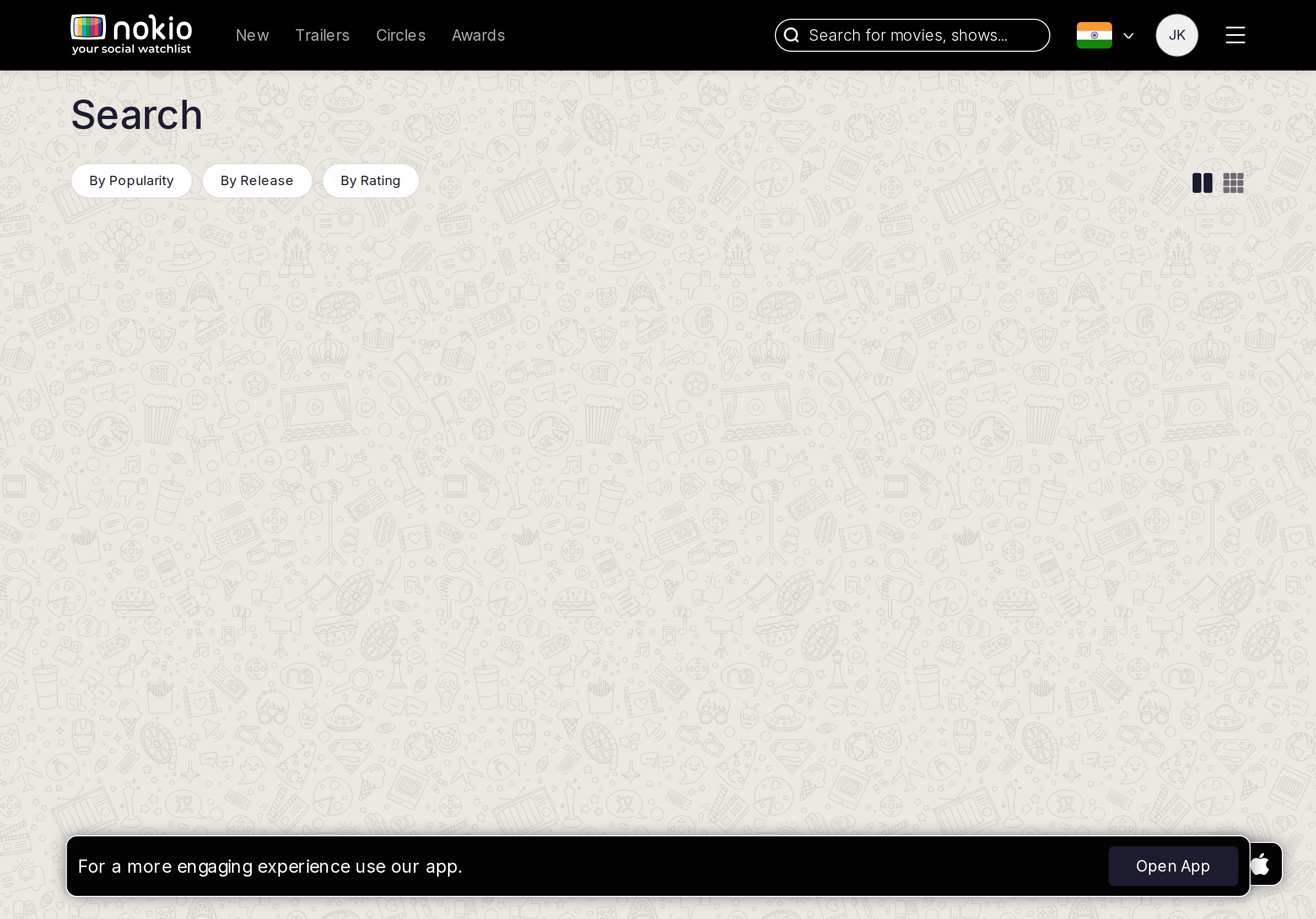
- P0Page is titled Search but the field is behind an icon. Auto-expand the field on this route.
- P0Empty q → doodle, not popular. Header search with a query already works.
UI elements on phone
- P0The only search control is the header magnifying glass — this page’s own header has no input.
- P0Sort chips (By Popularity / By Release / By Rating) sit over an empty doodle.
- P0Grid/list icon toggle is present with nothing to toggle.
Gaps on tablet
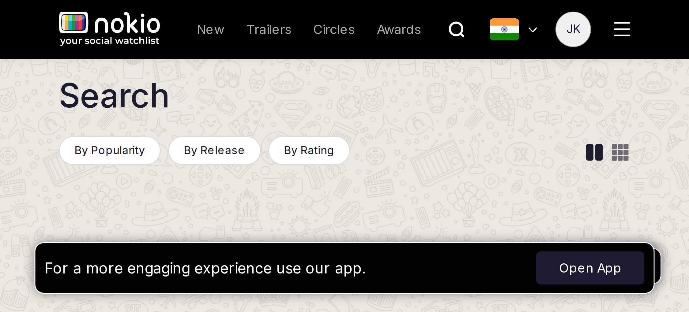
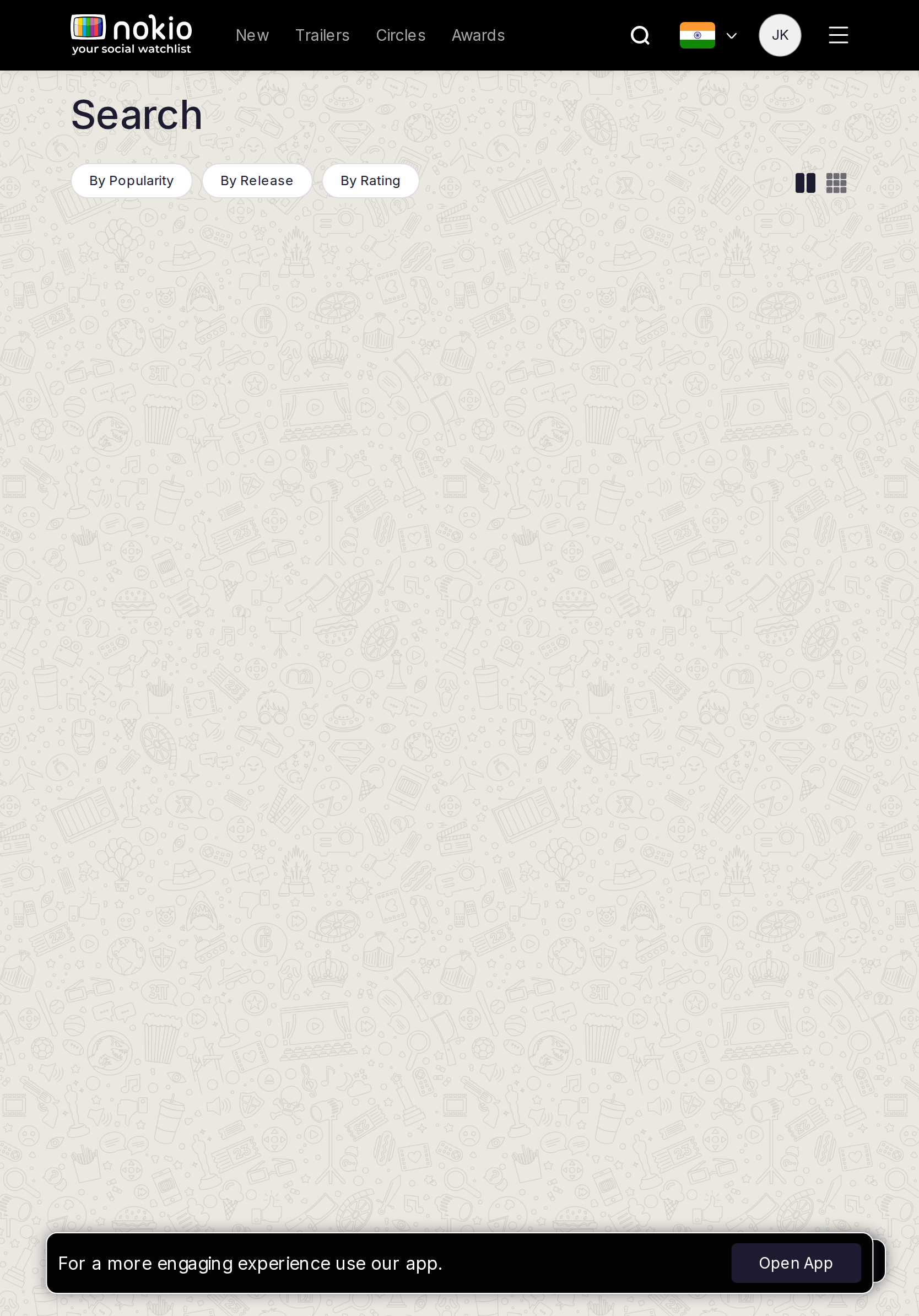
- P0iPad portrait still uses the search icon on a page named Search. iPad landscape has the field — portrait should match.
- P1Empty state is the same doodle as phone.
UI elements on tablet
- P0iPad portrait: still search icon + sort chips + empty canvas. iPad landscape: header field appears (width ≥920) but the page field does not.
- P1Grid/list icons unlabeled.
Gaps on desktop
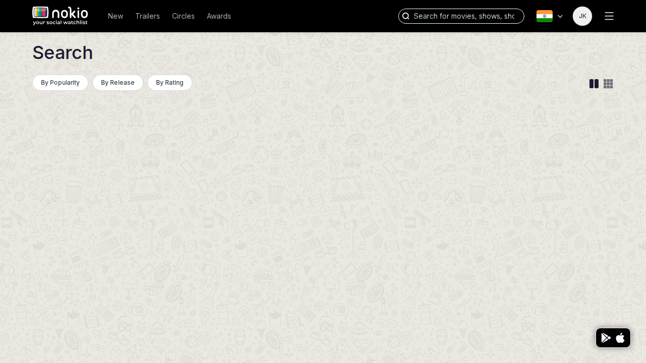
- P0Empty /movies with a visible field still shows no catalog. Empty q → popular.
- P16-col grid is dense at 1280; label movie vs series on the card.
UI elements on desktop
- P0Header search pill is the real control; page title “Search” plus sort chips over emptiness.
- P1Sort pills have no count or empty-state coupling.
- P2Results (when q is set) use 6 dense columns; platform logos on cards are tiny.
About
Job: Understand Nokio and start using it.
Gaps on phone
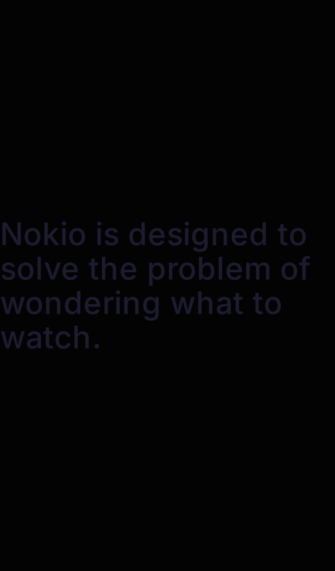
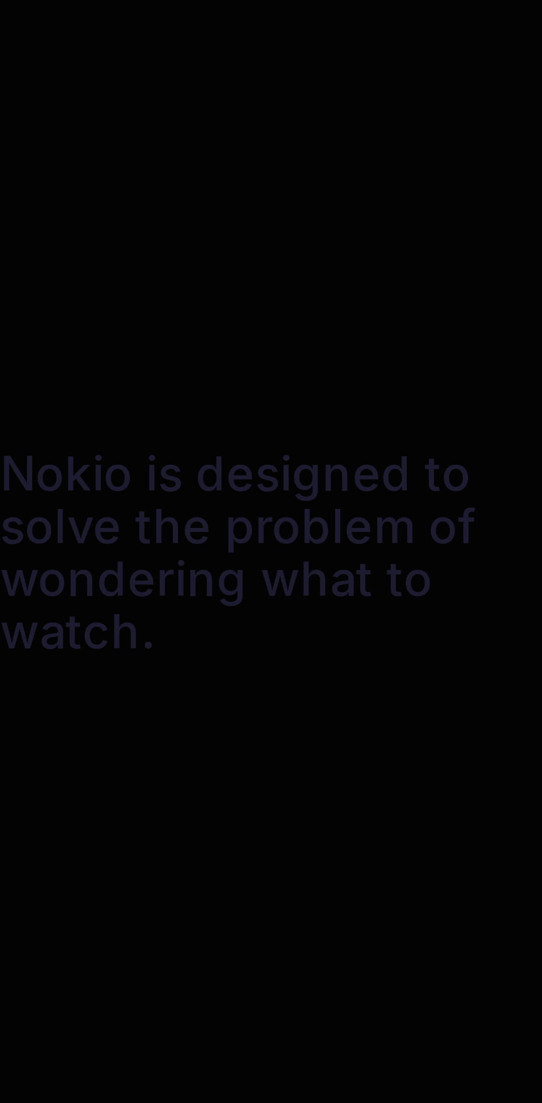
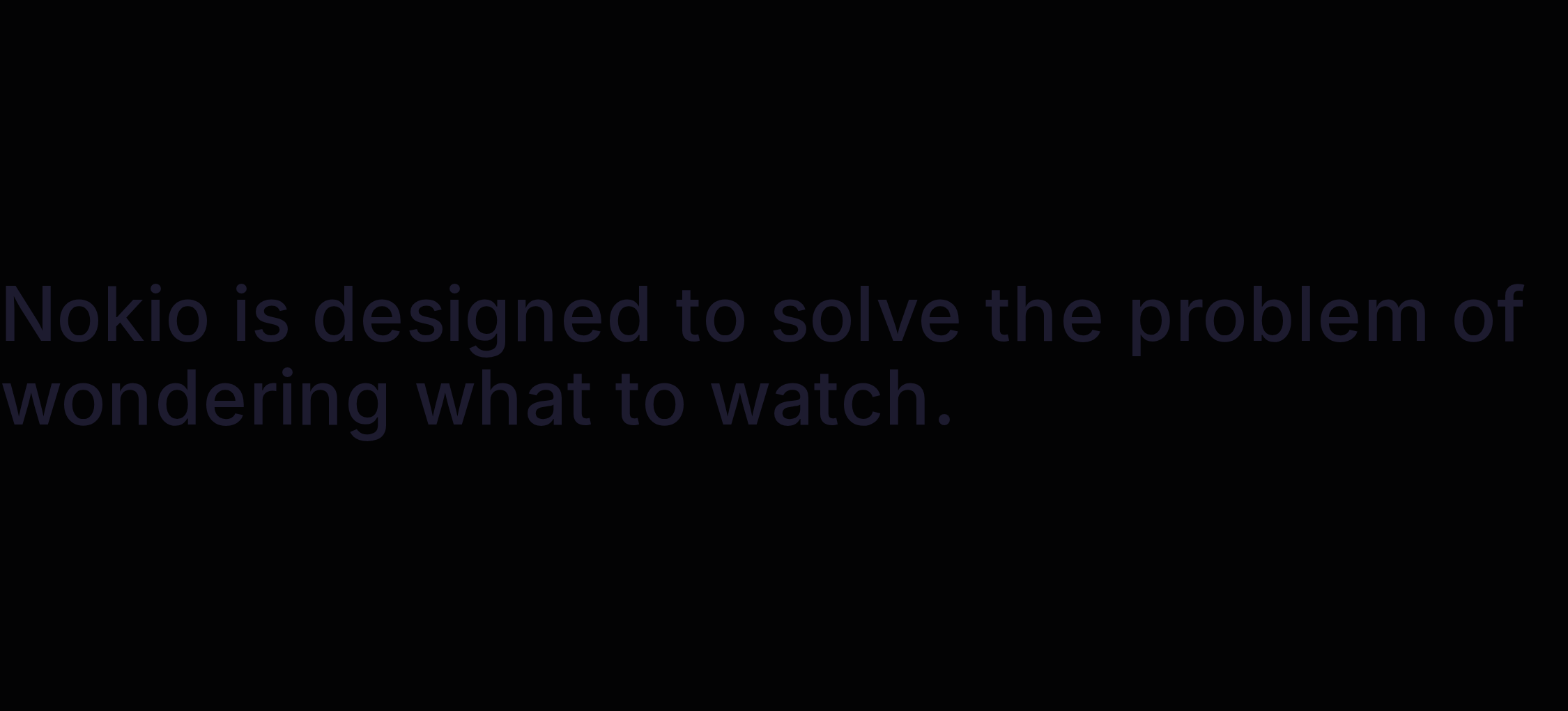
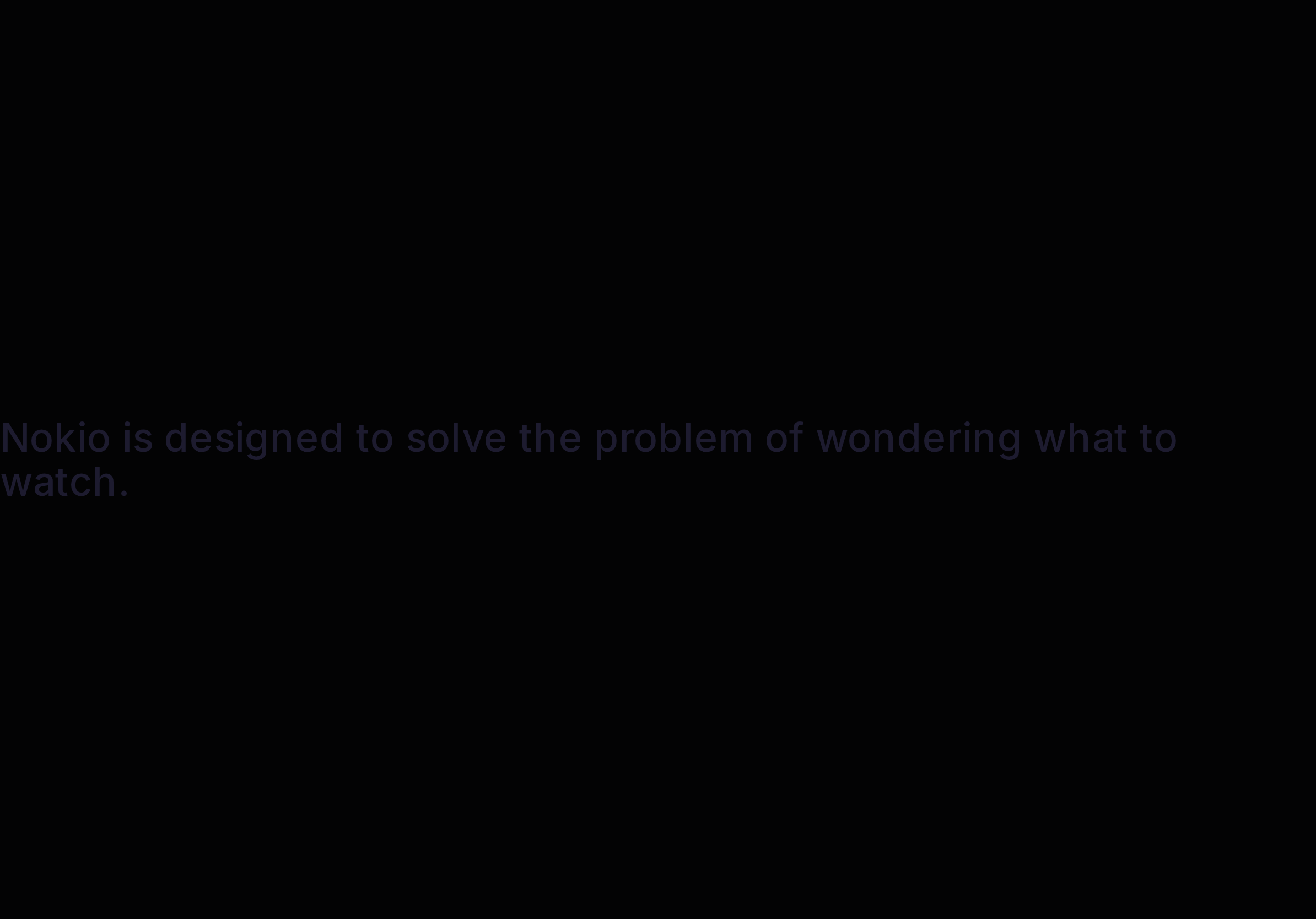
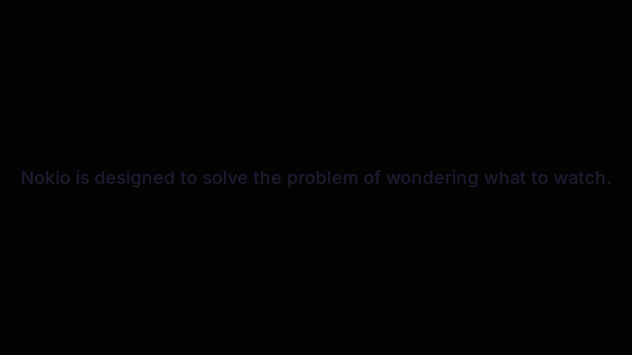
- P0Navy on black, no header, no CTA. Open App may still appear on top of nothing.
- P0Restore app chrome + 4.5:1 type.
UI elements on phone
- P0No header, no logo, no buttons, no links. Contrast fails. Only a sentence.
- P1If Open App mounts, it’s the sole control on a dead page.
Gaps on tablet
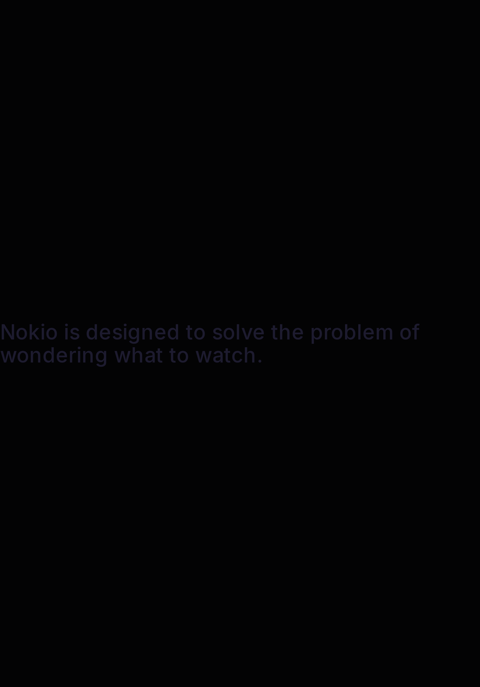
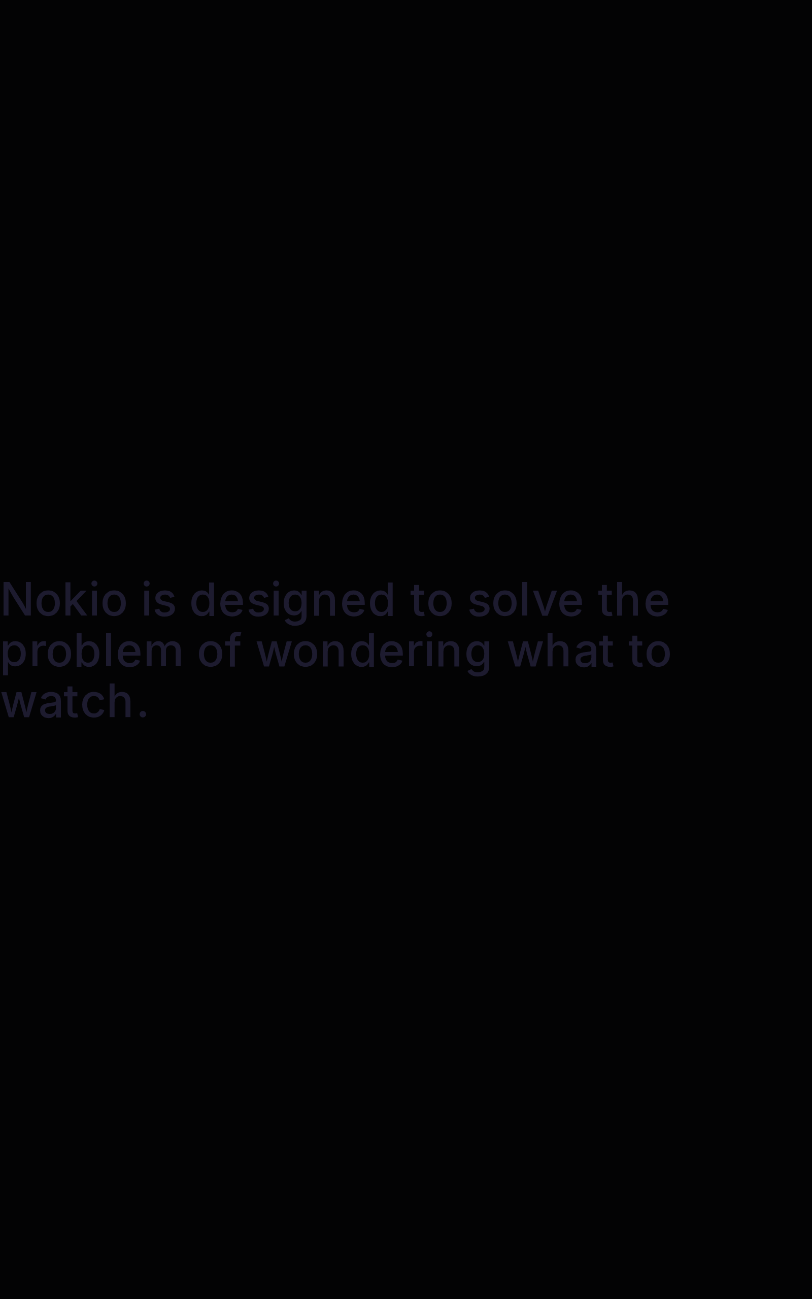
- P0Same island. Tablet width does not save contrast or navigation.
UI elements on tablet
- P0Same missing chrome. Width does not add navigation.
Gaps on desktop
- P0Same. Logo home, Sign in, Get the app.
UI elements on desktop
- P0Same. Need logo-home, Sign in, Get the app.
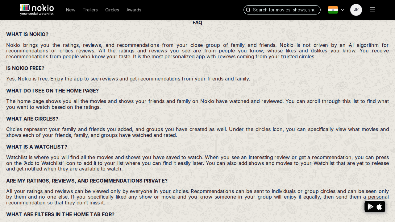
FAQ
Job: Resolve how Circles and home actually work.
Gaps on phone
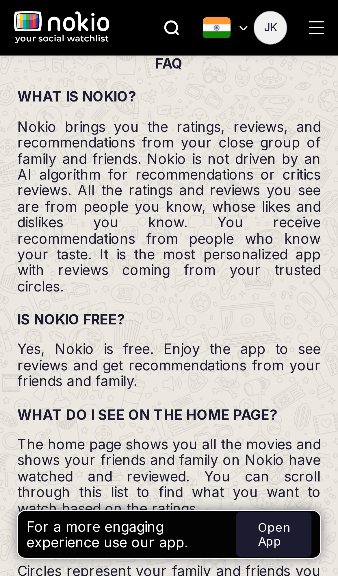
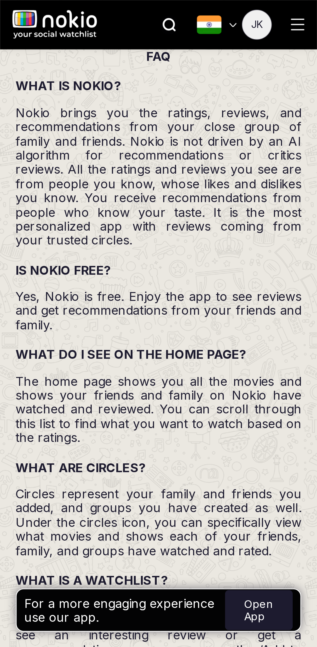
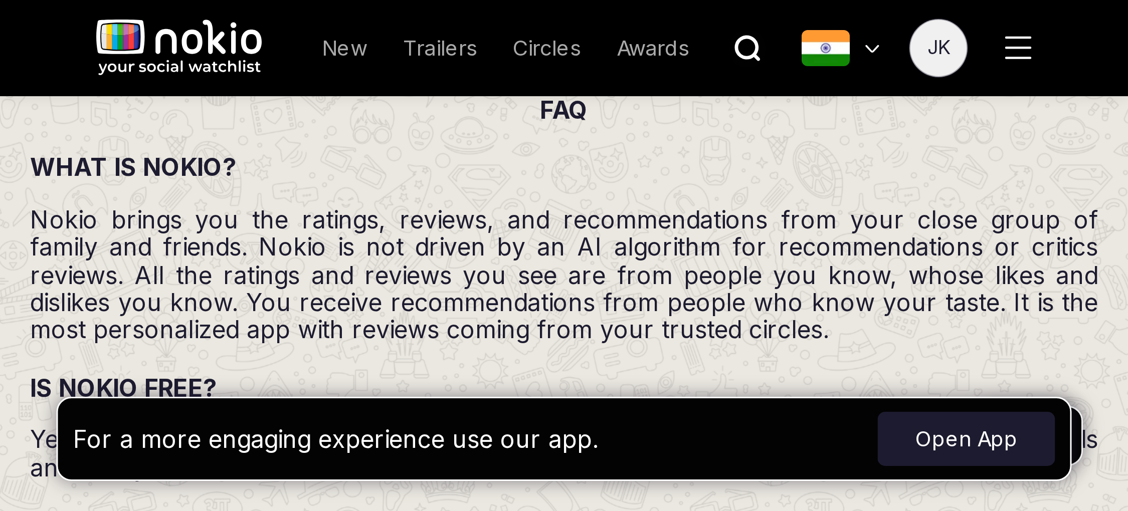
- P0Copy promises friends’ watches on home — home is a public catalog.
- P0Open App + FAB cover body copy after 5s.
UI elements on phone
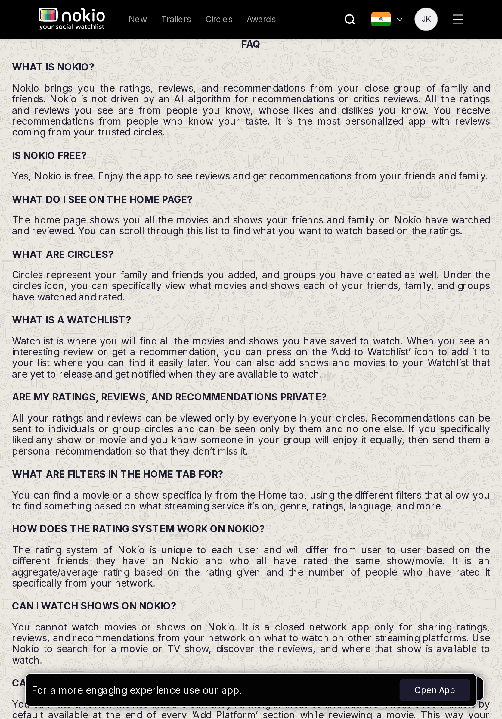
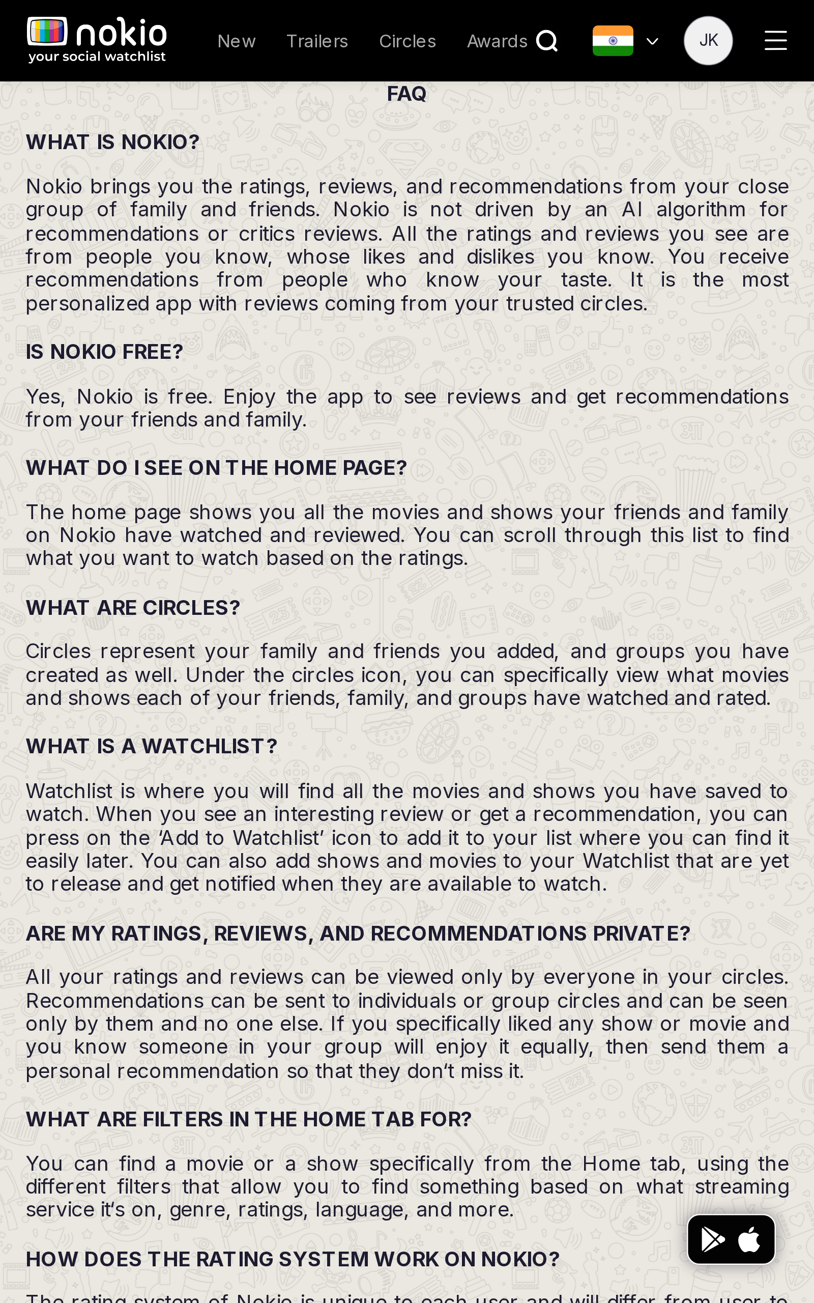
- P0Questions are ALL-CAPS, not an accordion — no expand/collapse control.
- P0Open App + store FAB overlay paragraphs.
- P1Doodle wallpaper shows through body copy.
Gaps on tablet
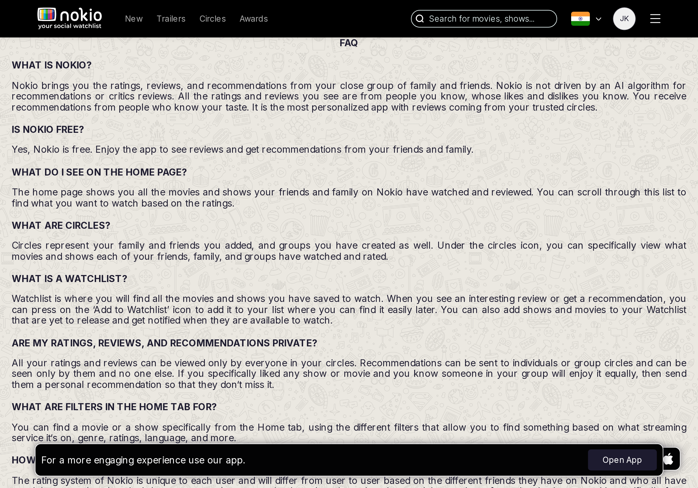
- P0Same copy lie; Open App on a help page.
UI elements on tablet
- P0Same ALL-CAPS blocks + Open App. No jump links / TOC.
Gaps on desktop
- P0Rewrite Home/Circles answers. Accordion, no doodle under type.
UI elements on desktop
- P1FAB only. No accordion. Sentence-case questions on solid cards.
Terms
Job: Read the agreement.
Gaps on phone
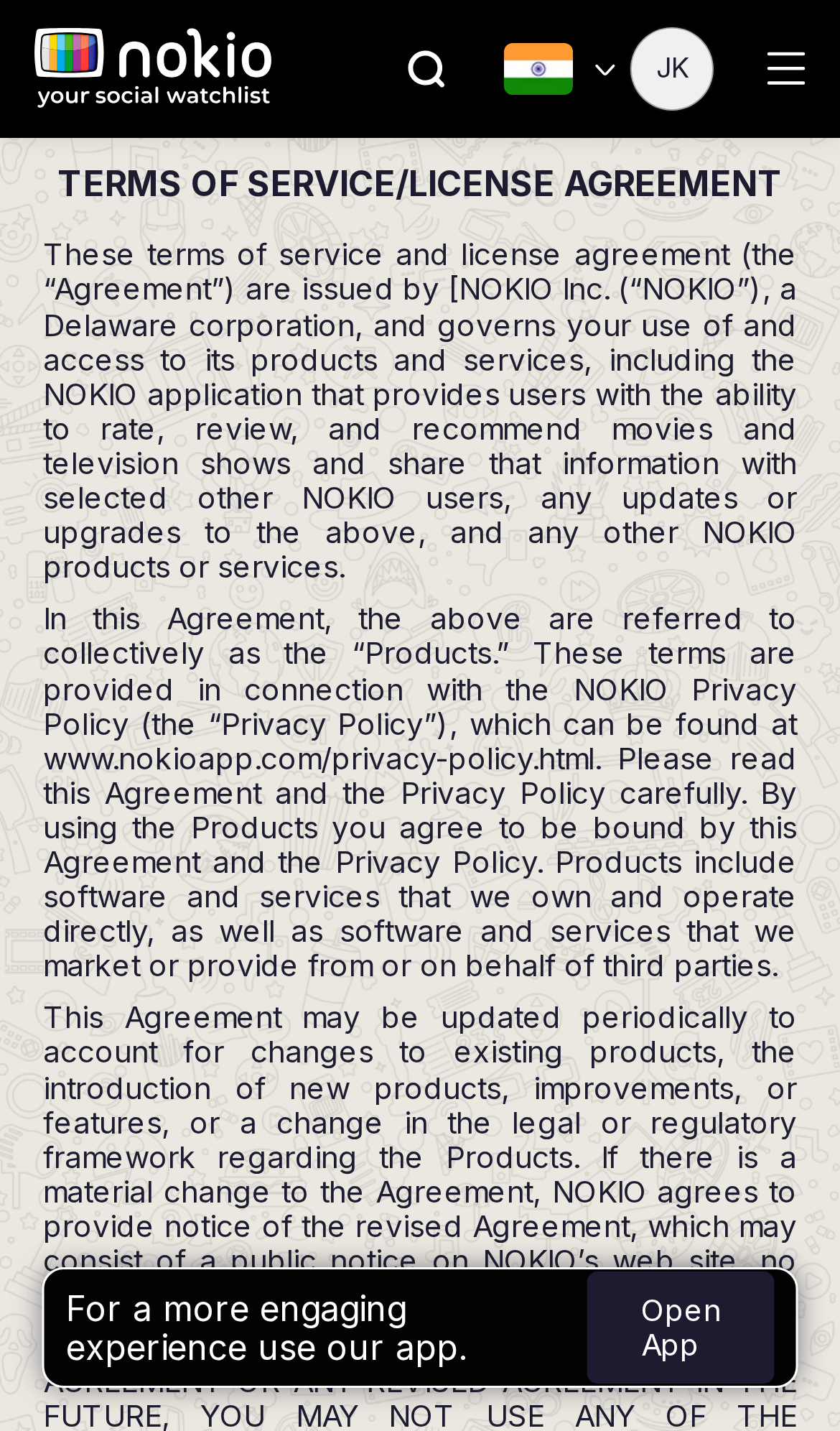
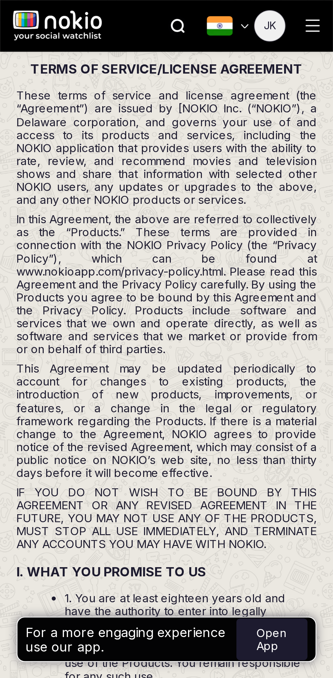
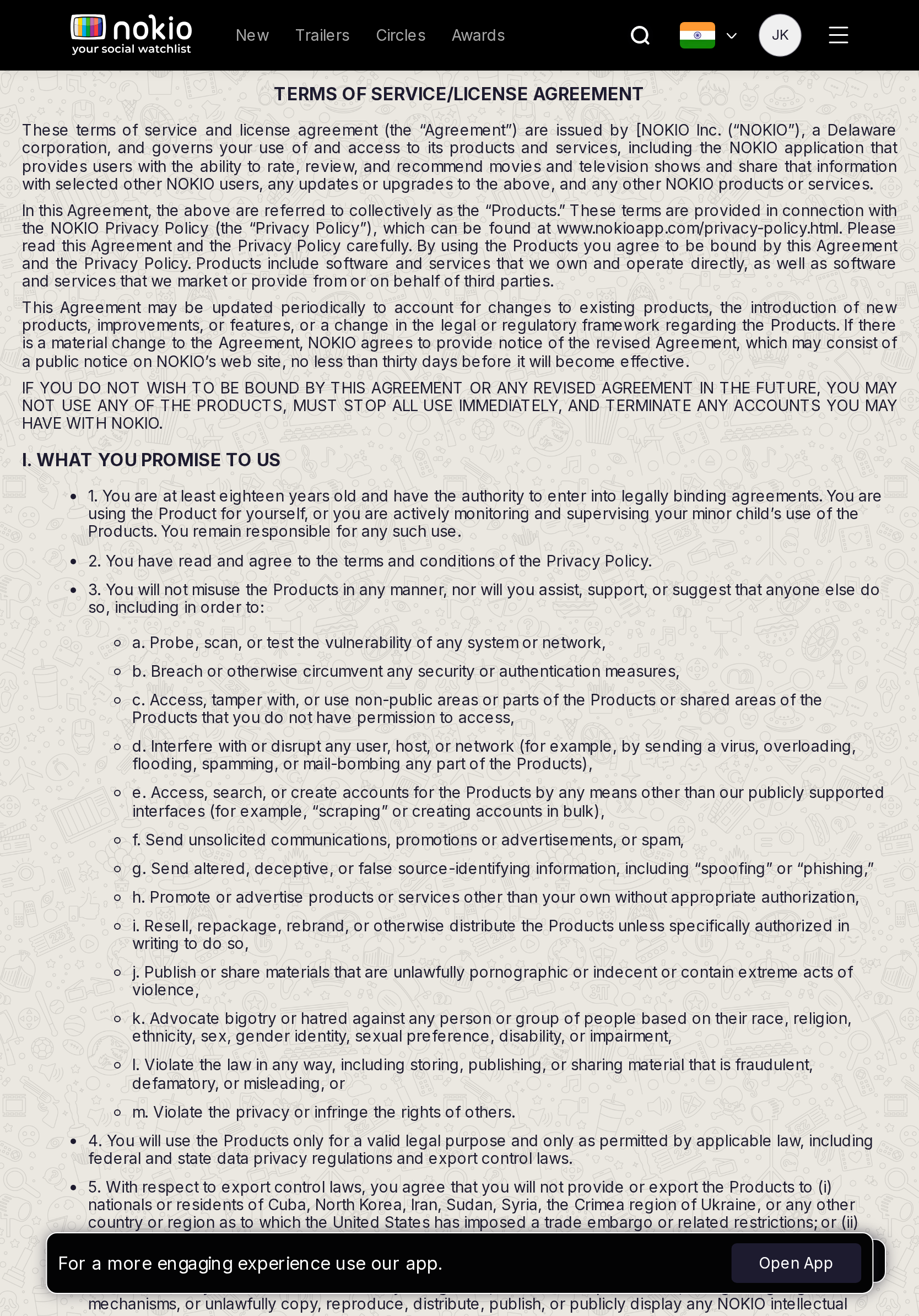
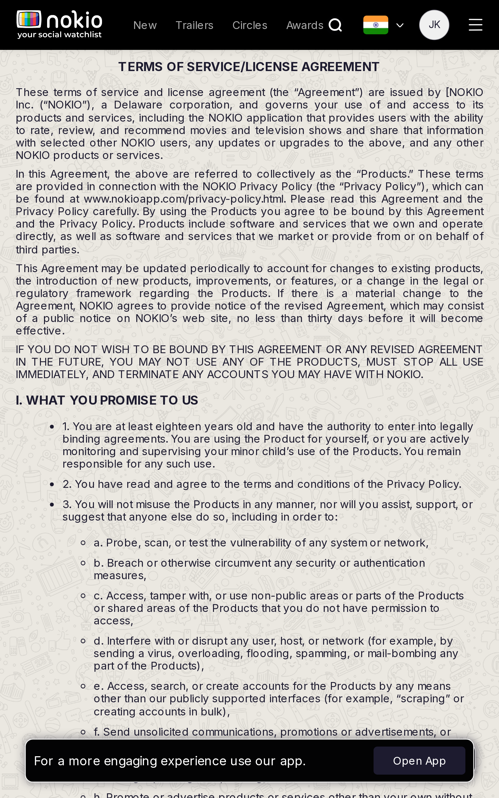
- P0Open App + FAB on the first numbered clause. Hide both on legal routes.
UI elements on phone
- P0Open App covers clause 1. Store FAB sits on the article. No back/home in the article itself.
- P1Justified dense type on doodle.
Gaps on tablet
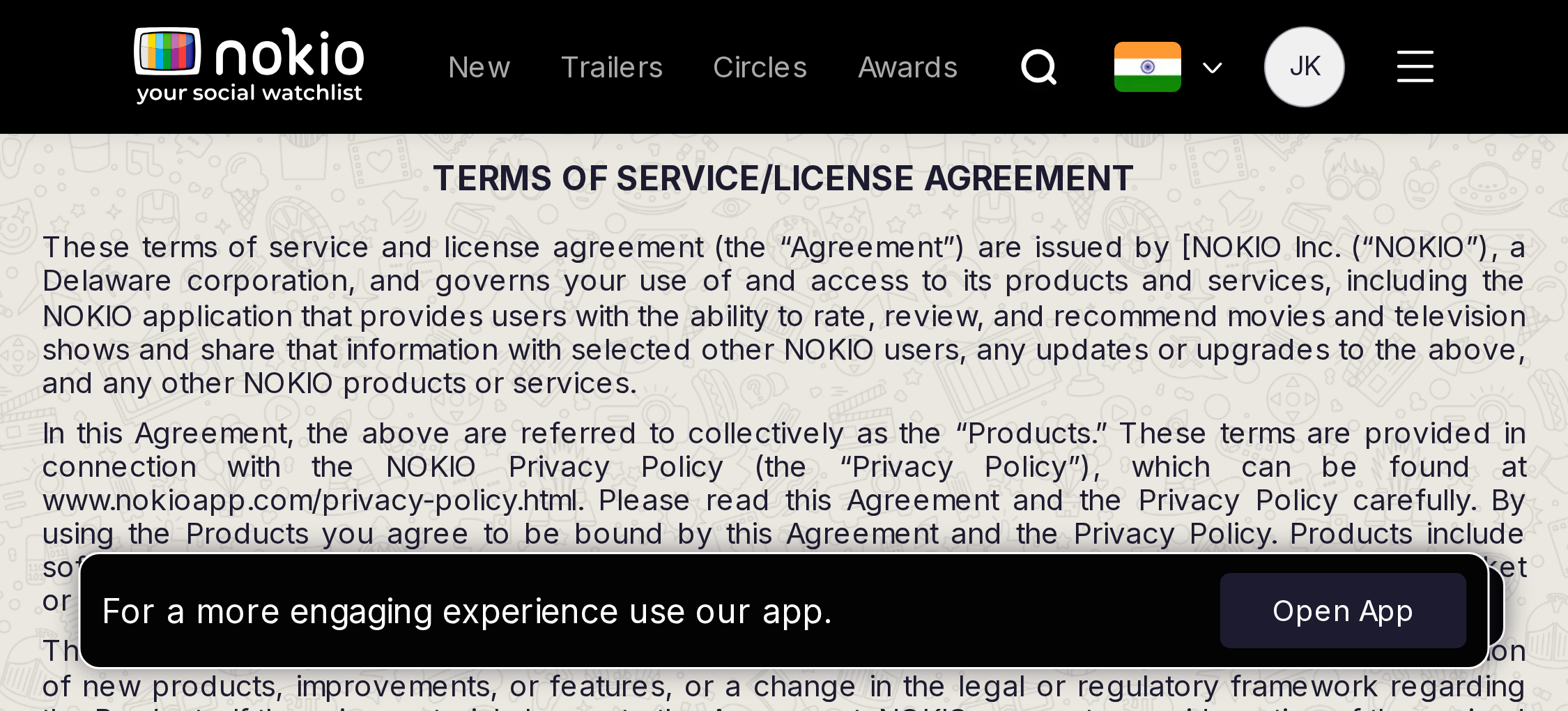
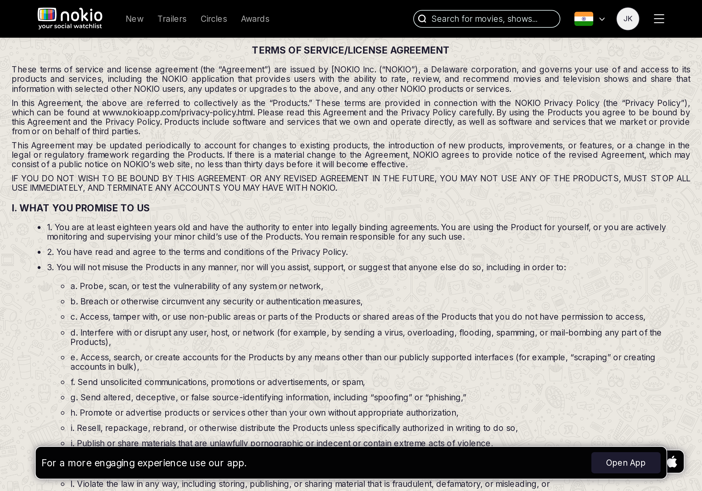
- P0Same install chrome on a contract.
UI elements on tablet
- P0Same install controls on a contract.
Gaps on desktop
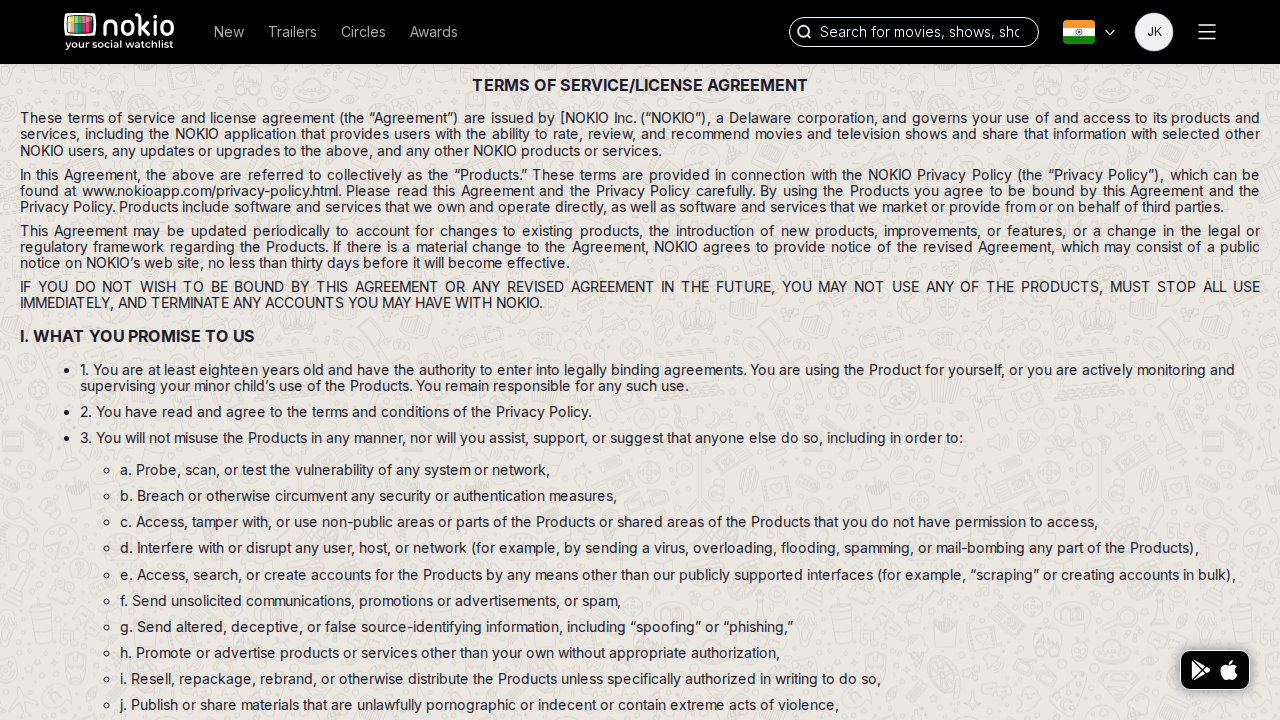
- P1FAB only (no Open App). Still hide it. Max-width ~680px, left-aligned.
UI elements on desktop
- P1Store FAB only. Article has no max-width constraint that feels like reading chrome.
Privacy
Job: Understand data use.
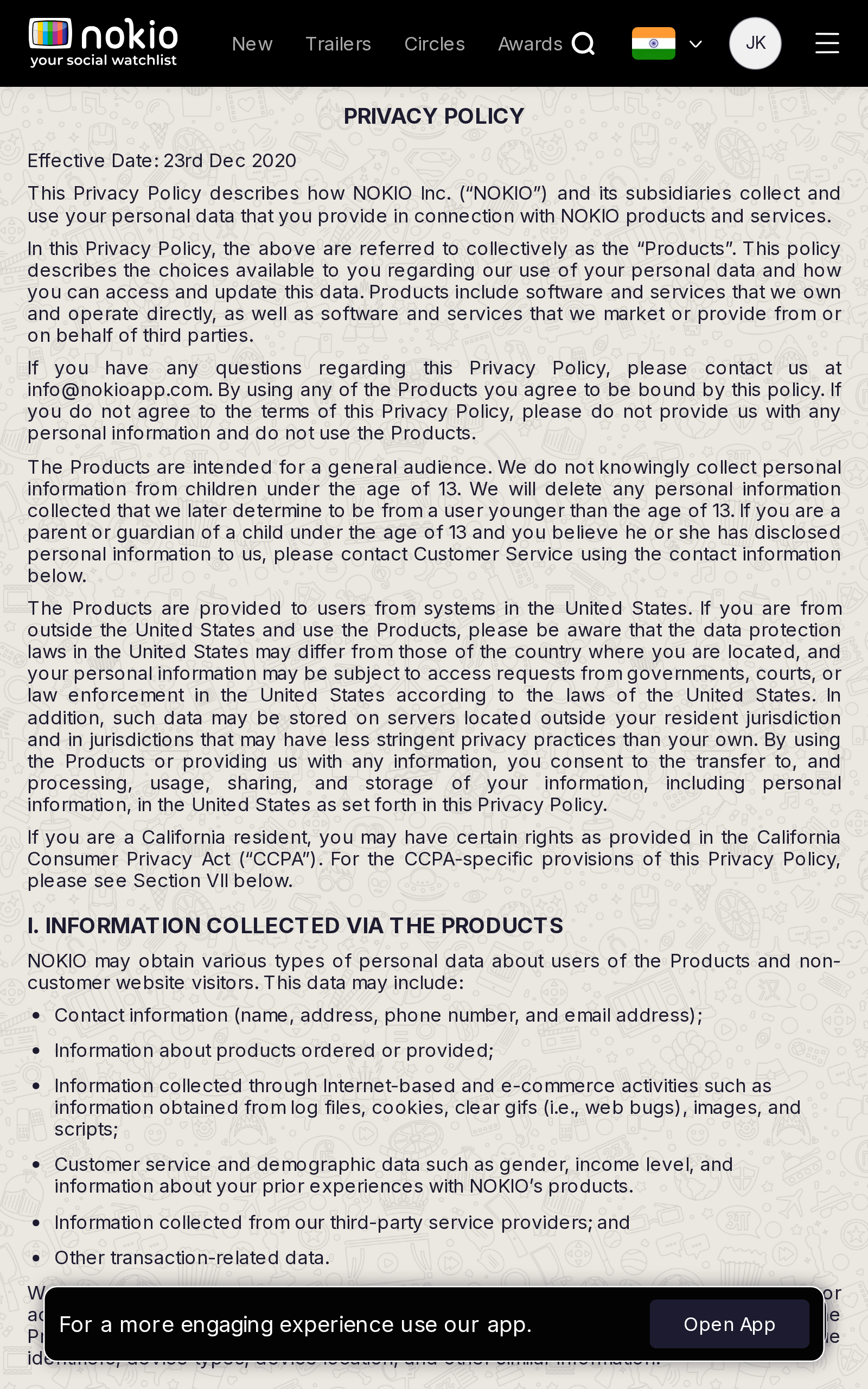
Gaps on phone
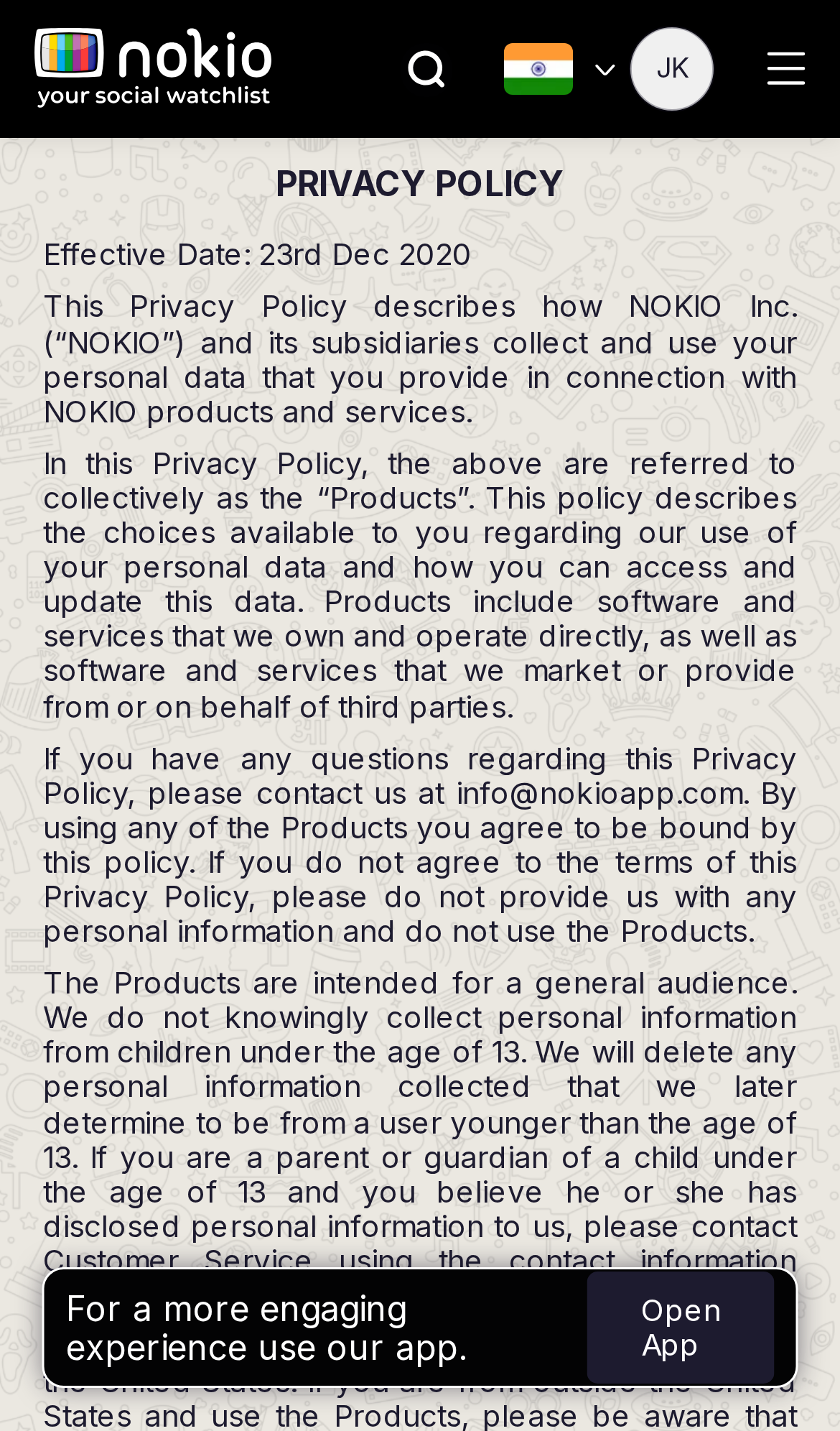
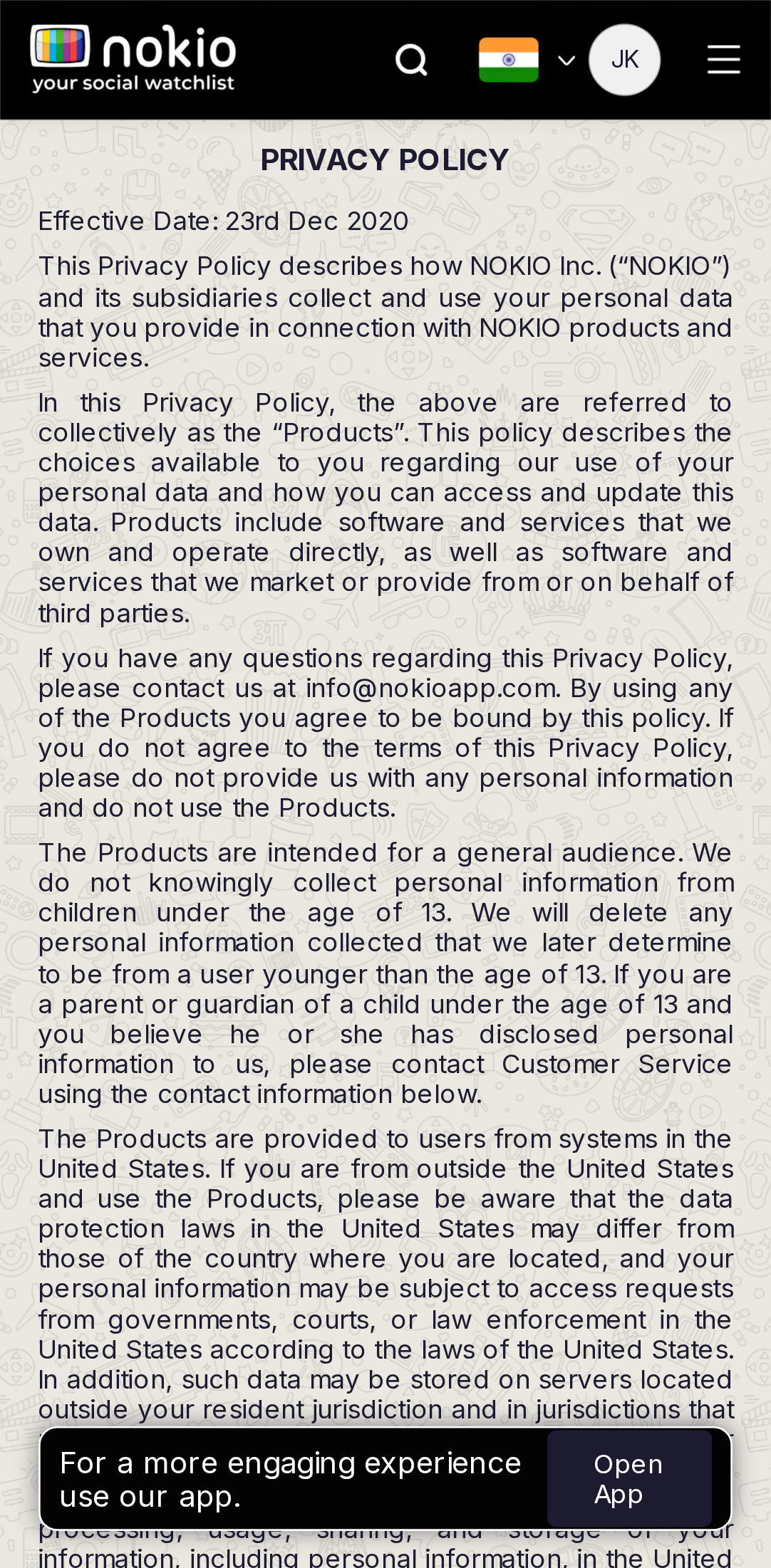
- P1Same as Terms: no install chrome. Stale “effective 2020” date.
UI elements on phone
- P1Same FAB + Open App as Terms. “Effective date” is plain text, not a control.
- P1No TOC for a long policy.
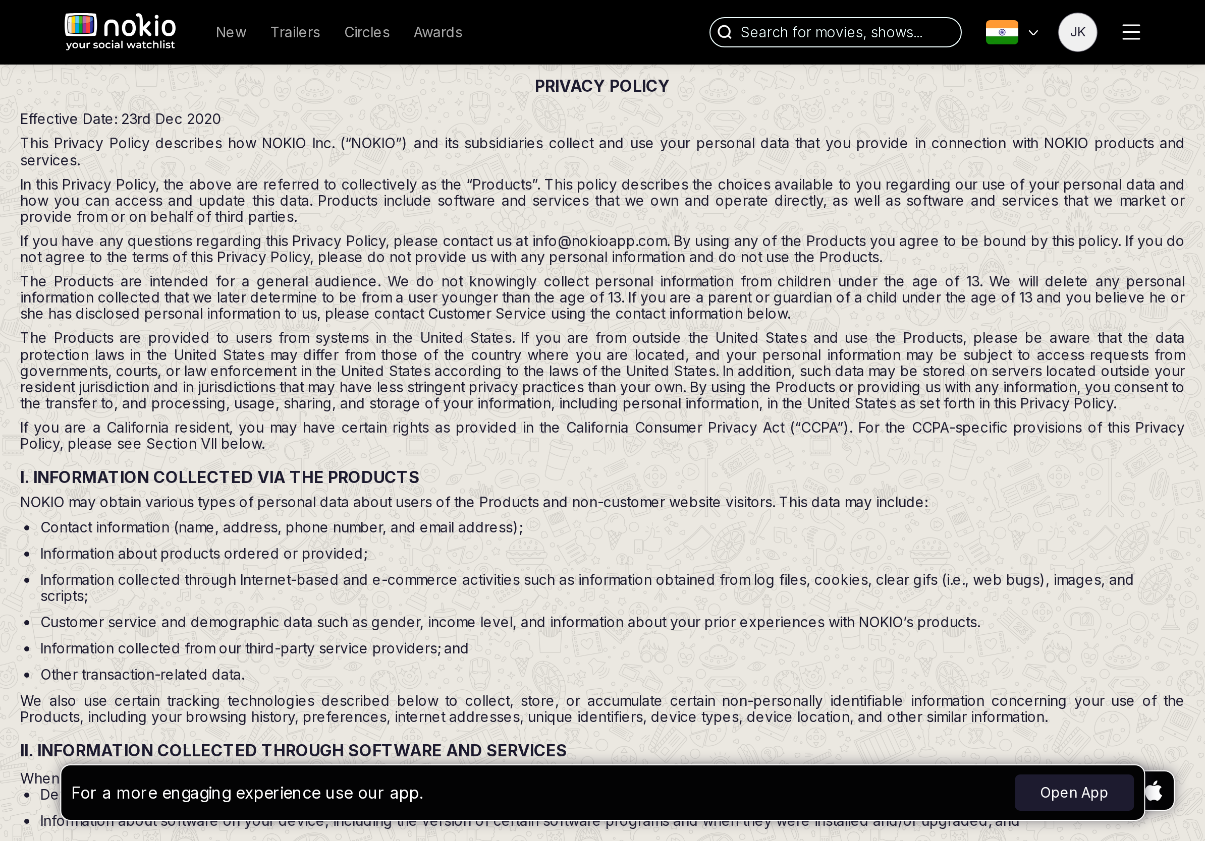
Gaps on tablet
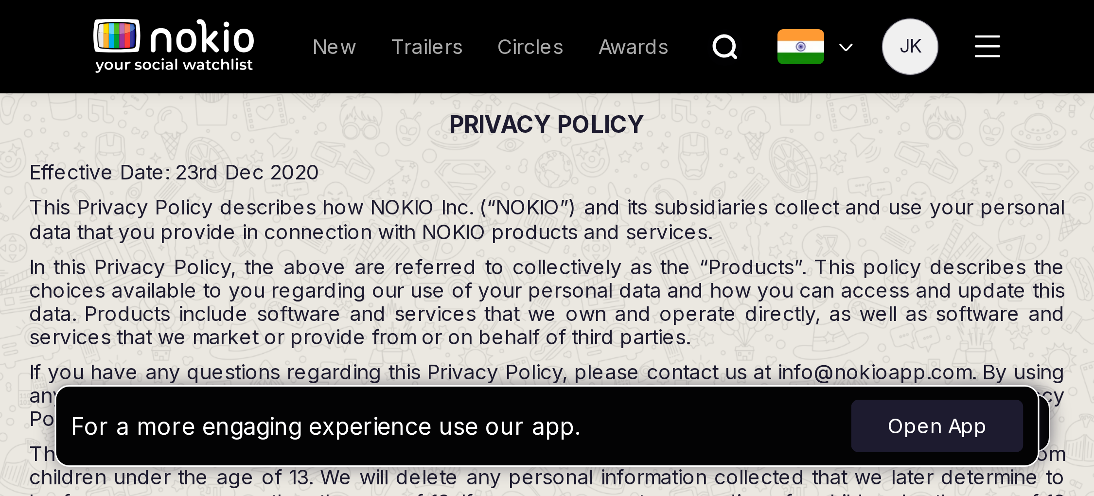
- P1Shared legal template without Open App.
UI elements on tablet
- P1Same.
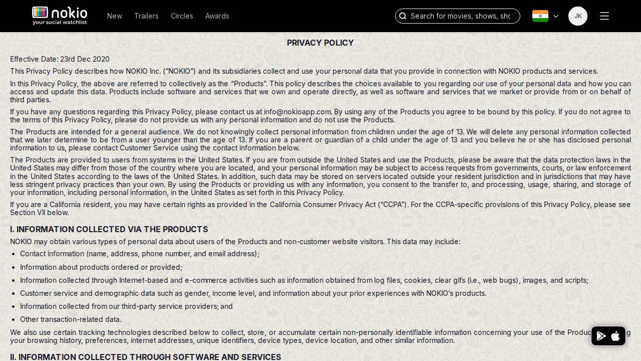
Gaps on desktop
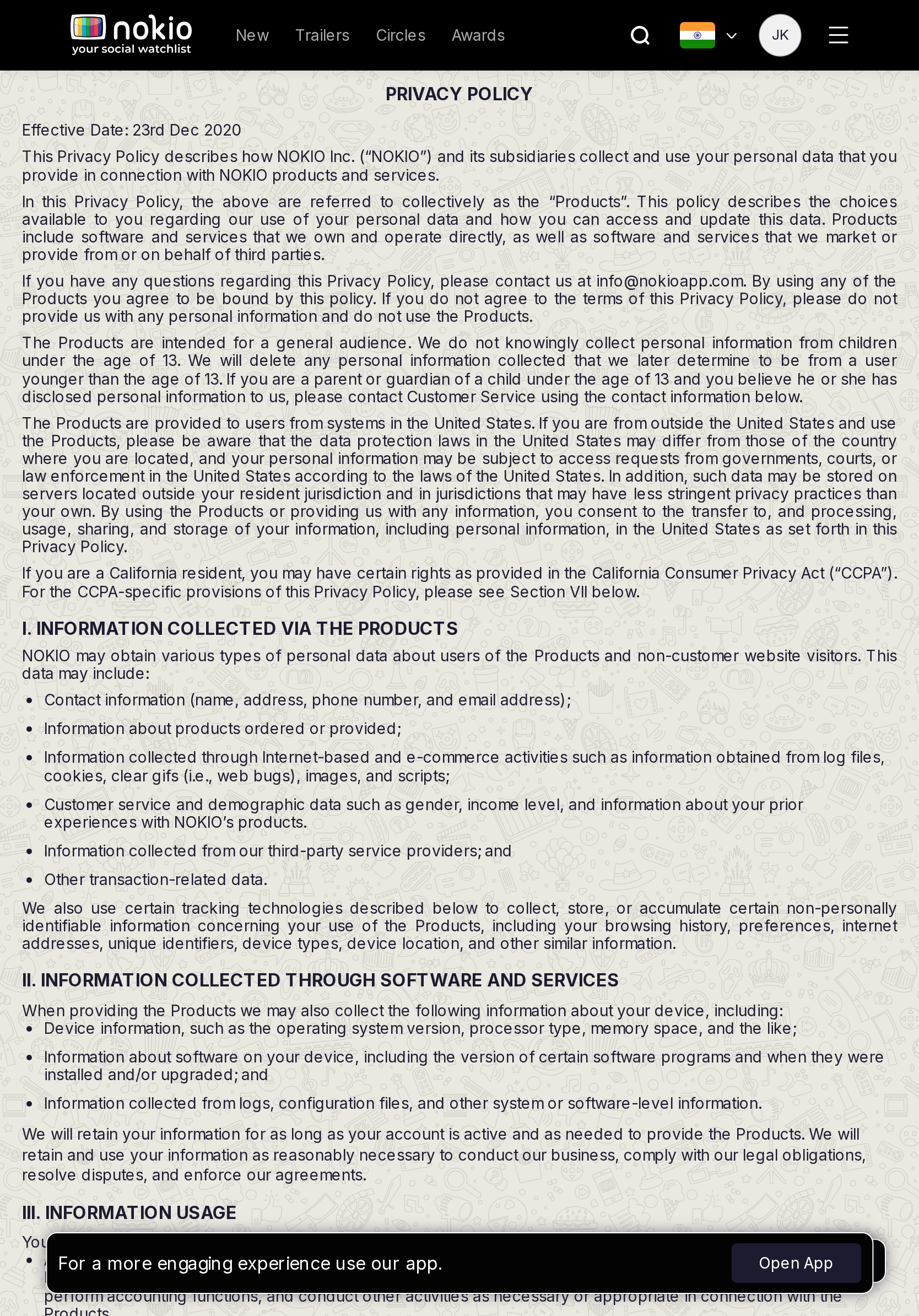
- P1Shared legal template, maintained last-updated date.
UI elements on desktop
- P1FAB. Stale date. No last-updated control.
Public profiles
Job: Find critics and follow them.
Gaps on phone
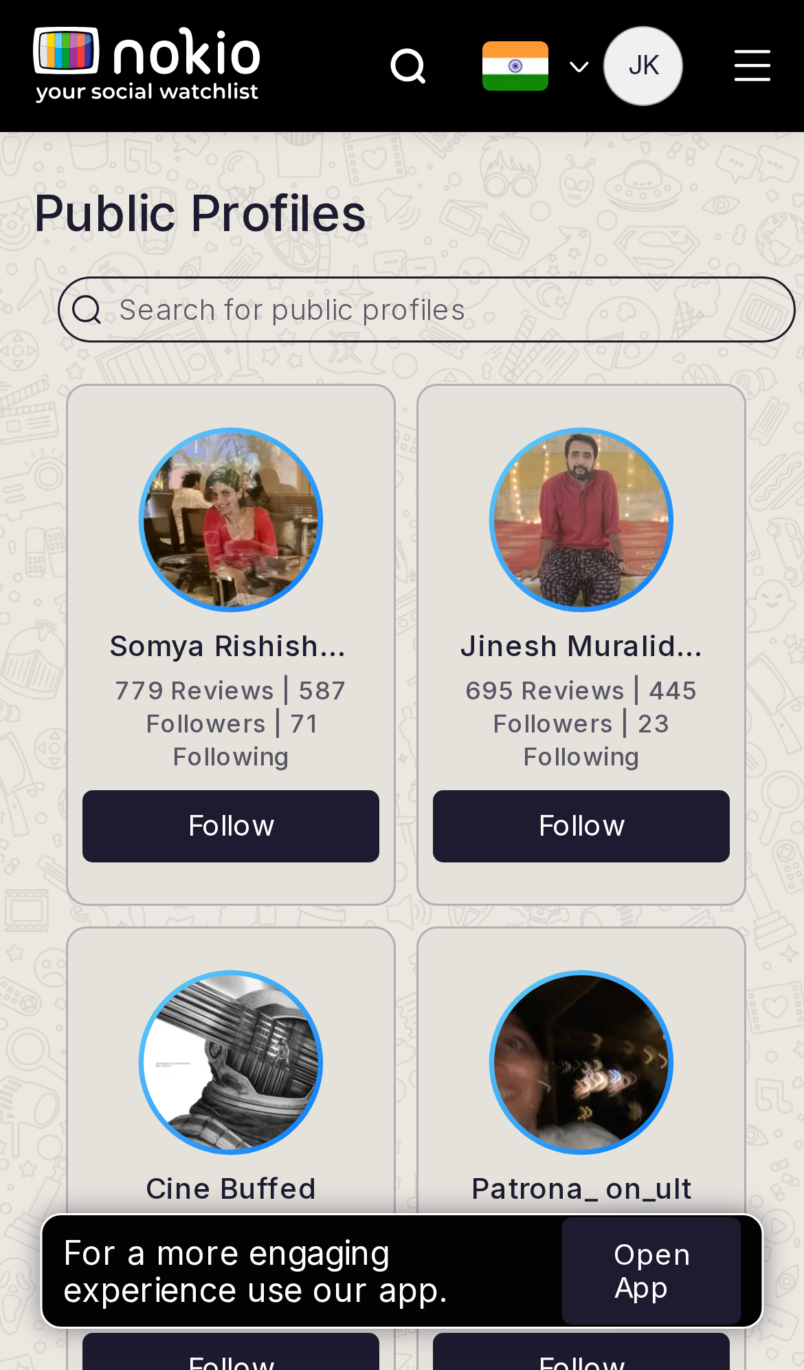
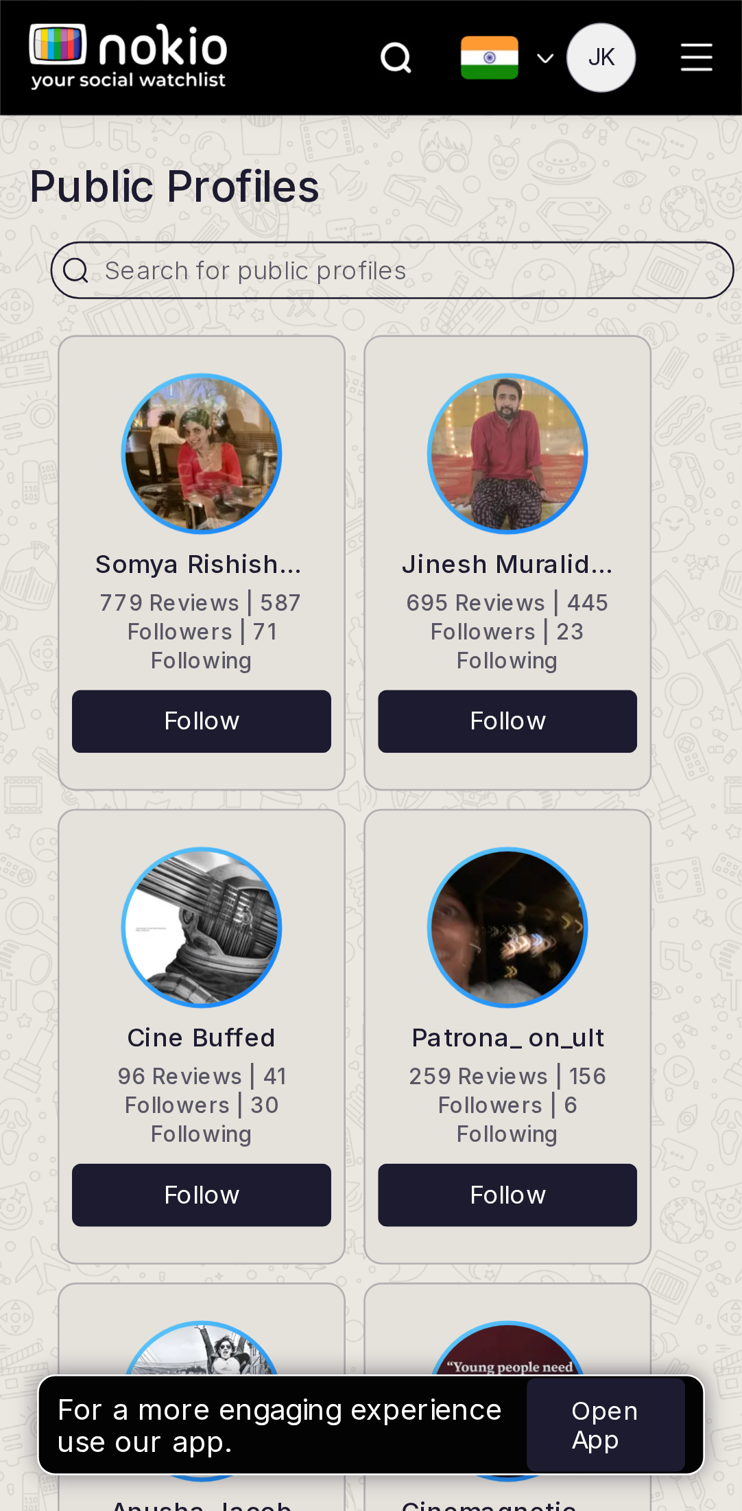
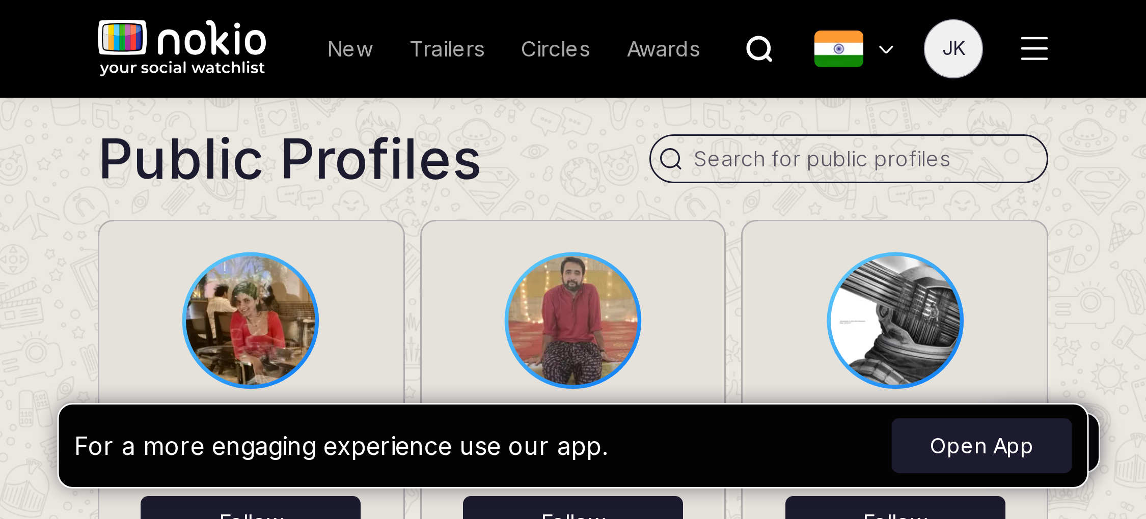
- P02-col minmax grid truncates names; Open App covers the last avatar.
- P1Follow → Following must flip immediately.
UI elements on phone
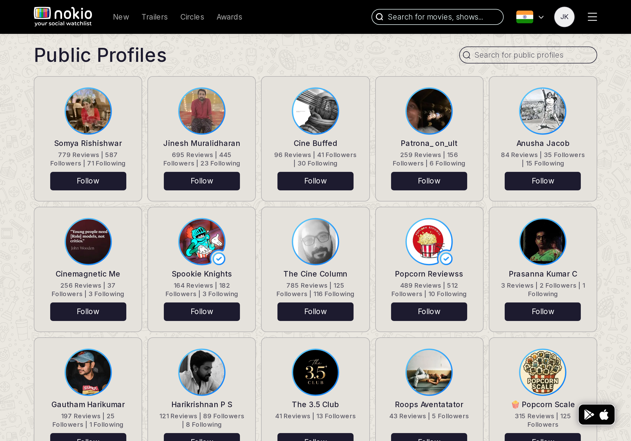
- P0Follow is a small text/button on a truncated name card — must be 44px and flip to Following.
- P0Avatar + name ellipsis + wrapped stats (Reviews/Followers/Following) fight a 2-col minmax grid.
- P0Open App covers the last avatar.
Gaps on tablet
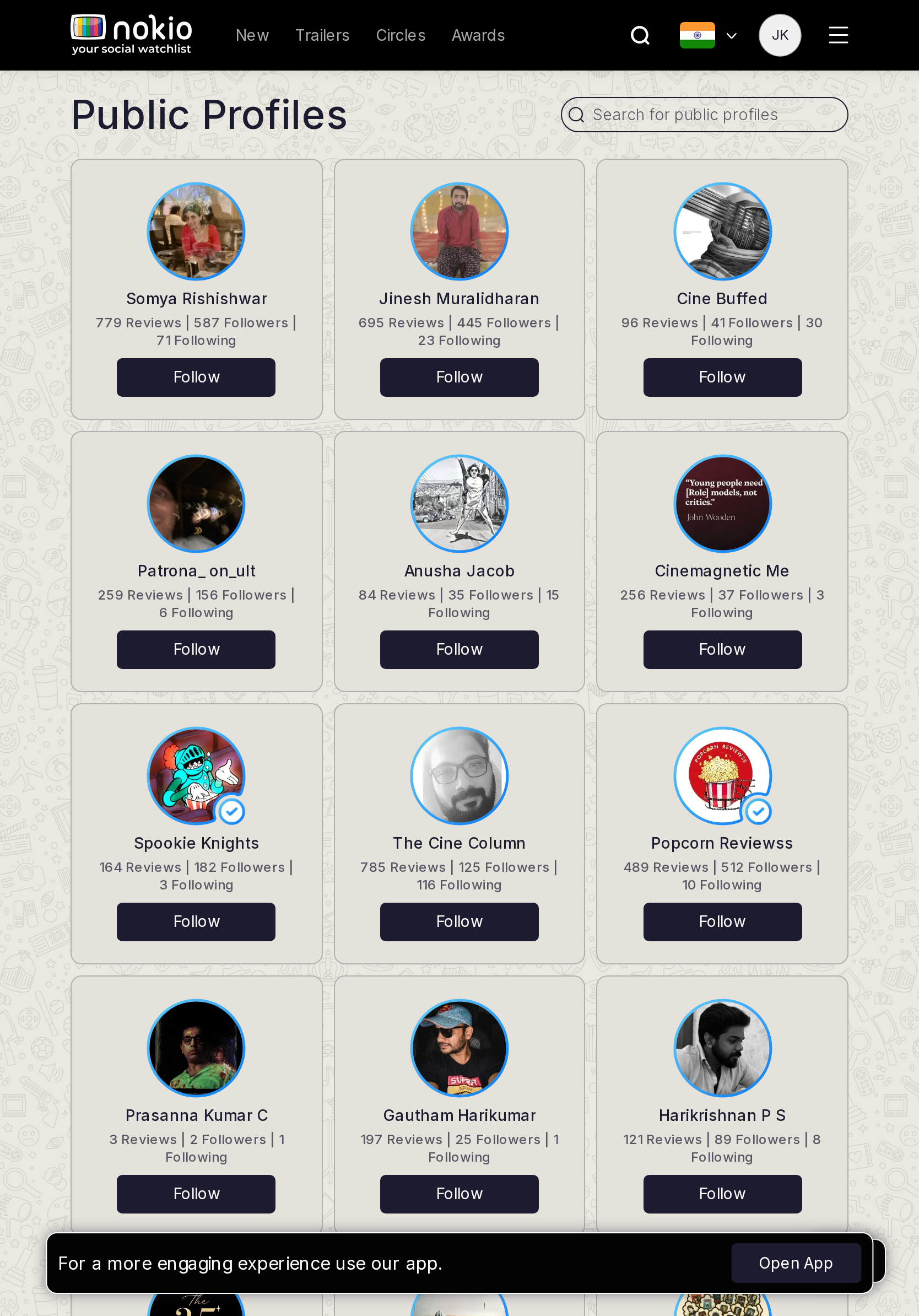
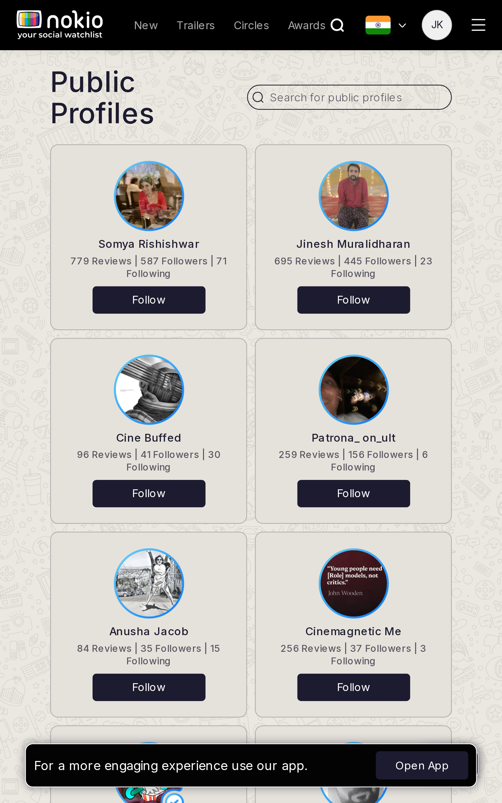
- P1iPad 834 is a cramped desktop grid. Galaxy Tab 640 truncates like a phone.
UI elements on tablet
- P1Follow buttons stay small. Stats wrap to three lines. Featured-style truncation on Galaxy Tab 640.
Gaps on desktop
- P2One URL: redirect /profiles → /public-profiles.
UI elements on desktop
- P2Follow in the card footer. Duplicate /profiles URL. No search field on this page (header only).
Circles friends
Job: See friends and what they watched.
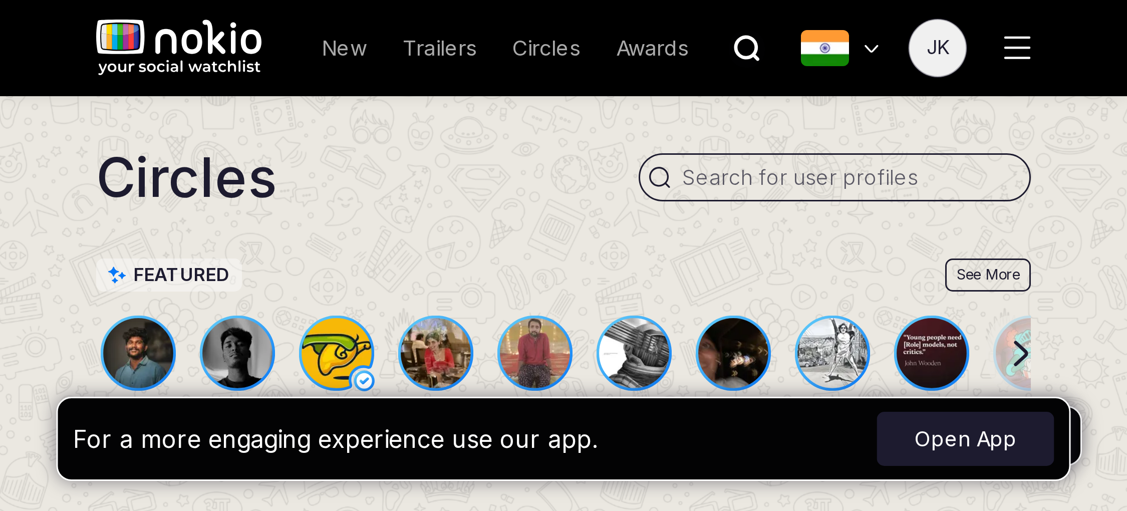
Gaps on phone
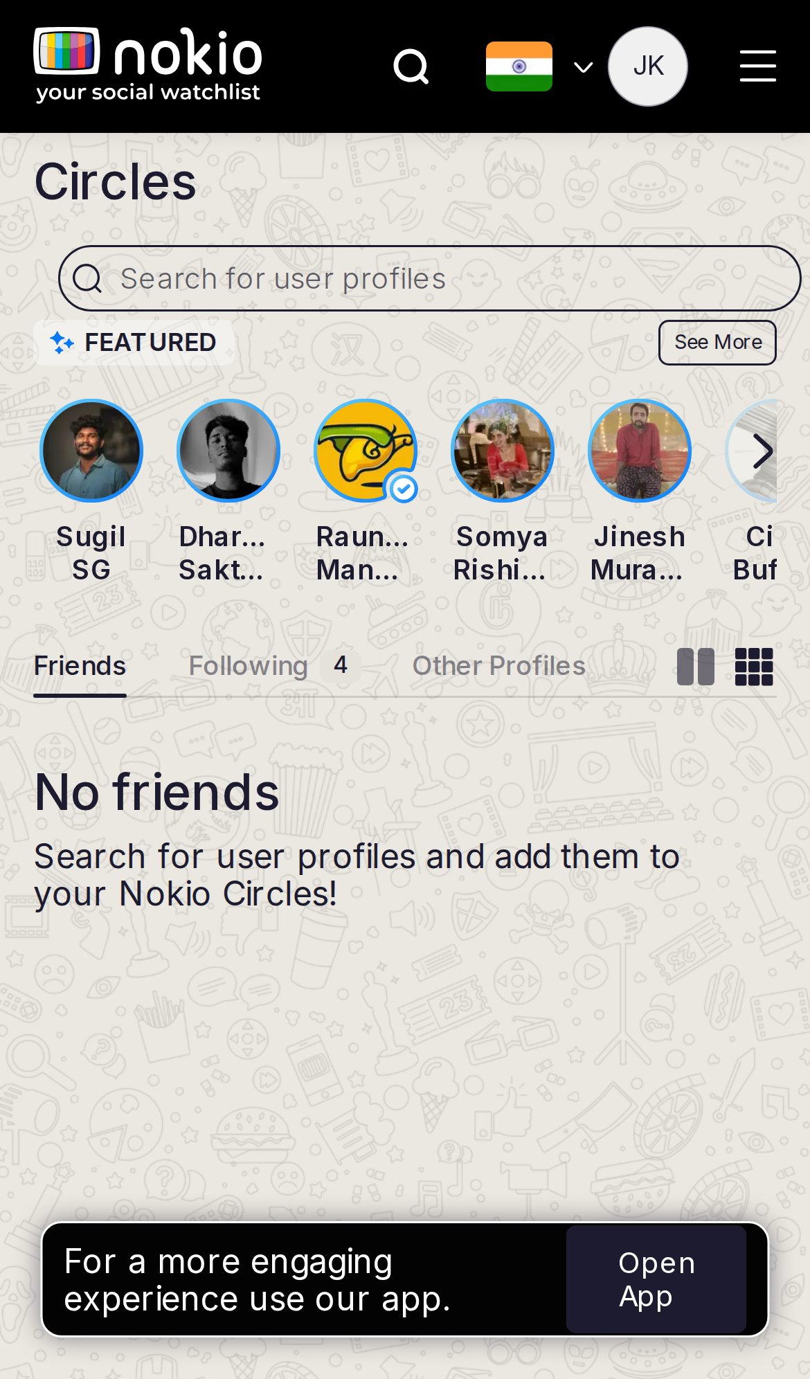
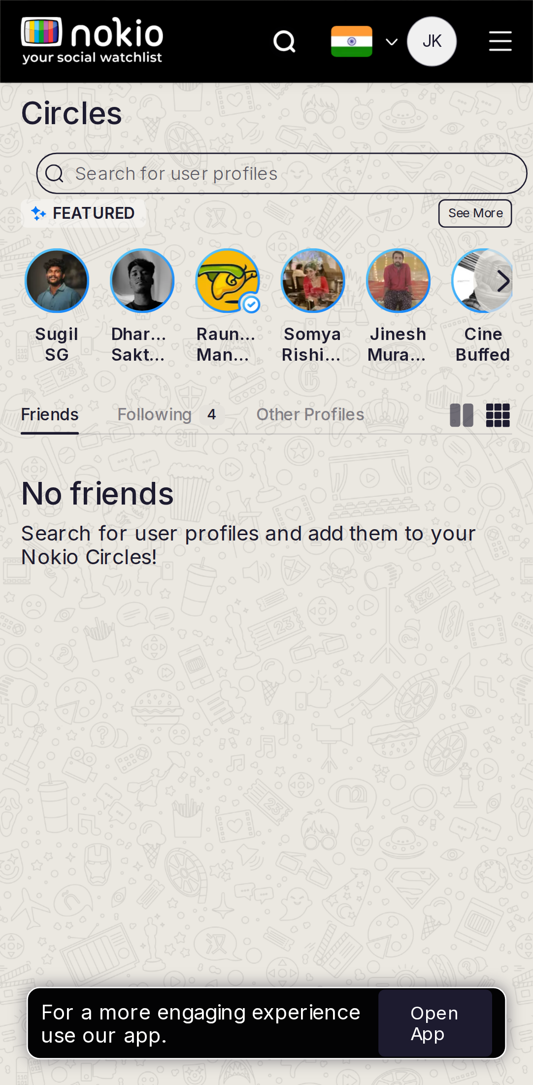
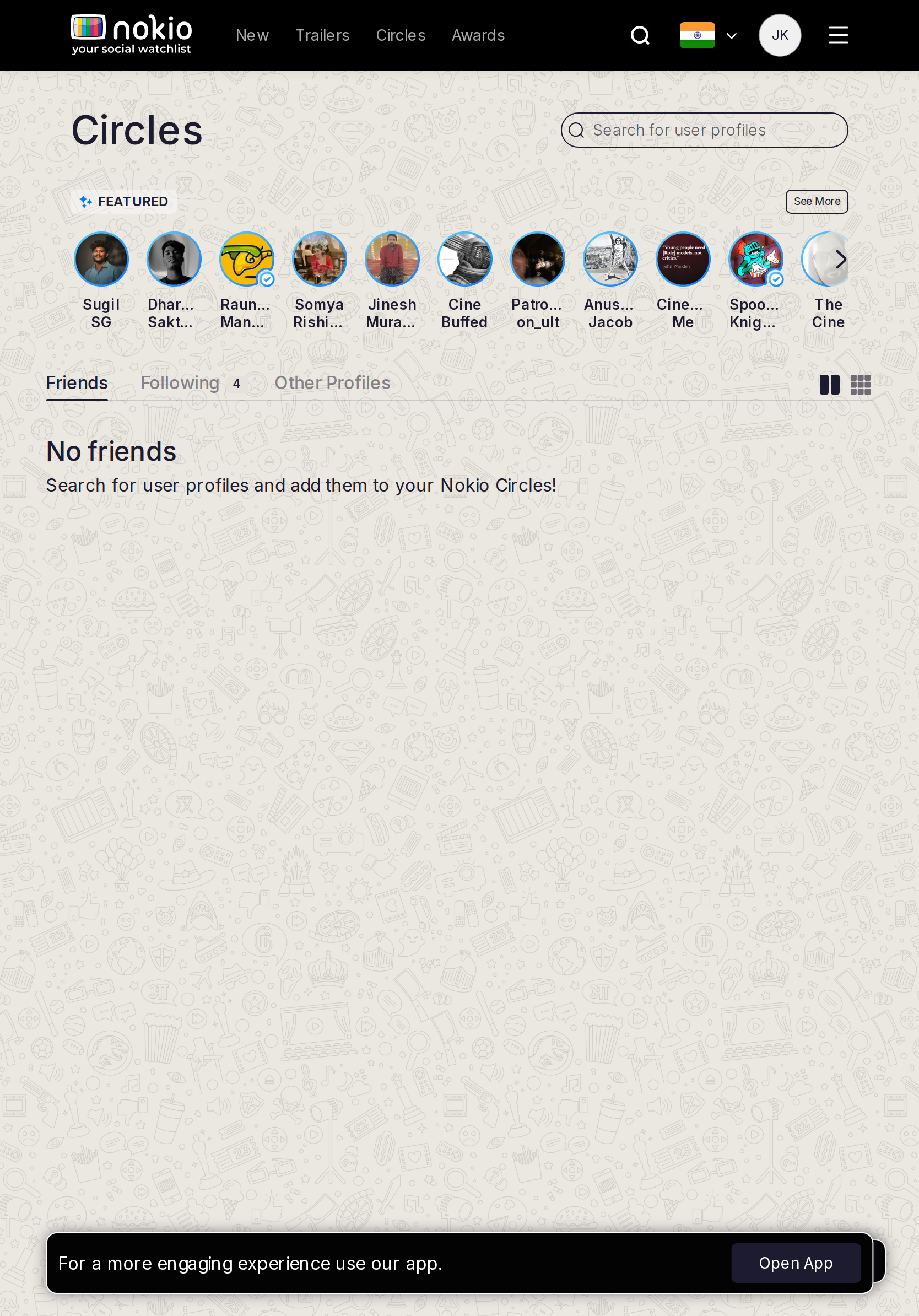
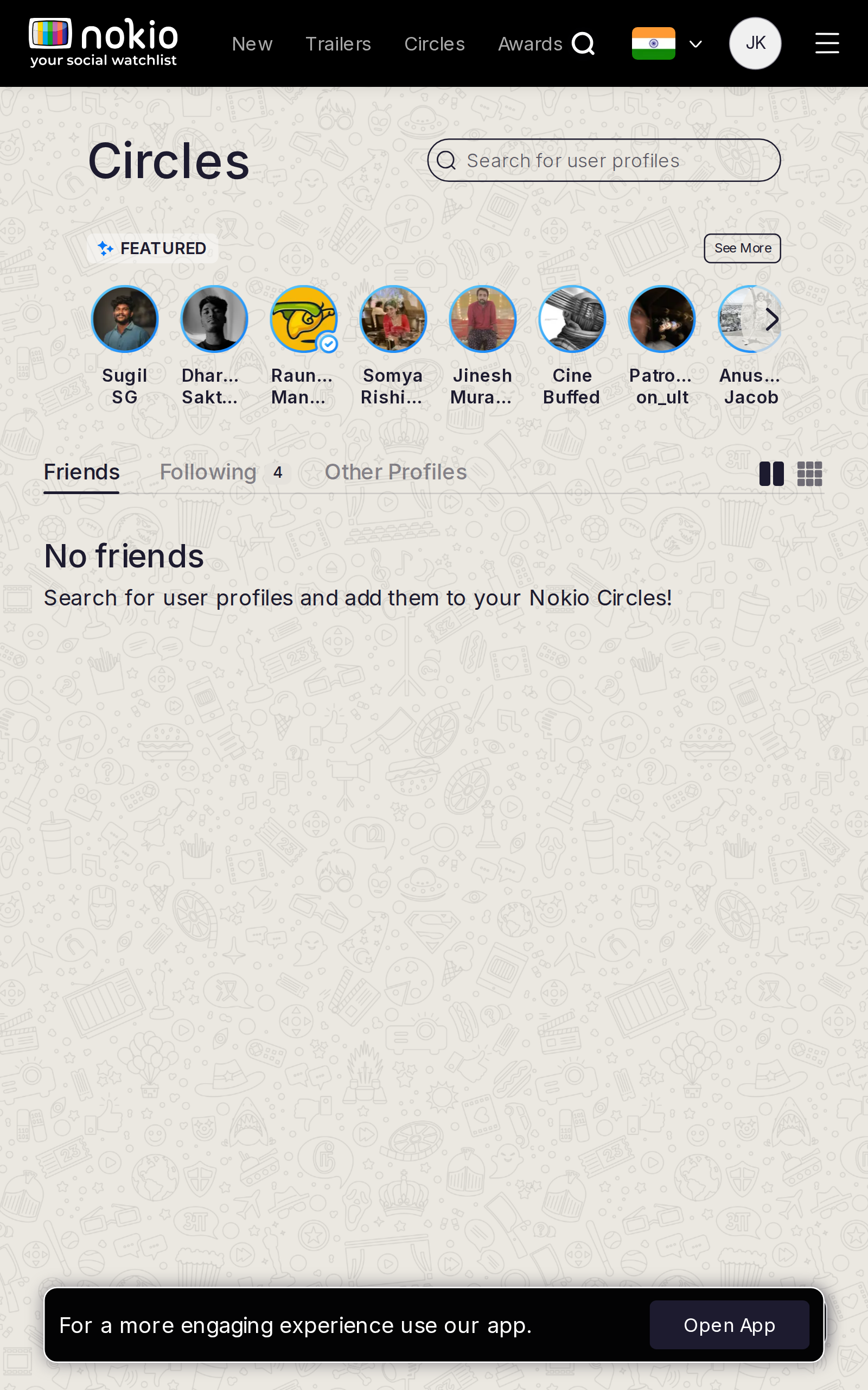
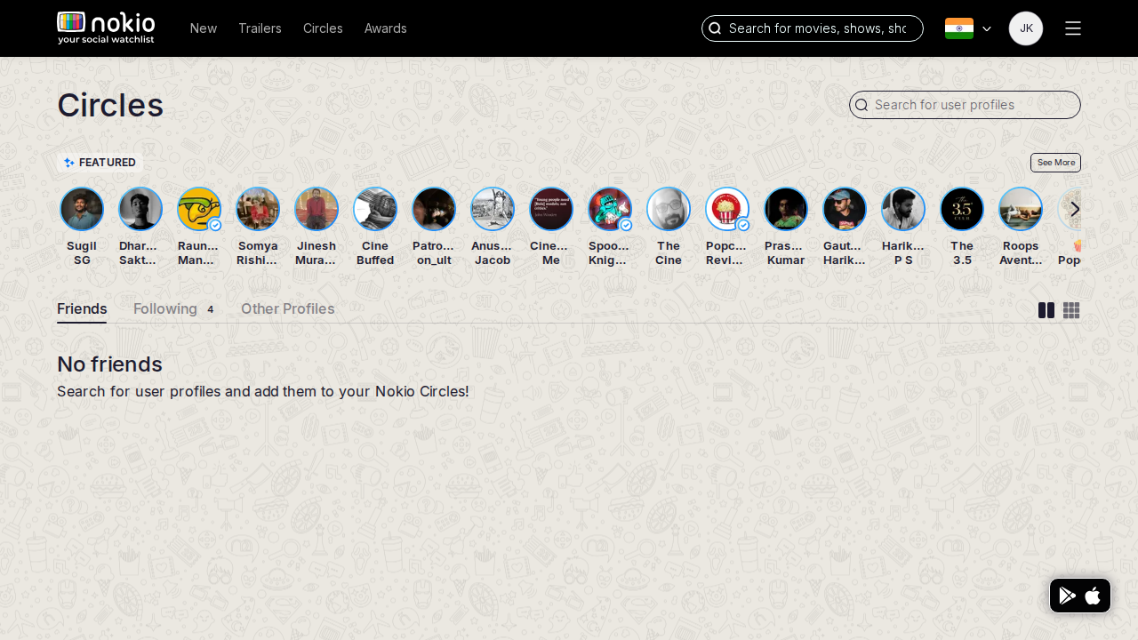
- P0Featured public people contradict “No friends”. Hide Featured on this tab.
- P0Open App eats the empty-state CTA.
UI elements on phone
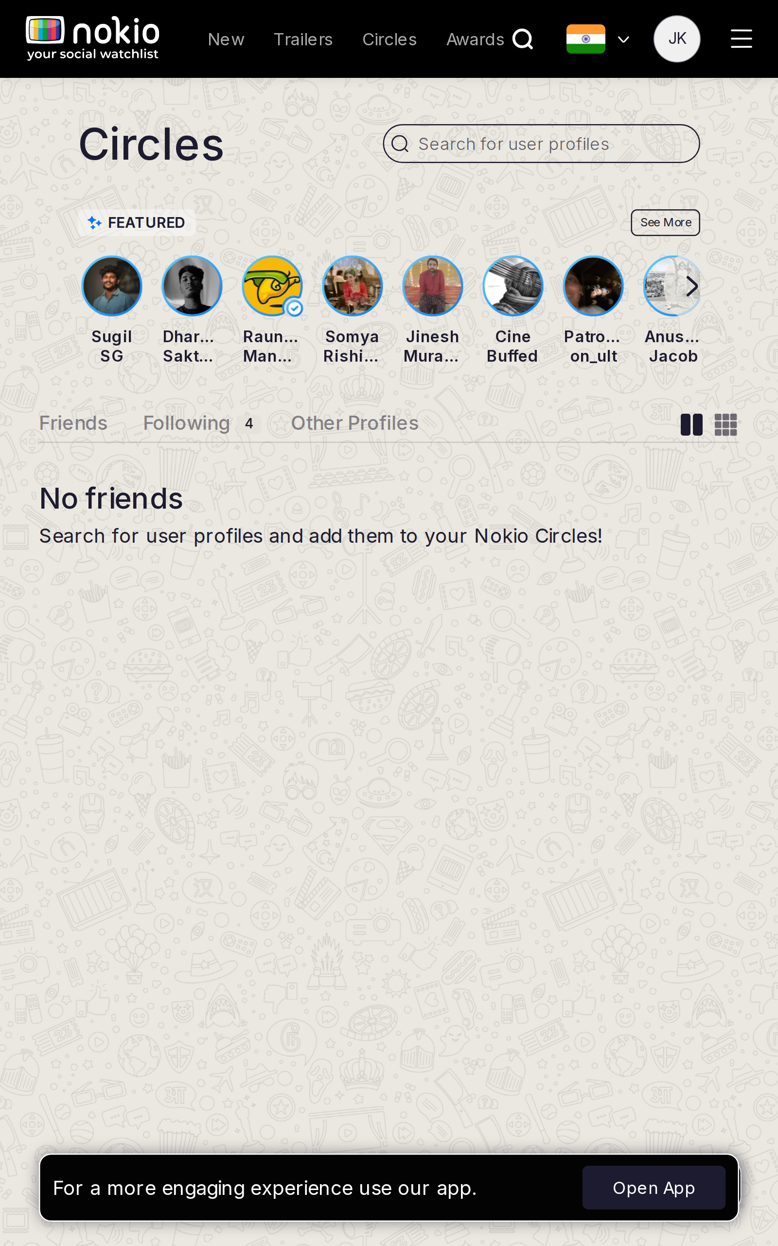
- P0Circles tabs (Friends / Following / …) are 0.8rem underlines — Followers is a URL the tab bar may not show.
- P0Featured row: circular avatars + truncated names (Dhar…) + Follow. Empty-state copy sits under that row.
- P0Open App covers the empty CTA.
Gaps on tablet
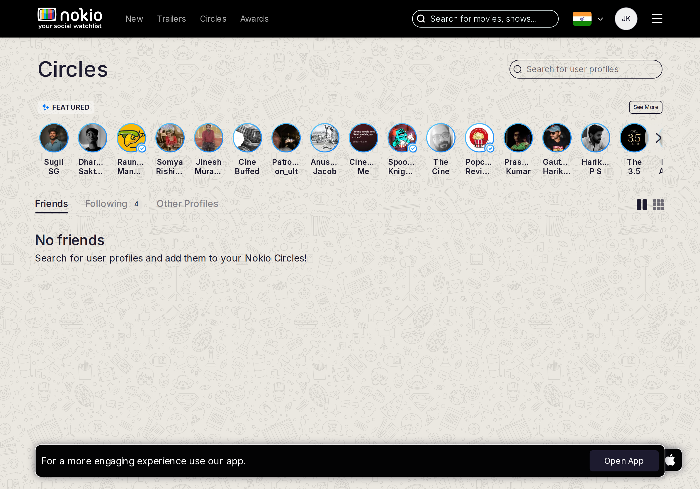
- P0Same Featured row. CTA: Find people — focus search.
UI elements on tablet
- P1Same tab set + Featured scroller. Dual search (header movies vs people) with no label which is which.
Gaps on desktop
- P0Hide Featured on Friends. Don’t maintain two empty rooms (Circles vs My Profile).
UI elements on desktop
- P1Featured still on Friends. Tab underline vs page title “Public Profiles” mismatch.
Circles following
Job: See people I follow.
Gaps on phone
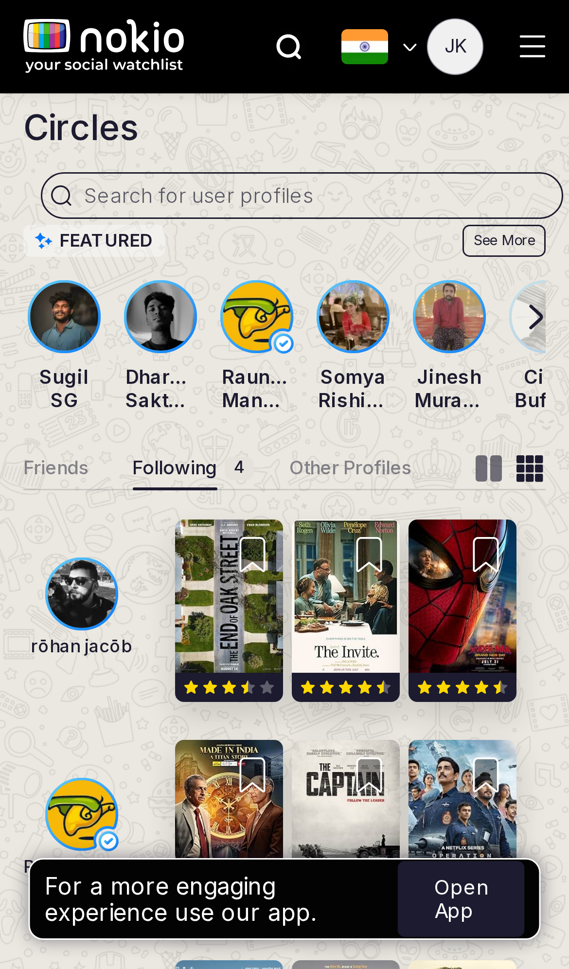
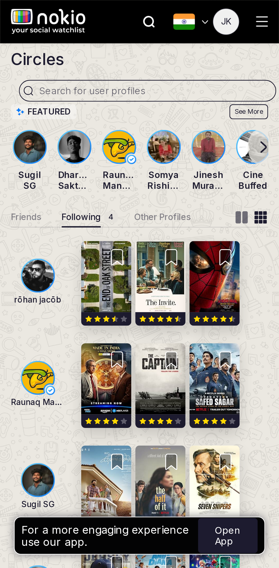
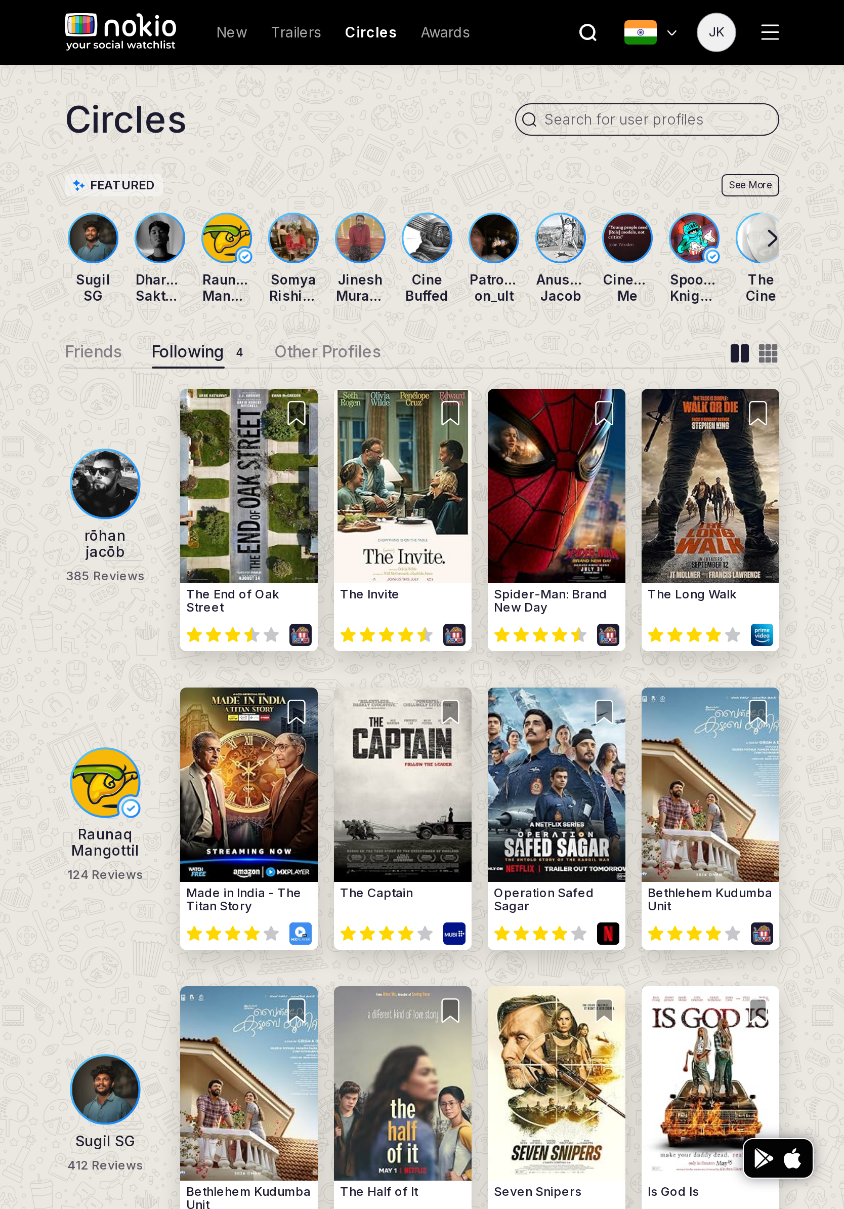
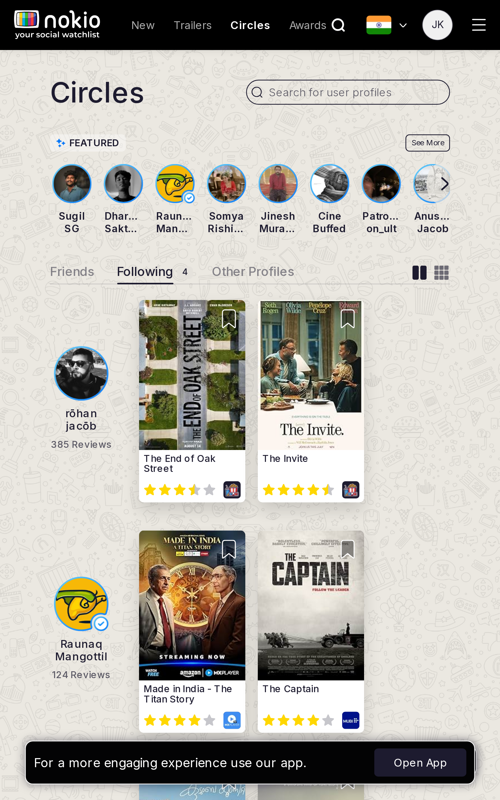
- P0Must show the same 4 people as My followings. If Featured still leads, this tab is the wrong surface.
UI elements on phone
- P0Following tab underline vs Featured public row — the Following button on cards is the real control and should list *my* follows.
- P1Open App + FAB.
Gaps on tablet
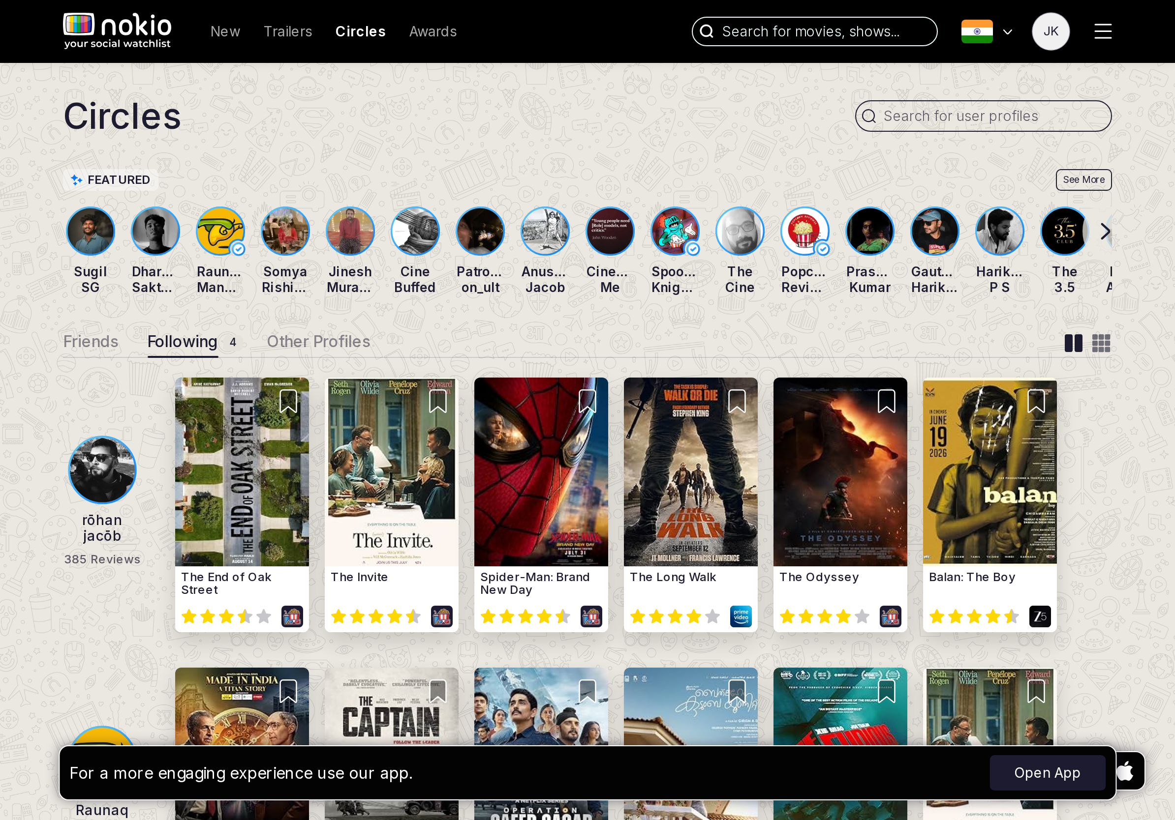
- P0Same data as My followings, tablet-sized cards, 44px Following.
UI elements on tablet
- P0Same Featured chrome. Following button must be 44px.
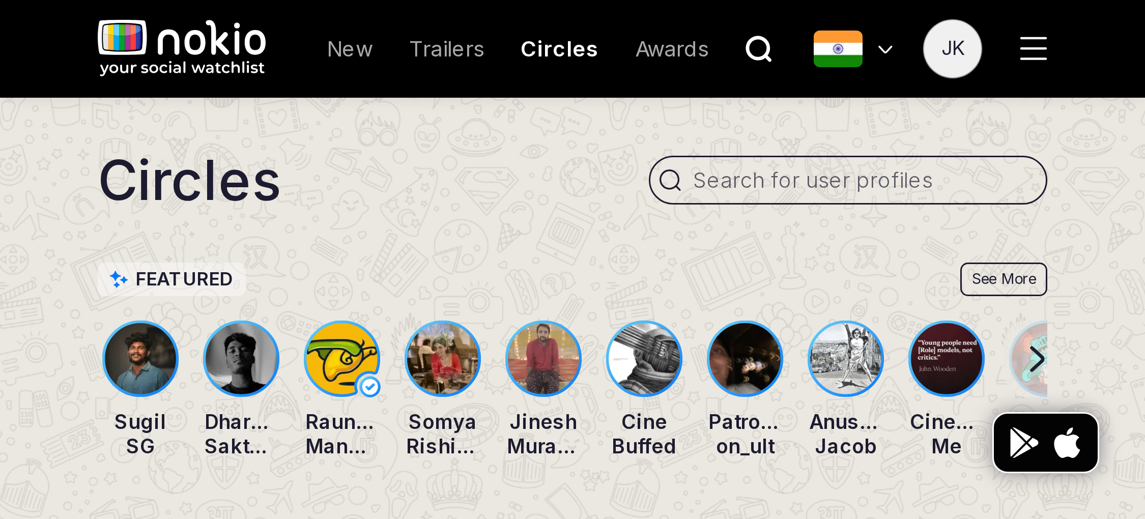
Gaps on desktop
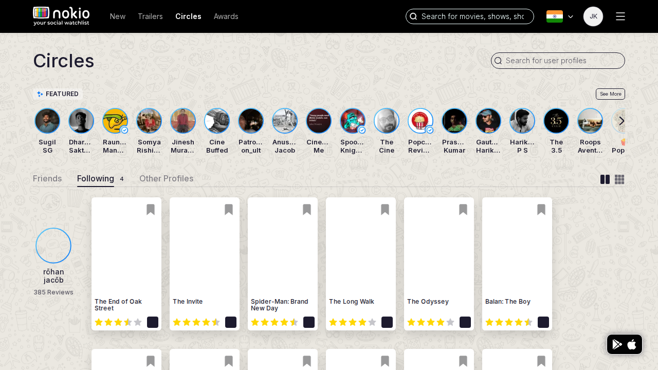
- P0One list. Pick Circles or My Profile as owner — not both with different empties.
UI elements on desktop
- P1Two Following buttons in the product (Circles card vs My followings) with different empties.
Circles followers
Job: See who follows me.
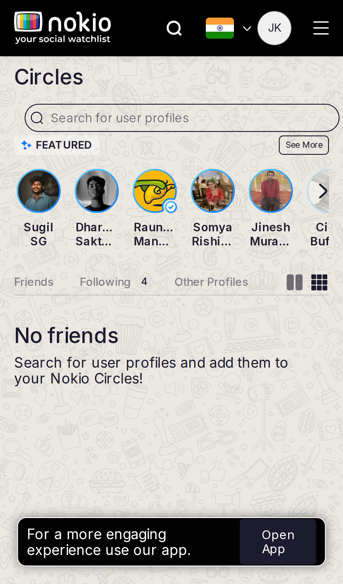
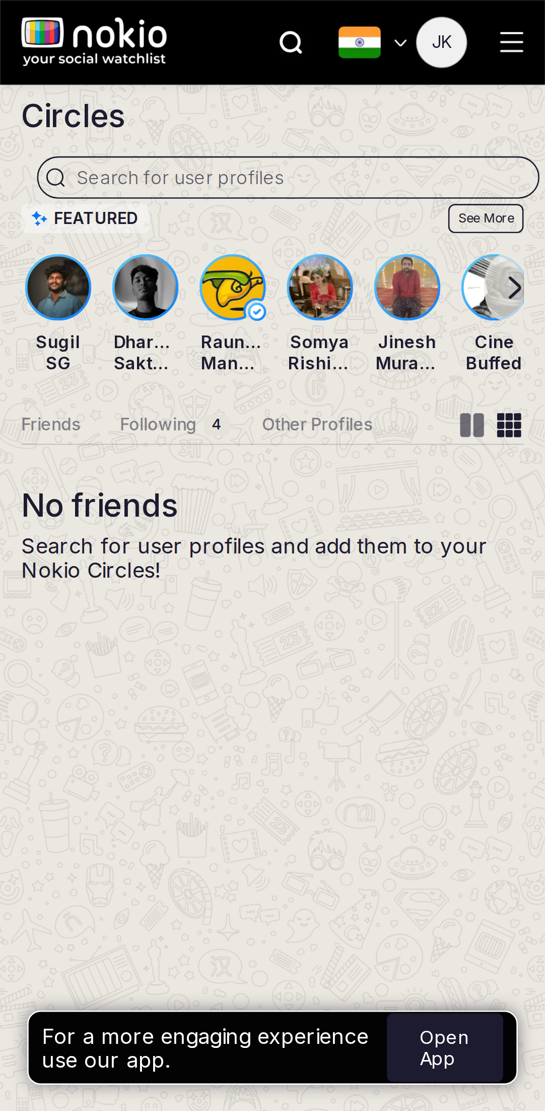
Gaps on phone
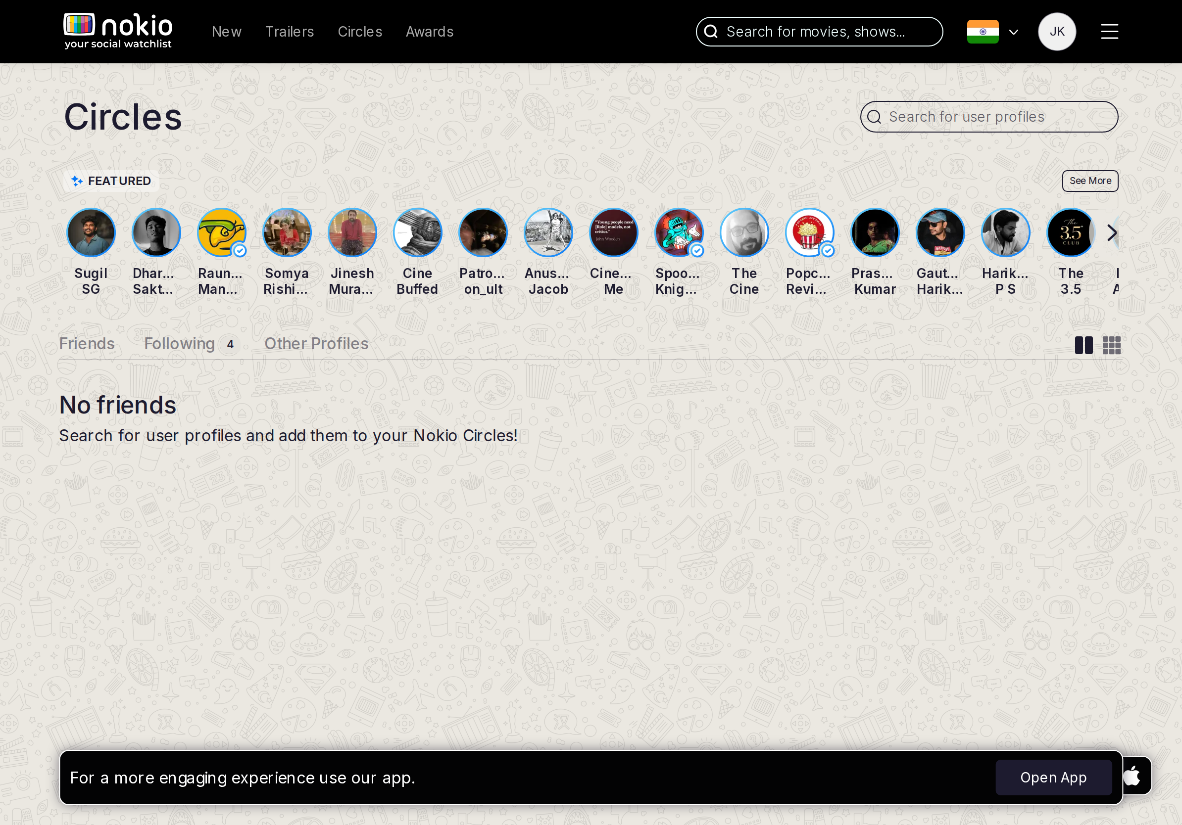
- P1Tab exists; Friends/Following/Other does not name it.
UI elements on phone
- P1No Followers label in the visible tab set — only a route. Featured still uses Follow buttons.
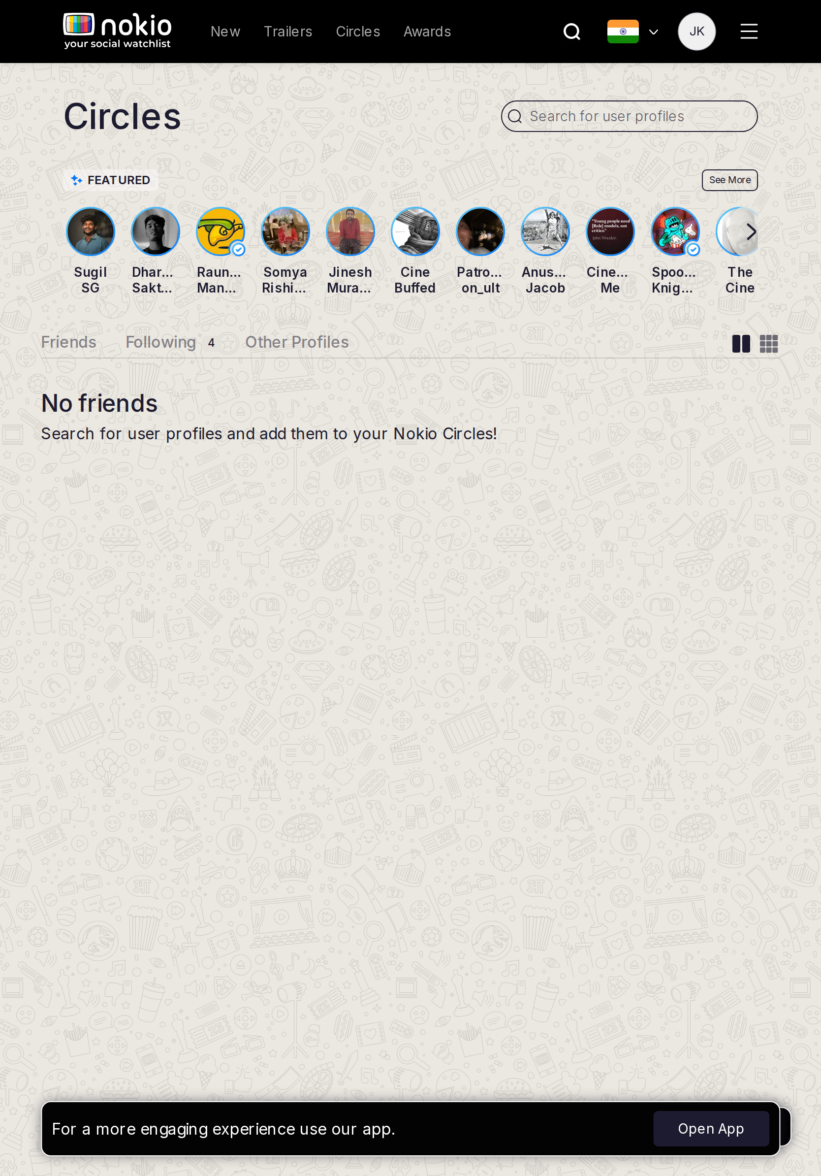
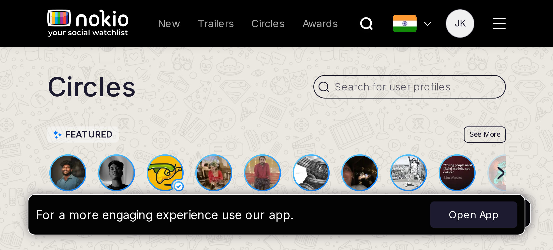
Gaps on tablet
- P1Name Followers in the tab set.
UI elements on tablet
- P1Same unlabeled route.
Gaps on desktop
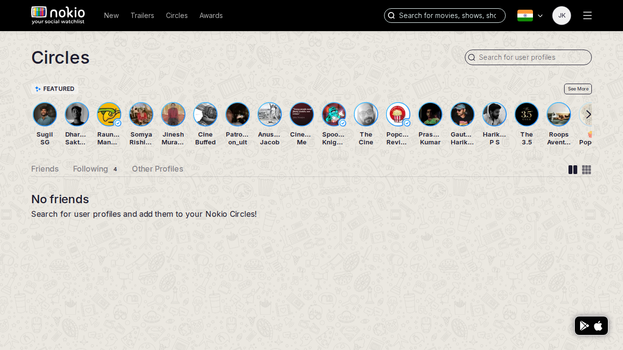
- P1Friends | Following | Followers | Public.
UI elements on desktop
- P1Add Followers as a tab, not a hidden URL.
Circles public
Job: Follow public profiles into my circle.
Gaps on phone
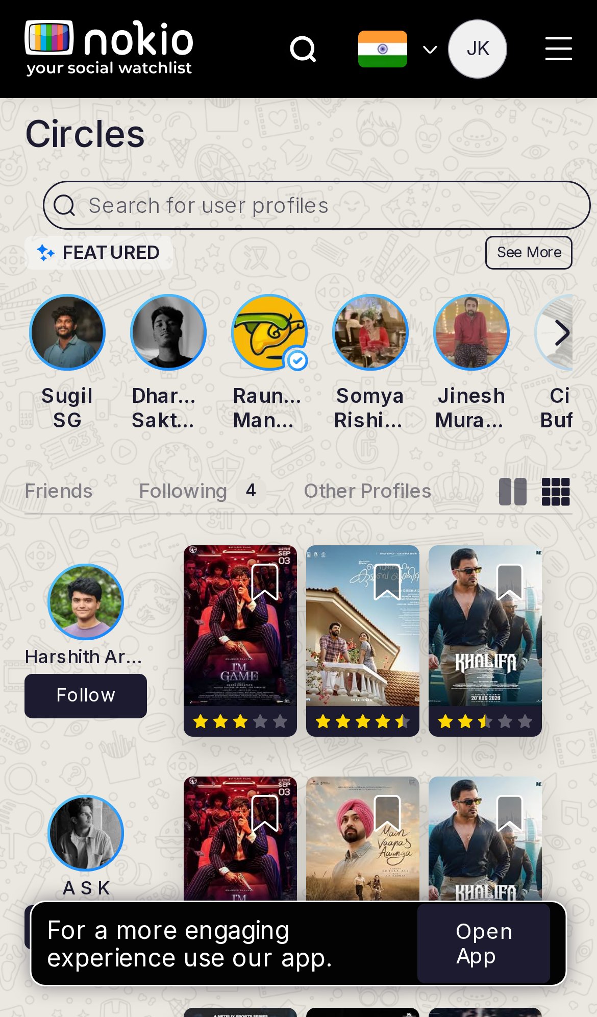
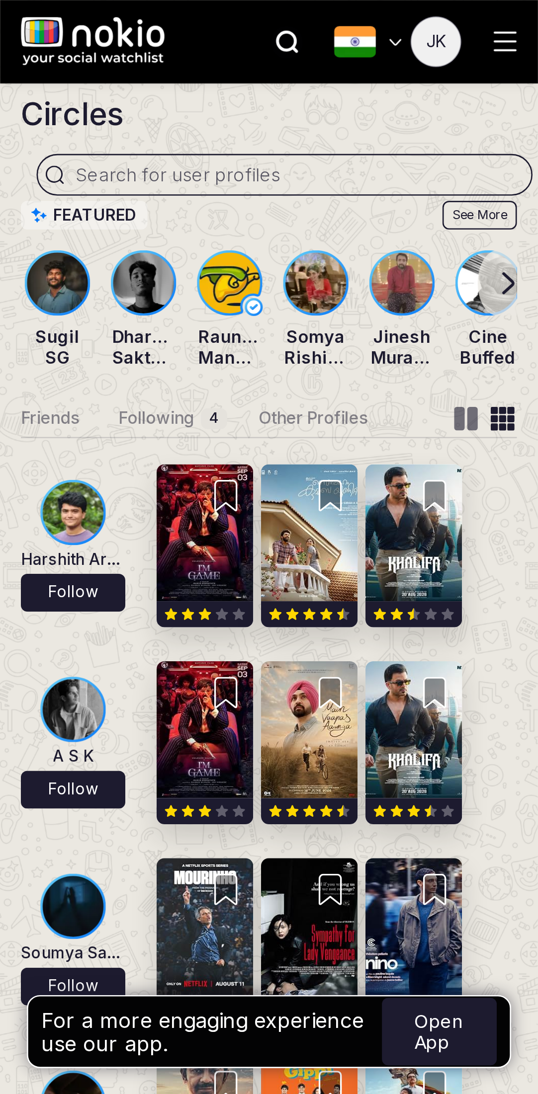
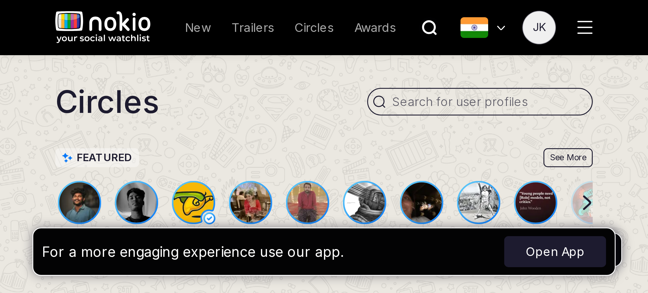
- P1Featured names truncate harder on iPhone 390 than Pixel 412. Two-line names.
- P1Dual search (movies vs people) — people-search is primary here.
UI elements on phone
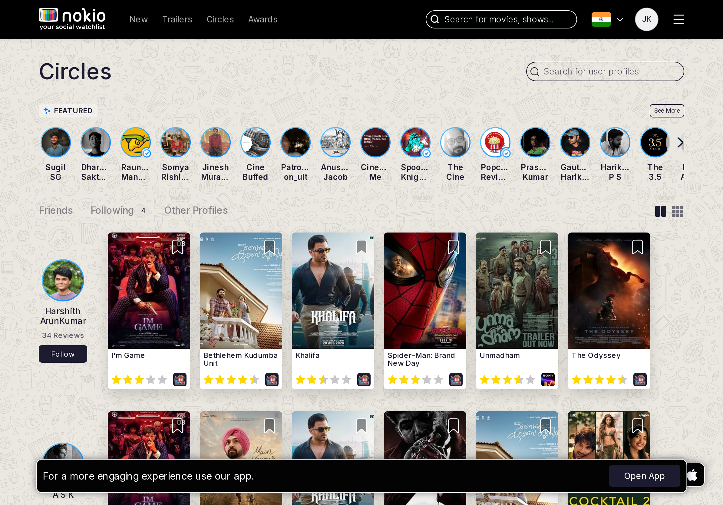
- P1Featured names clip (Dhar… Sakt…). Follow on each. Header search is movies; in-page people search unlabeled.
- P1Open App covers feed posters.
Gaps on tablet
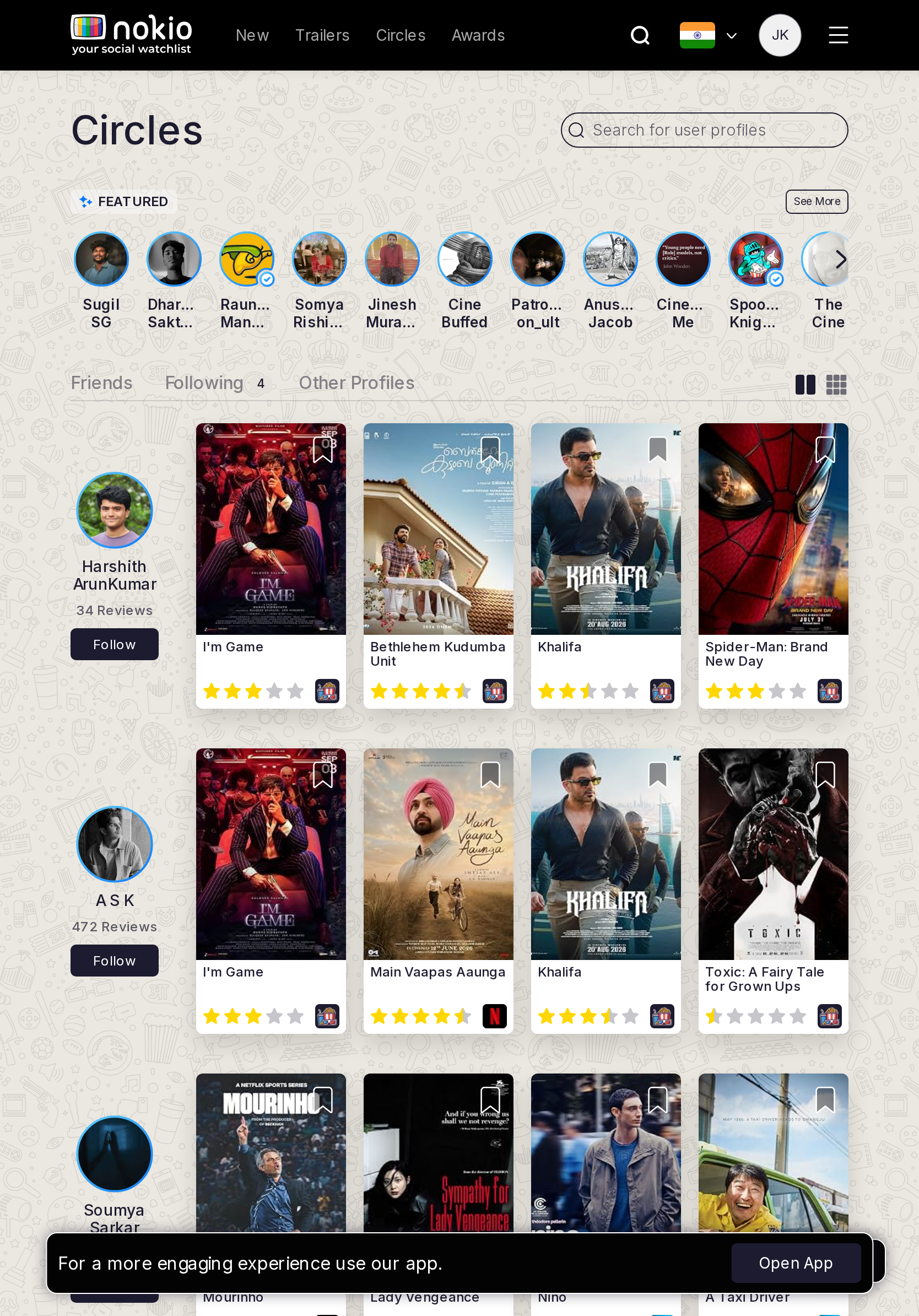
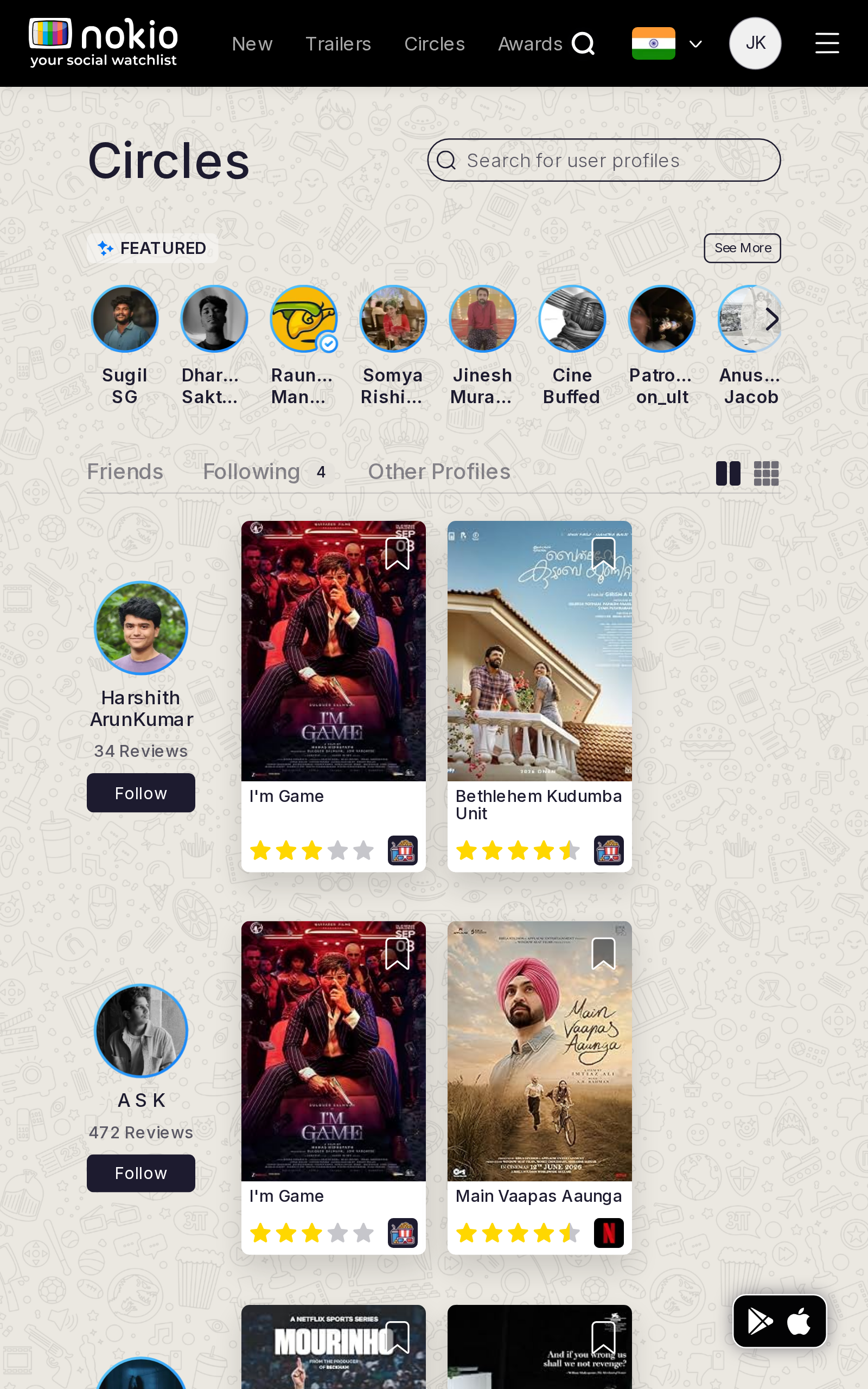
- P1Same Featured clip on Galaxy Tab 640.
UI elements on tablet
- P1Same Featured clip. Follow hits small.
Gaps on desktop
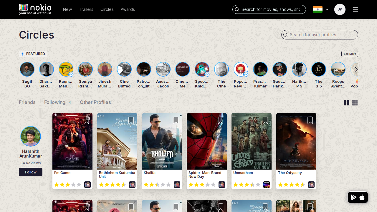
- P2Shrink header movie search on this route.
UI elements on desktop
- P2Two search fields. People-search should be primary; shrink movie search.
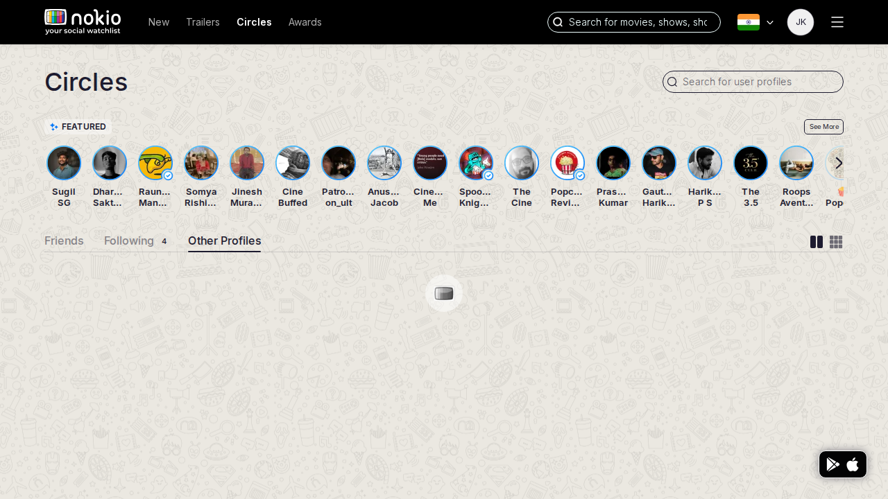
Circles other
Job: Find people who are not public critics.
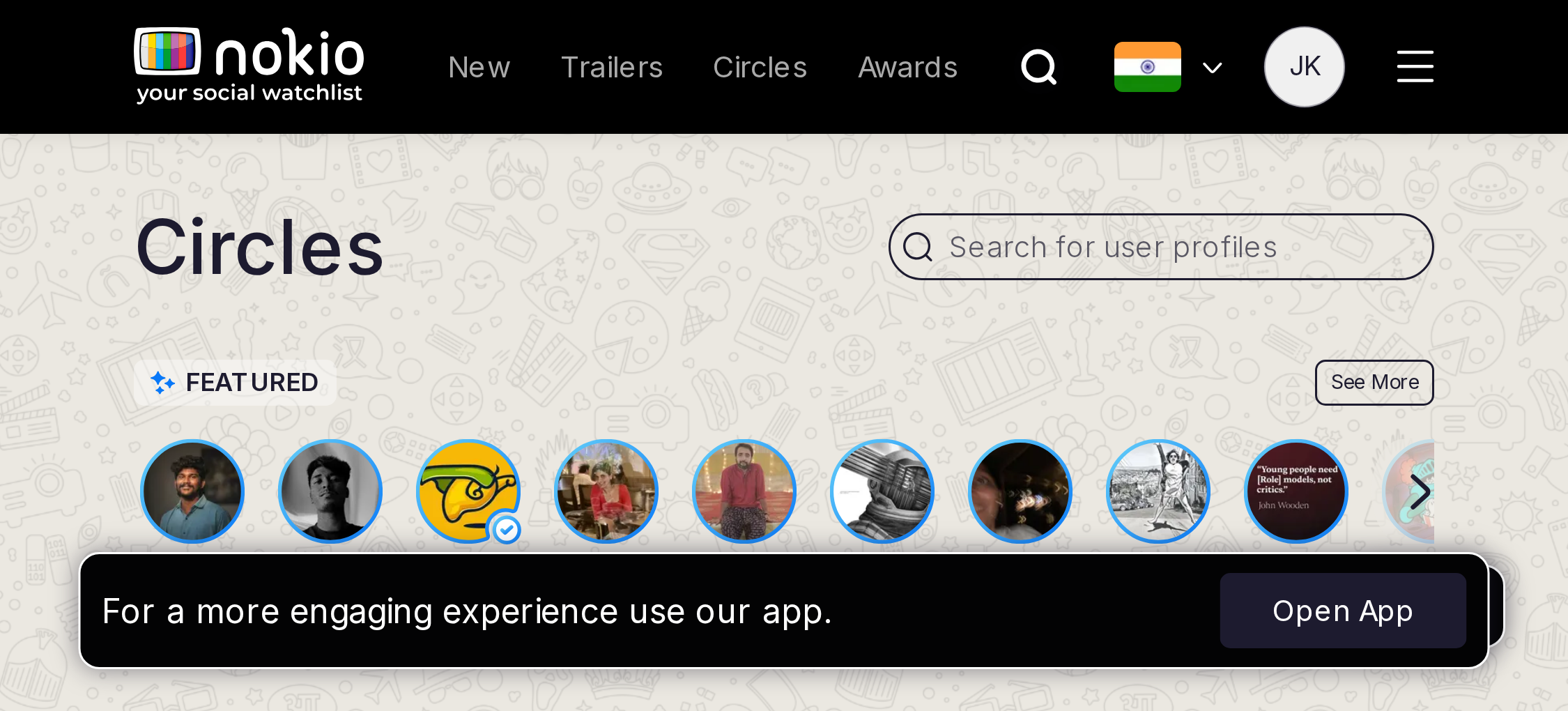
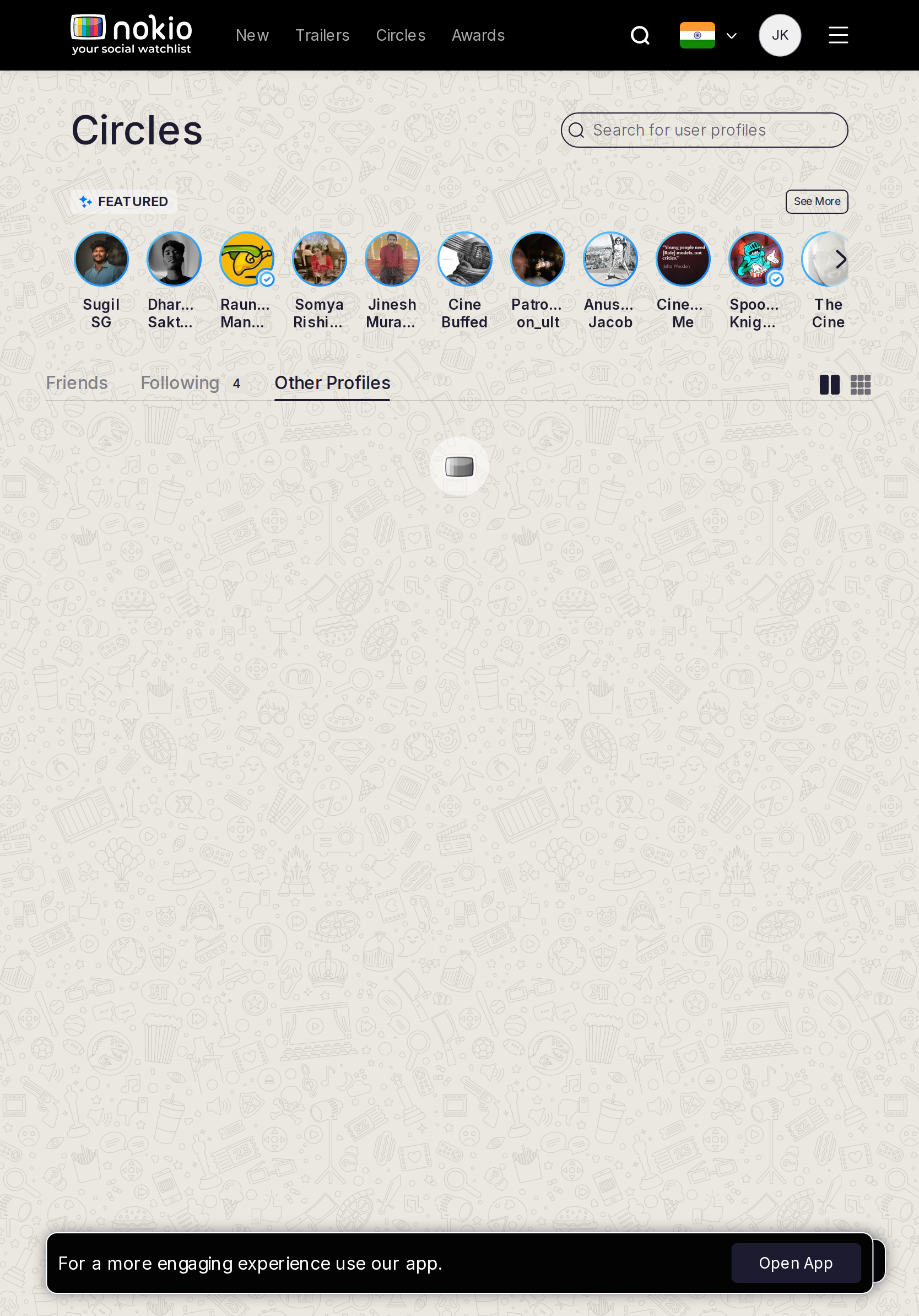
Gaps on phone
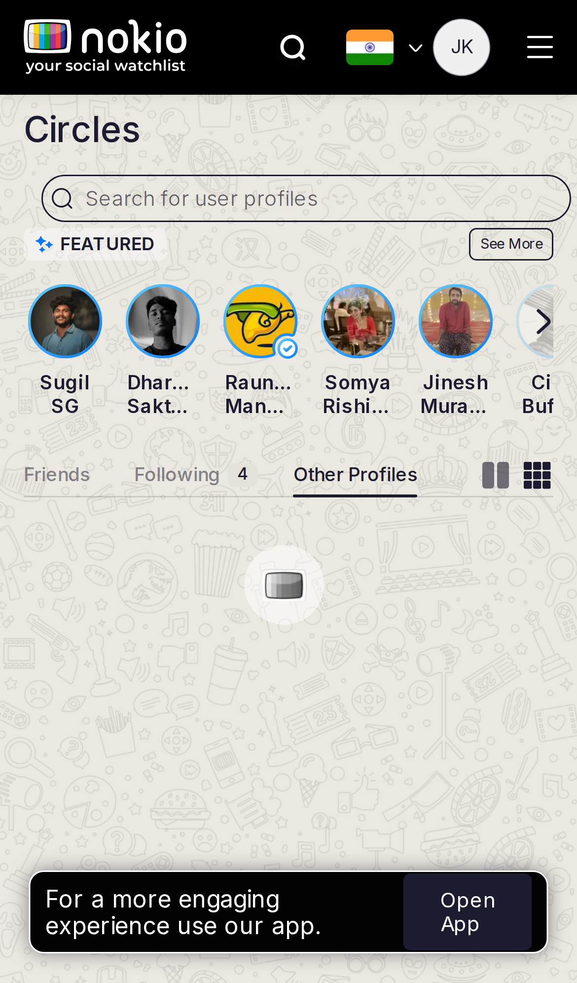
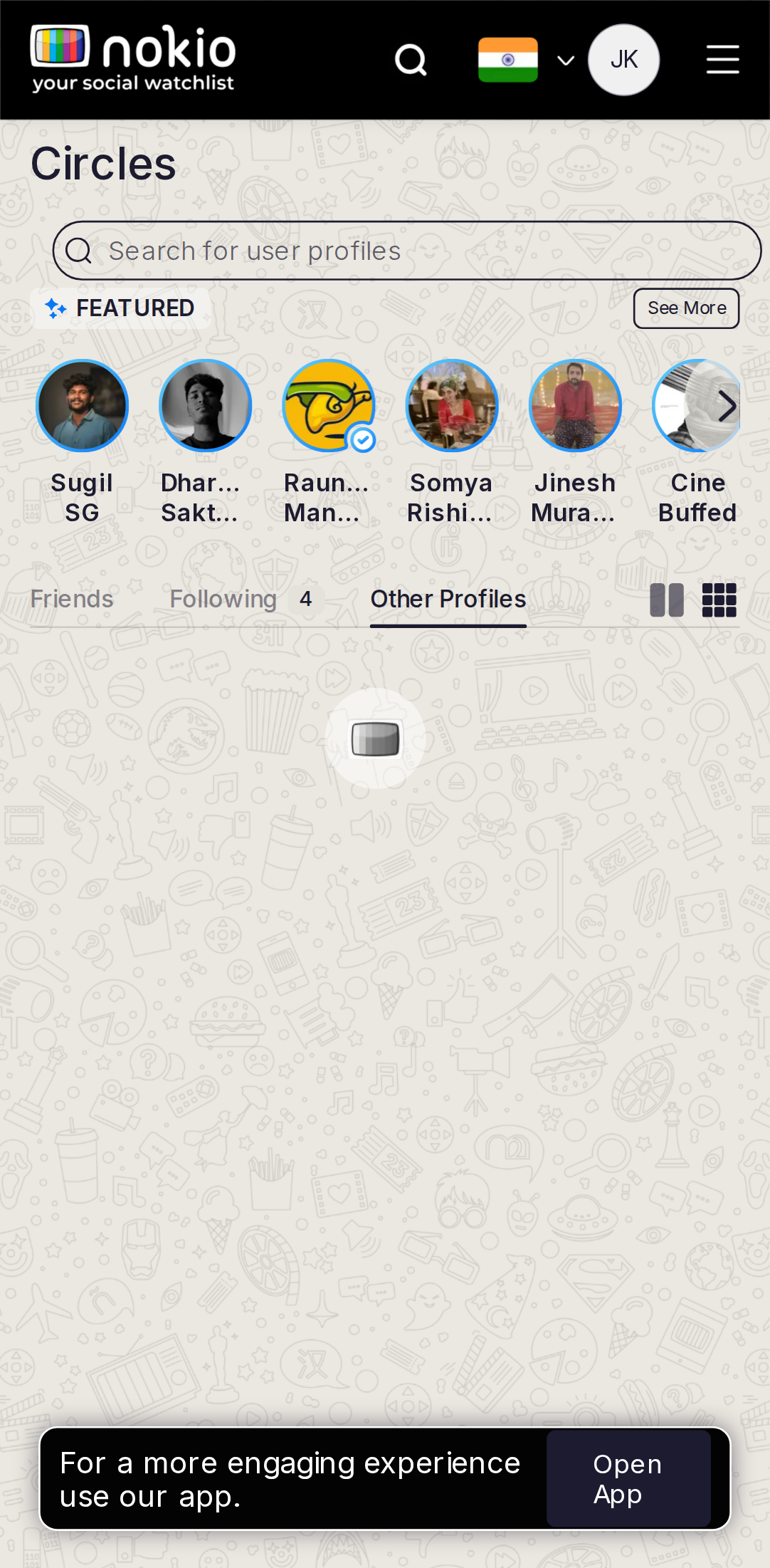
- P1Unclear vs Public. Don’t reuse Featured if Other is empty.
UI elements on phone
- P1Other tab underline with no helper text. Featured + Follow reused from Public.
- P1Open App.
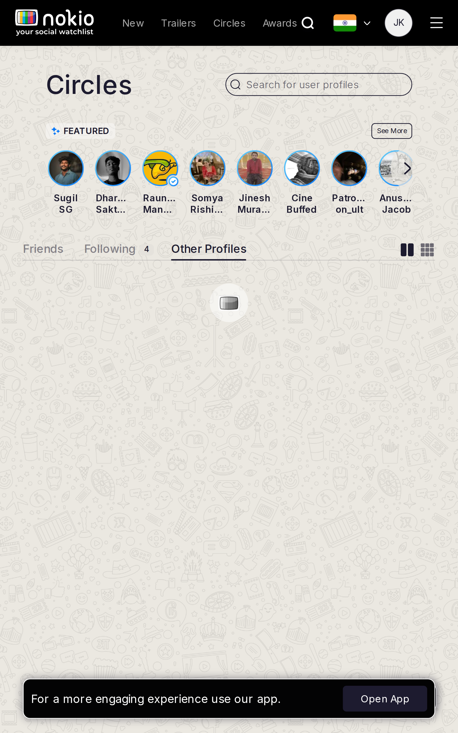
Gaps on tablet
- P1One line: “People you may know who aren’t public critics.”
UI elements on tablet
- P1Same.
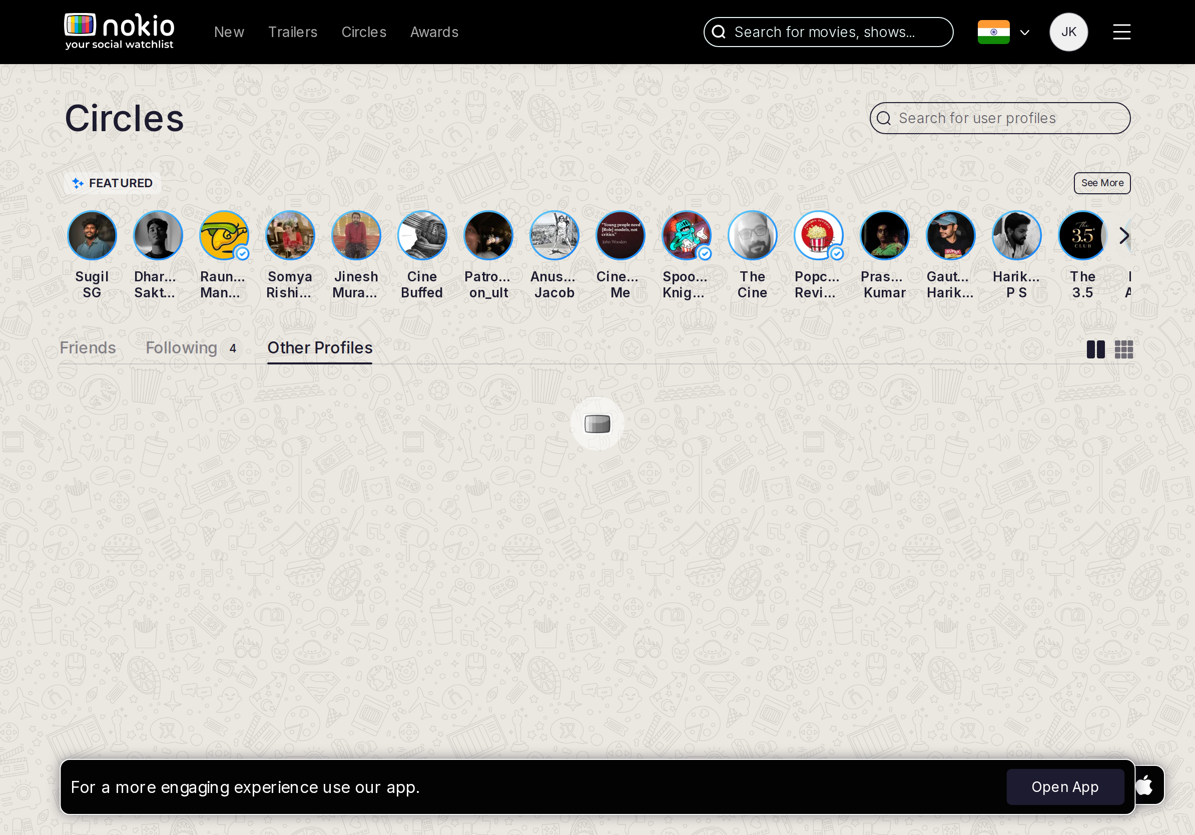
Gaps on desktop
- P1Same explanation; empty state, not public Featured.
UI elements on desktop
- P1Explain Other next to the tab, not only in empty copy.
My watchlist
Job: See titles I saved.
Gaps on phone
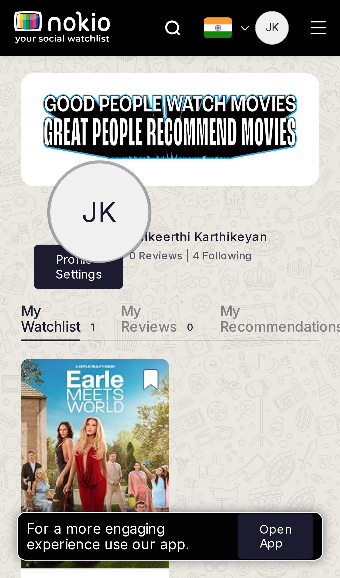
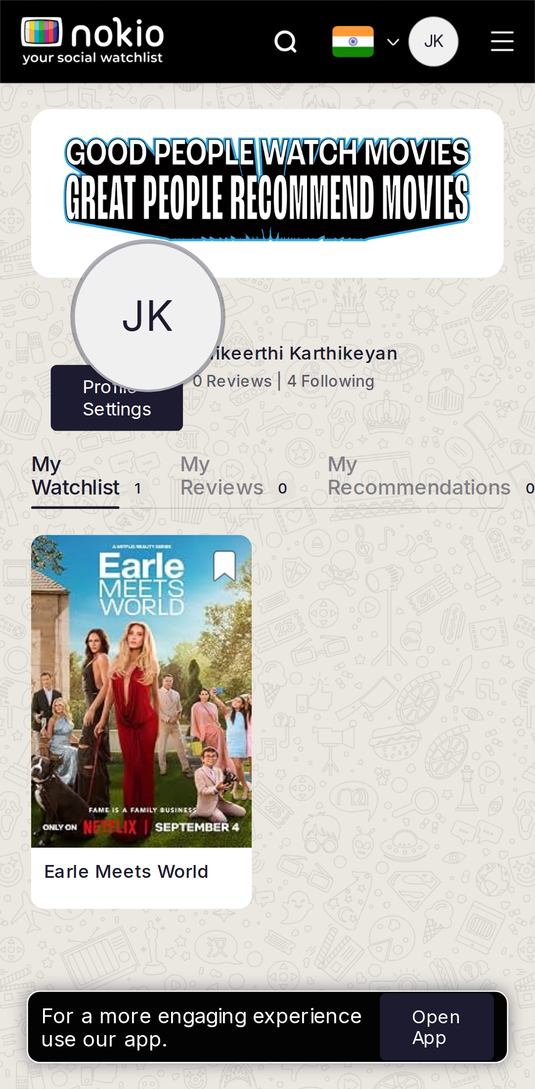
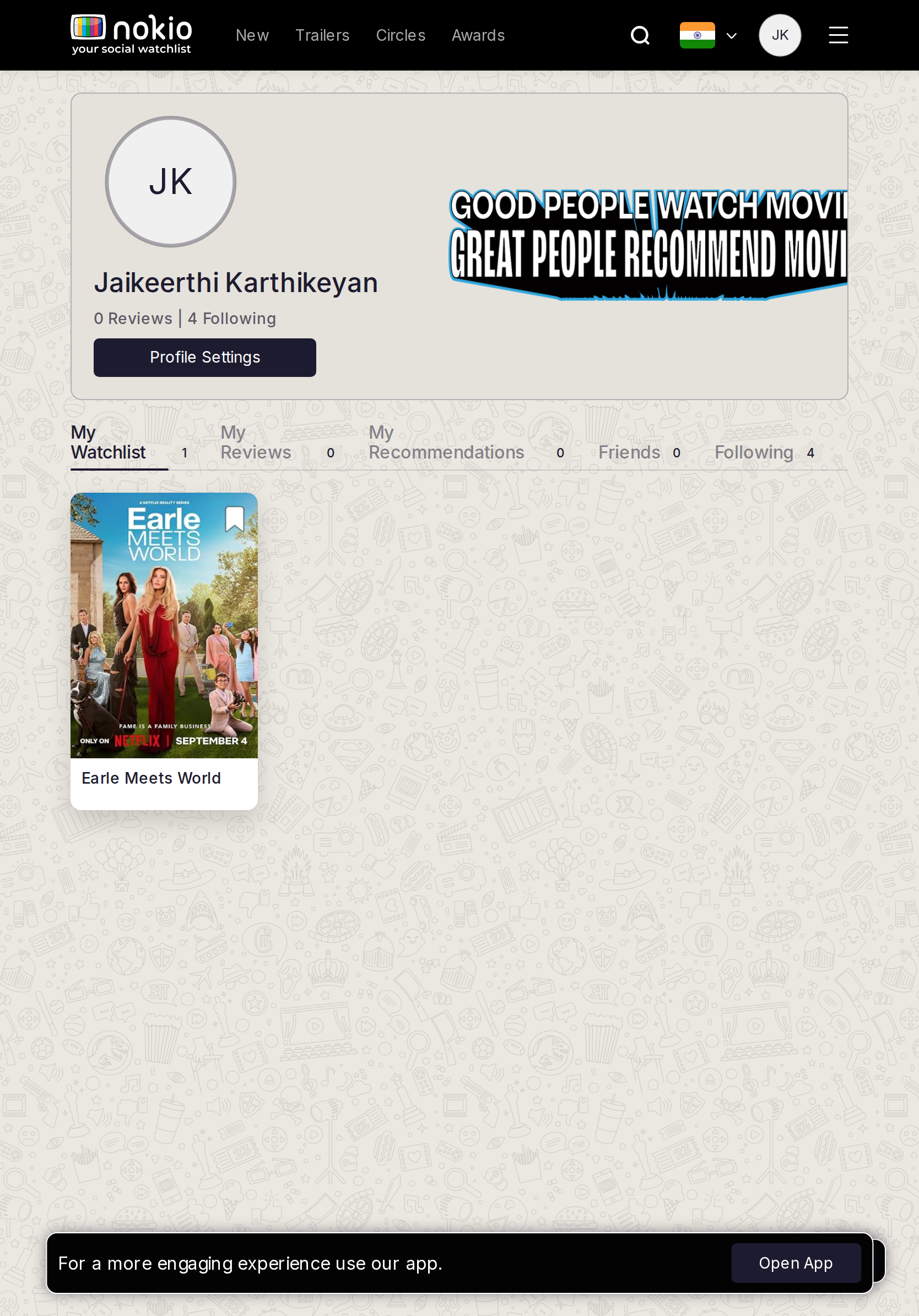
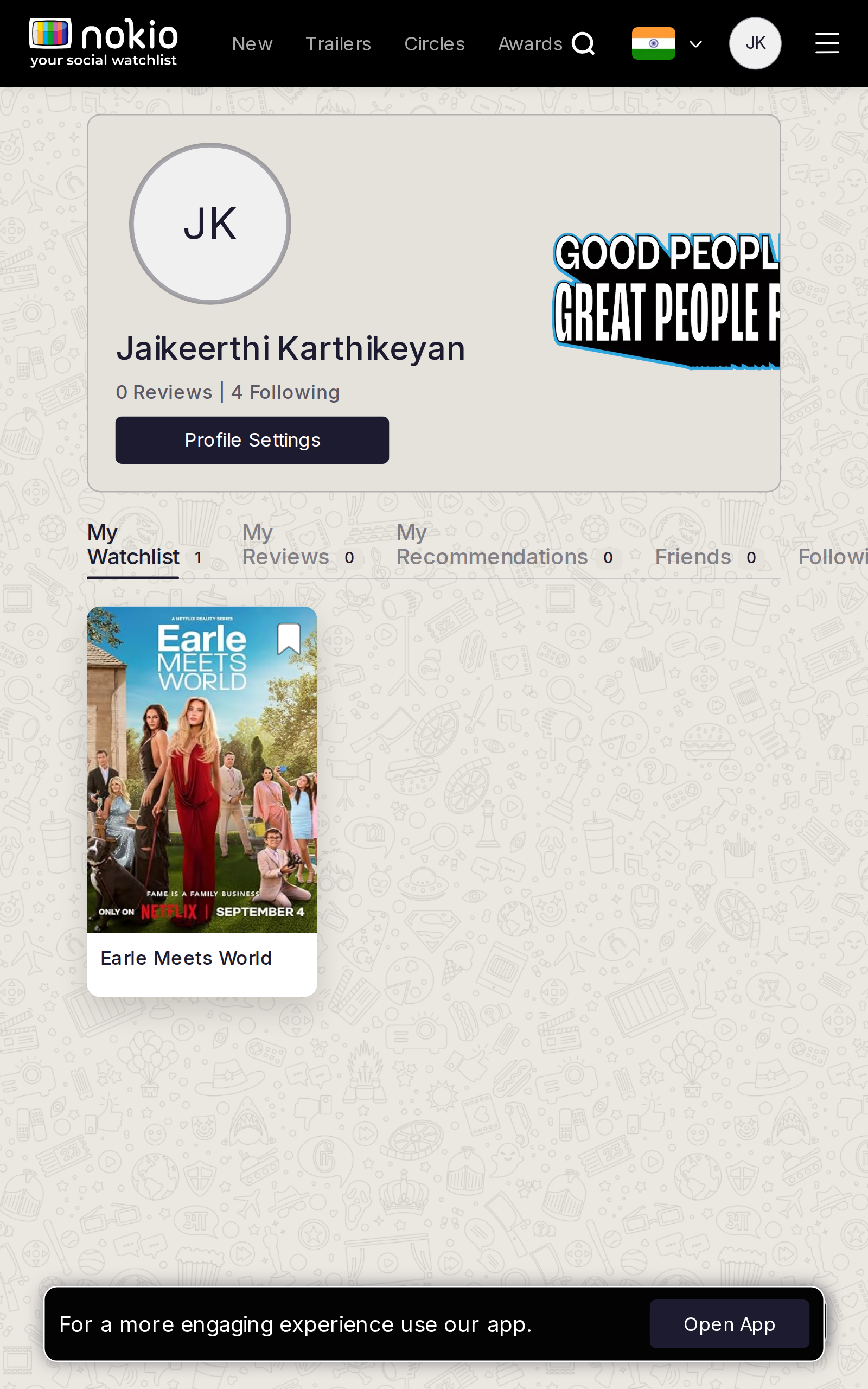
- P0iPhone 14: avatar overlaps name, stats, and Profile Settings. Stack banner → avatar → name → Settings.
- P0Tabs clip; Open App covers the one saved poster (Earle Meets World).
- P1Count is 1 — still add a Browse CTA so the doodle field doesn’t look abandoned.
UI elements on phone
- P0Profile Settings is a navy pill overlapping the avatar — not a 44px exclusive hit.
- P0Tabs (My Watchlist 1 / My Reviews 0 / …) clip “My Recommendation…” — 0.8rem, not a scroller.
- P0Slogan banner (“GOOD PEOPLE WATCH…”) is a graphic, not a control, and steals height from the poster.
- P0Bookmark on the saved poster looks like “add” even when it’s already saved.
- P0Open App covers Earle Meets World.
Gaps on tablet
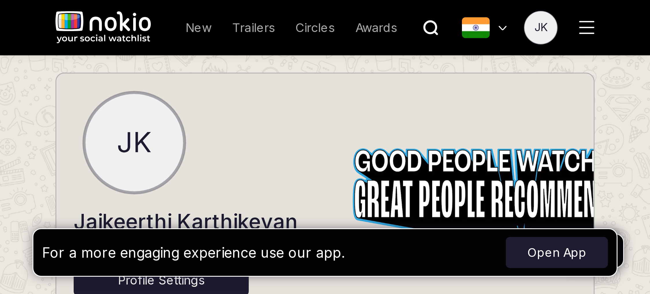
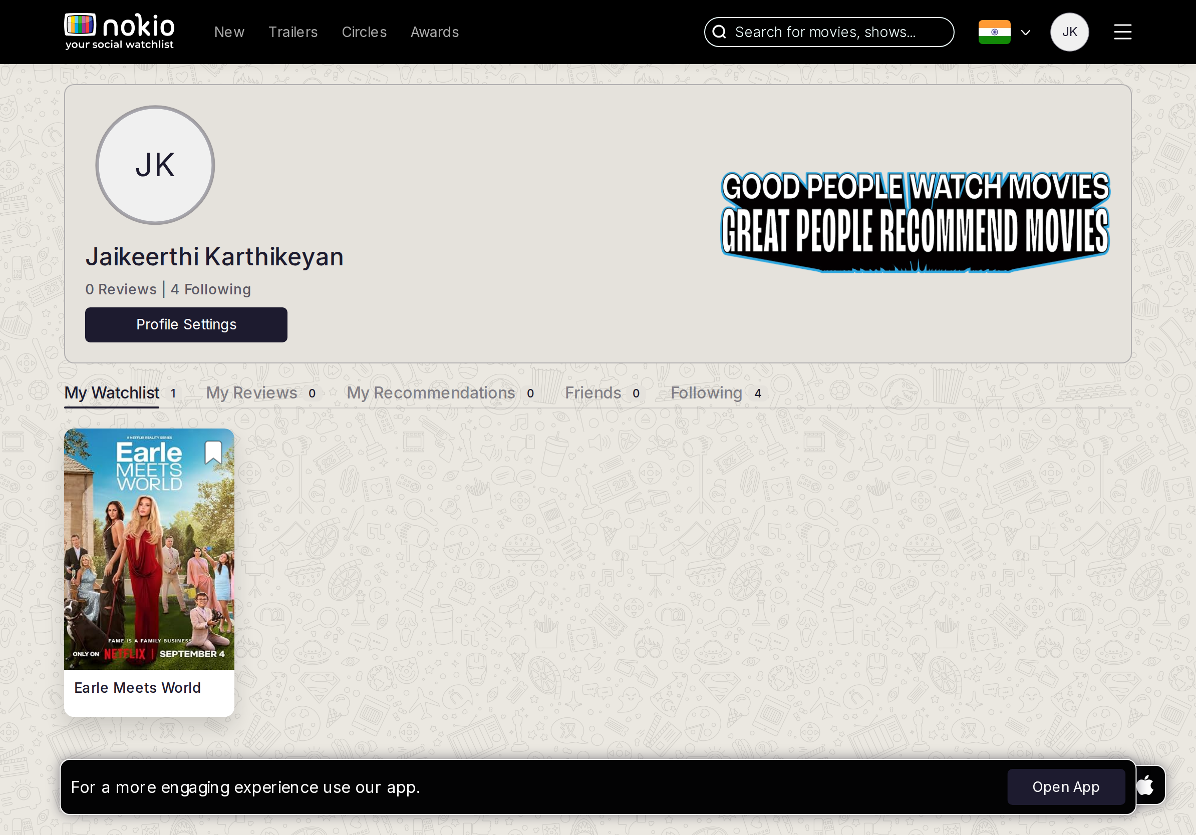
- P1iPad uses the desktop slogan banner, which eats vertical space. Shrink or drop it under 960.
- P1Galaxy Tab 640 inherits the phone collision.
UI elements on tablet
- P1Same Settings pill + clipped tabs. Slogan banner still desktop-sized.
- P1Open App on iPad UA.
Gaps on desktop
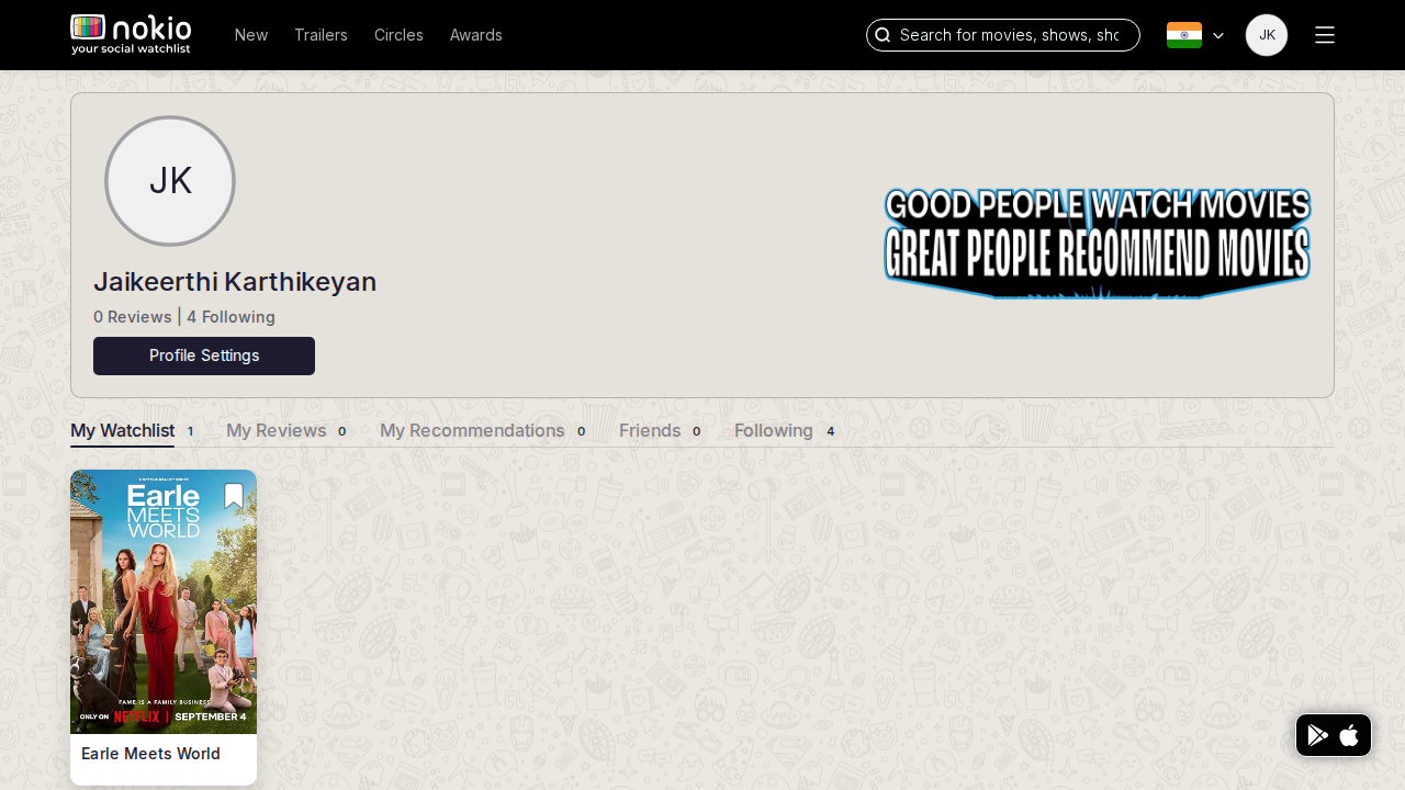
- P2Empty space beside one poster. Suggested titles would help. Header + hamburger redundancy remains.
UI elements on desktop
- P2Settings pill is clear. Tabs fit. Bookmark on the one poster has no “remove” label. Hamburger + Nav.
My reviews
Job: See and manage my reviews.
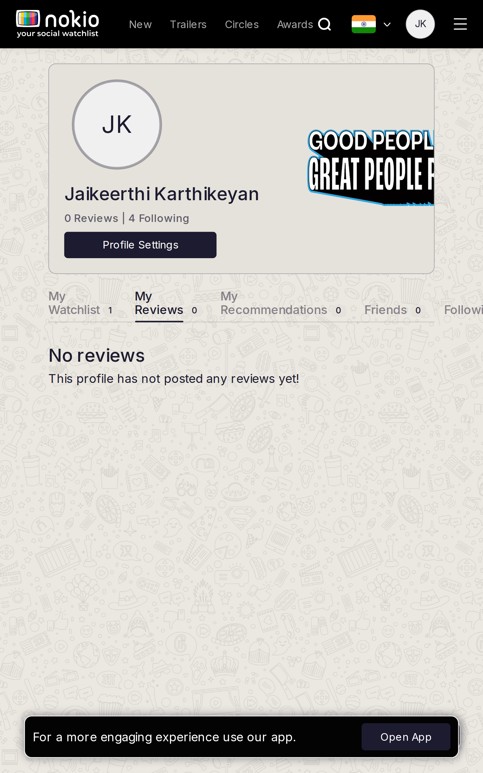
Gaps on phone
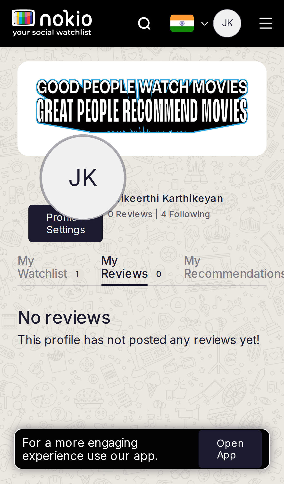
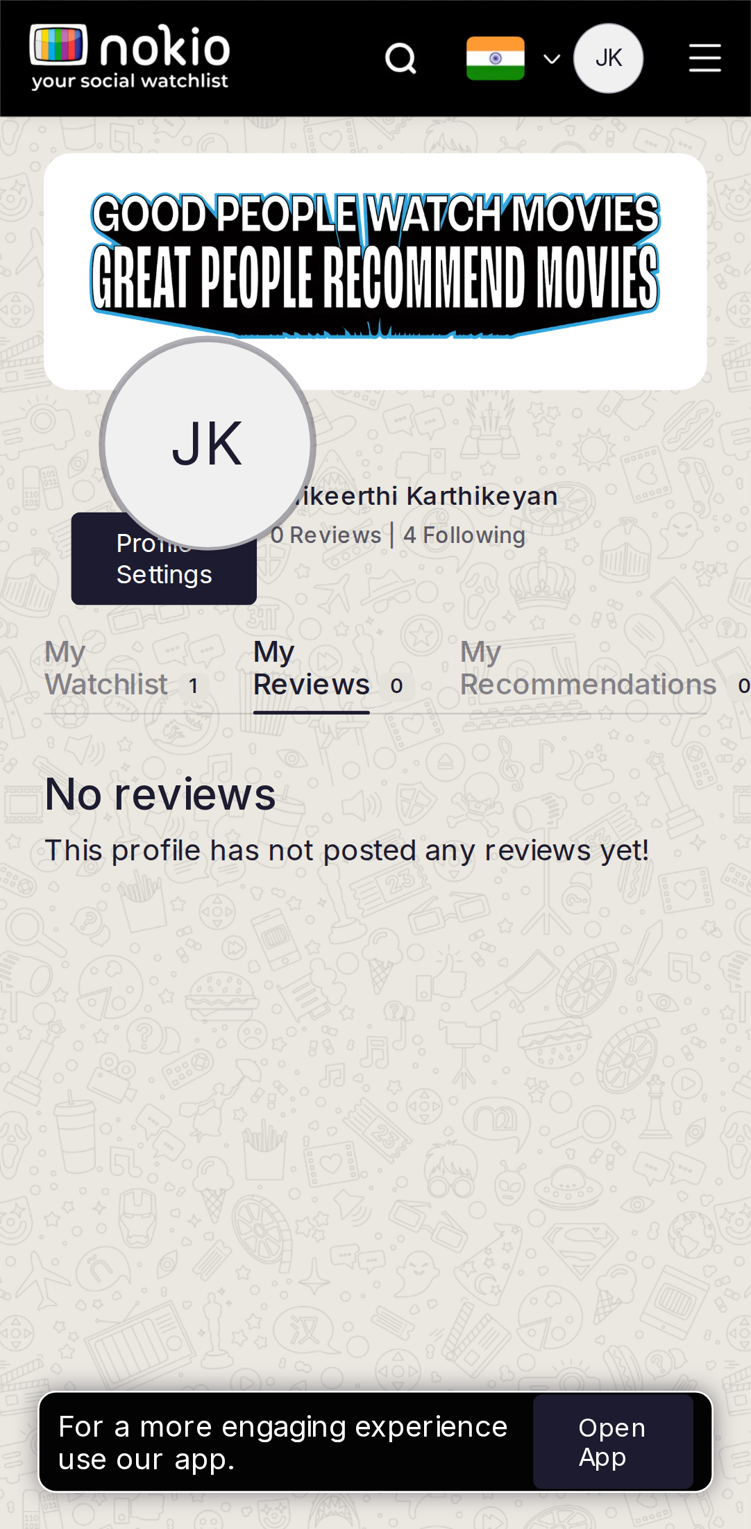
- P0Still 0 reviews — star rating is hover-then-click. Fatal on touch.
- P0Same header collision as Watchlist. Third-person empty copy.
- P0Open App on an empty reviews tab.
UI elements on phone
- P0Same Settings pill, avatar overlap, clipped tabs as Watchlist.
- P0Empty copy is not a button — no “Write a review” / Search control.
- P0Open App on empty.
Gaps on tablet
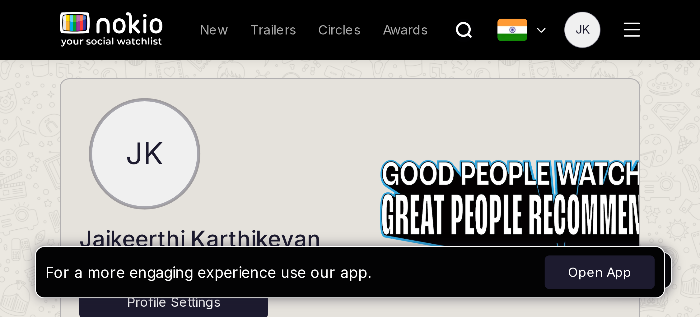
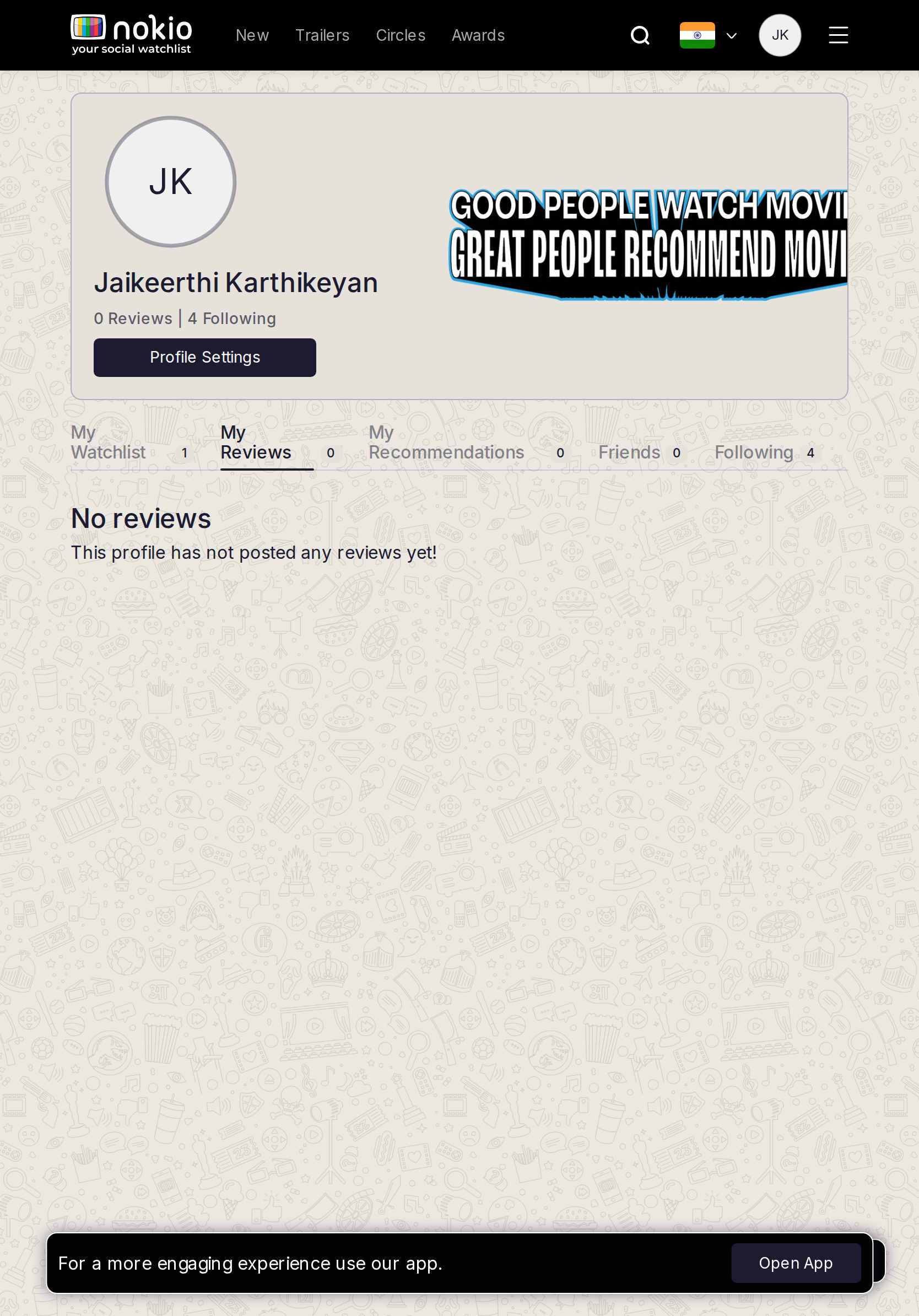
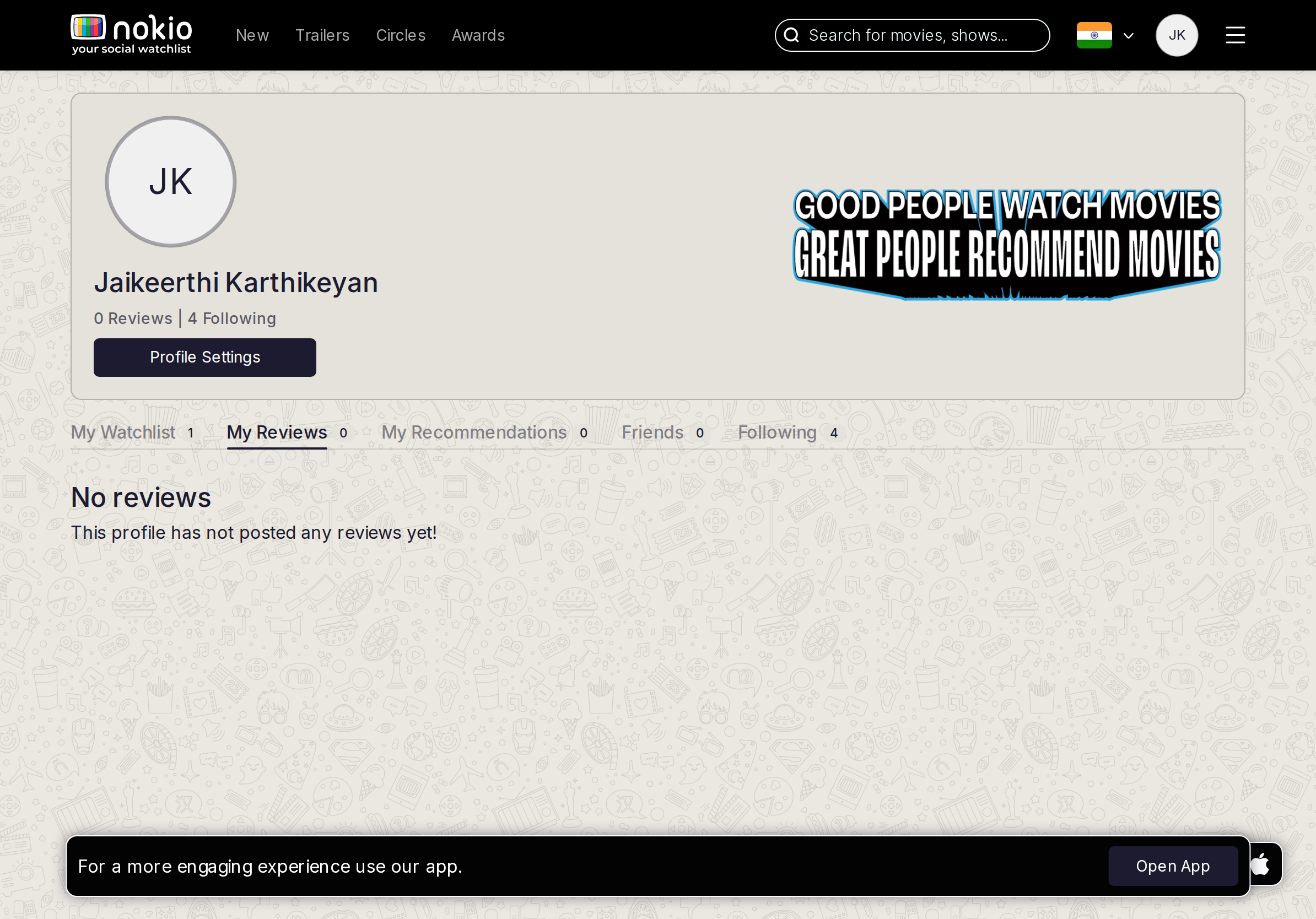
- P0Same rating bug. iPad has room for a write CTA that phone hides under Open App.
UI elements on tablet
- P1Room for a primary Write CTA that phone hides. Same tab clip risk on Galaxy Tab.
Gaps on desktop
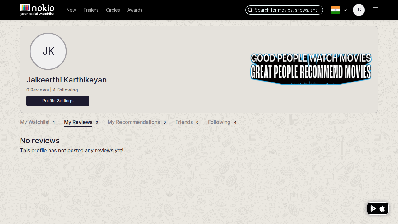
- P0Composer on the movie page is the only place to write — and Submit stays disabled without a hover rating.
- P1Copy: “You haven’t reviewed anything yet.” + Search a title.
UI elements on desktop
- P1Empty state has no button. Composer lives only on the movie page.
My recommendations
Job: See recs I sent or received.
Gaps on phone
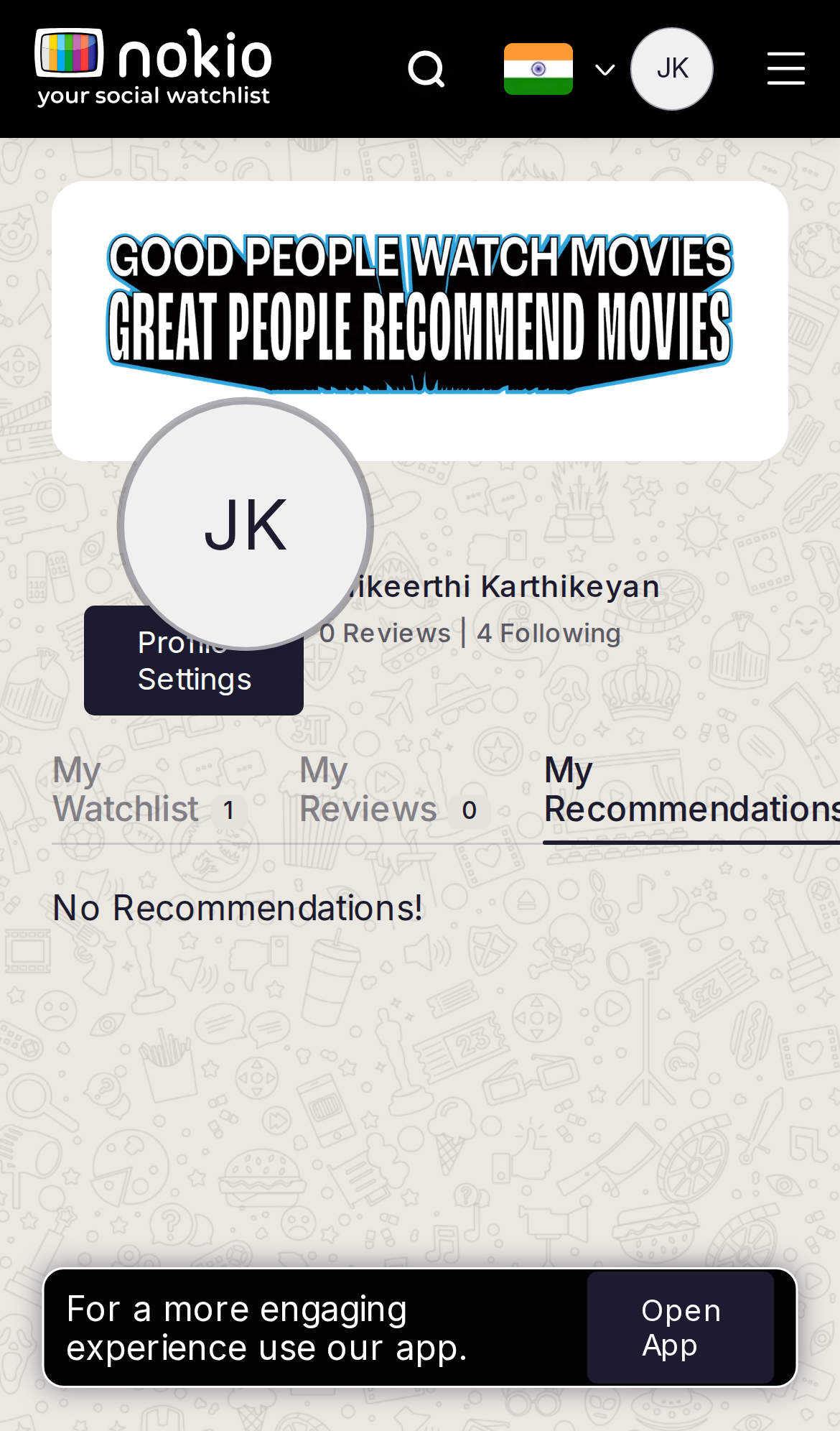
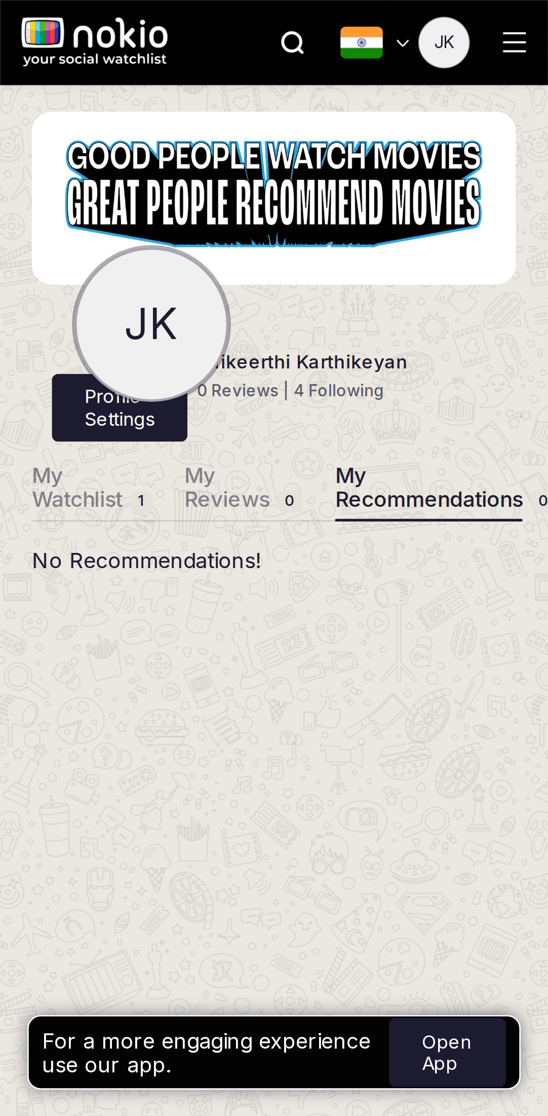
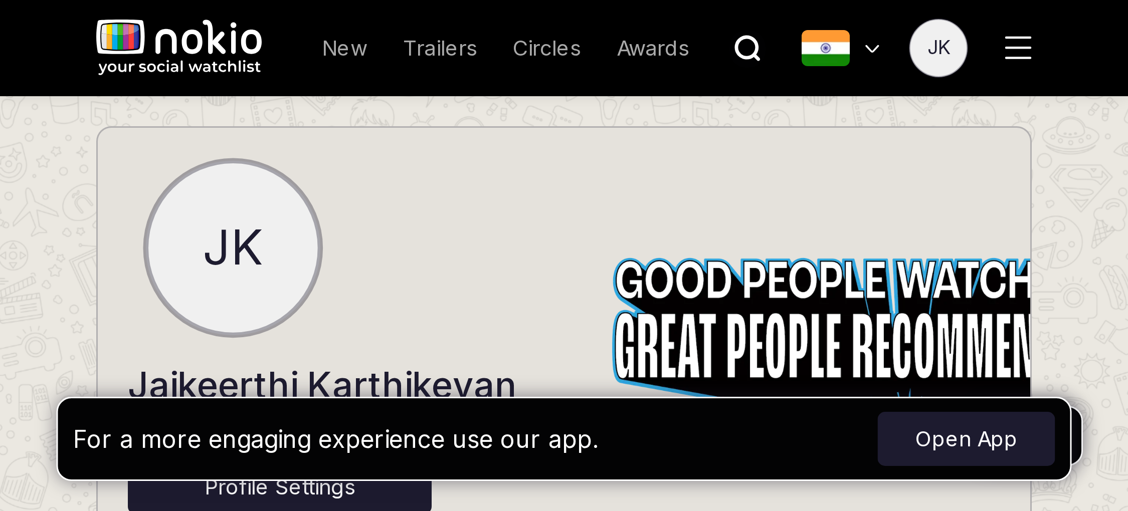
- P1“No Recommendations!” with no sent vs received. Open App covers the empty message.
UI elements on phone
- P1No Received/Sent control — one empty string. Open App covers it.
- P1Same profile chrome defects as Watchlist.
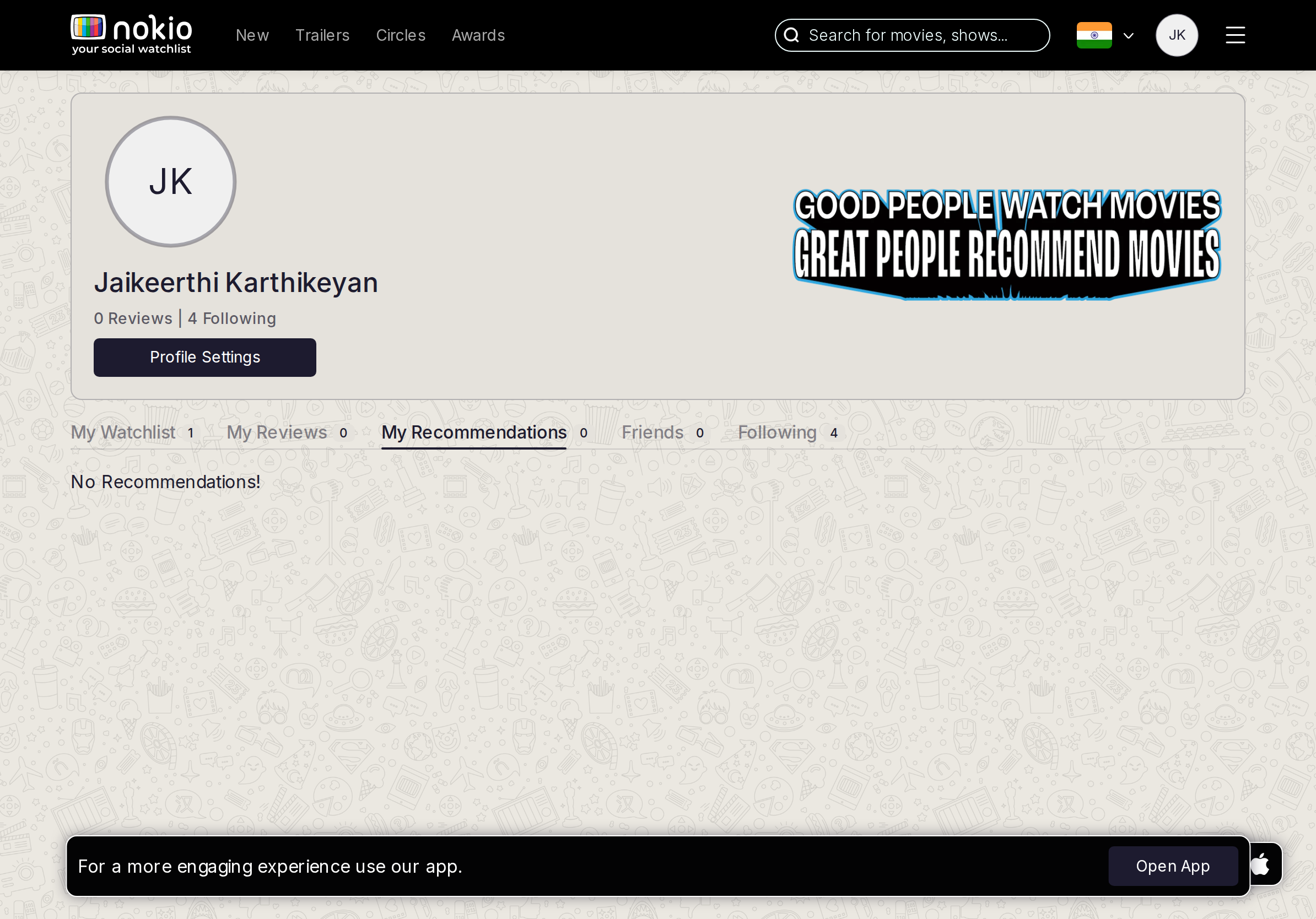
Gaps on tablet
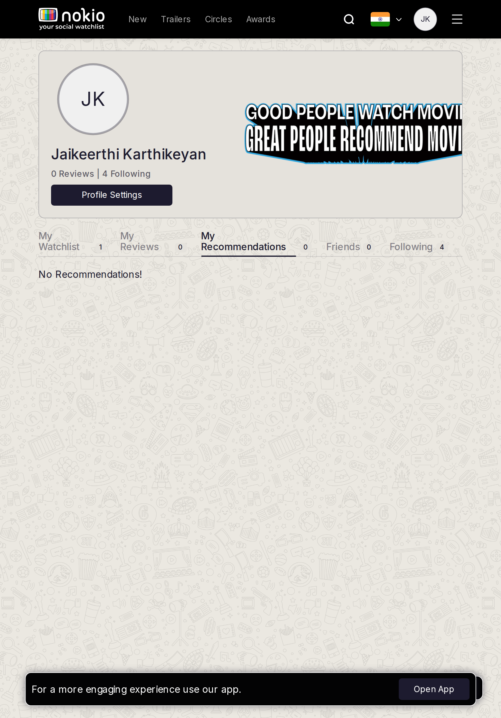
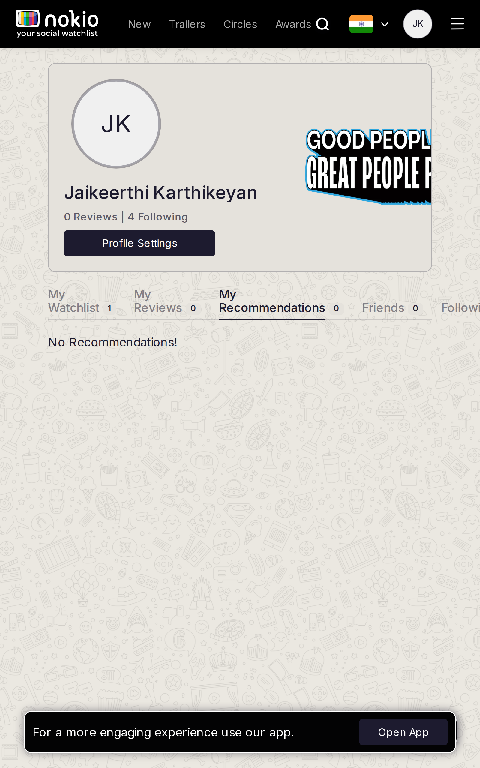
- P1Received | Sent sub-tabs. Explain how to send from a movie page.
UI elements on tablet
- P1Add sub-tabs as actual tabs, 44px.
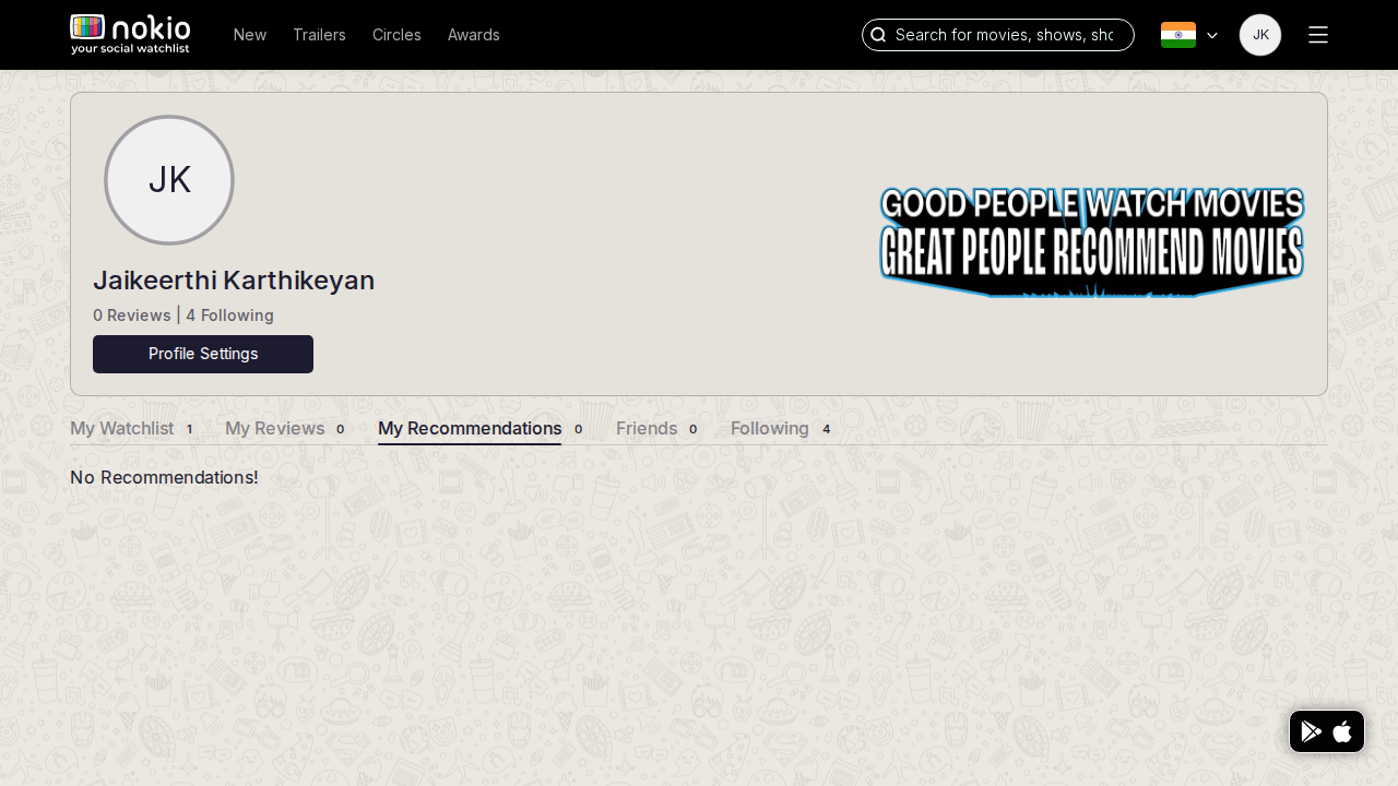
Gaps on desktop
- P1Same split. Empty received vs empty sent need different CTAs.
UI elements on desktop
- P1Same missing sub-tabs.
My friends
Job: Manage friends.
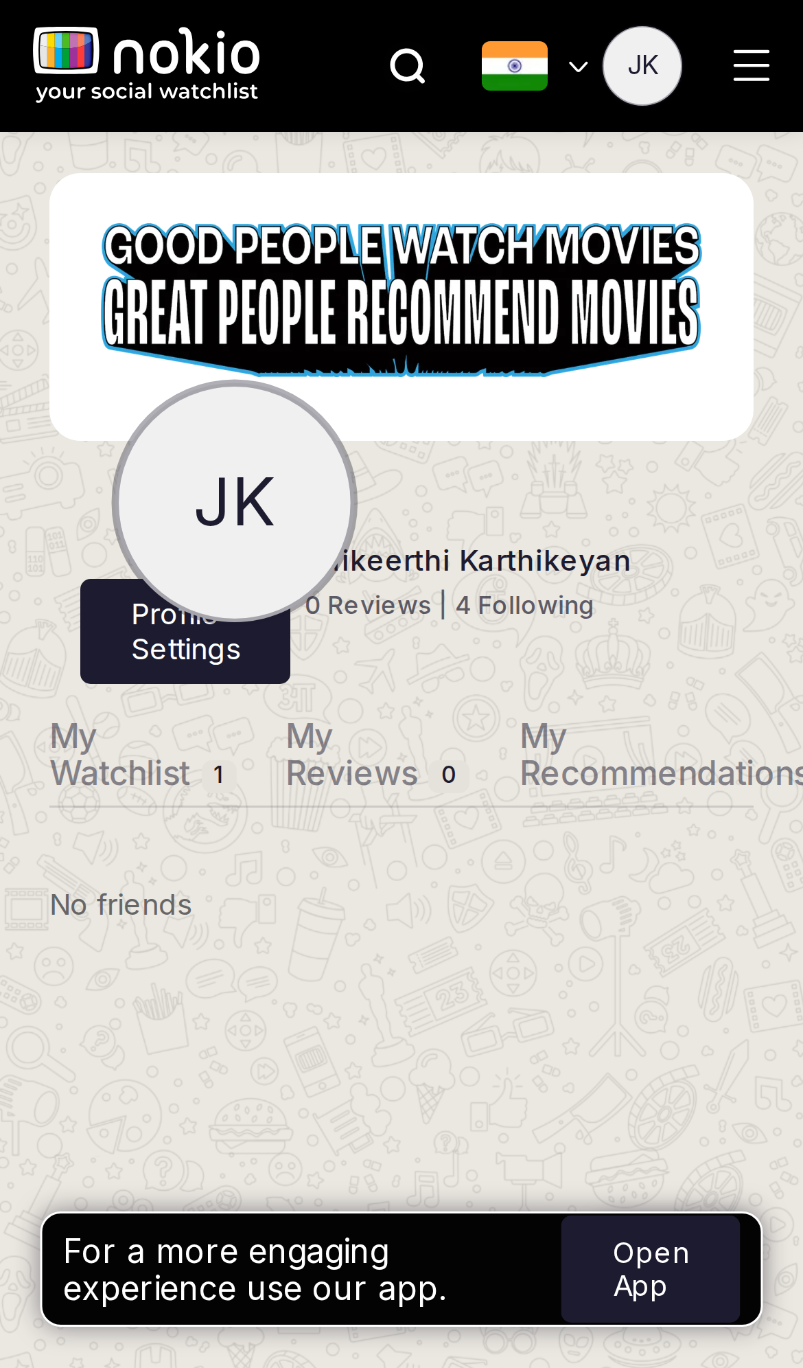
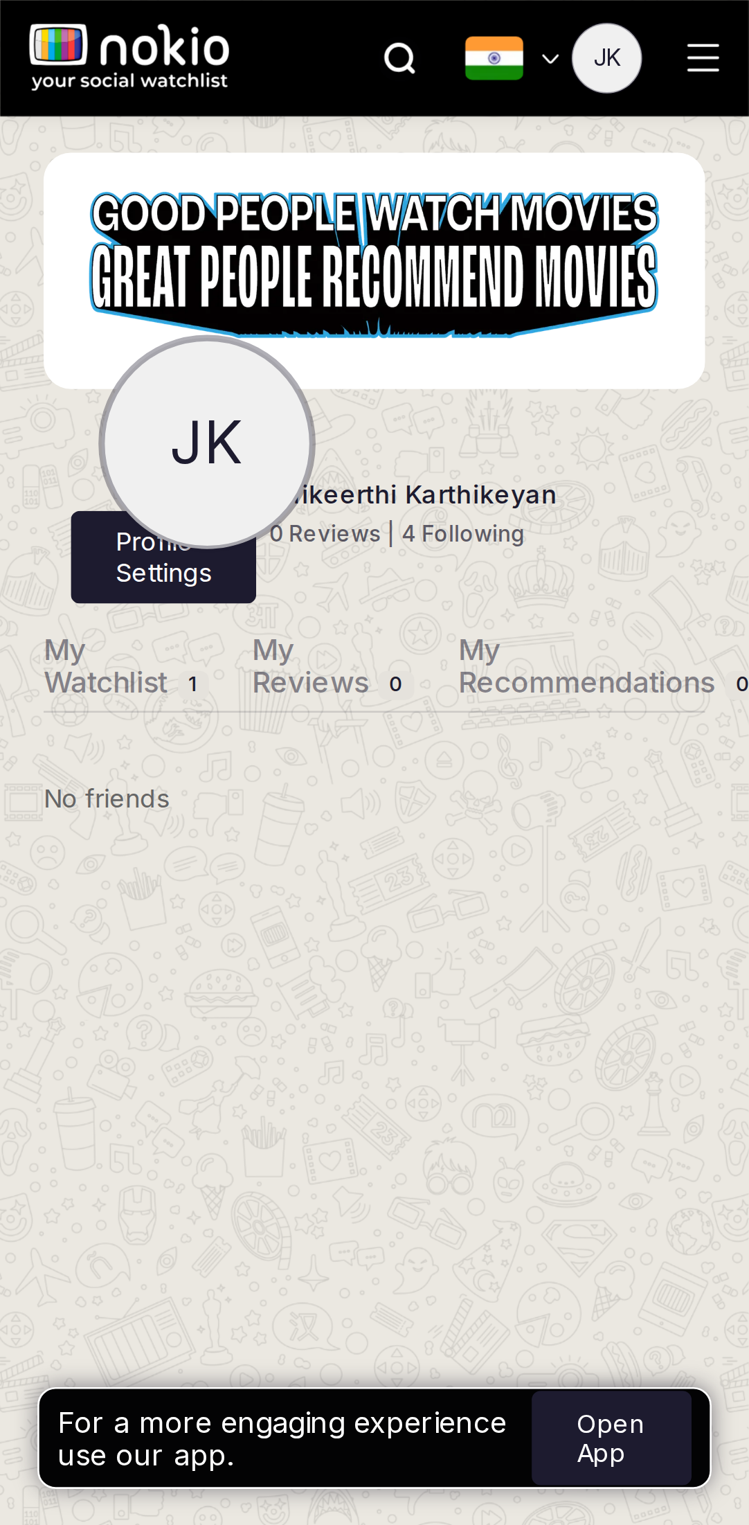
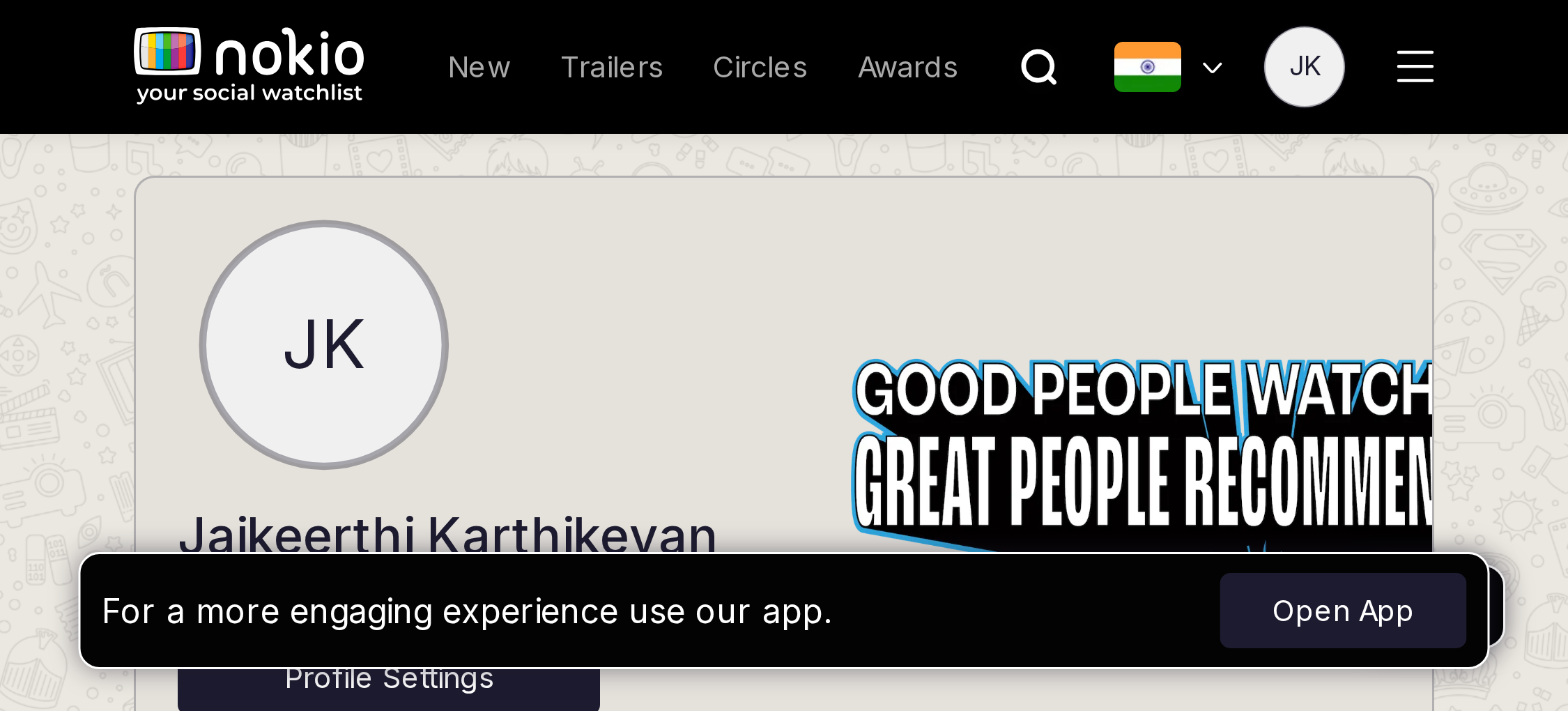
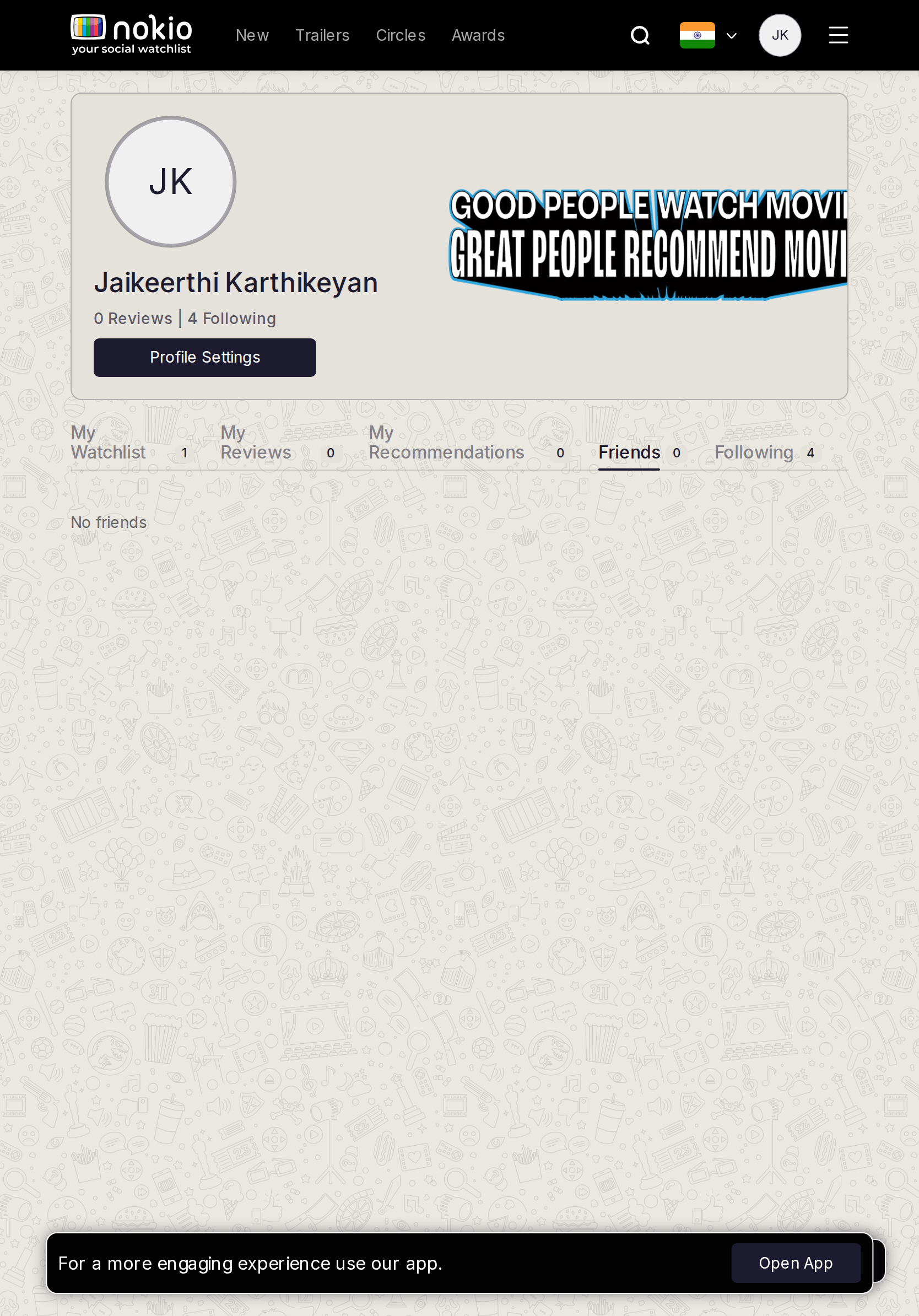
Gaps on phone
- P1Duplicate of Circles Friends. Deep-link Find friends. Open App on empty.
UI elements on phone
- P1No Find-friends field or button on the empty tab. Open App.
- P1Same header chrome.
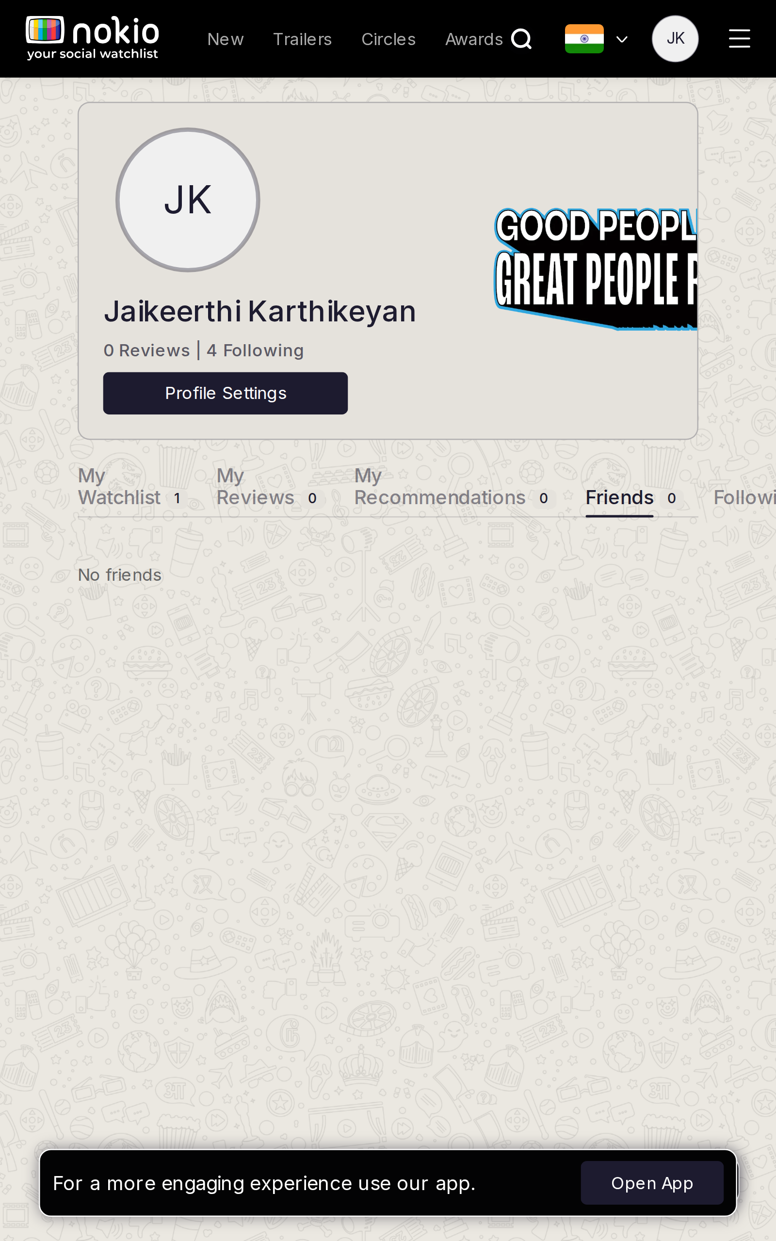
Gaps on tablet
- P1Same duplicate job.
UI elements on tablet
- P1CTA button that deep-links Circles search.
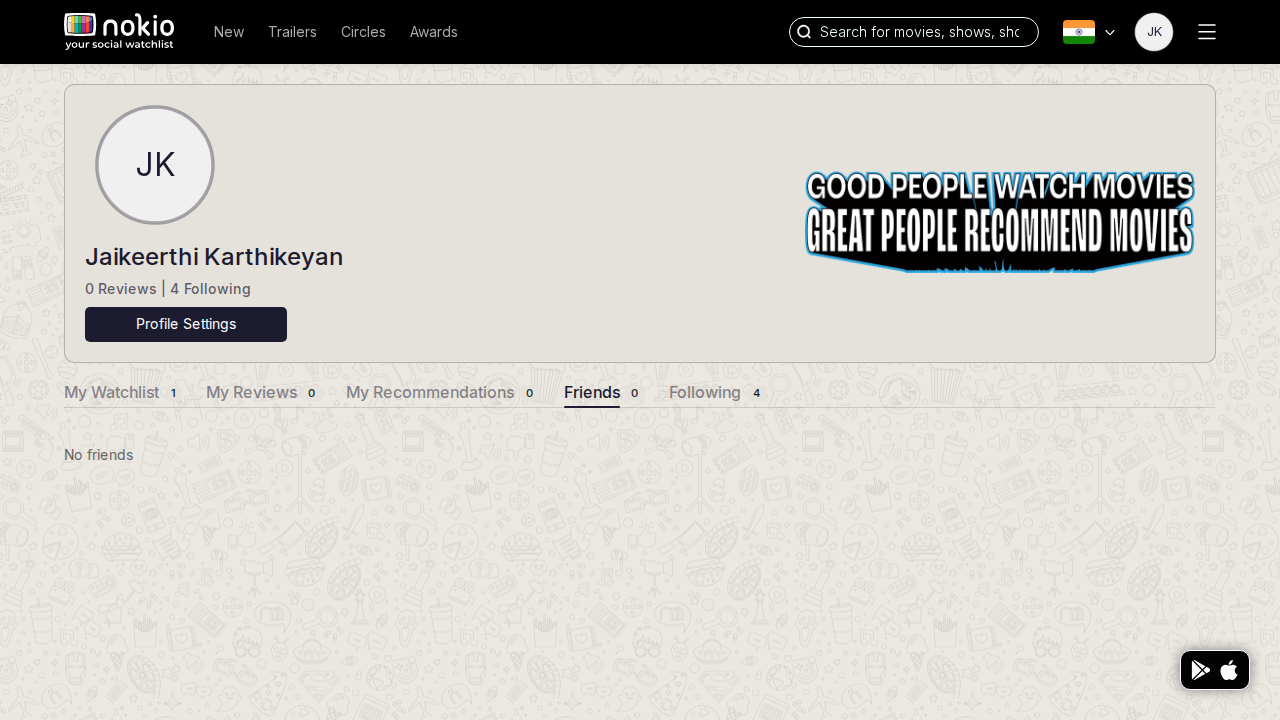
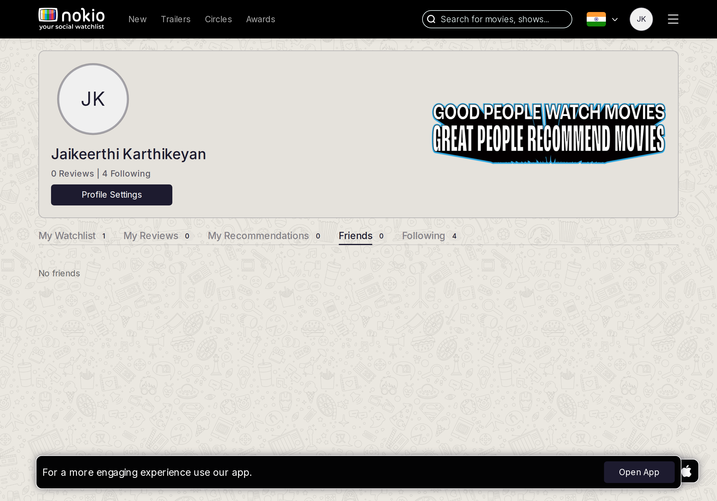
Gaps on desktop
- P1Don’t maintain two empty rooms for the same graph.
UI elements on desktop
- P1Same missing CTA.
My followings
Job: See who I follow.
Gaps on phone
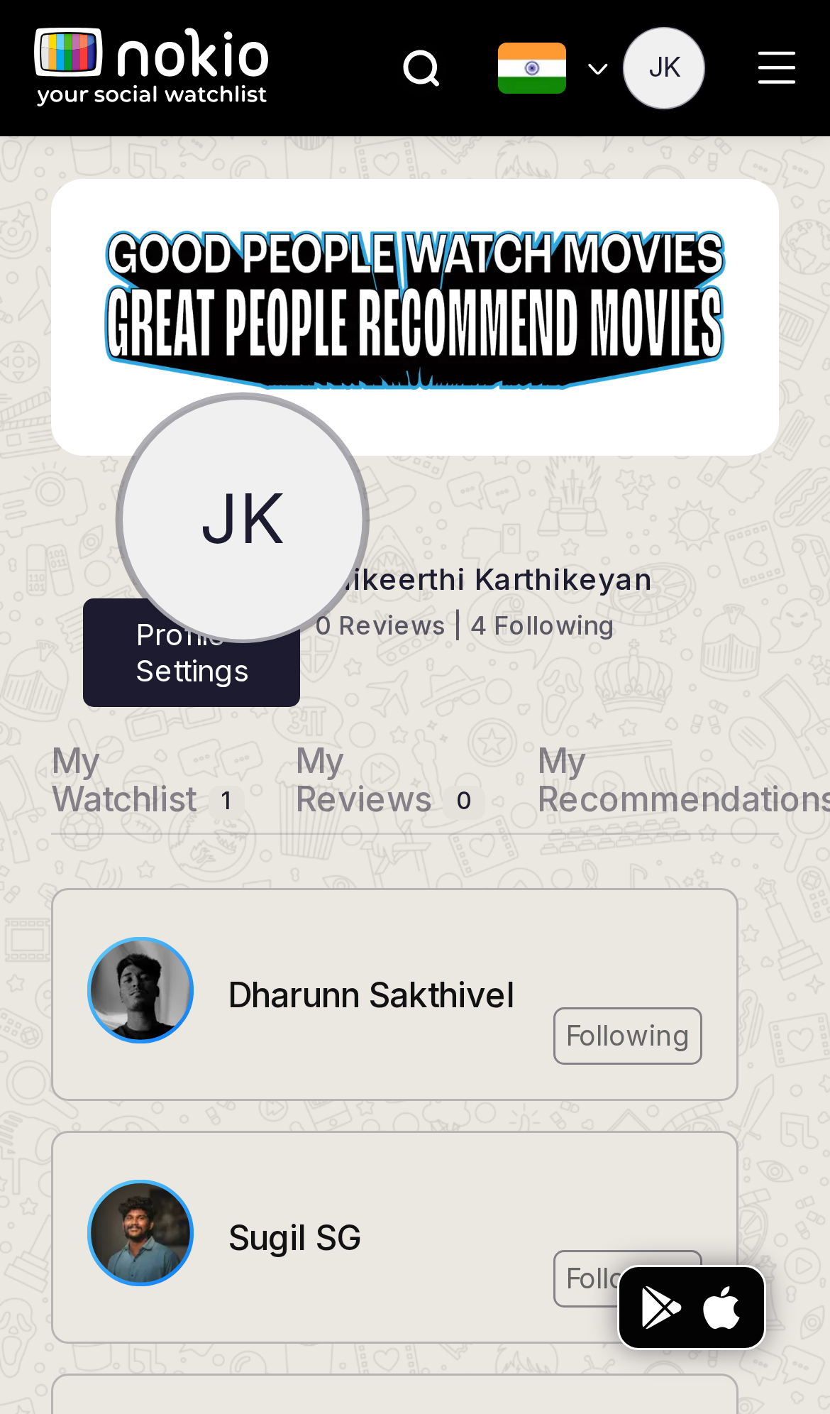
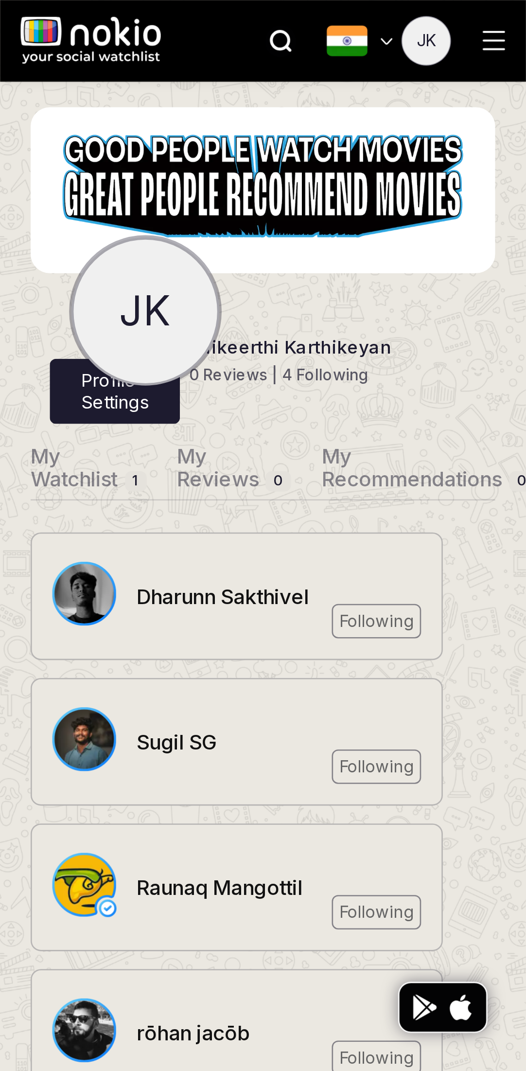
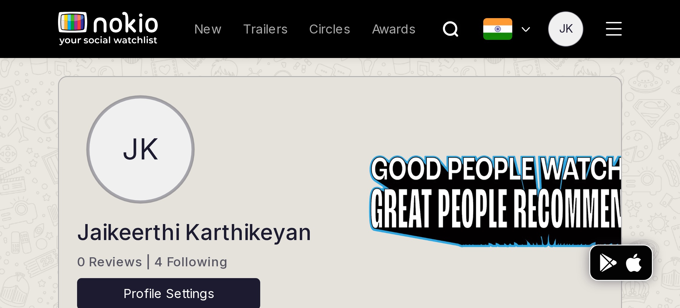
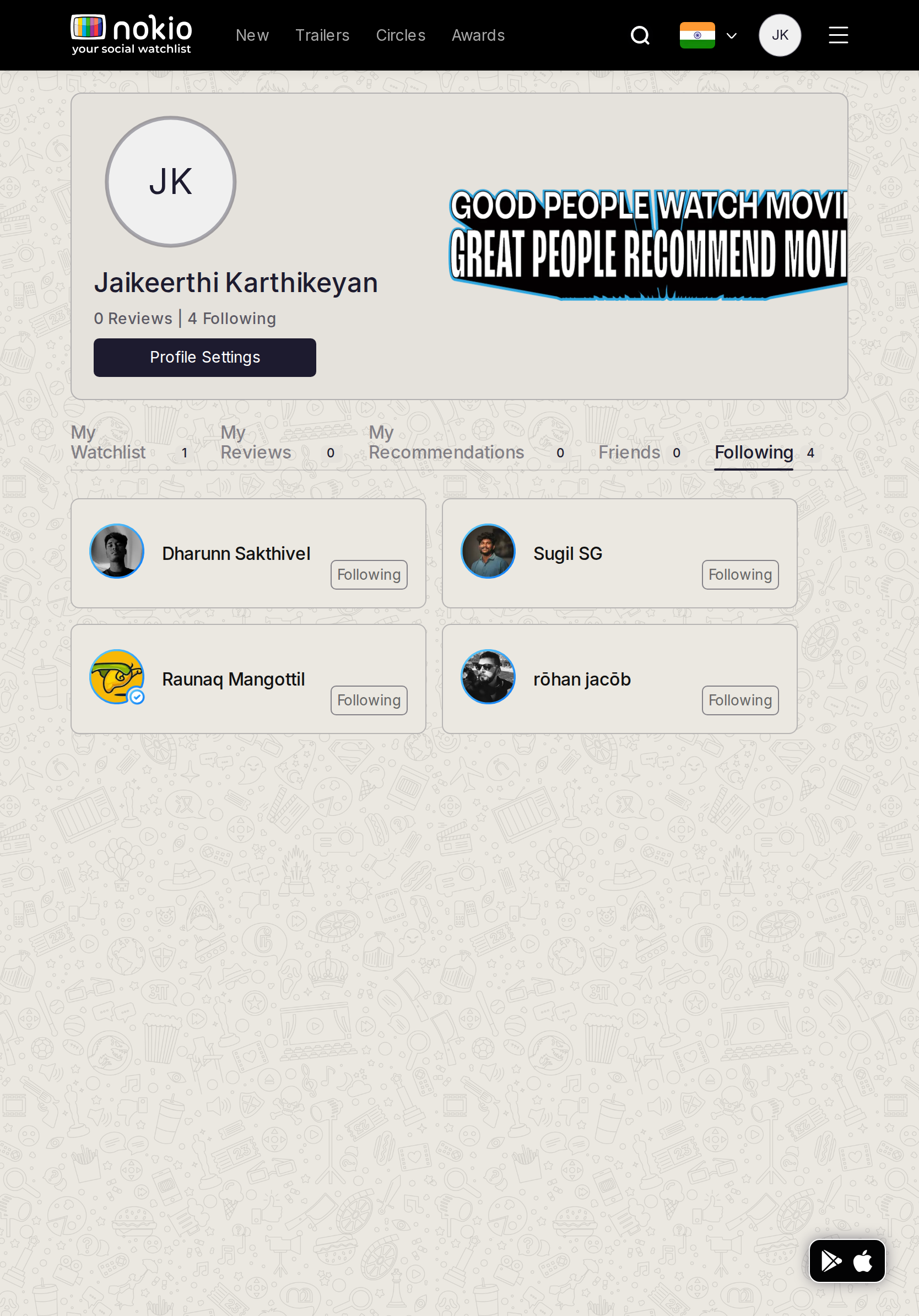
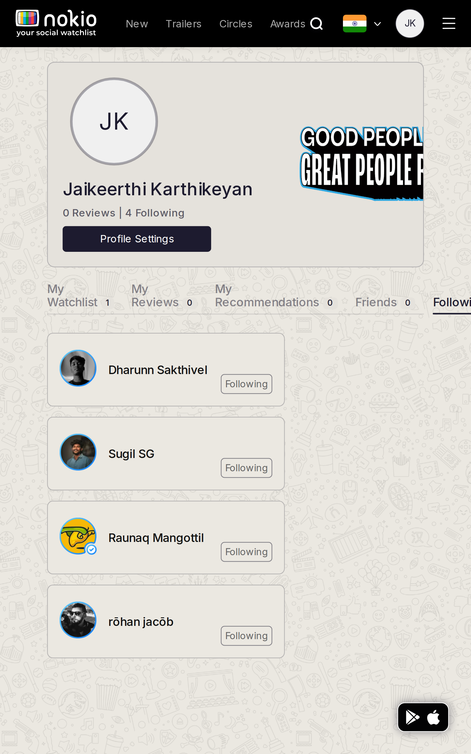
- P0List is populated (4 people) — the success to copy. Header still collides. Following button <44px.
UI elements on phone
- P0Following button on each row is shorter than 44px and easy to mis-tap next to the name.
- P0Same overlapping Settings + clipped tabs.
- P1Open App covers the last row.
Gaps on tablet
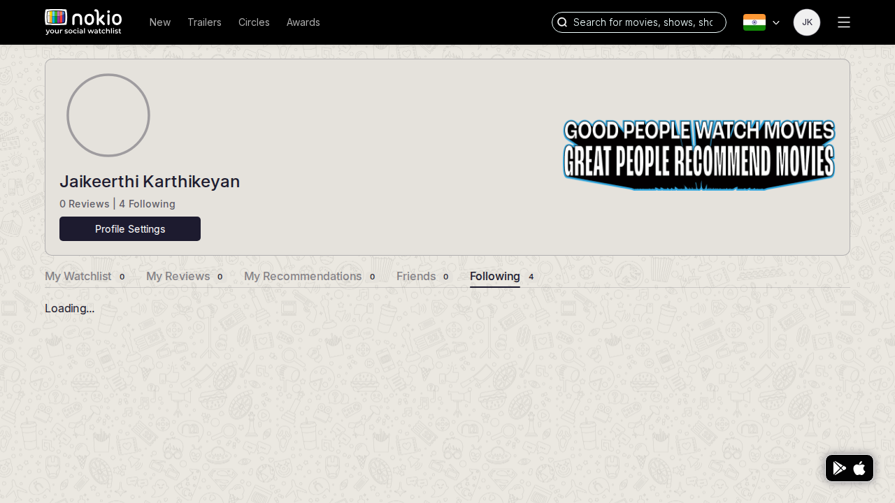
- P1Same list, more room. Don’t flash a doodle while loading.
UI elements on tablet
- P1Following buttons still compact. Avatar row is the pattern to copy onto Circles.
Gaps on desktop
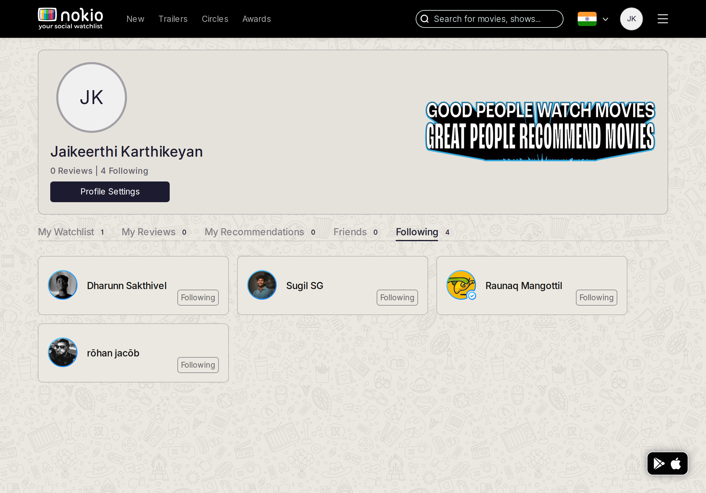
- P1One data source with Circles → Following.
UI elements on desktop
- P2Following button + name + avatar. No overflow menu (unfollow confirm).
Edit profile
Job: Update name, photo, contact.
Gaps on phone
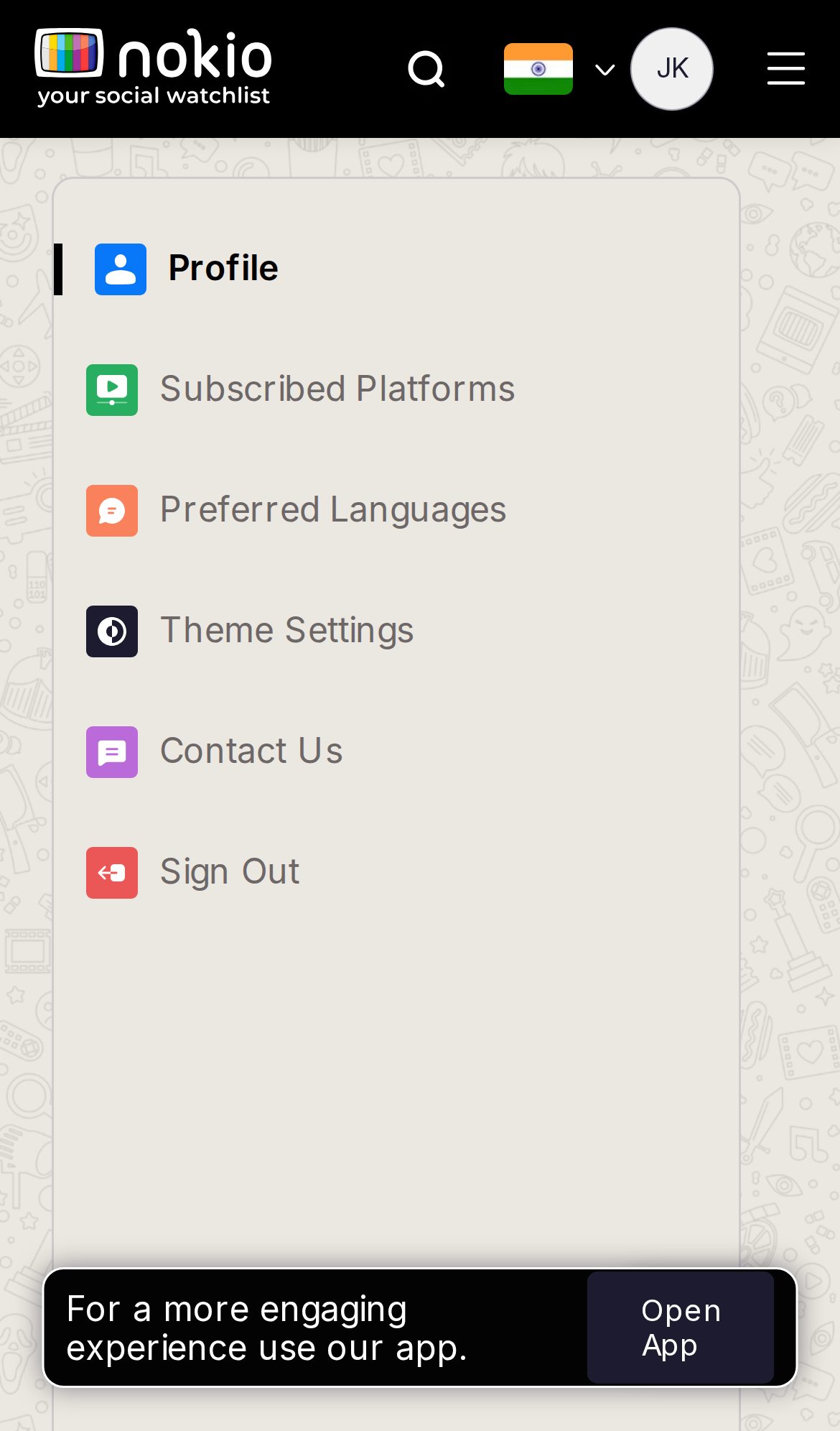
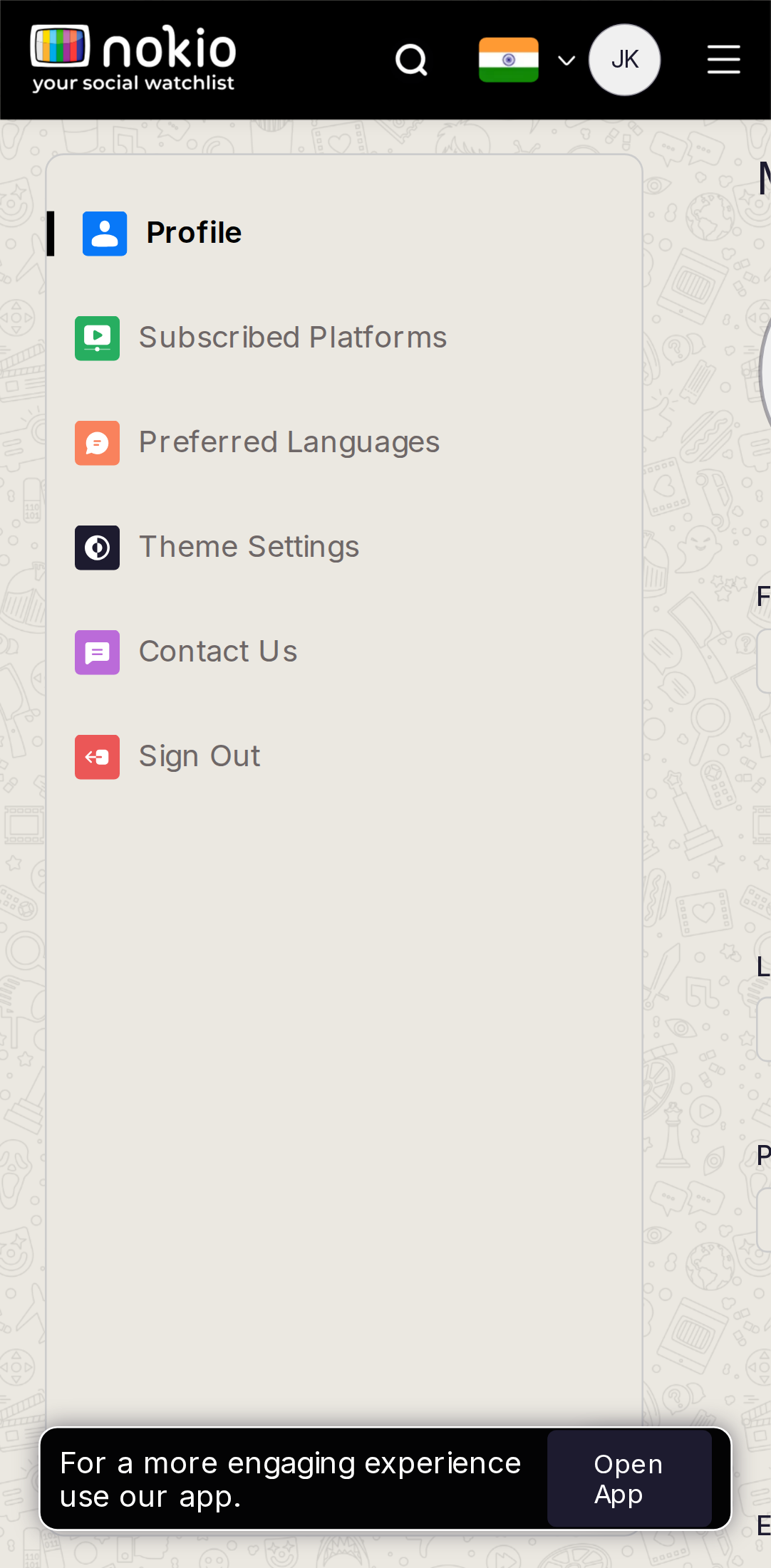
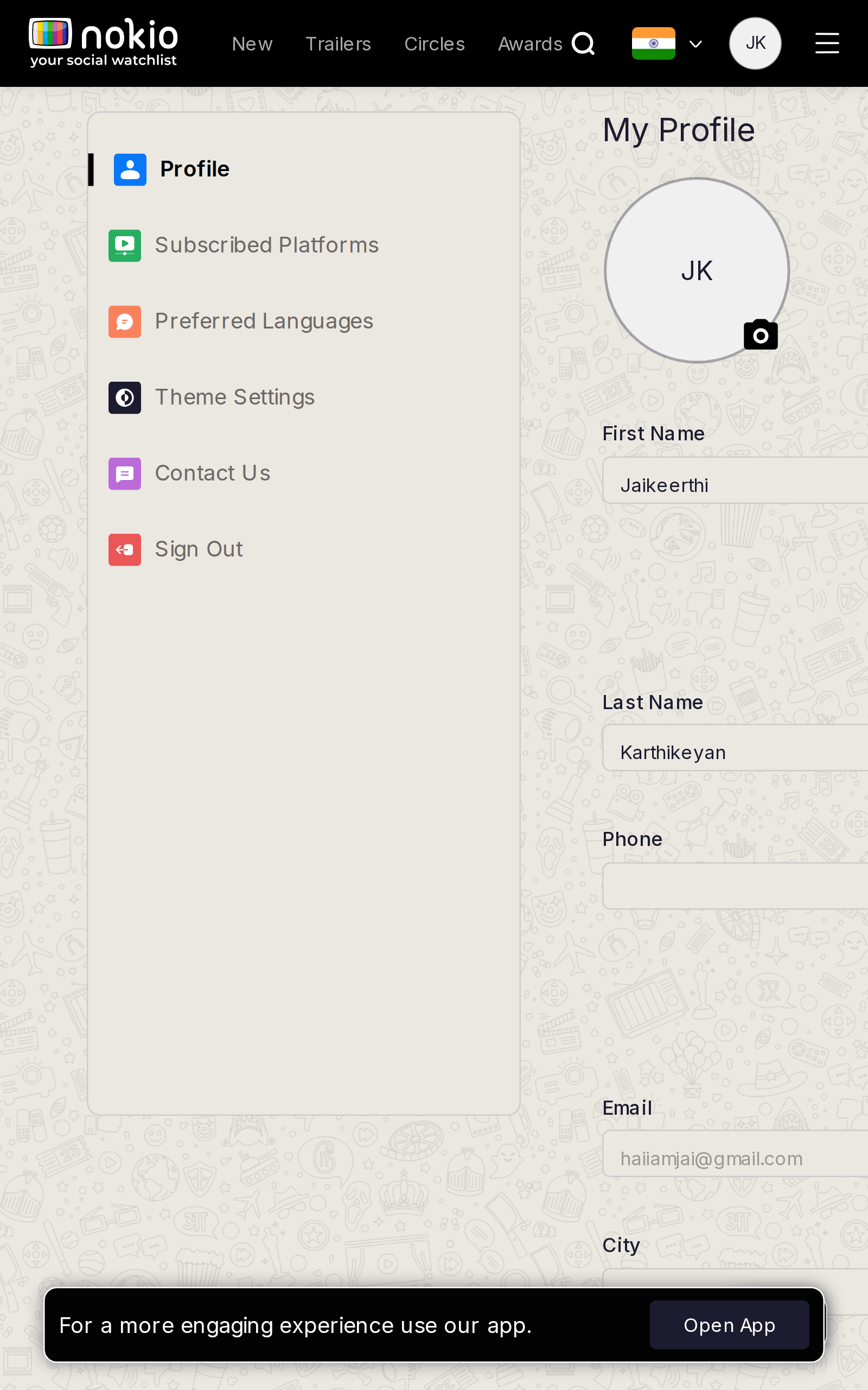
- P0First screen is ONLY the settings sidebar. Form is not in the fold.
- P0Open App covers Sign Out. Theme/Contact look live; they’re not.
UI elements on phone
- P0Sidebar rows (Profile, Platforms, Languages, Theme, Contact, Sign Out) are the only controls in the fold — colored icon tiles + grey labels (low contrast).
- P0Theme and Contact look tappable/live; they are not.
- P0Sign Out is a red-icon row with no confirm. Open App covers it.
- P0The actual form (name, photo, Save) is off-screen.
Gaps on tablet
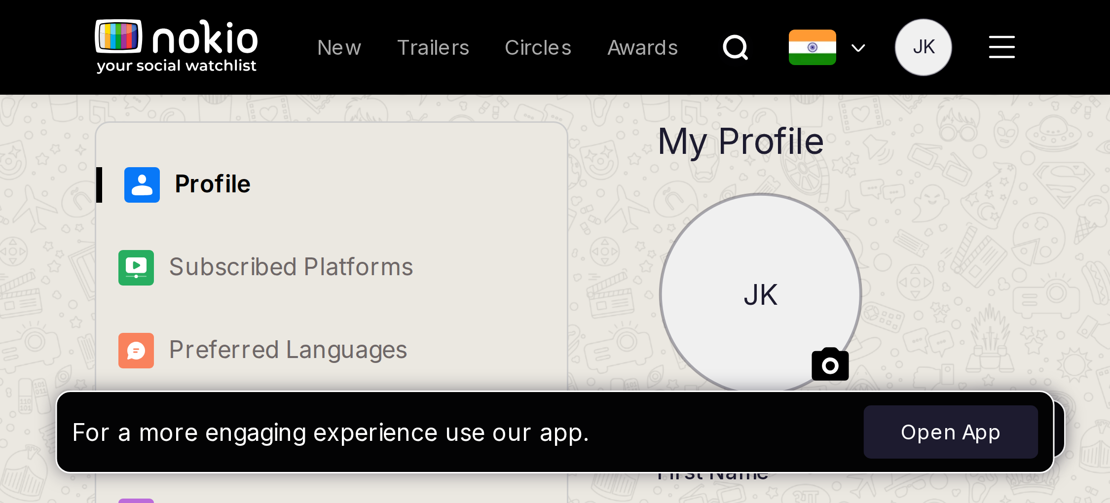
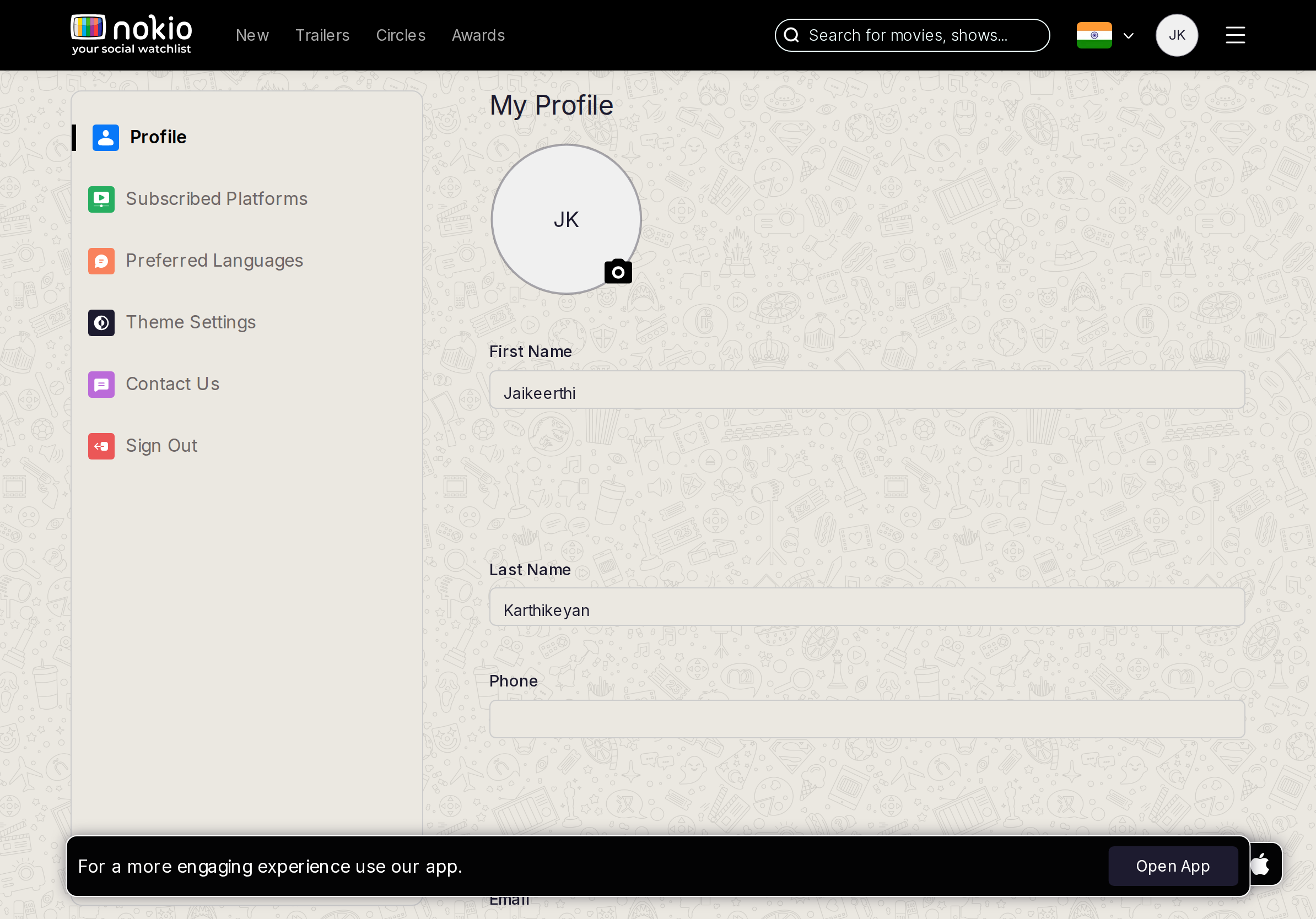
- P0iPad/Tab still lead with the sidebar card. Form first, sections in a select.
UI elements on tablet
- P0Sidebar card still dominates. Need a select/segment for sections + form.
- P1Open App on iPad.
Gaps on desktop
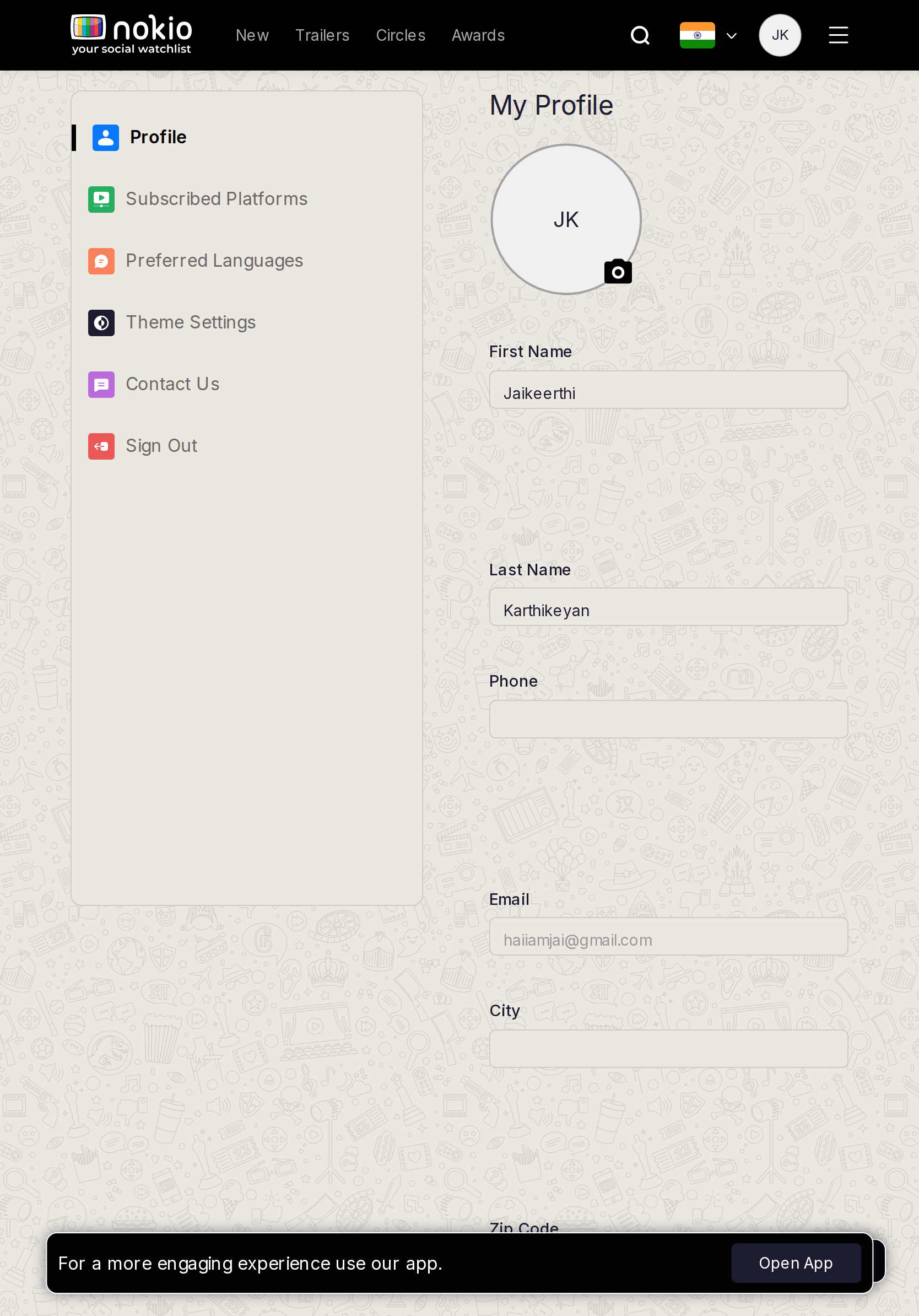
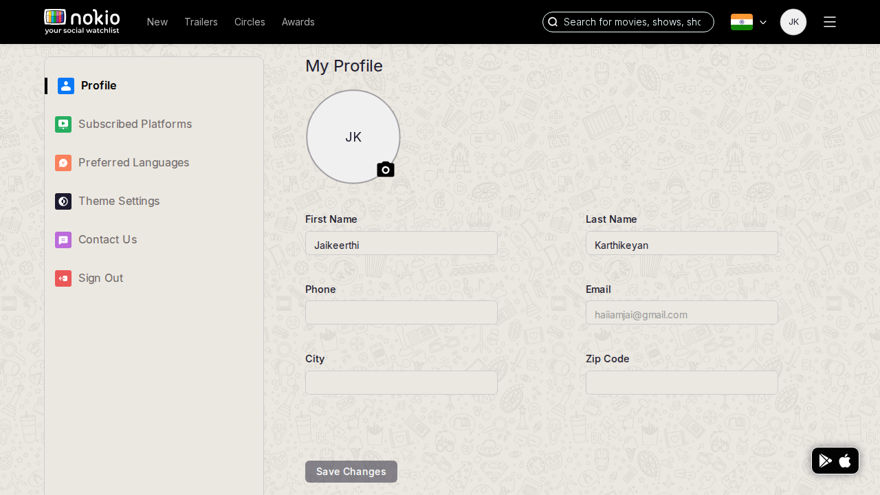
- P1Huge gutter; Save tucked bottom-left. Max-width ~720px, sticky Save. Mark Theme/Contact as coming soon.
UI elements on desktop
- P1First/Last fields stretch the full rail. Save is a small bottom-left button, not sticky.
- P1Theme/Contact in the sidebar have no “Coming soon” on the row.
- P2Sign Out in the sidebar vs hamburger — two exits.
Edit platforms
Job: Set streaming services I use.
Gaps on phone
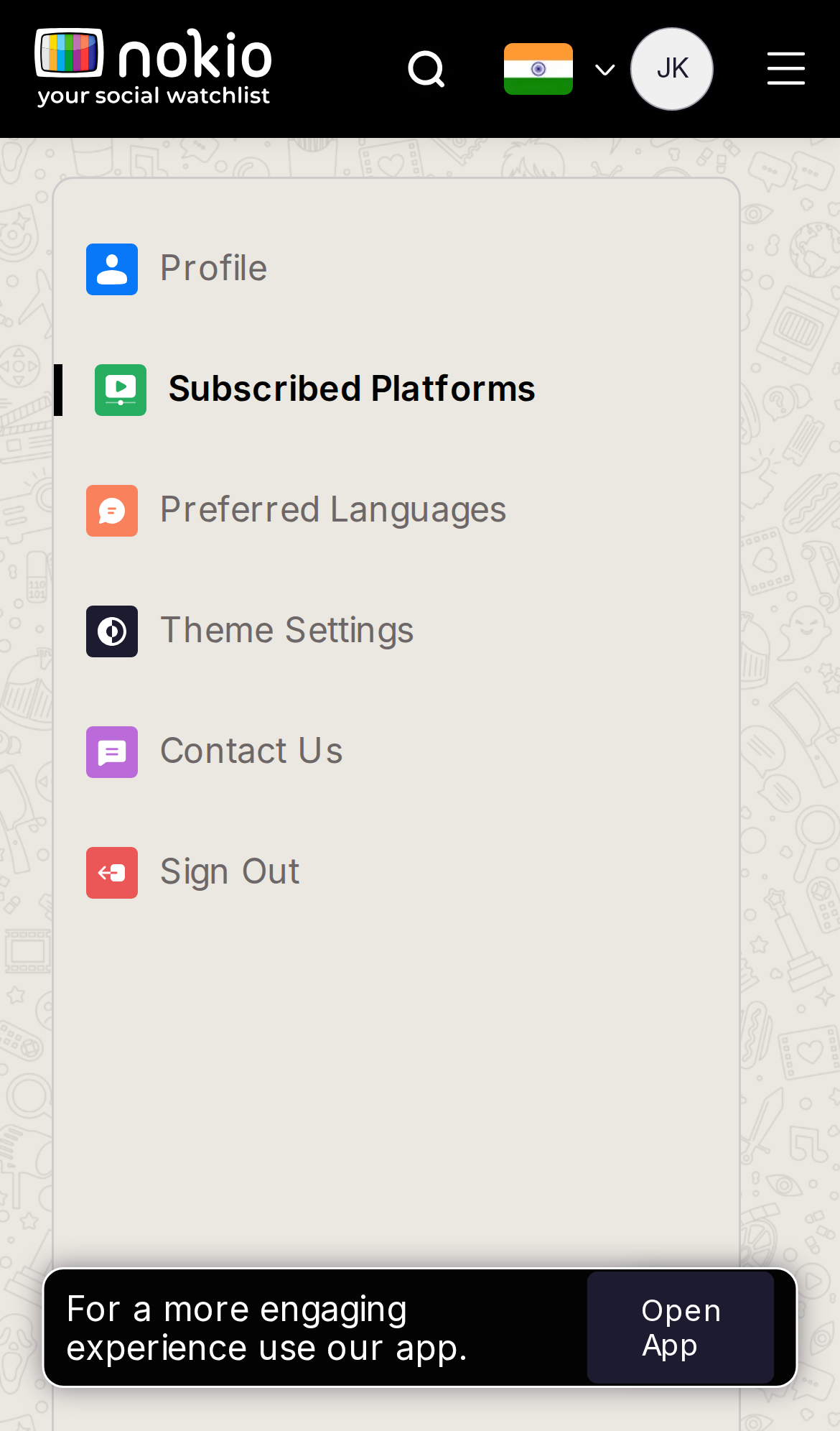
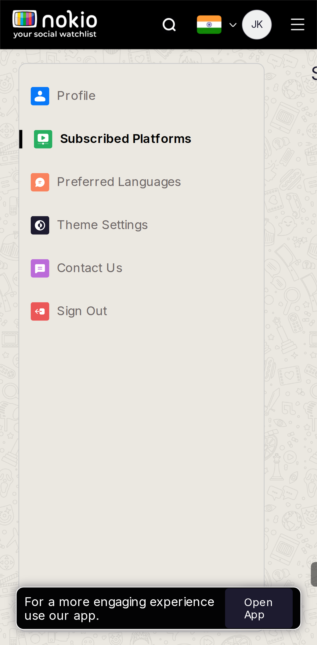
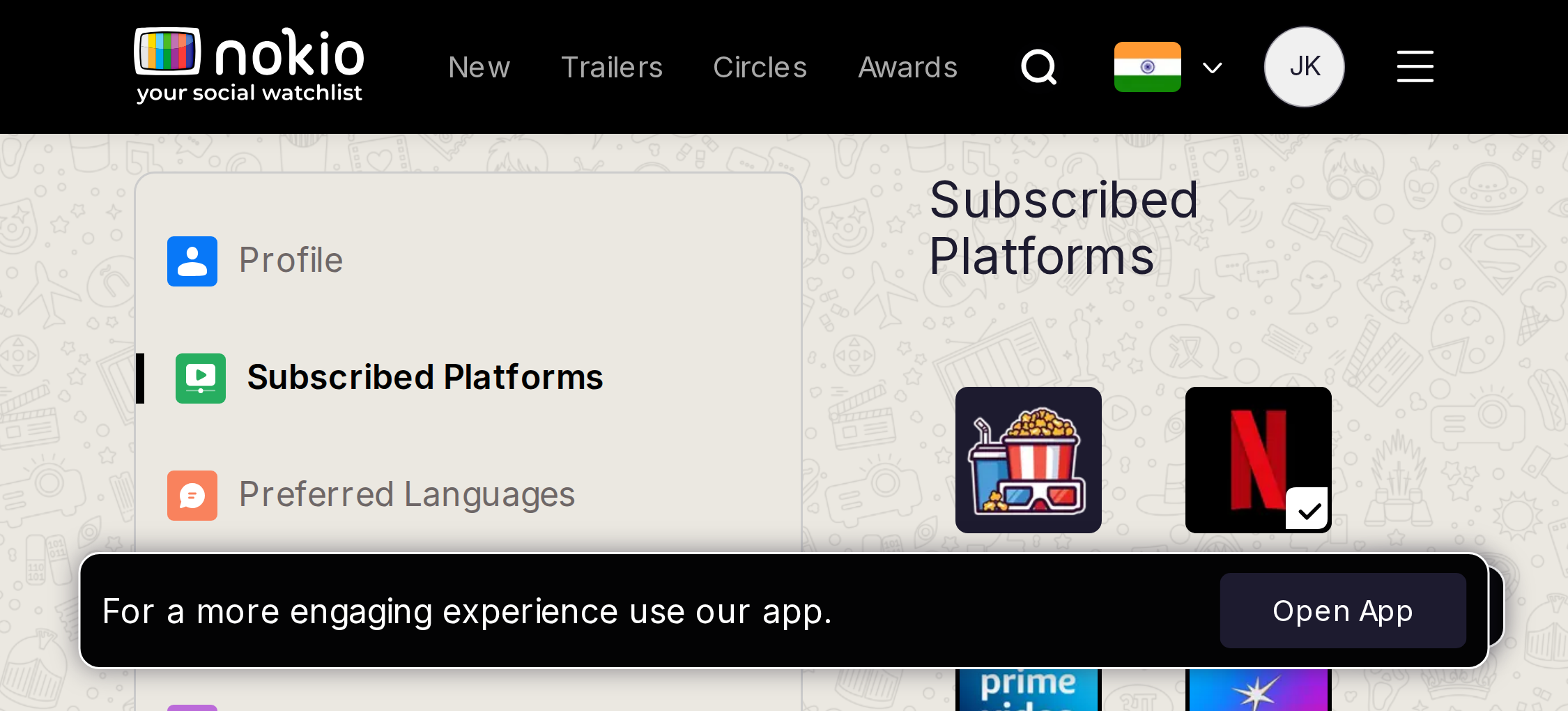
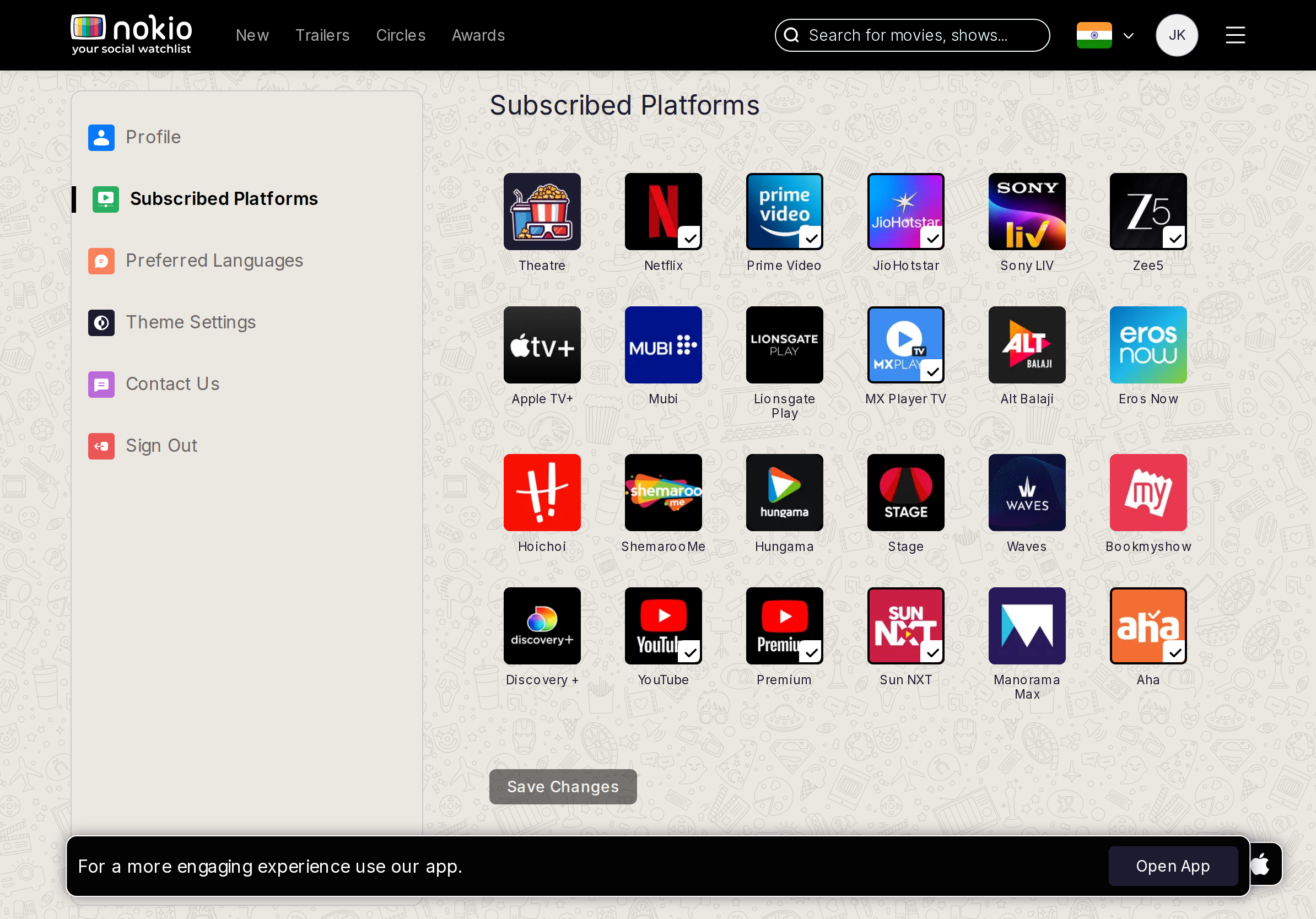
- P0Sidebar first, grid not visible. 3–4 col checkboxes at 44px. Caption: these filter Home.
UI elements on phone
- P0Same sidebar-first. Checkbox grid not in the fold. Need 44px checkboxes, 3–4 columns, then Save.
- P0Open App.
Gaps on tablet
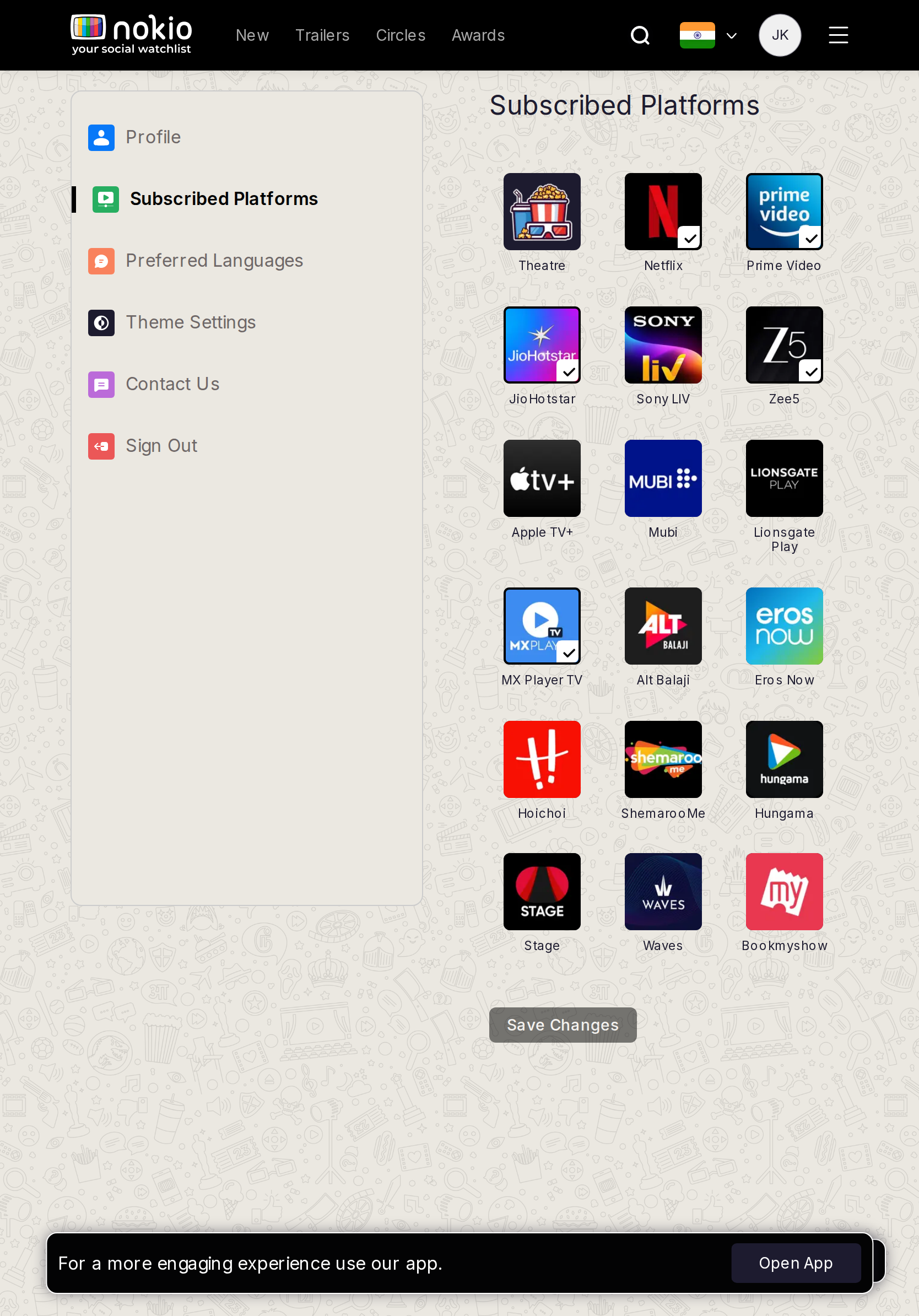
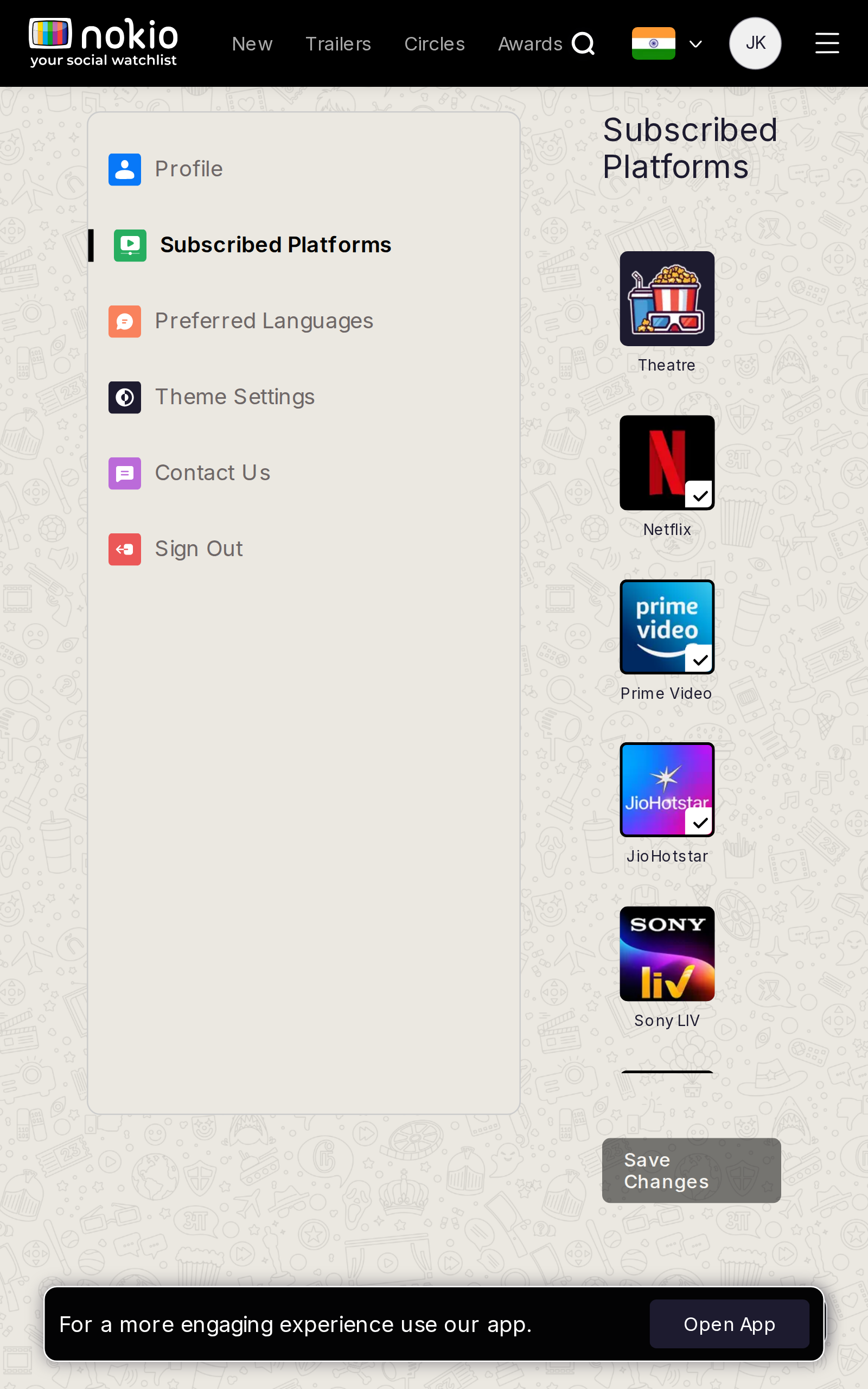
- P0Grid first. Home still showed a long public strip — this set must actually filter.
UI elements on tablet
- P0Show the checkbox grid first. Save sticky.
Gaps on desktop
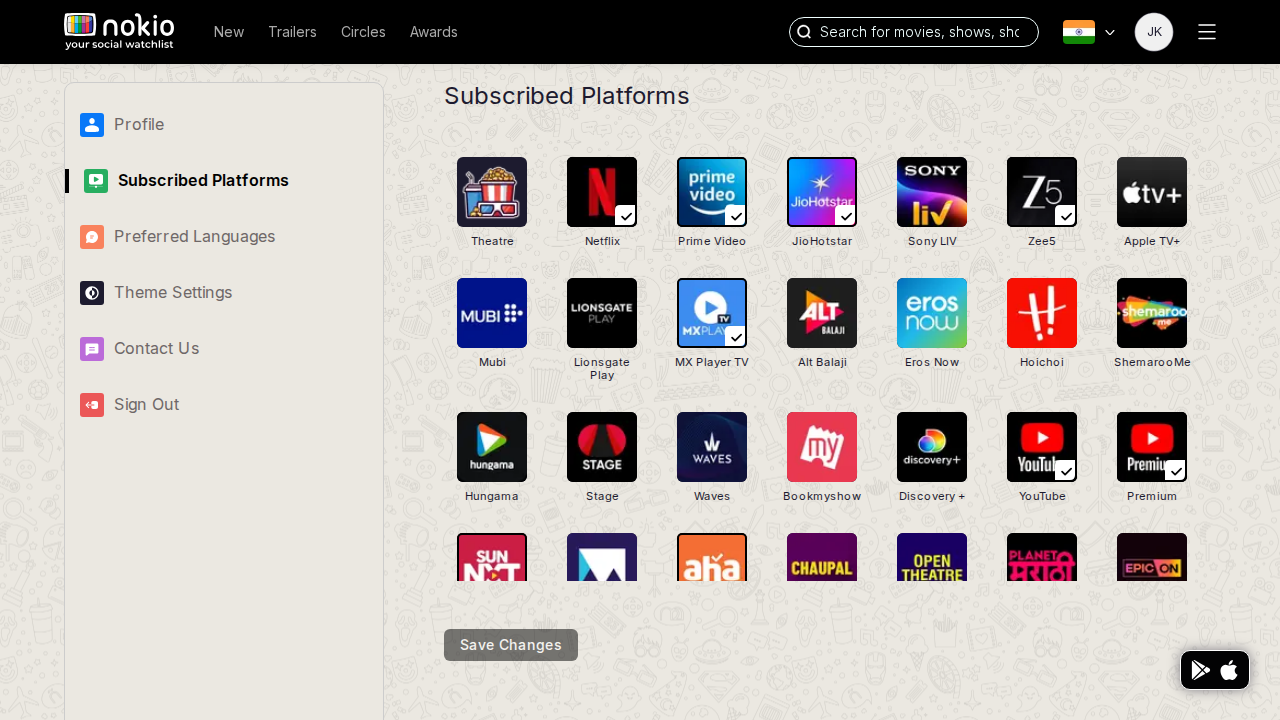
- P2Fill ragged last rows. Sticky Save. Home chips = this preference set.
UI elements on desktop
- P2Uneven last row of logos. Save bottom-left. No “these filter Home” caption on the control.
Edit languages
Job: Set preferred languages.
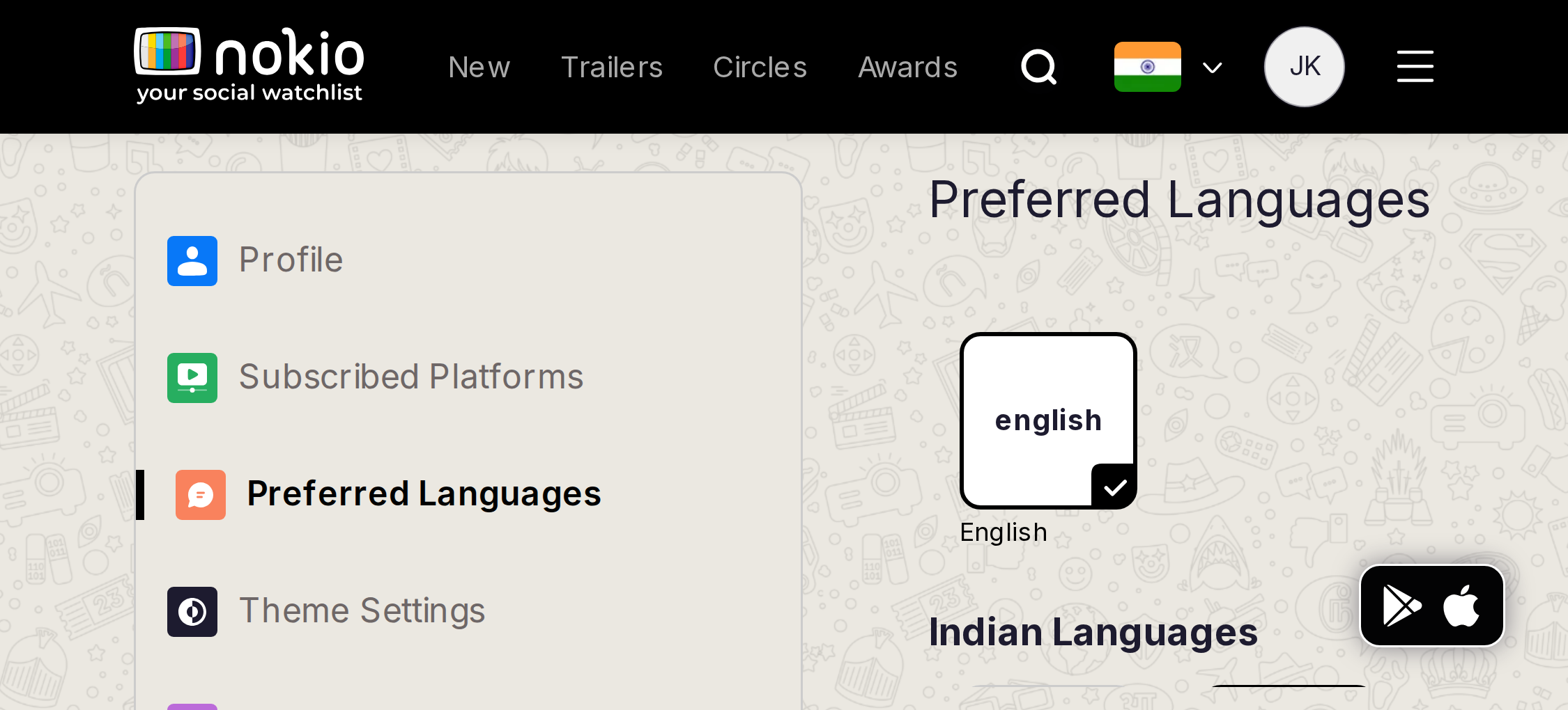
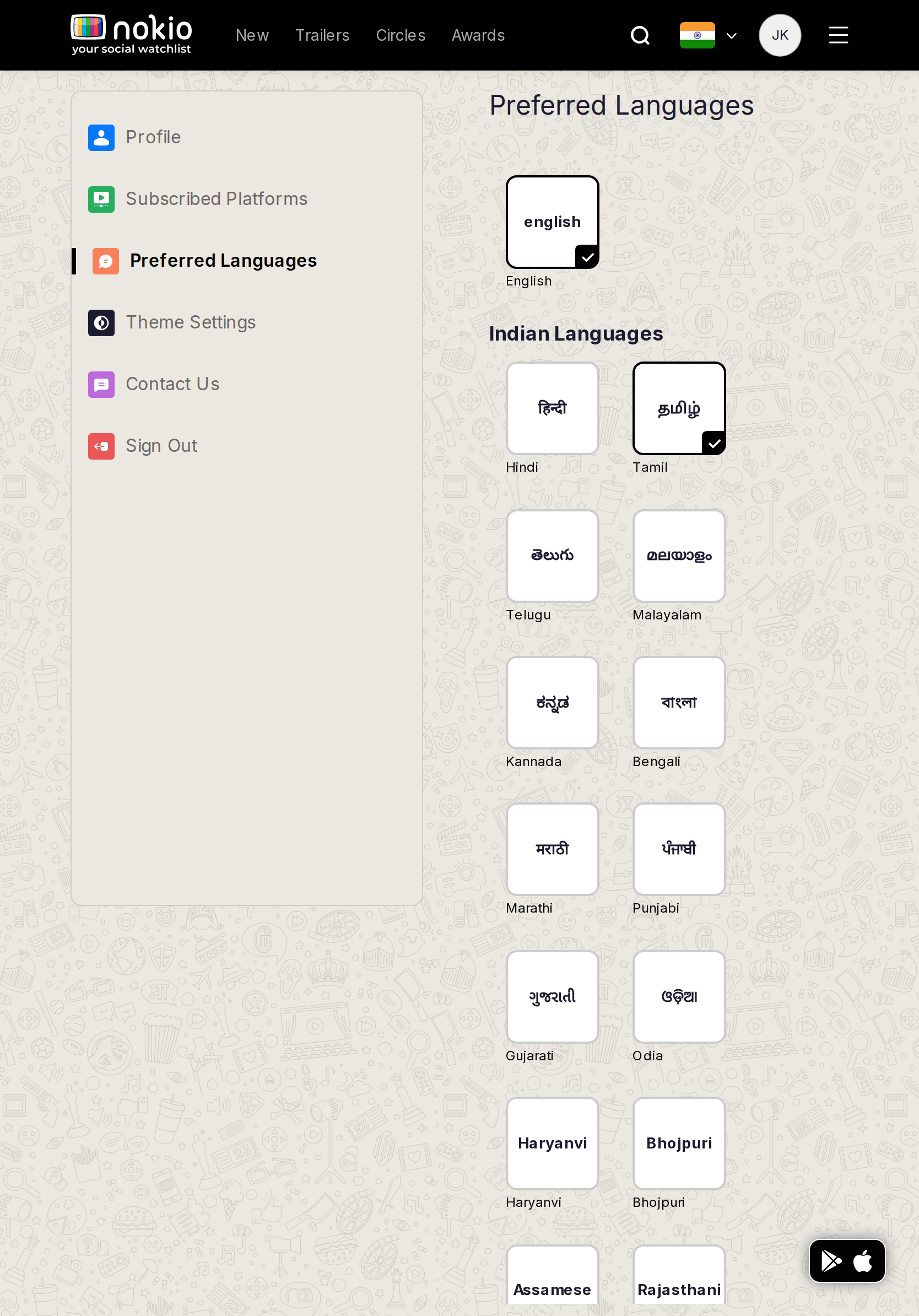
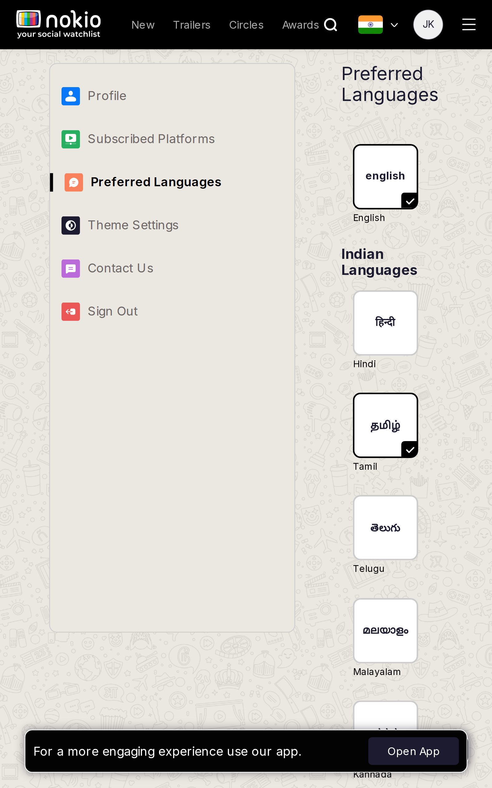
Gaps on phone
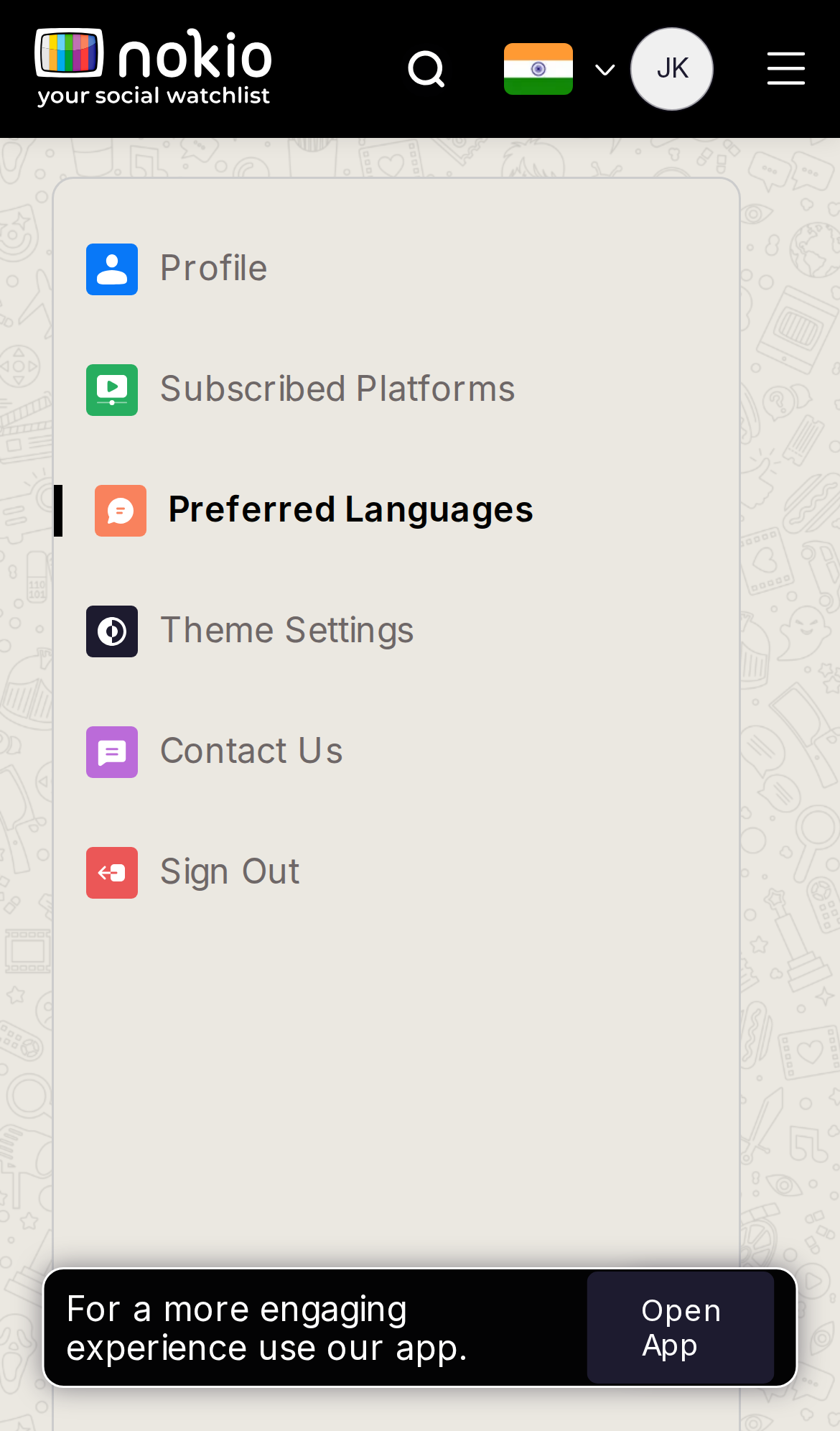
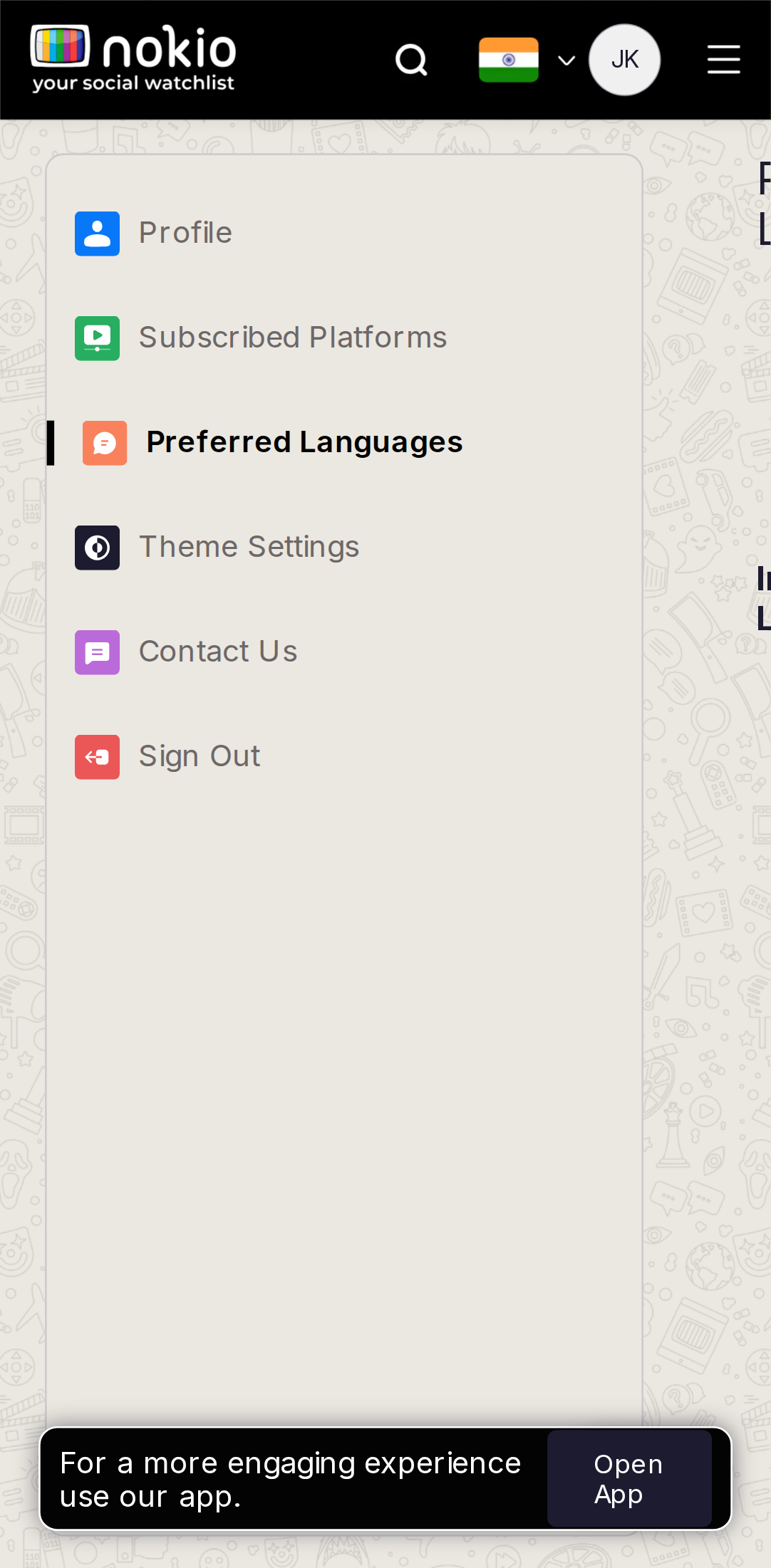
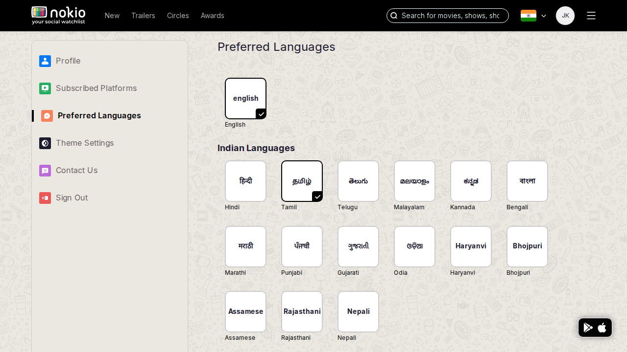
- P0Same sidebar-first. Caption: used on Home (English + Tamil already are).
UI elements on phone
- P0Same sidebar. Language checkboxes/chips not visible. Open App.
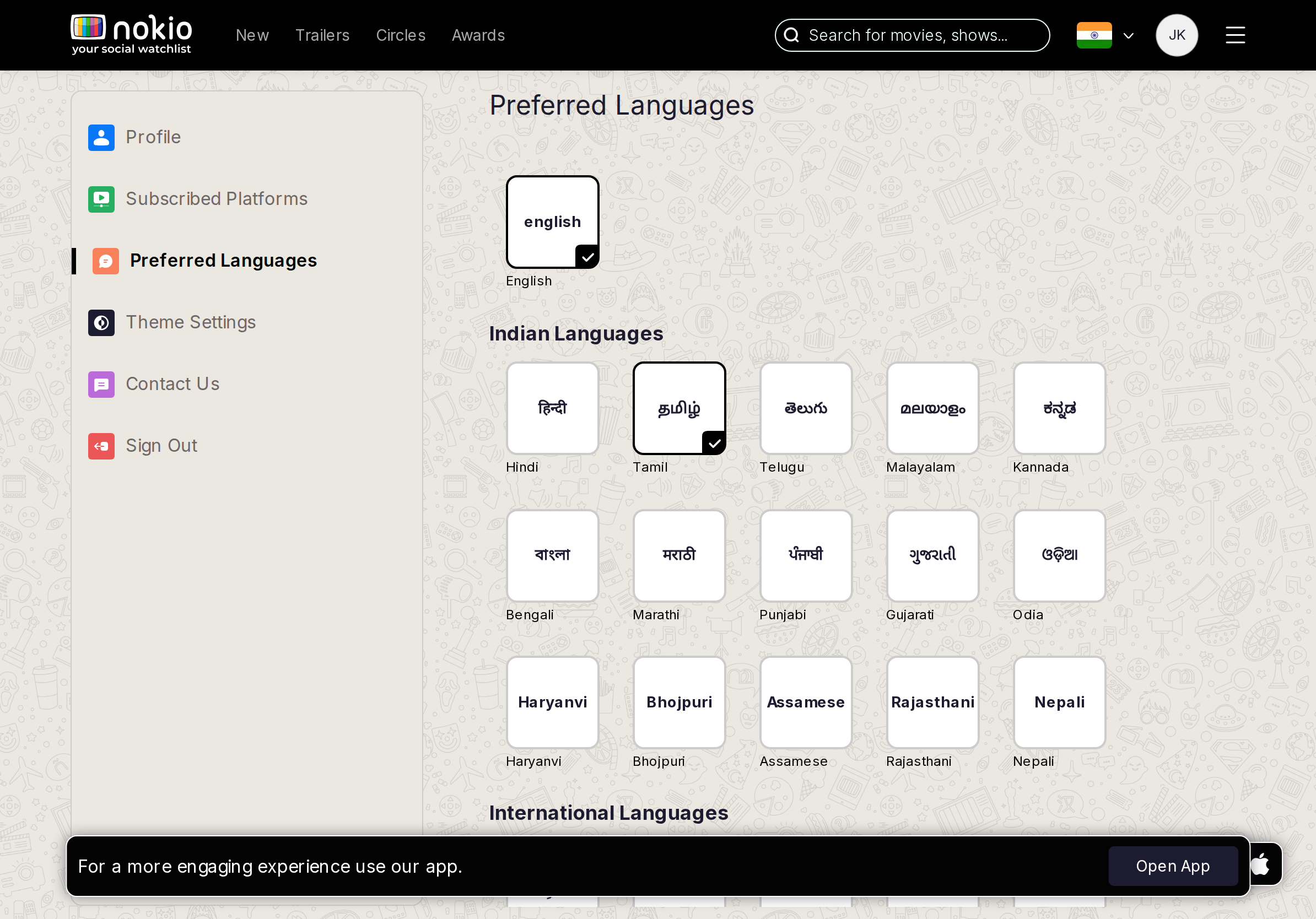
Gaps on tablet
- P0Form first.
UI elements on tablet
- P0Form/chips first.
Gaps on desktop
- P2Unlabeled source of truth for Home chips.
UI elements on desktop
- P2Language list unlabeled vs Home’s English/Tamil chips.
Movie reviews
Job: Decide whether to watch, and write a review.
Gaps on phone
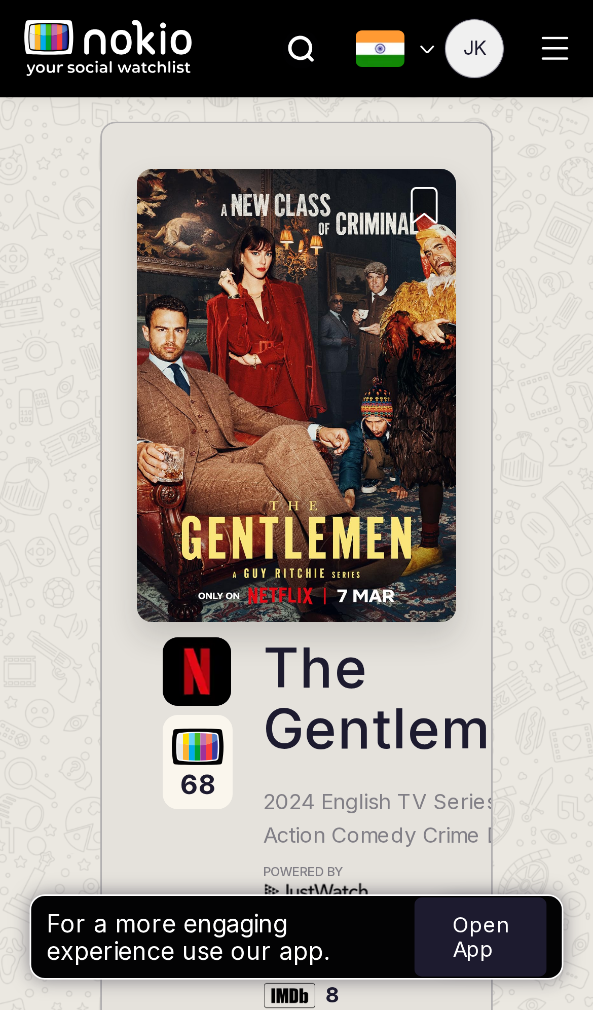
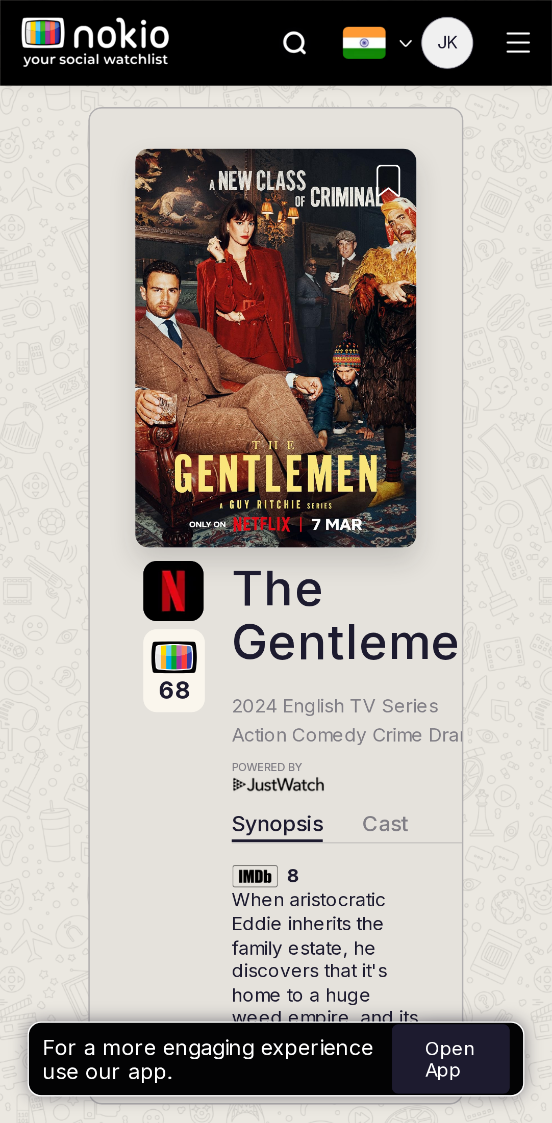
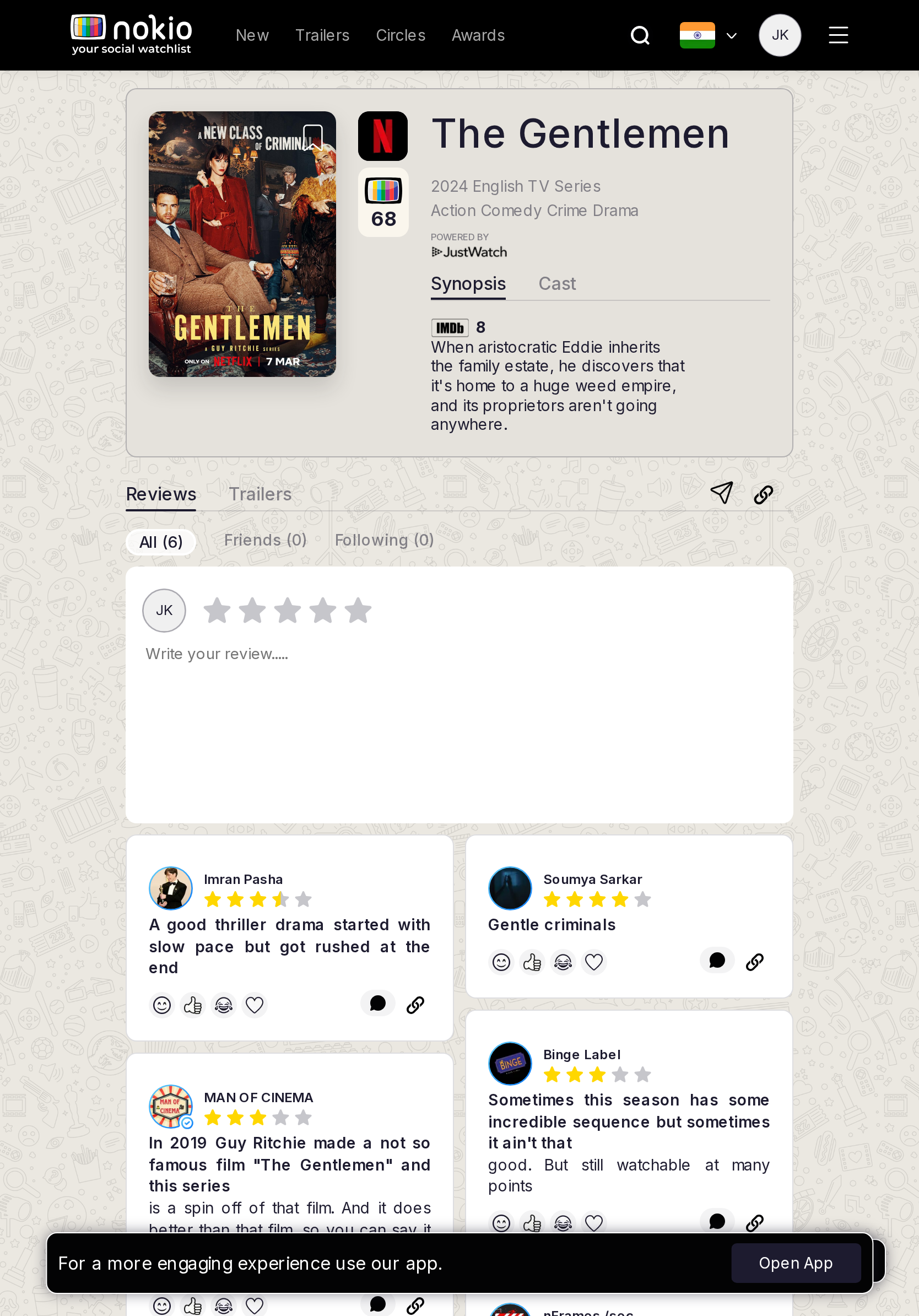
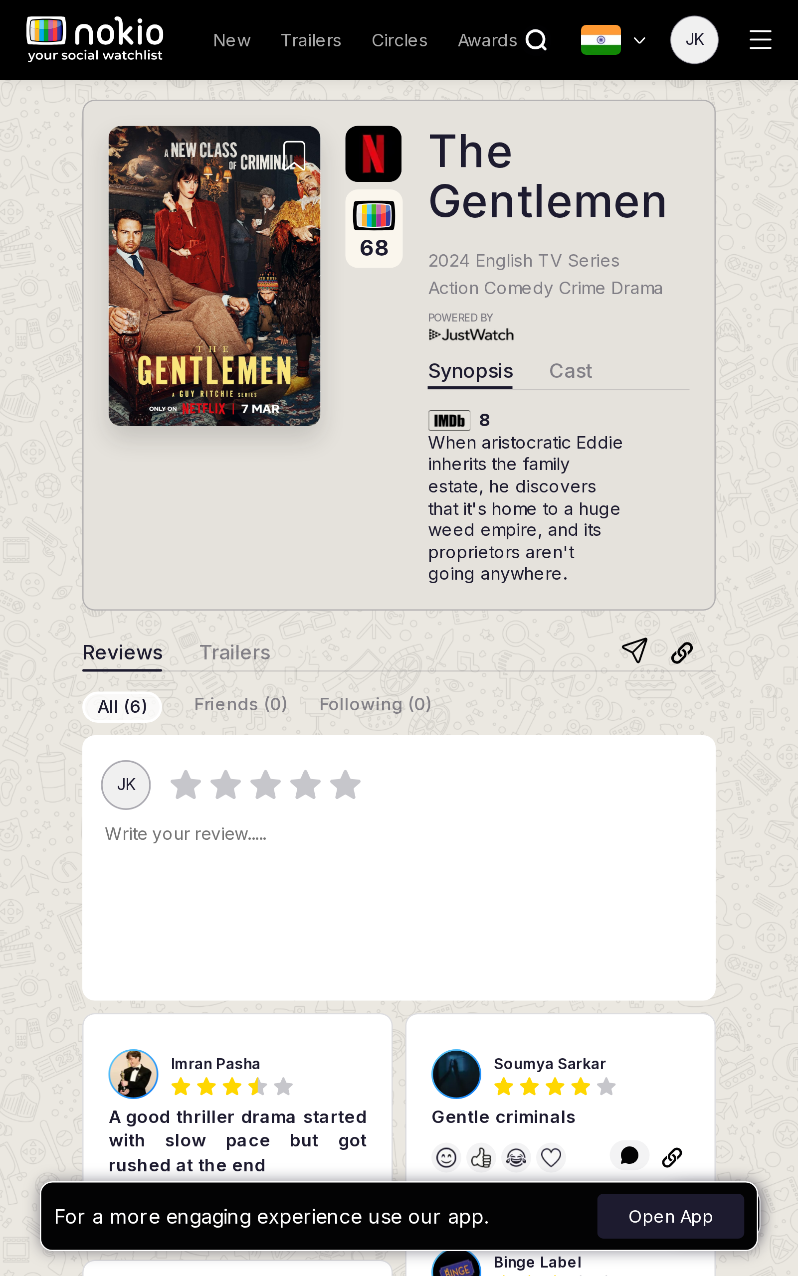
- P0Hero + synopsis push the composer below the fold. Stars need tap targets, not hover.
- P0Following (0) after following 4 people — either fetch or explain.
- P1Open App covers the first review cards.
UI elements on phone
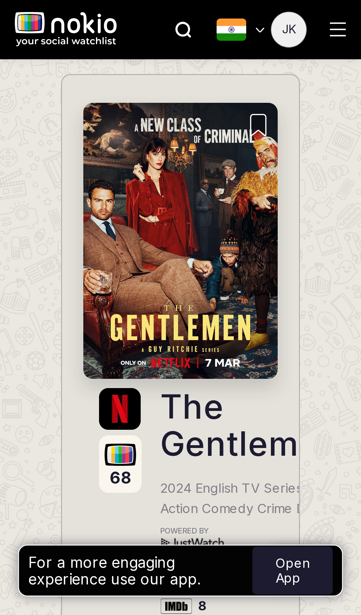
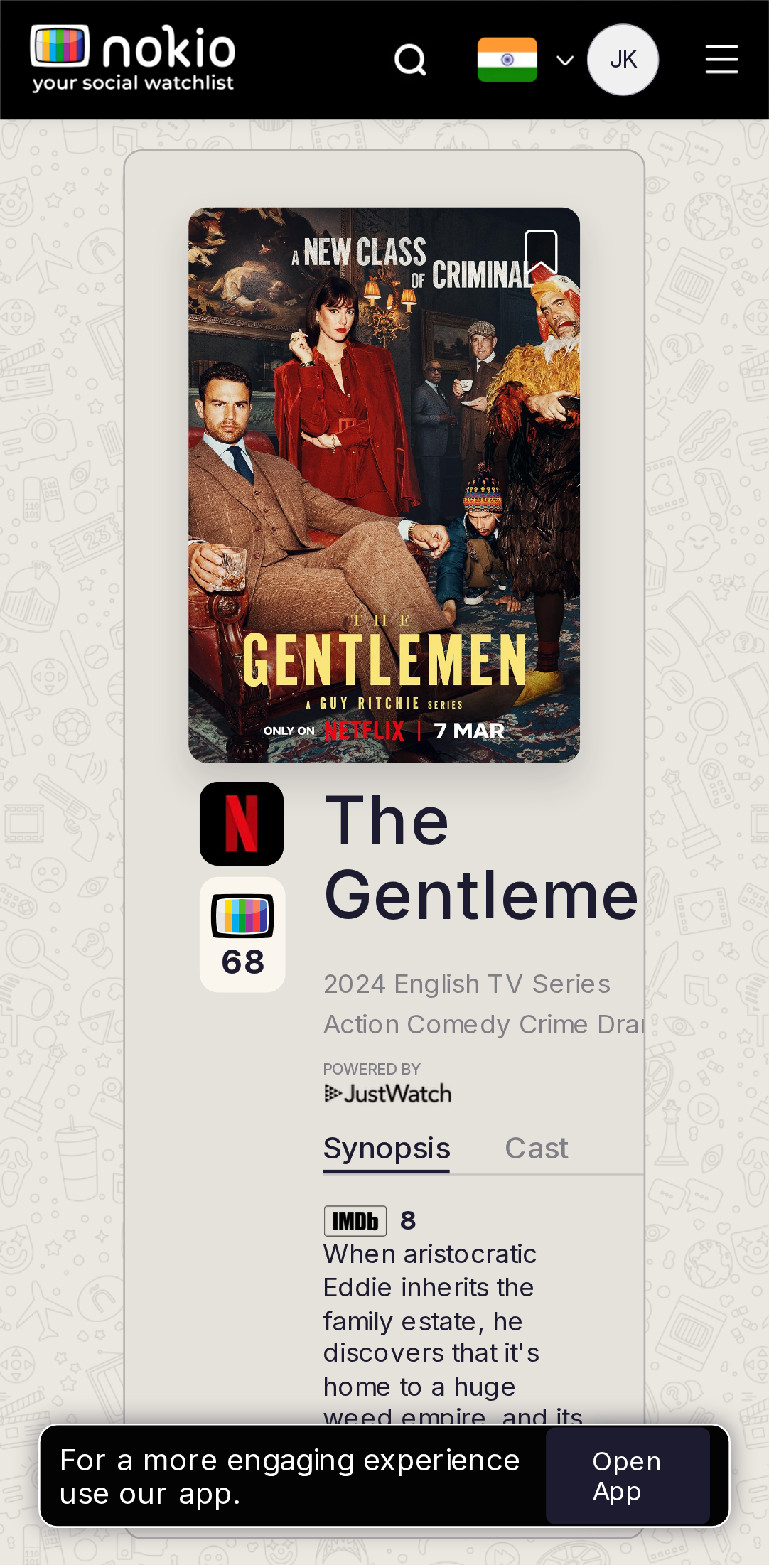
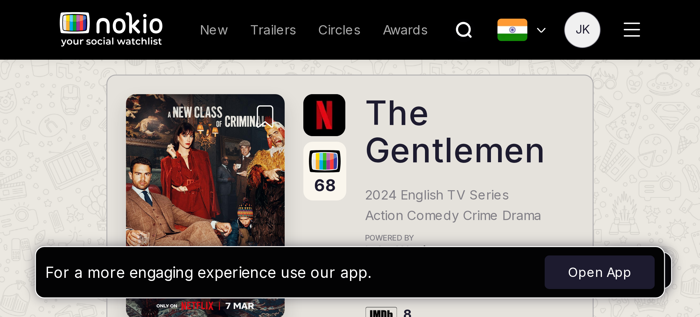
- P0Title truncates (“The Gentle…”). Genres truncate. JustWatch type is 0.52rem (~8px) — fail.
- P0Nokio 68 badge has no visible caption (hover-only tooltip). IMDb 8 sits under Open App.
- P0Bookmark on the poster is the same tiny corner glyph.
- P0Synopsis | Cast and Reviews | Trailers are two underline tab rows (0.8rem). Share + copy are unlabeled icons.
- P0All / Friends (0) / Following (0) are pills; Following (0) is a lie after follows.
- P0Star row is one SVG, not 5 buttons. Submit is 13px type, opacity 0.5 when disabled; tooltip is hover-only. Cancel is text-like.
- P0YouTube link field is min-width 25rem — blows the phone composer.
Gaps on tablet
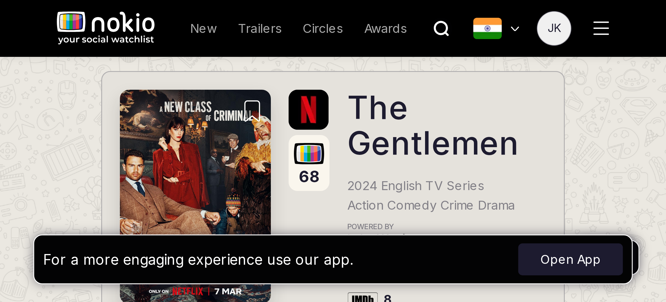
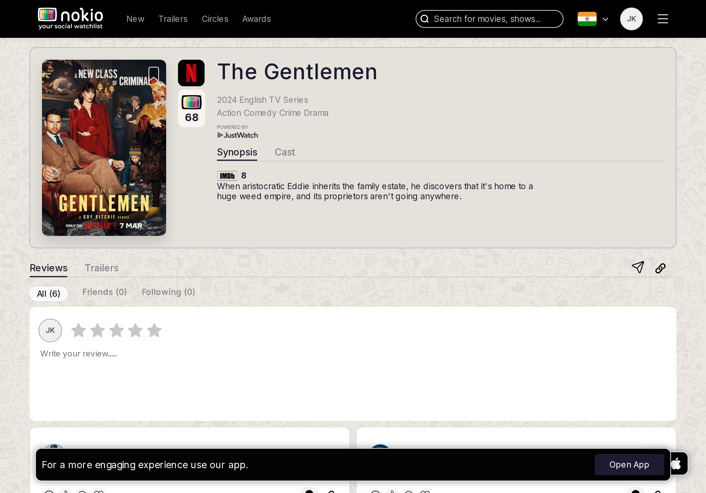
- P0Composer may enter the fold on iPad; stars still hover-based.
- P1One tab row: Synopsis | Cast | Reviews | Trailers.
UI elements on tablet
- P0Stars still hover-based. Dual tab rows remain.
- P1JustWatch still 0.52rem. Share/copy unlabeled.
- P1Open App covers the first review cards.
Gaps on desktop
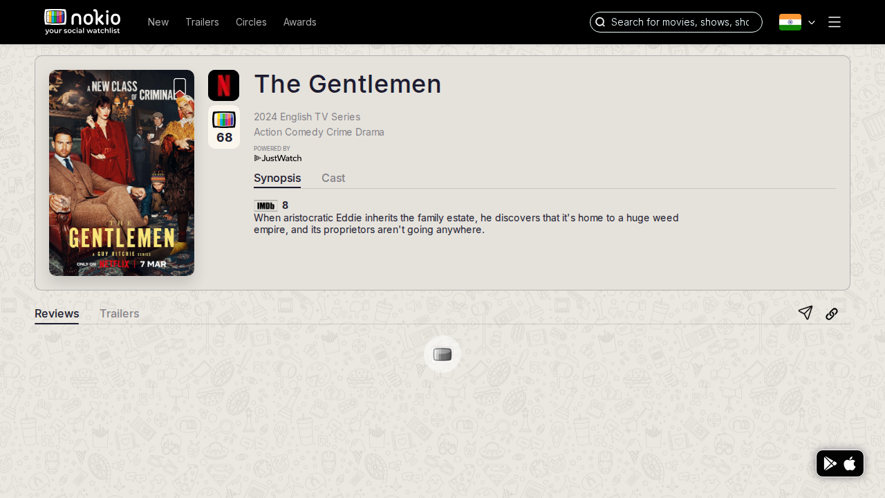
- P0Best layout in the product — but Submit stays disabled without pointermove on stars.
- P1Nokio 68 vs IMDb 8 unexplained on touch (no hover tooltip).
UI elements on desktop
- P0Submit Review 13px / padding 7px — looks disabled even when it isn’t; tooltip only on hover.
- P1Nokio 68 vs IMDb 8 still unexplained without hover.
- P1Share (paper plane) and copy-link icons have no text.
- P2Review cards: reaction glyphs (heart, like, smile, laugh) + comment — 0.75rem, tight hits.
Movie trailers
Job: Play a trailer for this title.
Gaps on phone
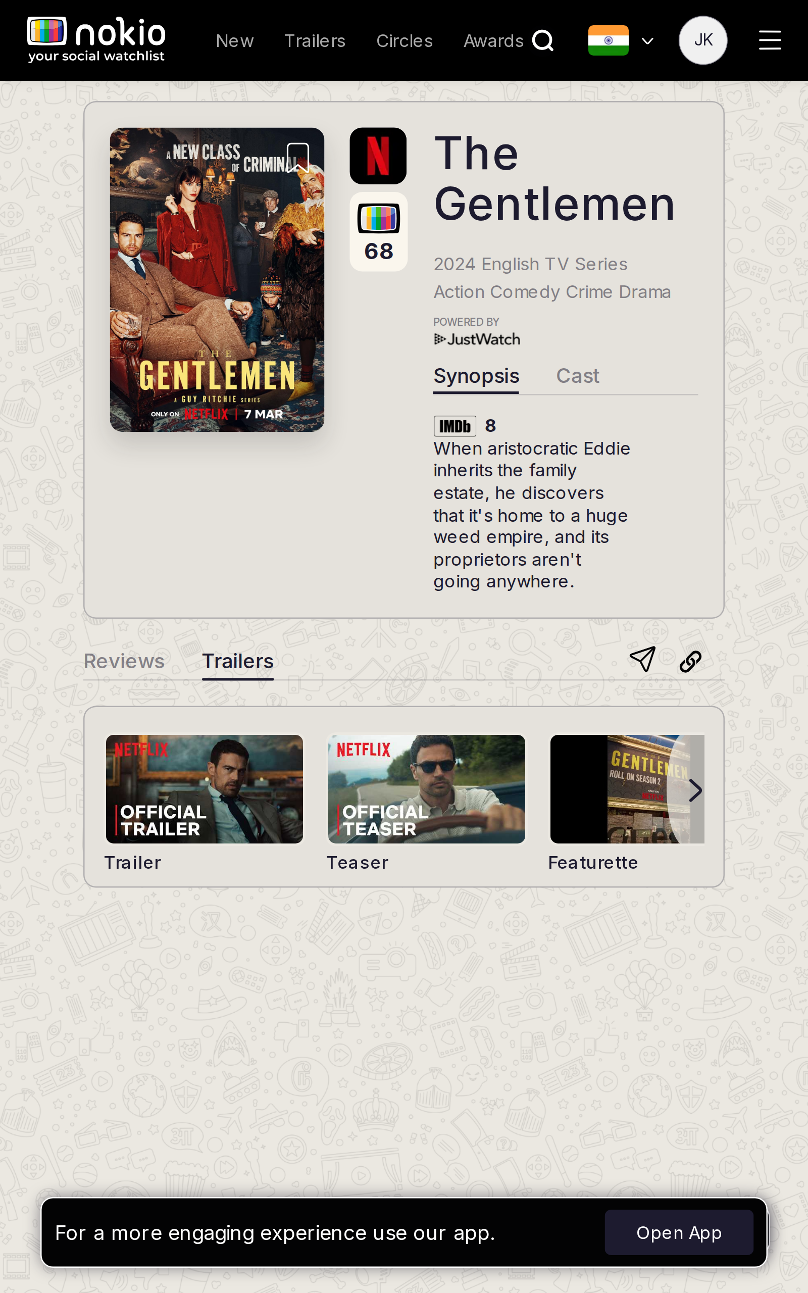
- P1/trailers still leads with synopsis. Player first. Header Trailers must not steal the in-page tab.
UI elements on phone
- P1Same hero truncations + JustWatch 0.52rem + bookmark glyph.
- P1Reviews | Trailers underline; header also has a Trailers link — two controls, same word.
- P1Trailer/Teaser strip may sit below Open App.
Gaps on tablet
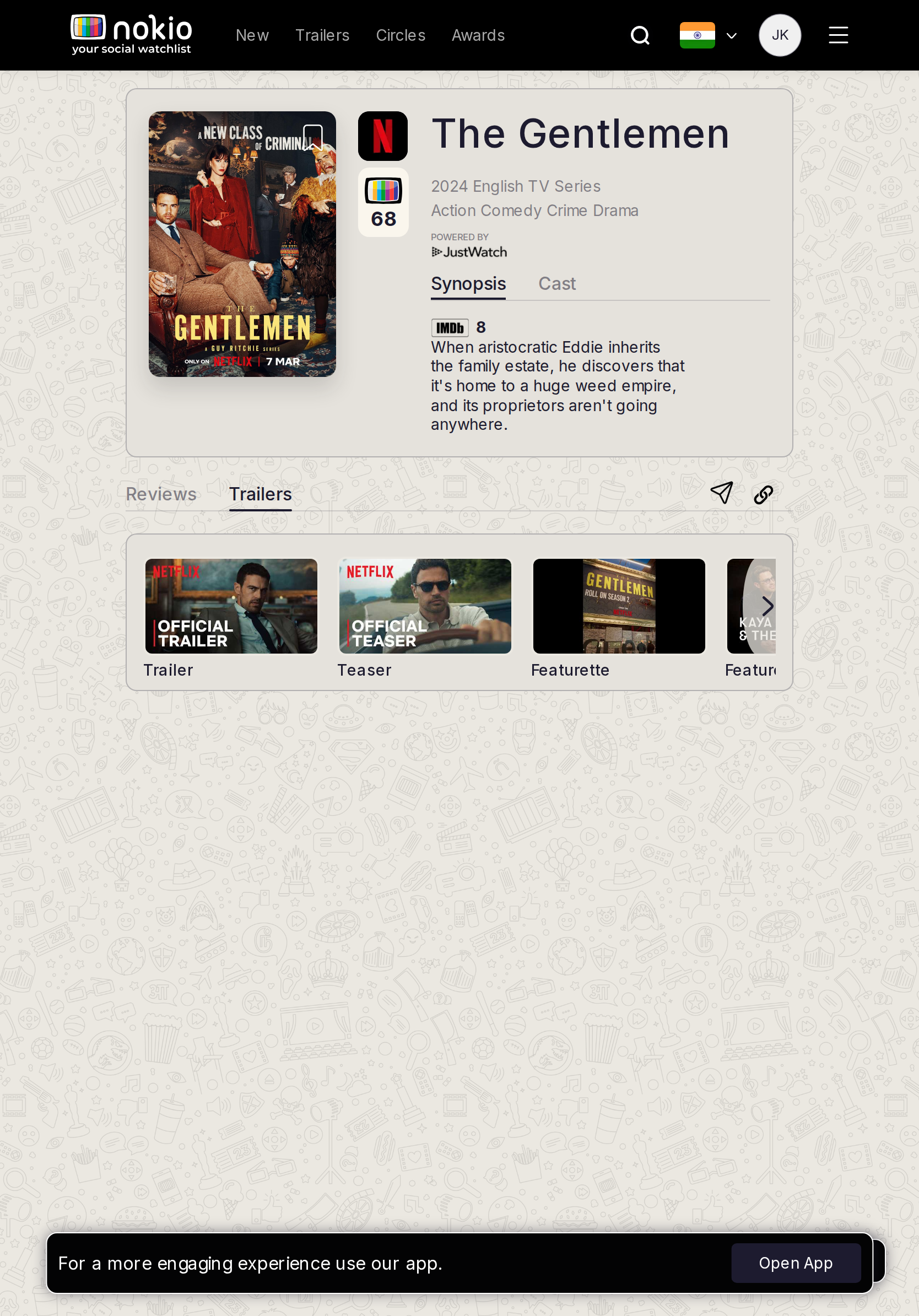
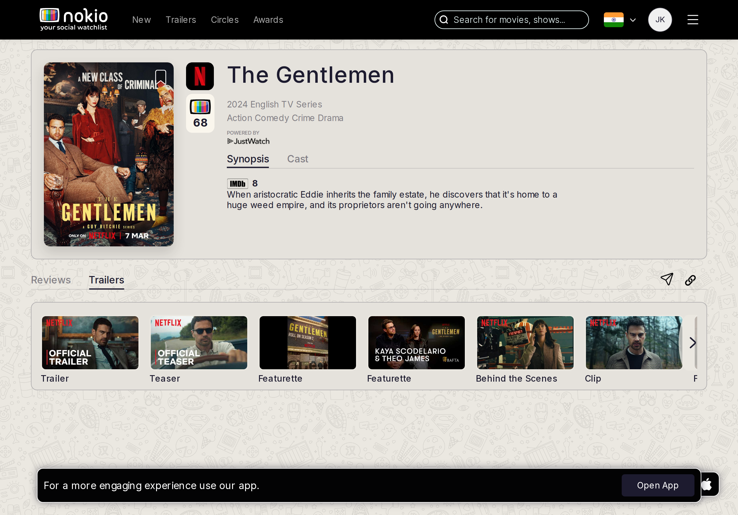
- P1iPad landscape has room for strip + player — use it. Portrait should scroll the player into view.
UI elements on tablet
- P1Strip labels (Trailer / Teaser / Featurette) are good; selected state is a blue border — add a play control.
- P1Header vs page Trailers clash.
Gaps on desktop
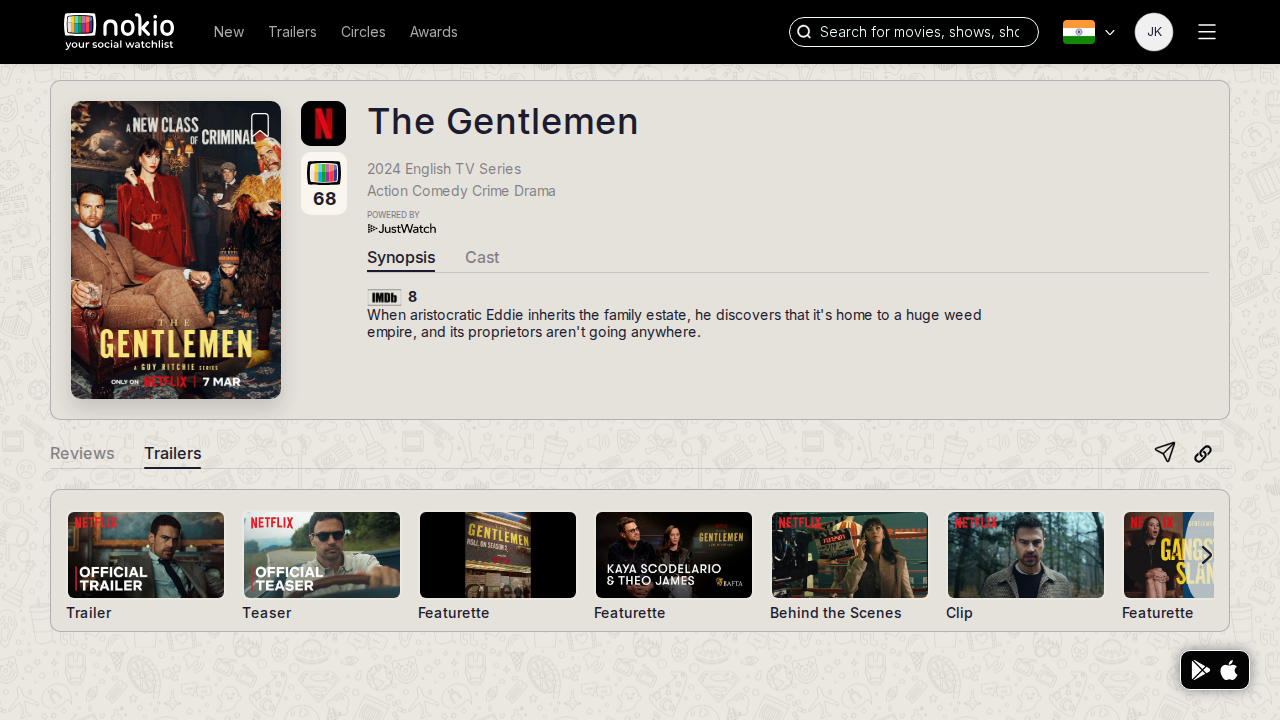
- P1Strip with Trailer/Teaser labels is good. A still with a blue border is not watching — play control.
UI elements on desktop
- P1Blue-border selected thumb without a play button. Share/copy unlabeled.
- P2Netflix/platform logo on thumbs duplicates JustWatch.
Festival
Job: Browse an awards slate and save titles.
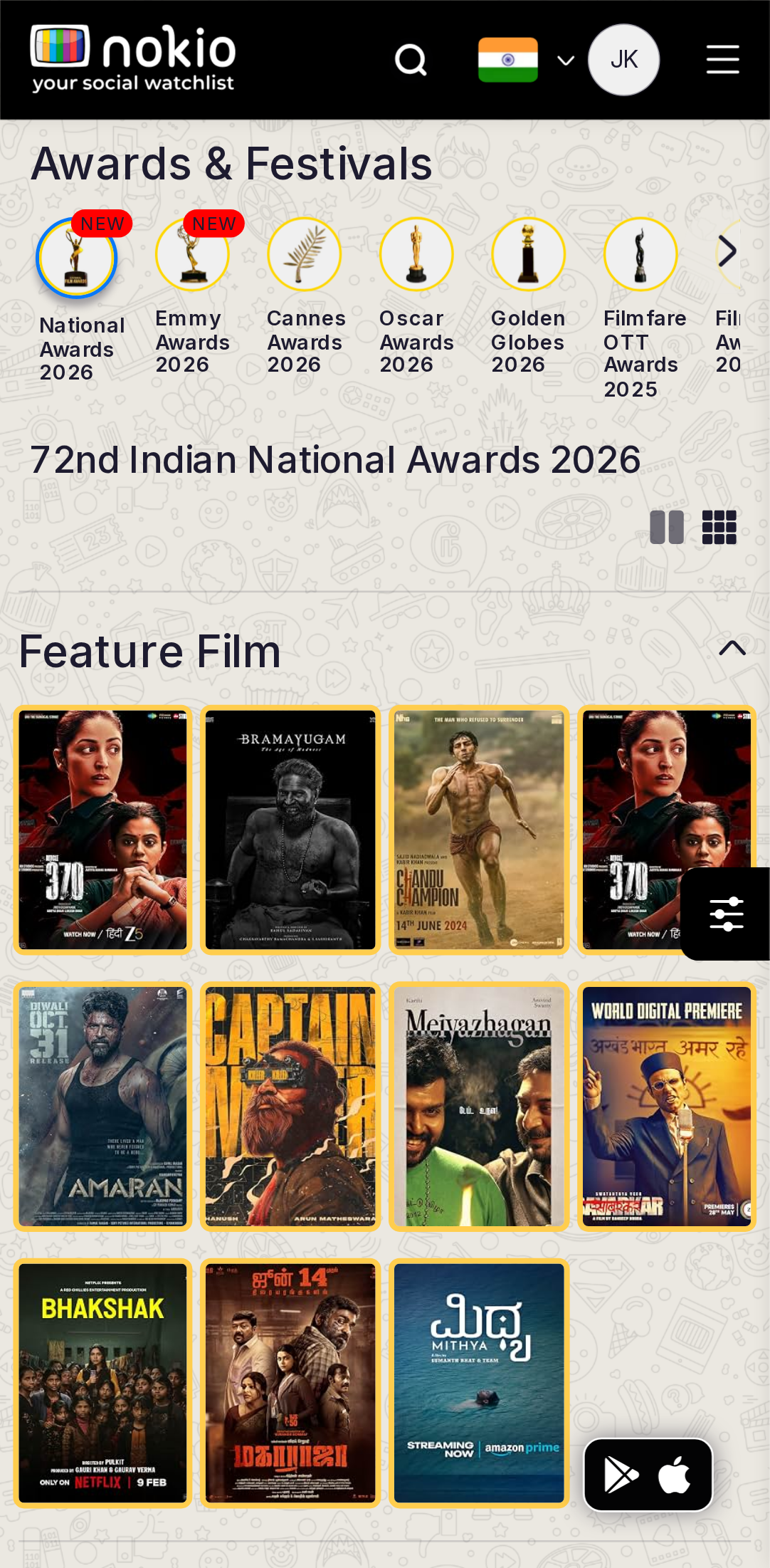
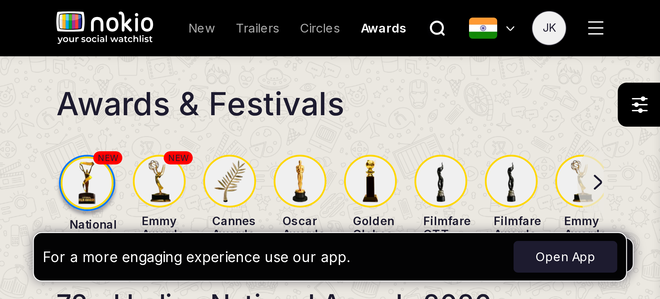
Gaps on phone
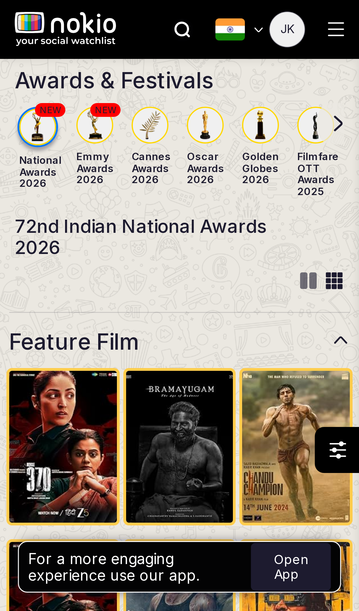
- P13-col posters too tight. 2-col. Open App covers the last row.
UI elements on phone
- P1Award-year circles are a horizontal scroller with clipped labels — no fade/affordance for more.
- P13-col posters + corner bookmarks + sliders FAB + Open App.
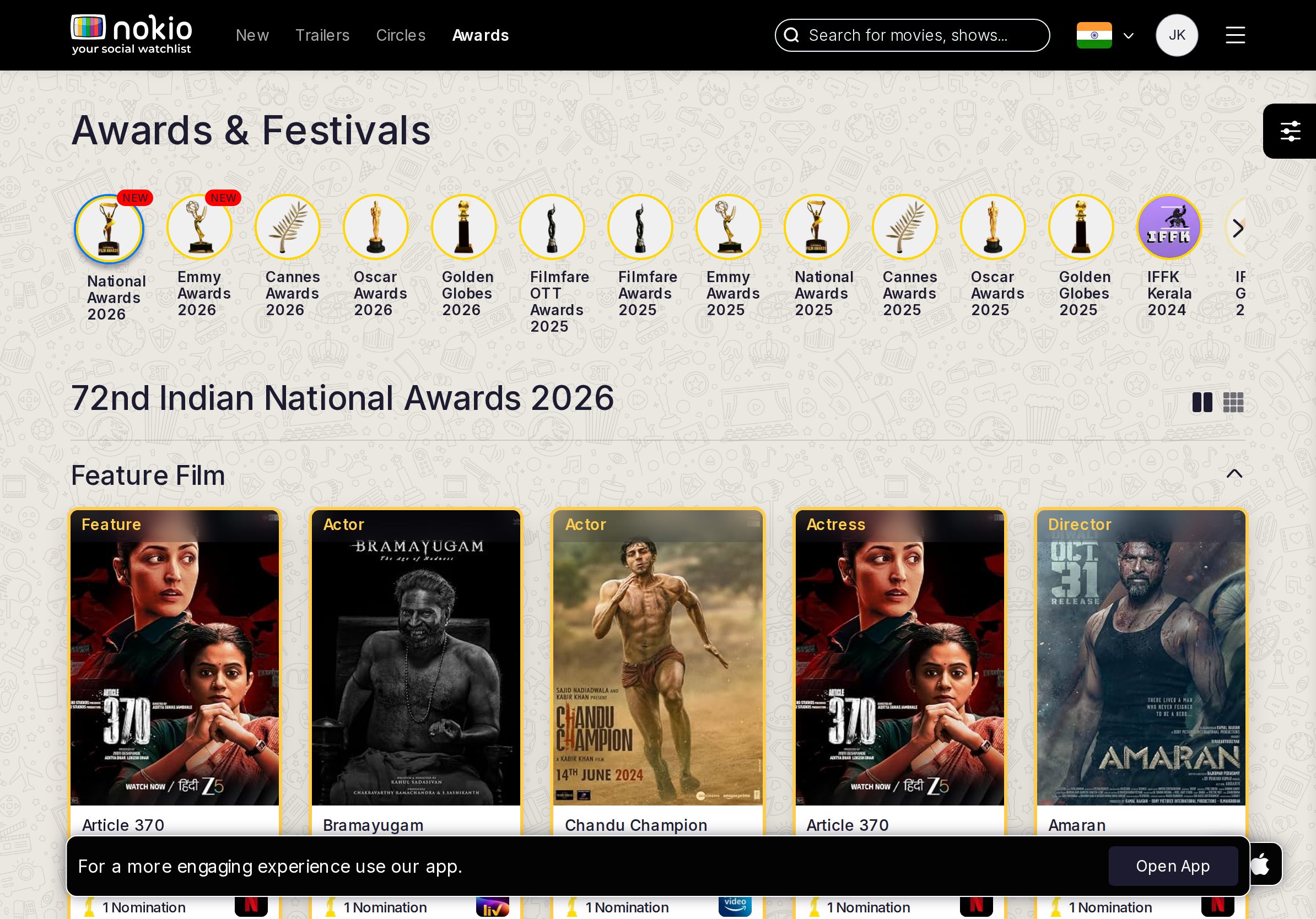
Gaps on tablet
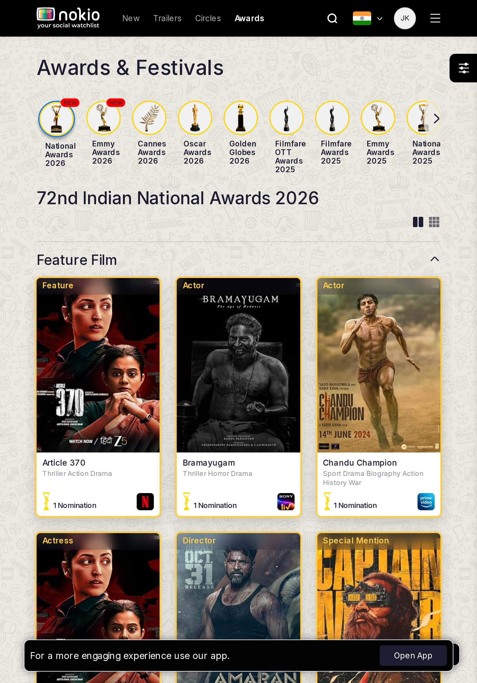
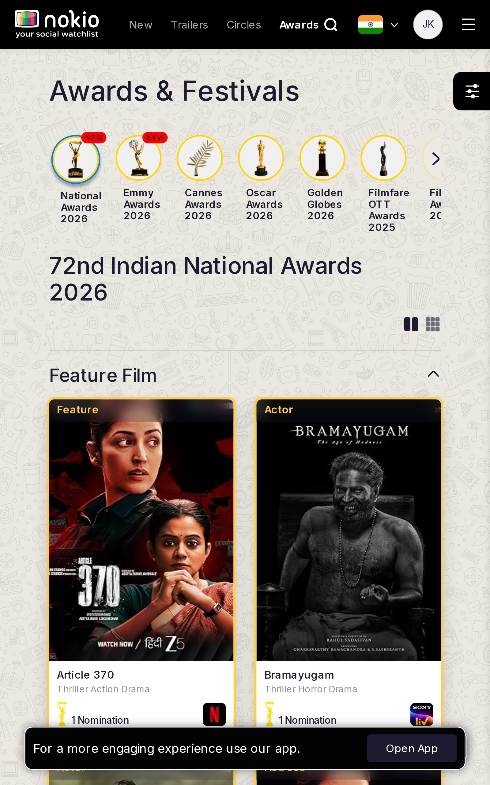
- P1Award-circle labels clip. Fade the scroller. Filter FAB overlaps.
UI elements on tablet
- P1Circle labels clip. Filter FAB overlaps the grid.
- P1Open App on iPad.
Gaps on desktop
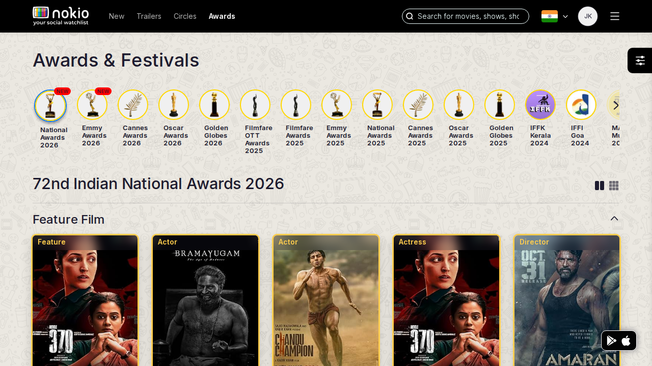
- P2Personal layer after login (bookmark = watchlist).
UI elements on desktop
- P2Award picker is the strongest control here — keep it, add two-line labels.
- P2Bookmark vs “I’ve seen this” unlabeled.
Festival panel
Job: Watch or read a festival panel.
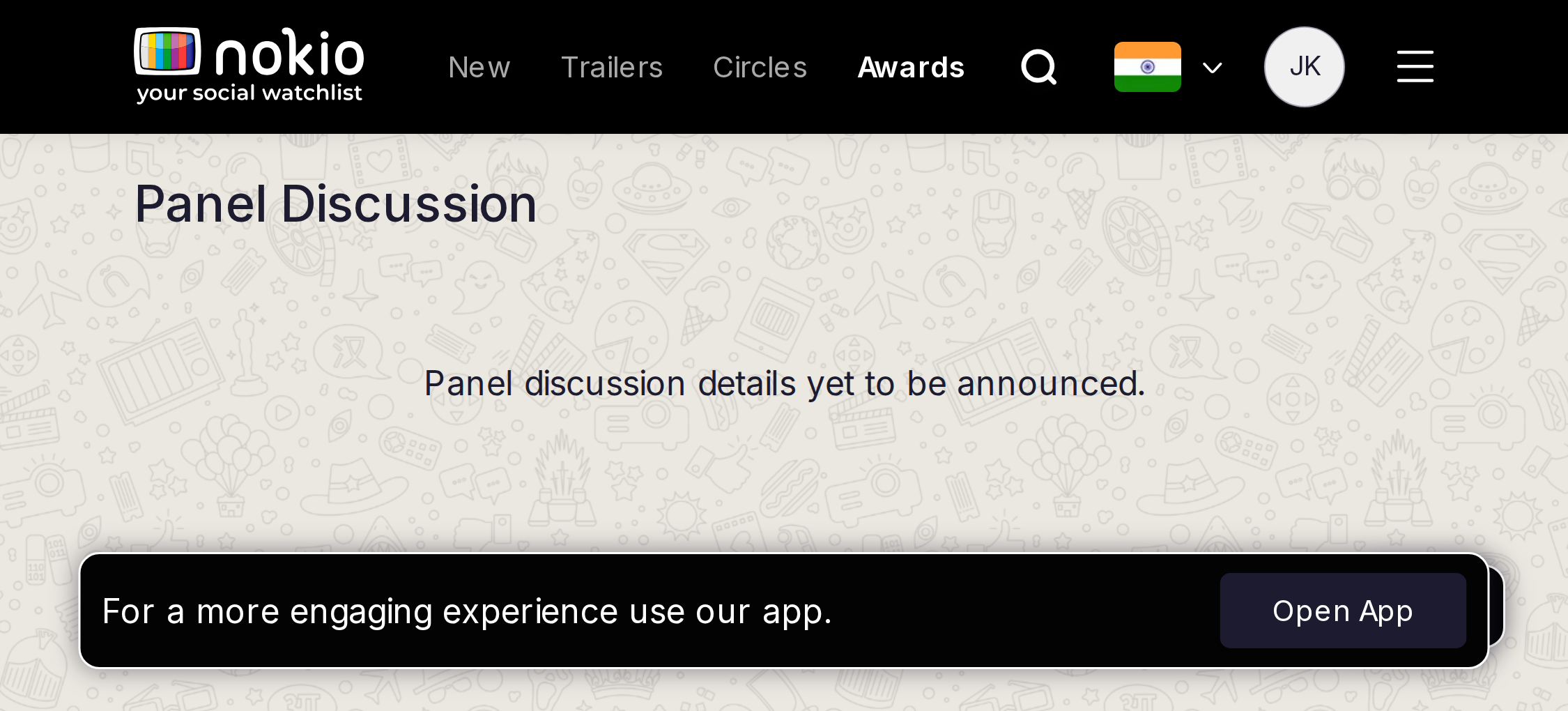
Gaps on phone
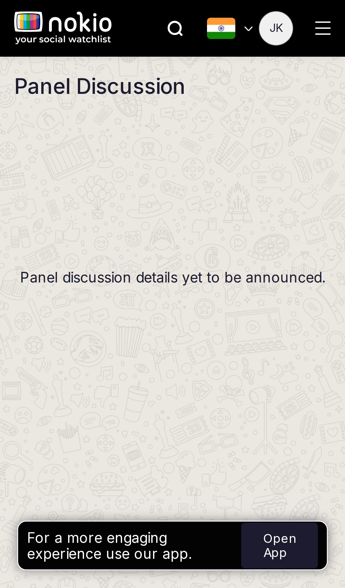
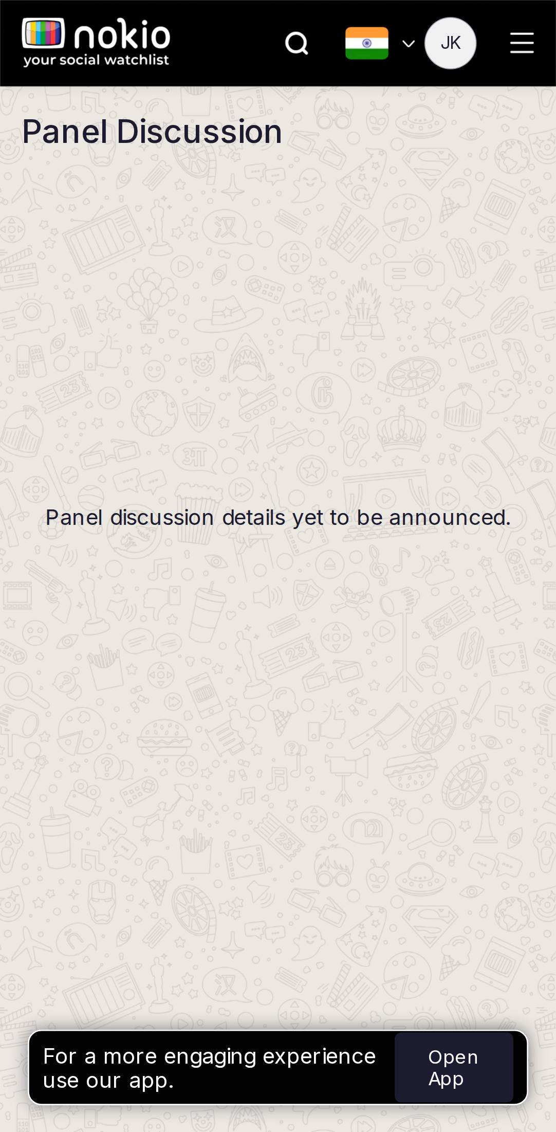
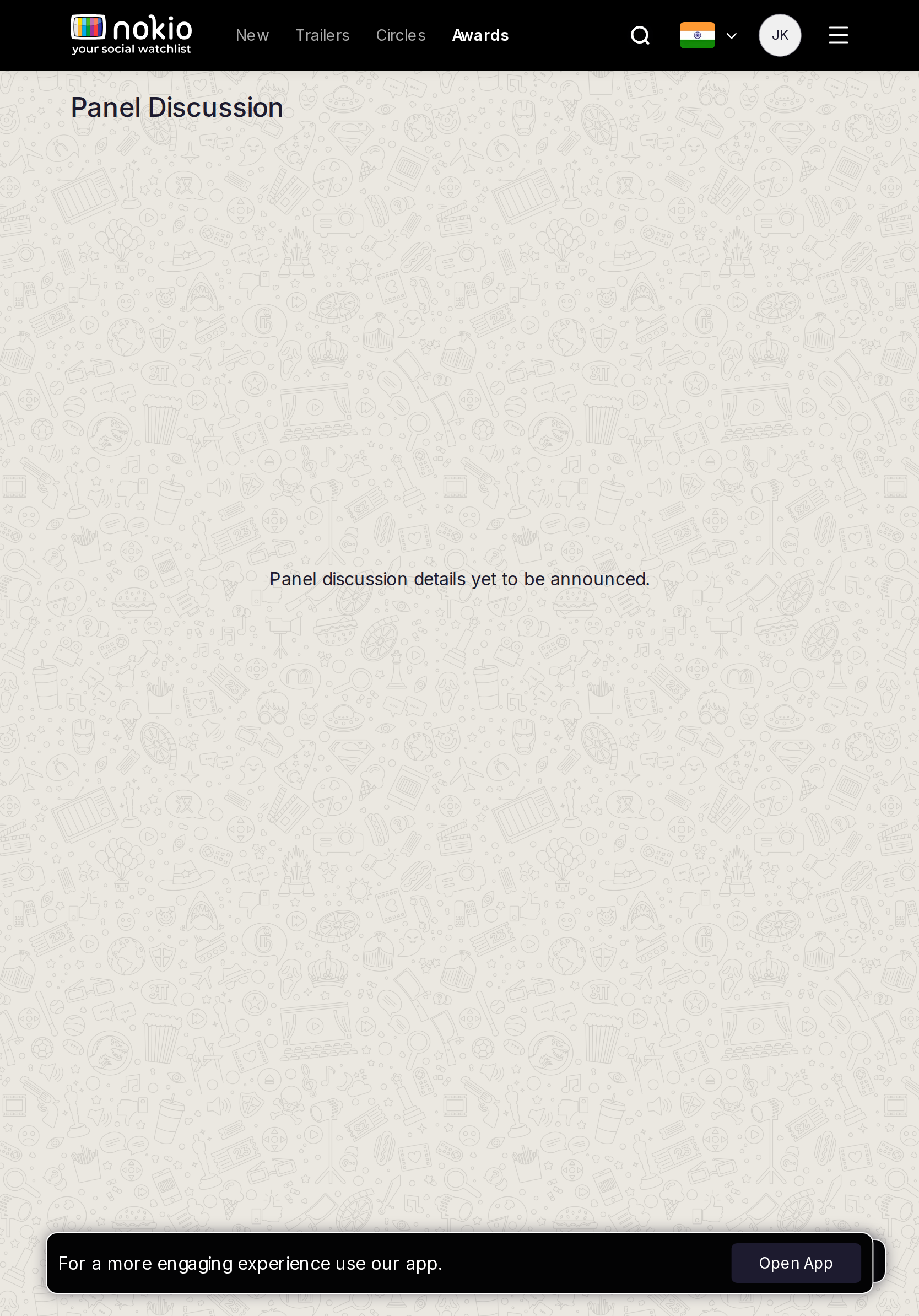
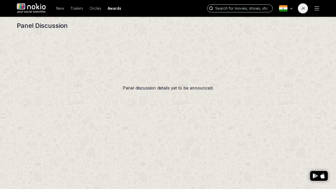
- P1Honest empty, tiny type, Open App. Coming-soon card + Notify.
UI elements on phone
- P1No player, no Notify button, no date chip — only empty copy + Open App.
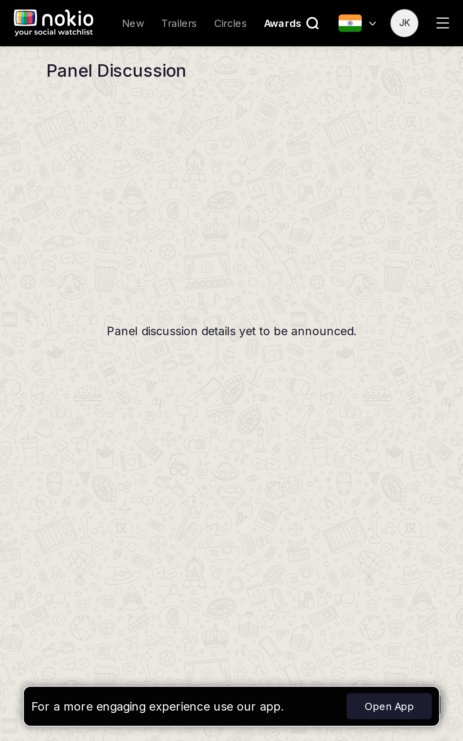
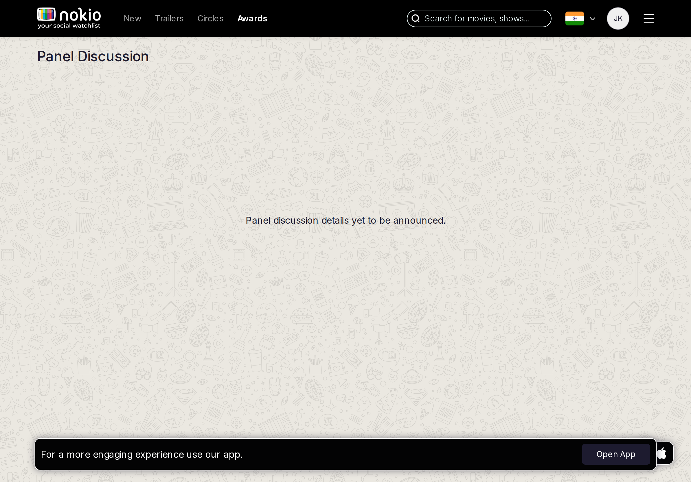
Gaps on tablet
- P1Same void. Hide the nav link until there is a panel.
UI elements on tablet
- P1Same missing controls. Nav still exposes Panel.
Gaps on desktop
- P1Festival name, date or TBA, Notify me.
UI elements on desktop
- P1Need Notify / calendar controls. Hide the nav item until content exists.
Public profile
Job: Evaluate a critic and follow them.
Gaps on phone
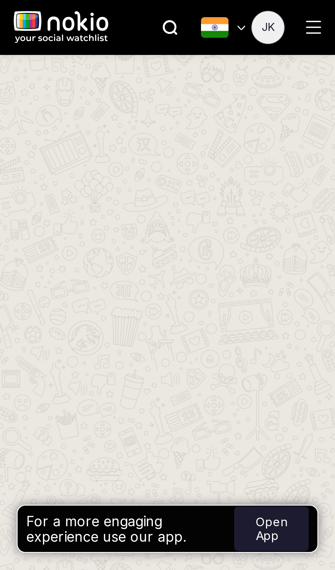
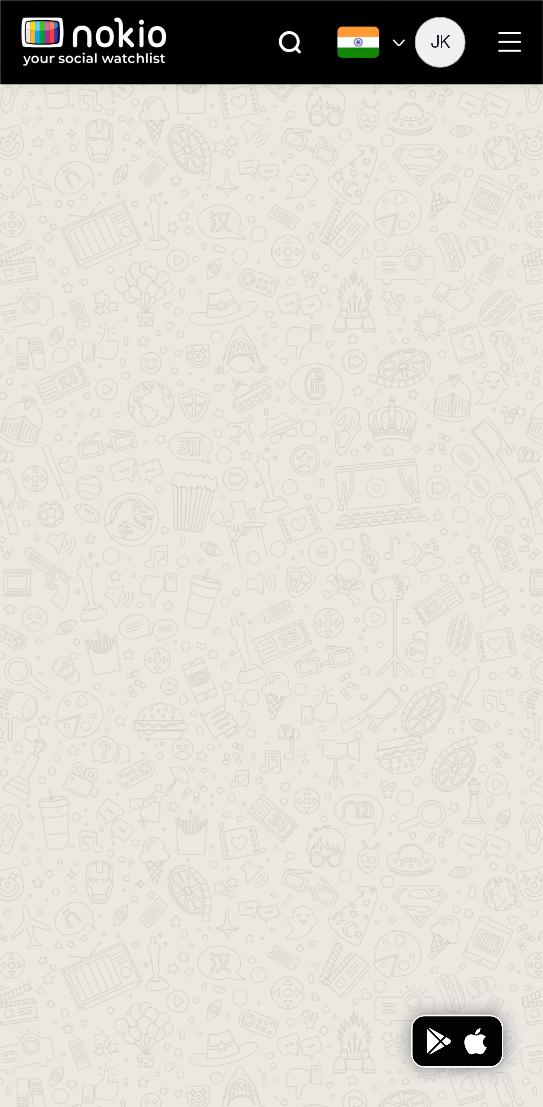
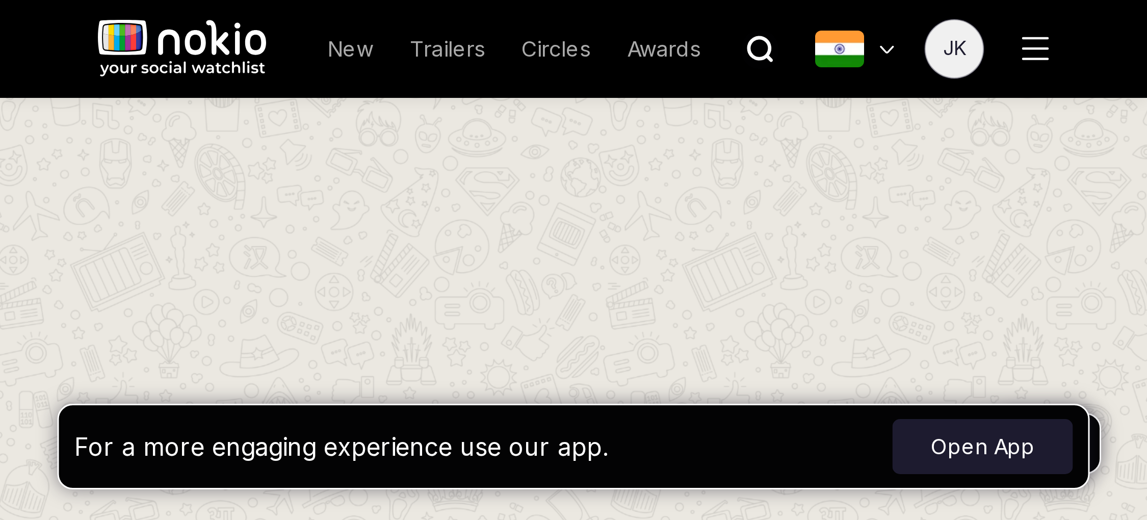
- P04-col posters unreadable. 2-col. Open App on the mosaic.
- P0Never empty-doodle a signed-in public profile.
UI elements on phone
- P0Follow button must be 44px. Counts (Reviews / Followers / Following) look like text, not links.
- P04-col poster mosaic + bookmark glyphs + Open App.
- P1Banner is a brand graphic, not a bio field.
Gaps on tablet
- P1Counts must be tappable and those routes must not be blank.
UI elements on tablet
- P1Counts should be tappable. Follow/Following state on the primary button.
Gaps on desktop
- P1Follow reflects graph state. Banner is brand, not bio.
UI elements on desktop
- P1Follow in the header. Counts as links. Bookmark-on-poster still unlabeled.
Reset password
Job: Set a new password from an email link.
Gaps on phone
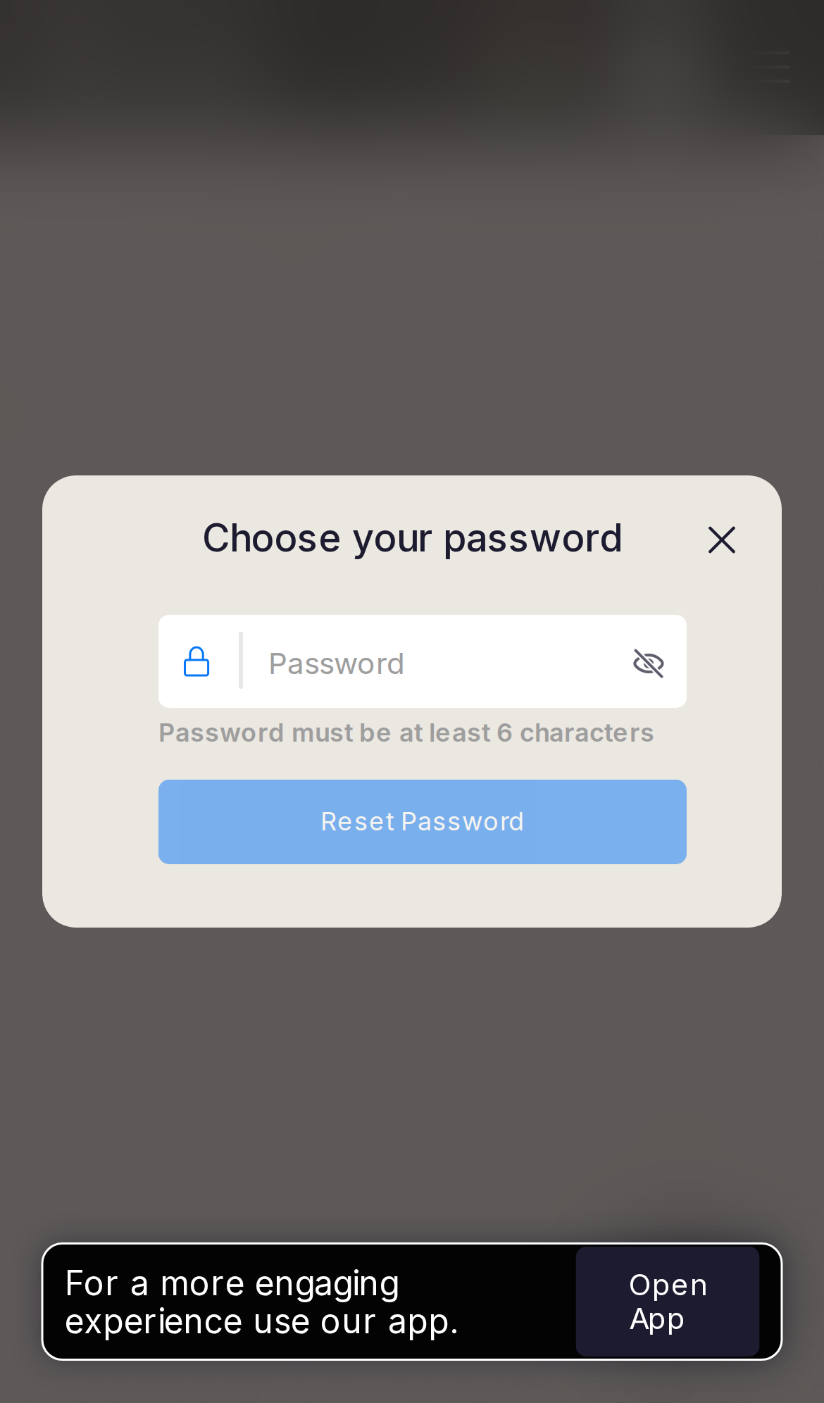
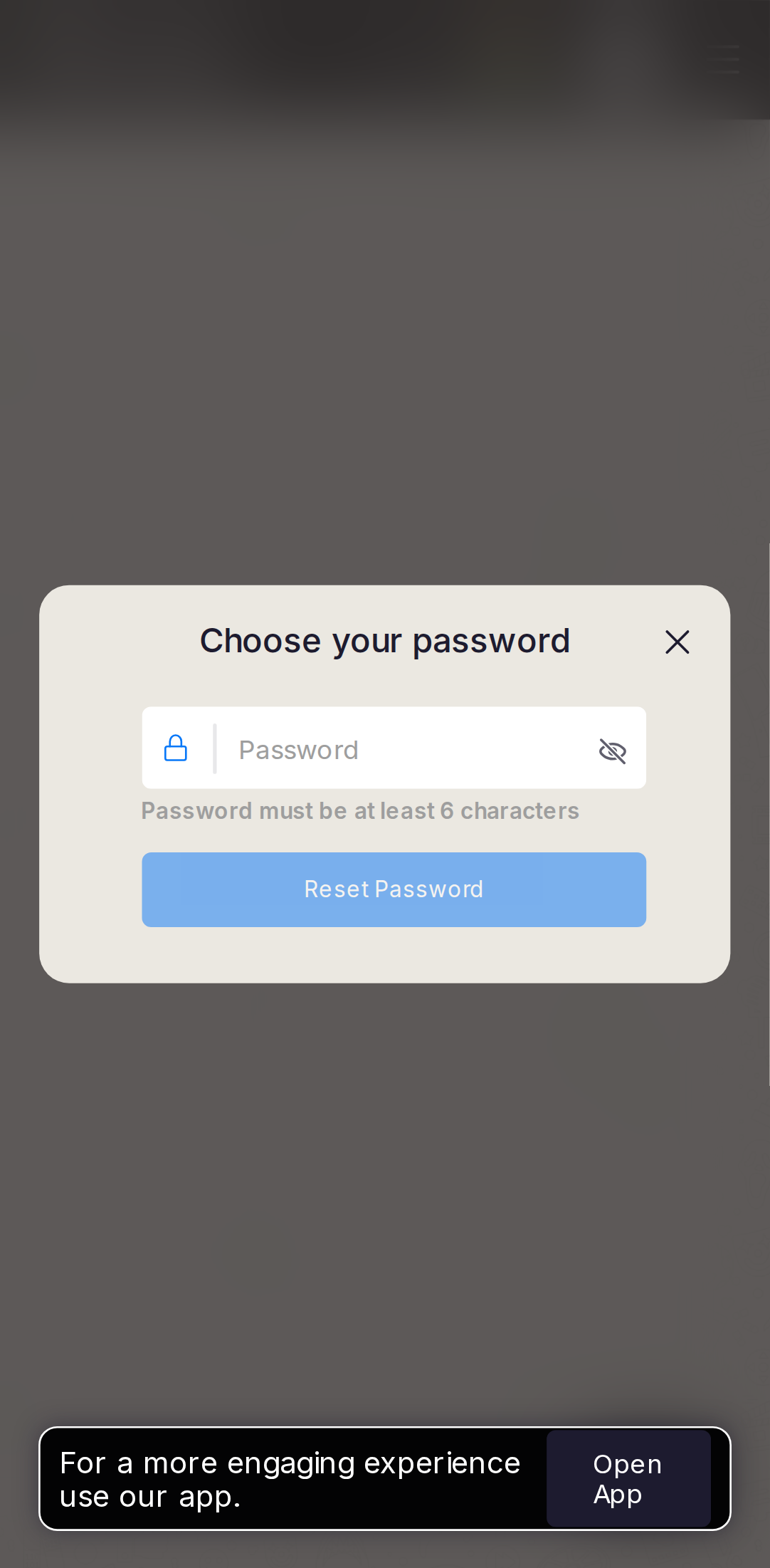
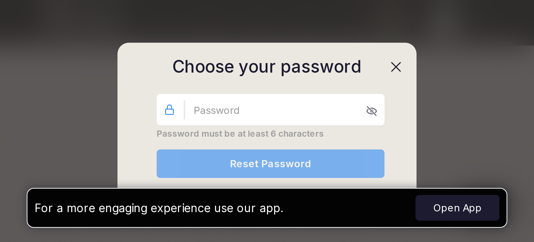
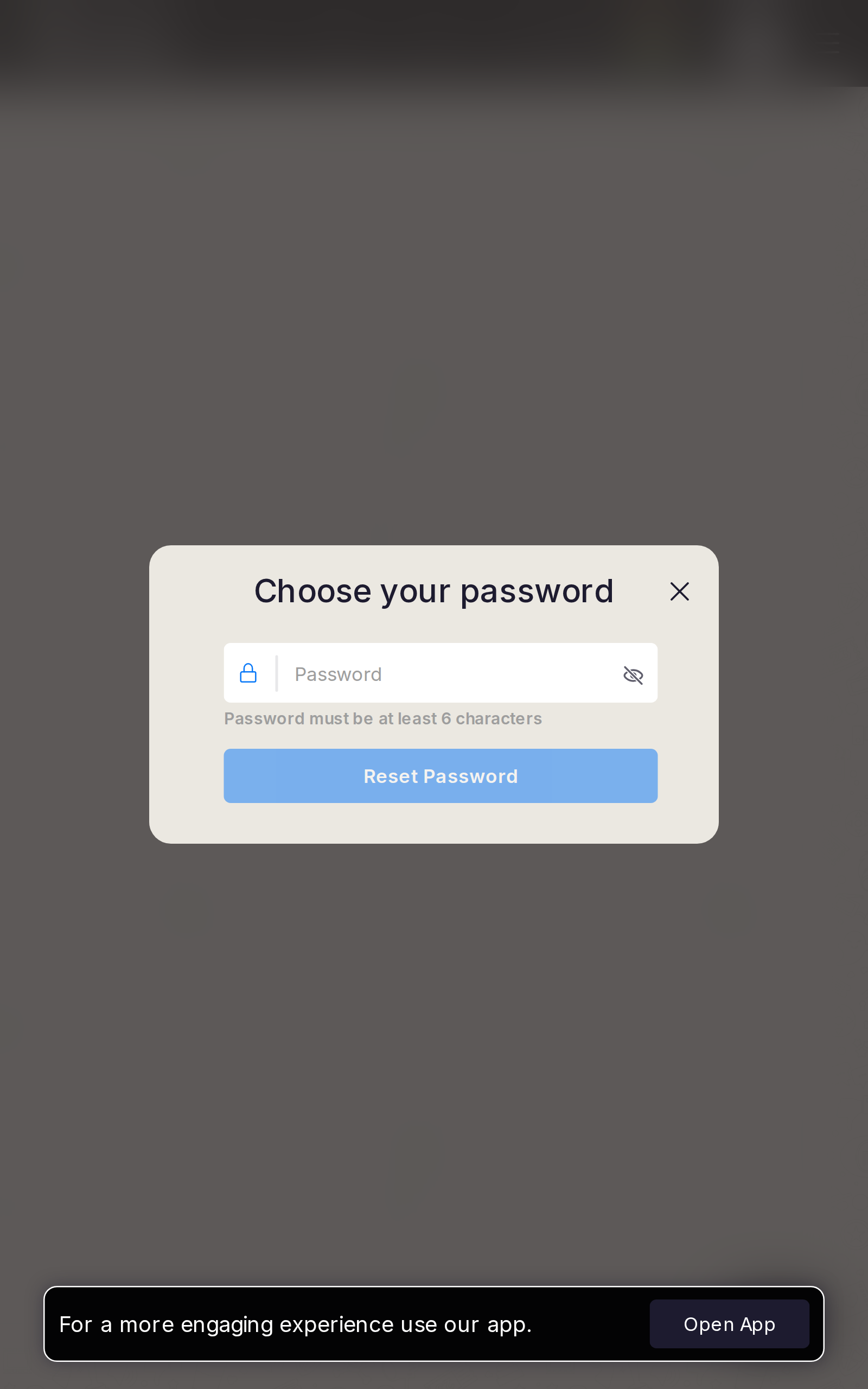
- P1Submit looks enabled while empty. Keyboard covers the button — bottom sheet. Landscape 340px is worse.
UI elements on phone
- P1Email/password-style field + Show password eye. Submit looks enabled while empty (opacity, not disabled).
- P1Close is a tiny X, not “Back to sign in”.
- P1Keyboard will cover Submit; landscape 340px is worse. Open App may still mount.
Gaps on tablet
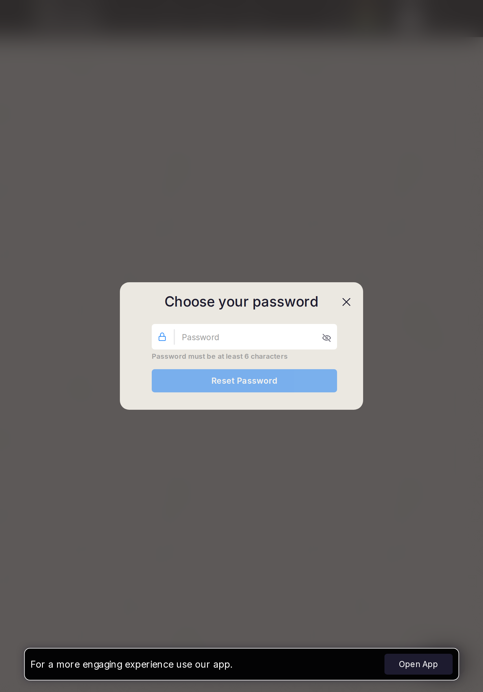
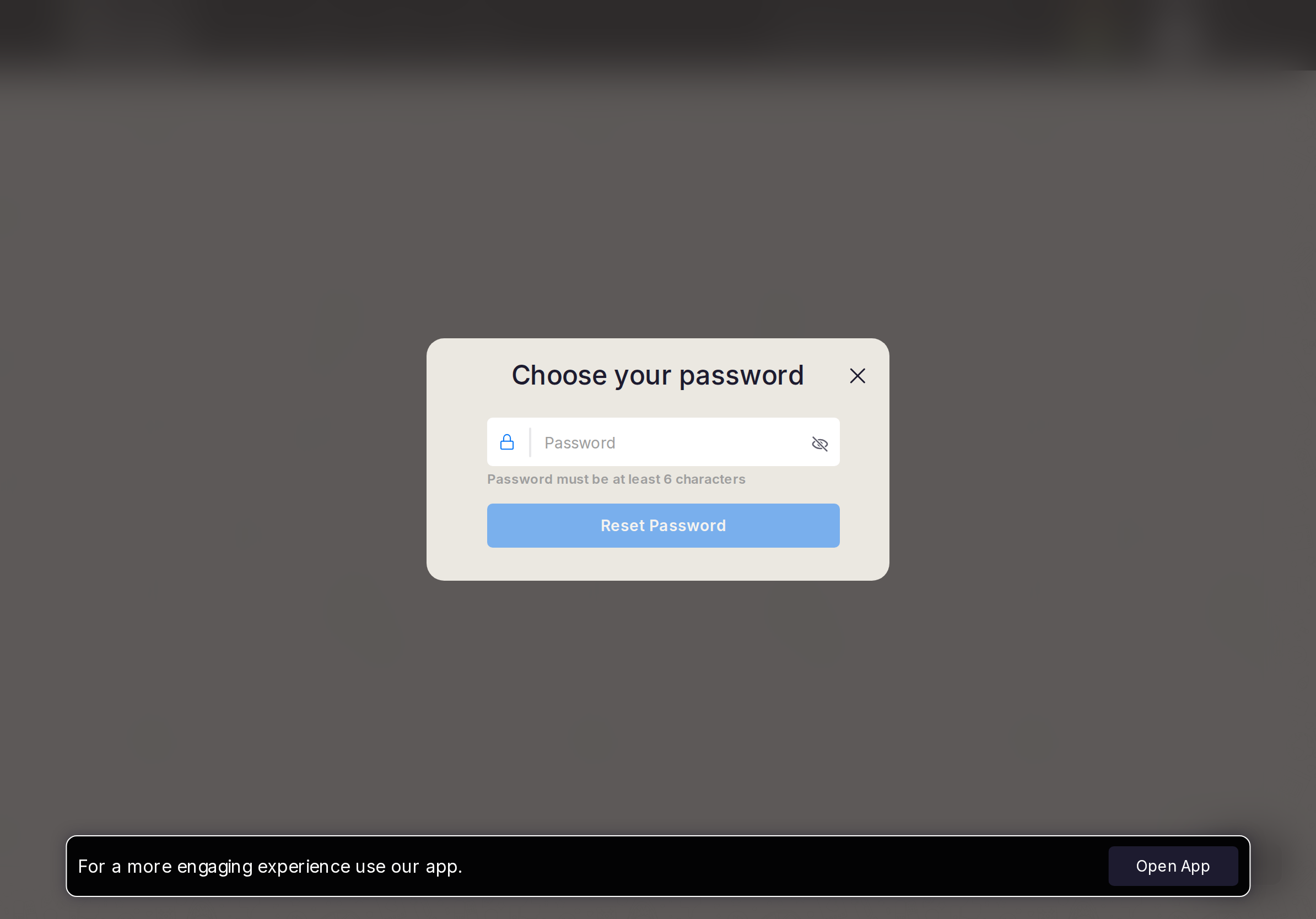
- P1Disable until 6 characters. Back to sign in besides X.
UI elements on tablet
- P1Same X + enabled-looking Submit. Prefer a dialog with 44px primary.
Gaps on desktop
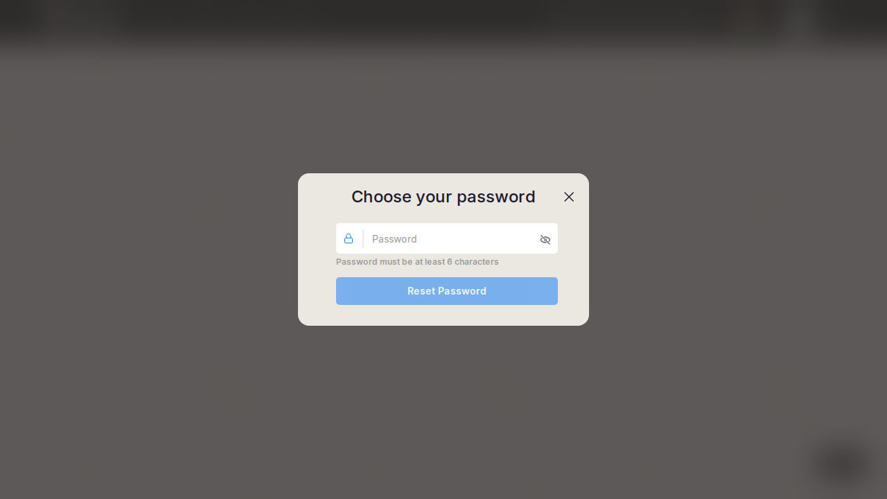
- P2Dim the button until valid.
UI elements on desktop
- P2Centered modal. Dim Submit until 6 characters. Add Back to sign in.