Chapter 4 · Design analysis
Every page — phone and desktop
Phone (390×844) and desktop (1440×900) from production. Signed-in shots where login changes the screen; signed-out for marketing, legal, empty-graph URLs, and a same-route comparison on discovery and account pages. Each section: what the screenshot shows, then prioritized fixes.
Home
Job: Decide what to watch from trailers, new titles, and people I trust.
Signed out — same route
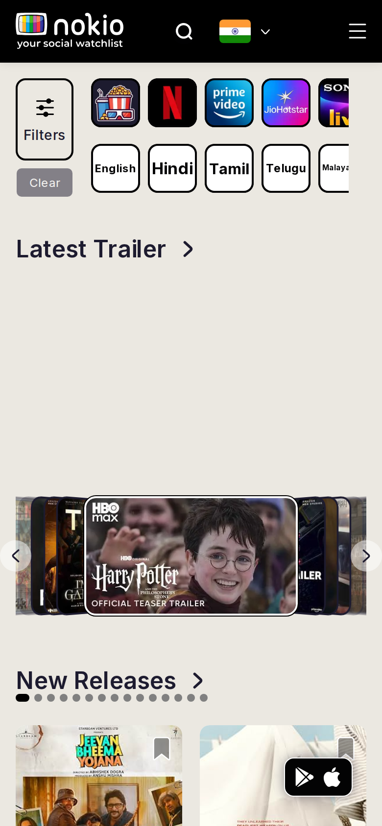
What the screenshots show
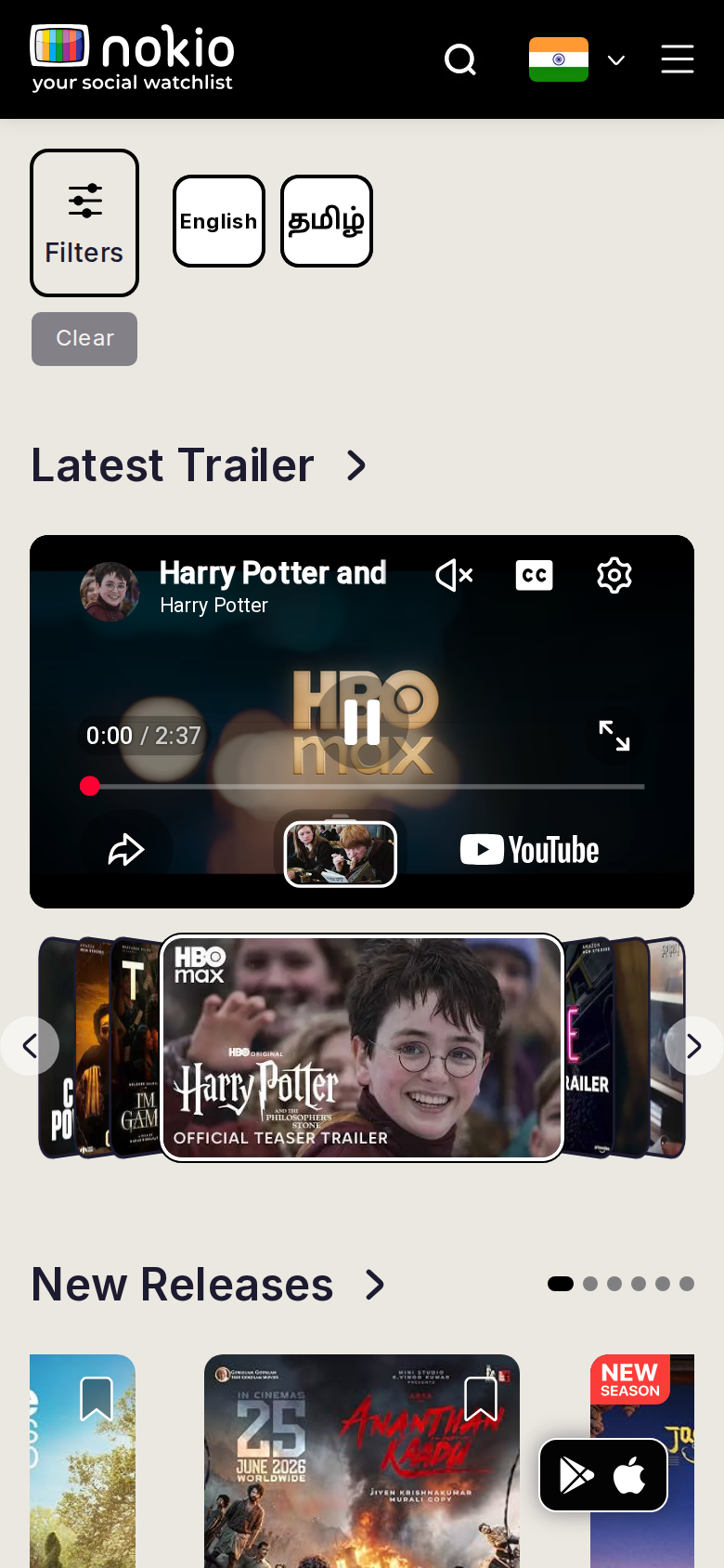
- First screen is Filters + language chips, not a title or a person.
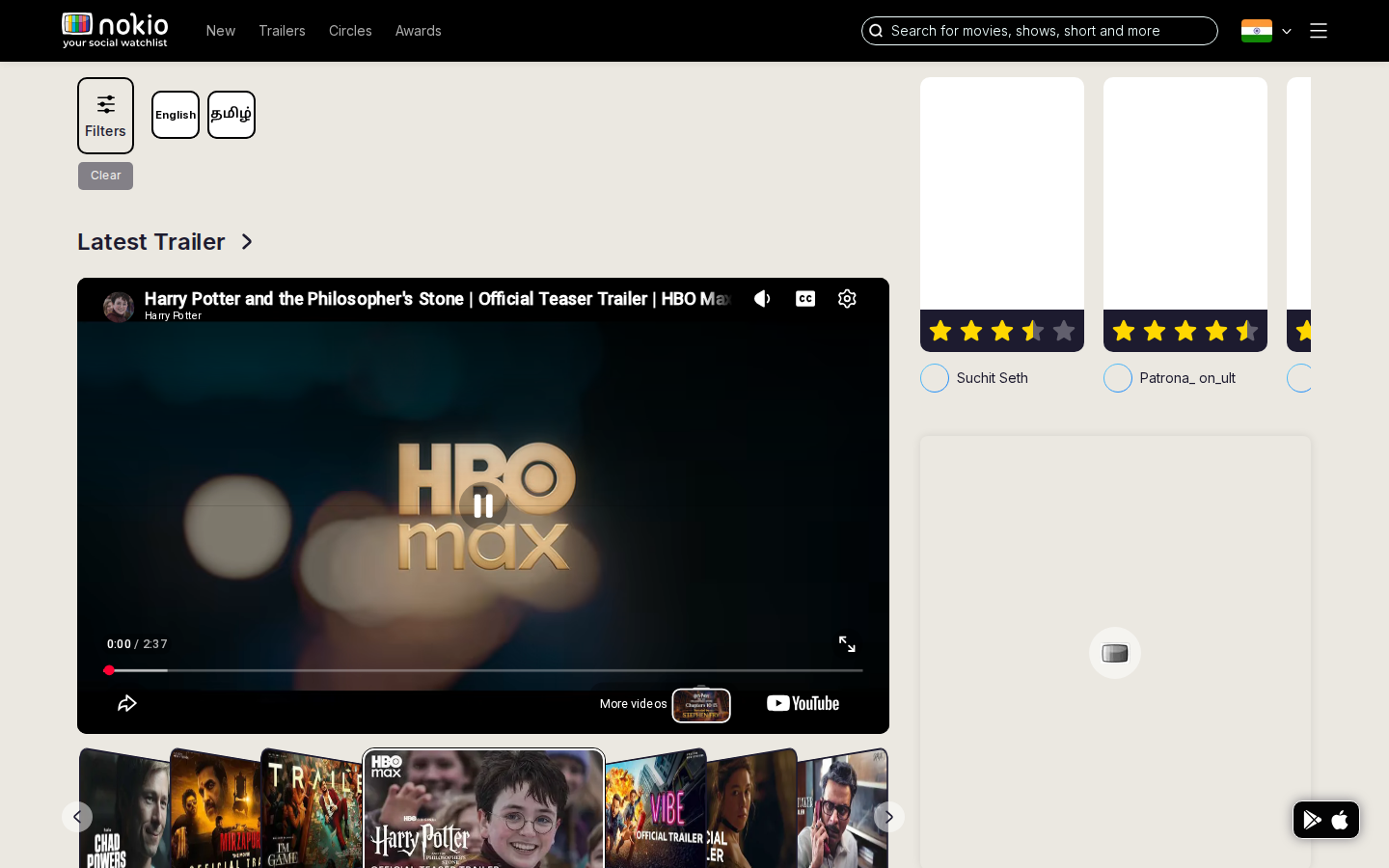
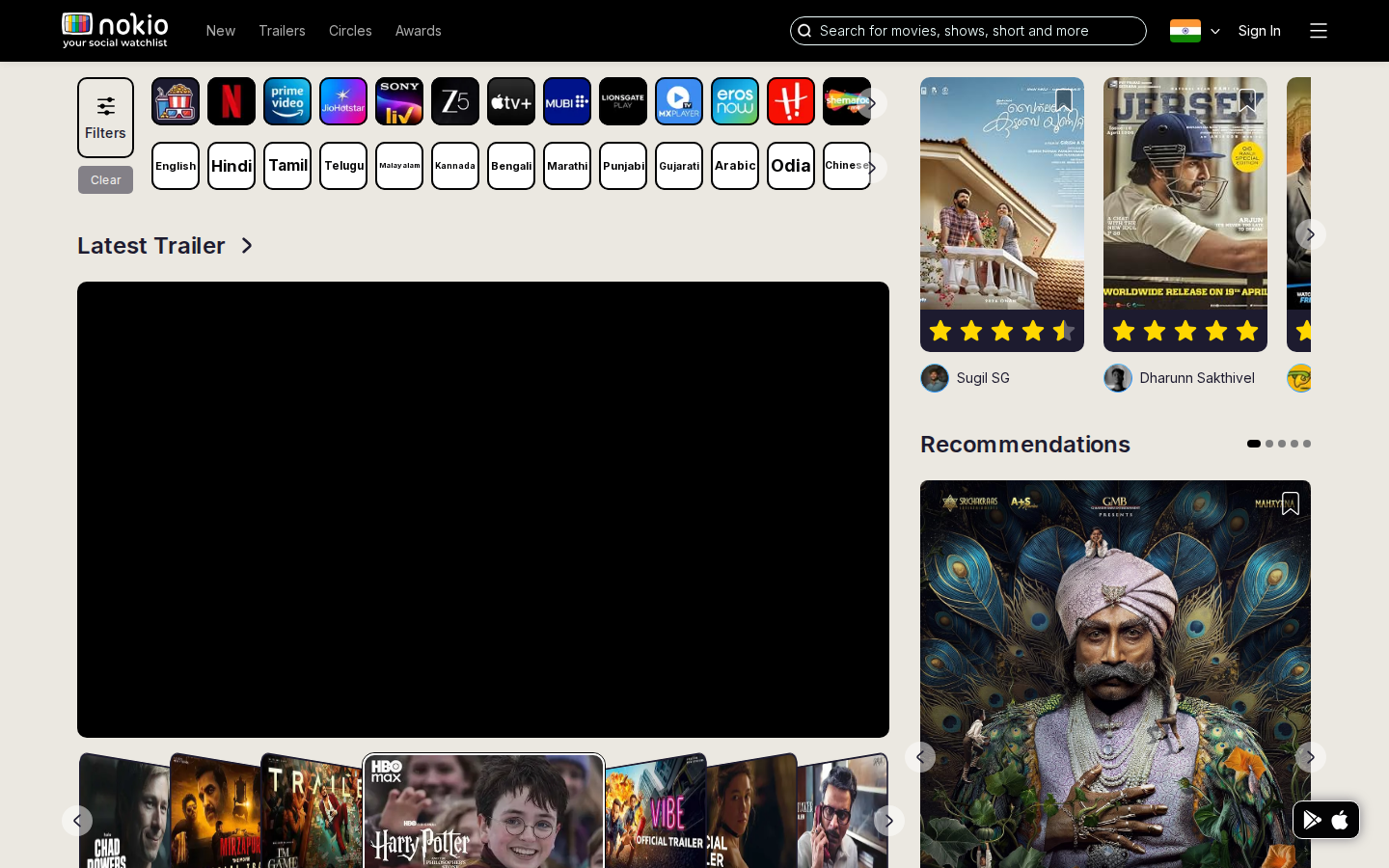
- Desktop right rail: social cards missing posters, clipped off the right edge, empty grey block below — worse than signed-out.
- Phone: YouTube + cover-flow leave New Releases half-visible; store FAB covers posters.
- Clear sits under Filters with a dead gap. Home chips are English + Tamil; trailers still dump every language.
- FAQ says home shows friends’ watches. After login this is still a public catalog.
Improvements
Empty rail, not broken cards
If recs/watchlist have no art, use Watchlist-style copy (“Nothing from your circle yet”) instead of blank clipped cards. Rail needs min-width: 0 and overflow hidden, or drop the third card.
Lead with one watchable thing
Move Latest Trailer to the top. Collapse Filters to one chip row. Remove the vertical gap under the trailer heading (cover-flow is reserving desktop height on phone).
One language source of truth
Trailers and New releases should use the same preferred-language set as Home, with a “More” overflow — not a 20-chip strip.
Hide store FAB when signed in
Put Get the App in the hamburger. The FAB currently covers New Releases posters.
New releases
Job: Scan titles that just landed, by service and language.
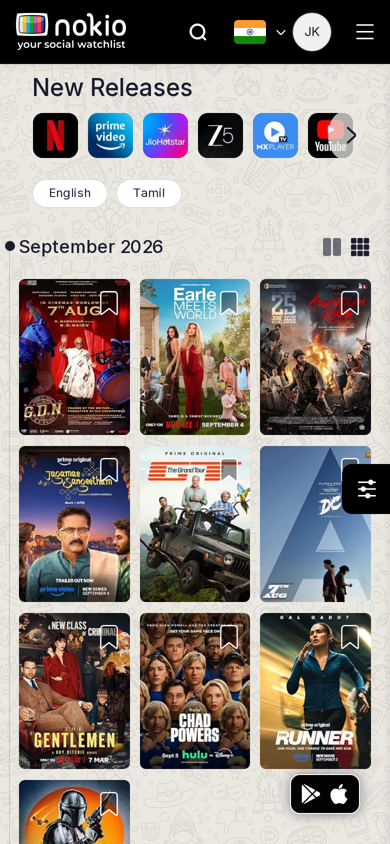
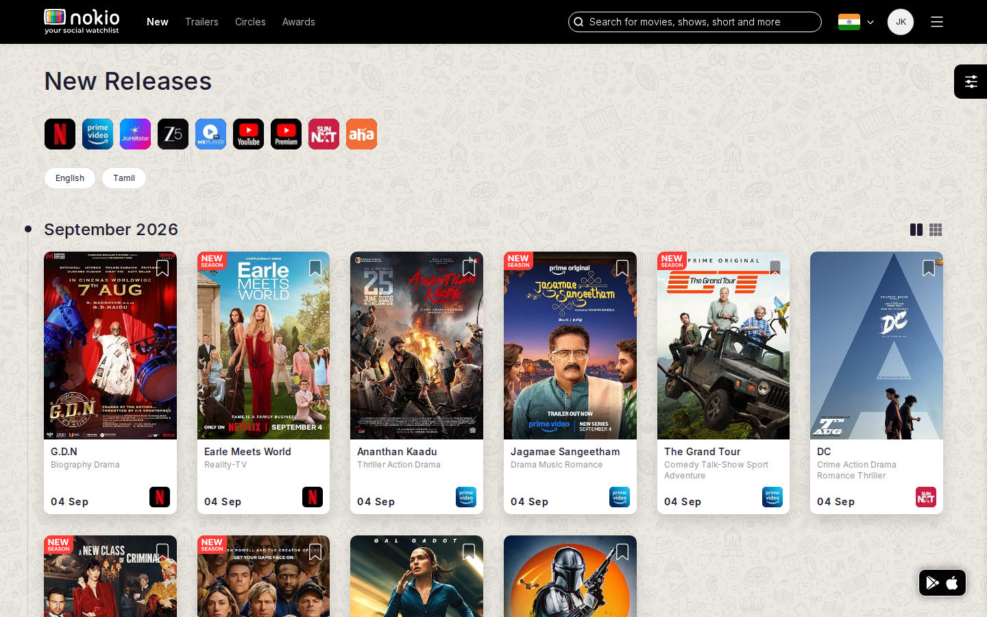
Signed out — same route
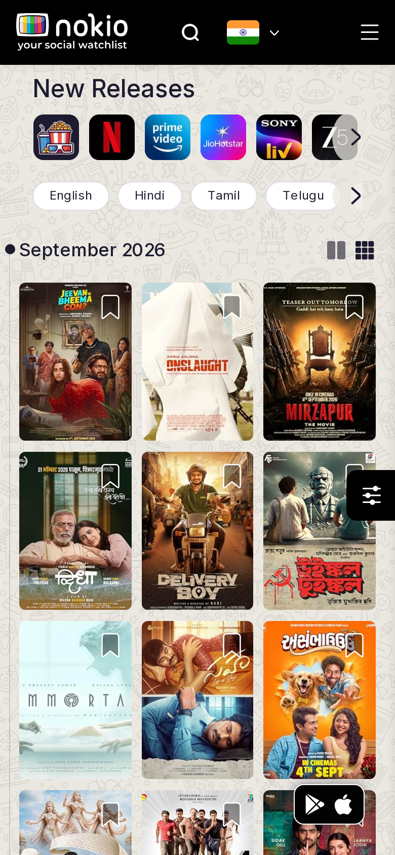
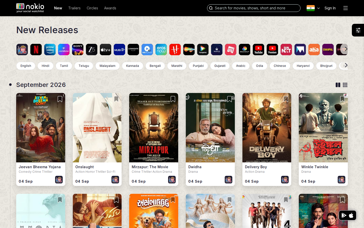
What the screenshots show
- Phone uses a 3-column poster grid — titles on art are unreadable; bookmark hits are tiny.
- Filter FAB + store FAB stack on the right column.
- Month grouping is useful; list/grid toggles are easy to miss.
Improvements
2-column posters on phone
grid-template-columns: repeat(2, minmax(0,1fr)). Bookmark at 44×44. Desktop can stay 4–6 columns.
Filters in the month row
Put filter next to “September 2026”. Drop the floating sliders button on phone so it does not cover posters.
Month jump
Sticky month label + jump (Aug / Sep) beats scrolling empty weeks.
Trailers (Recent)
Job: Skim latest trailers and play one.
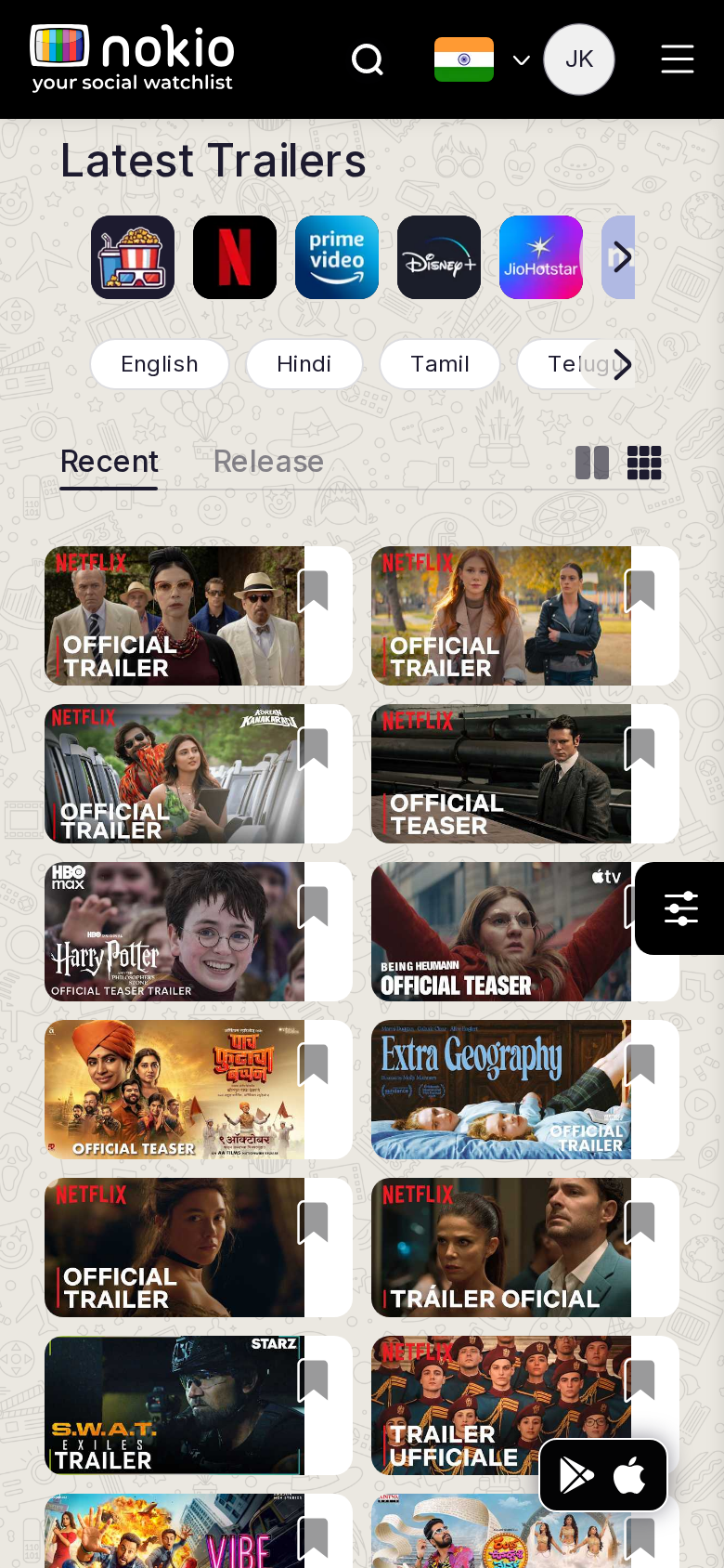
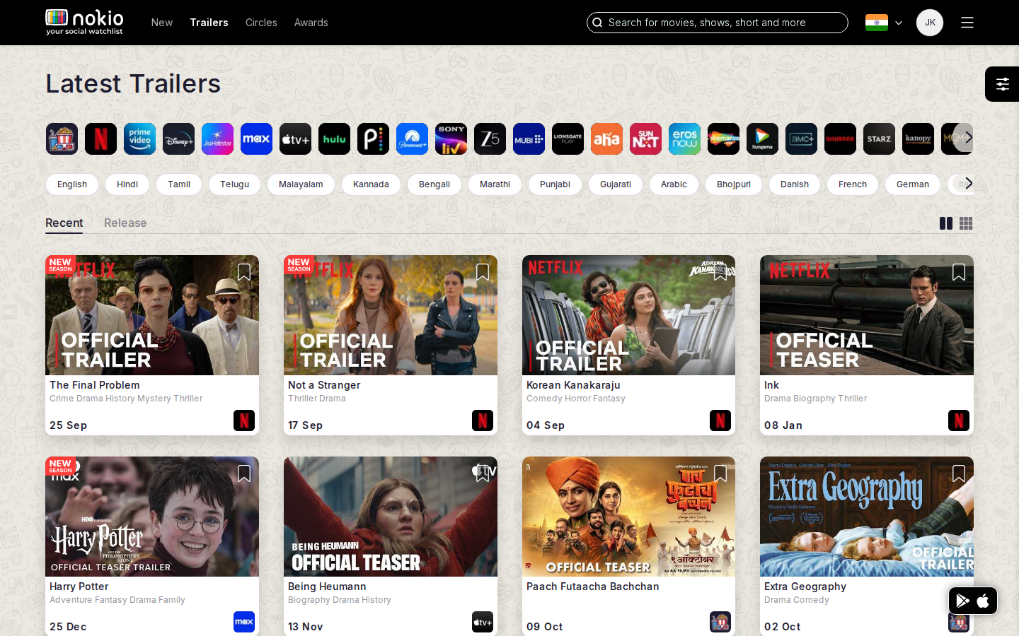
Signed out — same route
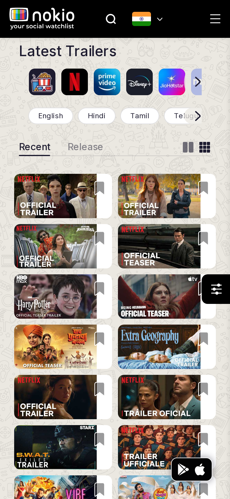
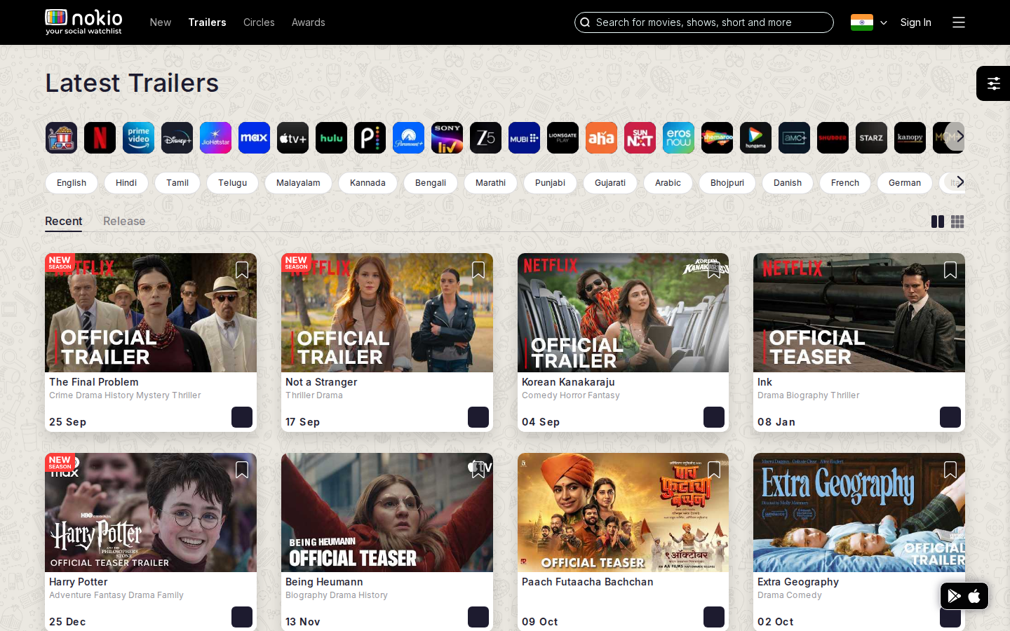
What the screenshots show
- 2-column thumbs work. Recent/Release labels are jargon.
- Bookmark on every thumb competes with play.
- Filter FAB overlaps the right column. Language chips ignore Home personalization.
Improvements
Rename tabs Latest / Coming soon
“Release” is not a user word. Keep the underline, change the labels.
Play is the primary action
Tap thumb to play. Bookmark as long-press or a 44px corner control, not a second tab on the art.
Reuse preferred languages
Same chip set as Home. Horizontal scroll with a fade, not a clipped last chip.
Trailers (By release)
Job: See trailers ordered by release date.
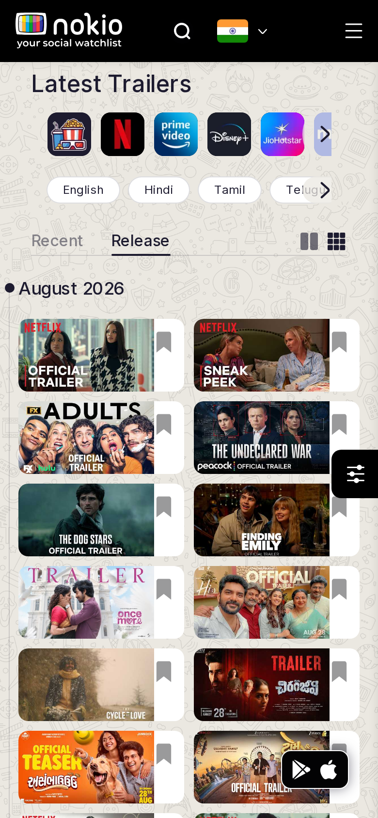
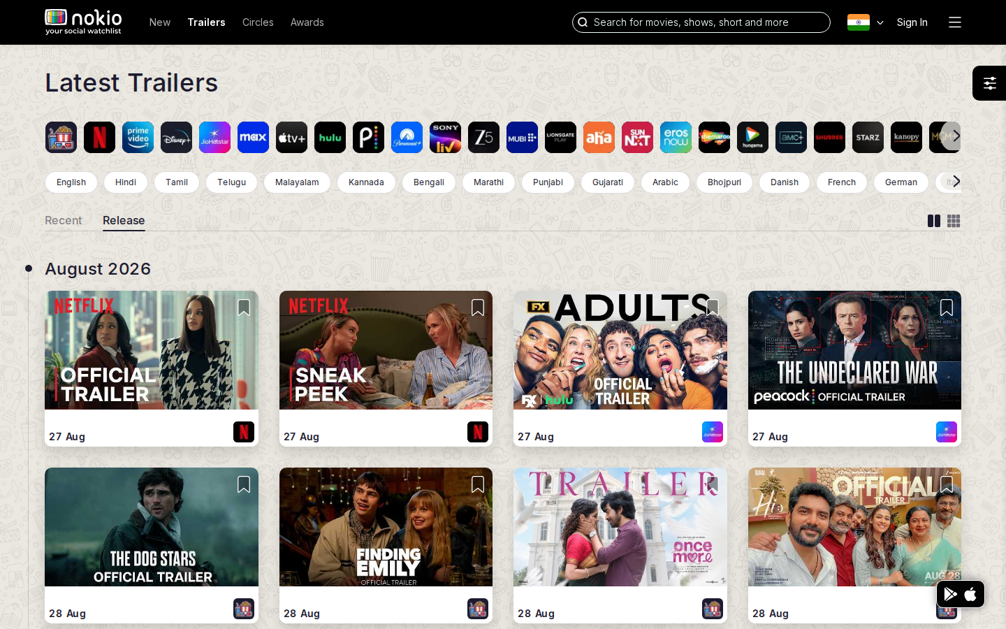
What the screenshots show
- Visually identical to Recent except the active tab — easy to think the click did nothing.
- Same FAB overlap and chip clipping.
Improvements
Make sort visible in the heading
H1 should read “Trailers · coming soon” when Release is active.
One trailers route
/in/trailers?sort=recent|release — less chrome, same job.
Movies search
Job: Find a specific title.
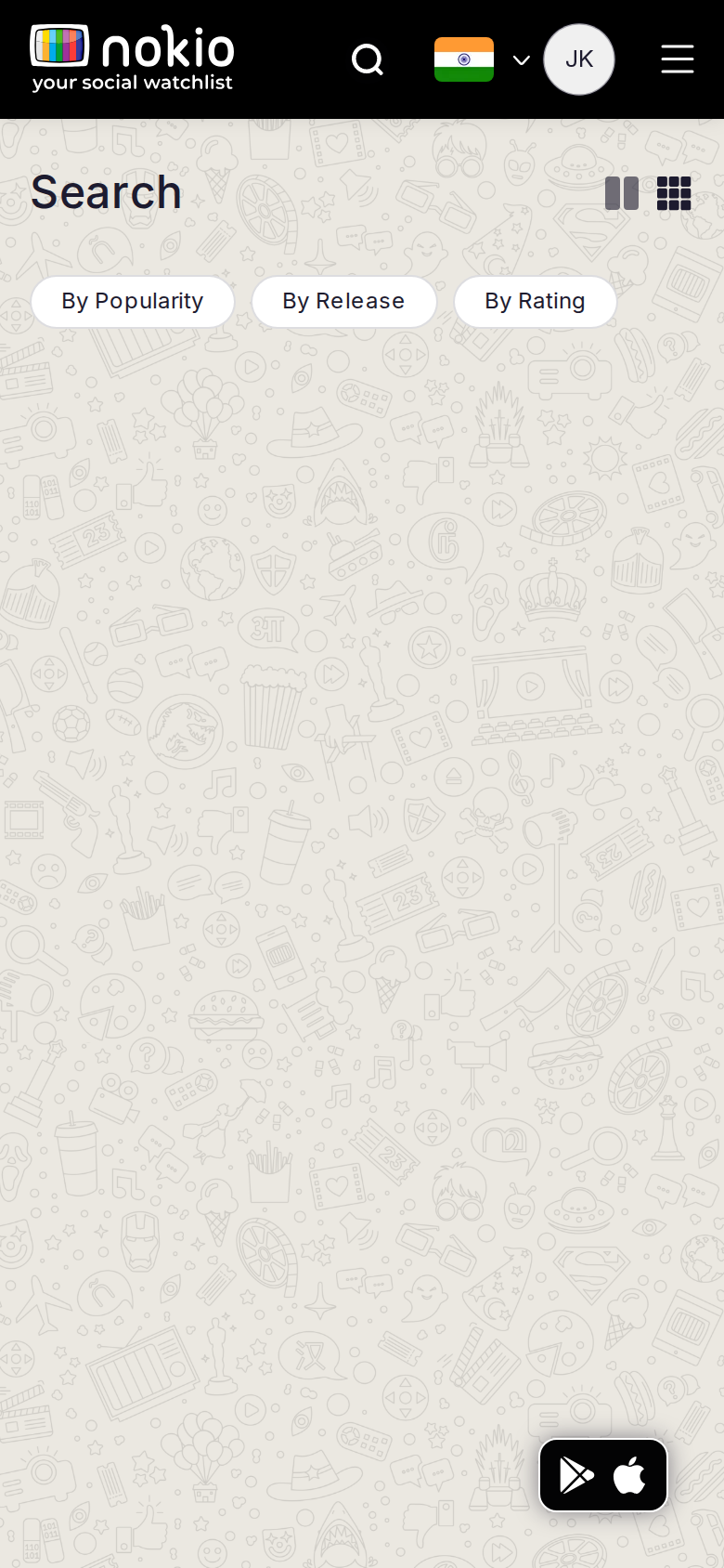
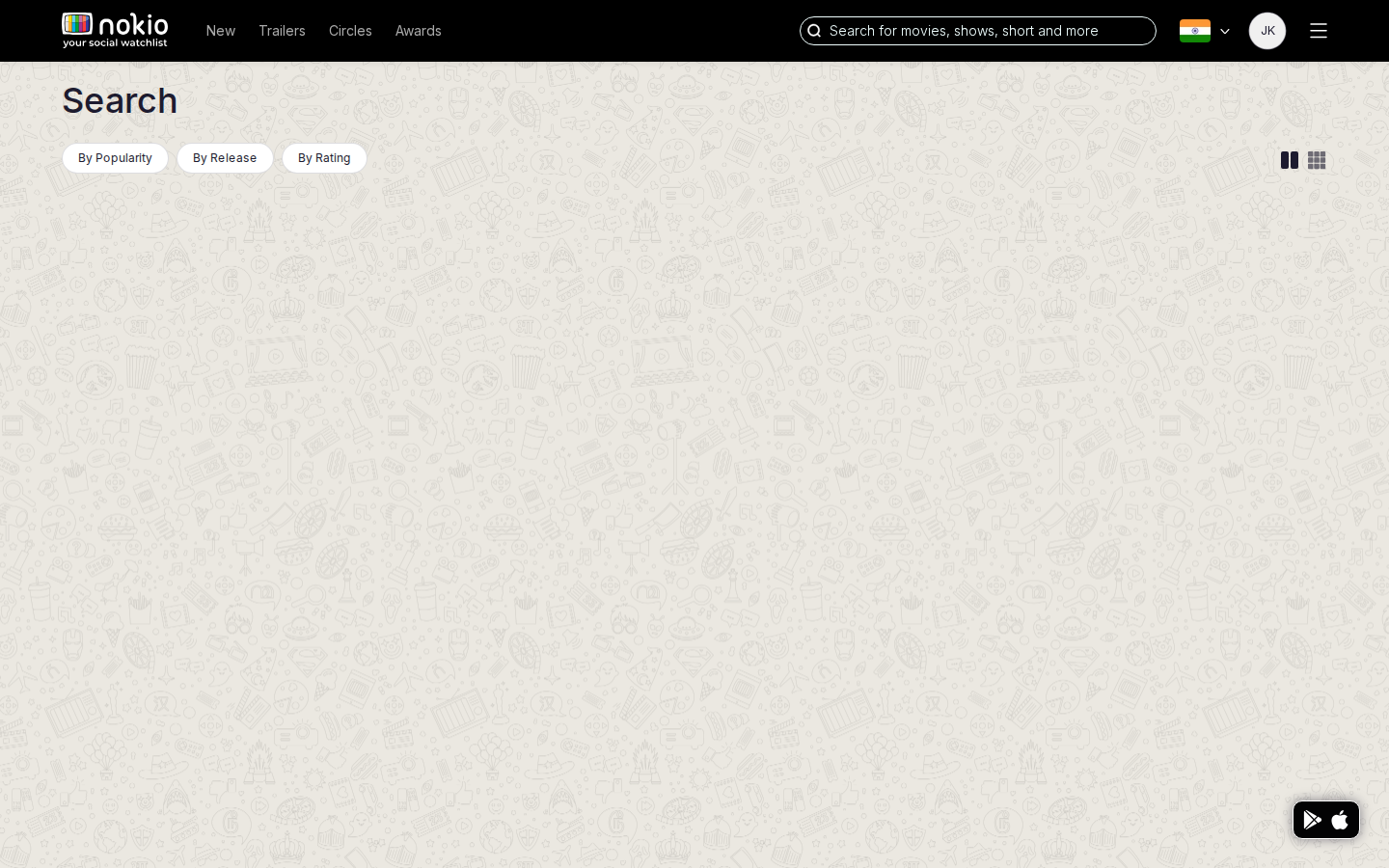
Signed out — same route
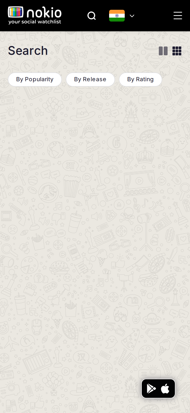
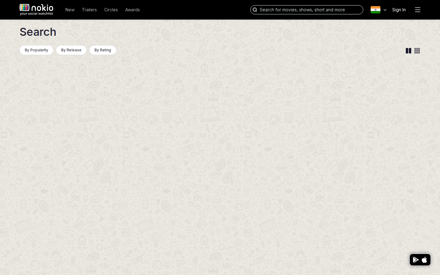
What the screenshots show
- Titled Search but has no search field. Query lives in the header icon.
- Empty patterned canvas. Sort chips sit over nothing. Login does not load a catalog.
Improvements
Autofocused field on this page
Large input, placeholder “Movie, show, or person”. This is the search destination — a field here is not redundant.
Never show a blank pattern
Empty q → popular (By Popularity already exists). No hits → “No titles match X” + clear.
Header search lands here with ?q=
Submitting the header field should populate this page, not a mystery empty state.
About us
Job: Understand Nokio and start using it.
What the screenshots show
- One sentence, navy on black, no header, no links, no CTA. Contrast fails WCAG.
- Zero anchors — cannot reach Home, Sign in, or stores.
Improvements
Restore app chrome + contrast
Use the app layout. White type on black (4.5:1). Logo goes home.
Real about page
What Nokio is, how Circles differ from algorithms, Sign in + Get the app. Three short blocks beat one riddle.
FAQ
Job: Resolve confusion about Circles, privacy, and how the product works.
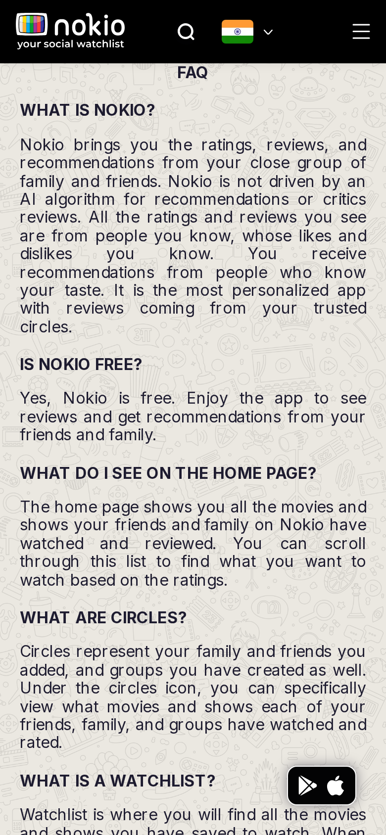
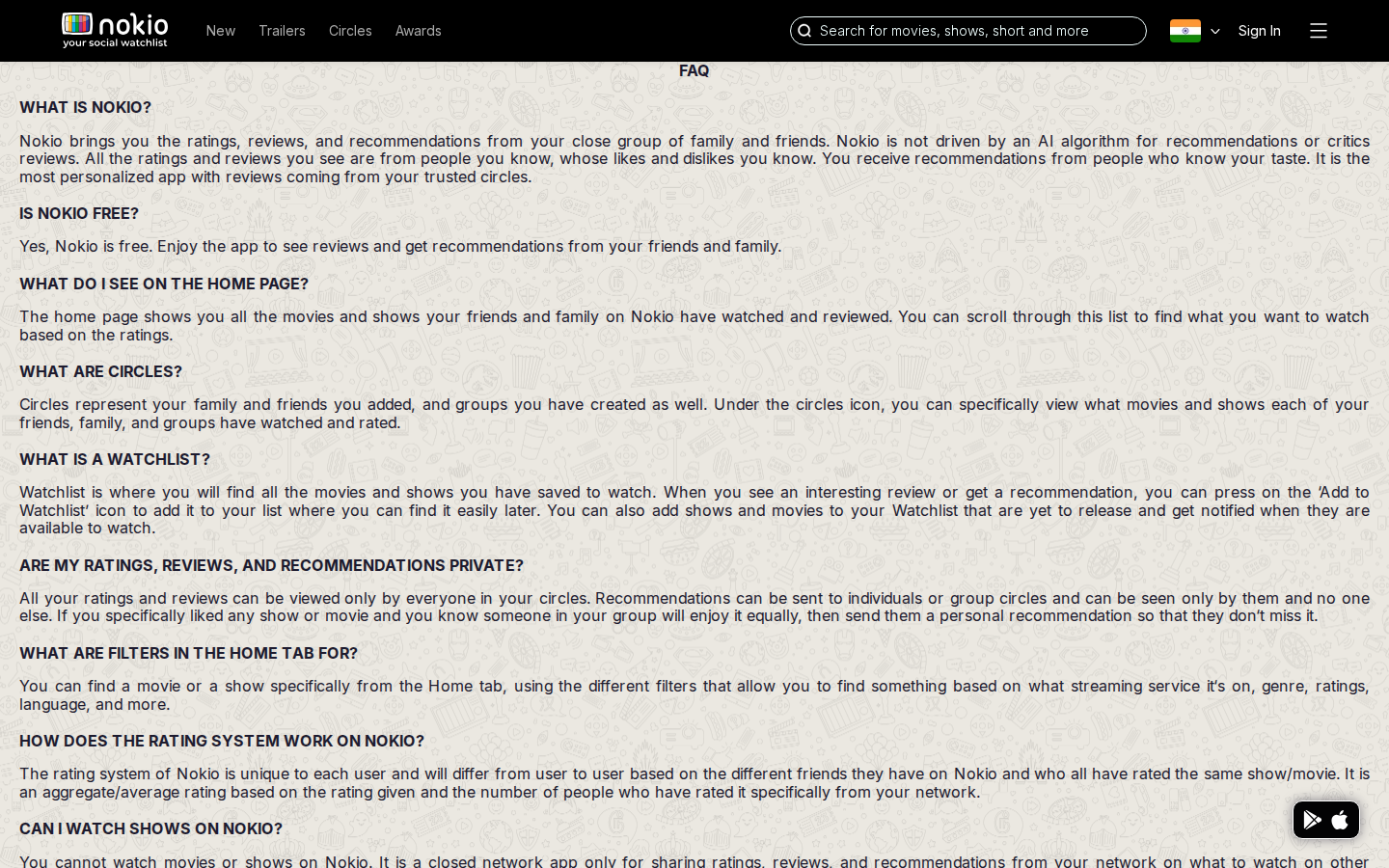
What the screenshots show
- Copy does not match UI: FAQ says home shows friends’ watches; home shows public trailers.
- Store FAB overlaps body copy. ALL-CAPS questions, no accordion, doodle under paragraphs.
Improvements
Rewrite Home / Circles answers
Change the product or the FAQ. Do not promise friends’ ratings on a public trailer page.
Accordion + solid cards
White cards, no doodle under text, padding-bottom 96px so the FAB cannot cover a clause. Sentence-case questions.
Terms of service
Job: Read the agreement.
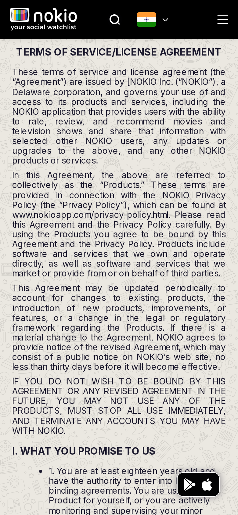
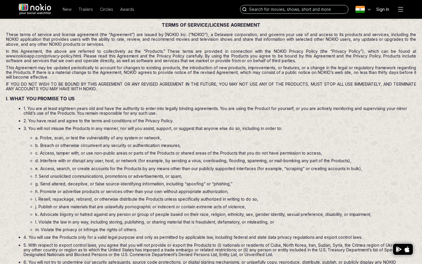
What the screenshots show
- Store FAB covers the first numbered clause on phone.
- Dense justified text on a busy background.
Improvements
Hide FAB on legal routes
Or pad the article 80px from bottom-right. Legal text must never sit under a chip.
Article chrome
Max-width ~680px, left-aligned, solid background, more paragraph spacing.
Privacy policy
Job: Understand data use.
What the screenshots show
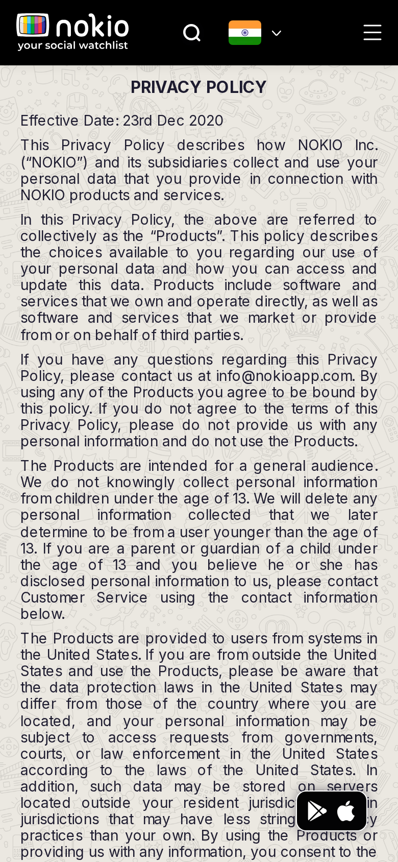
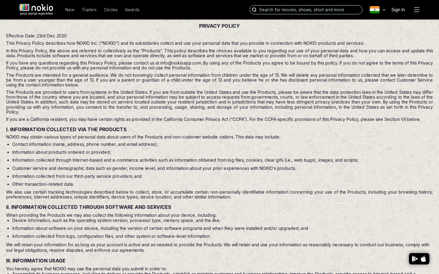
- Effective date 23 Dec 2020 looks stale. Same FAB overlap as Terms.
Improvements
Shared legal template
No FAB, no doodle, a Last updated date you actually maintain.
Public profiles
Job: Find critics to follow.
Signed out — same route
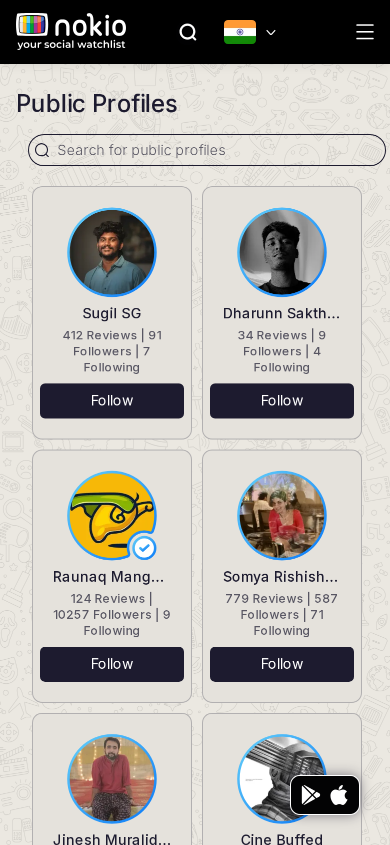
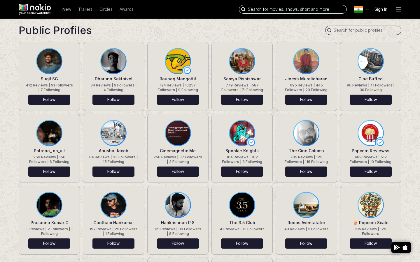
What the screenshots show
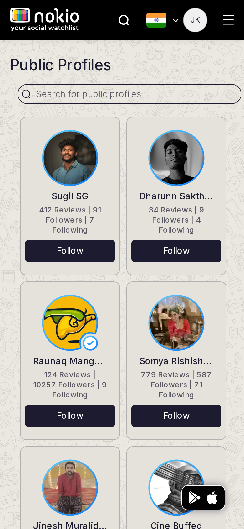
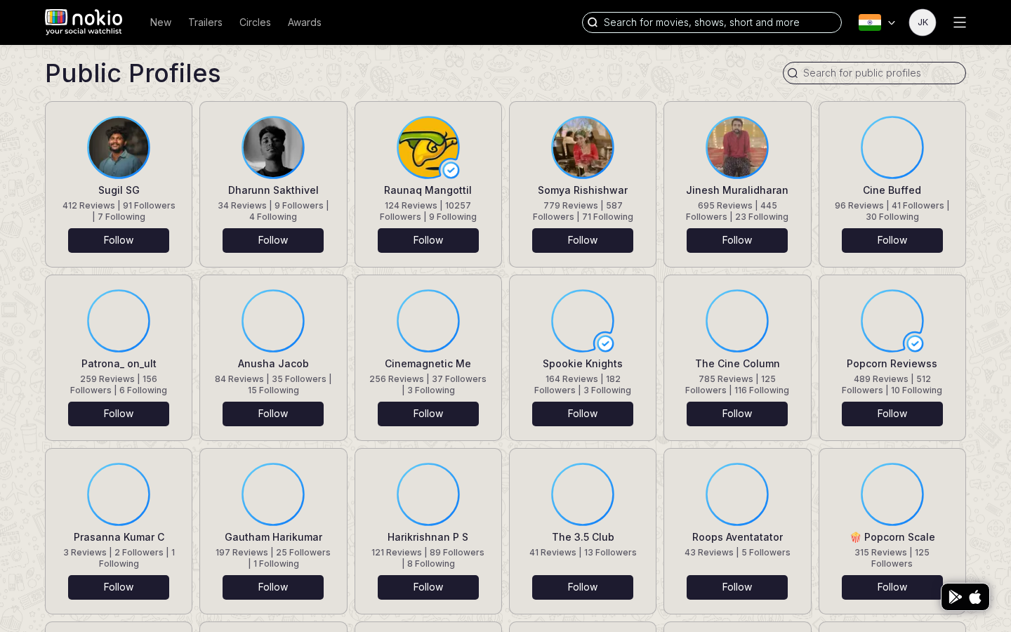
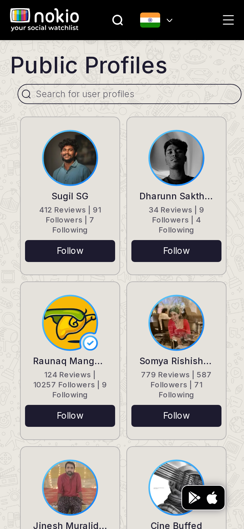
- Two-column cards truncate names. Stats wrap onto three lines. FAB covers the bottom-right avatar.
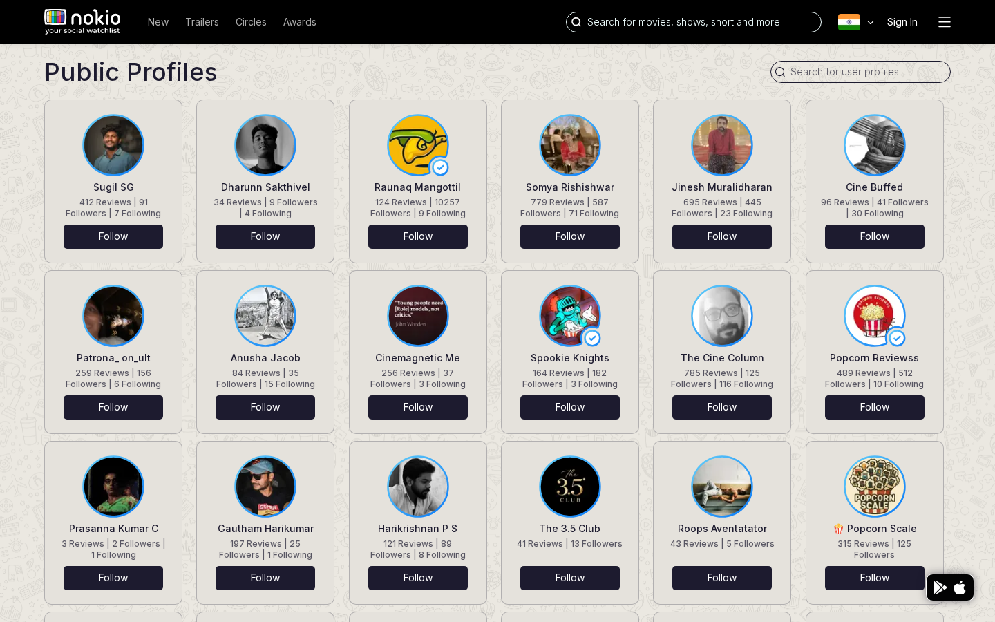
- /profiles still titles the page Public Profiles — duplicate IA.
Improvements
Fix the grid
repeat(2, minmax(0, 1fr)); width 100% on the absolute row. Names wrap two lines instead of ellipsis at ~12 characters.
One URL
Redirect /profiles → /public-profiles. Follow button must flip to Following immediately after tap.
Festival / awards
Job: Browse an awards slate and save titles.
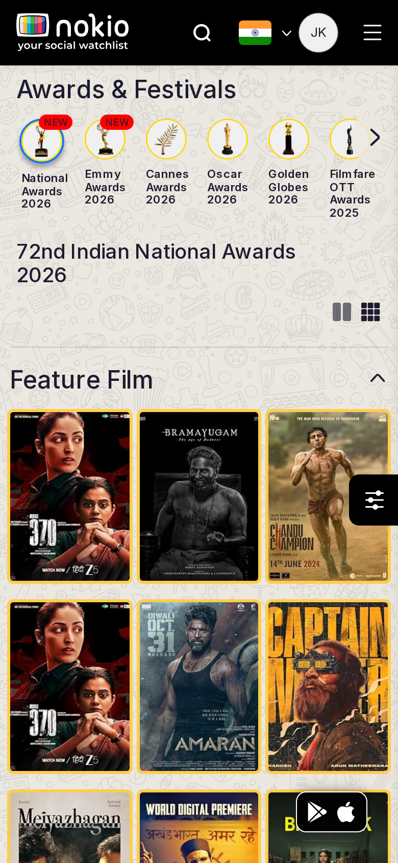
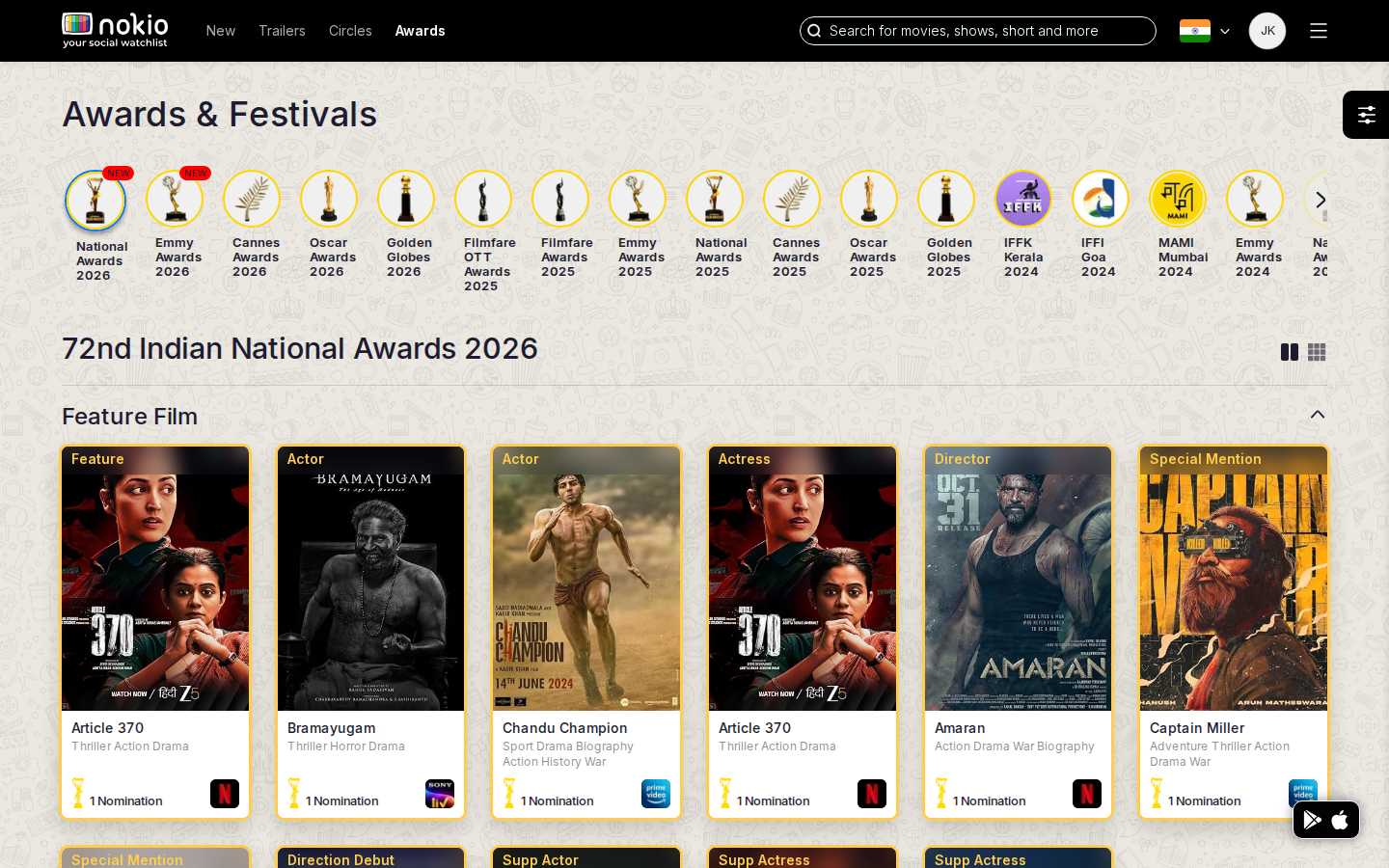
Signed out — same route
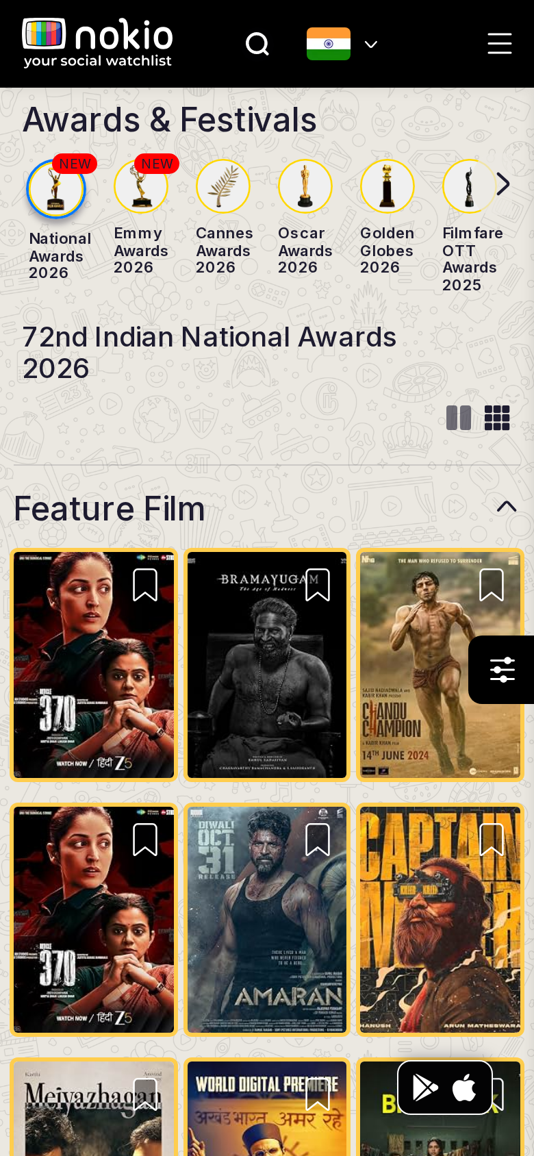
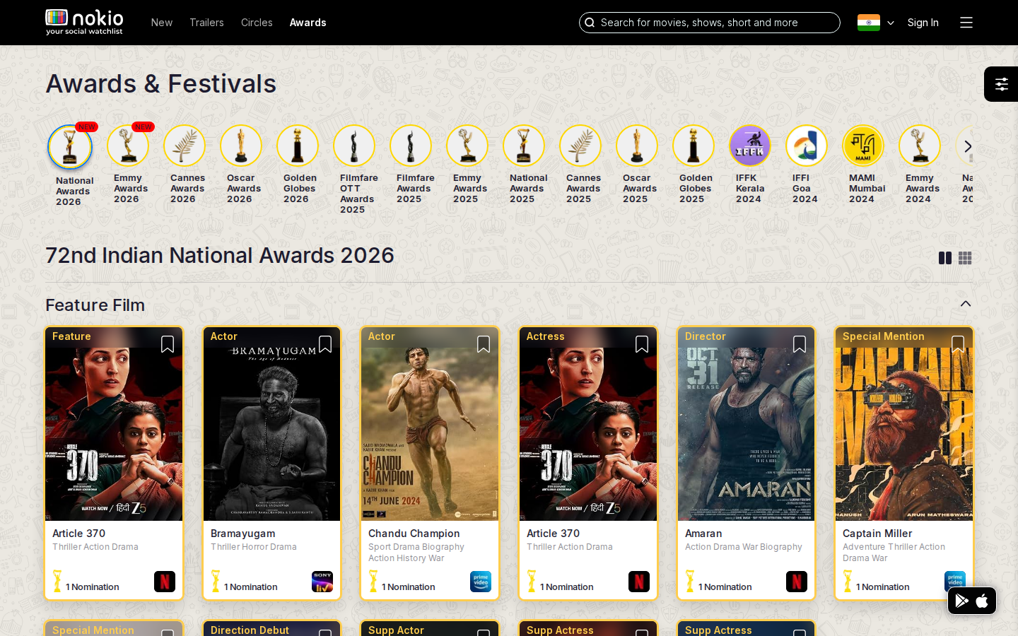
What the screenshots show
- Award-circle picker is strong; labels clip. Phone 3-col posters are tight. Filter FAB overlaps the grid.
- Possible duplicate poster. Auth does not add seen/want on first paint.
Improvements
2-col posters + fade on the award scroller
Two-line labels under circles. Gradient on the last visible award so “more” is obvious.
Personal layer after login
Bookmark should reflect watchlist. Optional “I’ve seen this” on winners.
Festival panel
Job: Watch or read a festival panel.
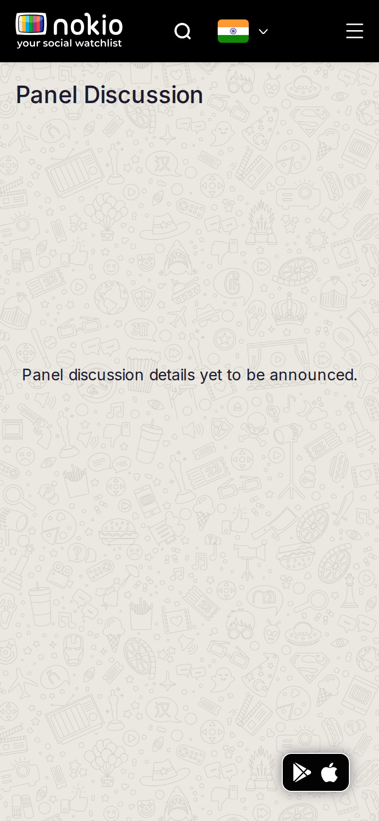
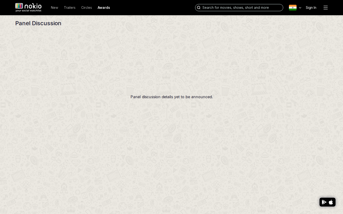
What the screenshots show
- Honest empty copy, tiny type in a huge patterned void. No festival name, date, or notify CTA.
Improvements
Coming-soon card
Which festival, date or TBA, Notify me. Illustration instead of doodle wallpaper. Hide the nav link until there is a panel.
Movie — reviews
Job: Decide whether to watch, and write a review.
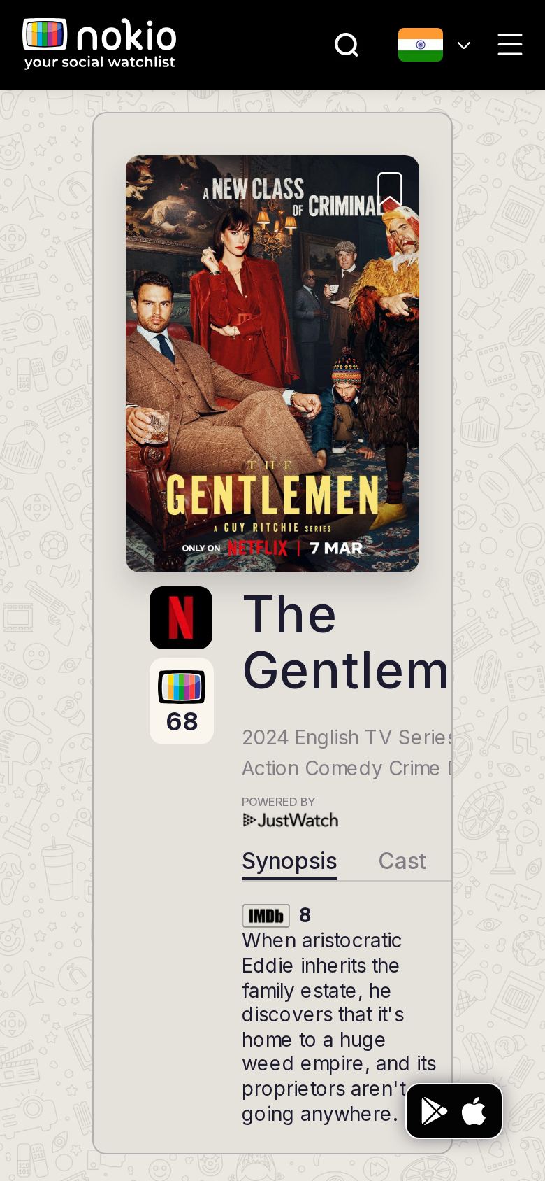
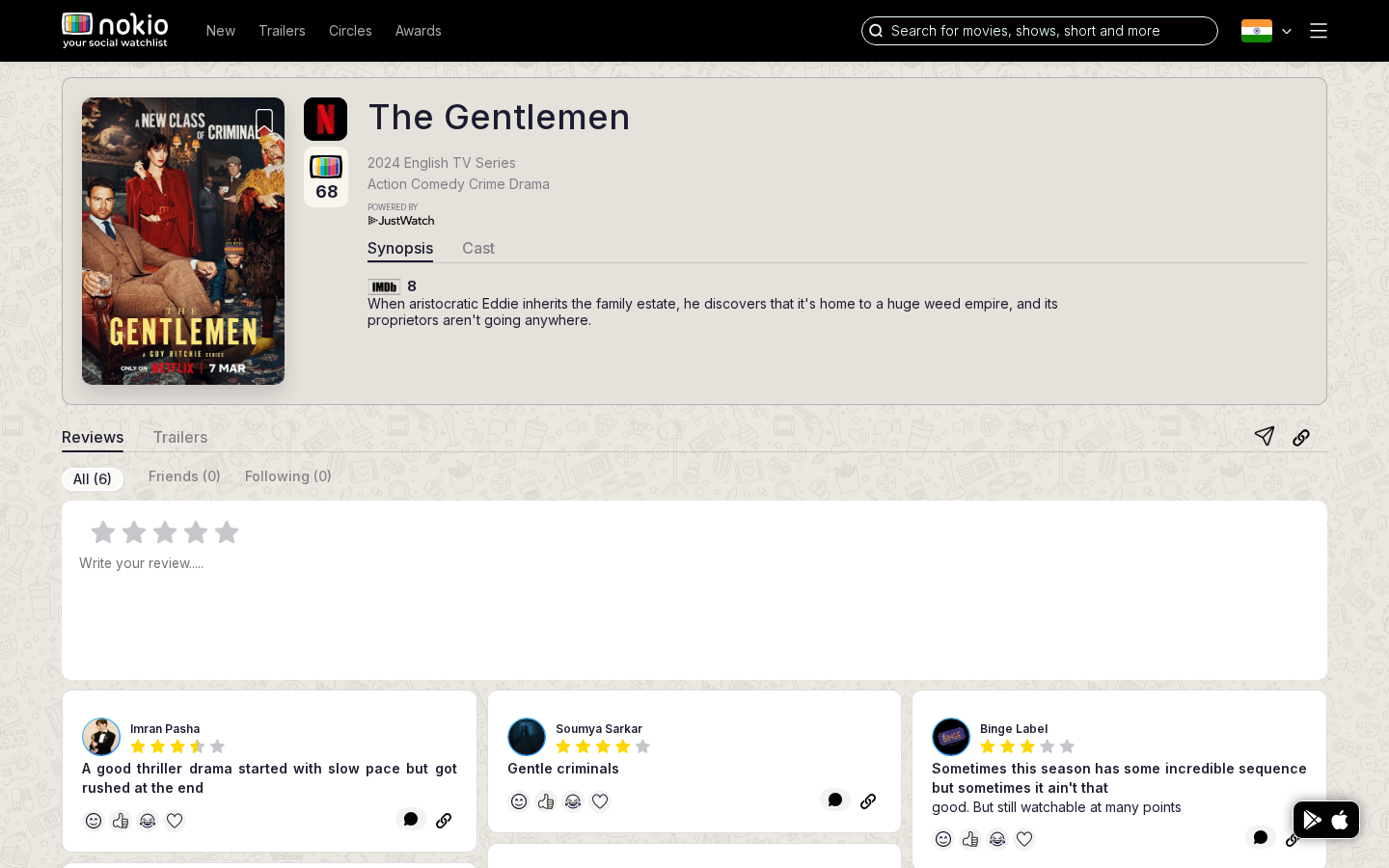
Signed out — same route
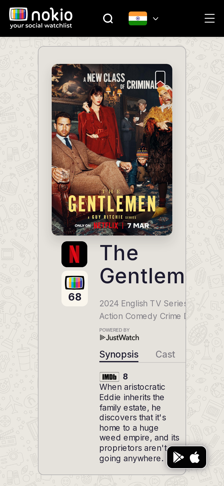
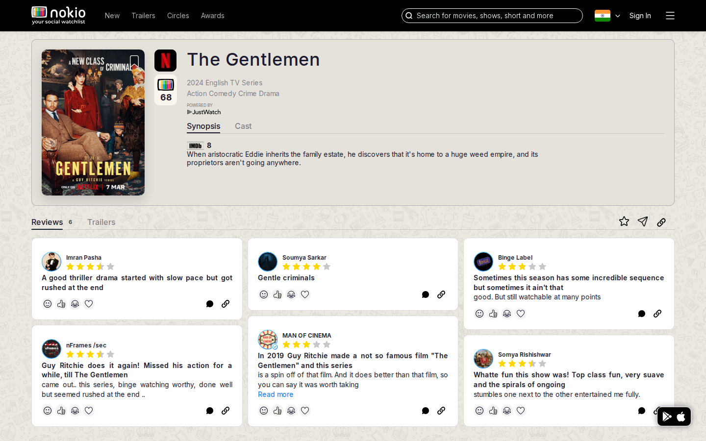
What the screenshots show
- Desktop is the best screen: compose box, All / Friends (0) / Following (0), review grid.
- Phone: title wraps badly, genres clip, reviews and compose are below the fold.
- Two tab rows (Synopsis/Cast vs Reviews/Trailers). Nokio 68 vs IMDb 8 unexplained.
Improvements
Stack phone hero
Poster, then full-width title (wrap), then genres, then synopsis. First review or the compose box should enter the fold.
One tab row
Synopsis | Cast | Reviews | Trailers. Visible caption: “Nokio score · public profiles” — no hover-only tooltip on touch.
Friends (0)
Pill should say “Follow people to see their reviews” instead of an empty filter.
Movie — trailers
Job: Play a trailer for this title.
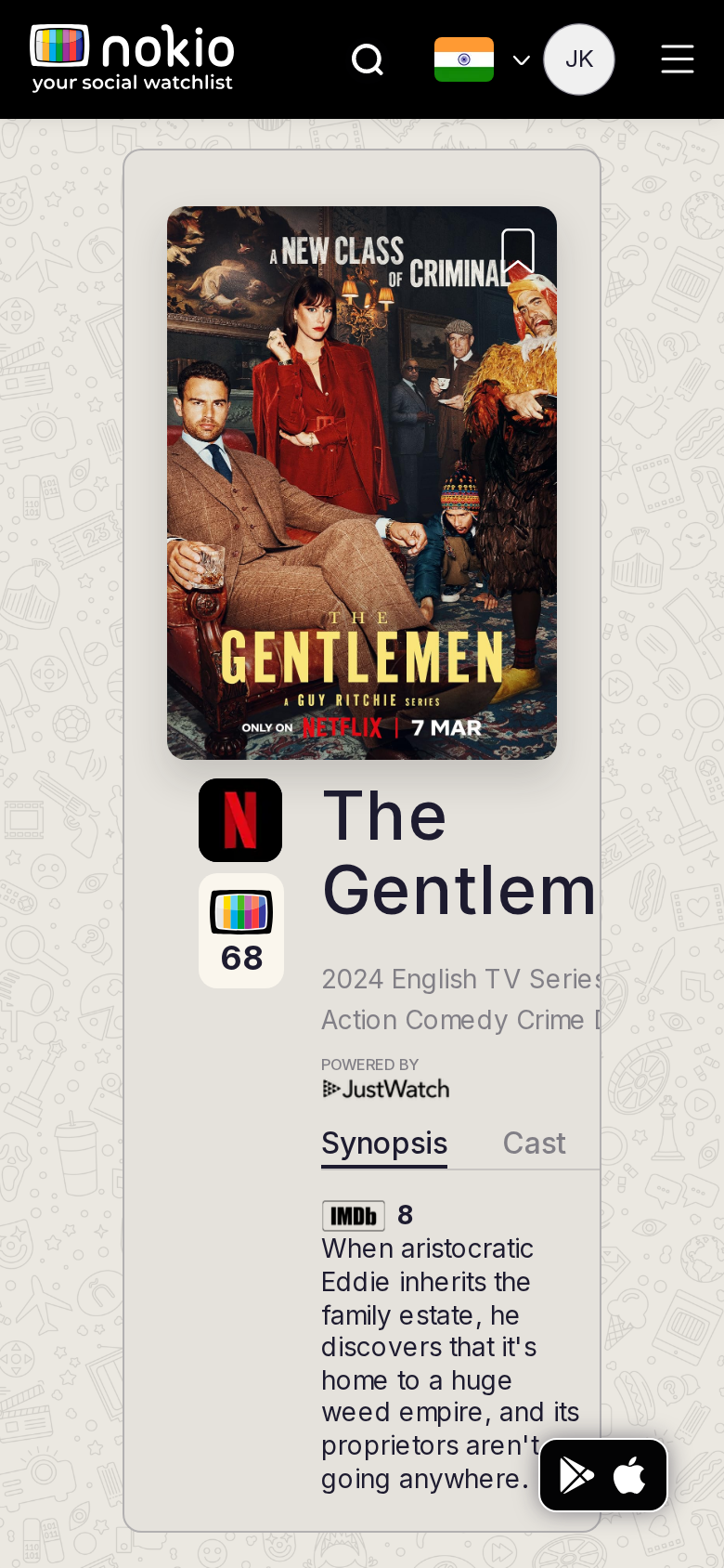
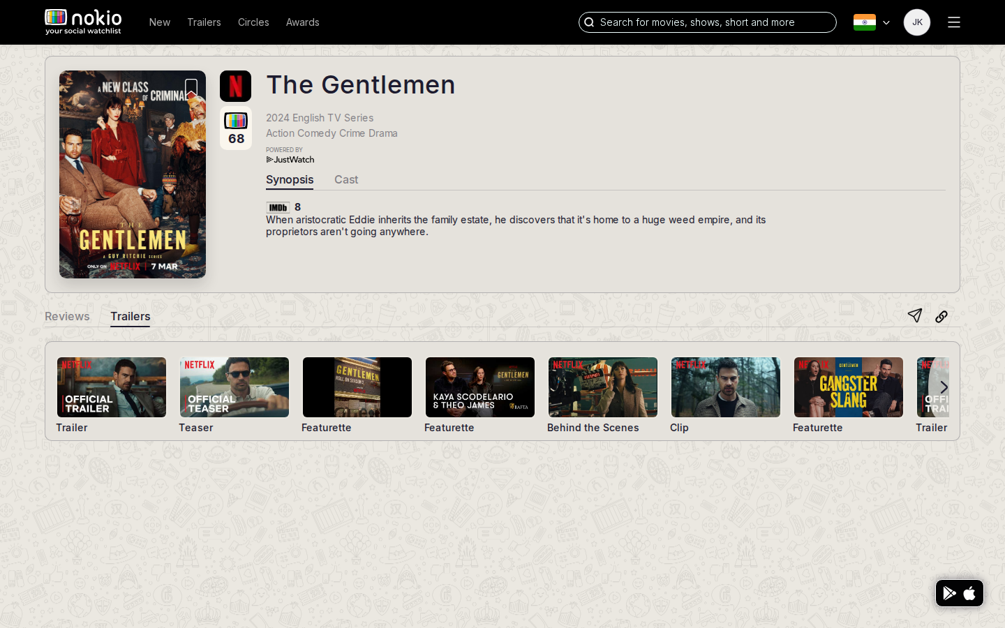
Signed out — same route
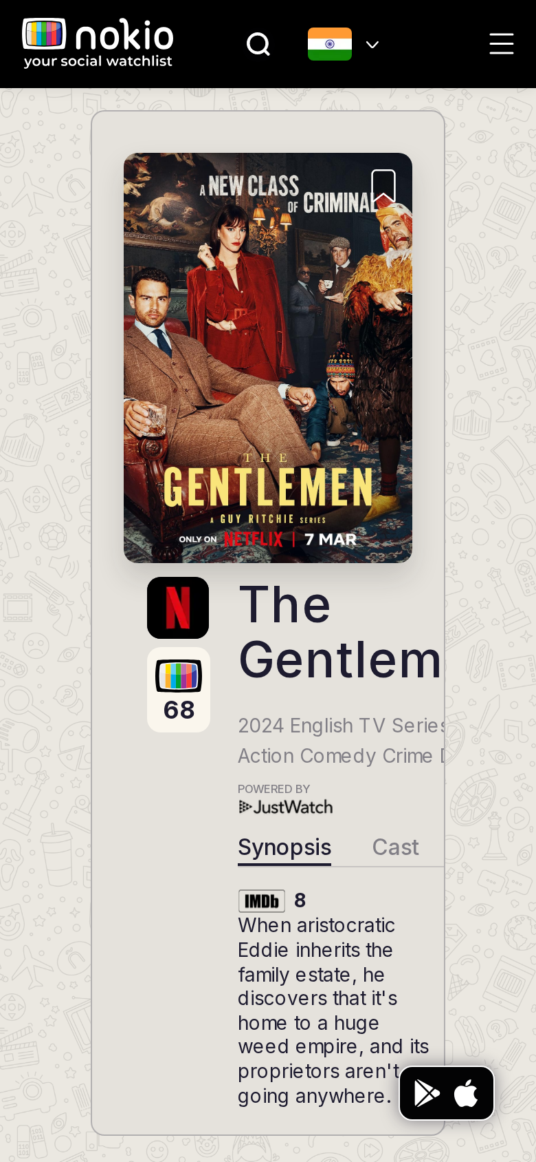
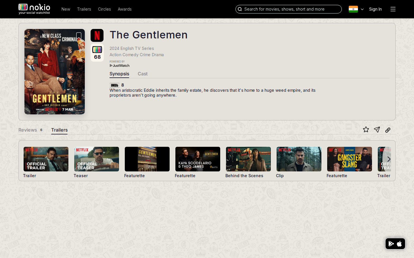
What the screenshots show
- Desktop strip with Trailer / Teaser / Featurette labels is scannable.
- Phone /trailers still shows the synopsis hero first — trailers below the fold.
Improvements
Honor the URL
On /trailers, scroll the player into view on load, or collapse the hero so the strip is first.
Tap opens a player
Phone should not be another poster wall. Autoplay muted on the selected item.
Upcoming movie
Job: Learn about a title that is not out yet.
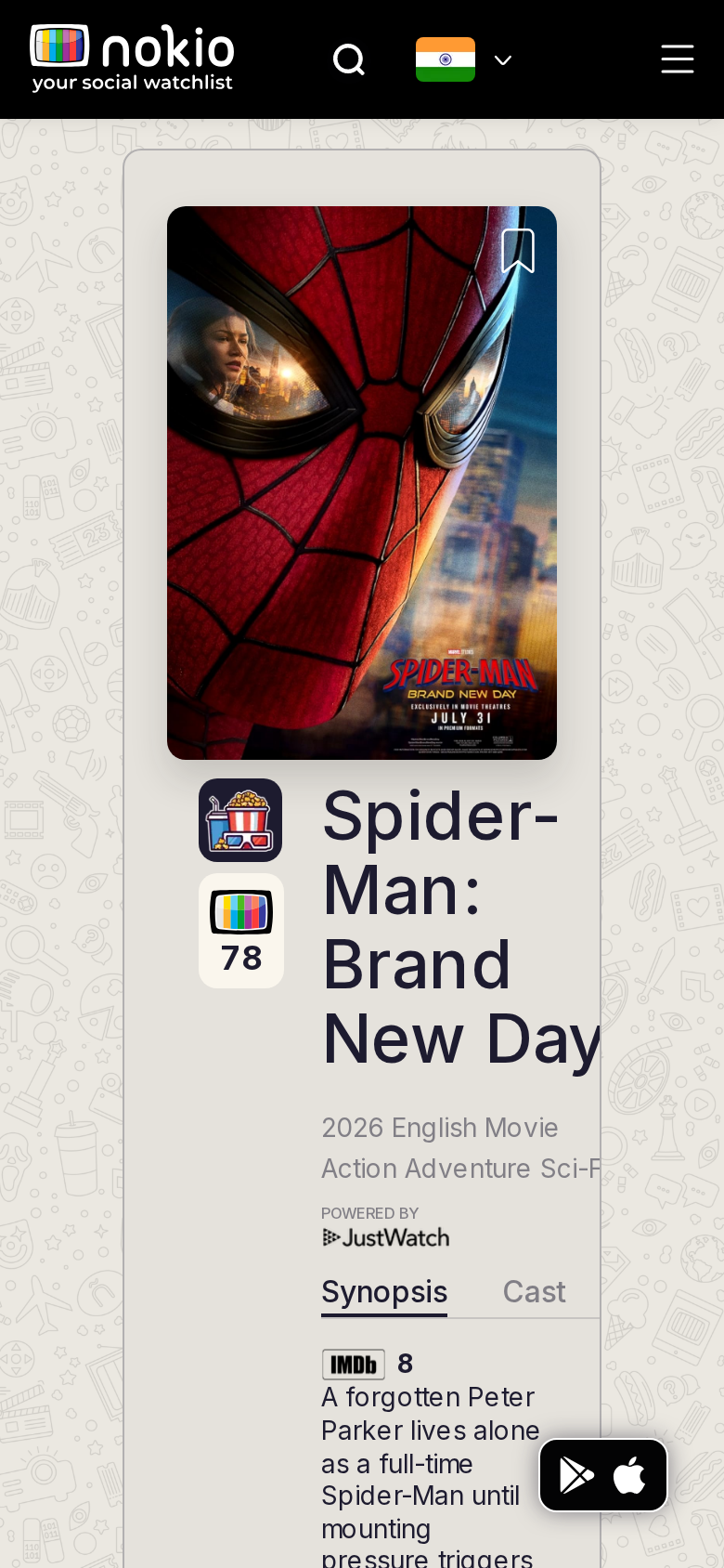
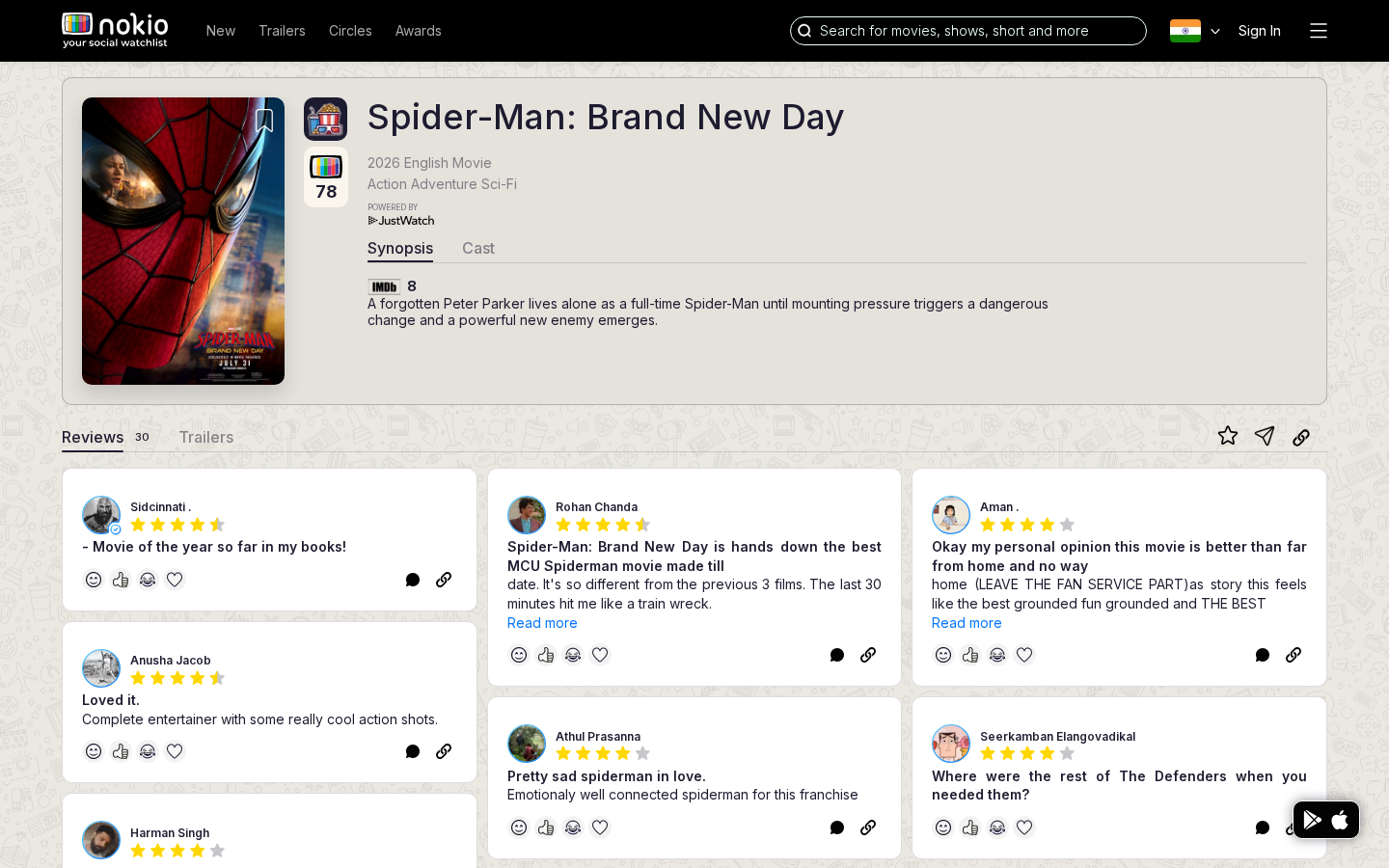
What the screenshots show
- Title fits. Store FAB overlaps synopsis. No countdown, notify, or “where it will play”.
- Score 78 on an unreleased film is unexplained.
Improvements
Upcoming module
Release date, Notify me, platforms when available. Qualify or hide the Nokio score until reviews exist. Keep FAB off the synopsis.
Public profile (signed out)
Job: Evaluate a critic and follow them.
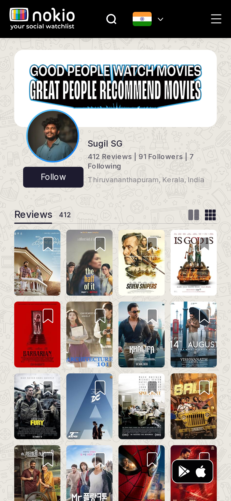
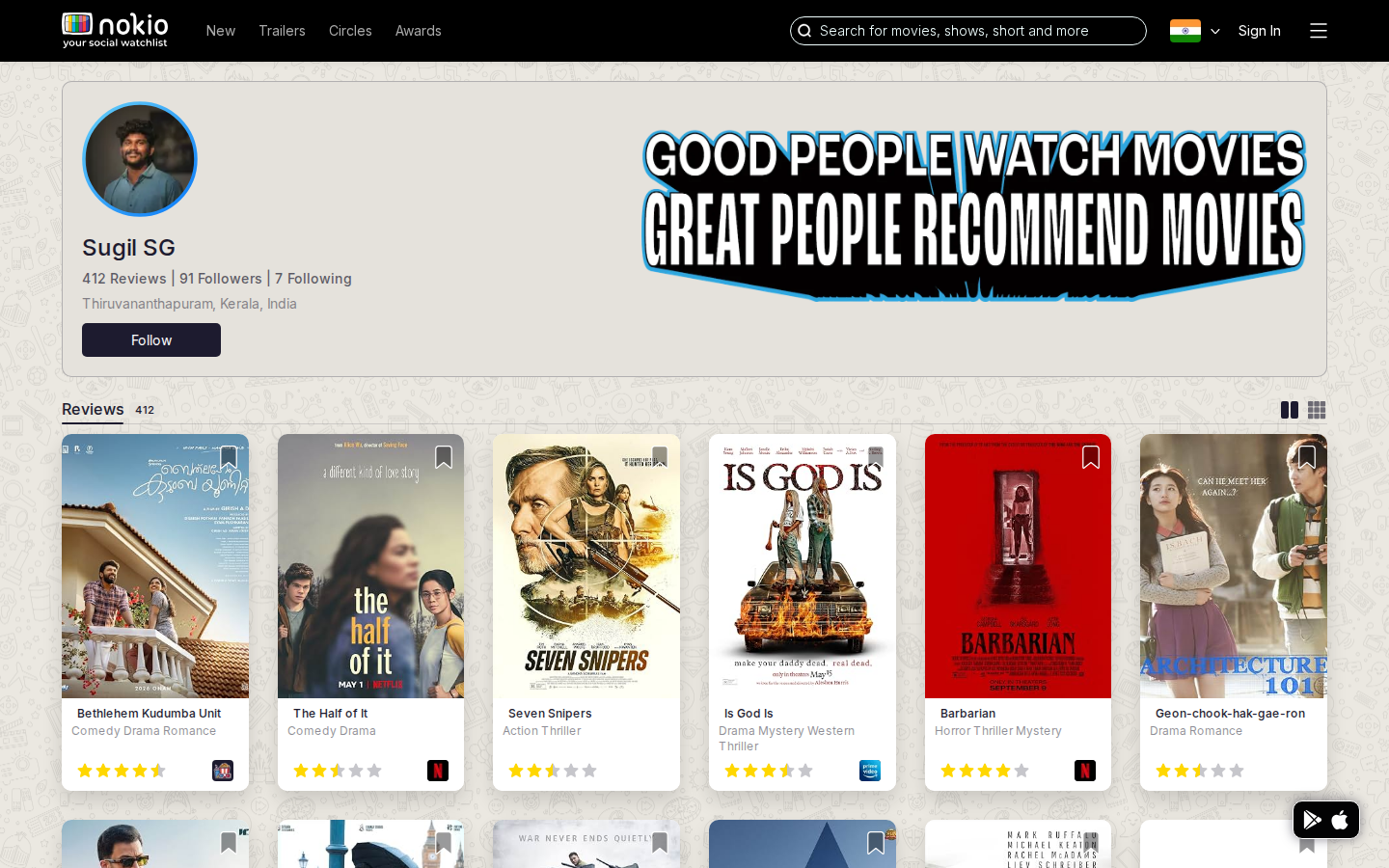
What the screenshots show
- Identity is clear: name, counts, city, Follow, reviews mosaic.
- Phone 4-column posters are unreadably small. Banner is brand, not bio. FAB covers posters.
Improvements
2-column posters on phone
Default list view on phone. Counts (Reviews / Followers / Following) must be tappable and those routes must not be blank.
Public profile (signed in)
Job: Same critic page after login.
What the screenshots show
- Signed-in phone is an empty patterned shell. Signed-out showed a full grid — likely an auth/query race.
Improvements
Fall back to public payload
If the signed-in query fails, keep the public profile on screen. Skeleton, never an empty doodle. Follow button must reflect graph state.
Profile followers
Job: See who follows this person.
What the screenshots show
- Blank pattern. Counts on the profile promise a graph this URL does not deliver.
Improvements
List or a gate
Public: follower cards. Private: “Sign in to see followers.” Never a naked pattern.
Profile following
Job: See who this person follows.
What the screenshots show
- Same blank shell as Followers.
Improvements
Same treatment as Followers
List, empty state, or sign-in gate. Wire header counts to these routes.
Reset password
Job: Set a new password from an email link.
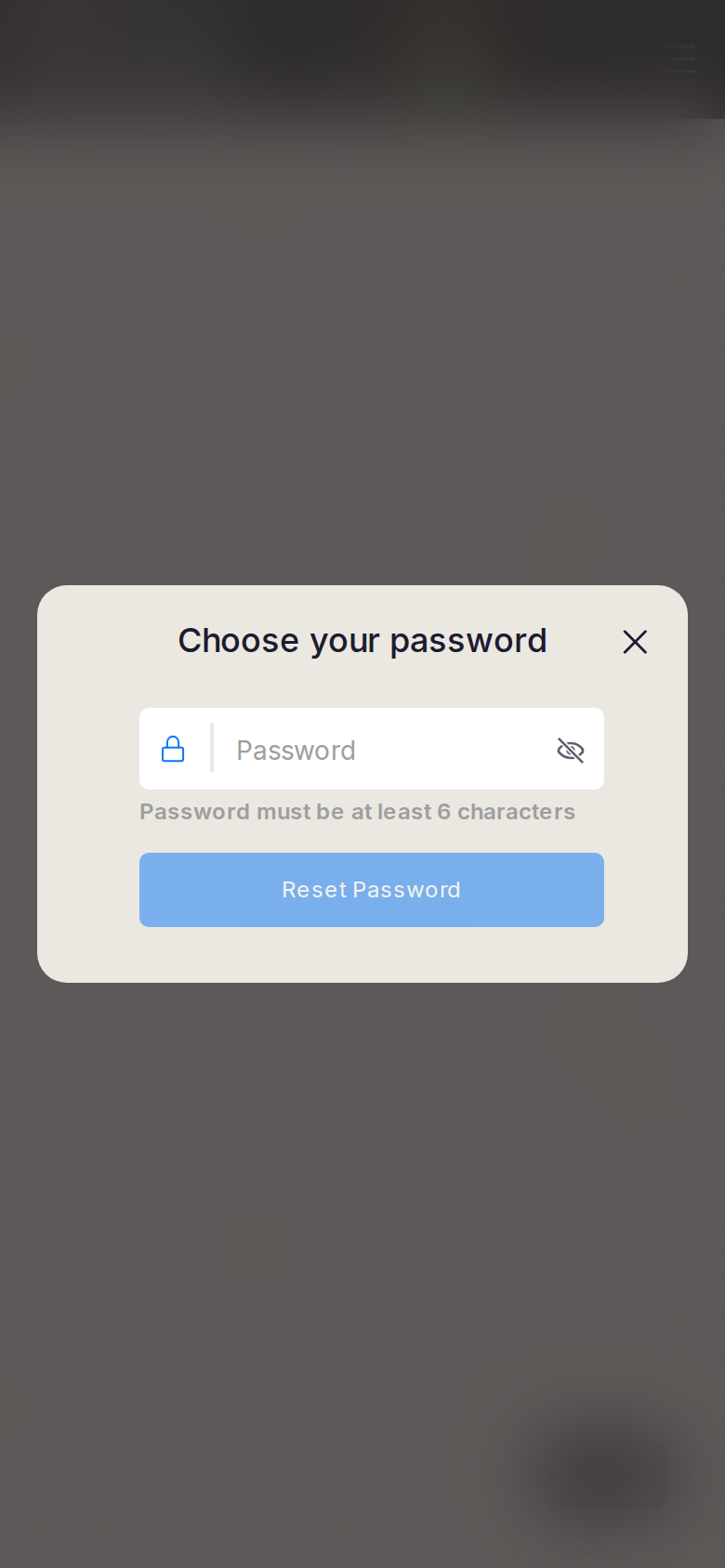
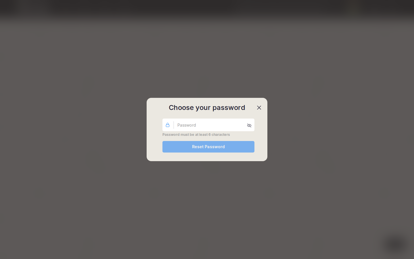
What the screenshots show
- Task is obvious. Submit looks enabled while empty. Centered modal; keyboard will cover the button. Tiny X.
Improvements
Disable until 6 characters
Dim the button. Phone: bottom sheet so the action stays above the keyboard. Add “Back to sign in” besides X.
Circles — public
Job: Follow public profiles into my circle.
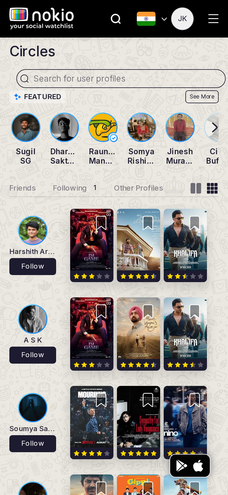
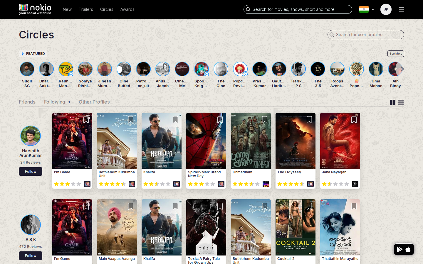
Signed out — same route
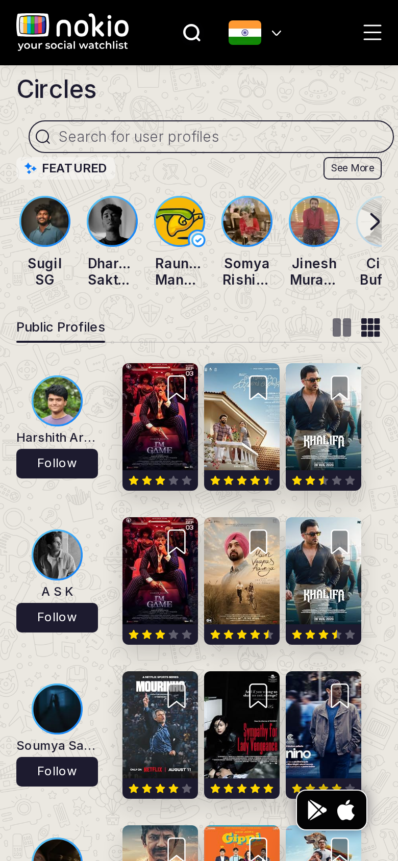
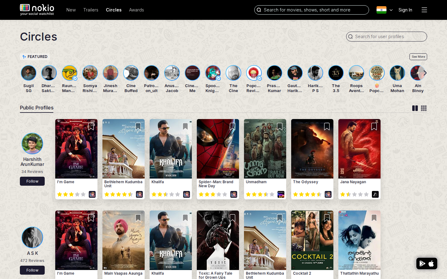
What the screenshots show
- Featured row truncates names. Dual search (movies vs people). FAB covers feed posters.
Improvements
Two-line names under avatars
Reduce visible count rather than “Dhar… Sakt…”. On this page, people-search is primary — shrink header movie search.
Circles — friends
Job: See friends and what they watched.
Signed out — same route
What the screenshots show
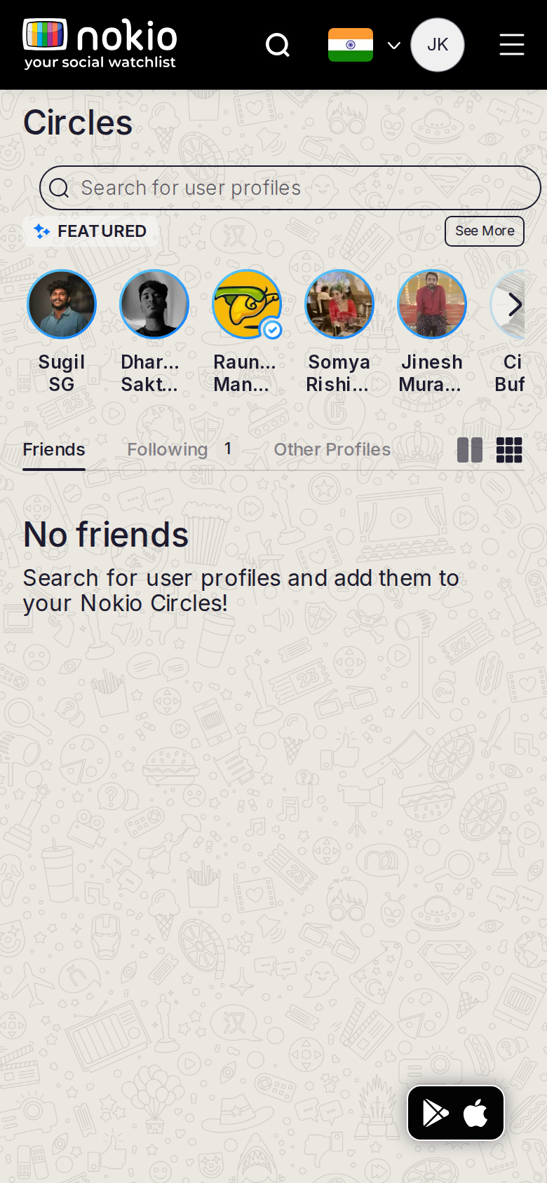
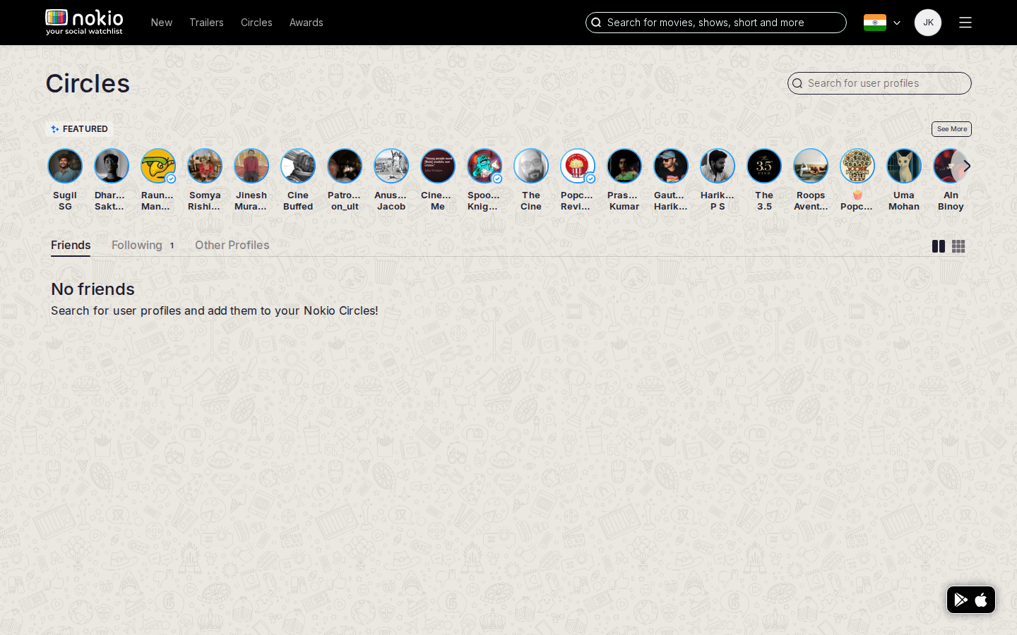
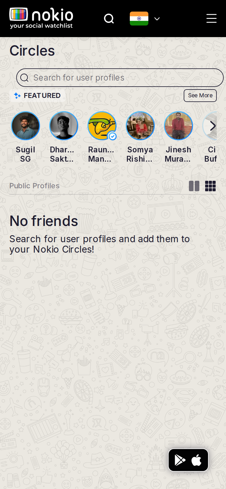
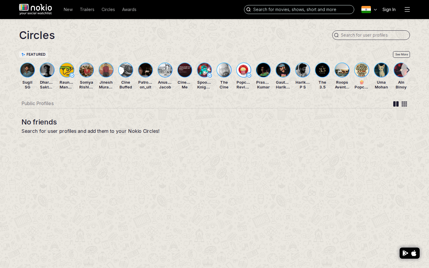
- Empty state exists, but Featured public people still dominate. Subhead says Public Profiles over “No friends”.
Improvements
Hide Featured on the Friends tab
Featured contradicts “No friends”. Move it to Public only. CTA: Find people to follow → focus search.
Circles — following
Job: See people I follow.
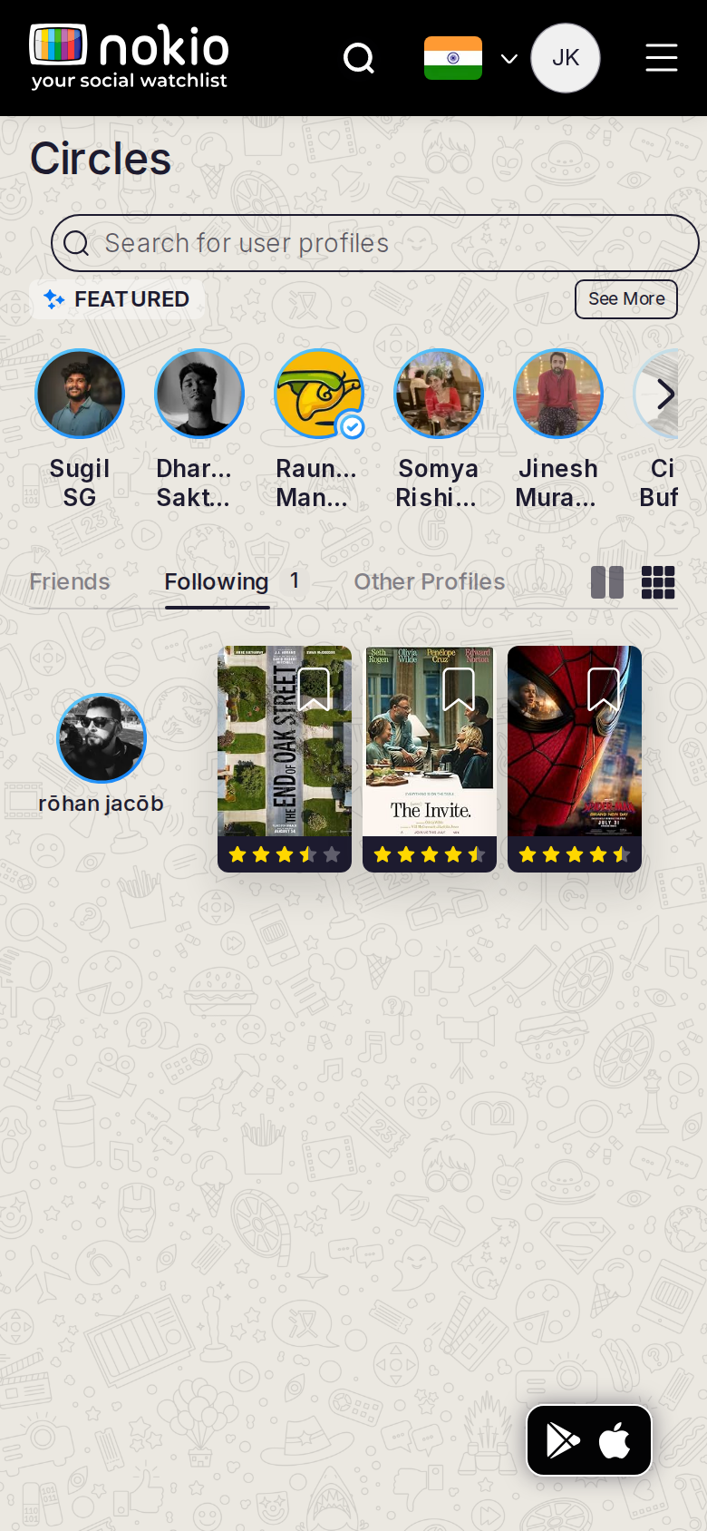
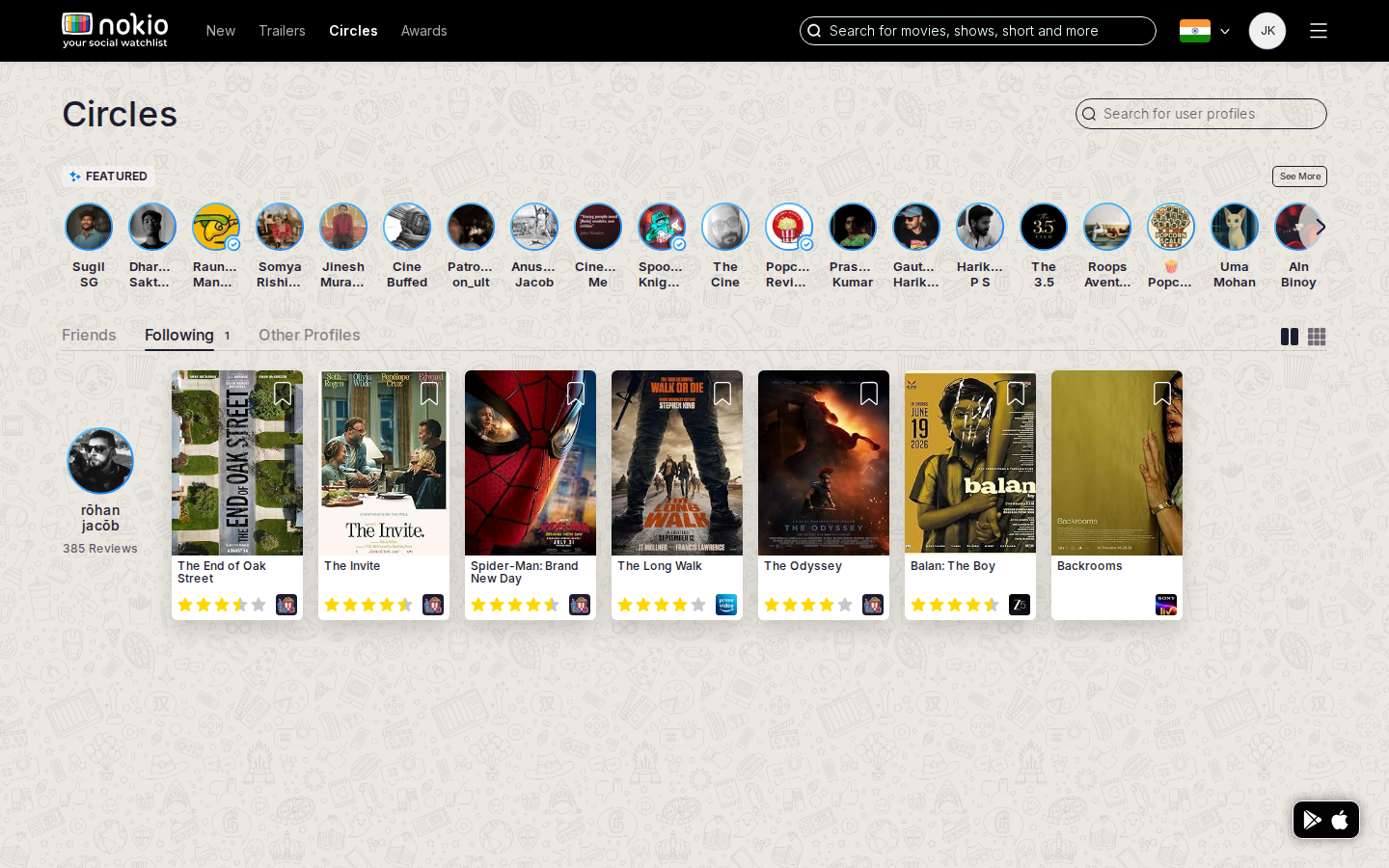
What the screenshots show
- Profile says Following 1, but this tab still leads with Featured public people.
- Split IA: Circles Following vs My Profile → Following.
Improvements
Same list as My followings
One data source. If there is one follow, show that card here. Pick Circles or My Profile as the owner — not both with different empties.
Circles — followers
Job: See who follows me.
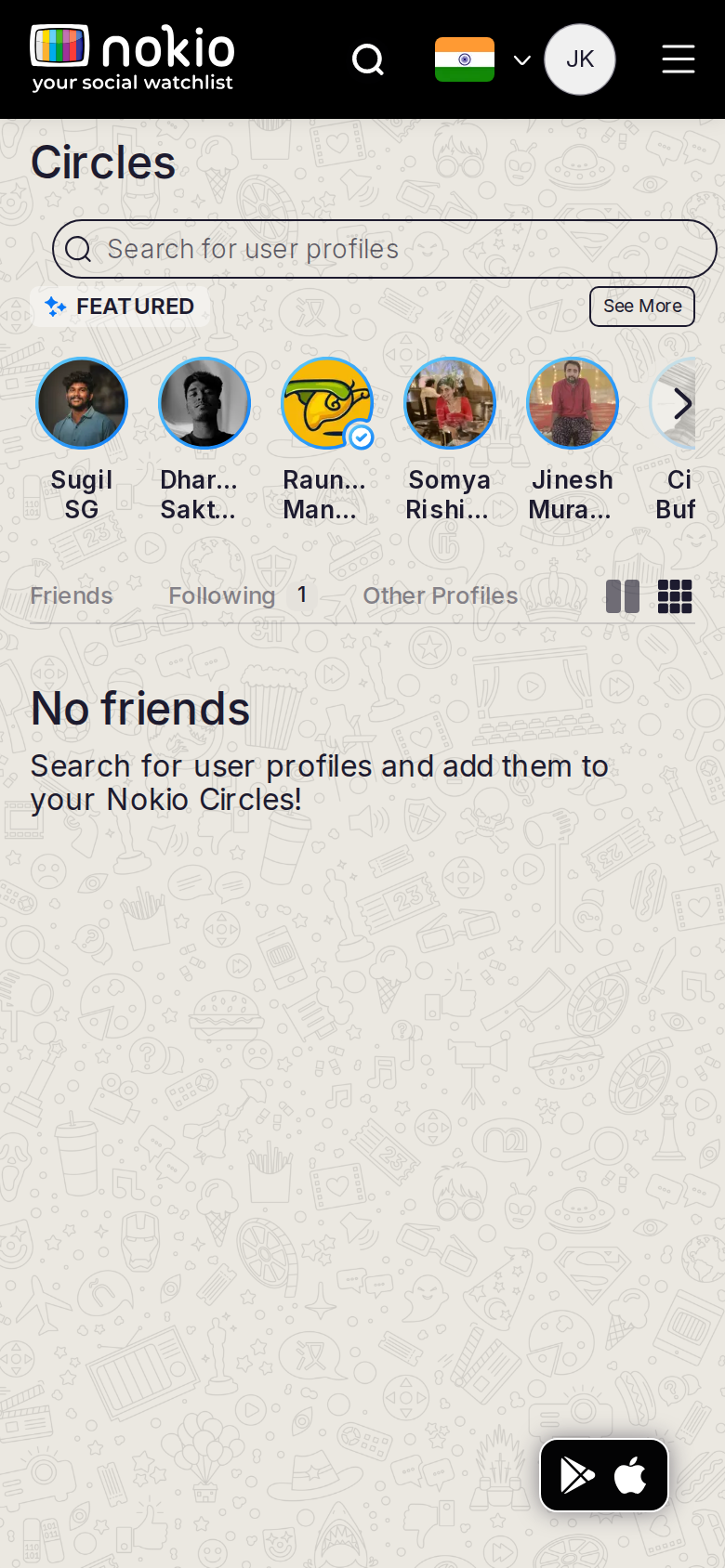
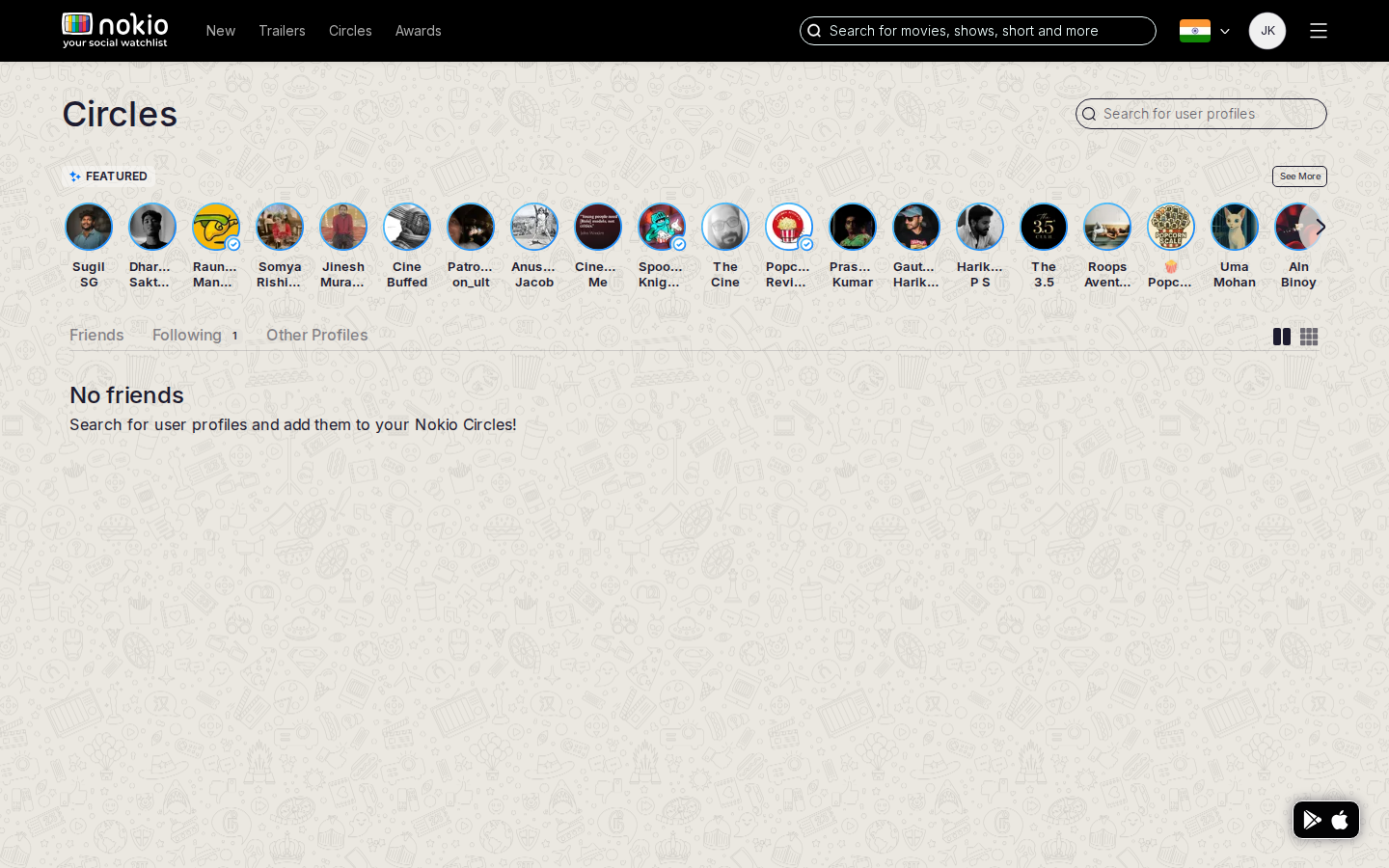
What the screenshots show
- Same Featured chrome. Followers is a URL the tab bar does not name (Friends / Following / Other).
Improvements
Name Followers in the tab set
Friends | Following | Followers | Public. Don’t hide a graph view in an unlabeled route.
Circles — other
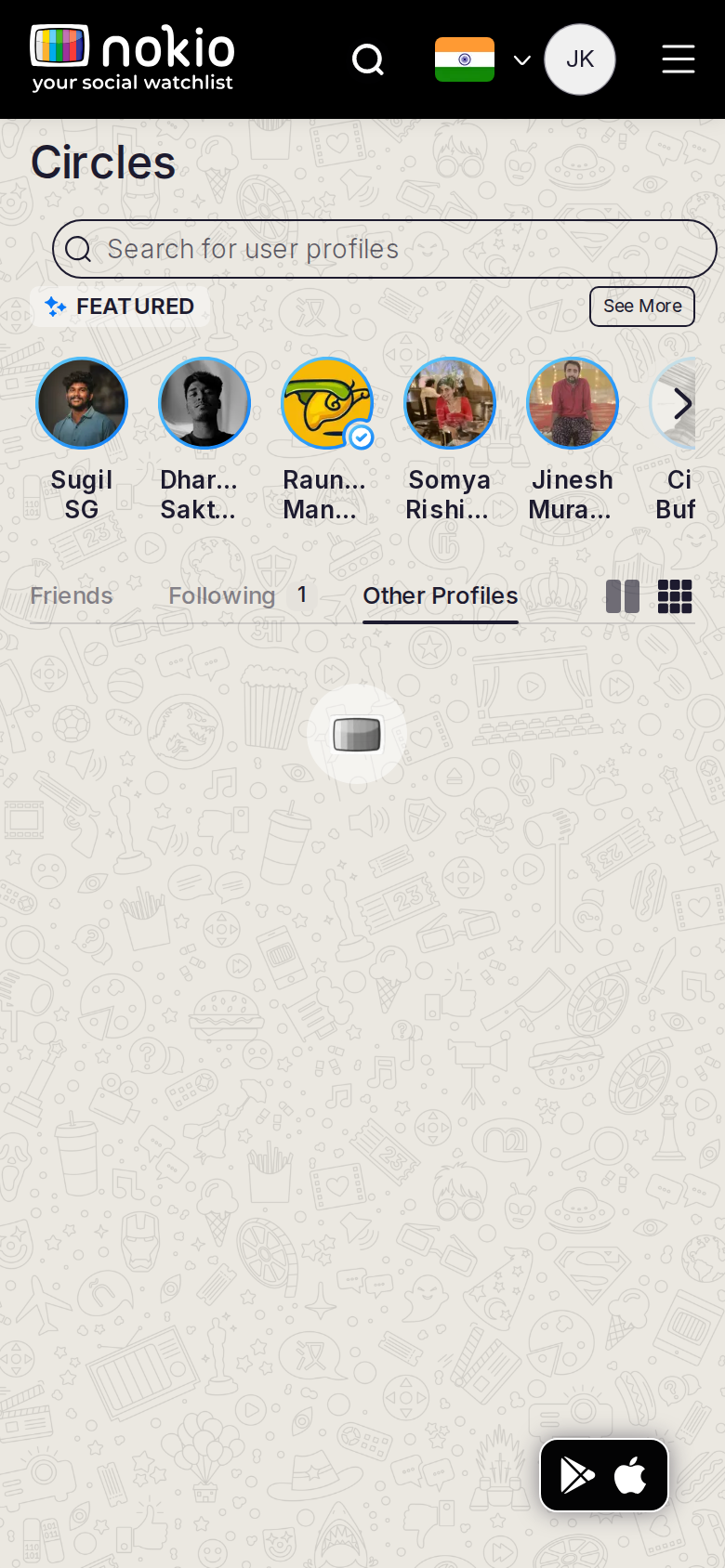
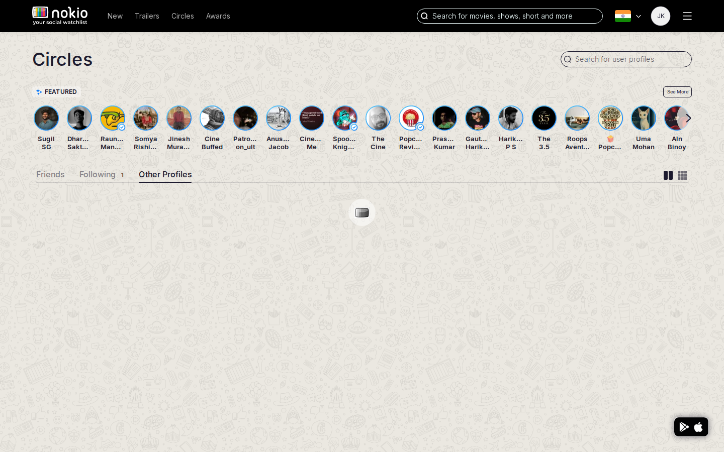
Job: Find people who are not public profiles.
What the screenshots show
- Unclear how Other differs from Public. Featured still on top.
Improvements
Explain Other
One line: “People you may know who aren’t public critics.” If empty, say so — don’t reuse the public Featured row.
My watchlist
Job: See titles I saved.
Signed out — same route
What the screenshots show
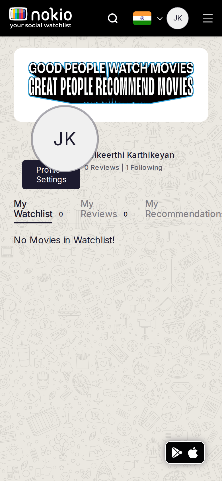
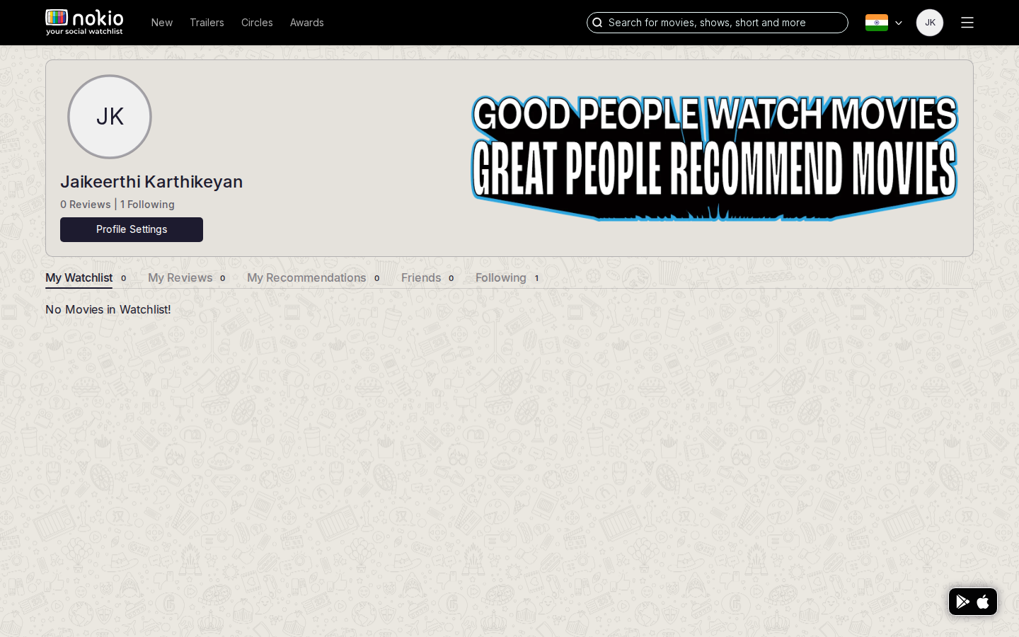
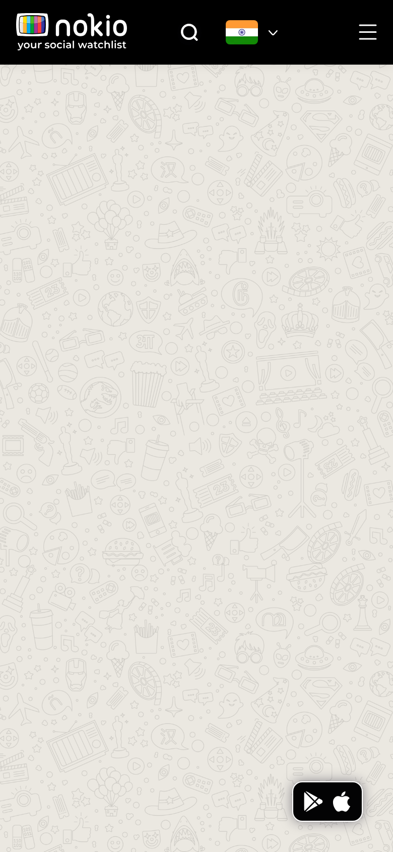
- Desktop empty state is fine. Phone: avatar overlaps banner, clips the name, covers Profile Settings.
- Tabs clip “My Recommendation…”. No CTA to add a title. Slogan outshouts the empty message.
Improvements
Stack the profile header under 960px
Column: drop or shrink the slogan on phone → avatar → name → stats → Settings. No absolute overlap. Tabs as a horizontal scroller, 44px tall. Shared layout for all my-profile tabs.
Empty-state CTAs
“Browse new releases” and “Search titles”. Bookmark on posters must actually add the title here.
My reviews
Job: See and manage my reviews.
What the screenshots show
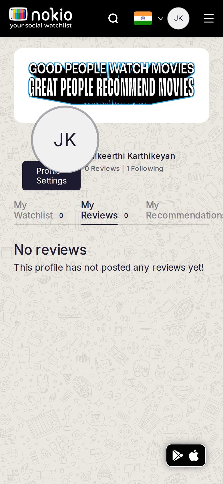
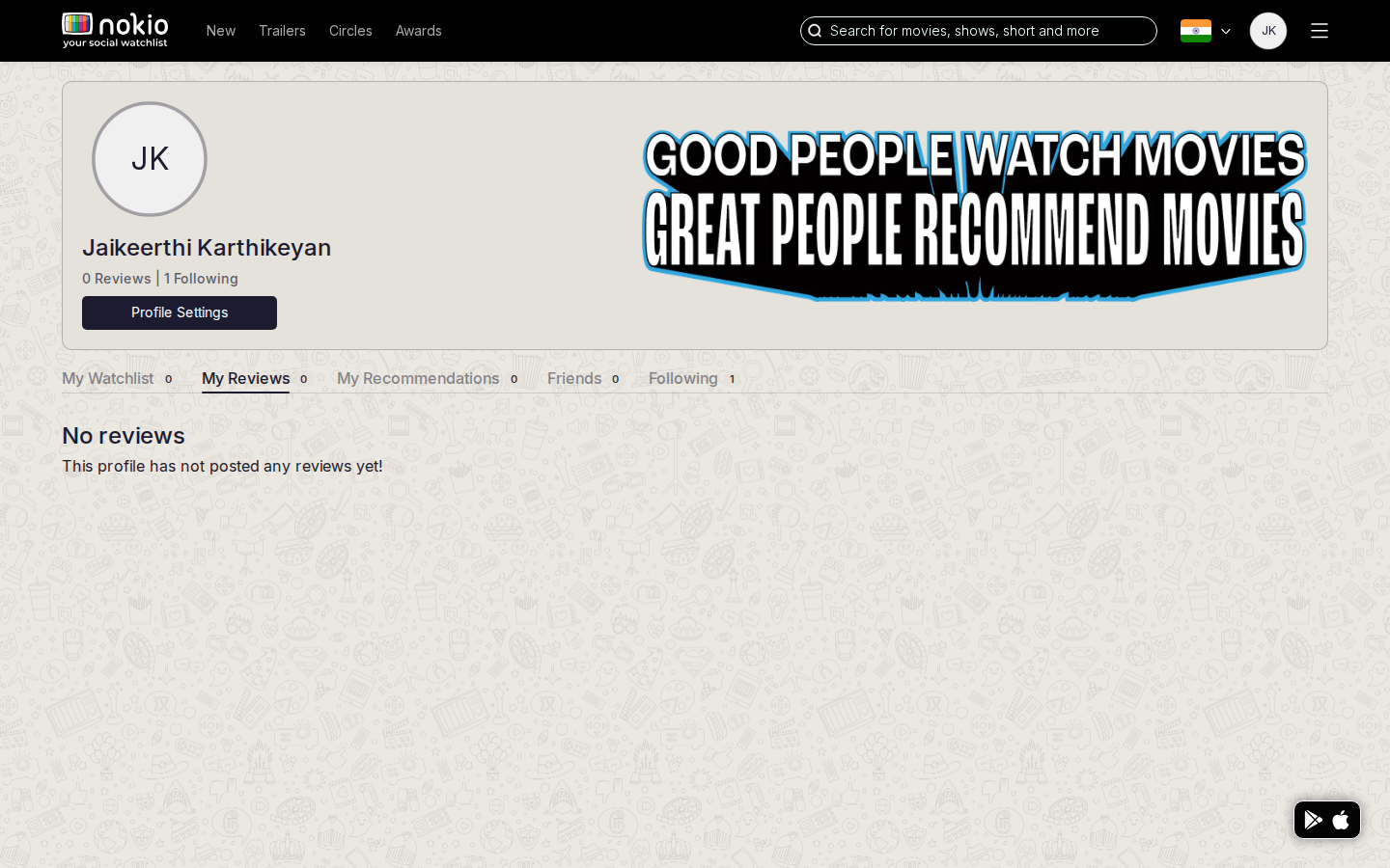
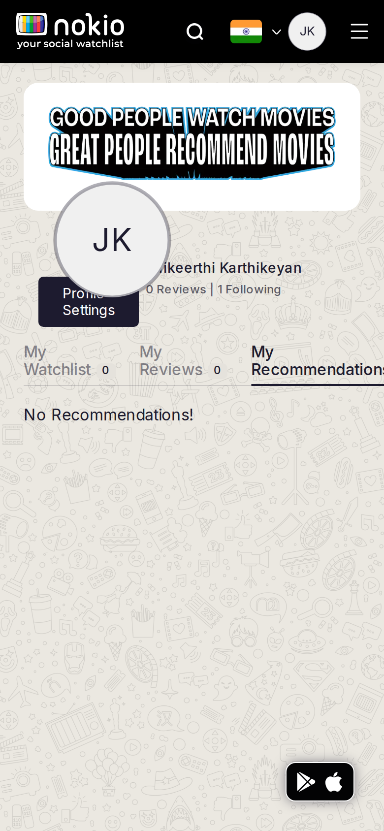
- Third-person copy: “This profile has not posted any reviews yet!” Same phone header collision. No write shortcut.
Improvements
Same header stack as Watchlist
Fix the my-profile layout once. Copy: “You haven’t reviewed anything yet.” Button: Search a title to review.
My recommendations
Job: See recs I sent or received.
What the screenshots show
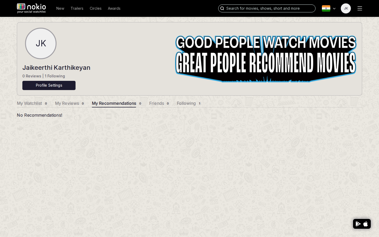
- “No Recommendations!” — no sent vs received. Same phone collision.
Improvements
Received | Sent sub-tabs
Empty received: “When someone recommends a title, it lands here.” Empty sent: “Recommend a title from any movie page.”
My friends
Job: Manage friends.
What the screenshots show
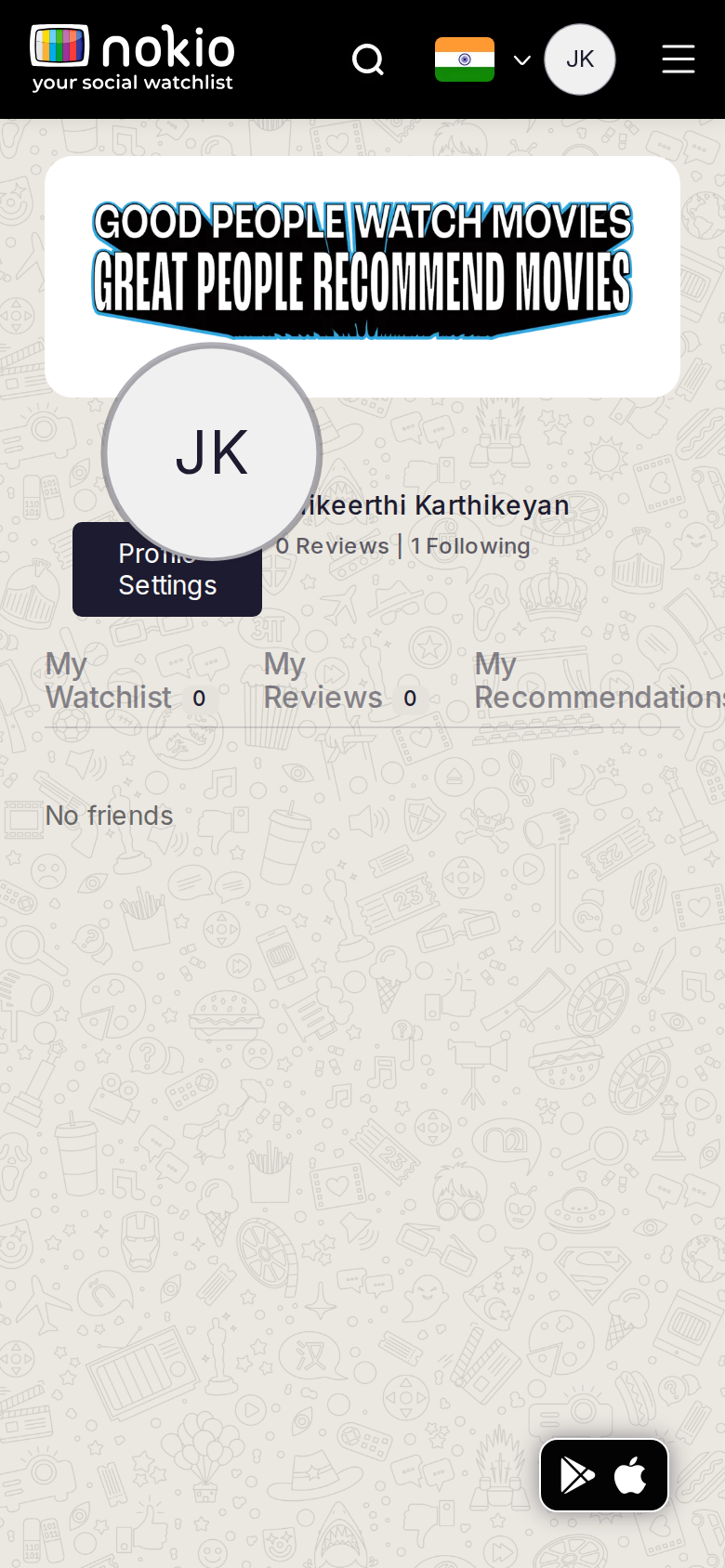
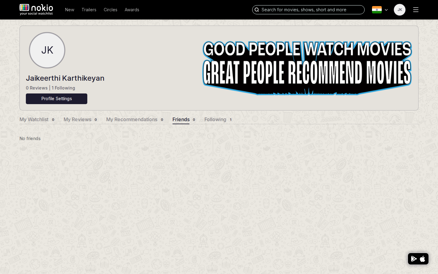
- Another “No friends” room. Circles and My Profile both own this job.
Improvements
Deep-link to Circles search
CTA: Find friends. Don’t maintain two empty rooms for the same graph.
My followings
Job: See who I follow.
What the screenshots show
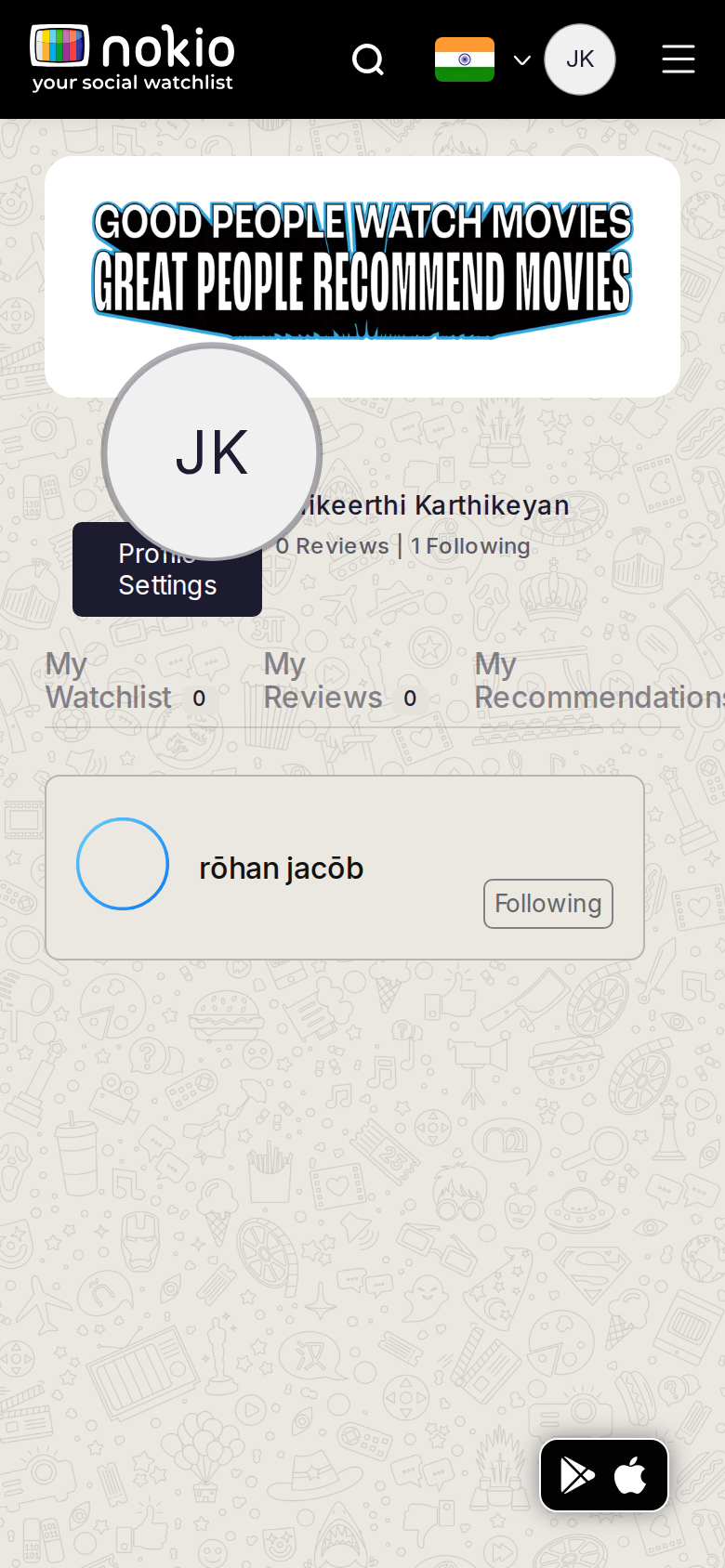
- Phone shows the one follow with a Following button — the only populated social list.
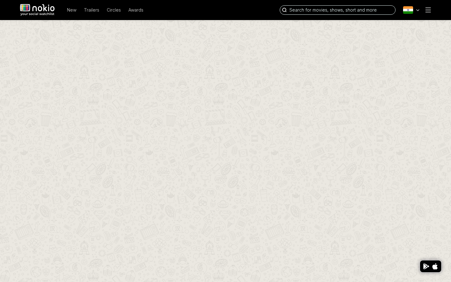
- Desktop raced to empty/skeleton. Phone header still overlapping.
Improvements
Header stack + wait for data
Same layout fix. Skeleton rows until the list resolves — don’t flash a doodle. Following button 44px tall.
Edit profile
Job: Update name, photo, contact.
Signed out — same route
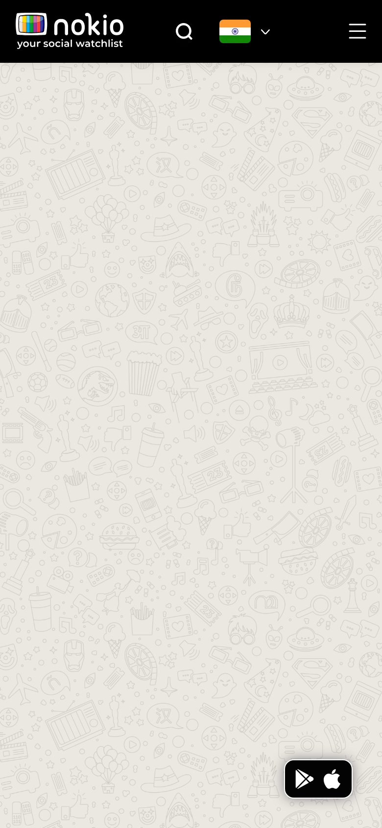
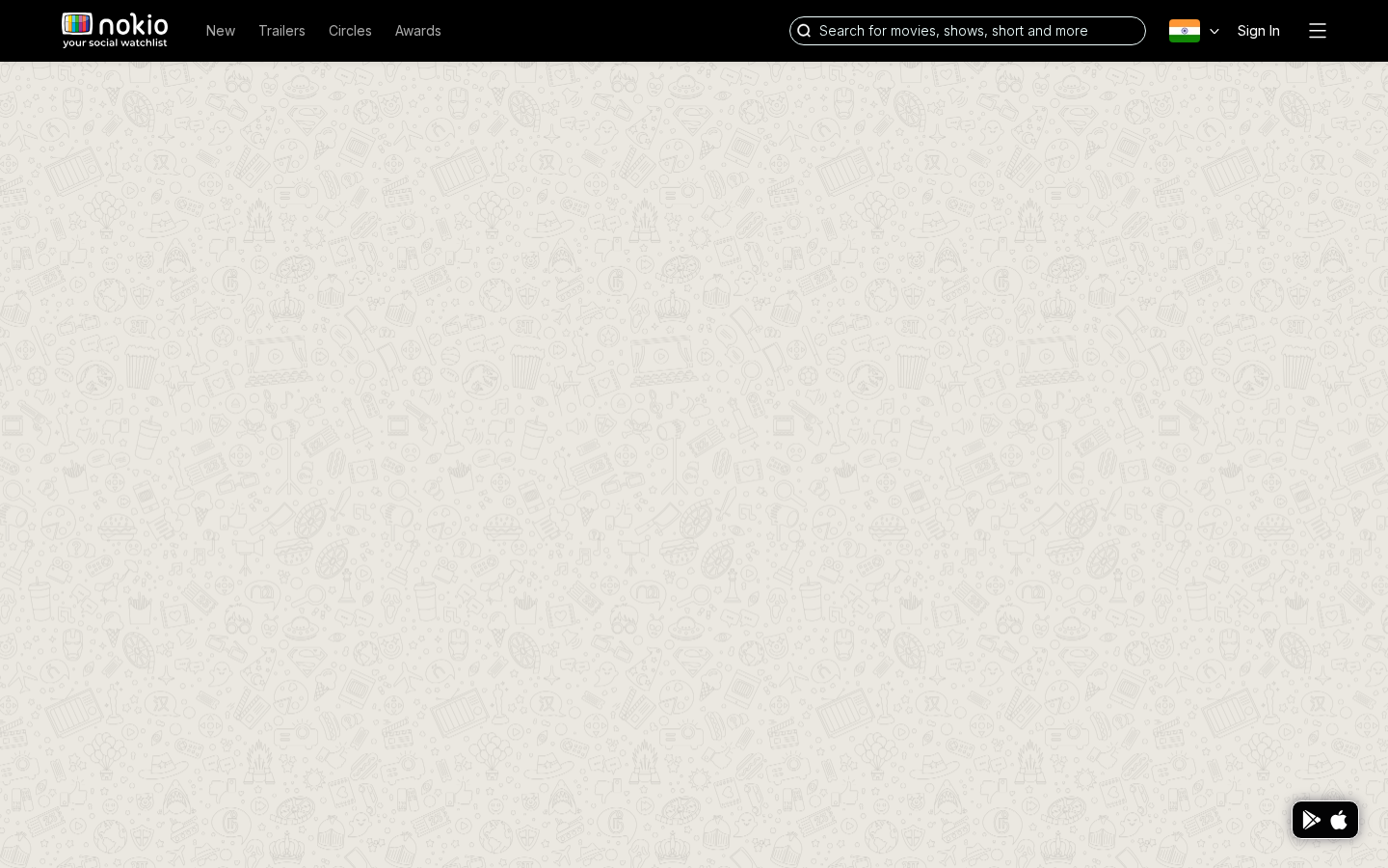
What the screenshots show
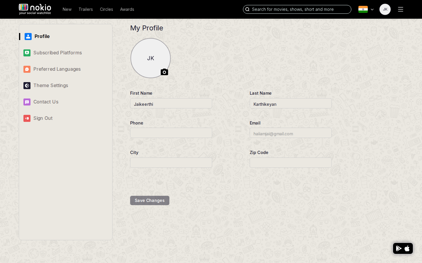
- Desktop: two-column form with a huge gutter; Save tucked bottom-left.
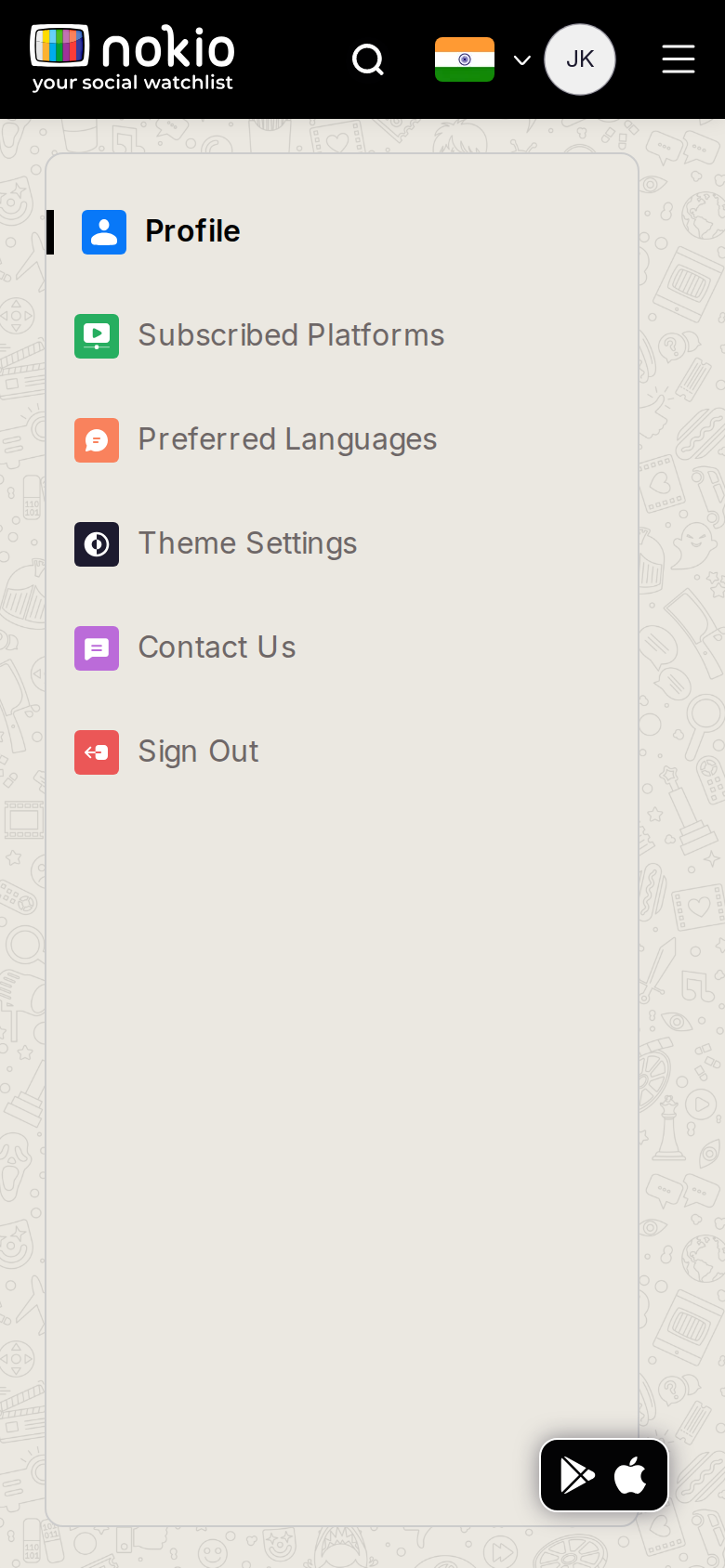
- Phone first screen is ONLY the settings sidebar. Form not visible. Theme/Contact look live; grey labels are low contrast.
Improvements
Phone: form first
Show My Profile immediately. Settings sections in a select or menu — not a 740px sidebar card that eats the viewport.
Desktop: max-width ~720px, sticky Save
Don’t stretch First/Last across the whole rail. Mark Theme / Contact as Coming soon on the row itself.
Edit platforms
Job: Set streaming services I use.
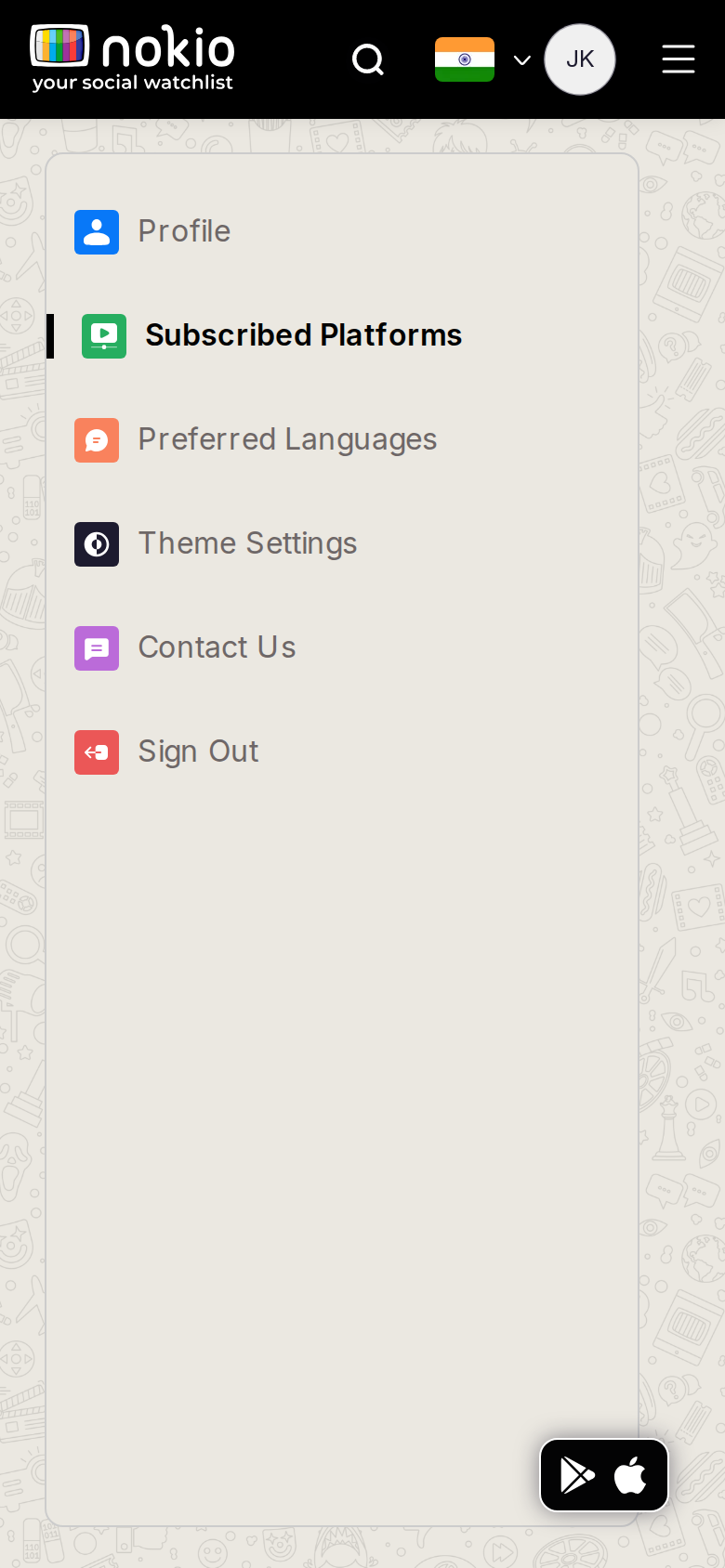
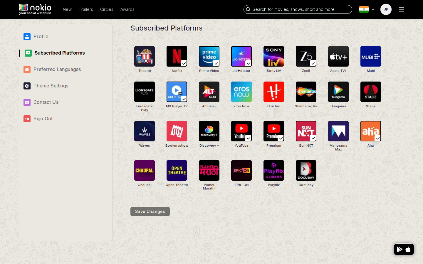
What the screenshots show
- Desktop checkbox grid is the right control; last rows uneven; Save bottom-left. Phone shows sidebar first.
Improvements
Grid first on phone
3–4 columns, 44px hits. Caption: “These services filter Home and New releases.” Toast on save and reflect on Home immediately.
Fill ragged last rows
auto-fill minmax(96px, 1fr) so the desktop grid doesn’t leave a dead right column.
Edit languages
Job: Set preferred languages.
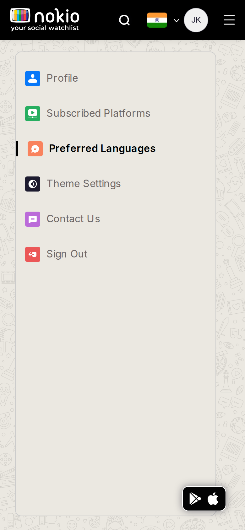
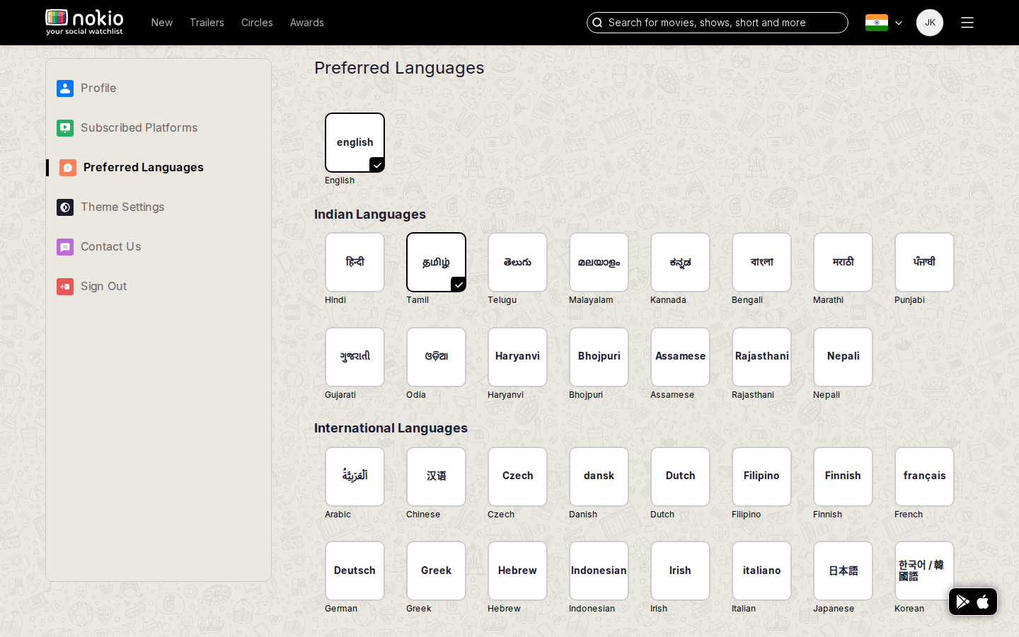
What the screenshots show
- Same sidebar-first phone problem. Home already shows English + Tamil — this is the source of truth but unlabeled.
Improvements
Form first on phone
Same contract as platforms. Caption: “Used on Home and New releases.”
Write a review
Job: Publish a rating and review for this title.
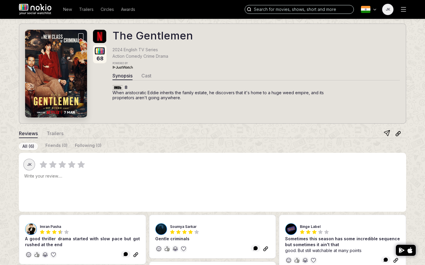
What the screenshots show
- Desktop composer is the strongest signed-in pattern: title, rating, body, submit, audience tabs.
- Phone reviews page still leads with the movie hero; the composer is not on first paint.
Improvements
Keep this layout — surface it on phone
Sticky “Write a review” bar on phone that expands the same form. Do not invent a second compose route.
Draft locally
Persist rating + text in localStorage so a refresh or nav away does not wipe the form.
Header menu
Job: Jump to Circles, profile, settings, legal, sign out.
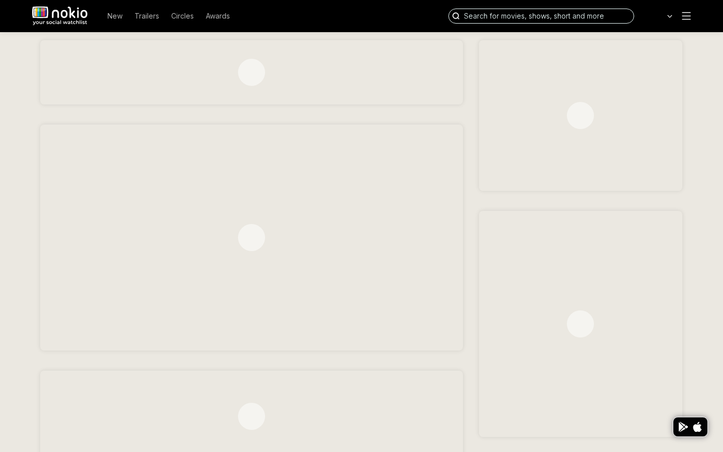
What the screenshots show
- Hamburger hit area is far below 44×44. Desktop still shows a hamburger next to a full nav.
- Menu capture is sparse — overlay likely closed or clipped in the screenshot.
Improvements
44×44 hamburger; hide it when desktop Nav is visible
JS breakpoint (480) currently shows both Nav and hamburger. Align JS with CSS: desktop Nav only ≥960; hamburger only below that.
Signed-in menu contents
My profile, Circles, Settings, Get the app, Sign out. Move store FAB into this menu so it stops covering posters.
Profiles (alias of Public profiles)
Job: Same as Public profiles — find critics.
What the screenshots show
- Same grid and truncation as /public-profiles. Two URLs, one page title.
Improvements
301 /profiles → /public-profiles
One canonical URL. Fix the 2-column minmax grid on that remaining page.