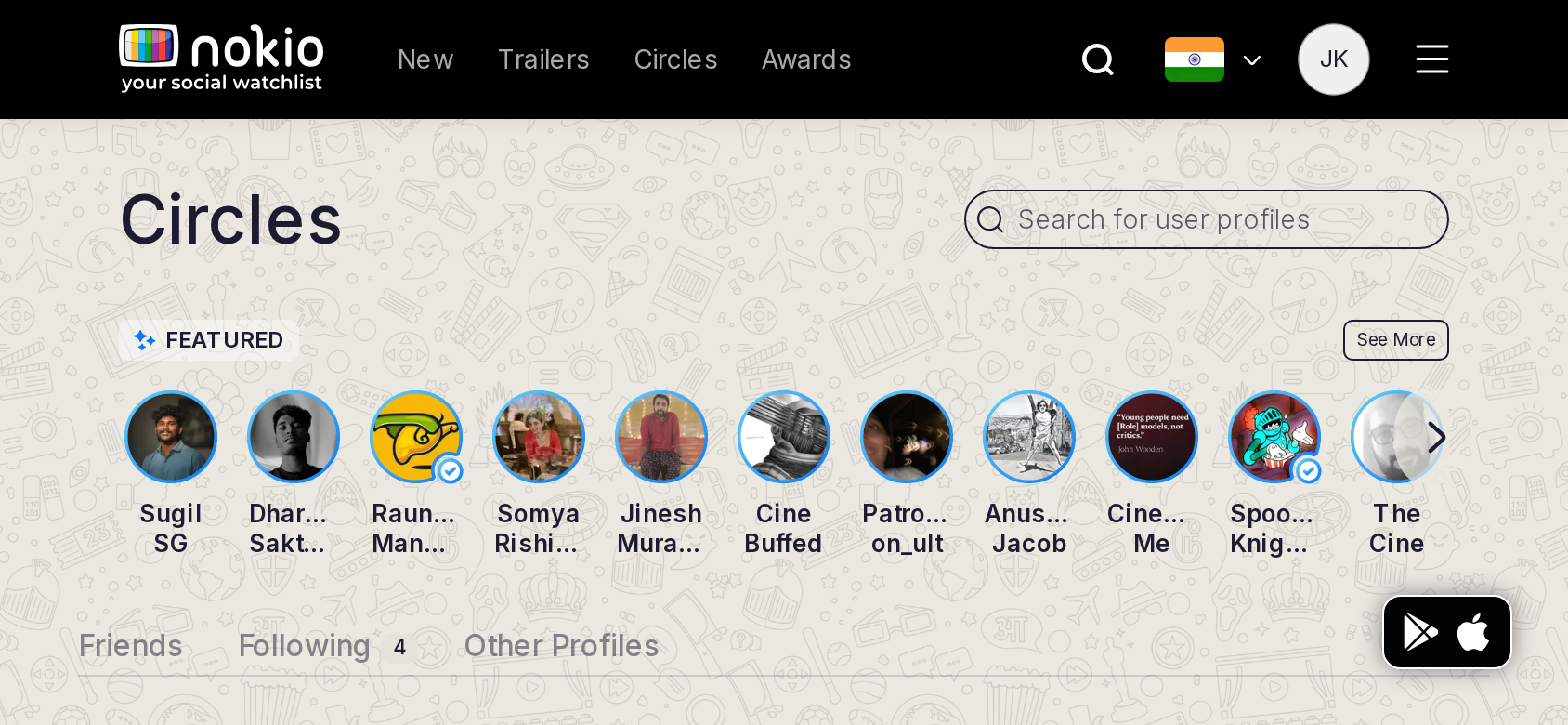
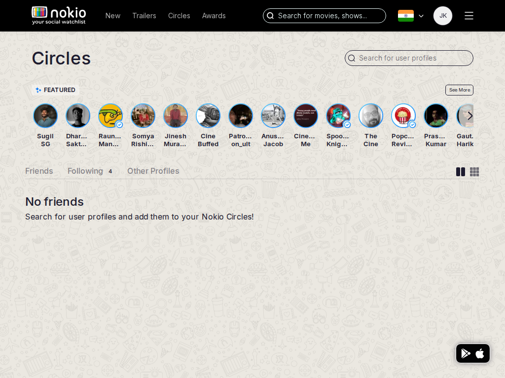
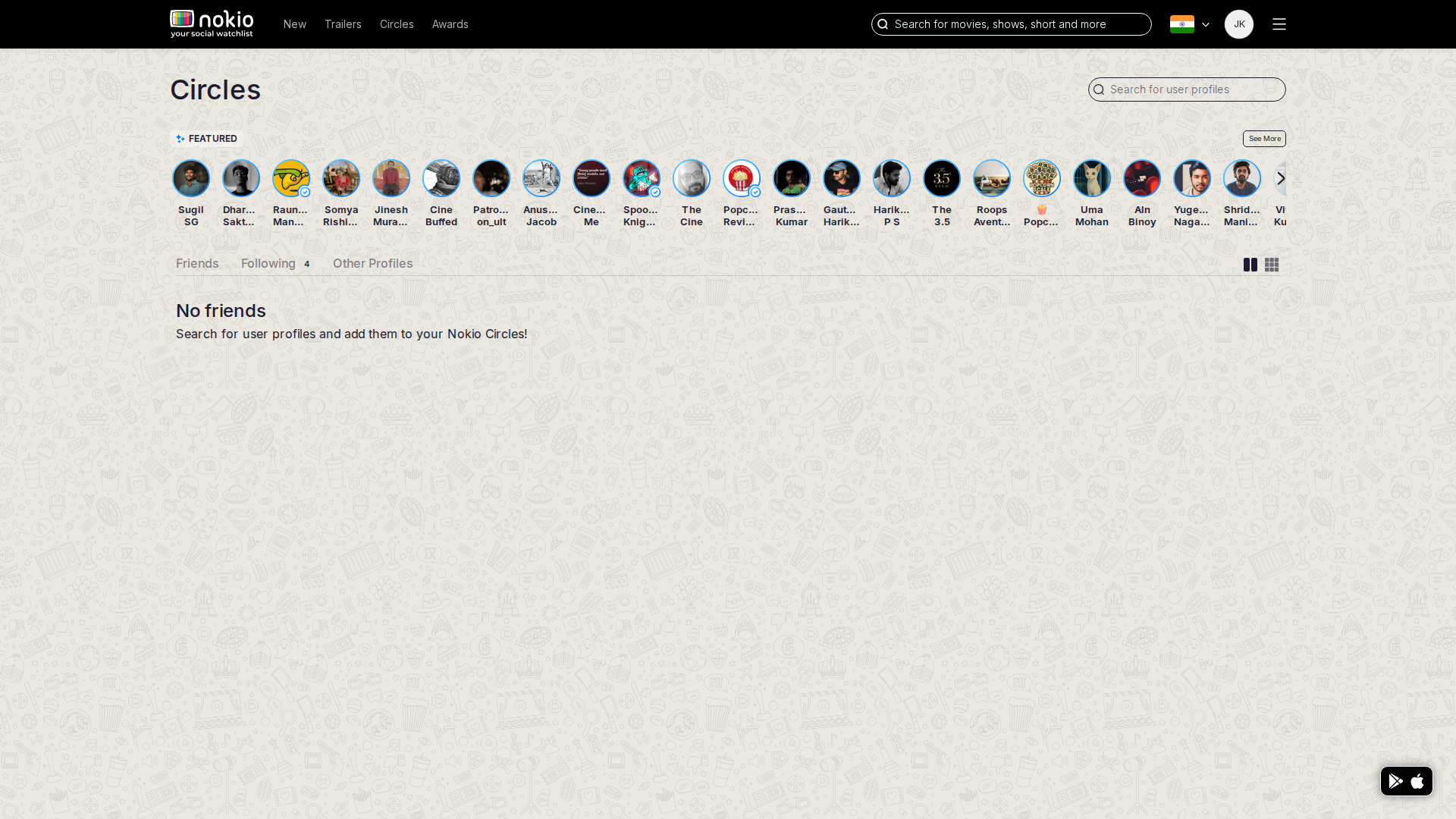
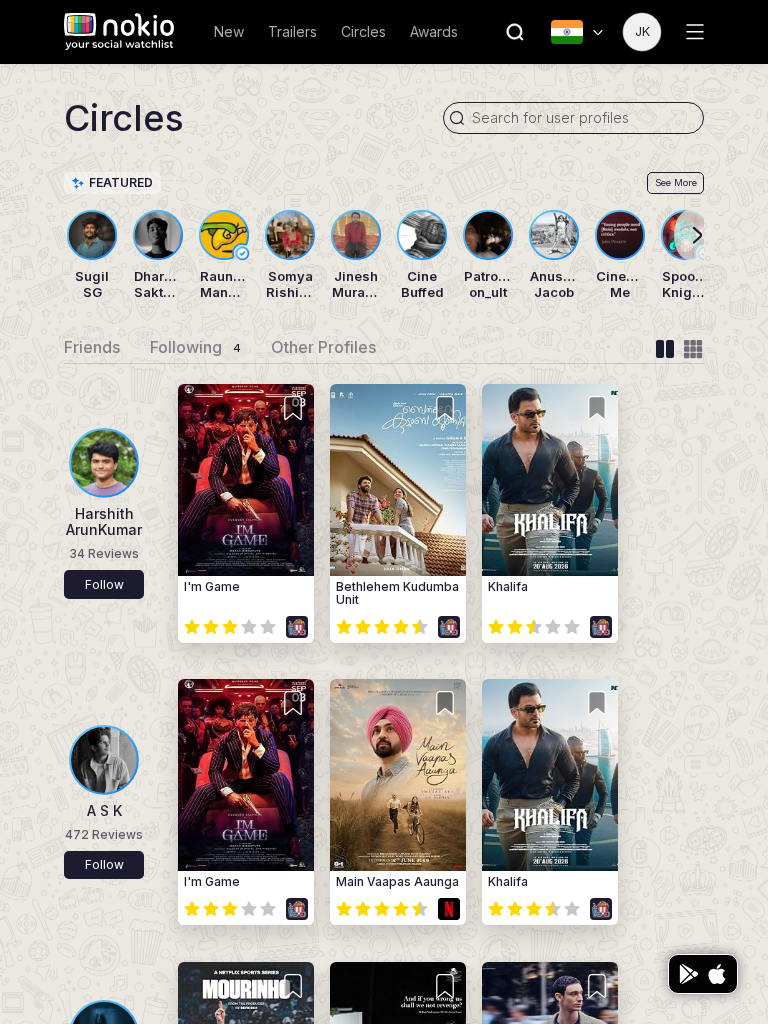
Chapter 4 · Design analysis

Every page at seven aspect ratios

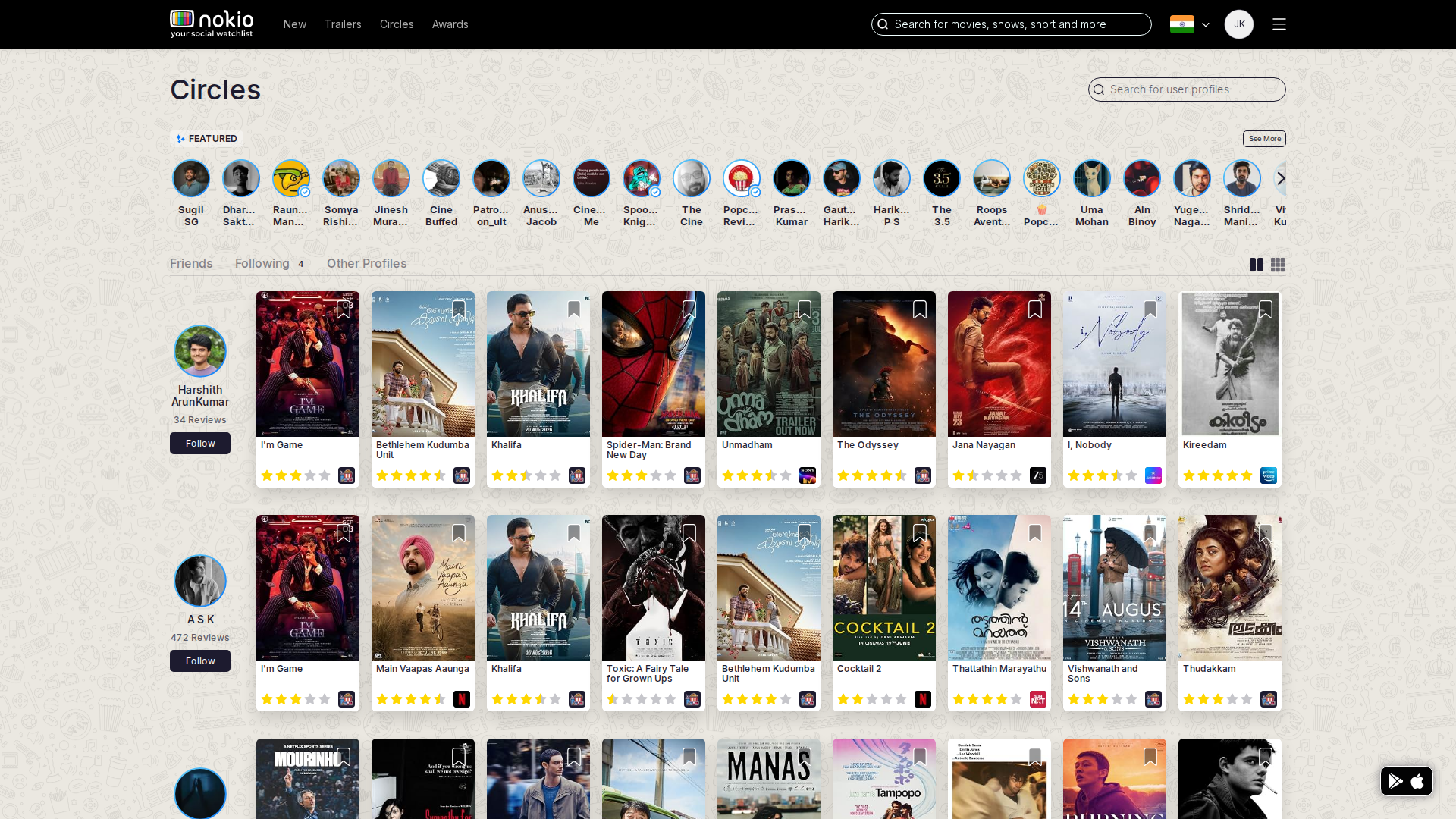
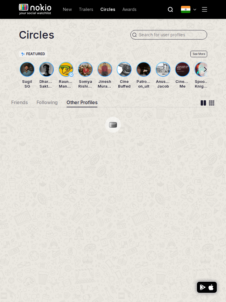
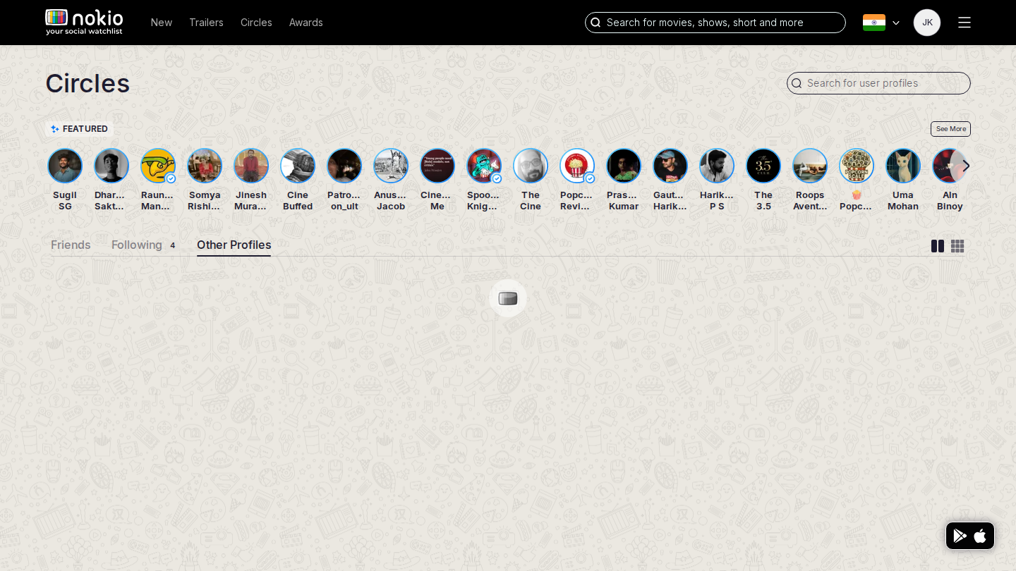
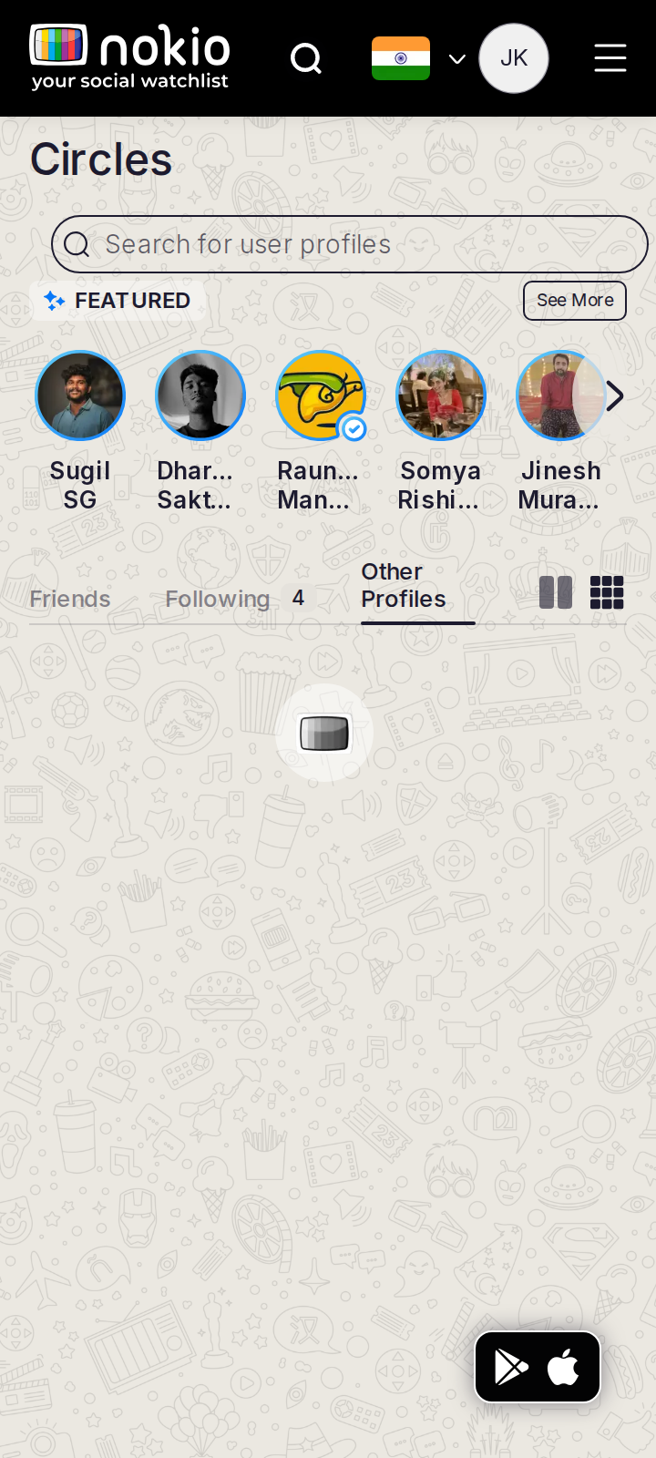
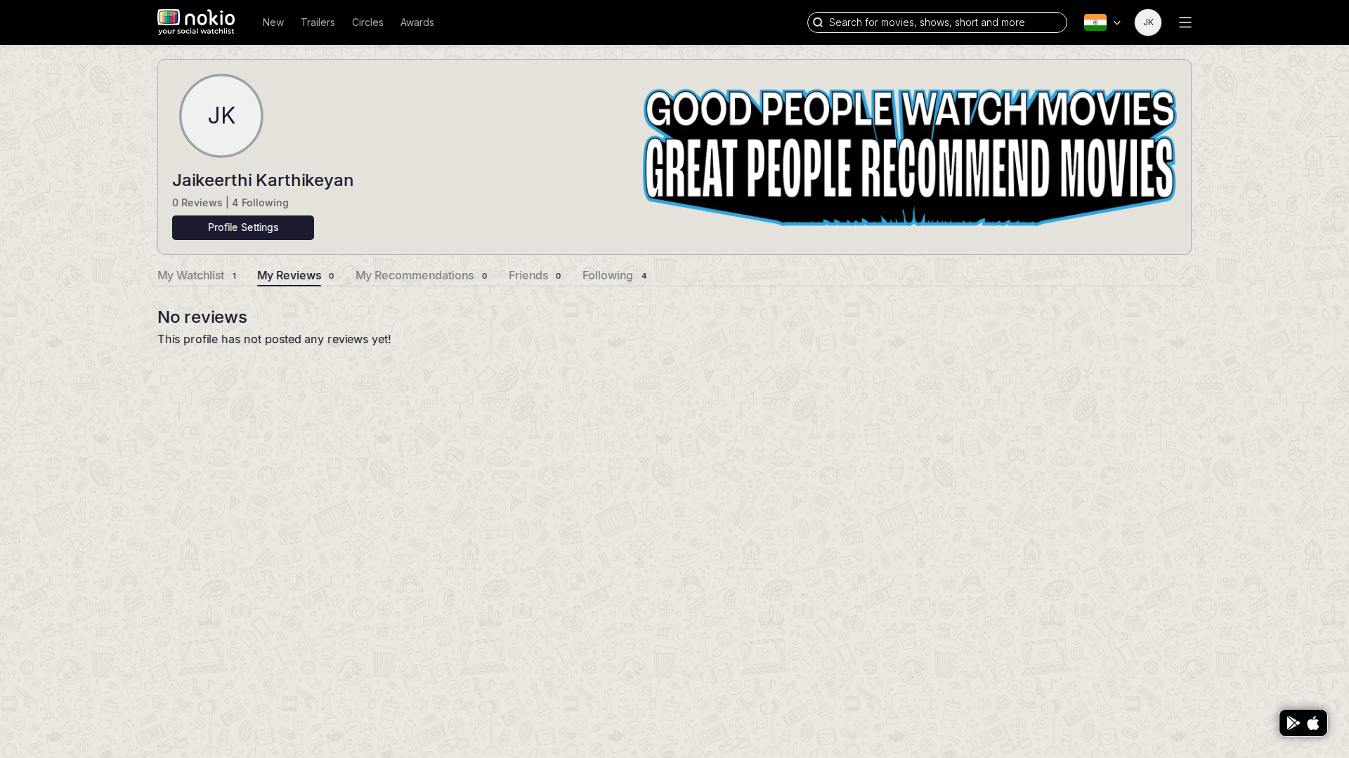
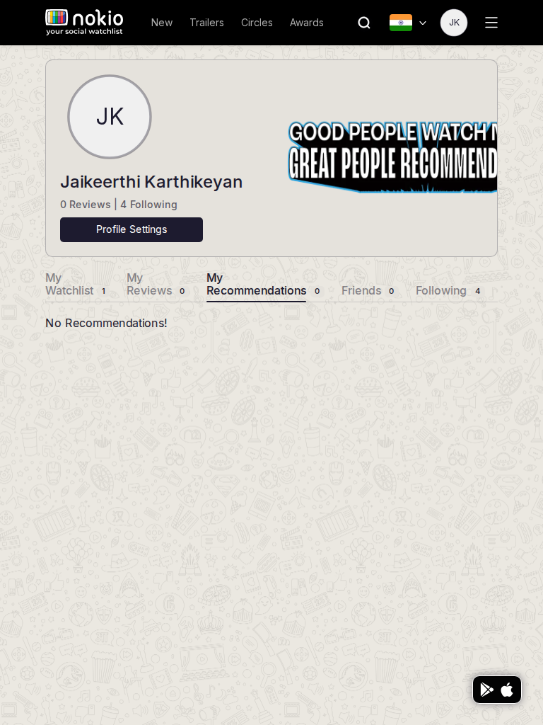
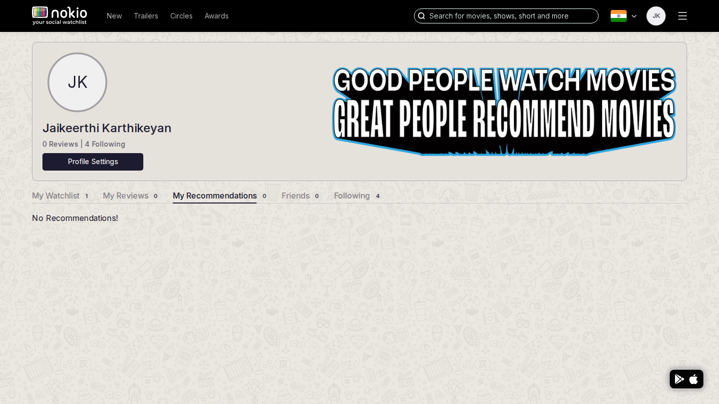
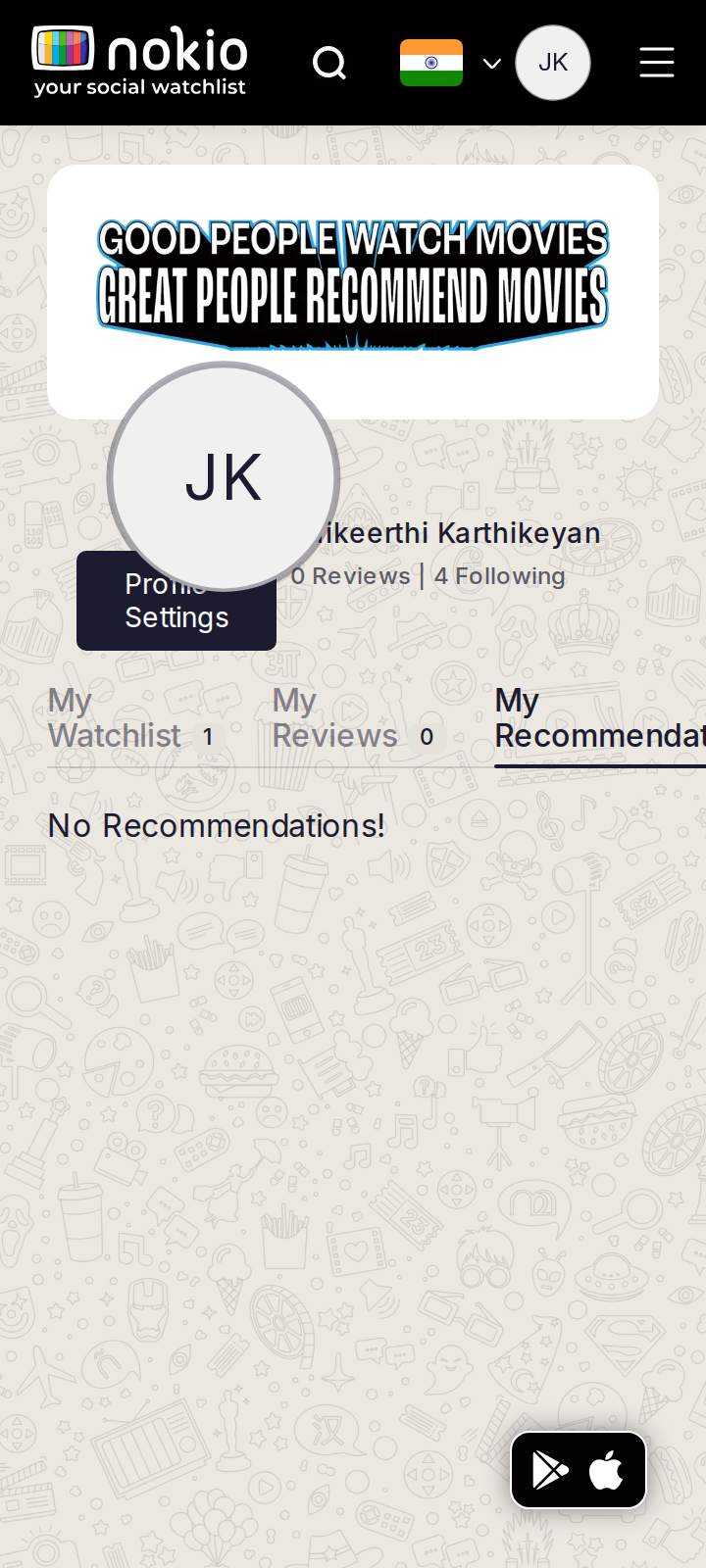
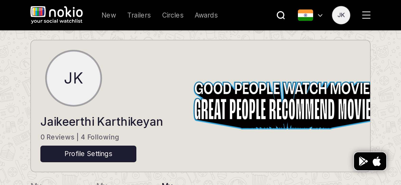
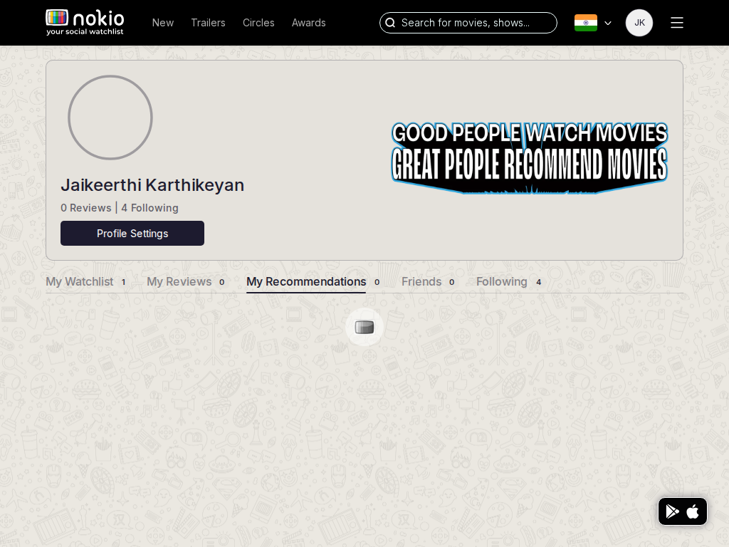
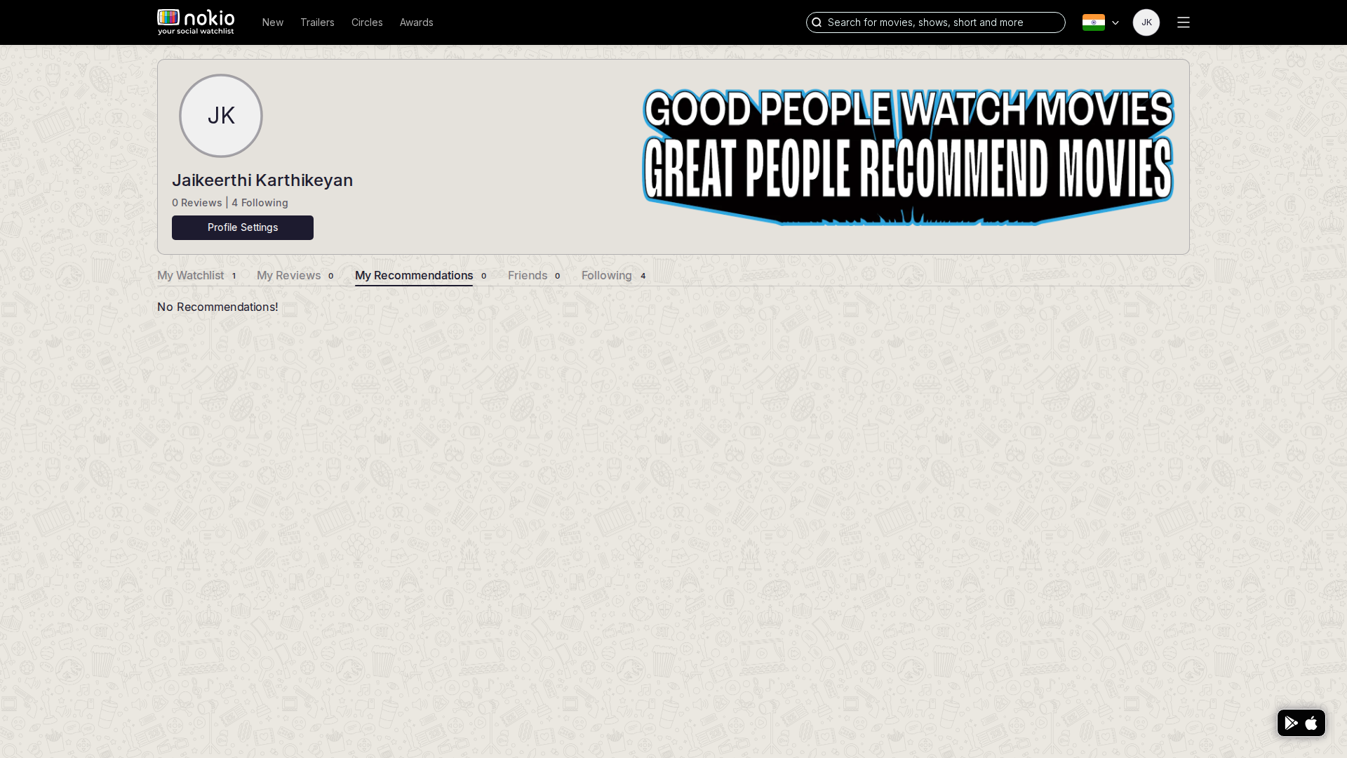
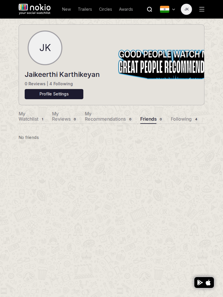
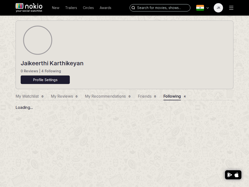
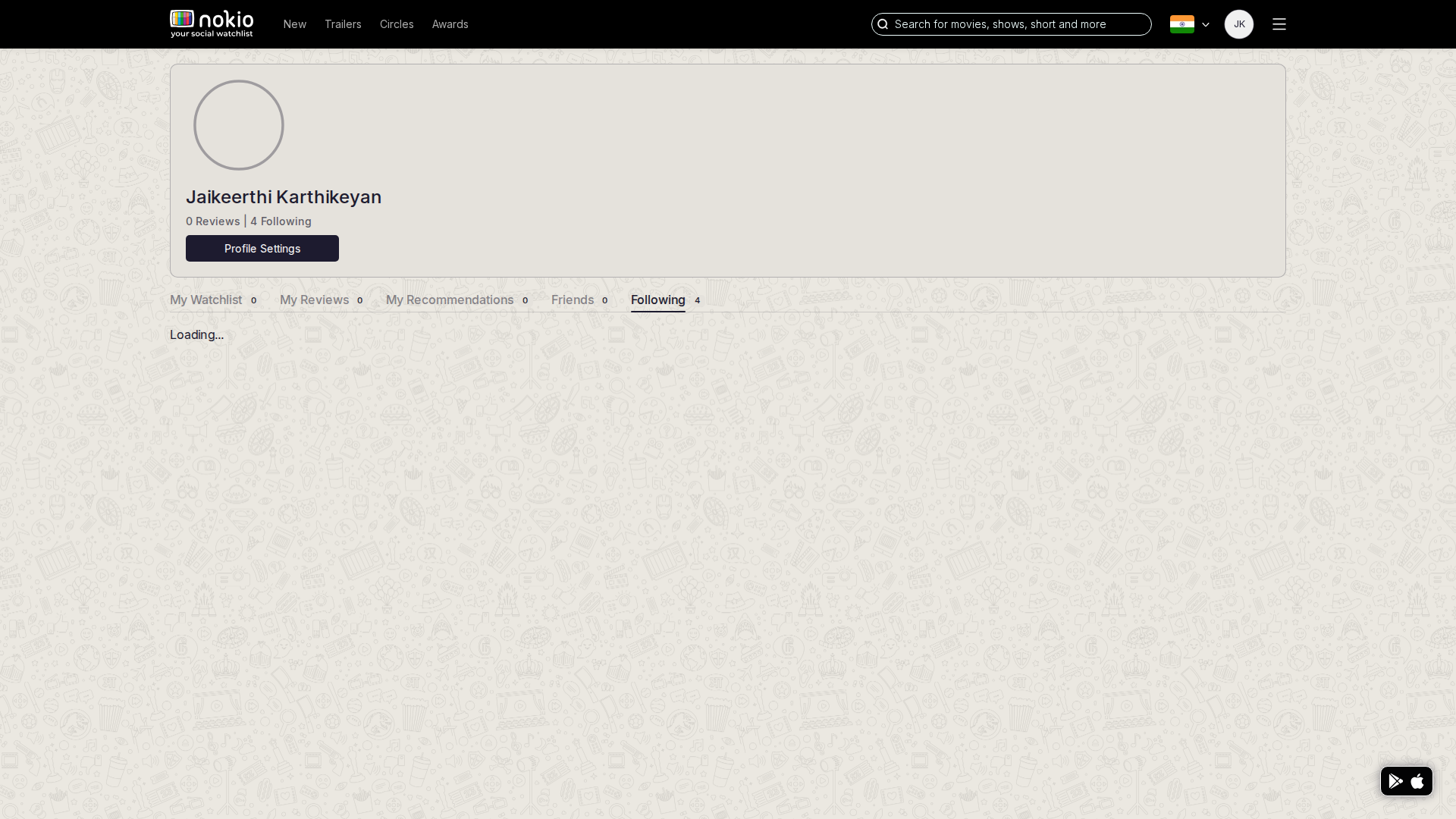
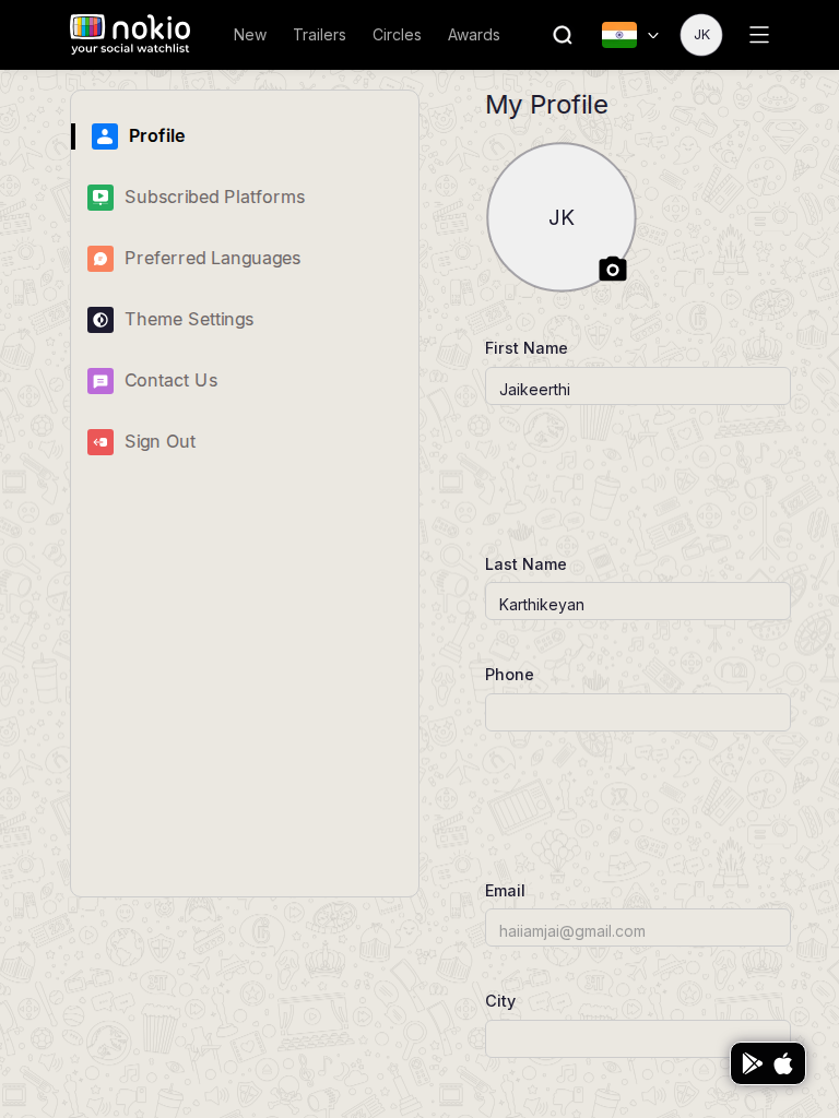
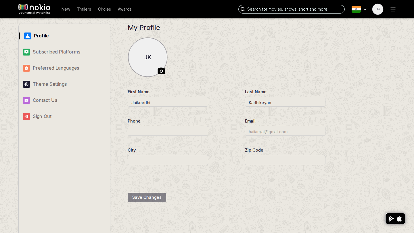
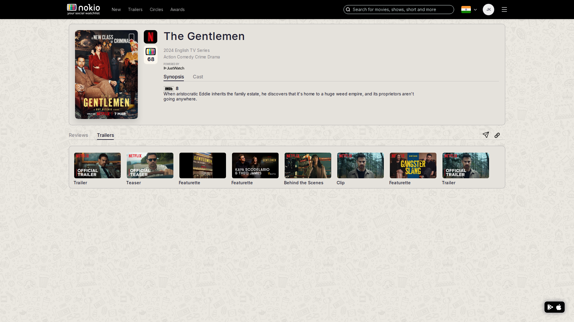
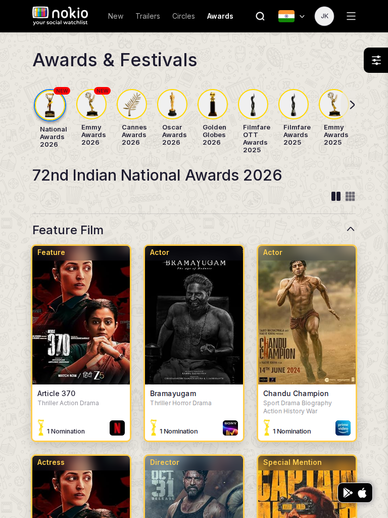
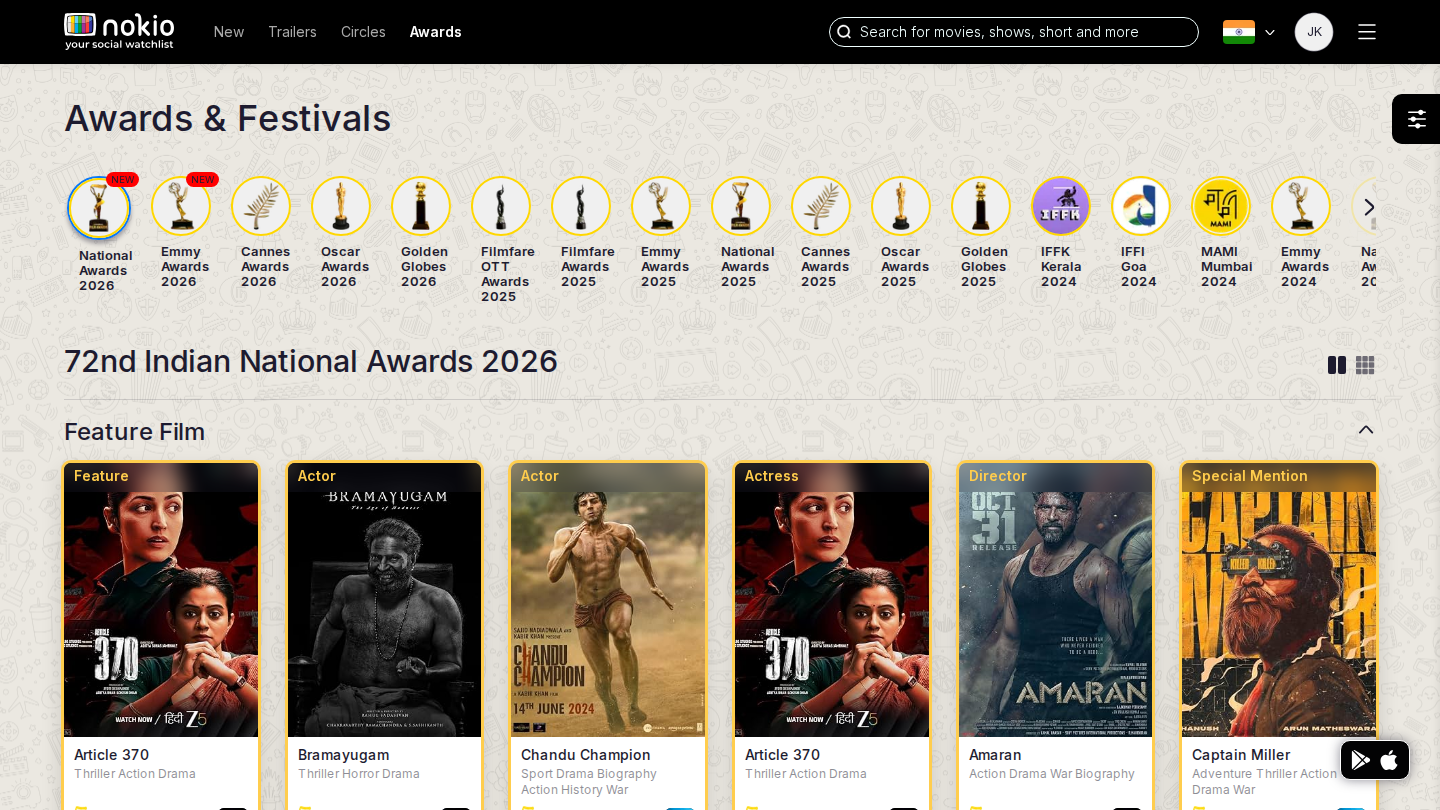
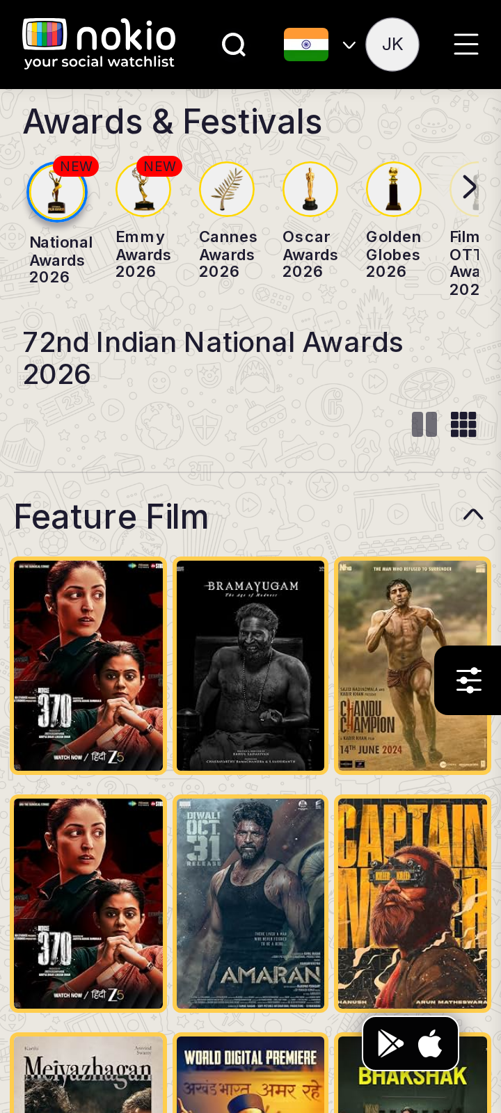
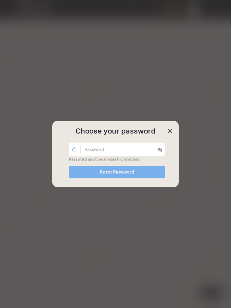
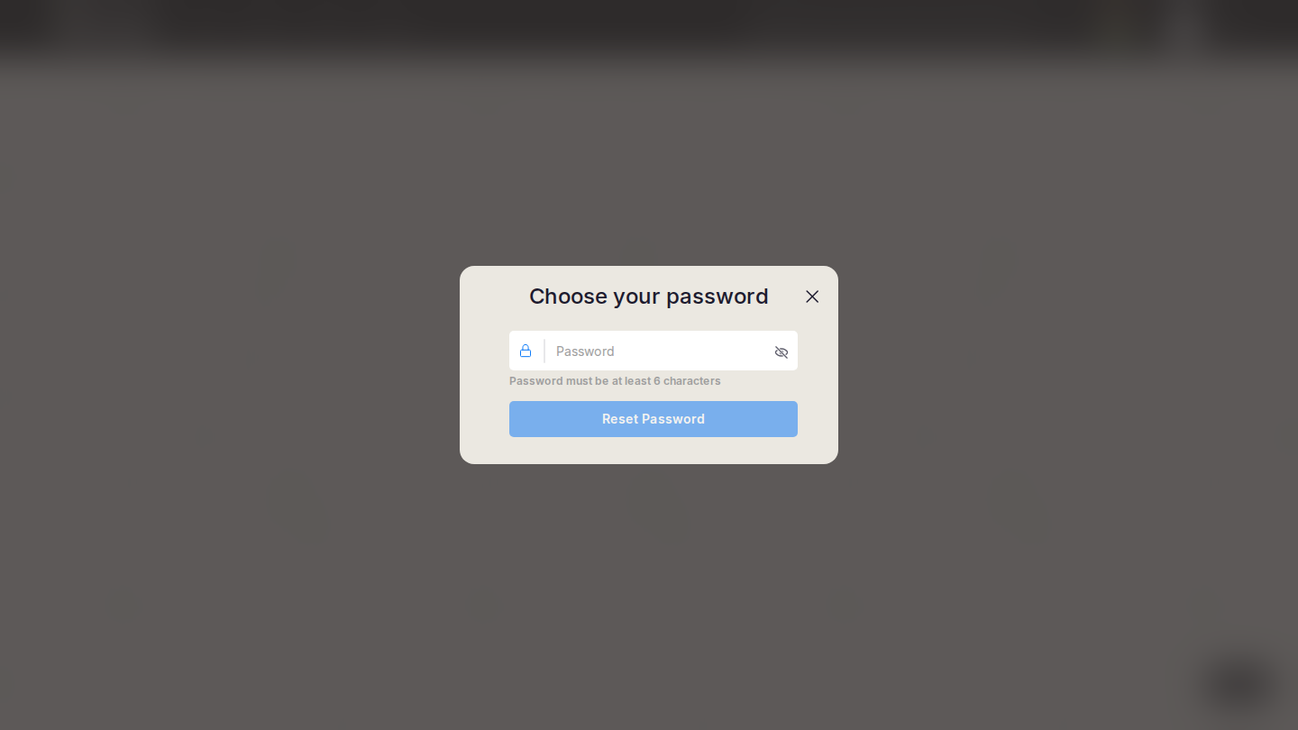
Signed-in member session recaptured by resizing Chromium: phone 360 and 390, phone landscape, tablet 3:4 and 4:3, desktop 1440 16:9 and 1920 FHD. Primary three widths are shown first; open “Other aspect ratios” for the remaining four. This is CSS-width evidence; the Device report uses real device agents (UA, DPR, touch).

203 shots · 29 routes × 7 widths · Playwright · nokioapp.com · 4 September 2026.

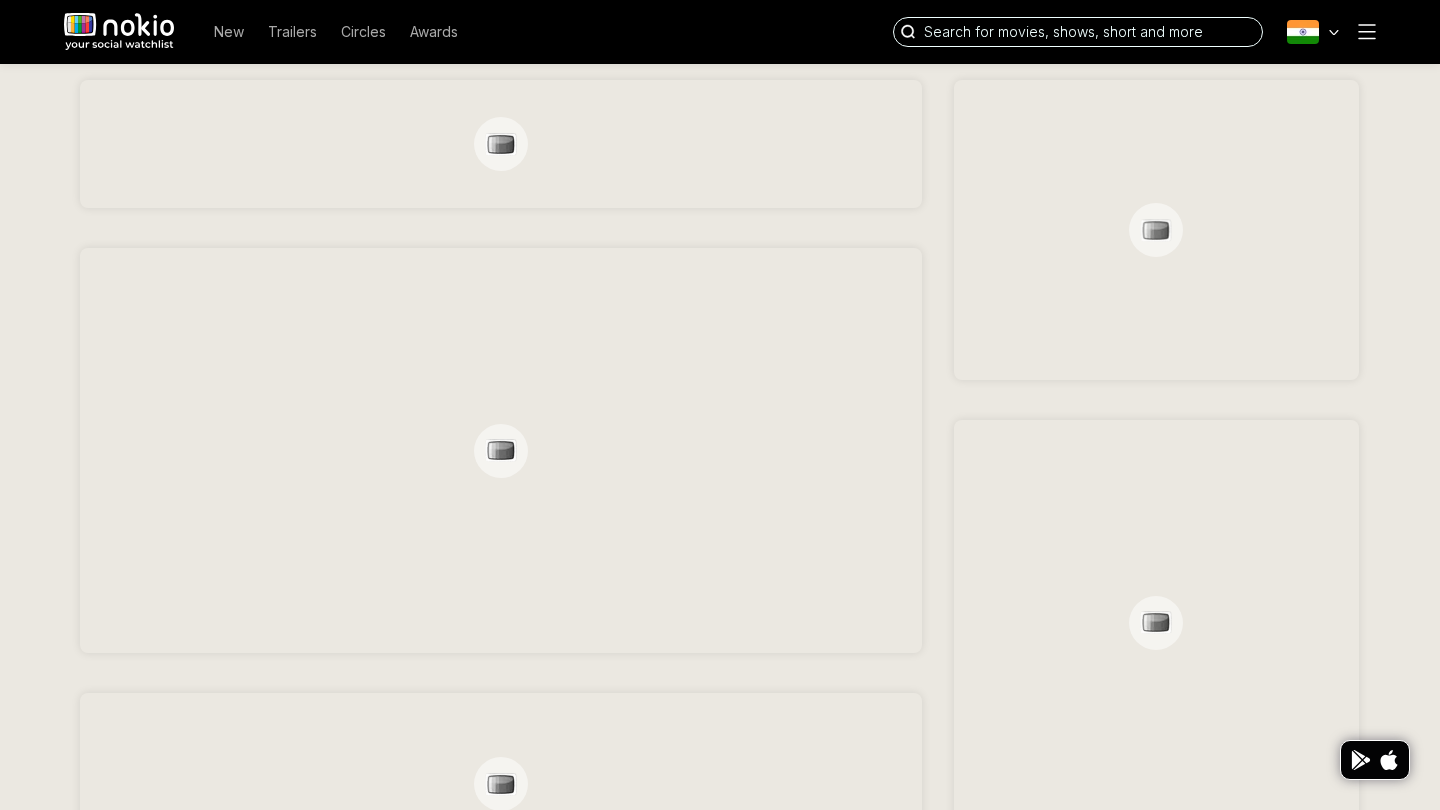
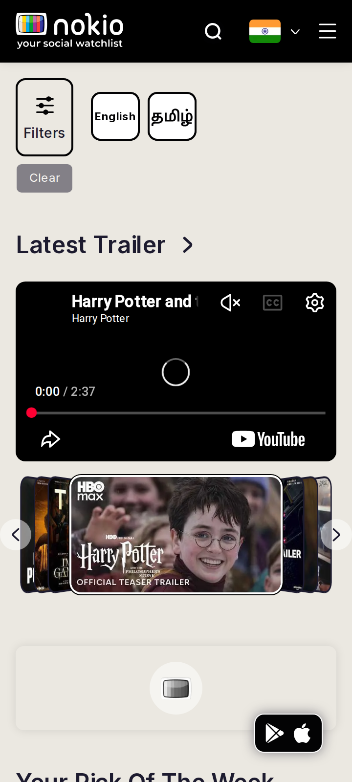
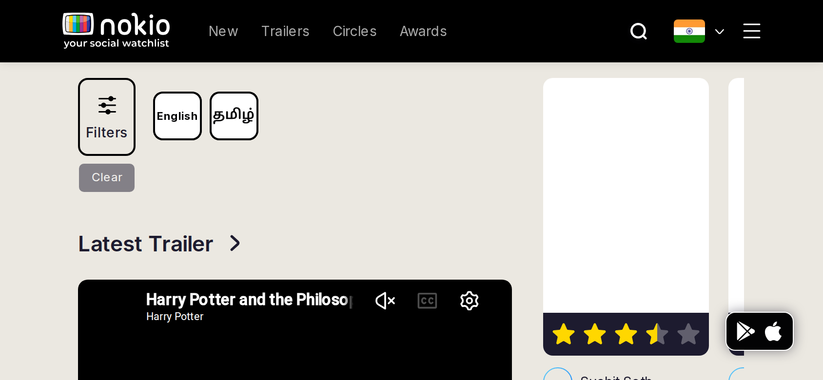
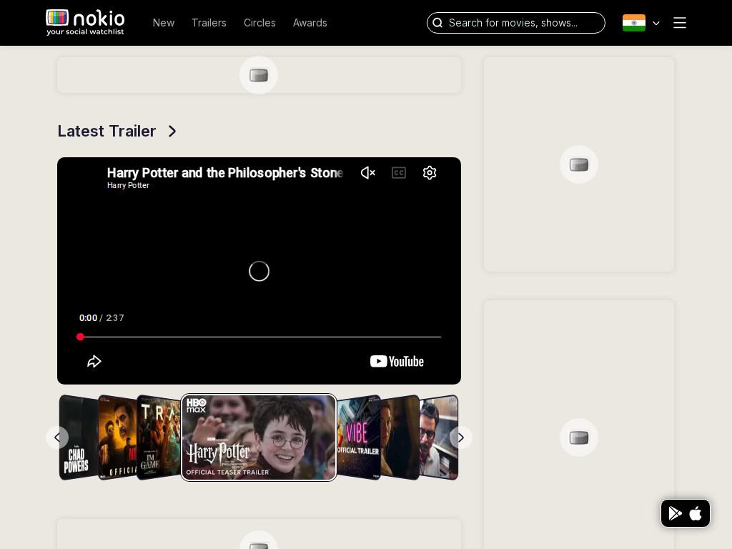
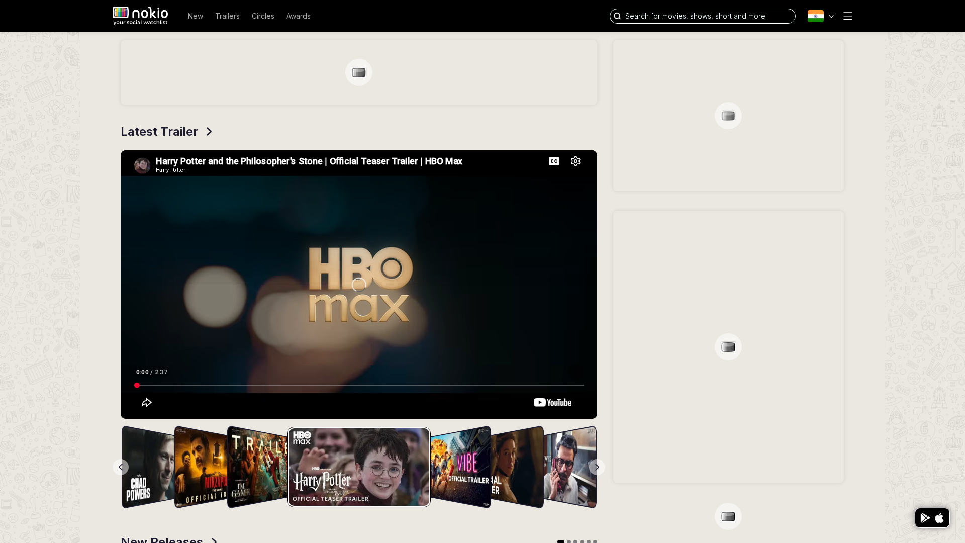
Home

/in?v=1 · Discovery

Job: Decide what to watch from trailers, new titles, and people I follow.

Signed in, trailer already playing (Harry Potter / HBO Max). After session settled, the right rail filled with real reviews (The Runner, Babita Singh Reporting) plus an honest recs empty card — earlier empty grey blocks were a loading/session miss, not a permanent empty design.
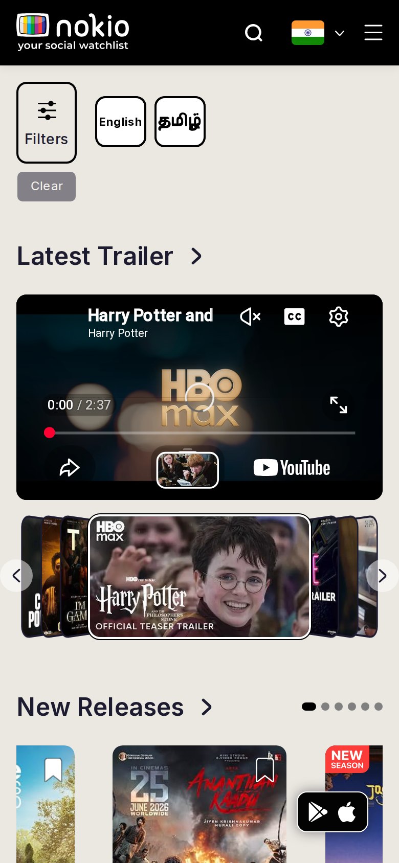
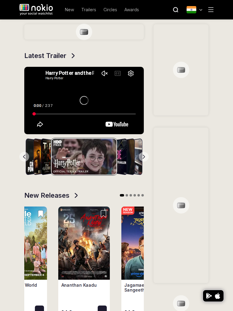
Home phone-390
390×844 · ~19.5:9 · CSS mobile ≤480
Home tablet-port
768×1024 · 3:4 · CSS tablet ≤960
Home desktop-16-9
1440×810 · 16:9
Other aspect ratios (4)
phone-360
360×800 · 9:20 · CSS mobile ≤480
phone-land
844×390 · landscape · CSS tablet ≤960 at phone height
tablet-land
1024×768 · 4:3 land · CSS small ≤1280 (desktop chrome)
desktop-fhd
1920×1080 · 16:9 FHD

Improvements

P0

Wait for session before painting the rail

Do not render two empty grey cards. Skeleton until recs/watchlist resolve, then either social cards or the TV-static empty copy.

P0

Lead with the trailer

Filters + 40 language/platform chips steal the first screen on phone. Collapse Filters; keep preferred languages only.

P1

Phone landscape (844×390) is a different product

Width 844 hits tablet CSS (≤960) with a 390px-tall viewport. Header + chips eat the trailer. Hide chips in landscape; make the player fill height.

P1

Hide store FAB when signed in

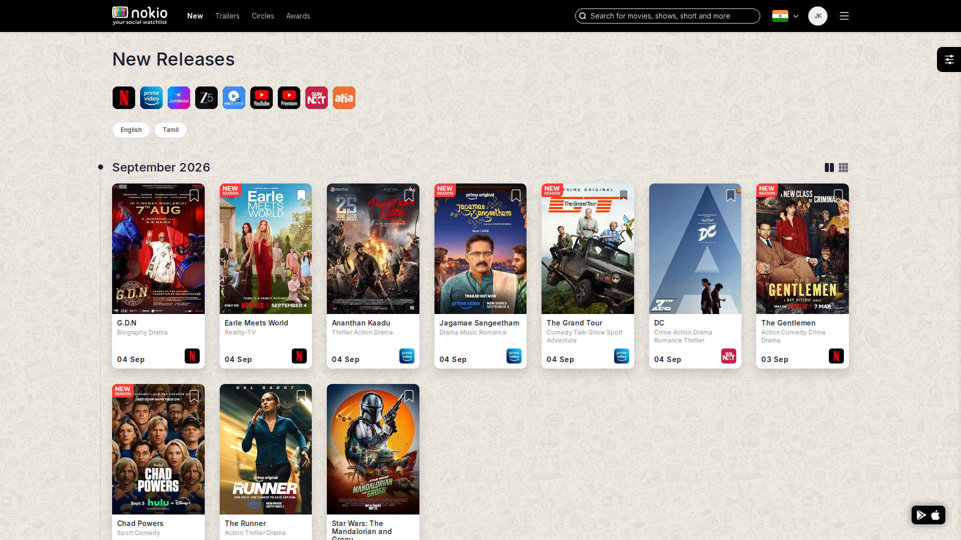
It covers New Releases posters and the last social card.

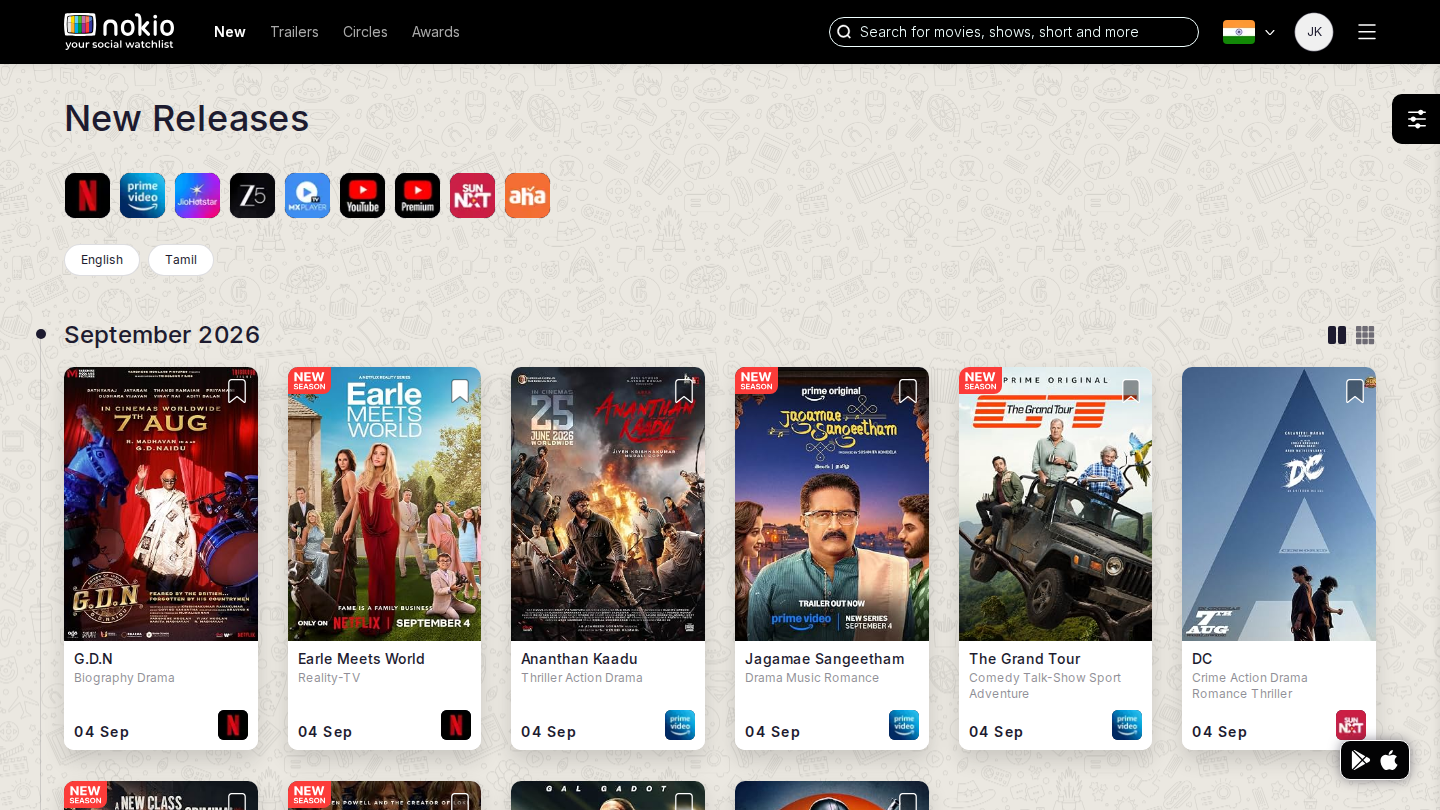
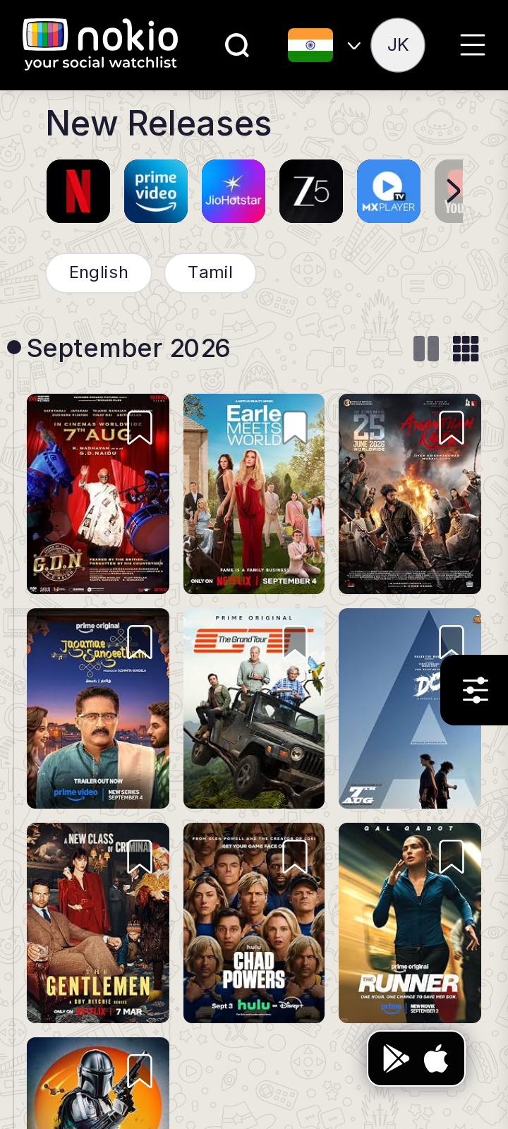
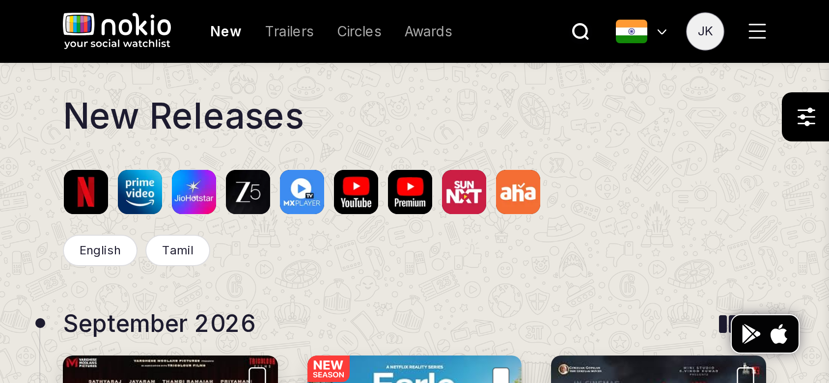
New releases

/in/new-releases · Discovery

Job: Scan titles that just landed and save a few.

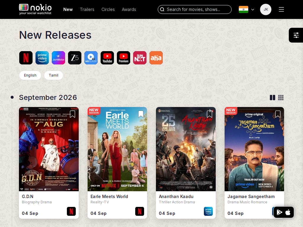
Clicked three bookmark controls; My Watchlist went from 0 to 1 (Earle Meets World). Bookmarks work, but most clicks did not persist — hit targets are tiny and easy to miss.
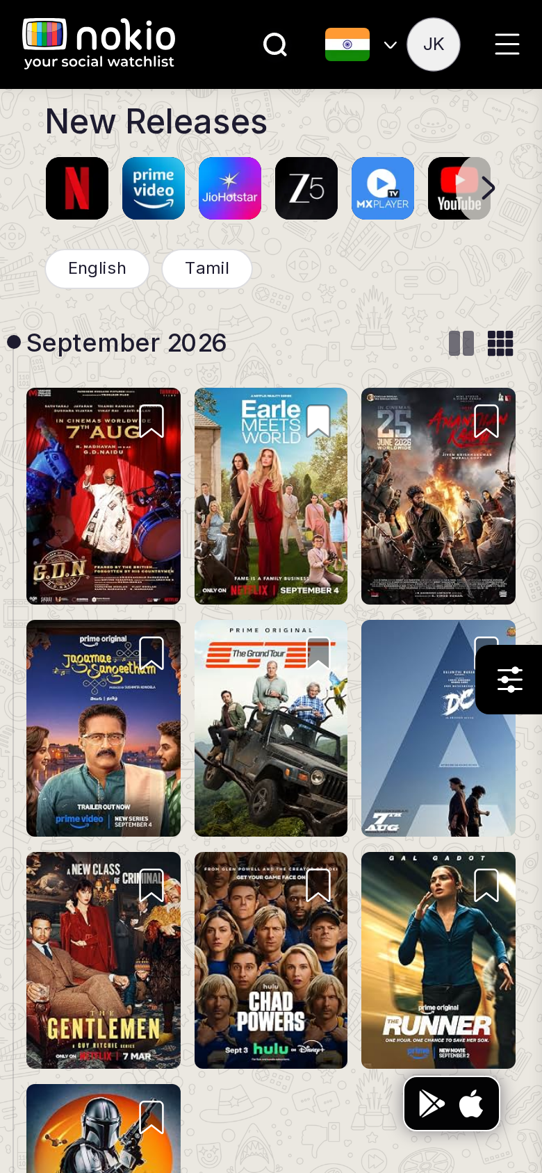
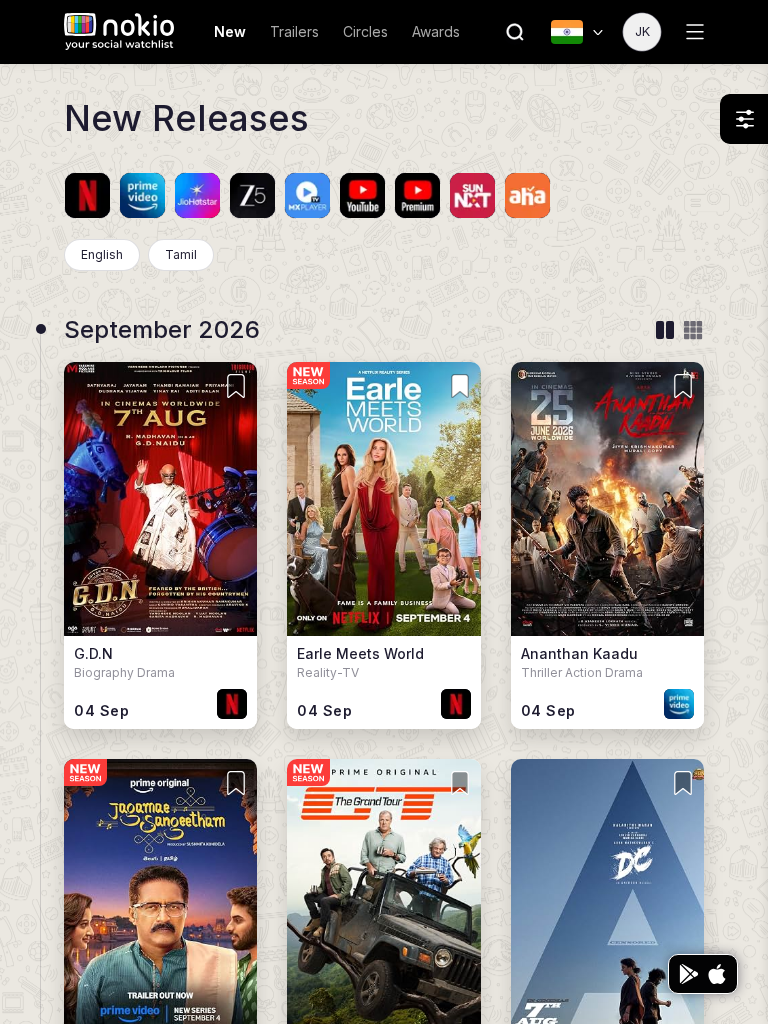
New releases phone-390
390×844 · ~19.5:9 · CSS mobile ≤480
New releases tablet-port
768×1024 · 3:4 · CSS tablet ≤960
New releases desktop-16-9
1440×810 · 16:9
Other aspect ratios (4)
phone-360
360×800 · 9:20 · CSS mobile ≤480
phone-land
844×390 · landscape · CSS tablet ≤960 at phone height
tablet-land
1024×768 · 4:3 land · CSS small ≤1280 (desktop chrome)
desktop-fhd
1920×1080 · 16:9 FHD

Improvements

P0

2-column posters on phone

3-col at 360/390 makes titles unreadable and bookmarks <44px.

P1

Confirm save

Toast “Saved to watchlist” and fill the bookmark. Three clicks → one save is a trust leak.

P1

Tablet 768: don’t use desktop 5–6 col

At 3:4, 2–3 columns with titles under art.

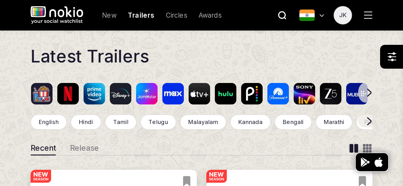
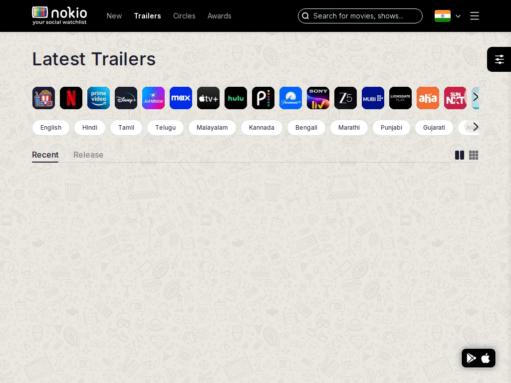
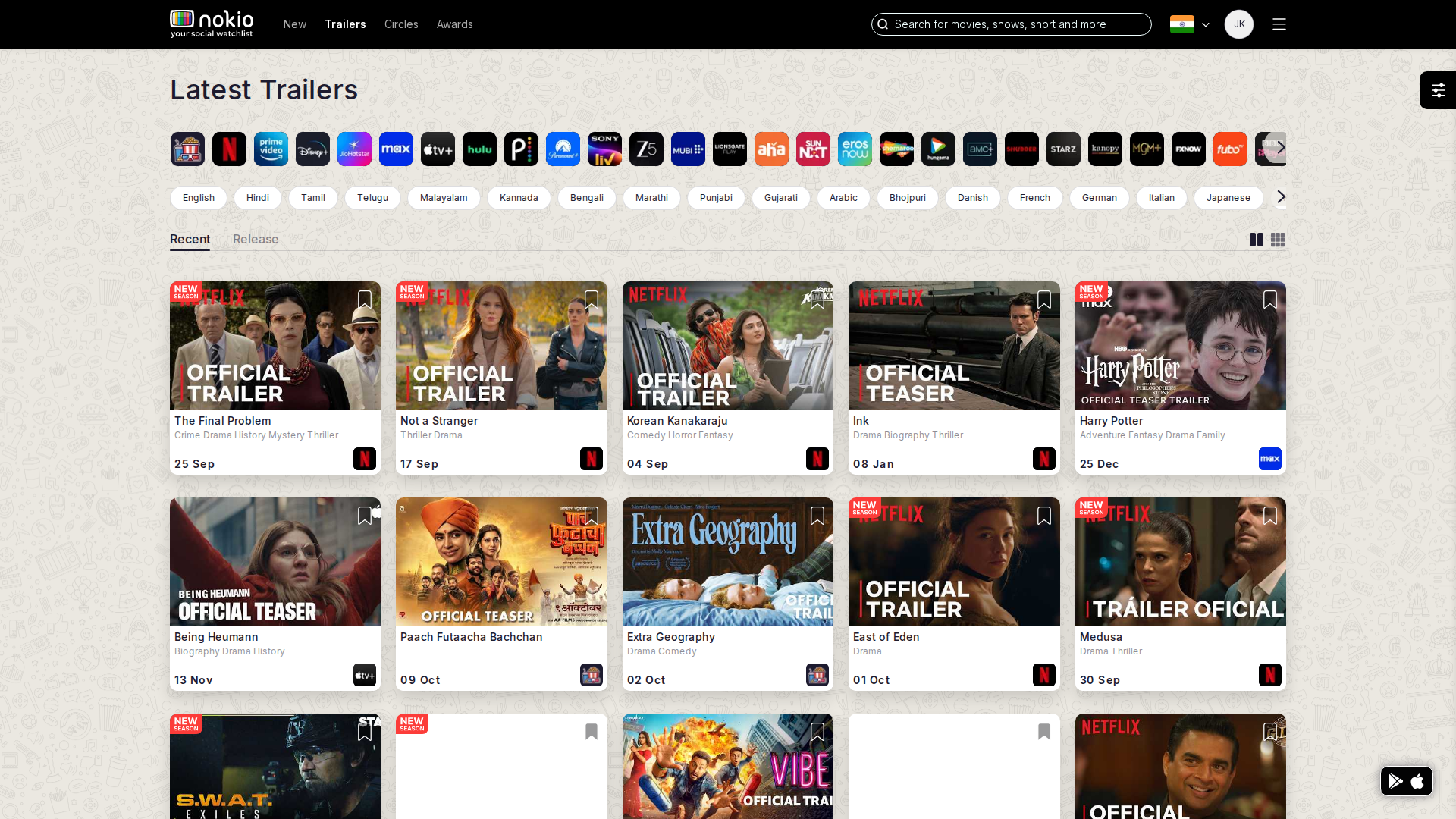
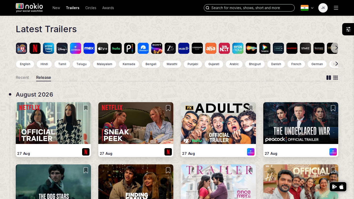
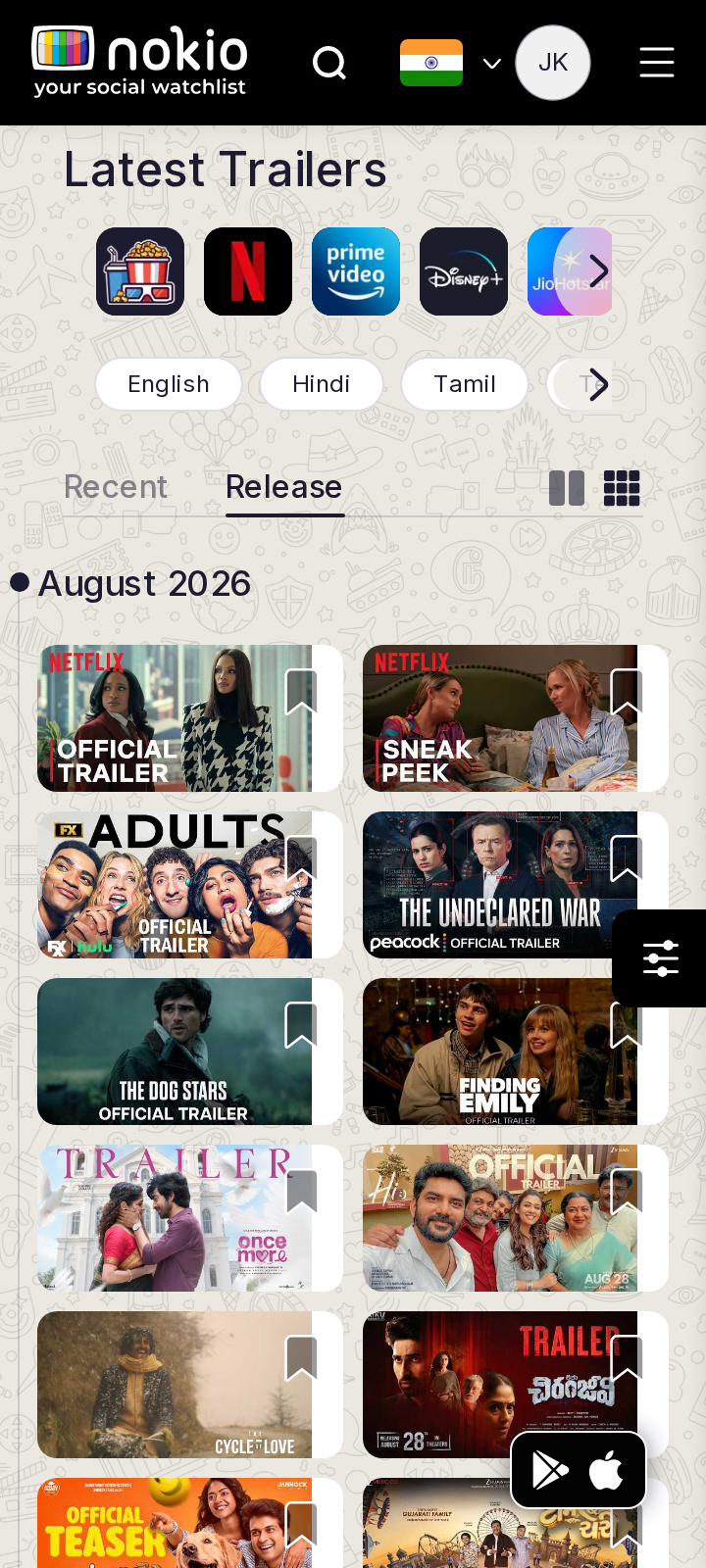
Trailers

/in/trailers/recent · Discovery

Job: Skim latest trailers and play one.

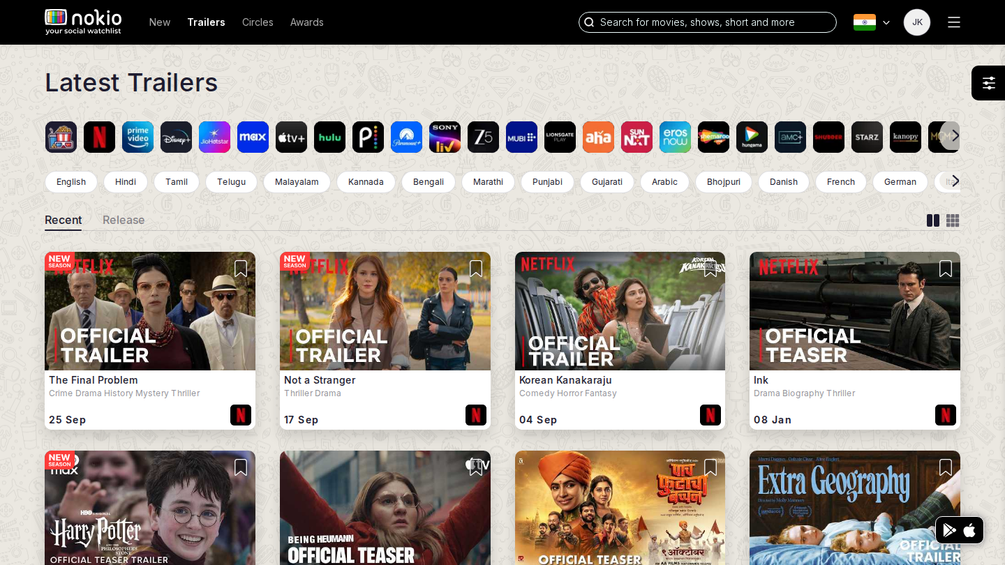
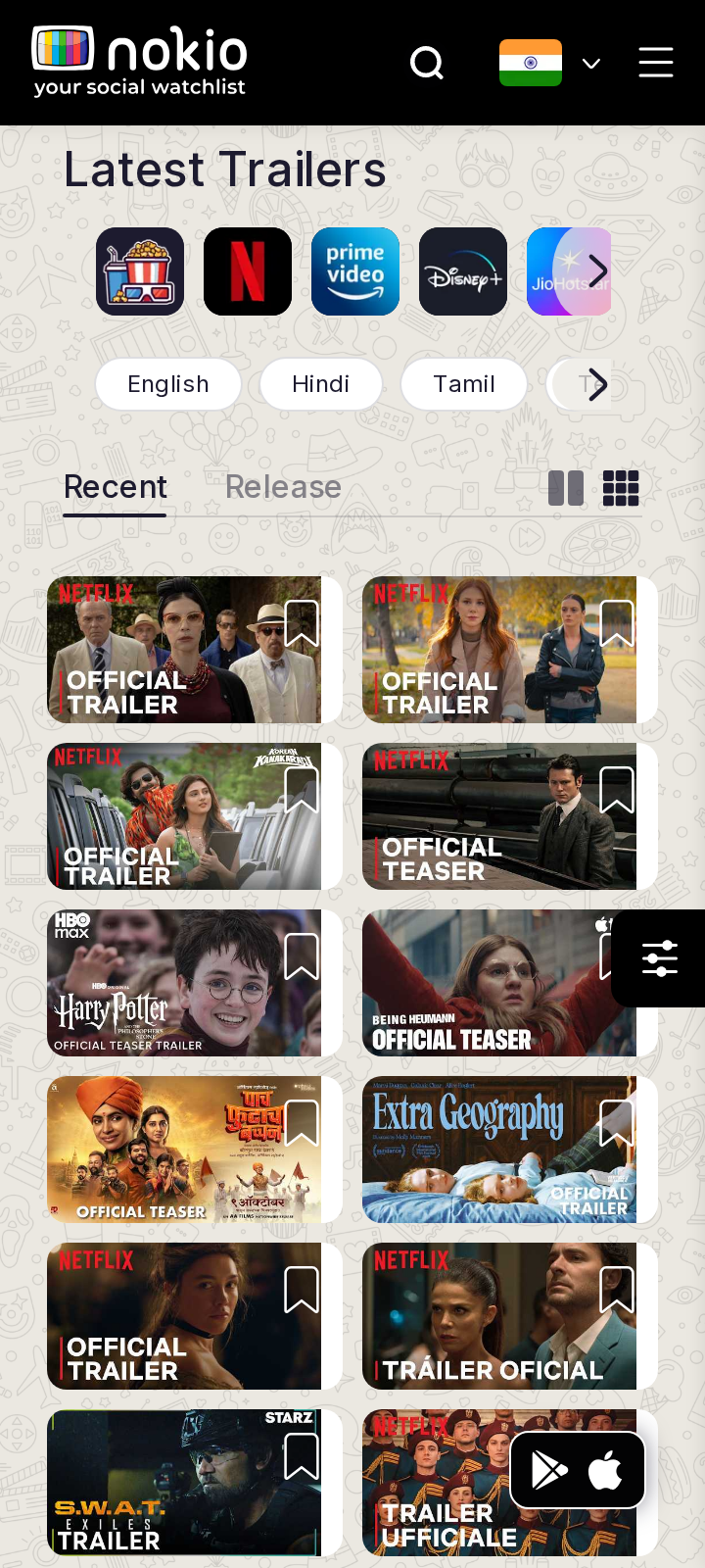
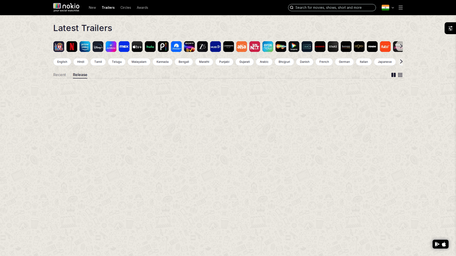
Clicking a thumb applied a platform filter (?platforms=49) instead of opening a title. Header “Trailers” also steals in-page Trailers tab clicks.
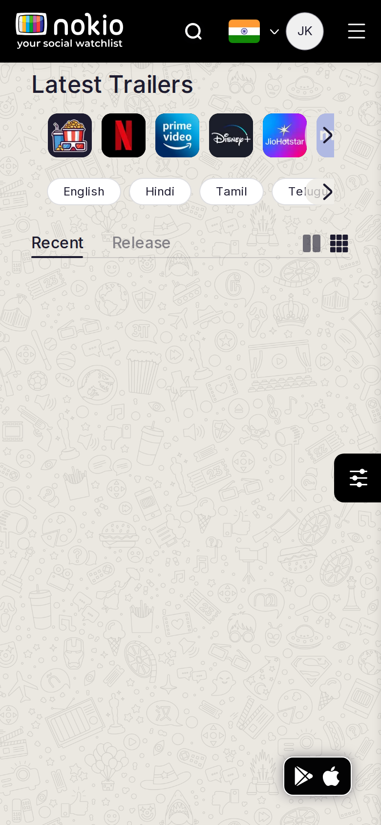
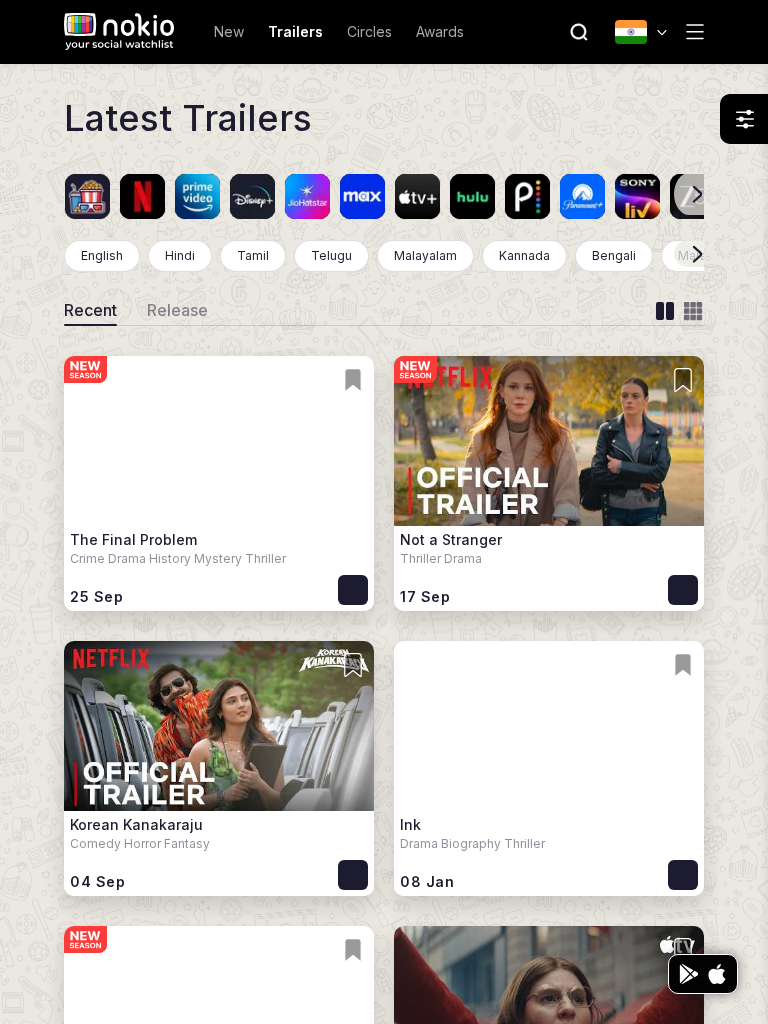
Trailers phone-390
390×844 · ~19.5:9 · CSS mobile ≤480
Trailers tablet-port
768×1024 · 3:4 · CSS tablet ≤960
Trailers desktop-16-9
1440×810 · 16:9
Other aspect ratios (4)
phone-360
360×800 · 9:20 · CSS mobile ≤480
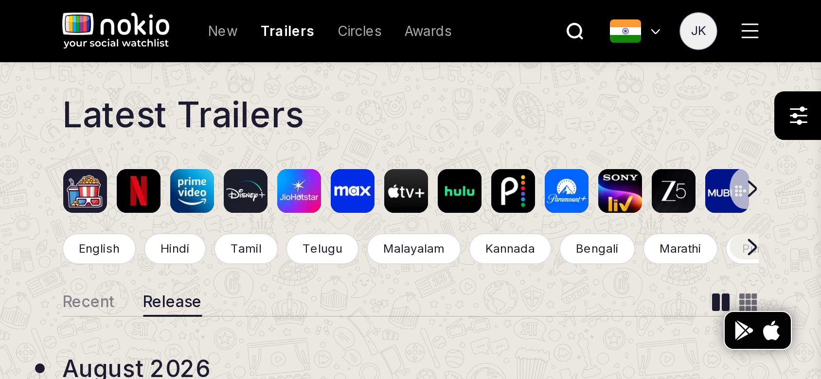
phone-land
844×390 · landscape · CSS tablet ≤960 at phone height
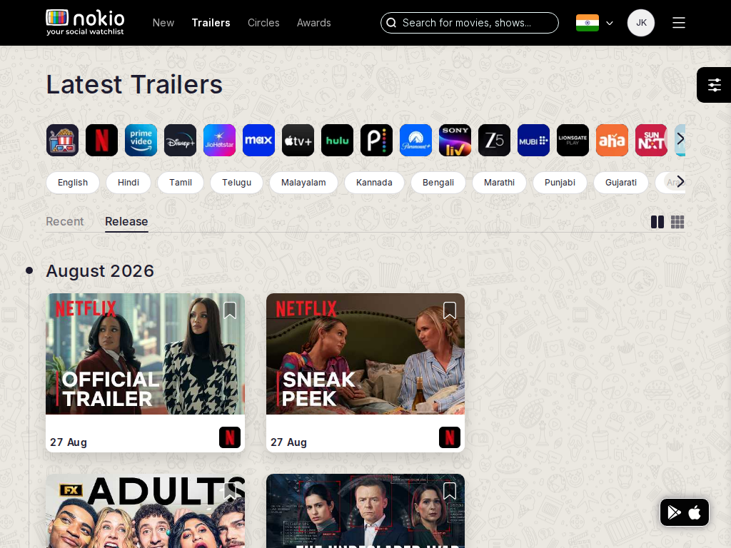
tablet-land
1024×768 · 4:3 land · CSS small ≤1280 (desktop chrome)
desktop-fhd
1920×1080 · 16:9 FHD

Improvements

P0

Thumb click = play or open title

Do not bind the first tap to a platform chip in the filter row.

P1

Rename header vs page tabs

Header: Discover / Trailers. Page tabs: Latest / Coming soon. Same word in two places caused a mis-nav to /in/trailers/recent.

P2

Phone landscape

2-col thumbs in 390px height show one half-row. Use a horizontal reel.

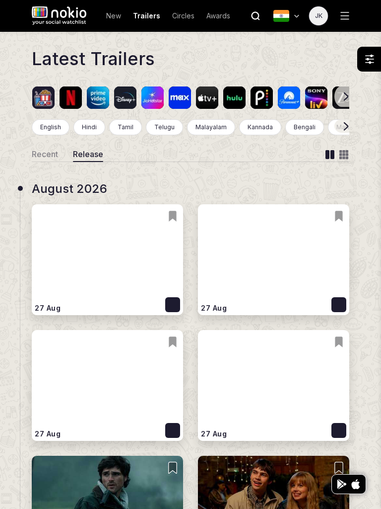
Trailers by release

/in/trailers/release · Discovery

Job: See trailers ordered by release date.

Visually identical to Recent except the underline — easy to think the tab did nothing.
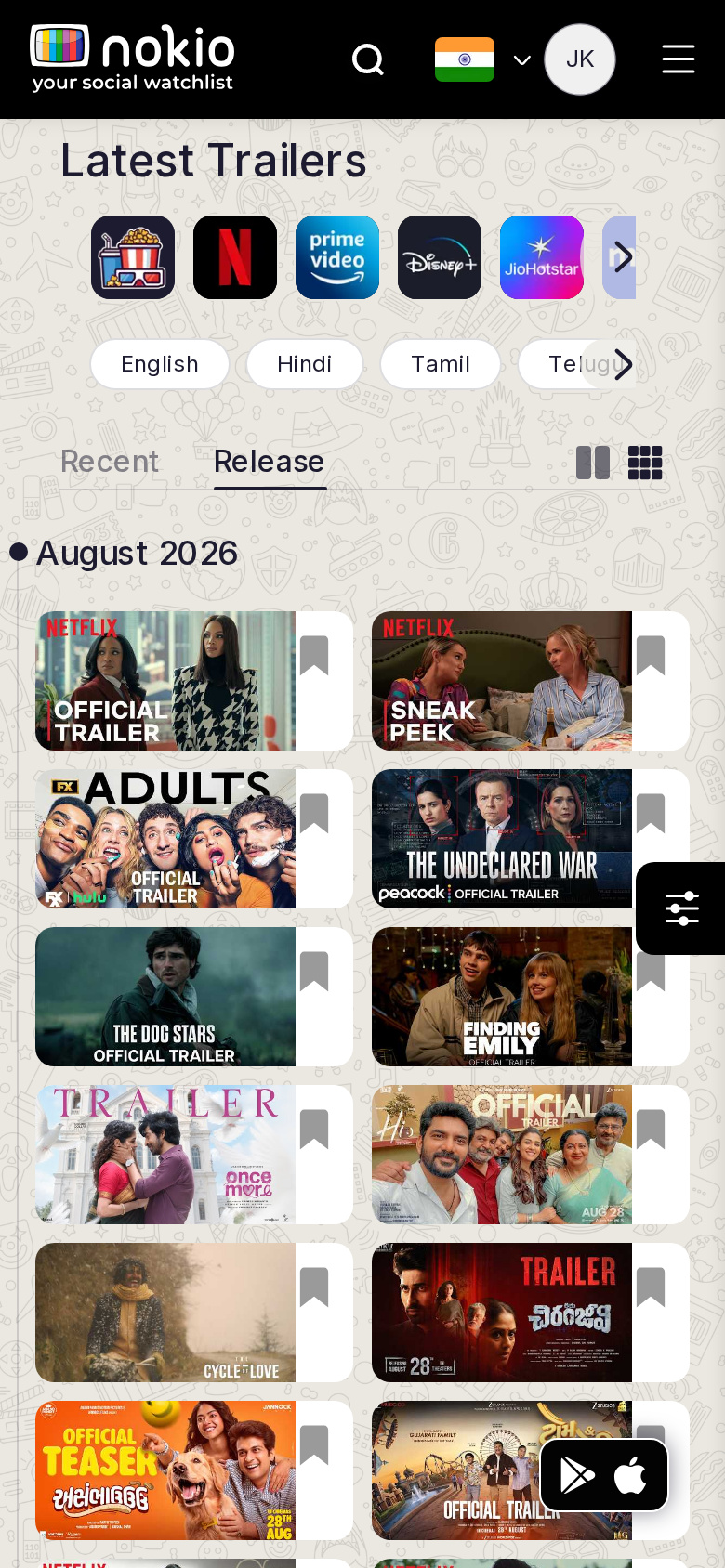
Trailers by release phone-390
390×844 · ~19.5:9 · CSS mobile ≤480
Trailers by release tablet-port
768×1024 · 3:4 · CSS tablet ≤960
Trailers by release desktop-16-9
1440×810 · 16:9
Other aspect ratios (4)
phone-360
360×800 · 9:20 · CSS mobile ≤480
phone-land
844×390 · landscape · CSS tablet ≤960 at phone height
tablet-land
1024×768 · 4:3 land · CSS small ≤1280 (desktop chrome)
desktop-fhd
1920×1080 · 16:9 FHD

Improvements

P1

Change the H1 with the tab

“Trailers · coming soon” vs “Trailers · latest”.

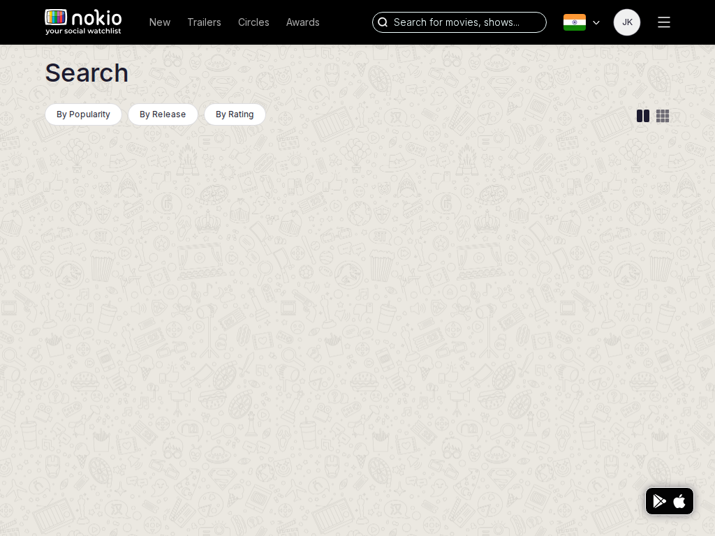
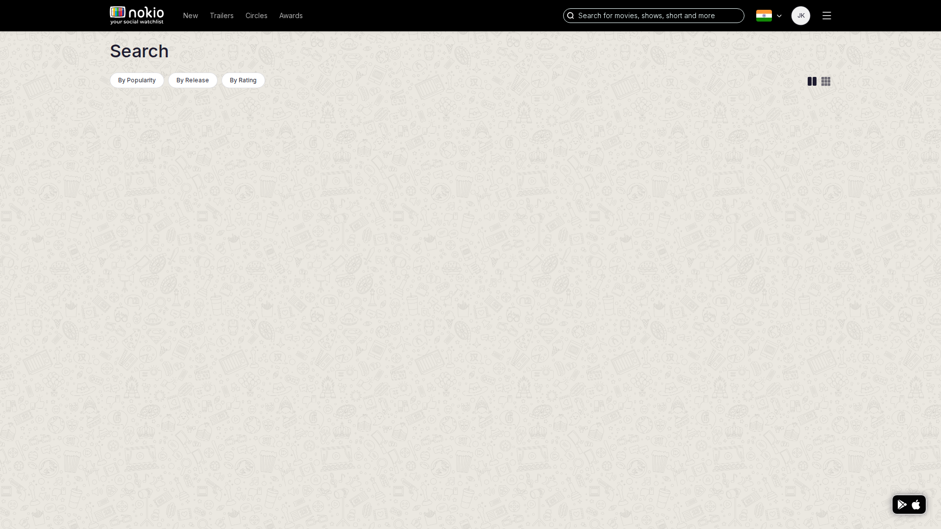
Search

/movies · Discovery

Job: Find a specific title.

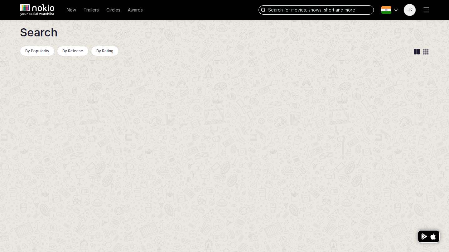
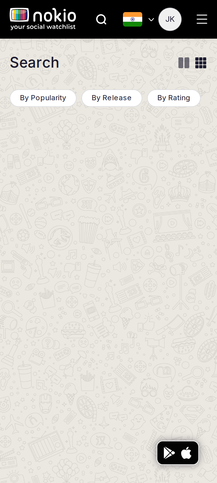
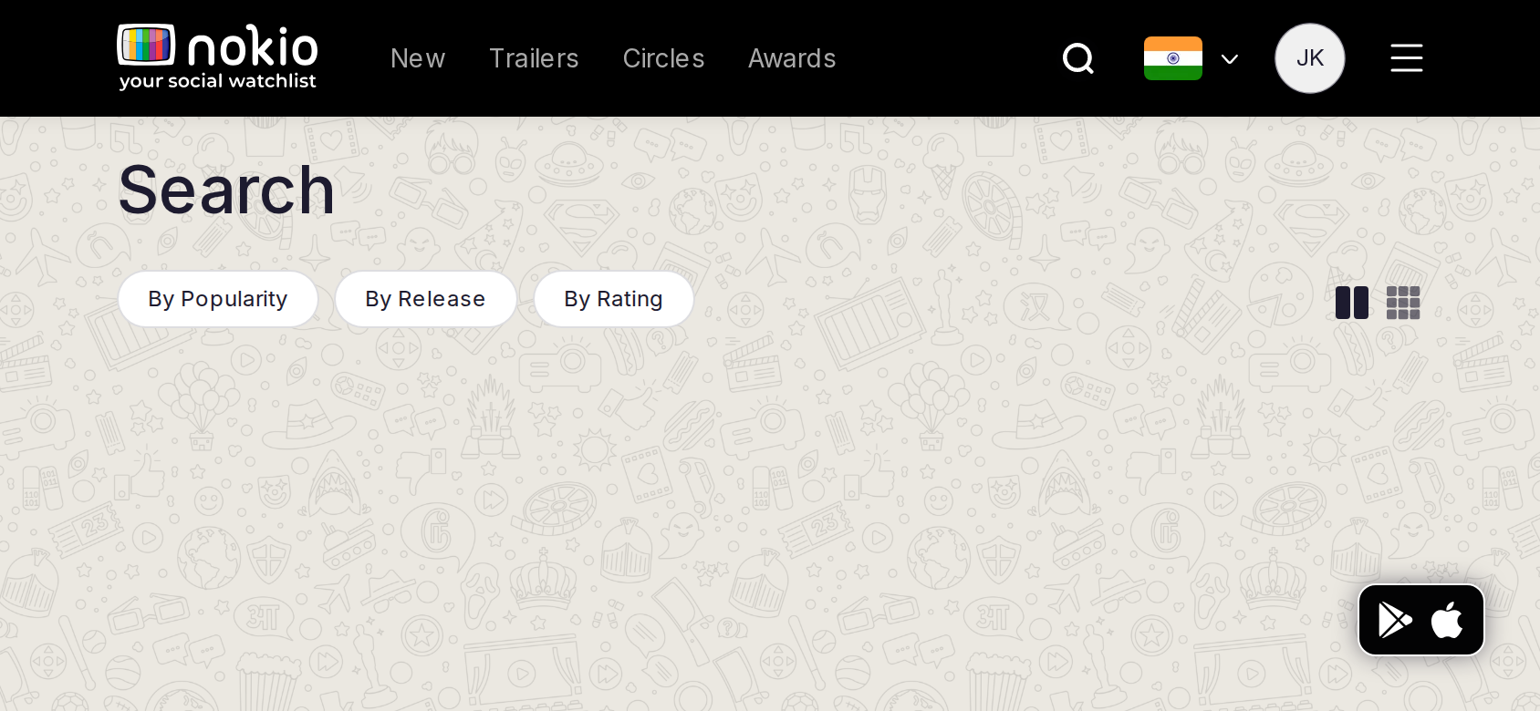
Header search for “The Gentlemen” landed on /movies?q=The+Gentlemen with a populated 6-col grid (2019 film, 2024 series, League of Extraordinary Gentlemen…). Empty /movies is a dead page; search-with-query works.
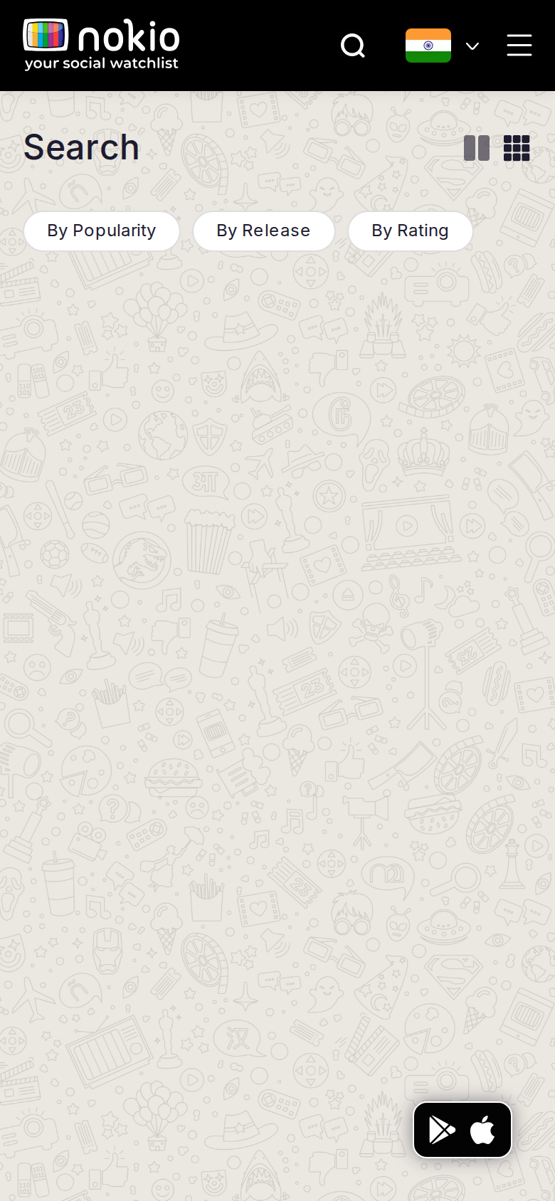
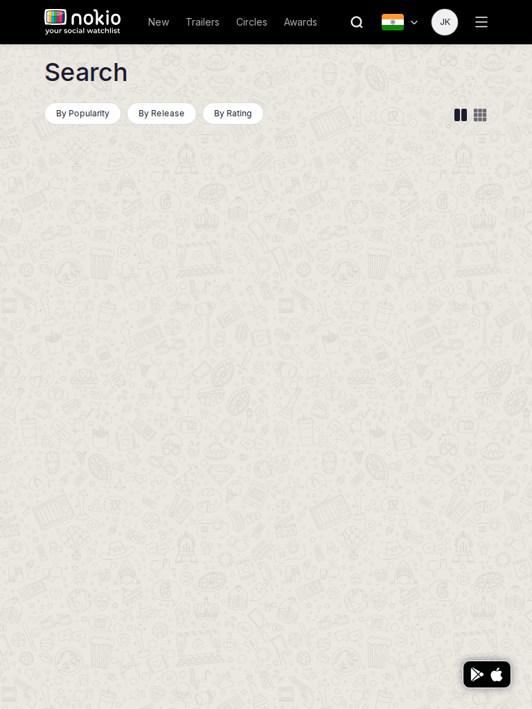
Search phone-390
390×844 · ~19.5:9 · CSS mobile ≤480
Search tablet-port
768×1024 · 3:4 · CSS tablet ≤960
Search desktop-16-9
1440×810 · 16:9
Other aspect ratios (4)
phone-360
360×800 · 9:20 · CSS mobile ≤480
phone-land
844×390 · landscape · CSS tablet ≤960 at phone height
tablet-land
1024×768 · 4:3 land · CSS small ≤1280 (desktop chrome)
desktop-fhd
1920×1080 · 16:9 FHD

Improvements

P0

Empty /movies must not be blank

Autofocus the field. Empty q → popular. The header field already proves results work.

P1

6 columns at 1440 is dense; 360 cannot do 6

Phone: 2 col. Tablet: 3. Desktop 16:9: 5. Label movie vs series on the card.

About

/about-us · Marketing

Job: Understand Nokio and start using it.

Not part of the signed-in loop. Still a navy-on-black island with no chrome.
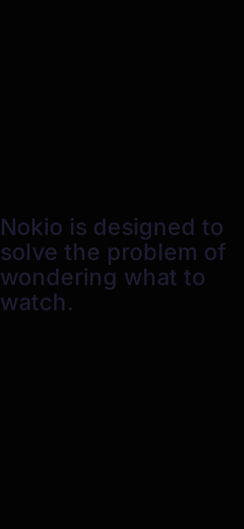
About phone-390
390×844 · ~19.5:9 · CSS mobile ≤480
About tablet-port
768×1024 · 3:4 · CSS tablet ≤960
About desktop-16-9
1440×810 · 16:9
Other aspect ratios (4)
phone-360
360×800 · 9:20 · CSS mobile ≤480
phone-land
844×390 · landscape · CSS tablet ≤960 at phone height
tablet-land
1024×768 · 4:3 land · CSS small ≤1280 (desktop chrome)
desktop-fhd
1920×1080 · 16:9 FHD

Improvements

P0

App chrome + contrast + CTA

White type, logo home, Sign in / Get the app.

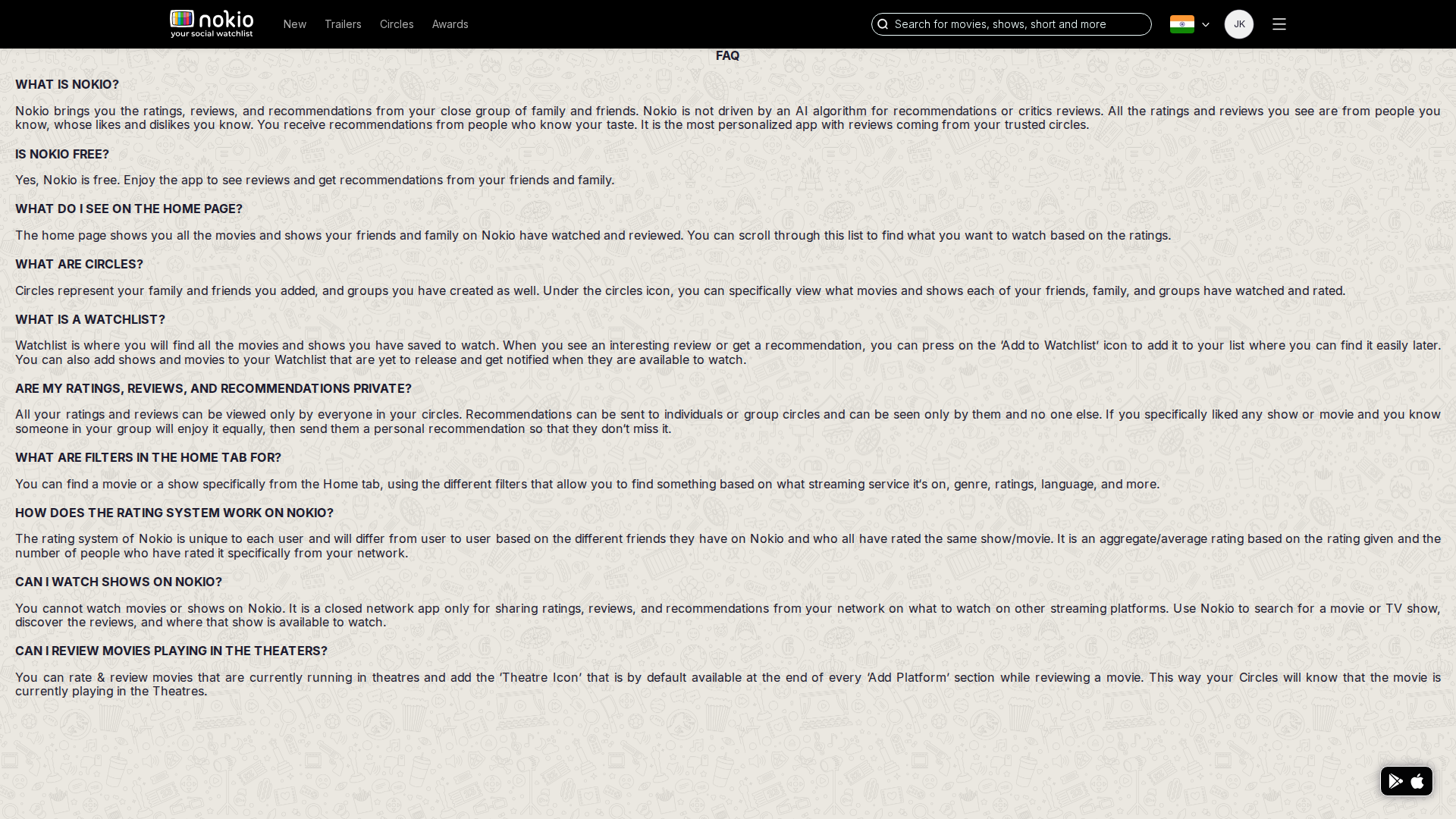
FAQ

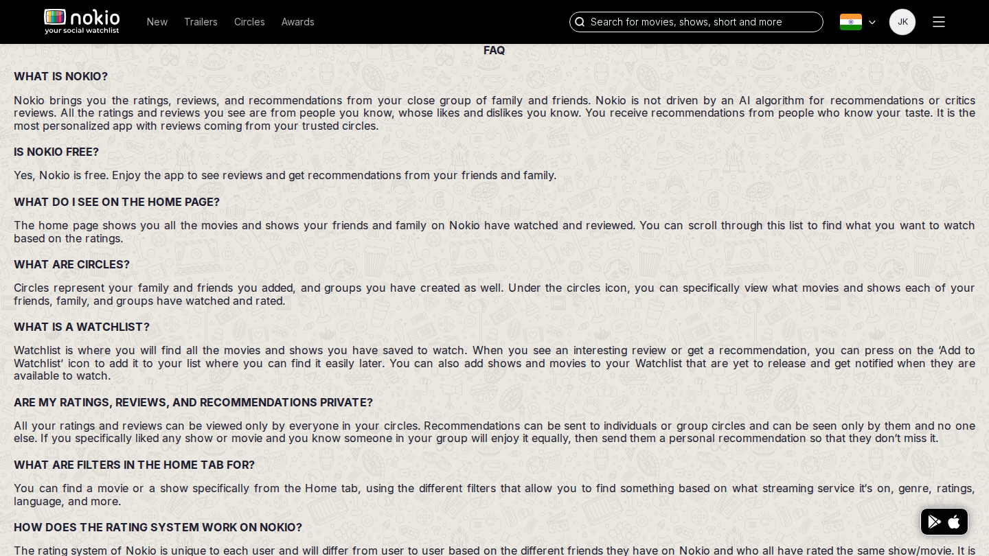
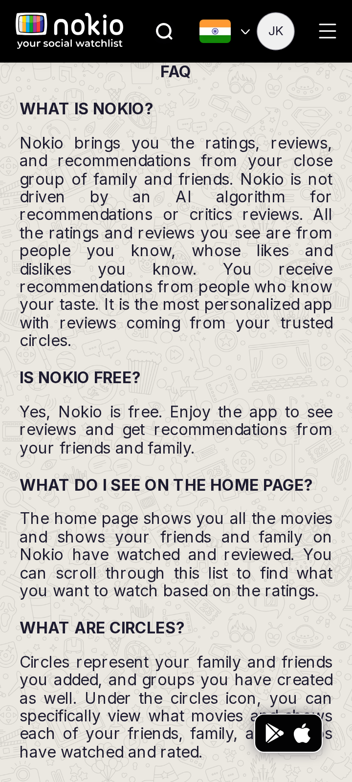
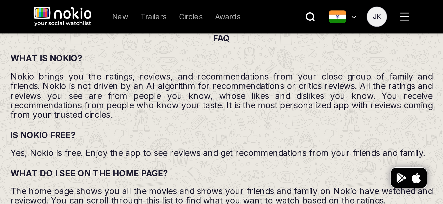
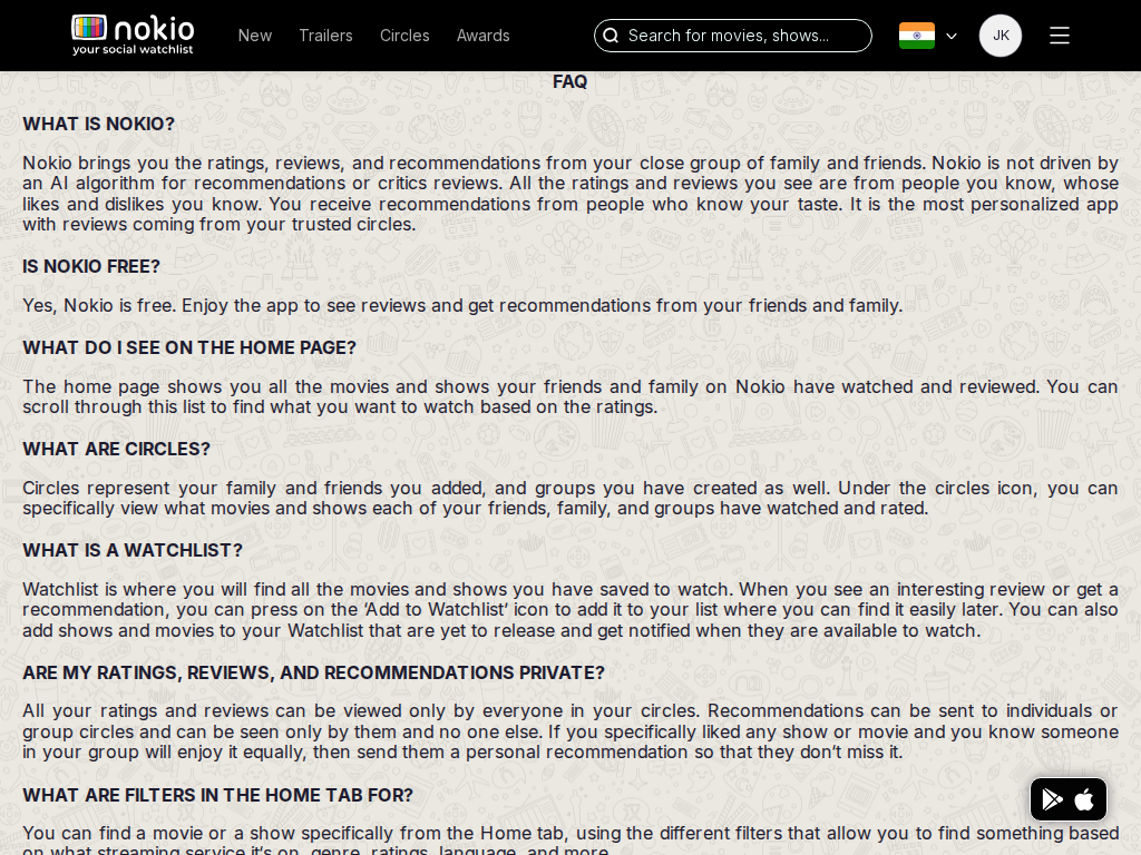
/faq · Marketing

Job: Resolve how Circles and home actually work.

FAQ still describes friends’ watches on home. After login, home is still a public trailer catalog plus a thin social rail.
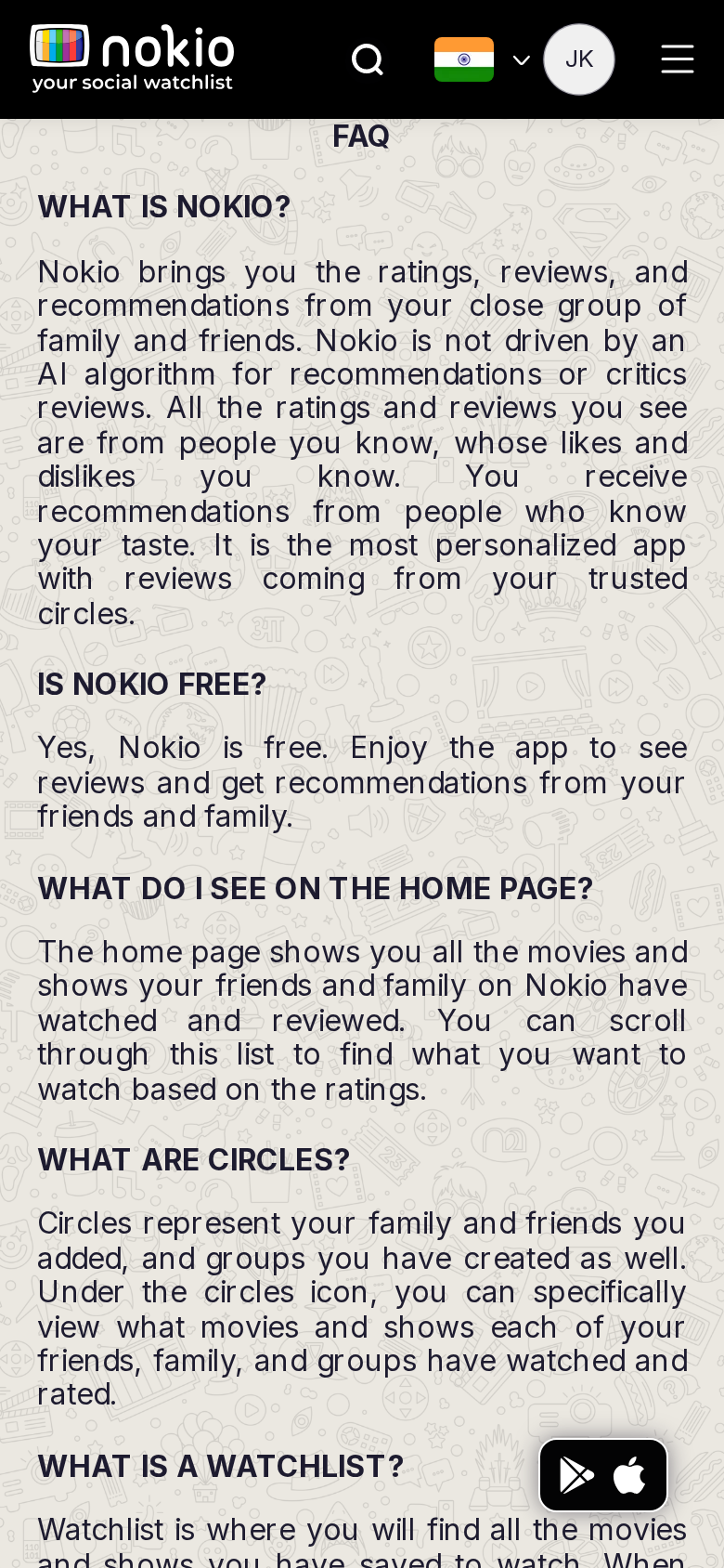
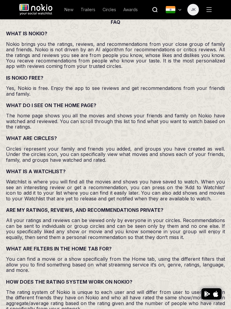
FAQ phone-390
390×844 · ~19.5:9 · CSS mobile ≤480
FAQ tablet-port
768×1024 · 3:4 · CSS tablet ≤960
FAQ desktop-16-9
1440×810 · 16:9
Other aspect ratios (4)
phone-360
360×800 · 9:20 · CSS mobile ≤480
phone-land
844×390 · landscape · CSS tablet ≤960 at phone height
tablet-land
1024×768 · 4:3 land · CSS small ≤1280 (desktop chrome)
desktop-fhd
1920×1080 · 16:9 FHD

Improvements

P0

Rewrite or rebuild

Don’t promise a friends feed the home page does not show.

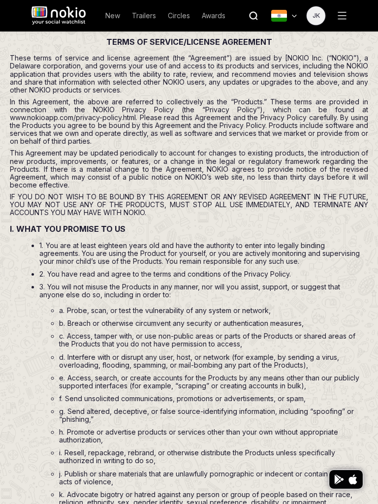
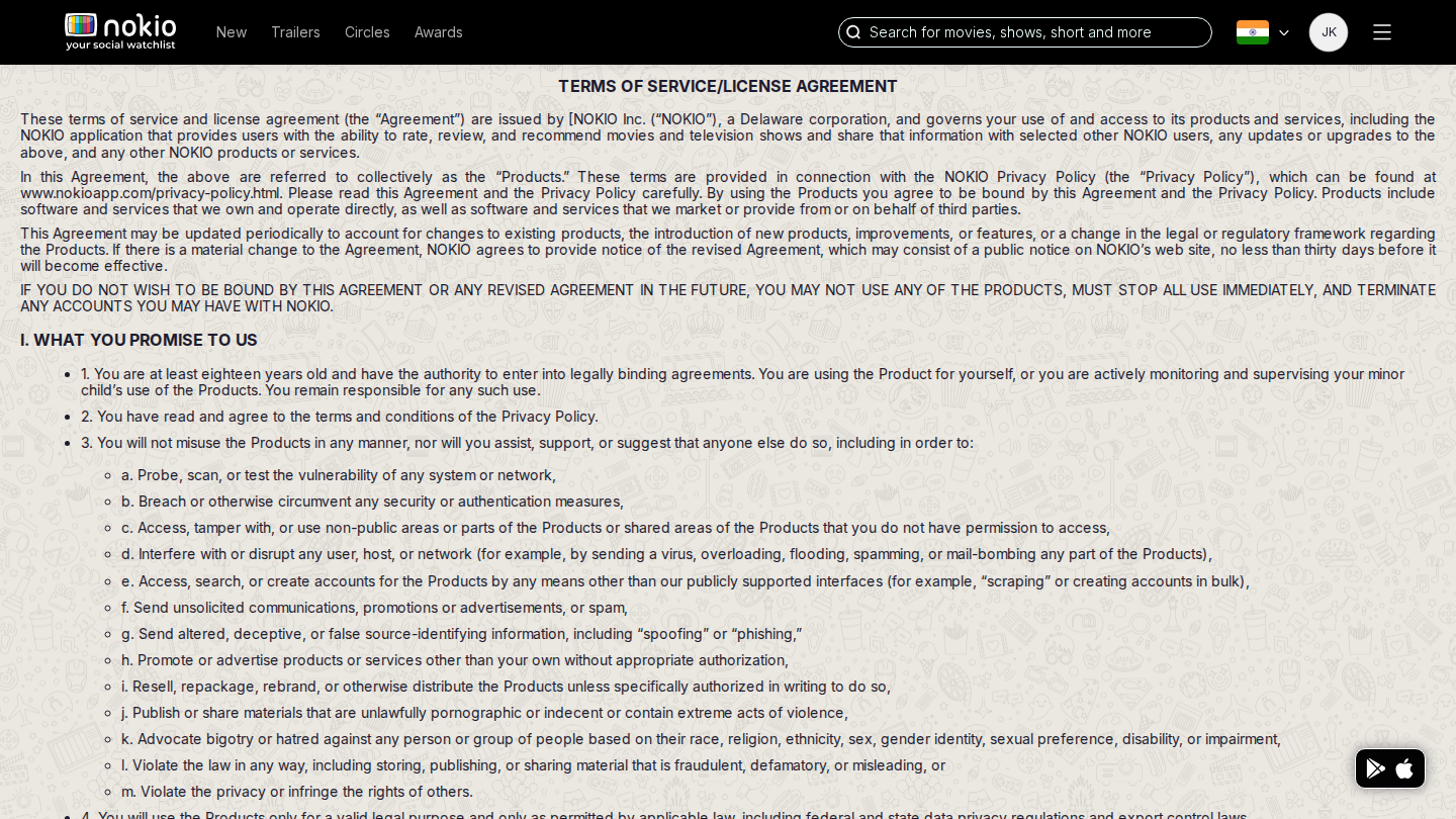
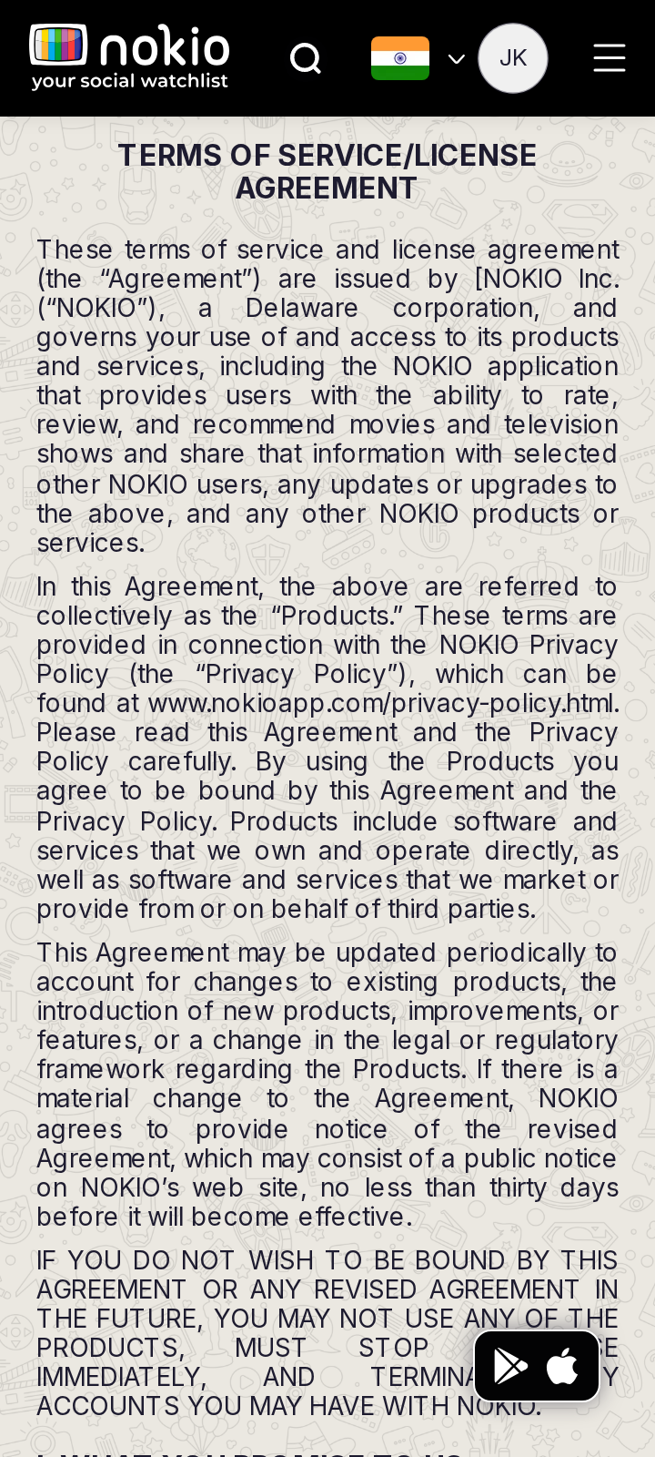
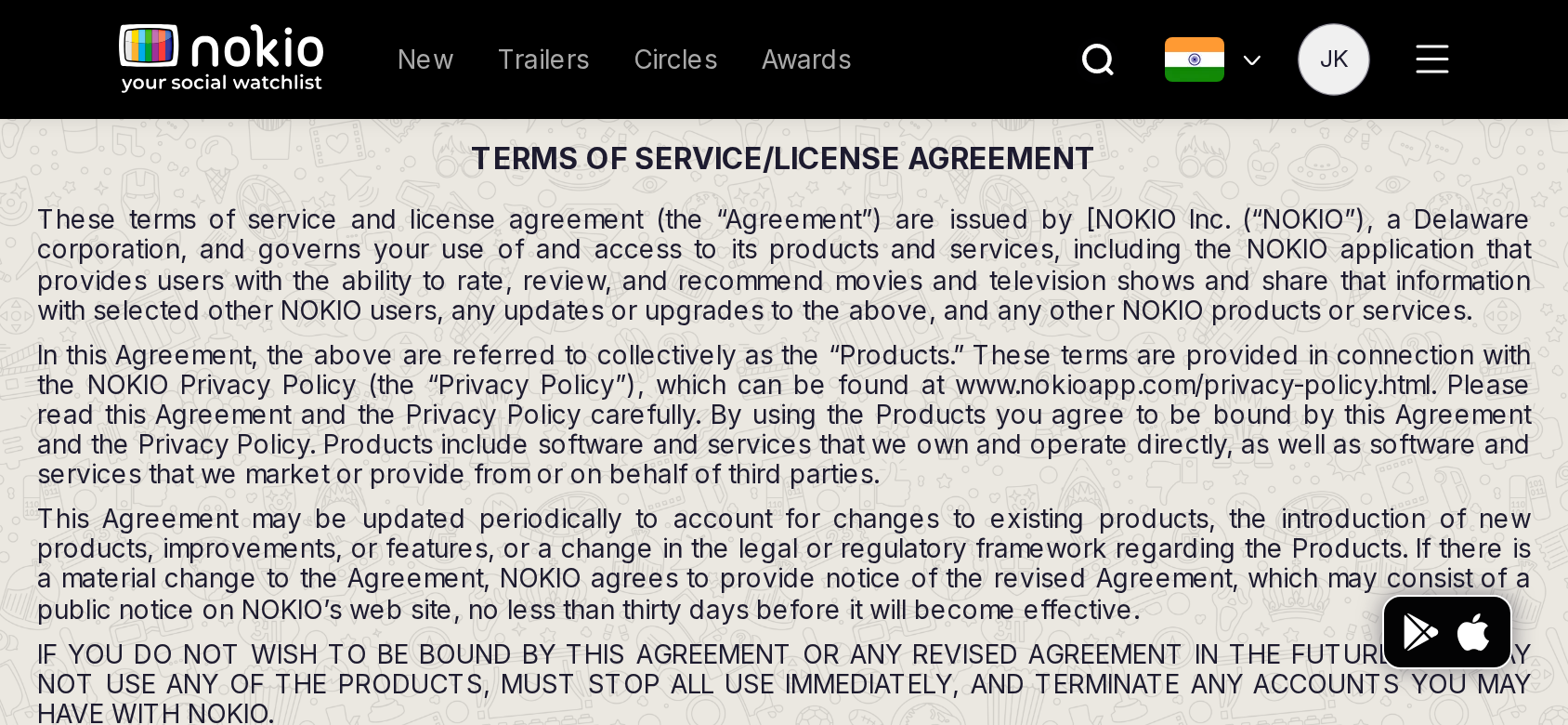
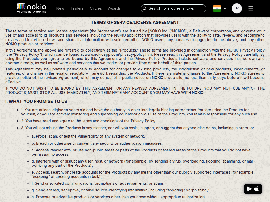
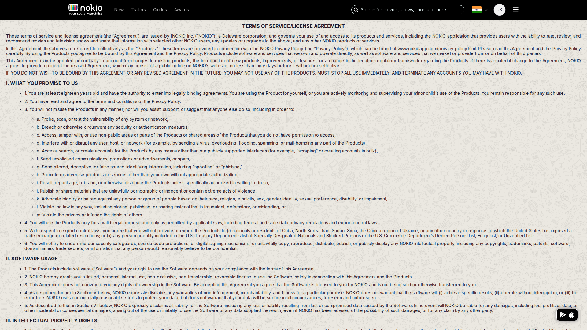
Terms

/terms-of-service · Marketing

Job: Read the agreement.

Legal route; FAB still covers clauses on phone.
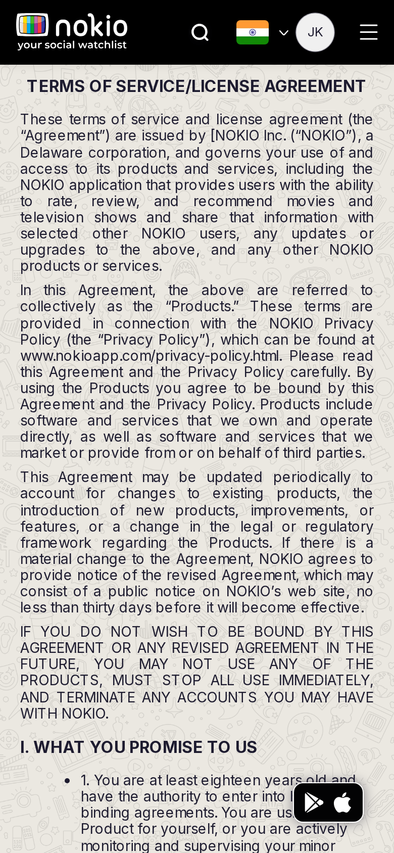
Terms phone-390
390×844 · ~19.5:9 · CSS mobile ≤480
Terms tablet-port
768×1024 · 3:4 · CSS tablet ≤960
Terms desktop-16-9
1440×810 · 16:9
Other aspect ratios (4)
phone-360
360×800 · 9:20 · CSS mobile ≤480
phone-land
844×390 · landscape · CSS tablet ≤960 at phone height
tablet-land
1024×768 · 4:3 land · CSS small ≤1280 (desktop chrome)
desktop-fhd
1920×1080 · 16:9 FHD

Improvements

P0

Hide FAB on legal pages

Or pad the article 80px from the bottom-right.

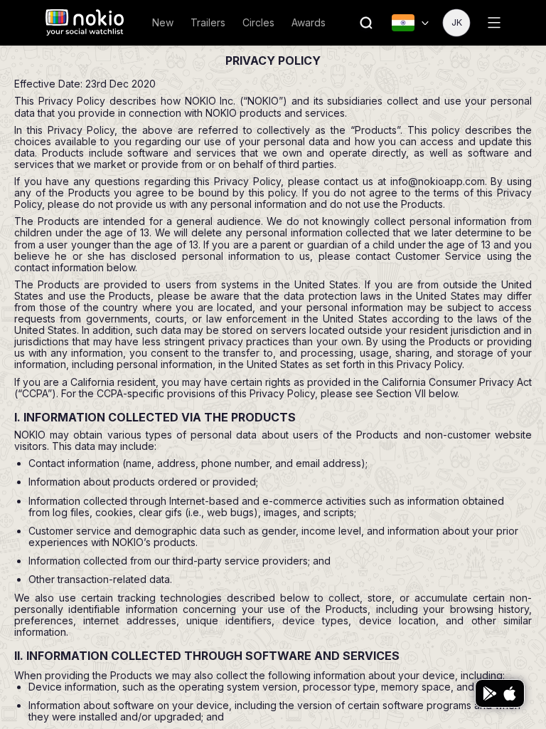
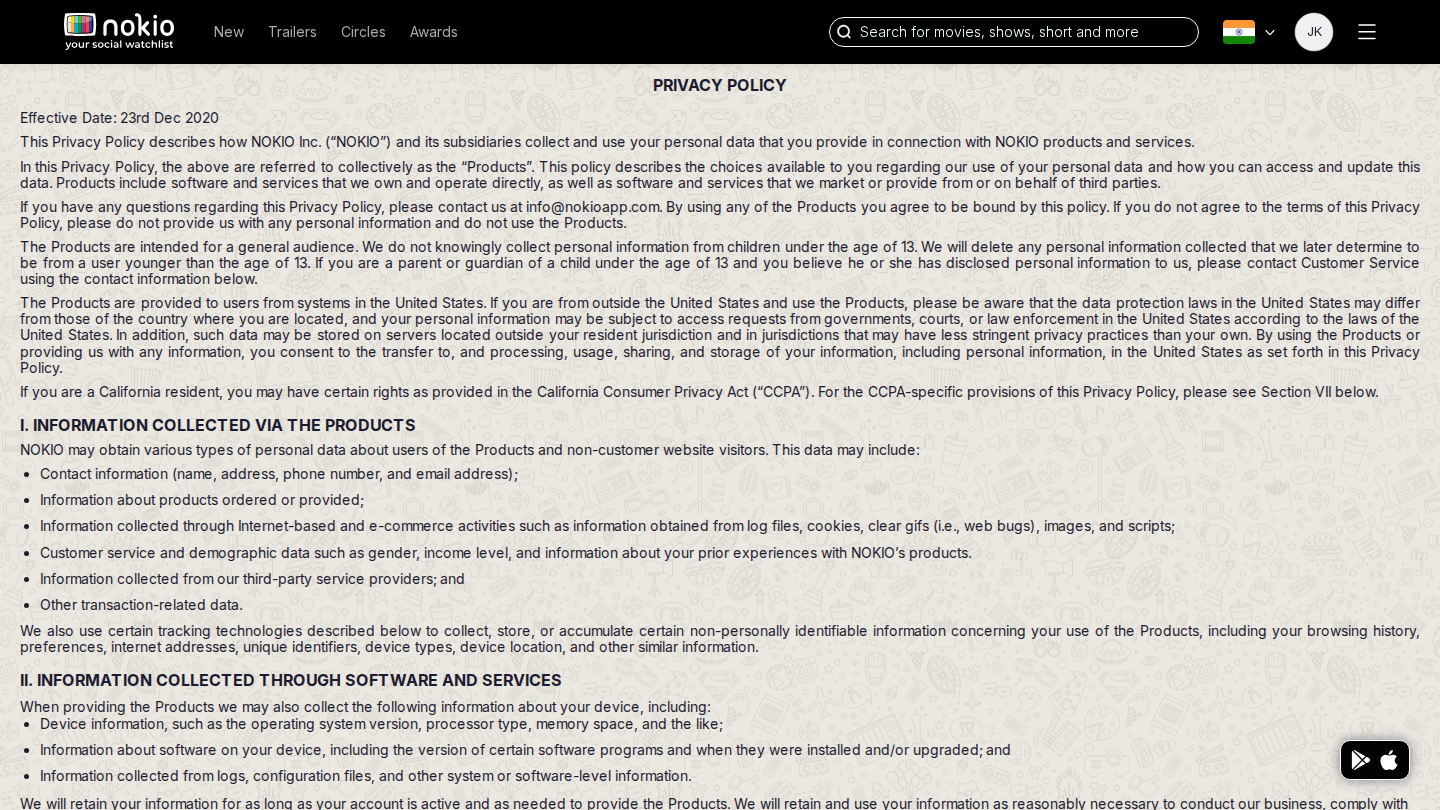
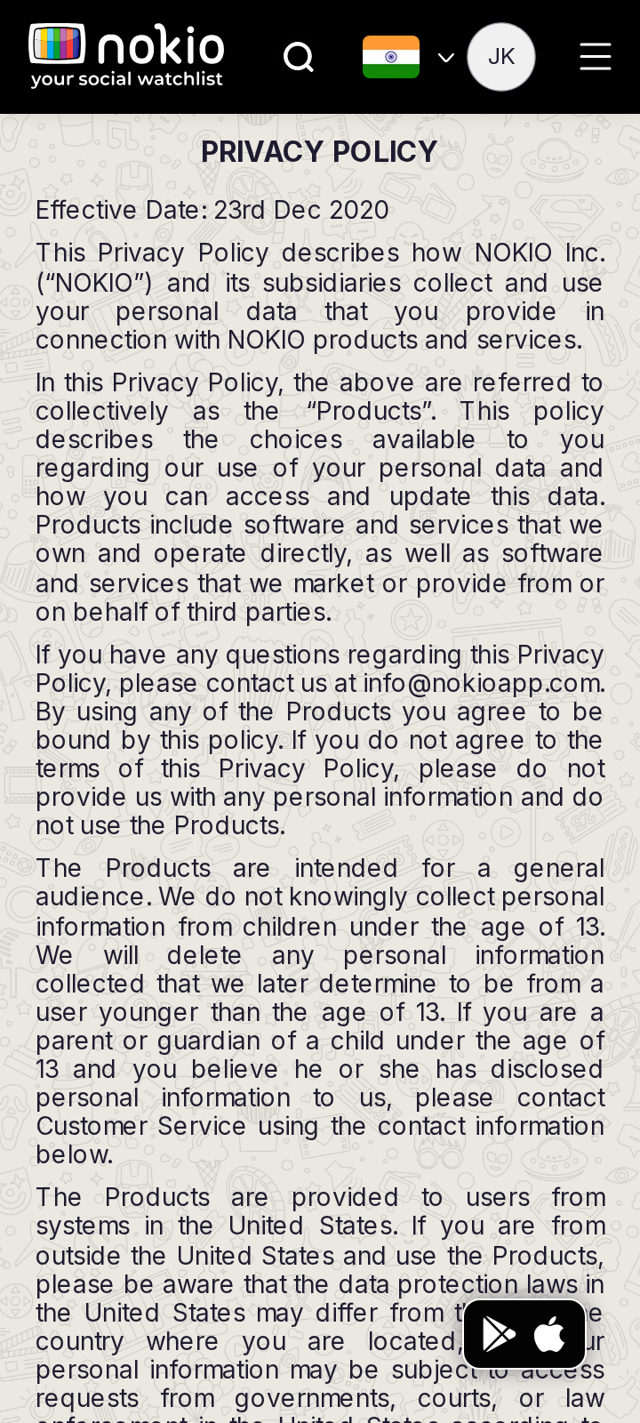
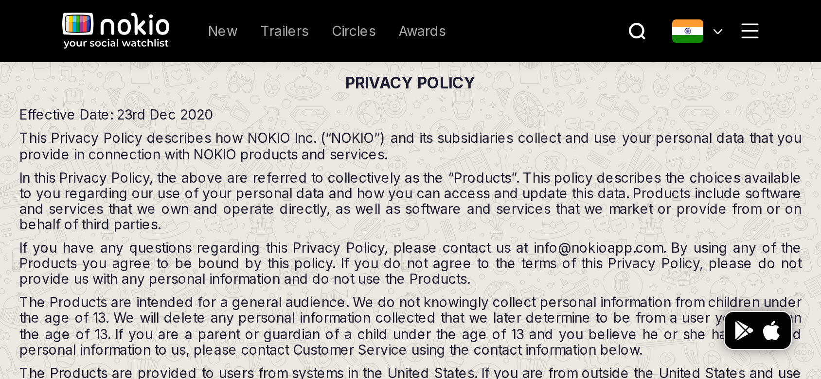
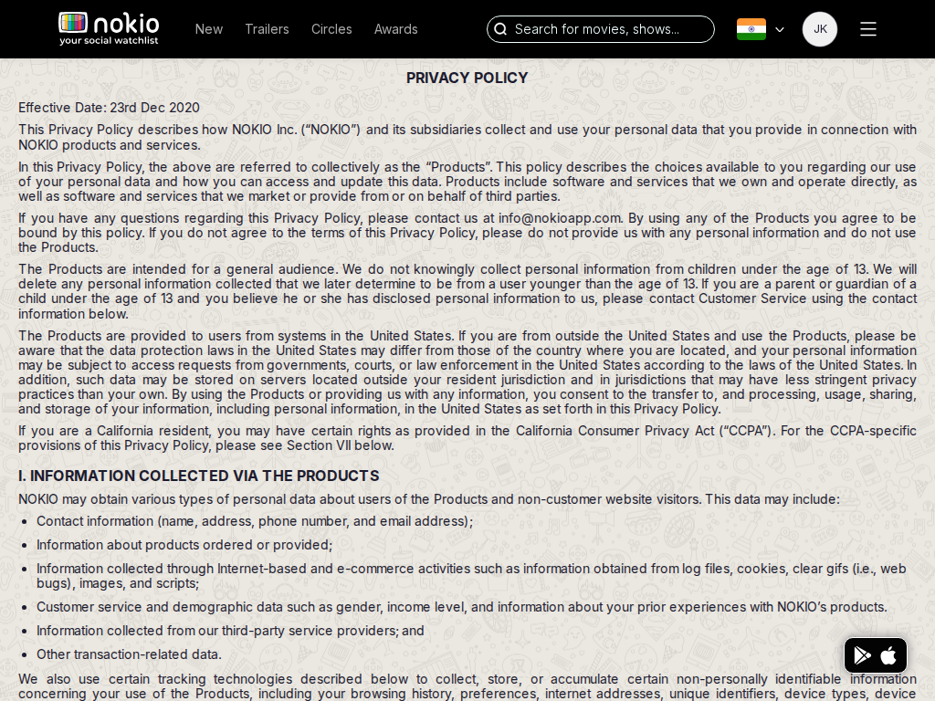
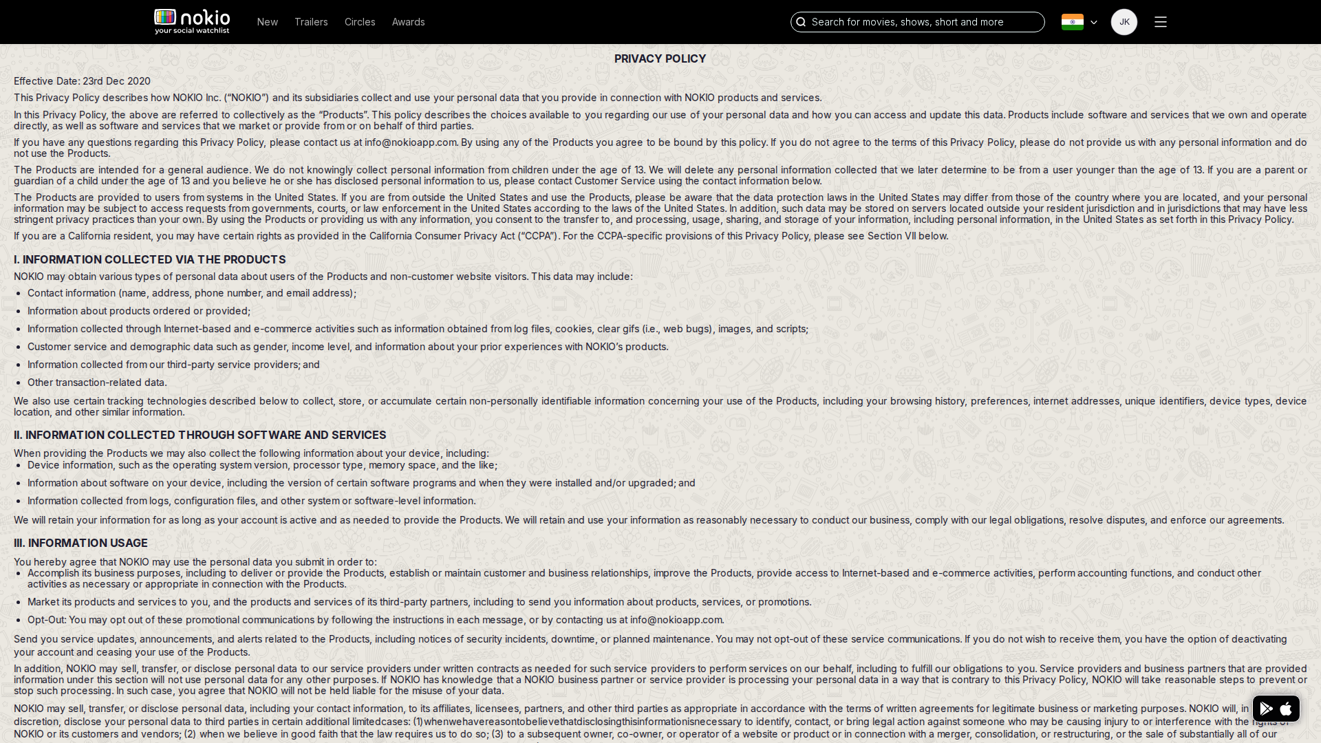
Privacy

/privacy-policy · Marketing

Job: Understand data use.

Same template as Terms.
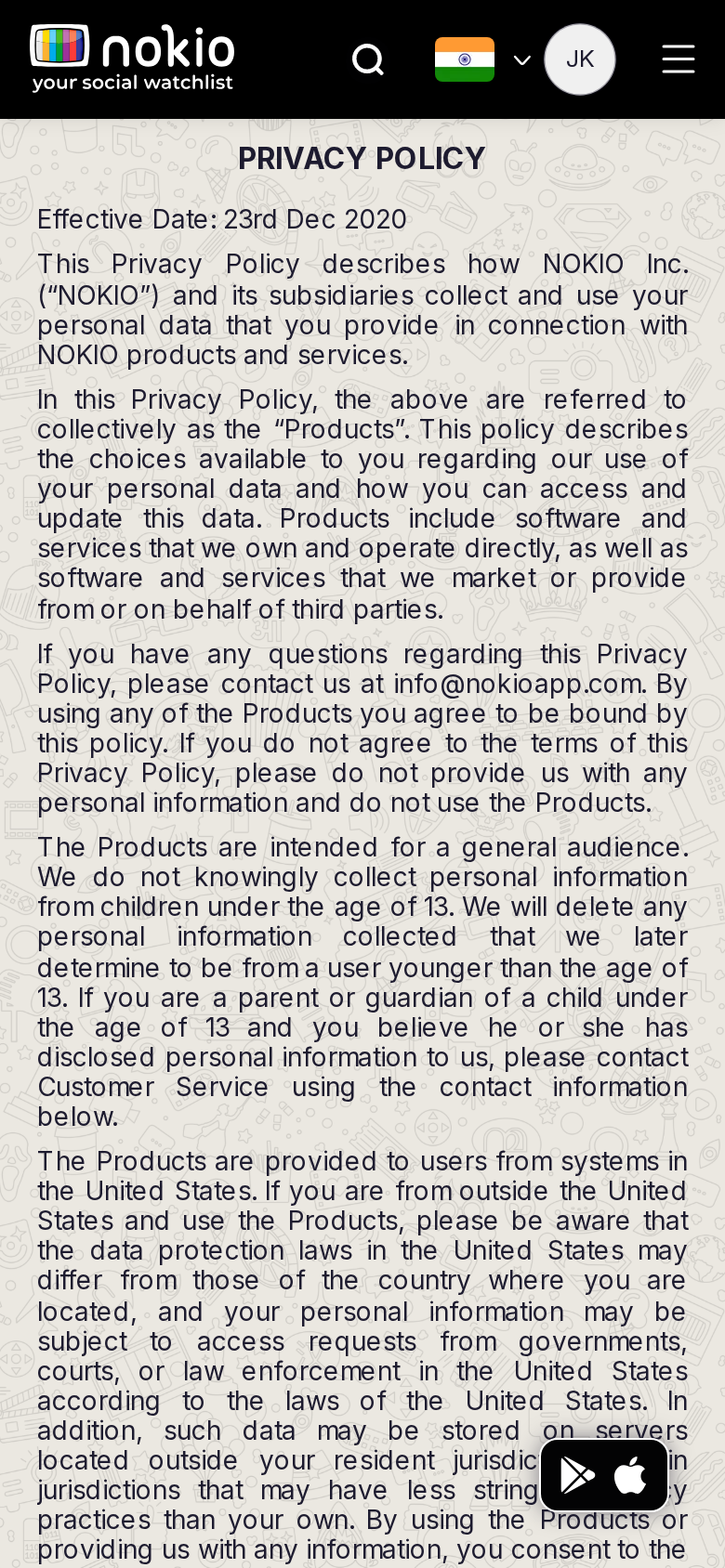
Privacy phone-390
390×844 · ~19.5:9 · CSS mobile ≤480
Privacy tablet-port
768×1024 · 3:4 · CSS tablet ≤960
Privacy desktop-16-9
1440×810 · 16:9
Other aspect ratios (4)
phone-360
360×800 · 9:20 · CSS mobile ≤480
phone-land
844×390 · landscape · CSS tablet ≤960 at phone height
tablet-land
1024×768 · 4:3 land · CSS small ≤1280 (desktop chrome)
desktop-fhd
1920×1080 · 16:9 FHD

Improvements

P1

Shared legal template

No FAB, no doodle, a maintained last-updated date.

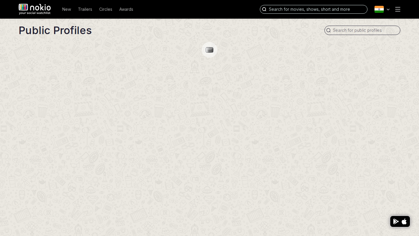
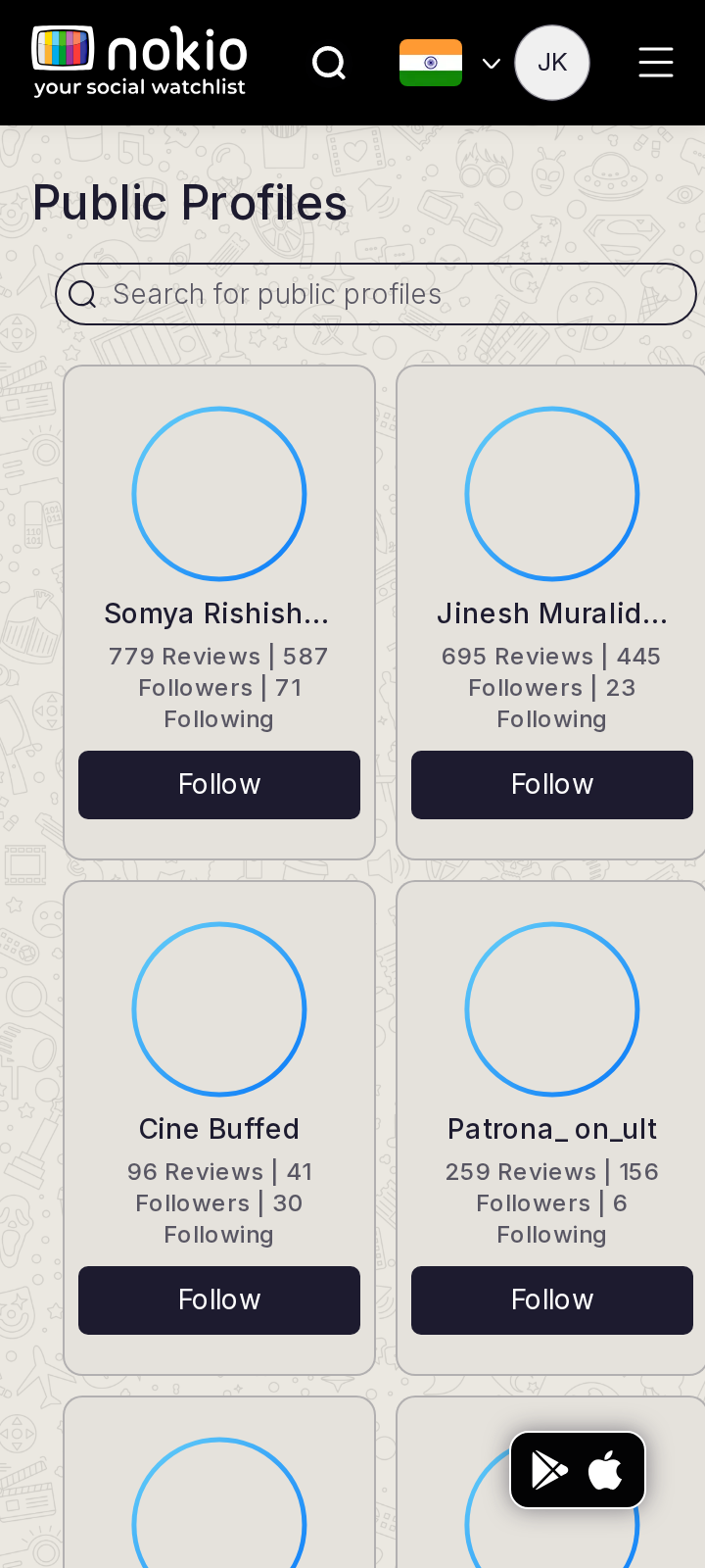
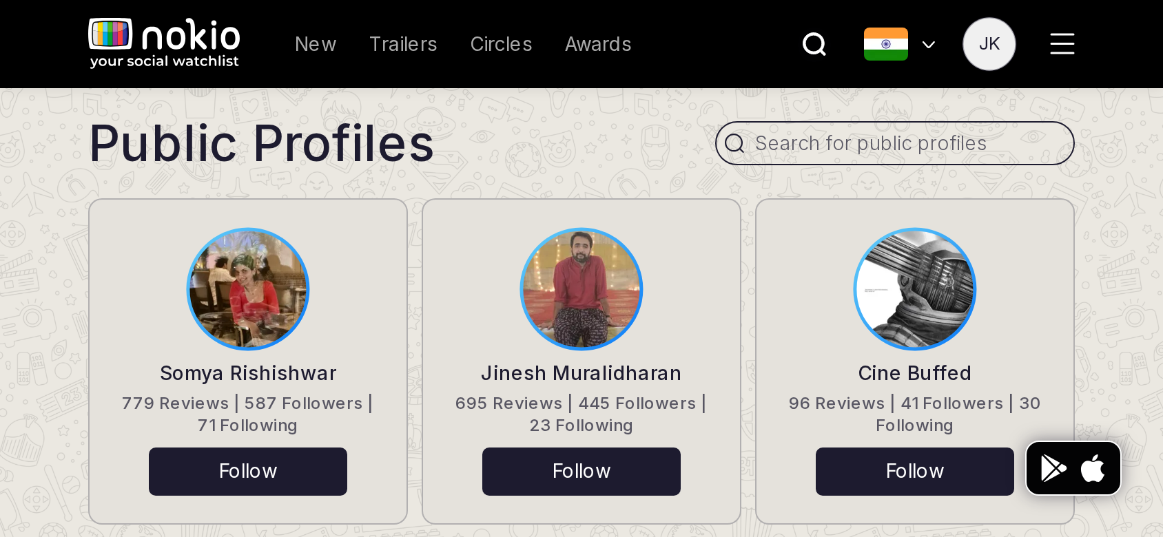
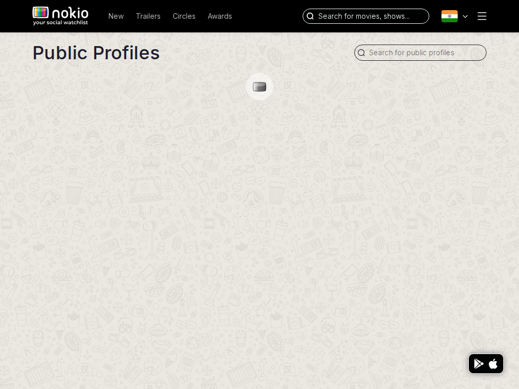
Public profiles

/public-profiles · Social

Job: Find critics and follow them.

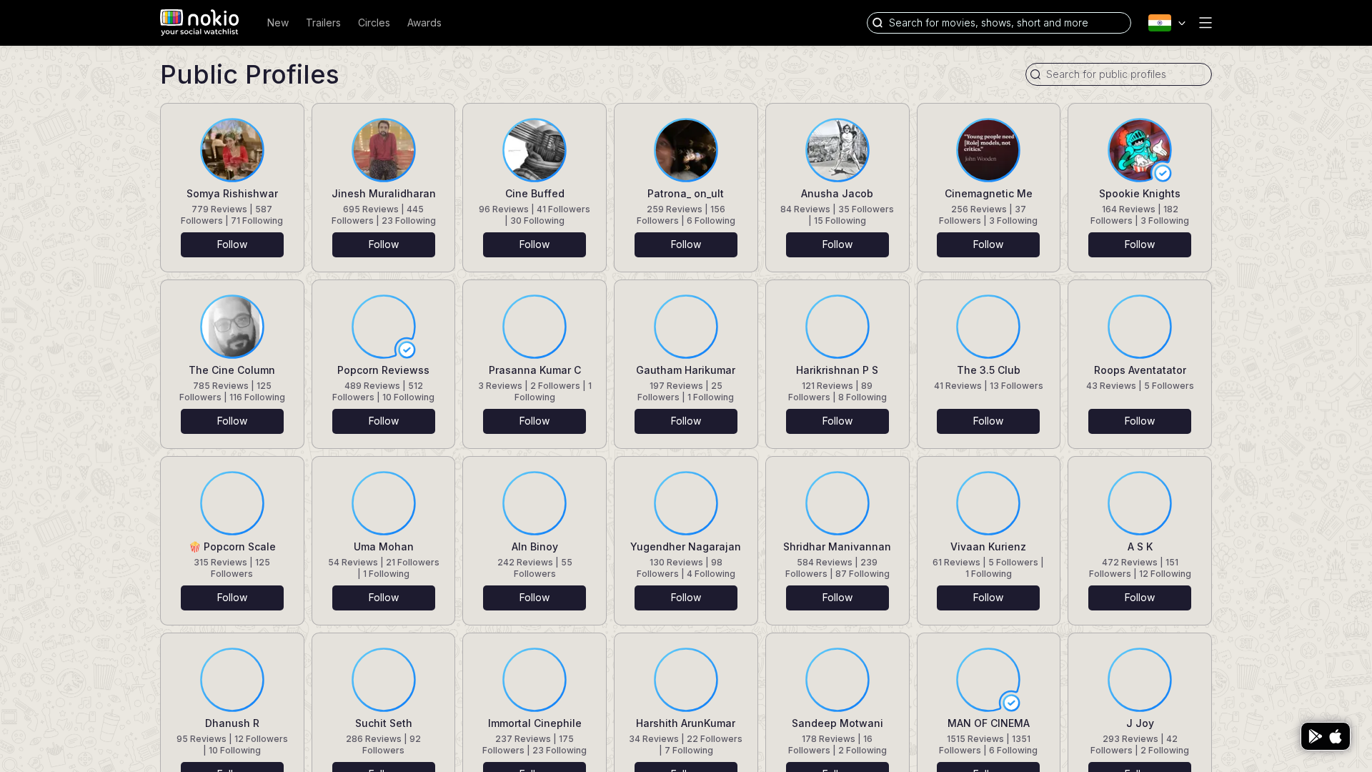
Clicked Follow three times. Following count went 1 → 4 (Dharunn, Sugil, Raunaq visible on My followings). Follow works.
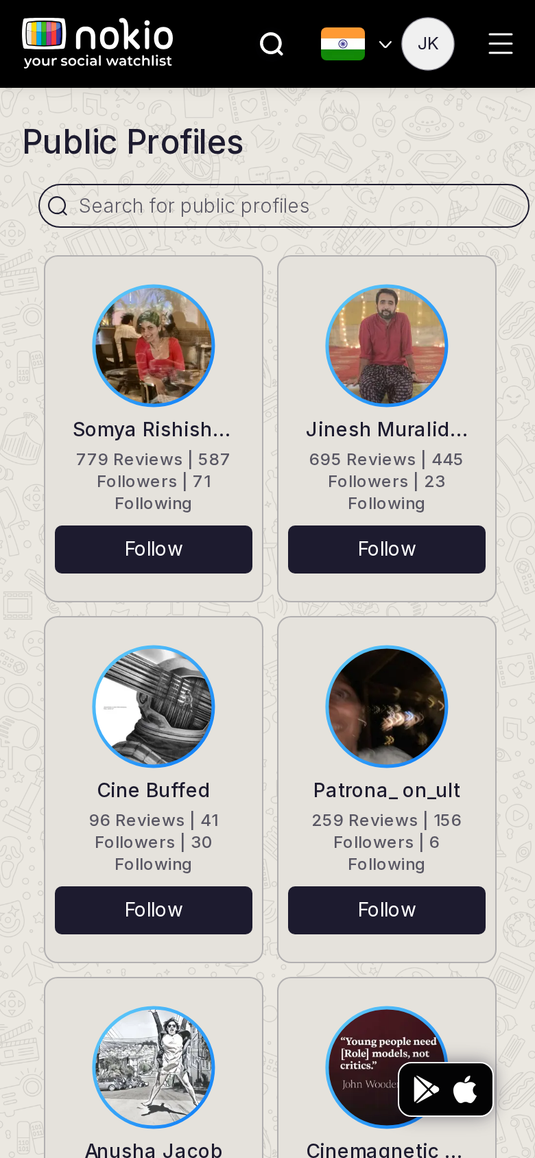
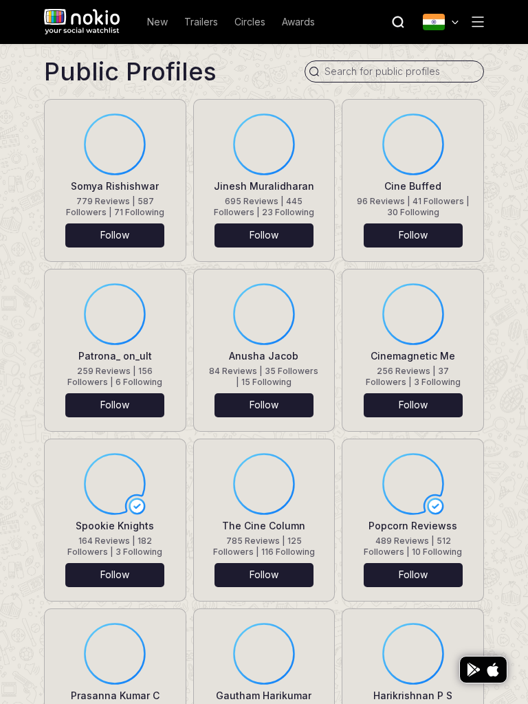
Public profiles phone-390
390×844 · ~19.5:9 · CSS mobile ≤480
Public profiles tablet-port
768×1024 · 3:4 · CSS tablet ≤960
Public profiles desktop-16-9
1440×810 · 16:9
Other aspect ratios (4)
phone-360
360×800 · 9:20 · CSS mobile ≤480
phone-land
844×390 · landscape · CSS tablet ≤960 at phone height
tablet-land
1024×768 · 4:3 land · CSS small ≤1280 (desktop chrome)
desktop-fhd
1920×1080 · 16:9 FHD

Improvements

P0

Fix 2-col minmax grid on phone

Names truncate; FAB covers the last avatar.

P1

Follow → Following immediately

Optimistic label so the tap feels real.

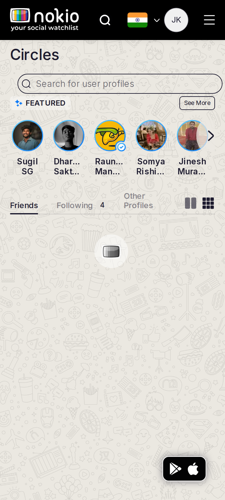
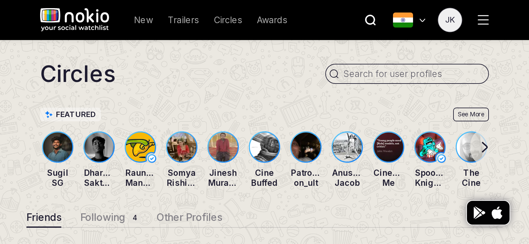
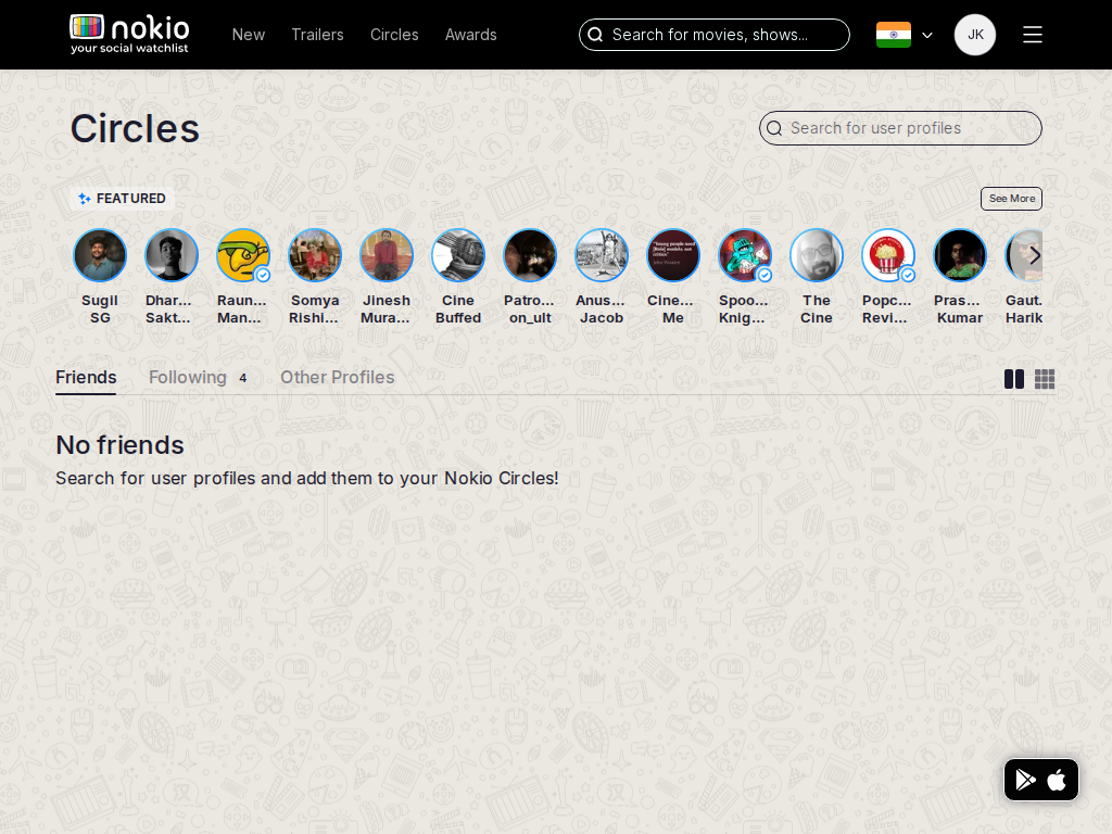
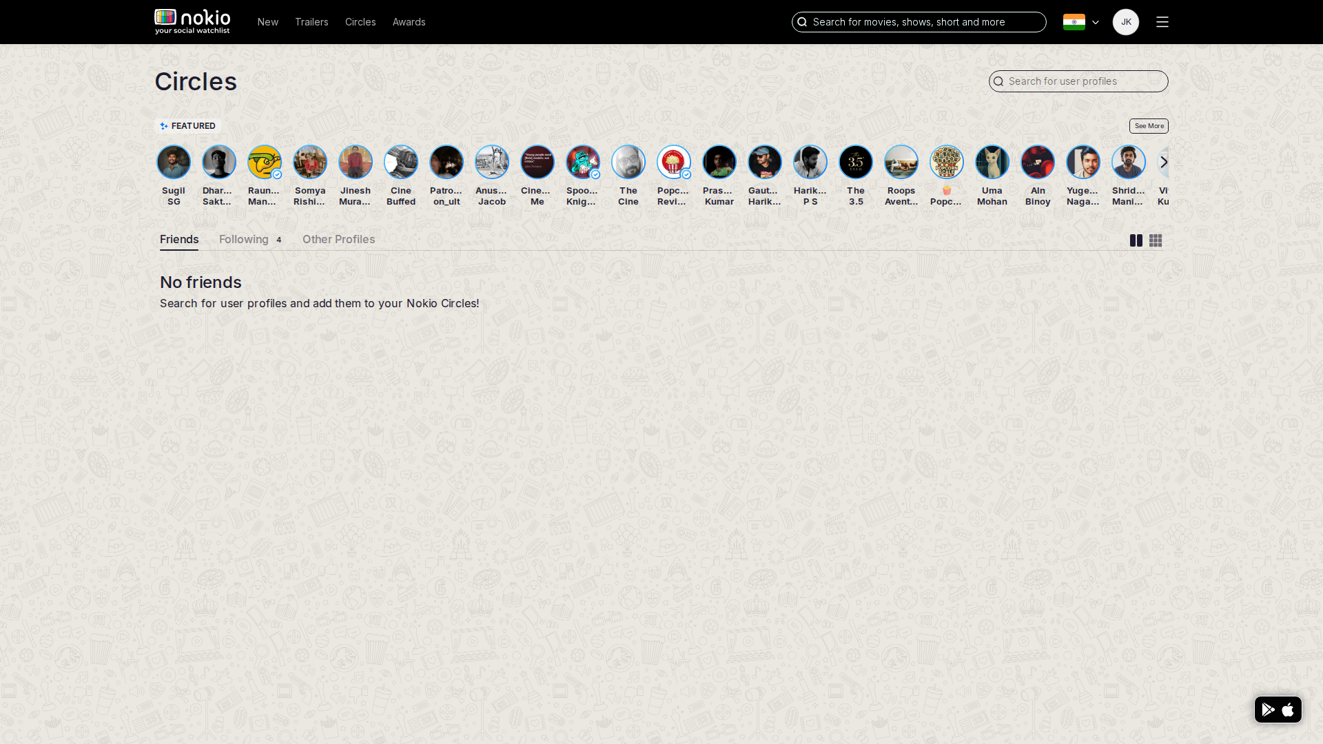
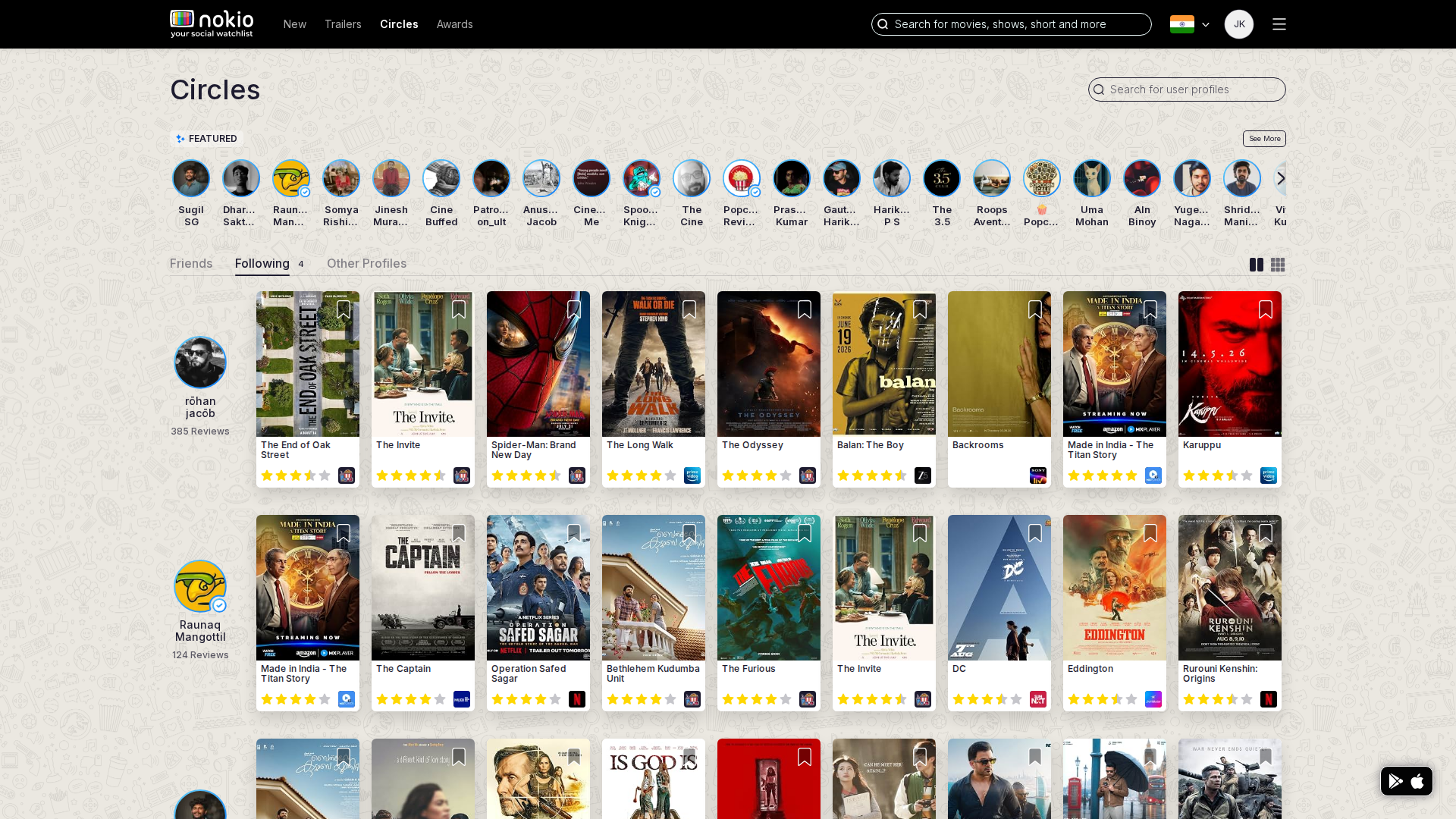
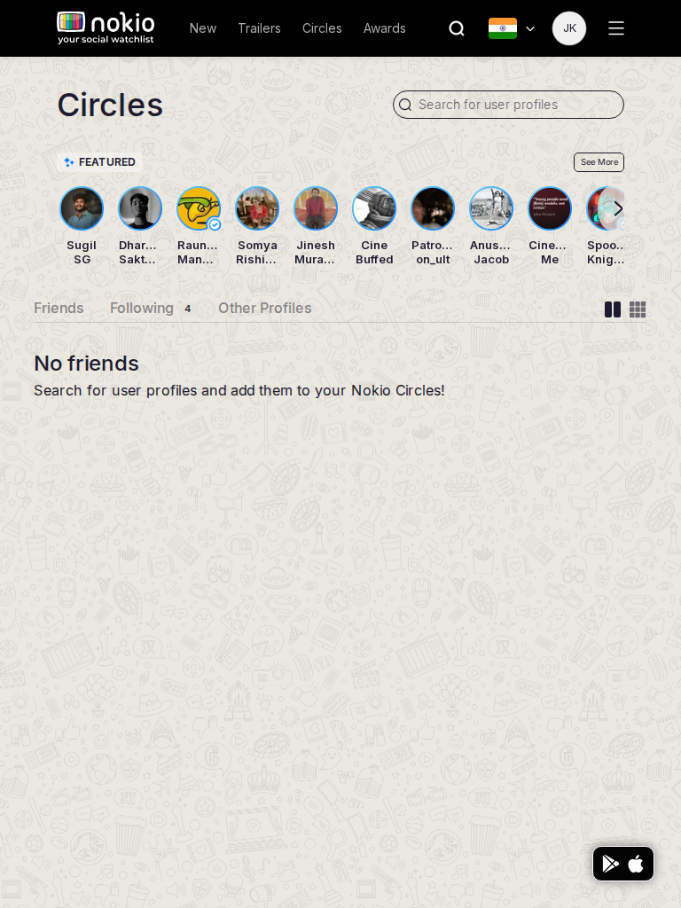
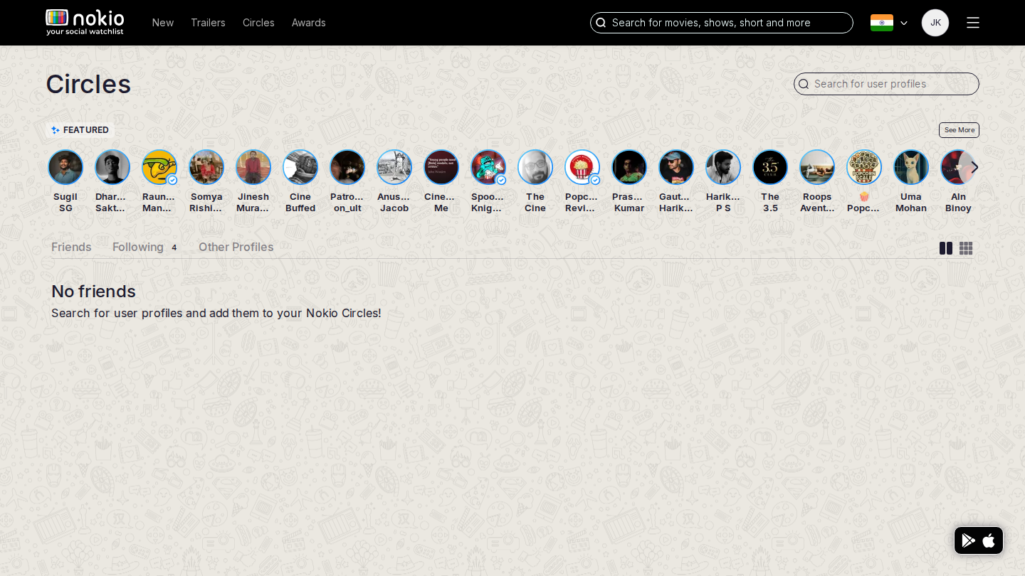
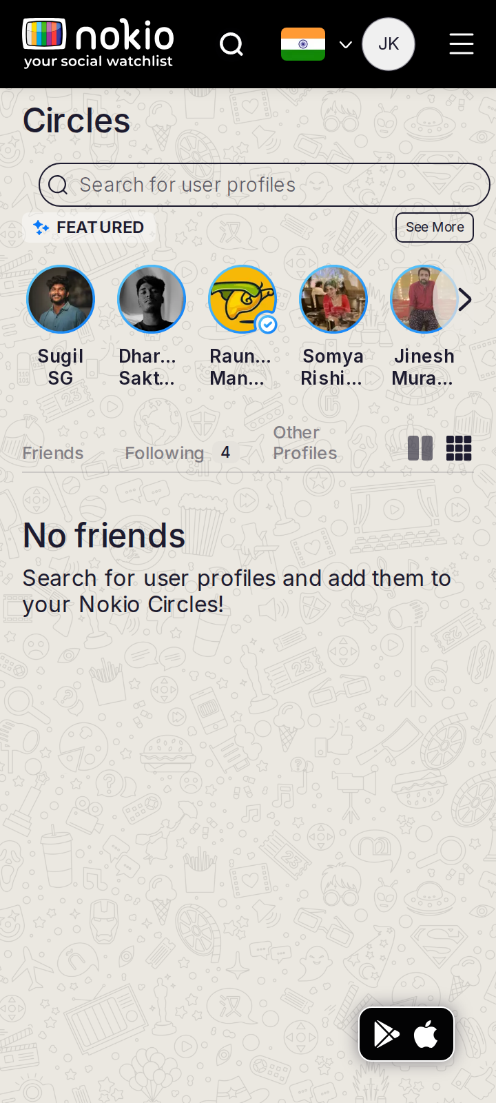
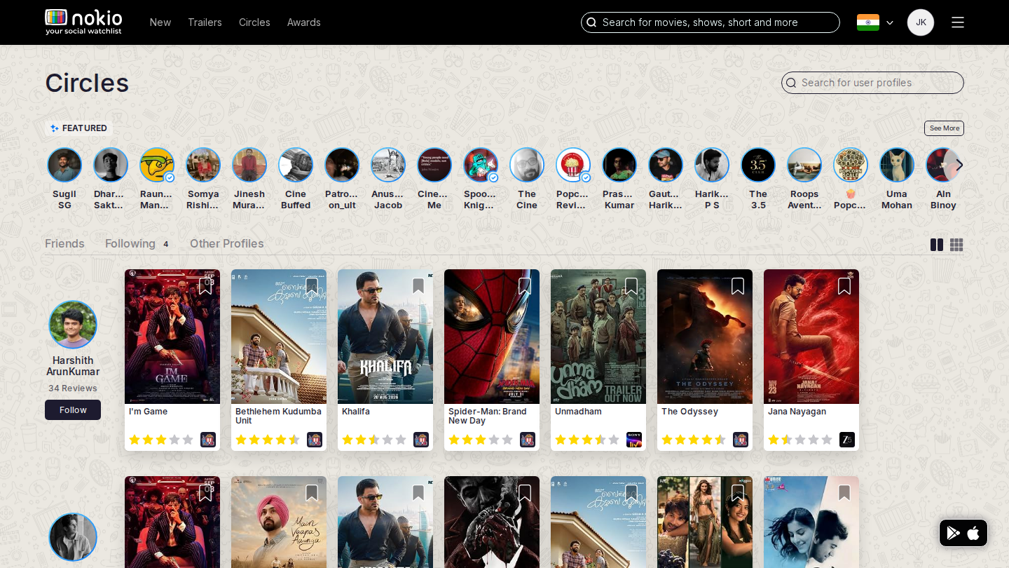
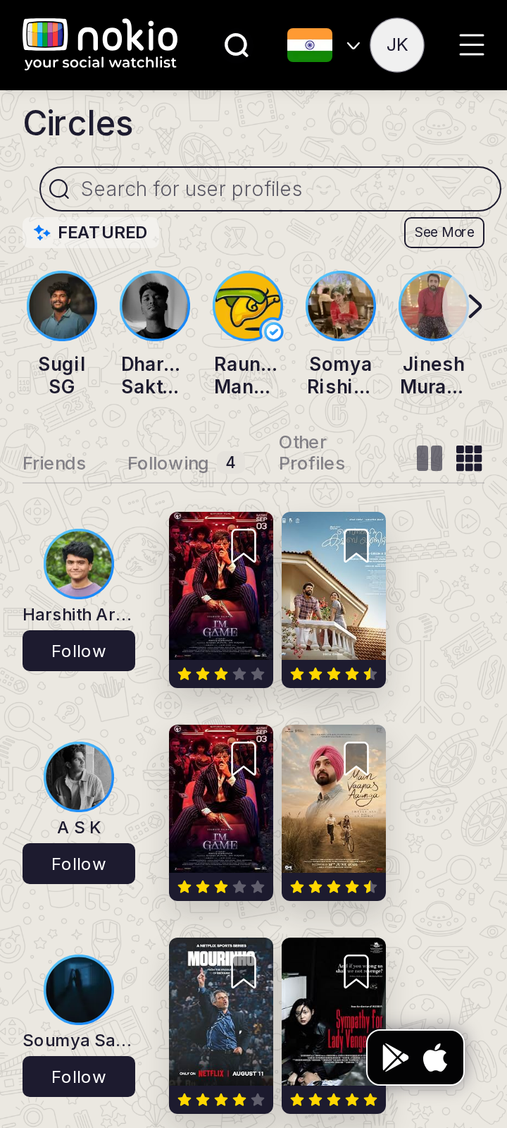
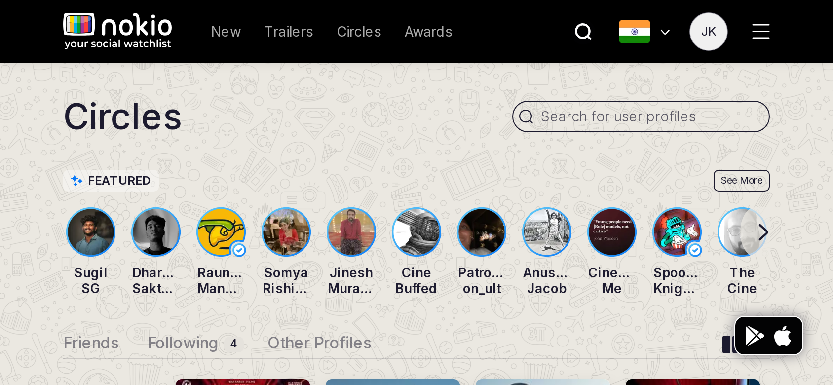
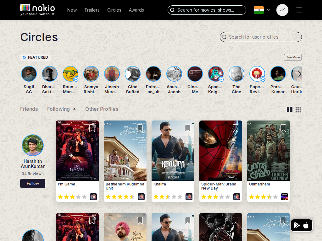
Circles friends

/circles/friends · Social

Job: See friends and what they watched.

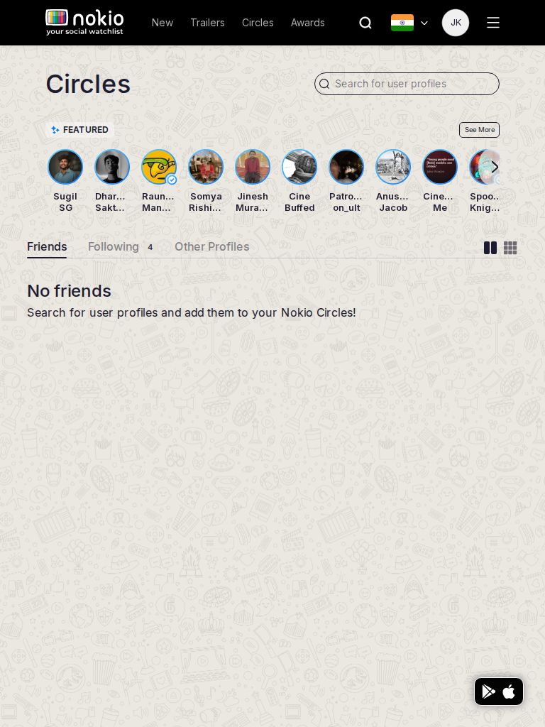
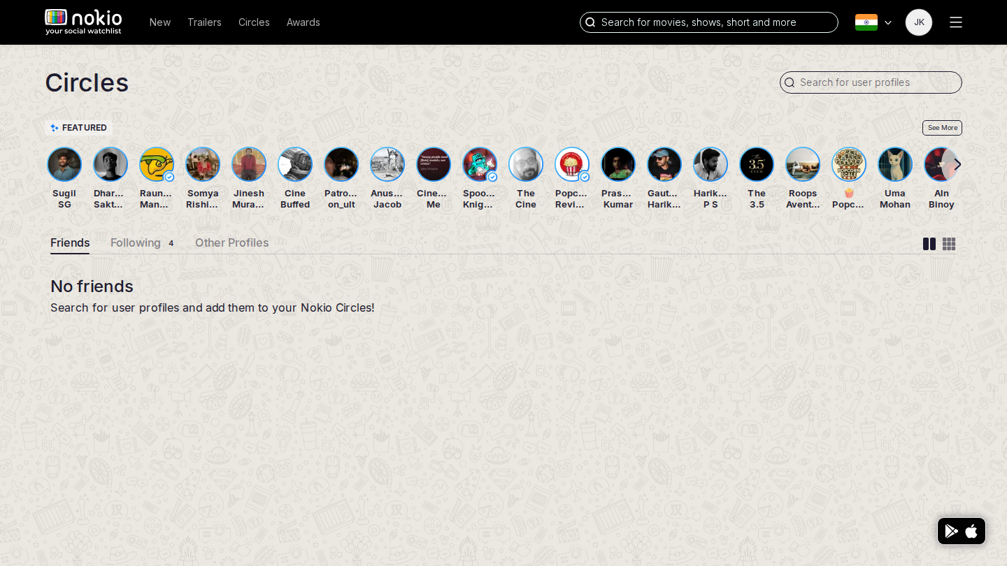
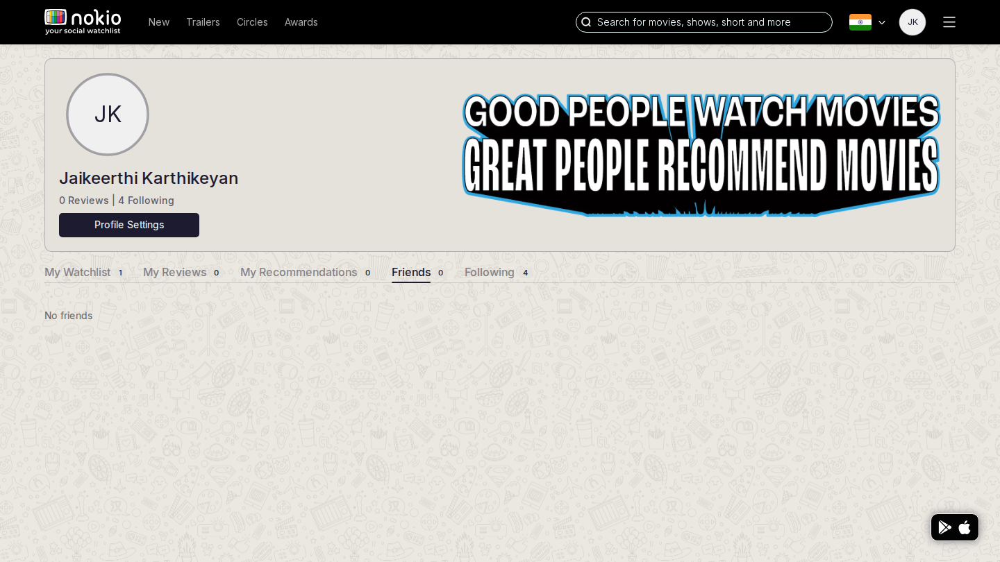
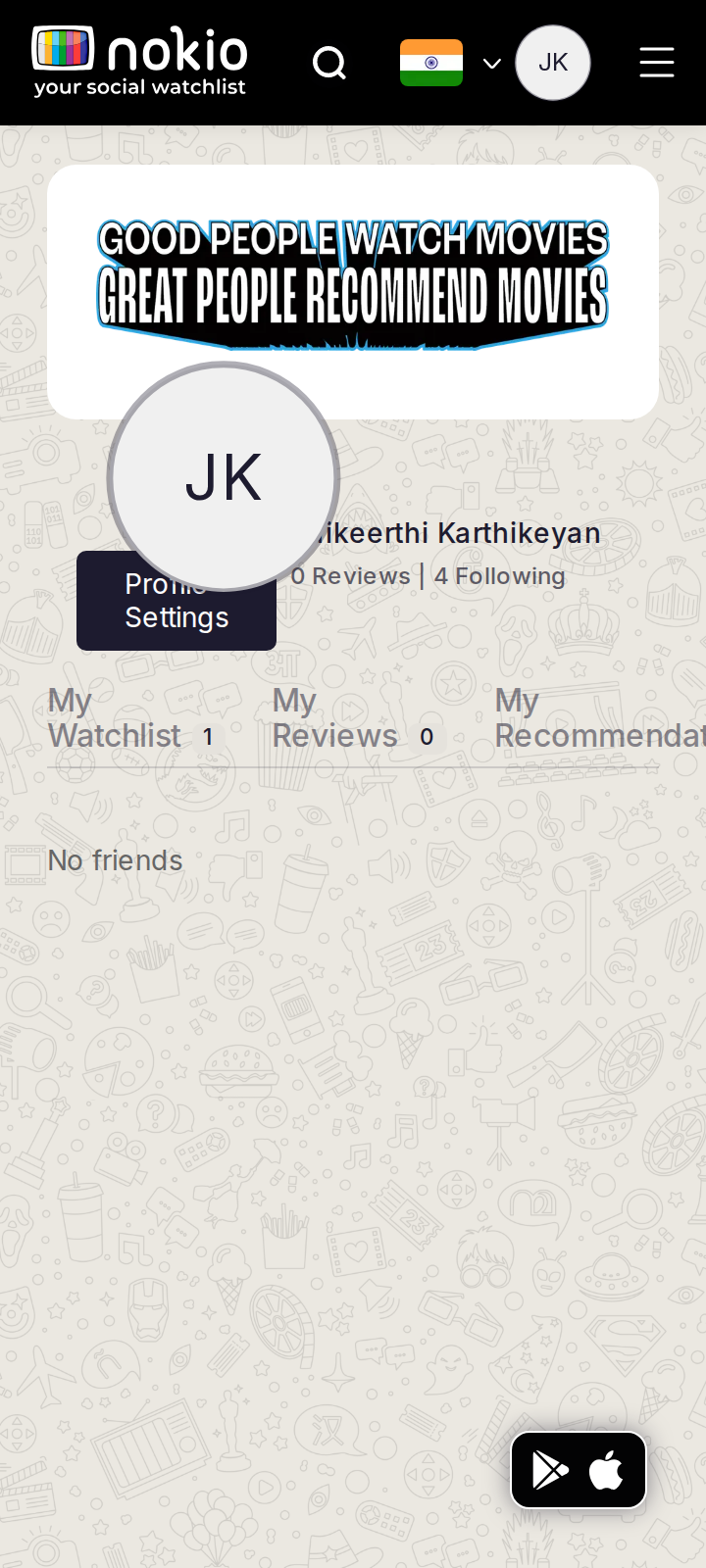
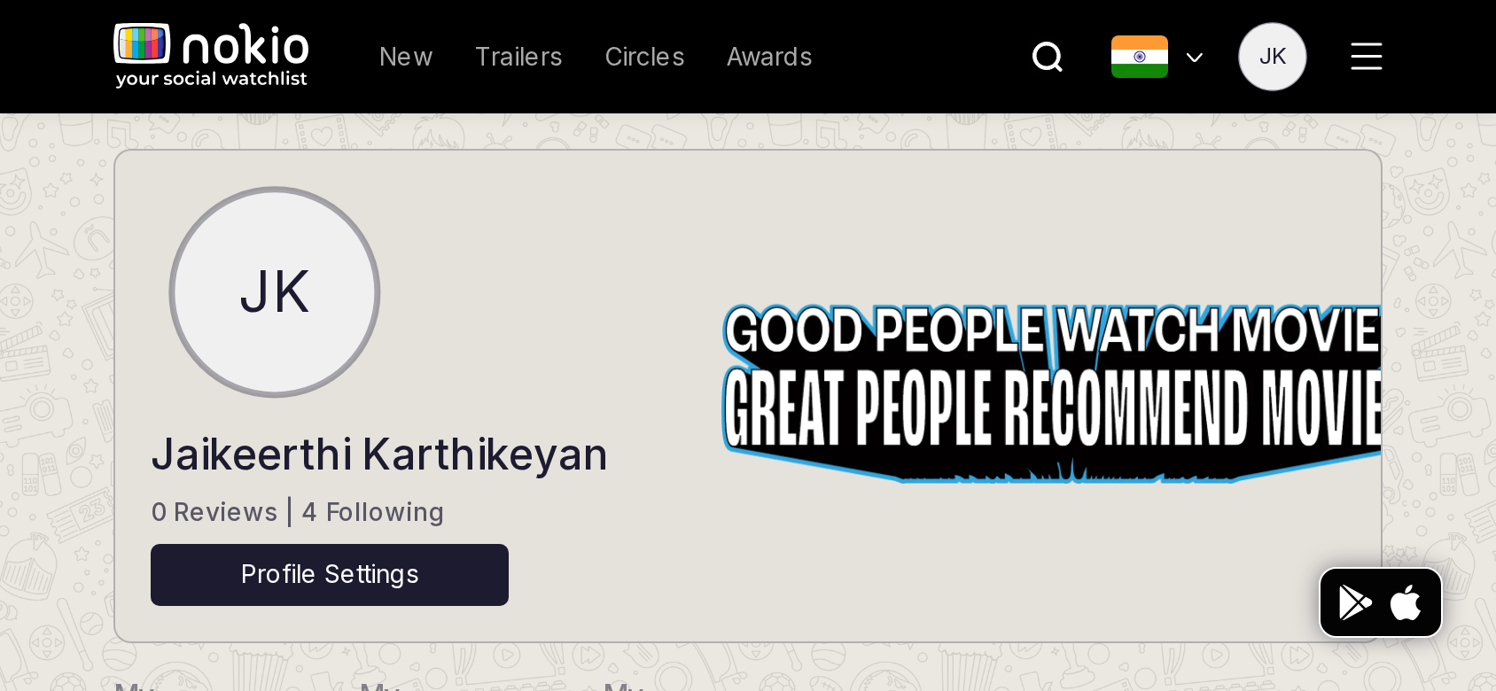
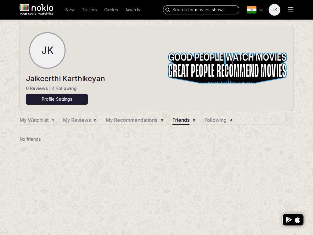
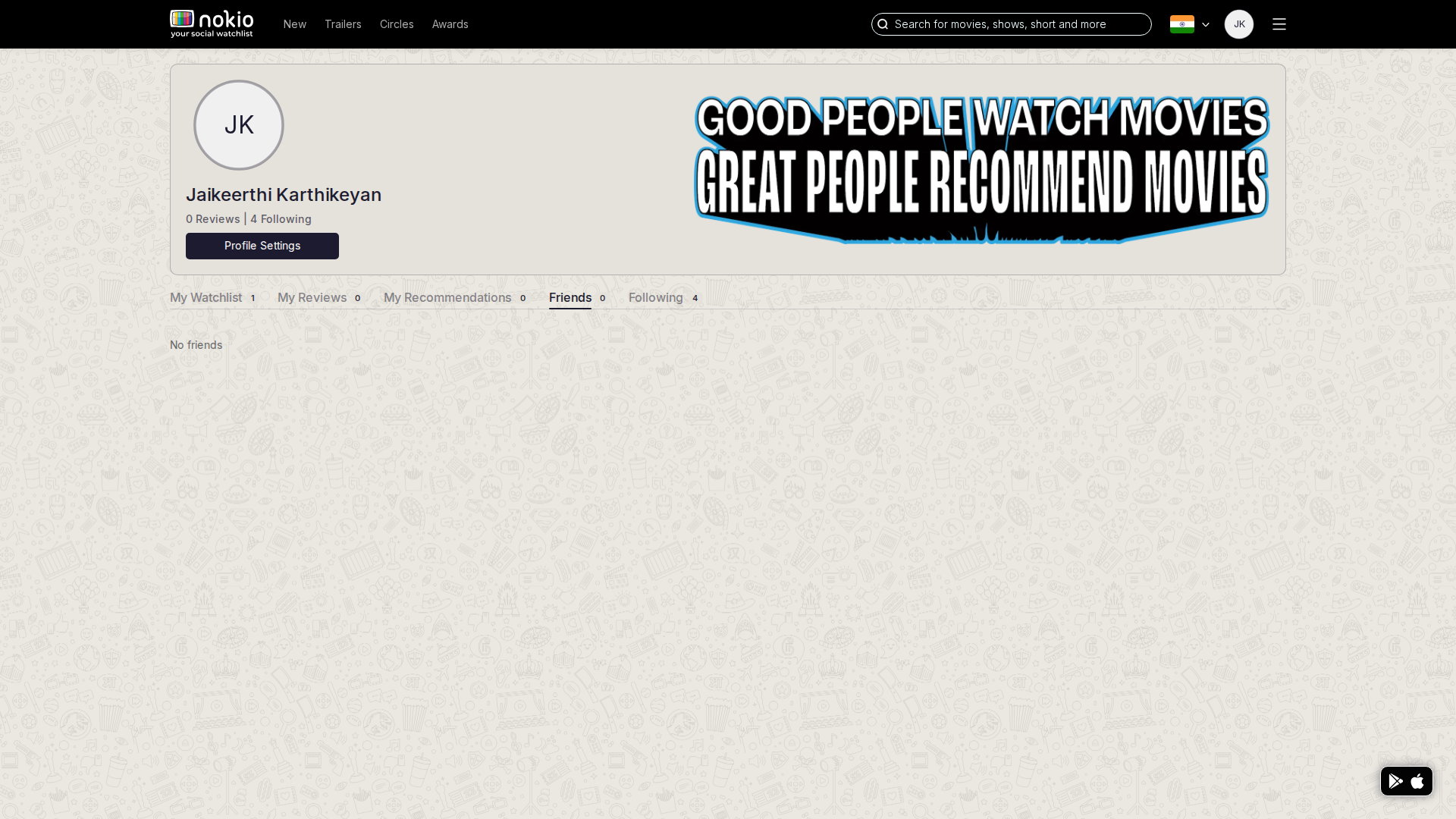
Still empty of friends; Featured public people still dominate the Friends tab.
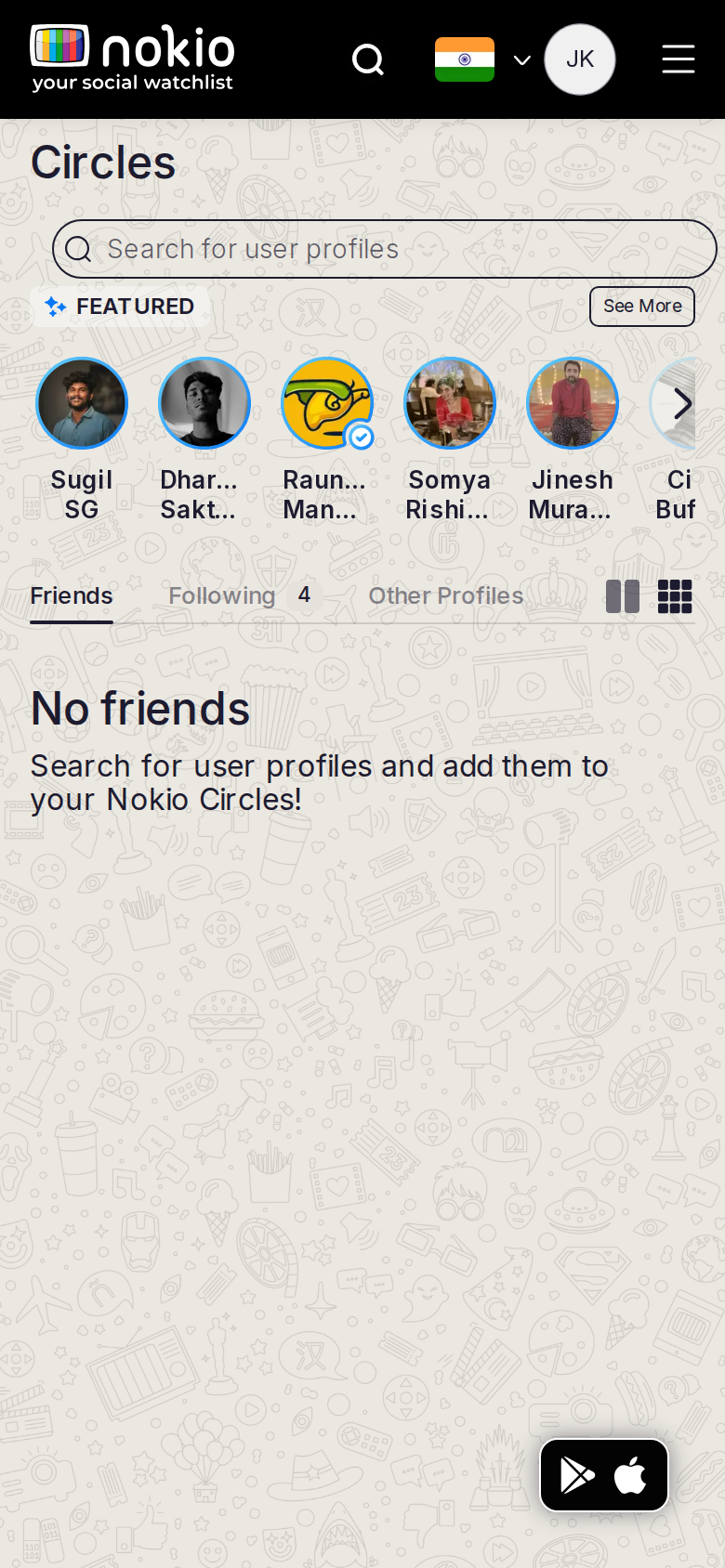
Circles friends phone-390
390×844 · ~19.5:9 · CSS mobile ≤480
Circles friends tablet-port
768×1024 · 3:4 · CSS tablet ≤960
Circles friends desktop-16-9
1440×810 · 16:9
Other aspect ratios (4)
phone-360
360×800 · 9:20 · CSS mobile ≤480
phone-land
844×390 · landscape · CSS tablet ≤960 at phone height
tablet-land
1024×768 · 4:3 land · CSS small ≤1280 (desktop chrome)
desktop-fhd
1920×1080 · 16:9 FHD

Improvements

P0

Hide Featured on Friends

CTA: Find people. Don’t contradict “No friends”.

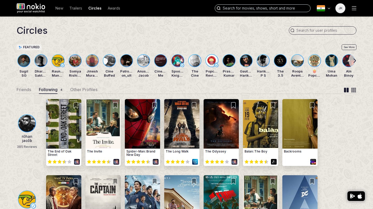
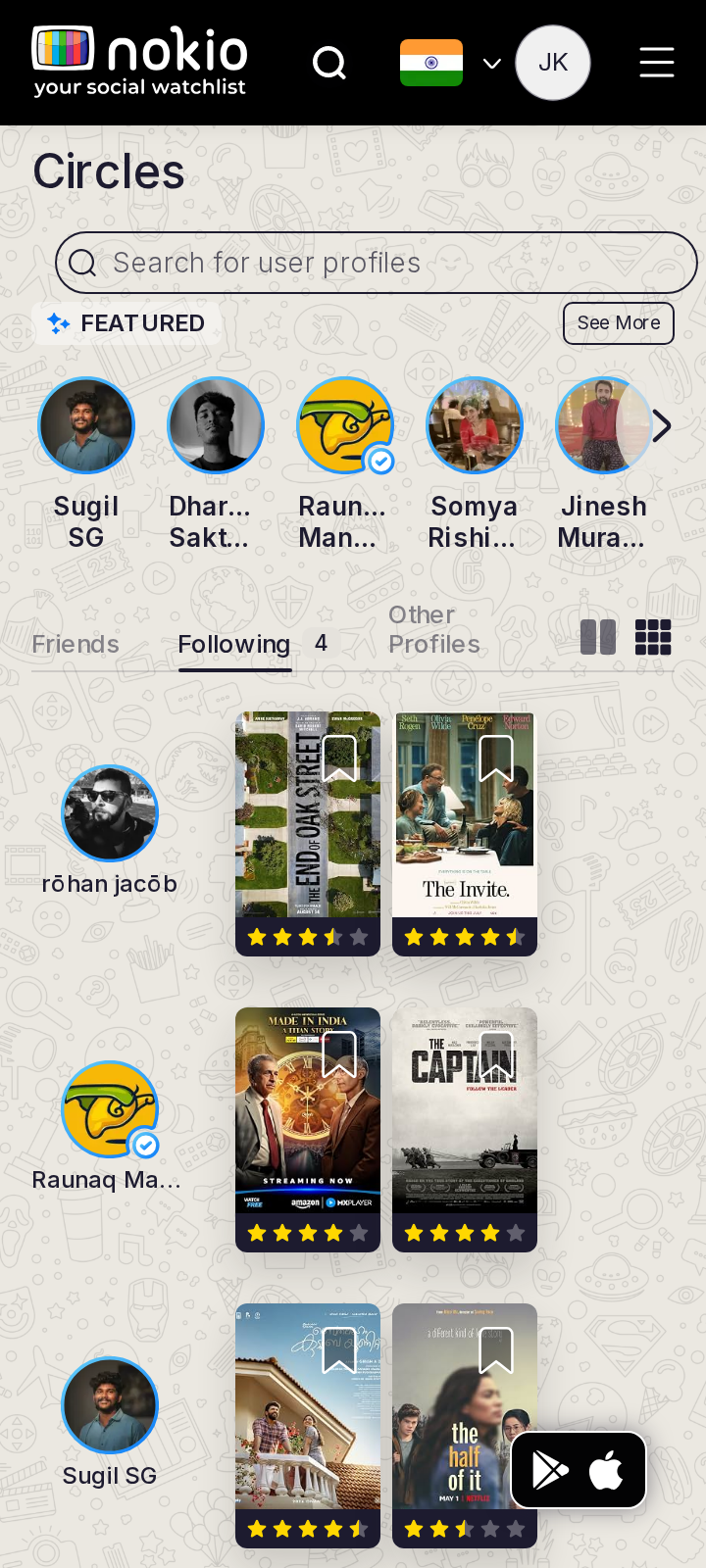
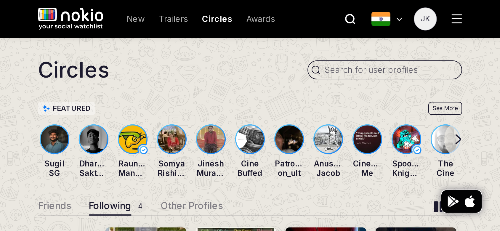
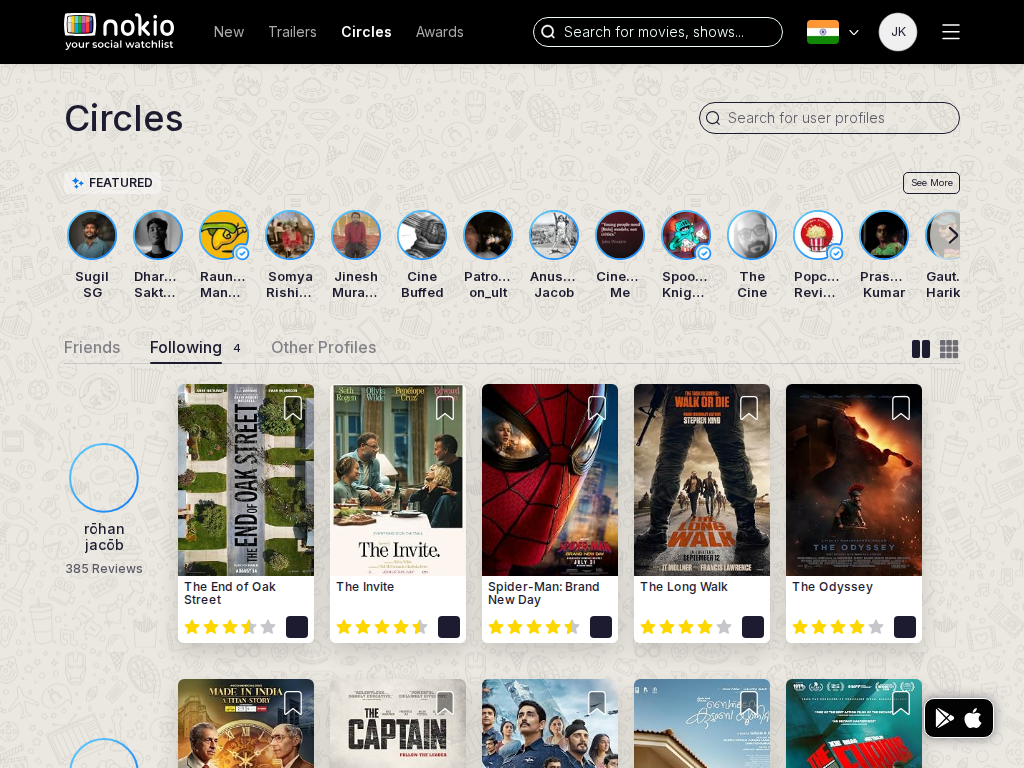
Circles following

/circles/following · Social

Job: See people I follow.

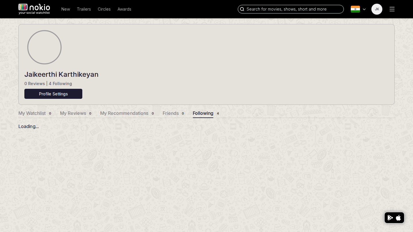
After follows, this should list the same 4 as My followings. Compare shots — if Featured still leads, the tab is the wrong surface.
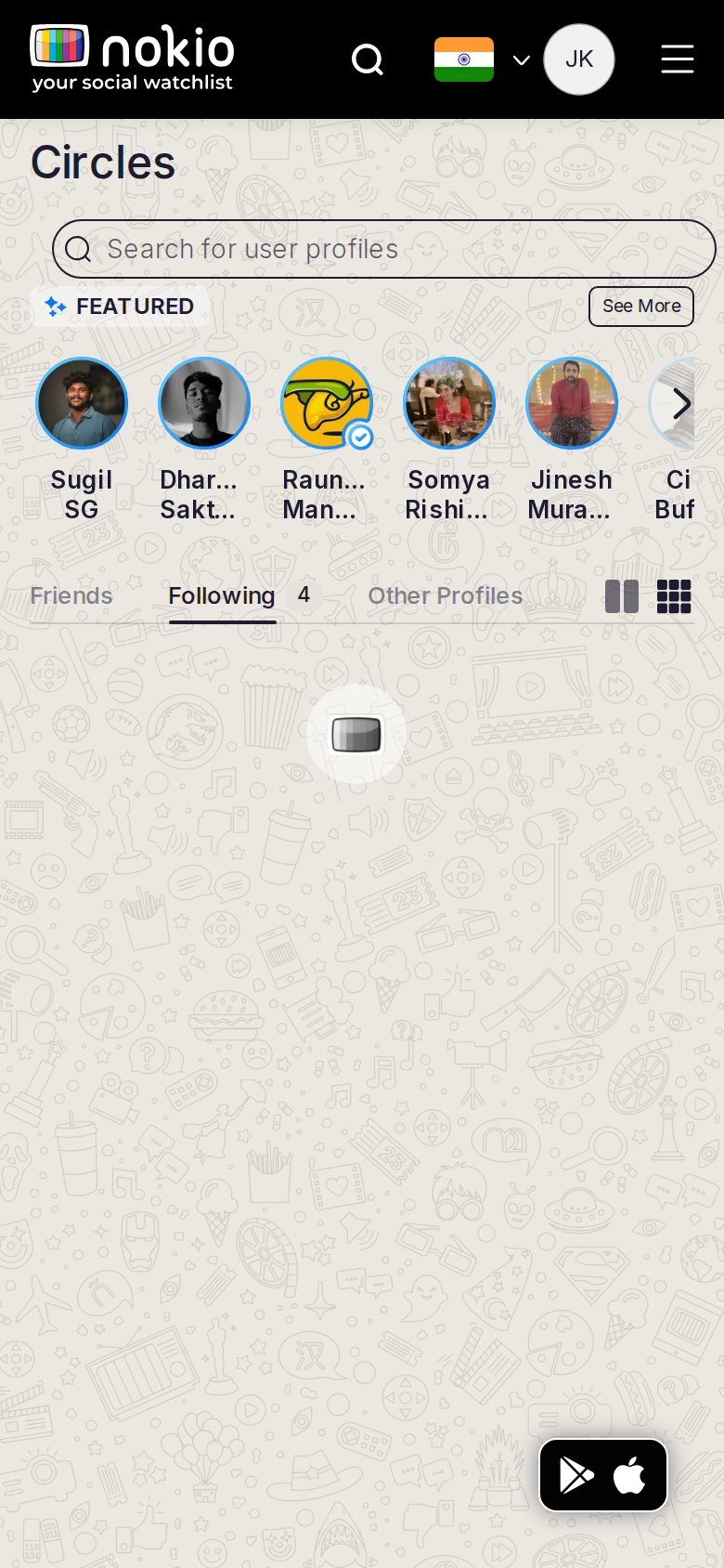
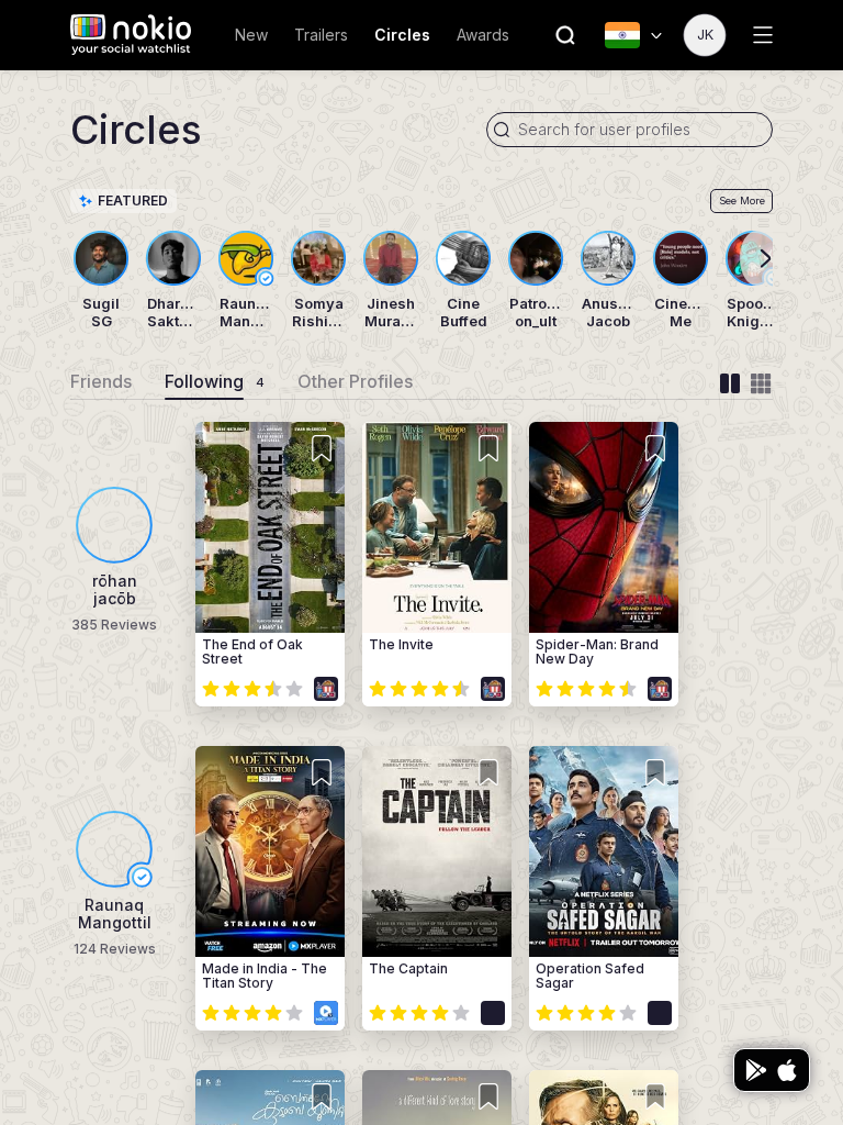
Circles following phone-390
390×844 · ~19.5:9 · CSS mobile ≤480
Circles following tablet-port
768×1024 · 3:4 · CSS tablet ≤960
Circles following desktop-16-9
1440×810 · 16:9
Other aspect ratios (4)
phone-360
360×800 · 9:20 · CSS mobile ≤480
phone-land
844×390 · landscape · CSS tablet ≤960 at phone height
tablet-land
1024×768 · 4:3 land · CSS small ≤1280 (desktop chrome)
desktop-fhd
1920×1080 · 16:9 FHD

Improvements

P0

One list with My followings

Same data, same cards.

Circles followers

/circles/followers · Social

Job: See who follows me.

Tab exists; Friends/Following/Other chrome does not name it.
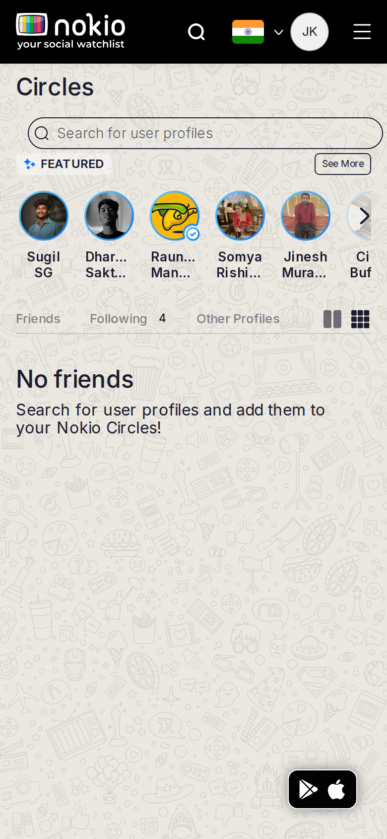
Circles followers phone-390
390×844 · ~19.5:9 · CSS mobile ≤480
Circles followers tablet-port
768×1024 · 3:4 · CSS tablet ≤960
Circles followers desktop-16-9
1440×810 · 16:9
Other aspect ratios (4)
phone-360
360×800 · 9:20 · CSS mobile ≤480
phone-land
844×390 · landscape · CSS tablet ≤960 at phone height
tablet-land
1024×768 · 4:3 land · CSS small ≤1280 (desktop chrome)
desktop-fhd
1920×1080 · 16:9 FHD

Improvements

P1

Name Followers in the tab set

Friends | Following | Followers | Public.

Circles public

/circles/public-profiles · Social

Job: Follow public profiles into my circle.

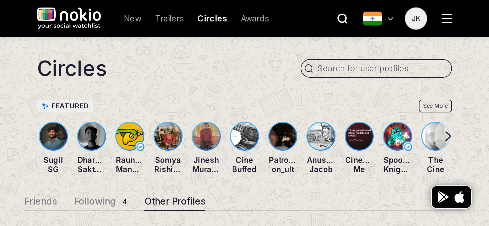
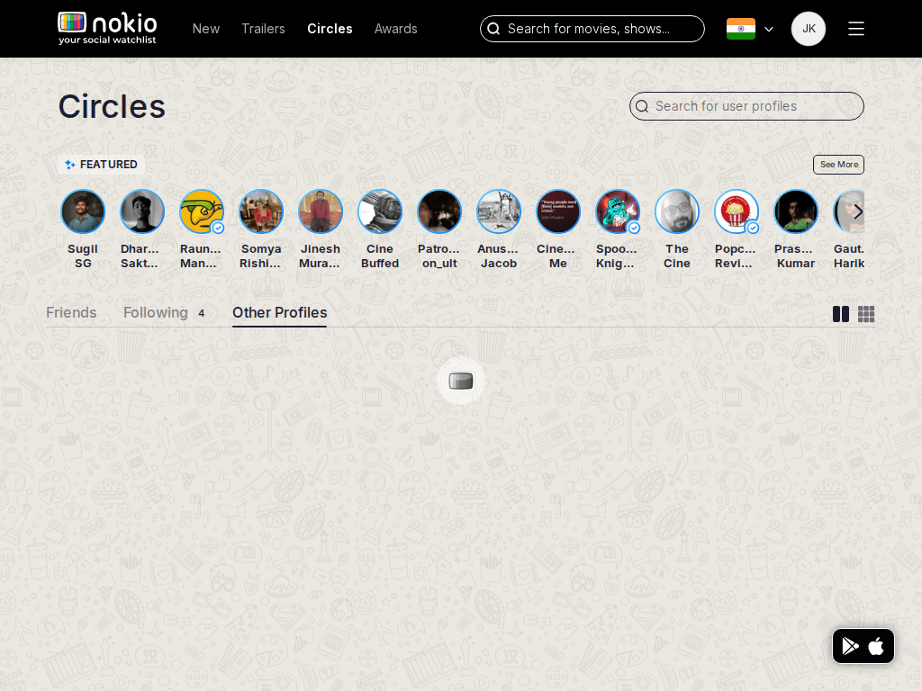
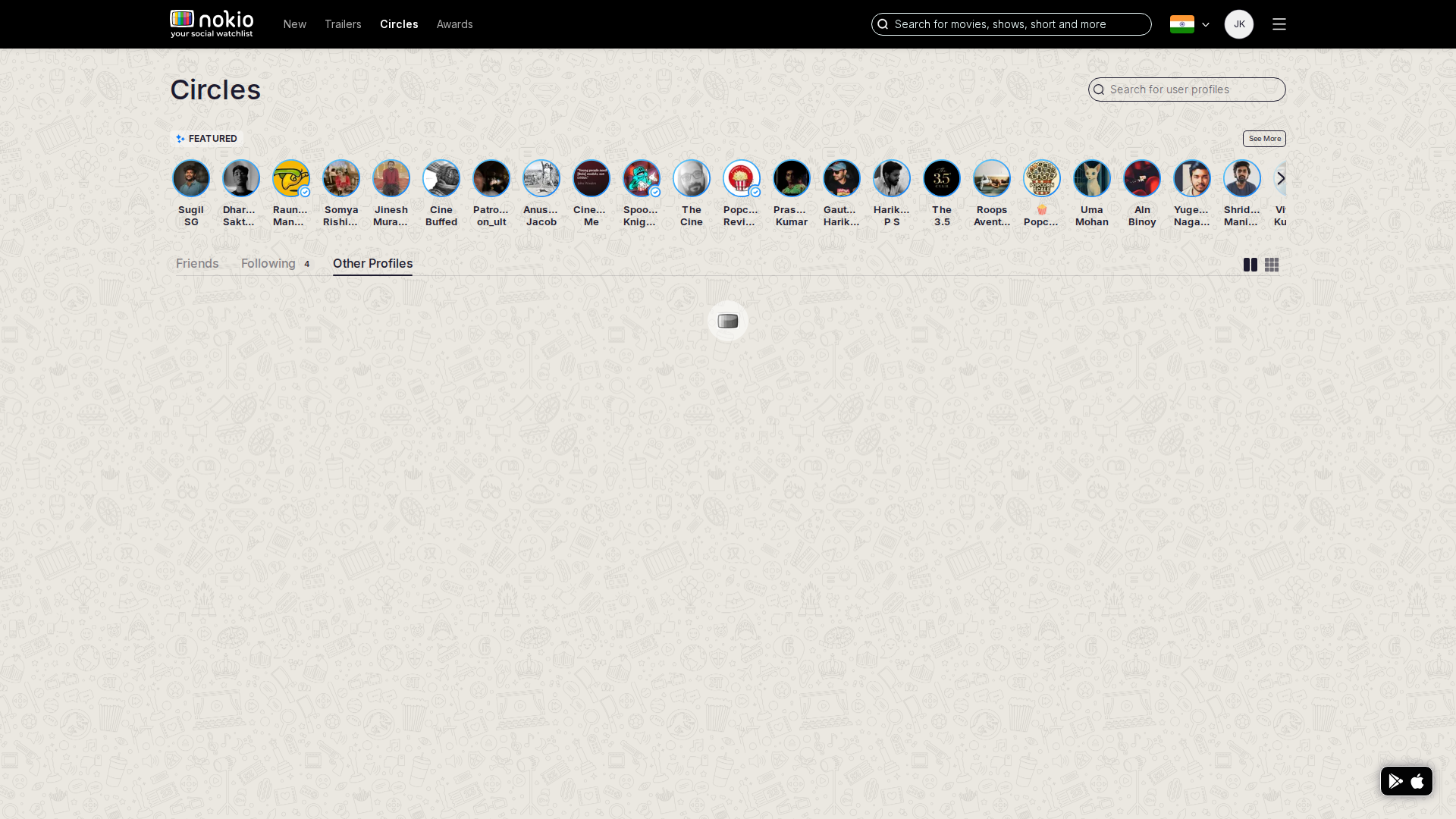
Featured row truncates names. Dual search (movies vs people).
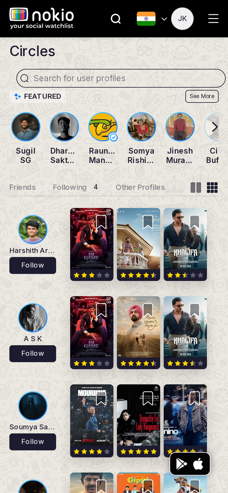
Circles public phone-390
390×844 · ~19.5:9 · CSS mobile ≤480
Circles public tablet-port
768×1024 · 3:4 · CSS tablet ≤960
Circles public desktop-16-9
1440×810 · 16:9
Other aspect ratios (4)
phone-360
360×800 · 9:20 · CSS mobile ≤480
phone-land
844×390 · landscape · CSS tablet ≤960 at phone height
tablet-land
1024×768 · 4:3 land · CSS small ≤1280 (desktop chrome)
desktop-fhd
1920×1080 · 16:9 FHD

Improvements

P1

Two-line names; people-search is primary here

Circles other

/circles/other-profiles · Social

Job: Find people who are not public critics.

Unclear vs Public. Featured still on top.
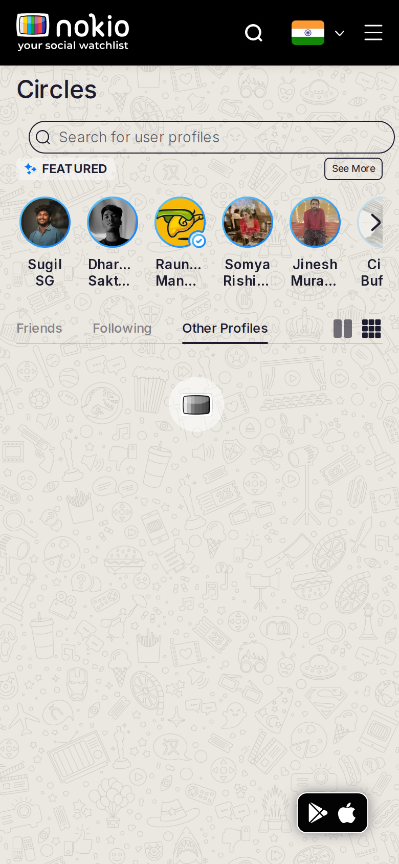
Circles other phone-390
390×844 · ~19.5:9 · CSS mobile ≤480
Circles other tablet-port
768×1024 · 3:4 · CSS tablet ≤960
Circles other desktop-16-9
1440×810 · 16:9
Other aspect ratios (4)
phone-360
360×800 · 9:20 · CSS mobile ≤480
phone-land
844×390 · landscape · CSS tablet ≤960 at phone height
tablet-land
1024×768 · 4:3 land · CSS small ≤1280 (desktop chrome)
desktop-fhd
1920×1080 · 16:9 FHD

Improvements

P1

One-line explanation + empty state

My watchlist

/my-profile/my-watchlist · Account

Job: See titles I saved.

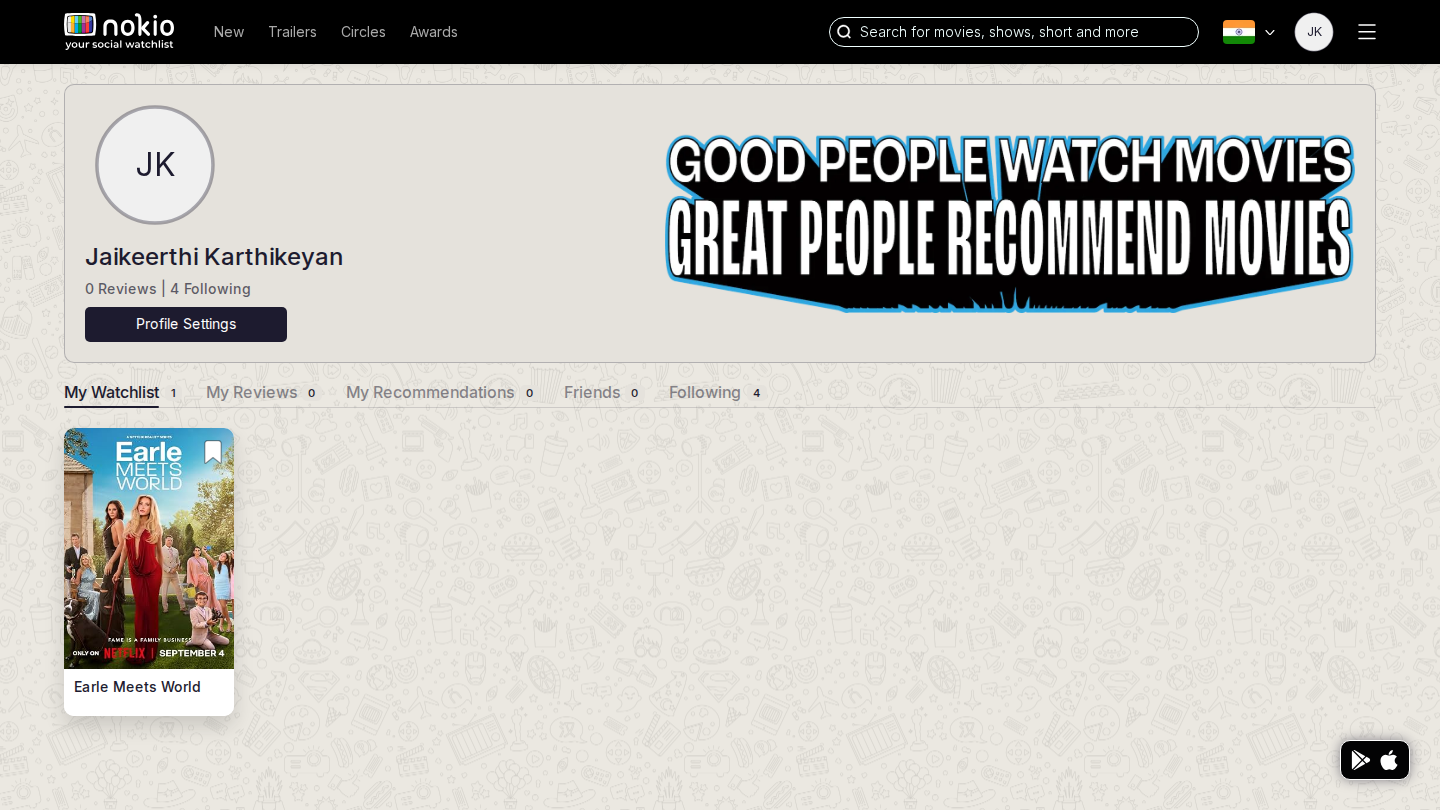
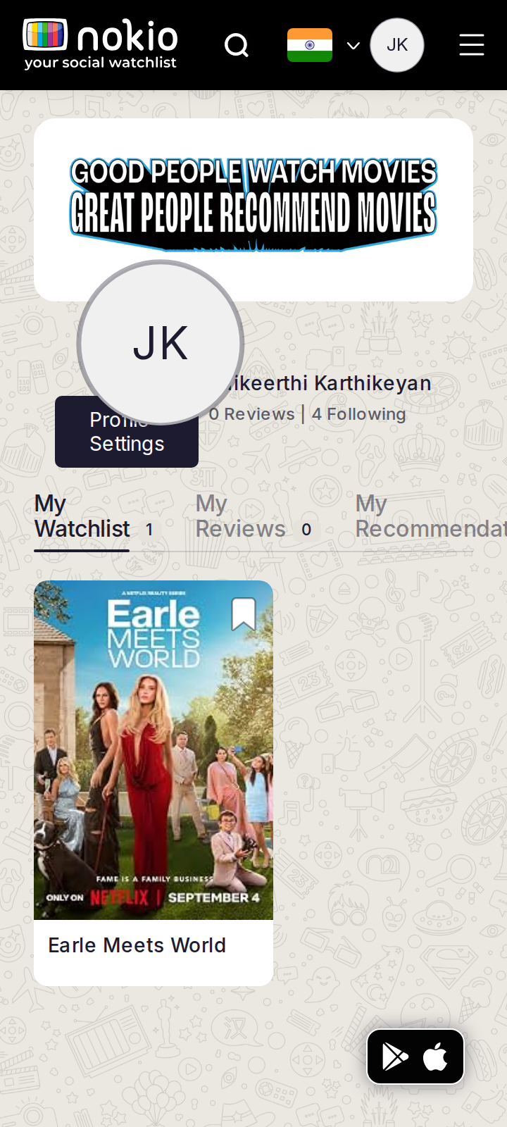
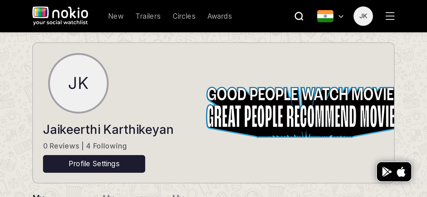
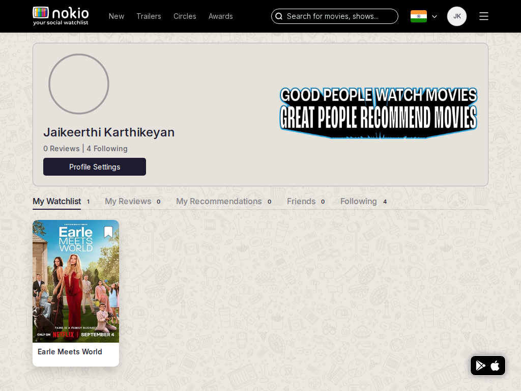
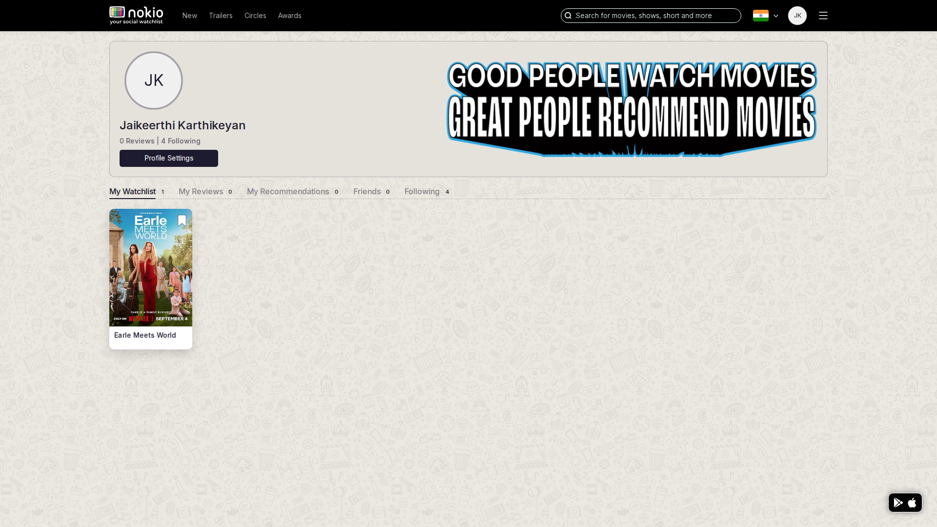
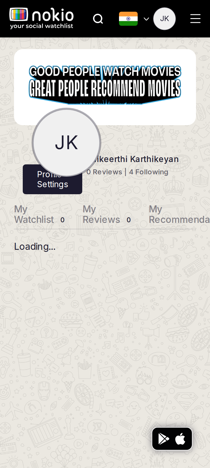
After saving, desktop shows Earle Meets World with count “My Watchlist 1”. The loop works. Phone header still overlaps name/settings.
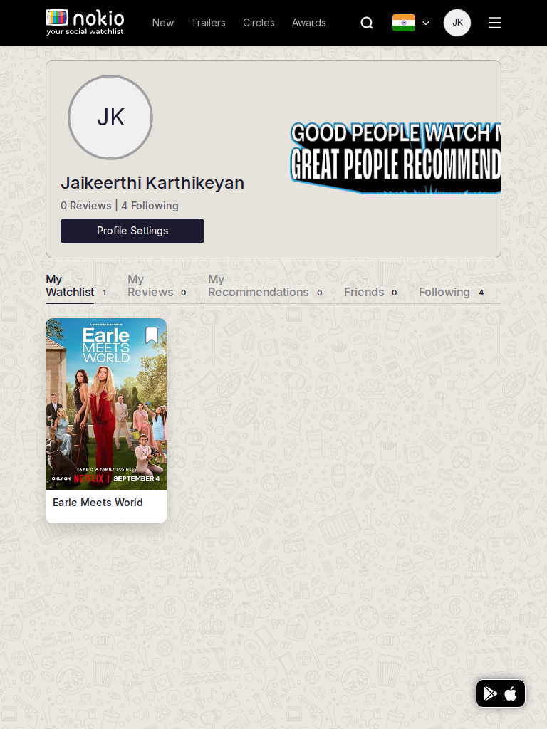
My watchlist phone-390
390×844 · ~19.5:9 · CSS mobile ≤480
My watchlist tablet-port
768×1024 · 3:4 · CSS tablet ≤960
My watchlist desktop-16-9
1440×810 · 16:9
Other aspect ratios (4)
phone-360
360×800 · 9:20 · CSS mobile ≤480
phone-land
844×390 · landscape · CSS tablet ≤960 at phone height
tablet-land
1024×768 · 4:3 land · CSS small ≤1280 (desktop chrome)
desktop-fhd
1920×1080 · 16:9 FHD

Improvements

P0

Stack profile header under 960px

Avatar must not cover Profile Settings or tabs.

P1

Add more / browse CTA even when count is 1

One poster on a huge doodle field looks abandoned.

My reviews

/my-profile/my-reviews · Account

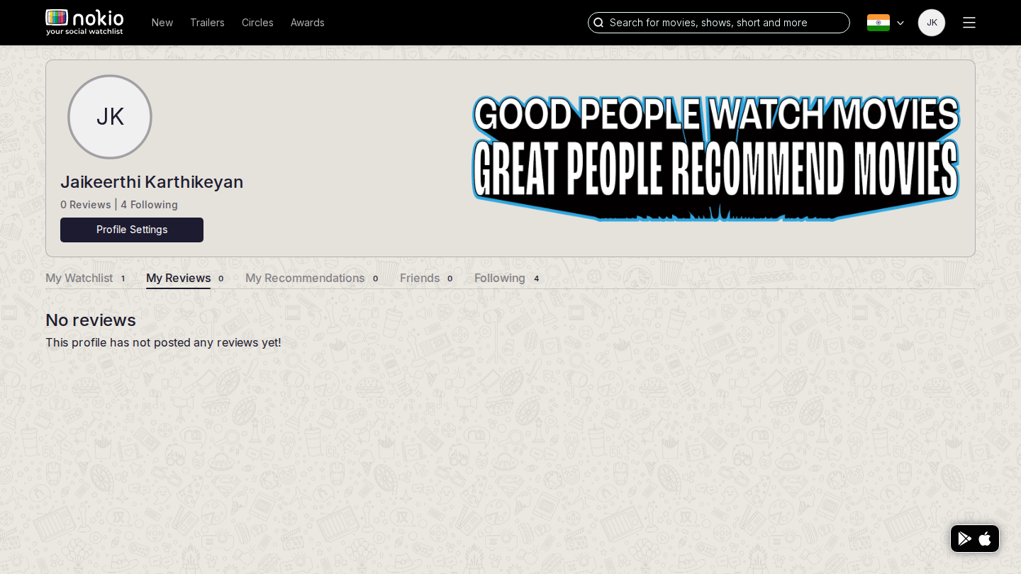
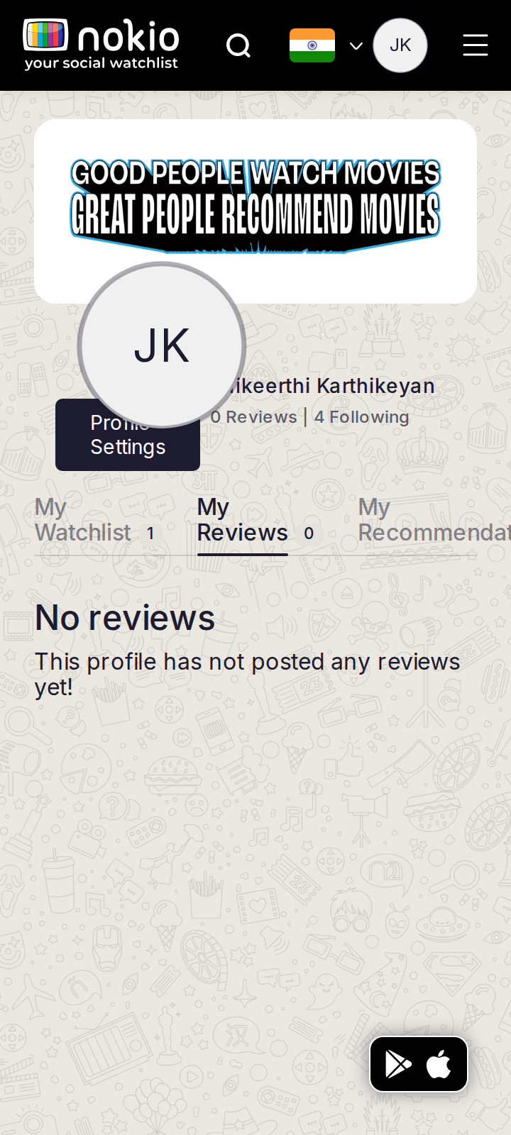
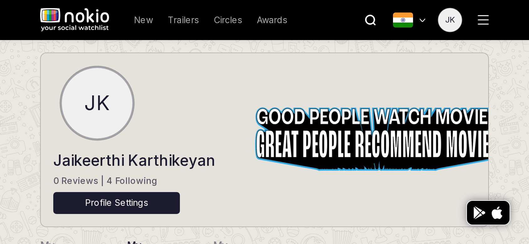
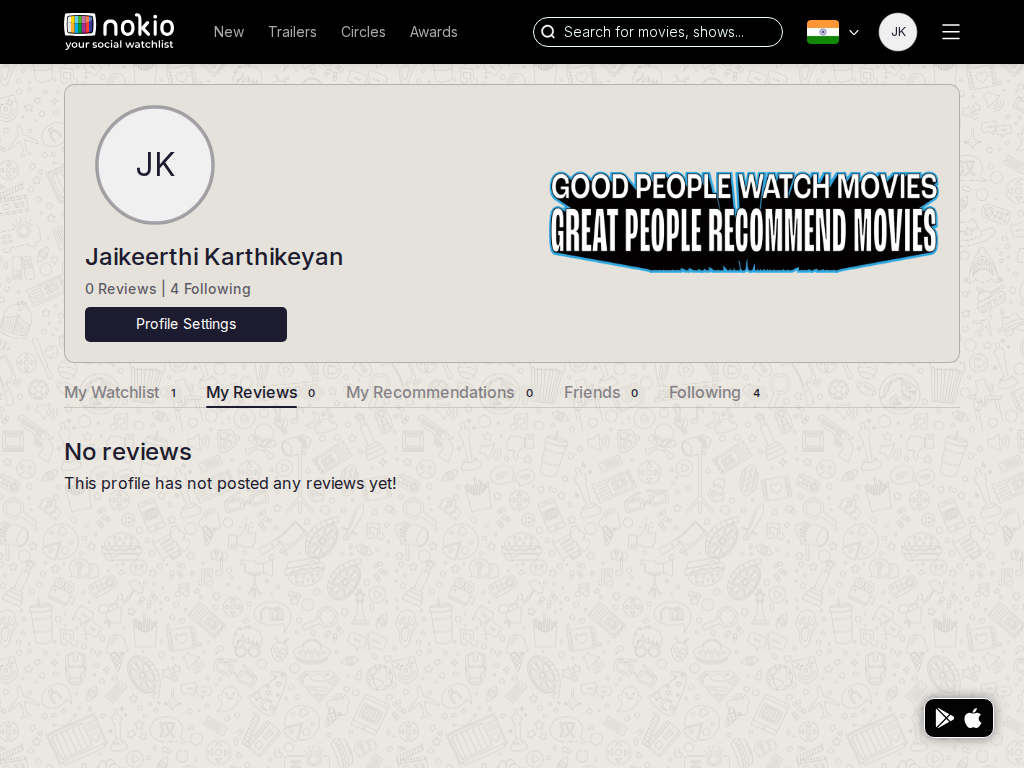
Job: See reviews I wrote.

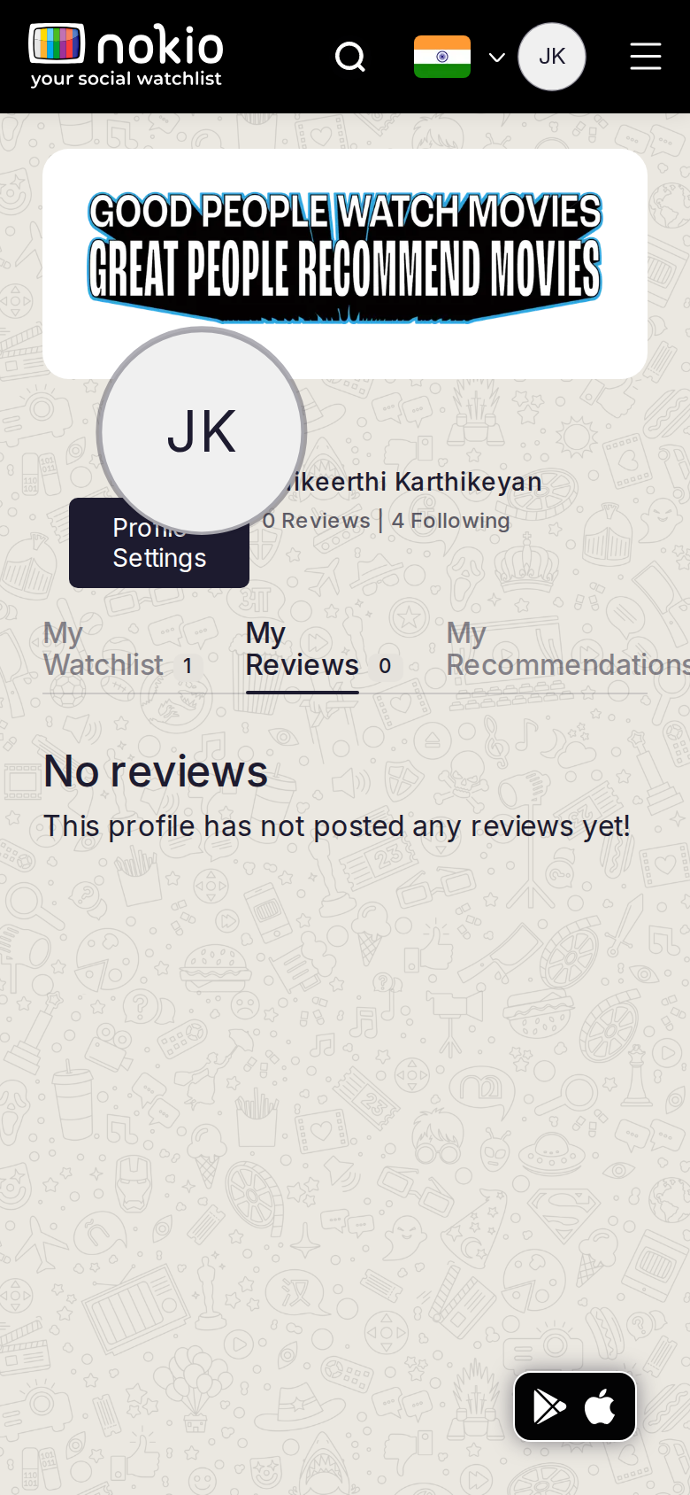
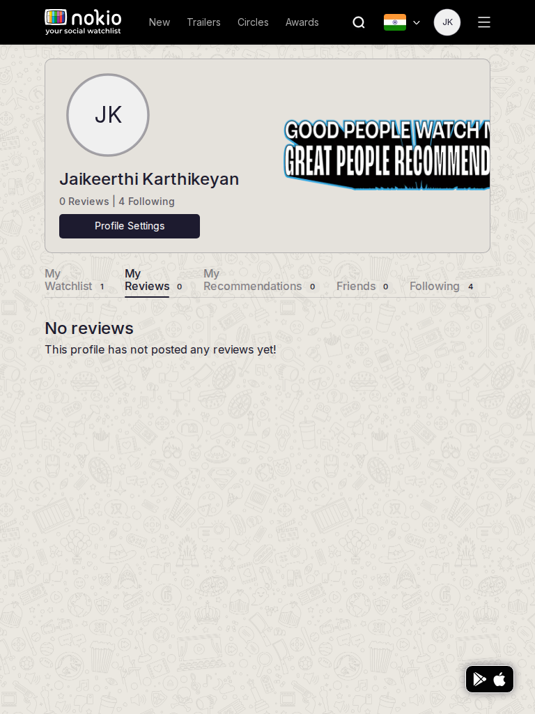
Tried twice to submit a review of The Gentlemen. Text saved in the composer; Submit stayed disabled because the star rating never registered. My Reviews still 0. This is the worst job-failure in the session.
My reviews phone-390
390×844 · ~19.5:9 · CSS mobile ≤480
My reviews tablet-port
768×1024 · 3:4 · CSS tablet ≤960
My reviews desktop-16-9
1440×810 · 16:9
Other aspect ratios (4)
phone-360
360×800 · 9:20 · CSS mobile ≤480
phone-land
844×390 · landscape · CSS tablet ≤960 at phone height
tablet-land
1024×768 · 4:3 land · CSS small ≤1280 (desktop chrome)
desktop-fhd
1920×1080 · 16:9 FHD

Improvements

P0

Stars must work on click, not hover-then-click

RateInput only commits if pointermove set hoverValue. A click on a star with no prior move leaves rating 0. Use click position on the star SVG (one svg, five paths) or buttons per star.

P0

Don’t grey “Submit Review” into looking disabled AND actually disable it with no explanation

Inline: “Tap a star to enable submit”.

P1

First-person empty copy

“You haven’t reviewed anything yet” + Search a title.

My recommendations

/my-profile/my-recommendations · Account

Job: See recs I sent or received.

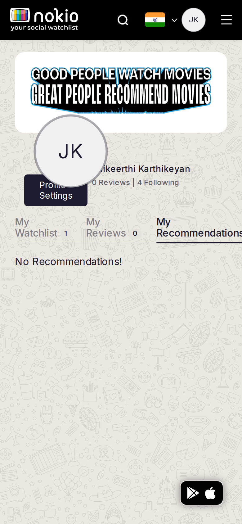
Still “No Recommendations!” with no sent/received split.
My recommendations phone-390
390×844 · ~19.5:9 · CSS mobile ≤480
My recommendations tablet-port
768×1024 · 3:4 · CSS tablet ≤960
My recommendations desktop-16-9
1440×810 · 16:9
Other aspect ratios (4)
phone-360
360×800 · 9:20 · CSS mobile ≤480
phone-land
844×390 · landscape · CSS tablet ≤960 at phone height
tablet-land
1024×768 · 4:3 land · CSS small ≤1280 (desktop chrome)
desktop-fhd
1920×1080 · 16:9 FHD

Improvements

P1

Received | Sent sub-tabs + how to send

My friends

/my-profile/my-friends · Account

Job: Manage friends.

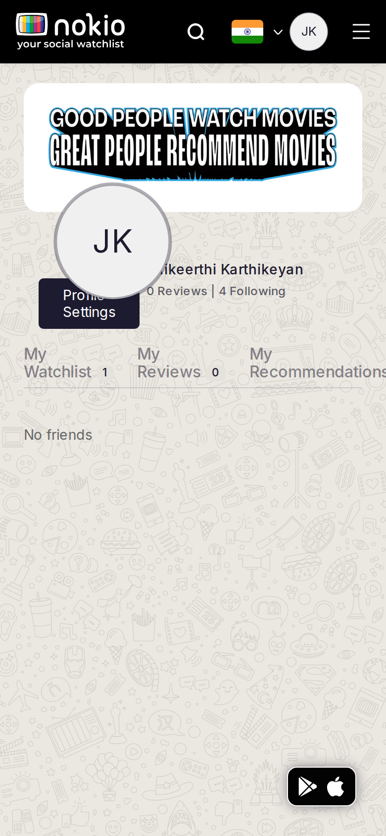
Empty; Circles Friends is the same job.
My friends phone-390
390×844 · ~19.5:9 · CSS mobile ≤480
My friends tablet-port
768×1024 · 3:4 · CSS tablet ≤960
My friends desktop-16-9
1440×810 · 16:9
Other aspect ratios (4)
phone-360
360×800 · 9:20 · CSS mobile ≤480
phone-land
844×390 · landscape · CSS tablet ≤960 at phone height
tablet-land
1024×768 · 4:3 land · CSS small ≤1280 (desktop chrome)
desktop-fhd
1920×1080 · 16:9 FHD

Improvements

P1

Deep-link Find friends to Circles search

My followings

/my-profile/my-followings · Account

Job: See who I follow.

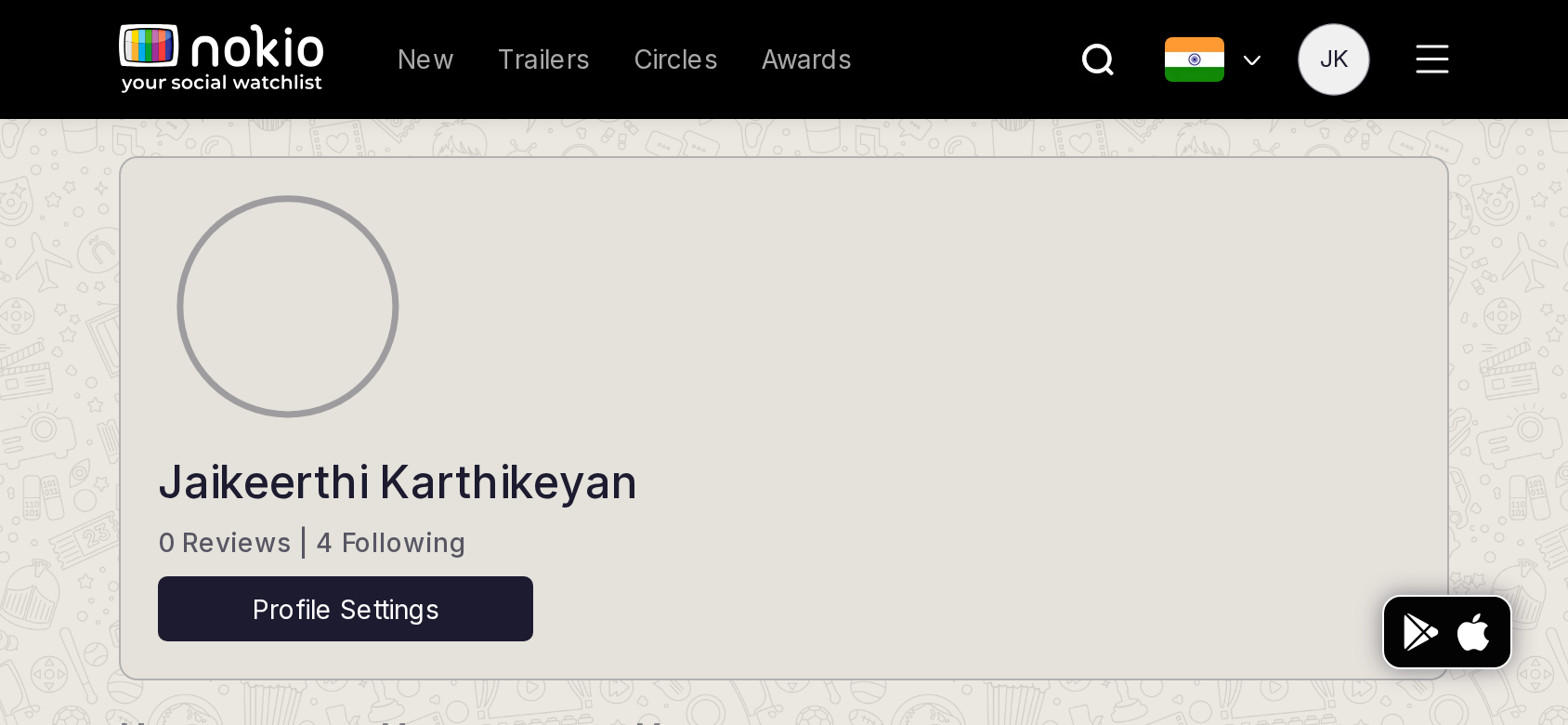
Now populated: Dharunn Sakthivel, Sugil SG, Raunaq… Following 4. This is the success state to copy onto Circles → Following.
My followings phone-390
390×844 · ~19.5:9 · CSS mobile ≤480
My followings tablet-port
768×1024 · 3:4 · CSS tablet ≤960
My followings desktop-16-9
1440×810 · 16:9
Other aspect ratios (4)
phone-360
360×800 · 9:20 · CSS mobile ≤480
phone-land
844×390 · landscape · CSS tablet ≤960 at phone height
tablet-land
1024×768 · 4:3 land · CSS small ≤1280 (desktop chrome)
desktop-fhd
1920×1080 · 16:9 FHD

Improvements

P0

Same phone header stack as Watchlist

Following button 44px.

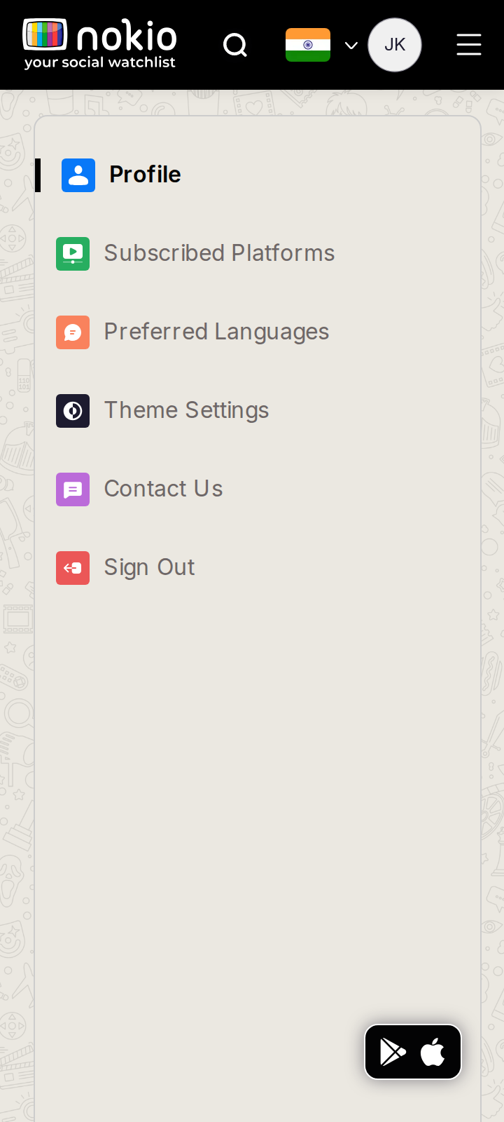
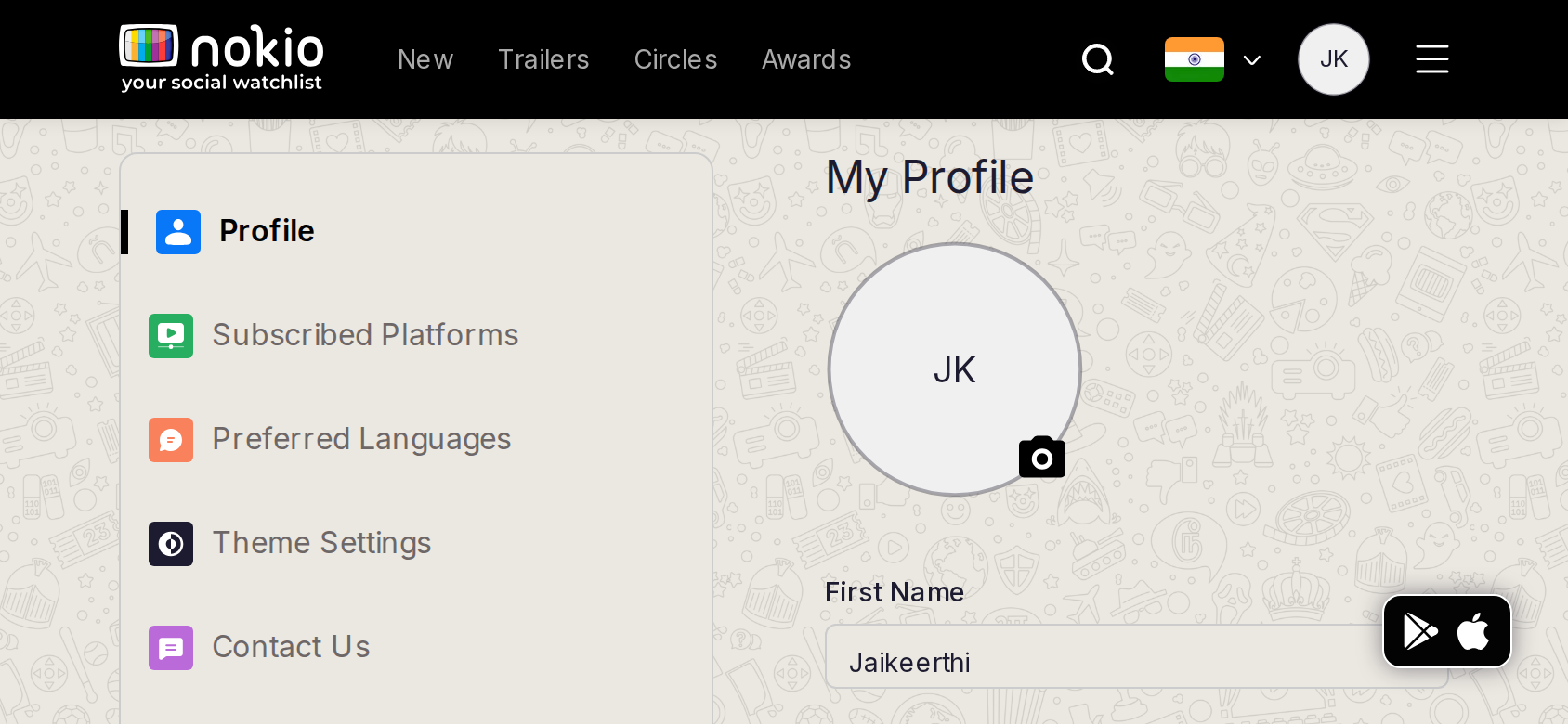
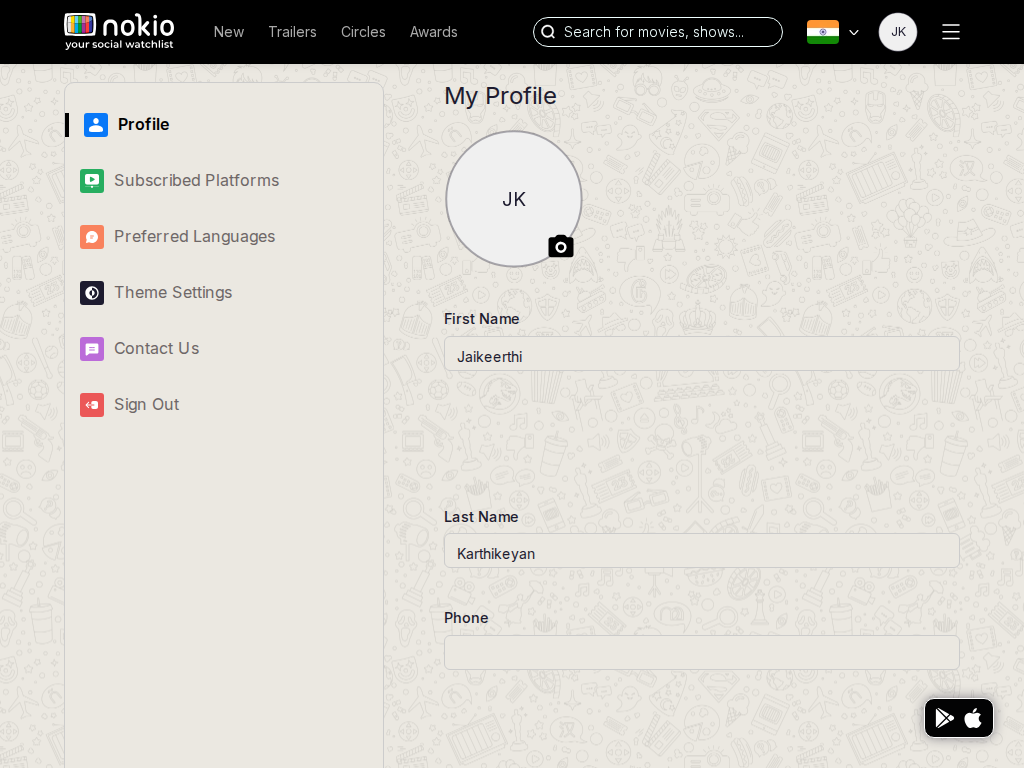
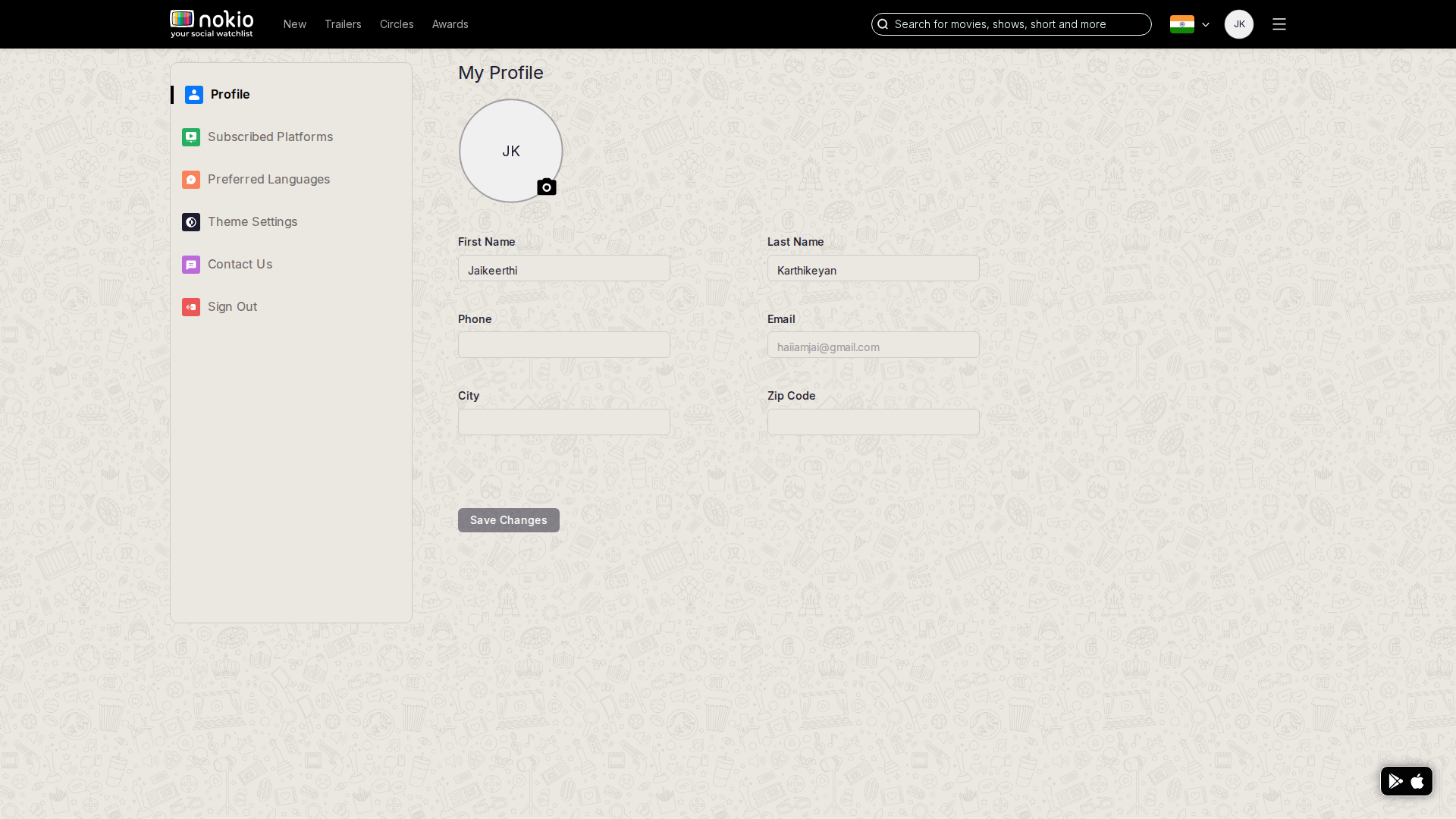
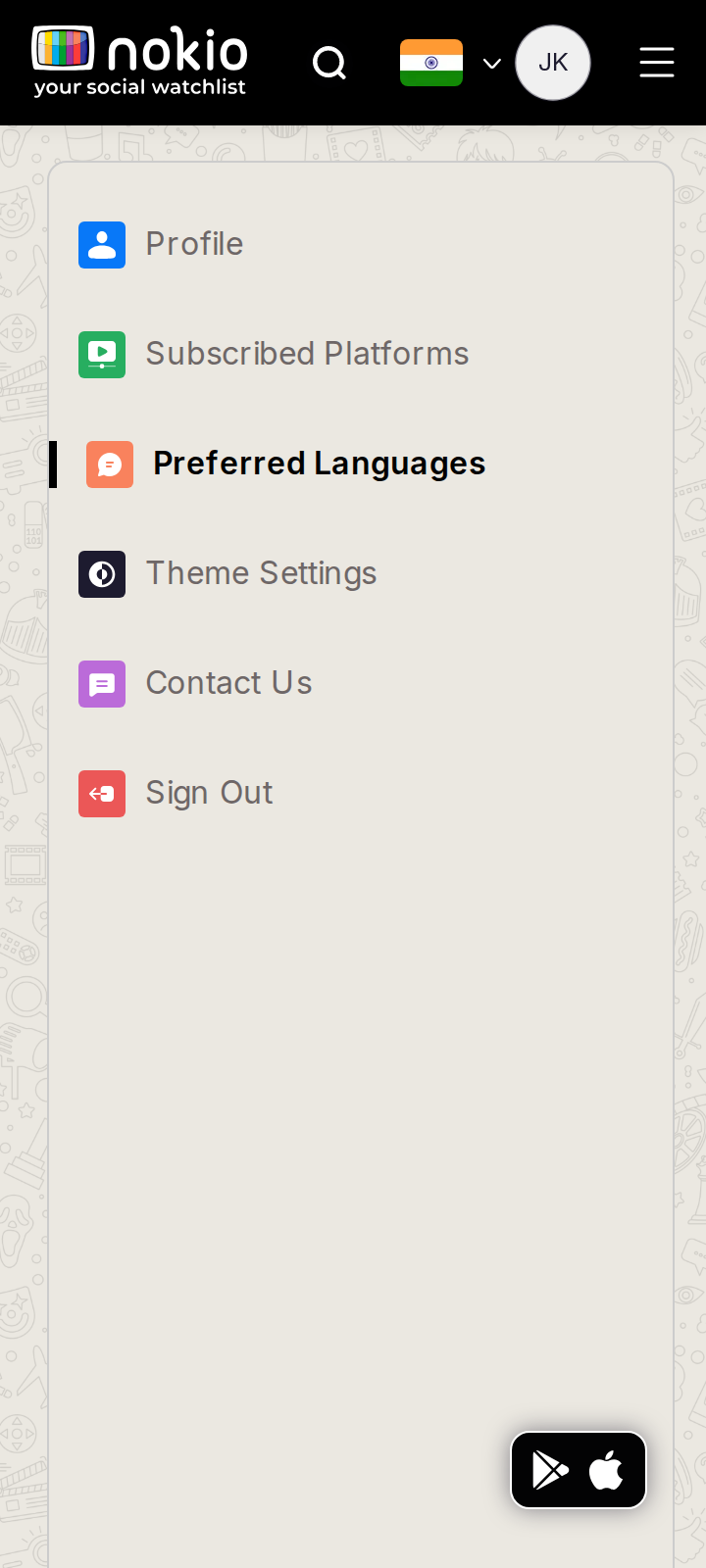
Edit profile

/edit-profile · Account

Job: Update name and photo.

Desktop form; phone still sidebar-first.
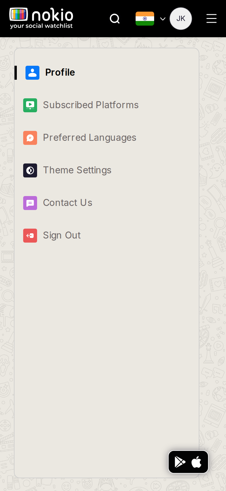
Edit profile phone-390
390×844 · ~19.5:9 · CSS mobile ≤480
Edit profile tablet-port
768×1024 · 3:4 · CSS tablet ≤960
Edit profile desktop-16-9
1440×810 · 16:9
Other aspect ratios (4)
phone-360
360×800 · 9:20 · CSS mobile ≤480
phone-land
844×390 · landscape · CSS tablet ≤960 at phone height
tablet-land
1024×768 · 4:3 land · CSS small ≤1280 (desktop chrome)
desktop-fhd
1920×1080 · 16:9 FHD

Improvements

P0

Phone: form first, sections in a menu

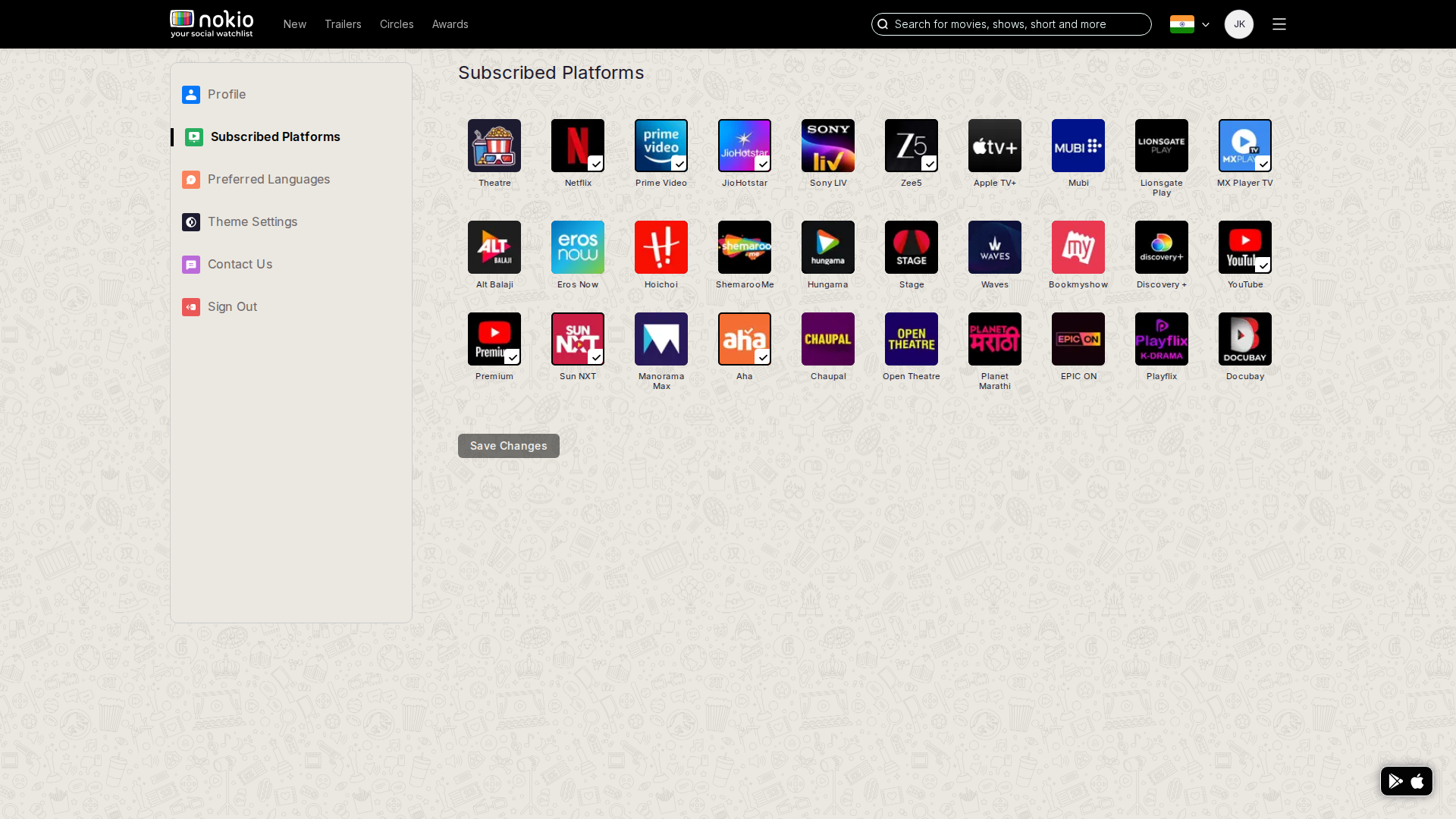
Edit platforms

/edit-profile/edit-platforms · Account

Job: Set streaming services I use.

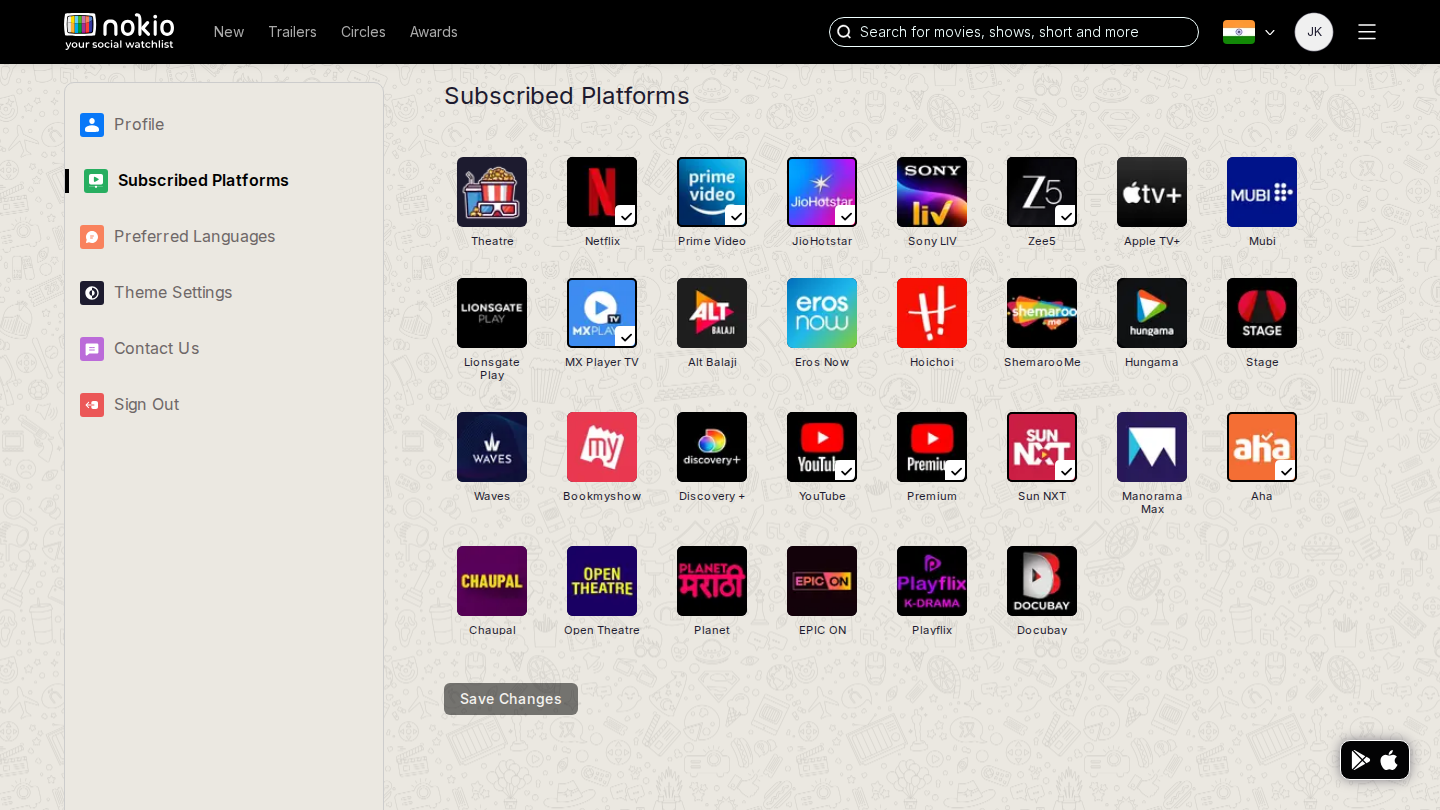
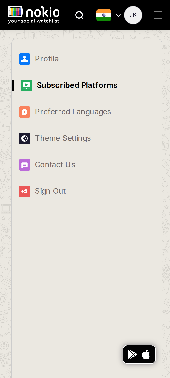
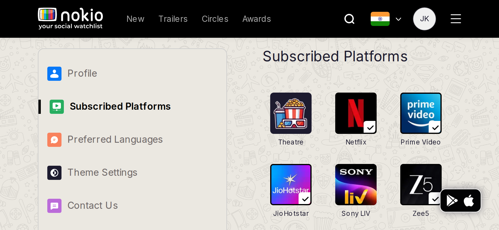
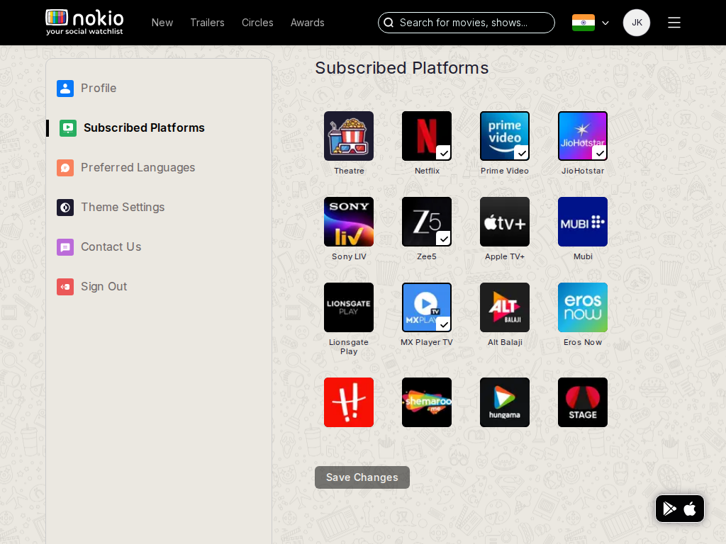
Opened subscribed platforms (Theatre, Netflix, Prime…). Home still showed a long public platform strip rather than this set.
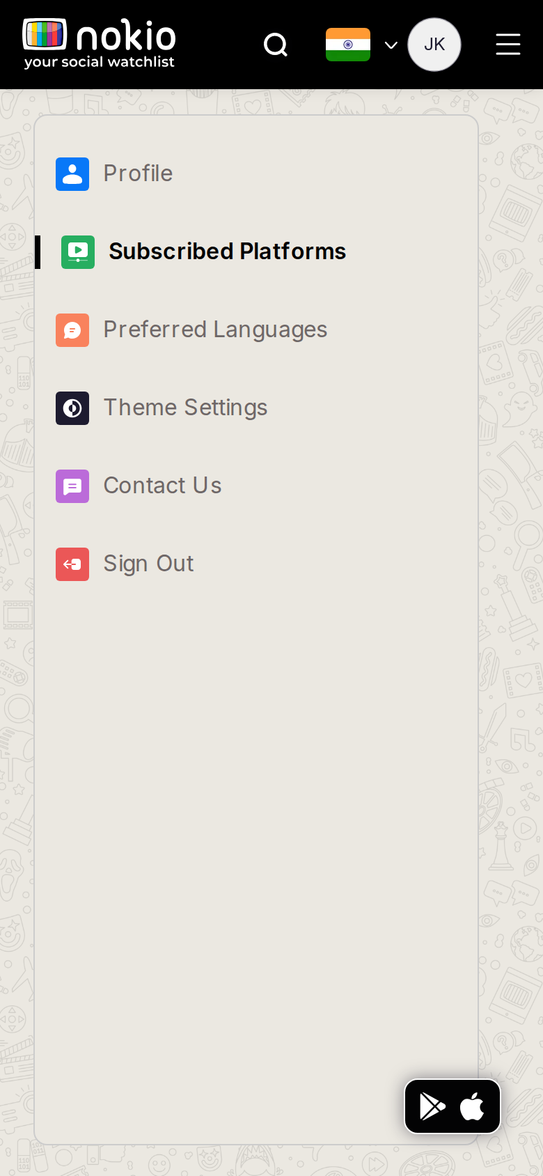
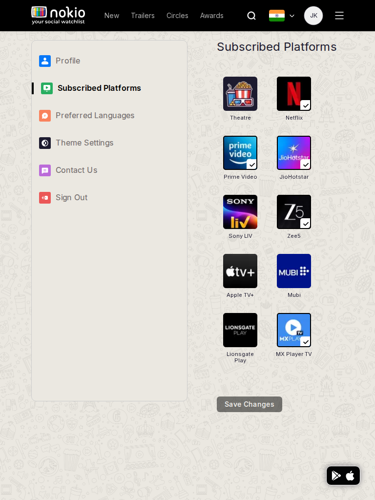
Edit platforms phone-390
390×844 · ~19.5:9 · CSS mobile ≤480
Edit platforms tablet-port
768×1024 · 3:4 · CSS tablet ≤960
Edit platforms desktop-16-9
1440×810 · 16:9
Other aspect ratios (4)
phone-360
360×800 · 9:20 · CSS mobile ≤480
phone-land
844×390 · landscape · CSS tablet ≤960 at phone height
tablet-land
1024×768 · 4:3 land · CSS small ≤1280 (desktop chrome)
desktop-fhd
1920×1080 · 16:9 FHD

Improvements

P0

Grid first on phone

Caption: these filter Home and New releases — and they must.

P1

Home chips = this preference set

Not 40 services.

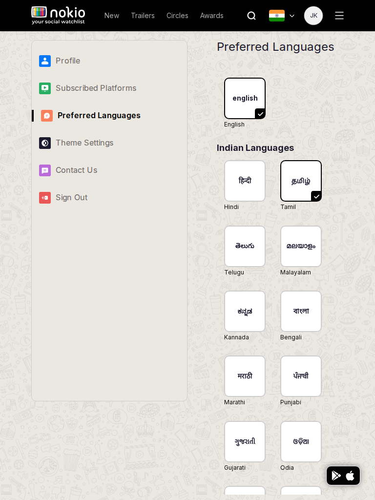
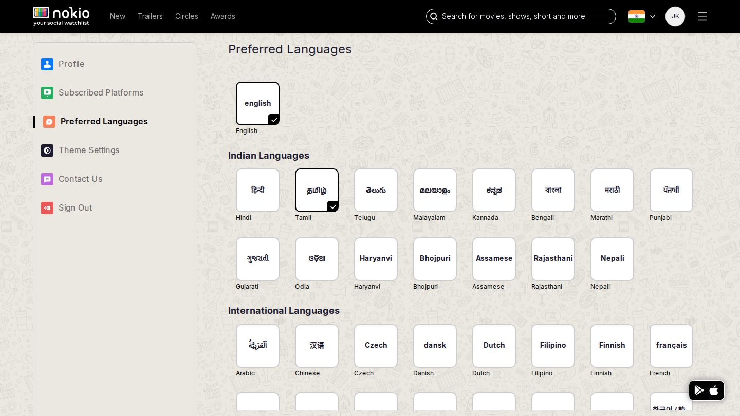
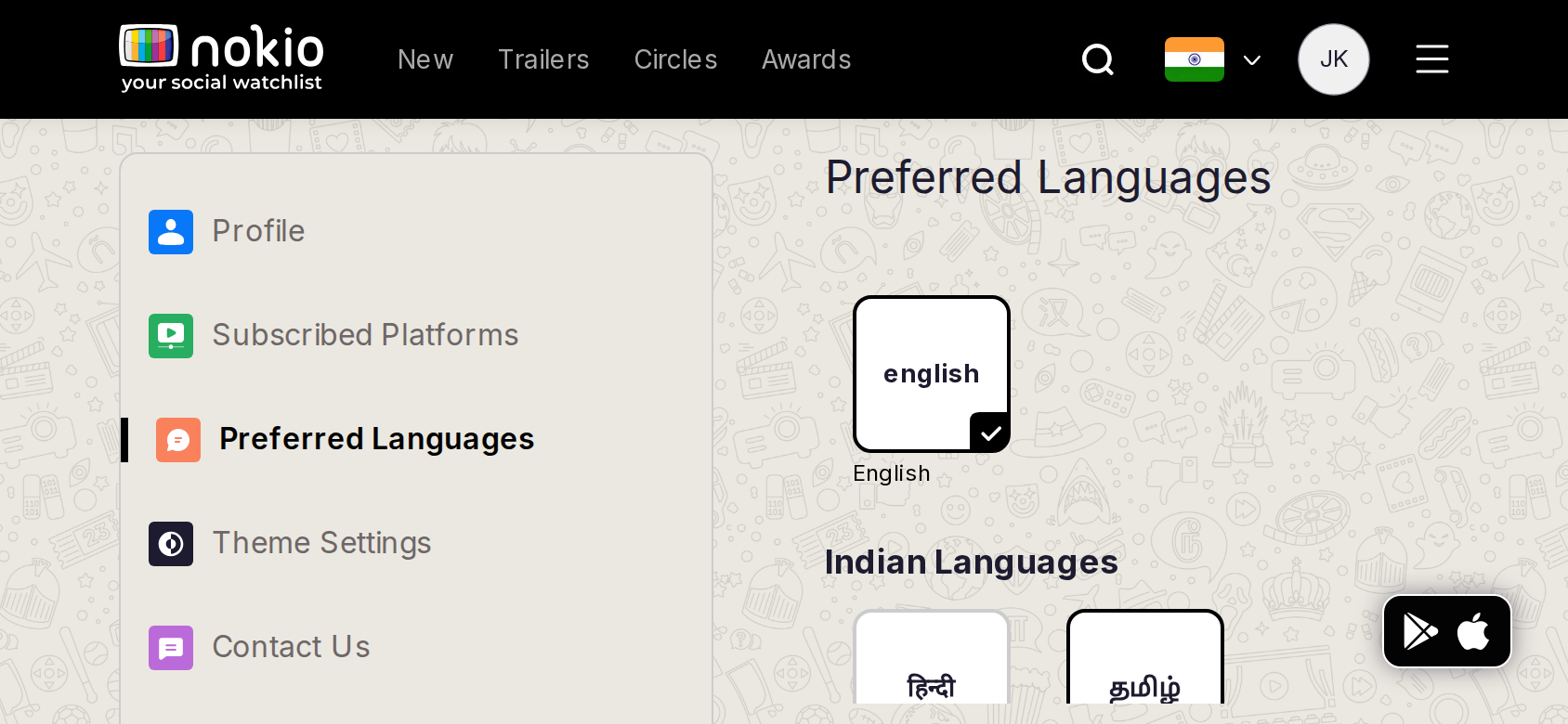
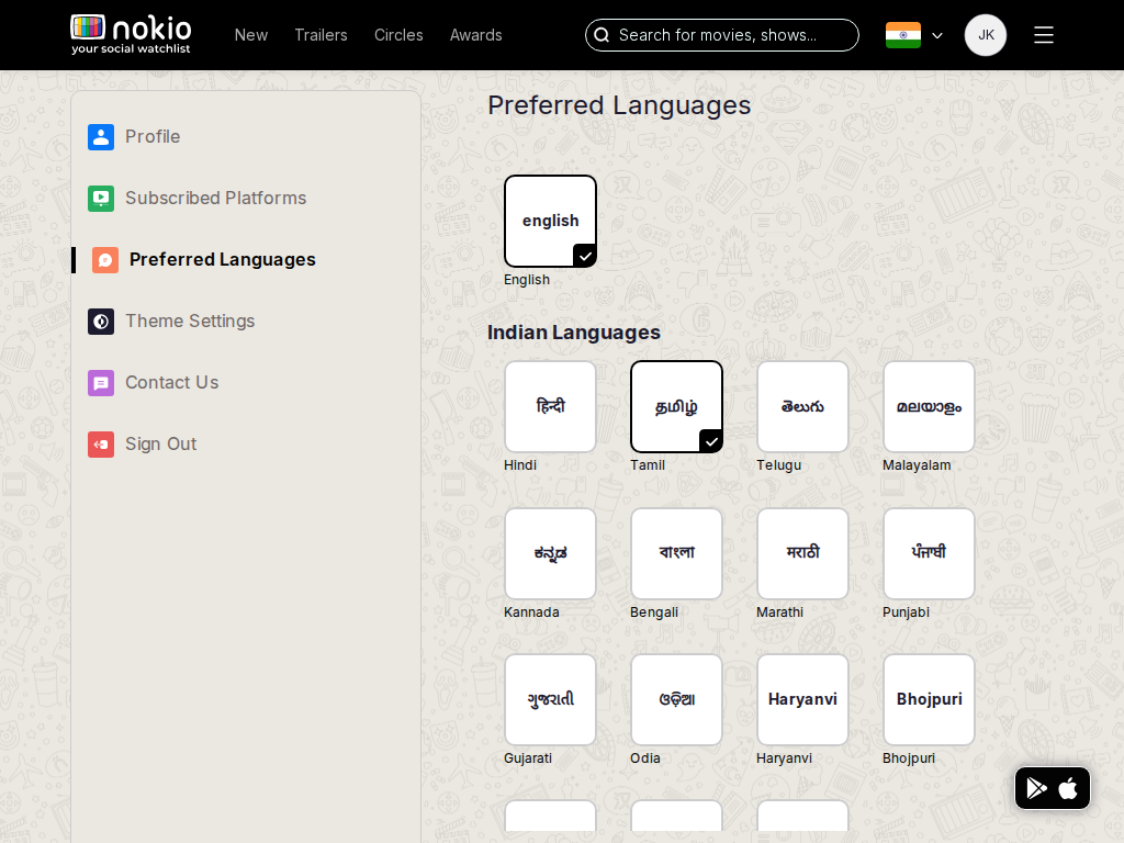
Edit languages

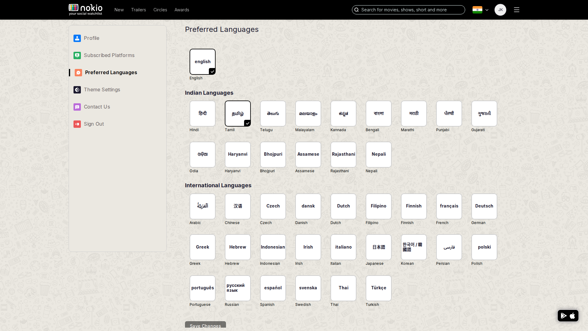
/edit-profile/edit-languages · Account

Job: Set preferred languages.

Home already showed English + Tamil after login — this is the source of truth.
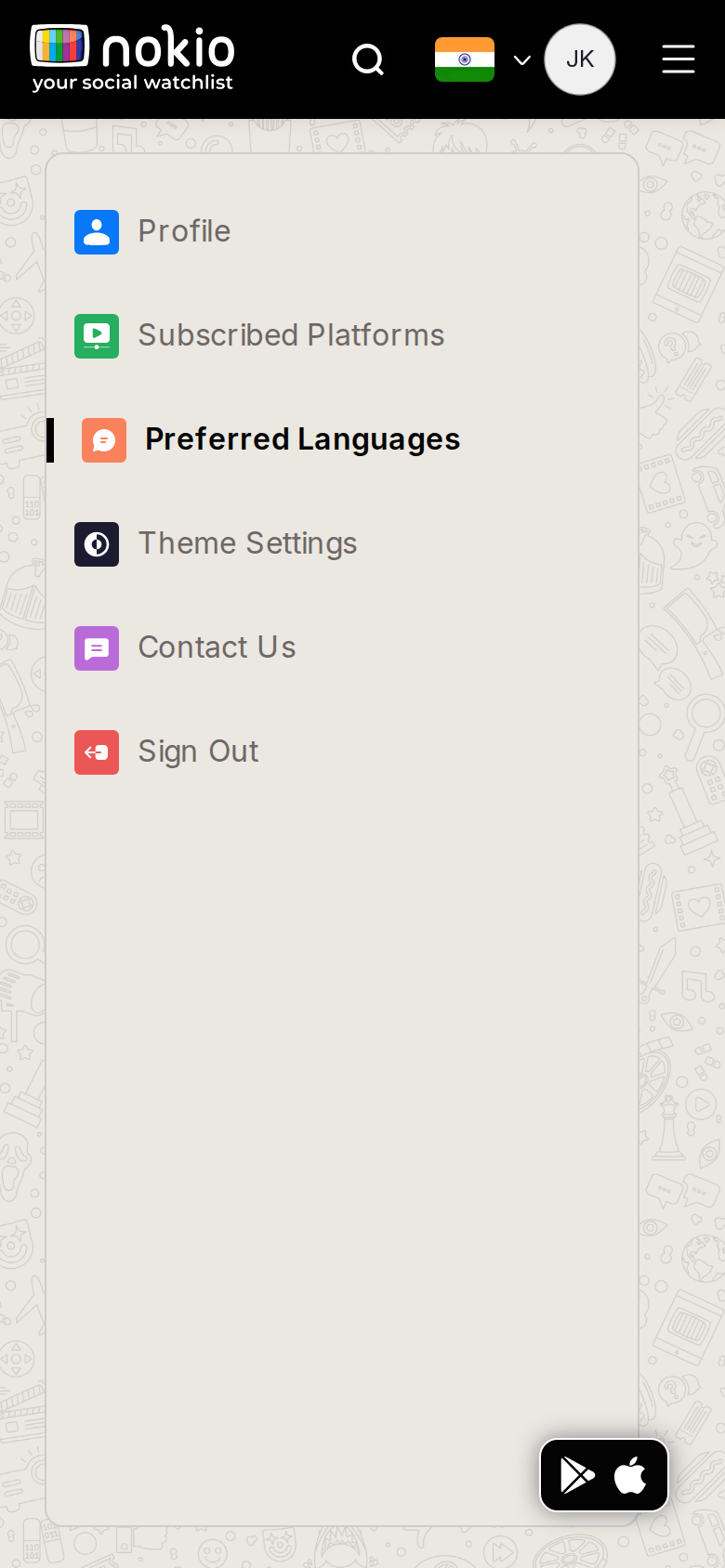
Edit languages phone-390
390×844 · ~19.5:9 · CSS mobile ≤480
Edit languages tablet-port
768×1024 · 3:4 · CSS tablet ≤960
Edit languages desktop-16-9
1440×810 · 16:9
Other aspect ratios (4)
phone-360
360×800 · 9:20 · CSS mobile ≤480
phone-land
844×390 · landscape · CSS tablet ≤960 at phone height
tablet-land
1024×768 · 4:3 land · CSS small ≤1280 (desktop chrome)
desktop-fhd
1920×1080 · 16:9 FHD

Improvements

P0

Form first on phone; caption that Home uses this

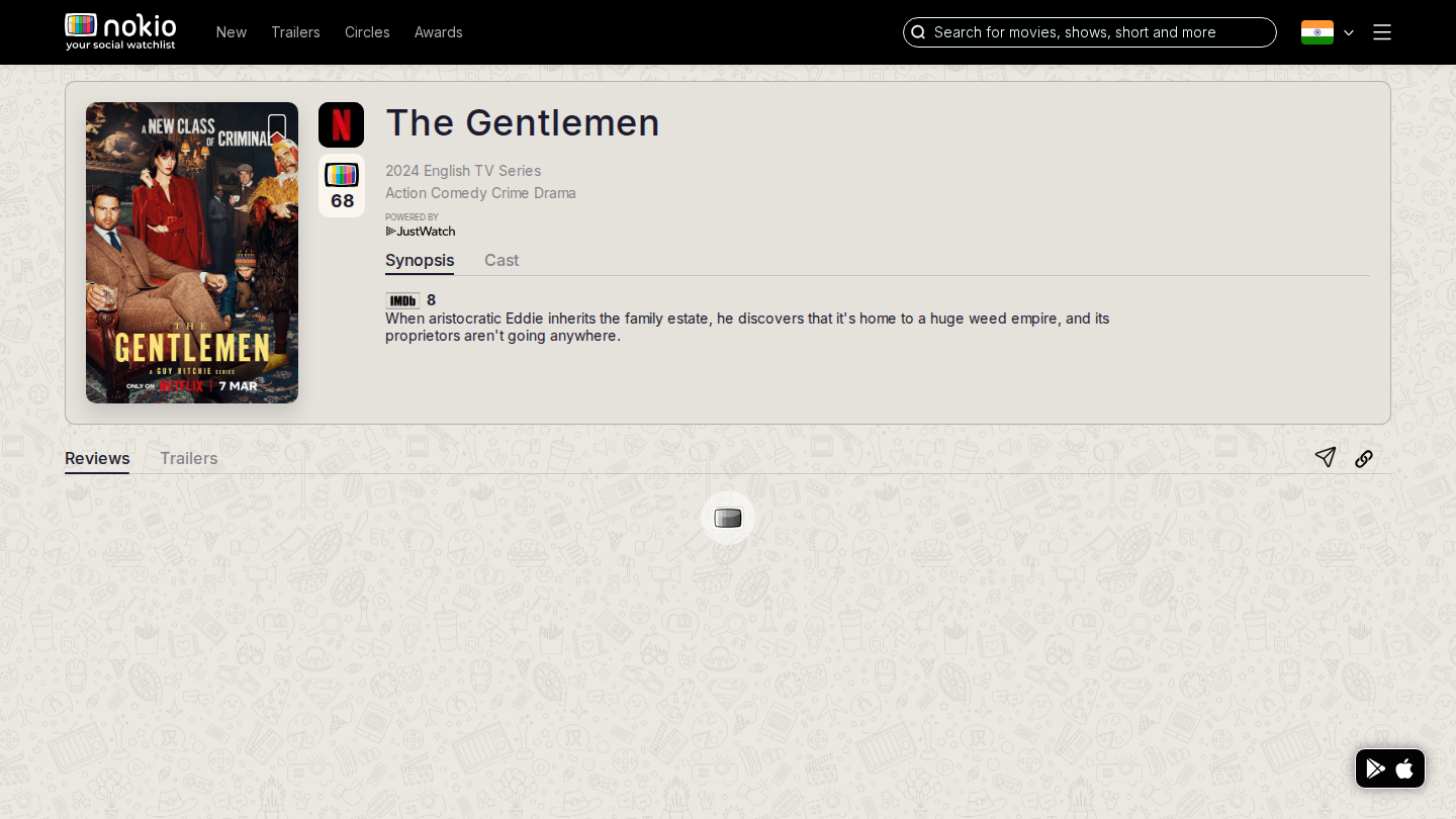
Movie reviews

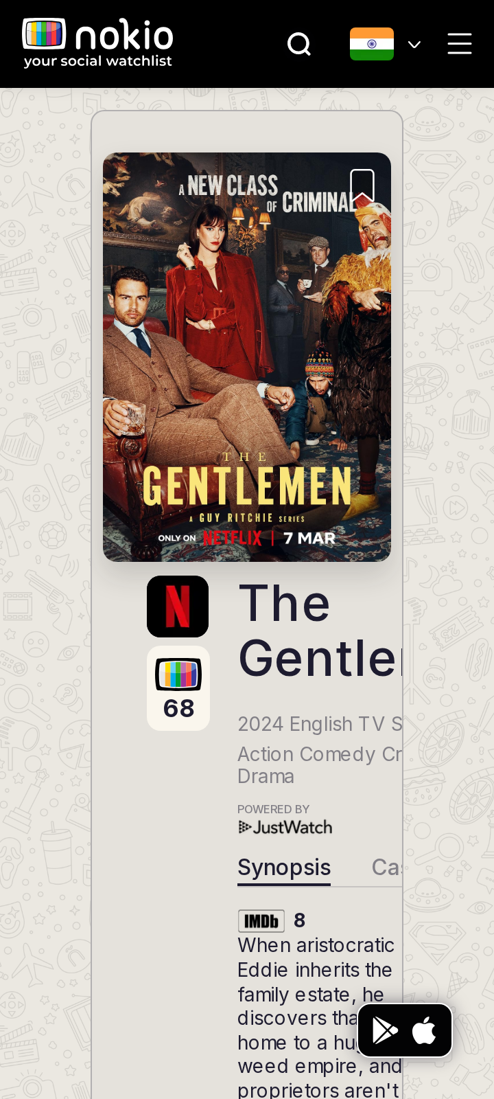
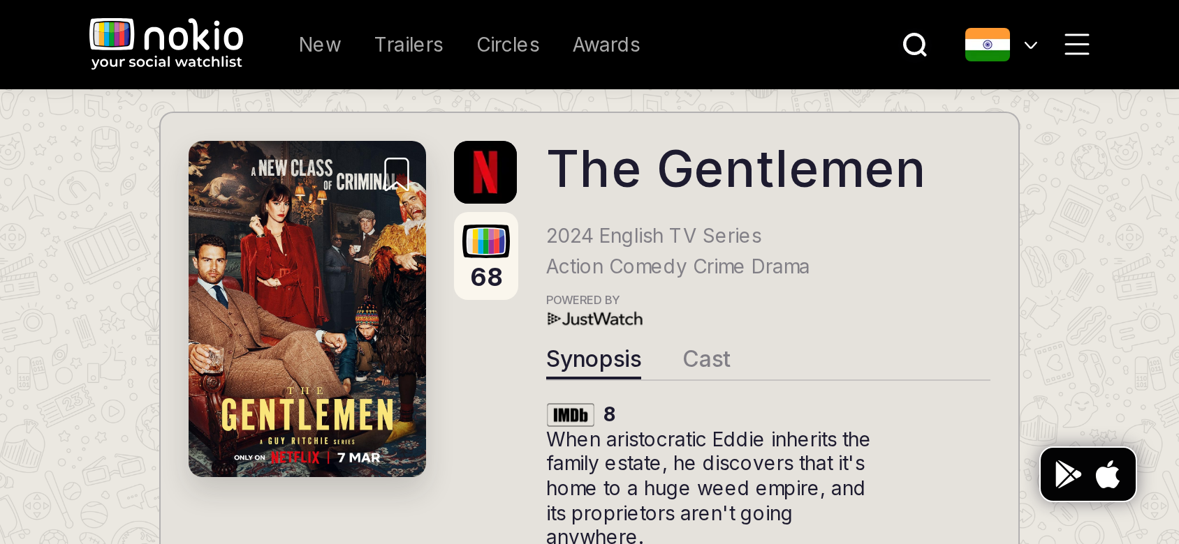
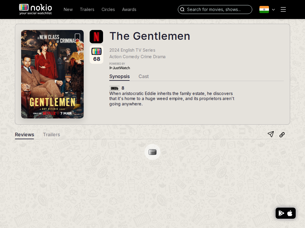
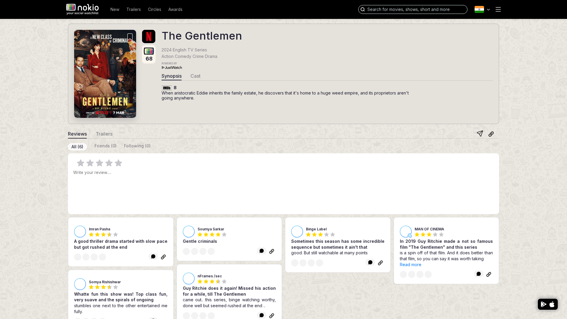
/movie/the-gentlemen-2024/reviews · Movie

Job: Decide whether to watch, and write a review.

Composer is visible on desktop (best screen in the product). Typed a full review. Could not submit without a rating, and could not set a rating. All (6) reviews from others rendered in a grid. Friends (0) / Following (0) even after following 4 people — following reviews did not appear.
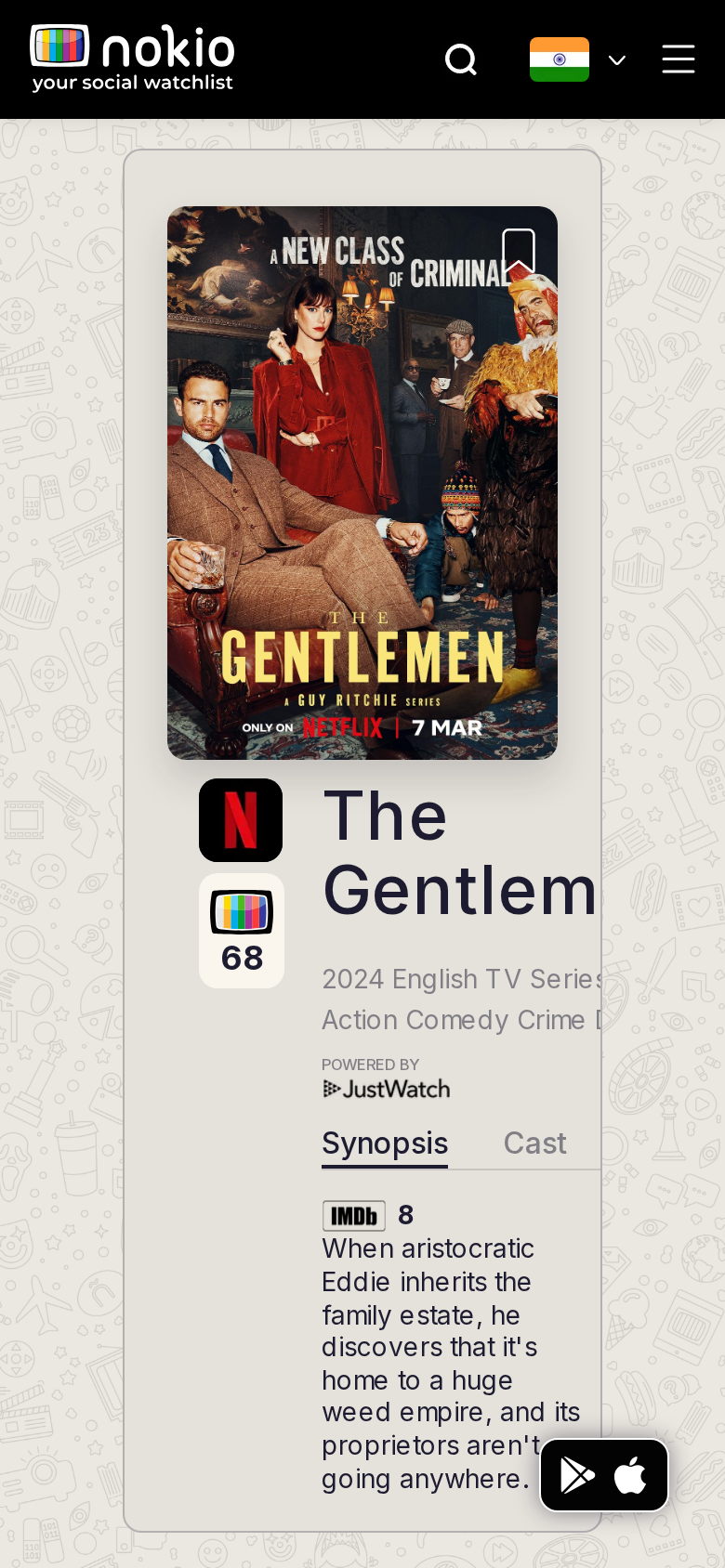
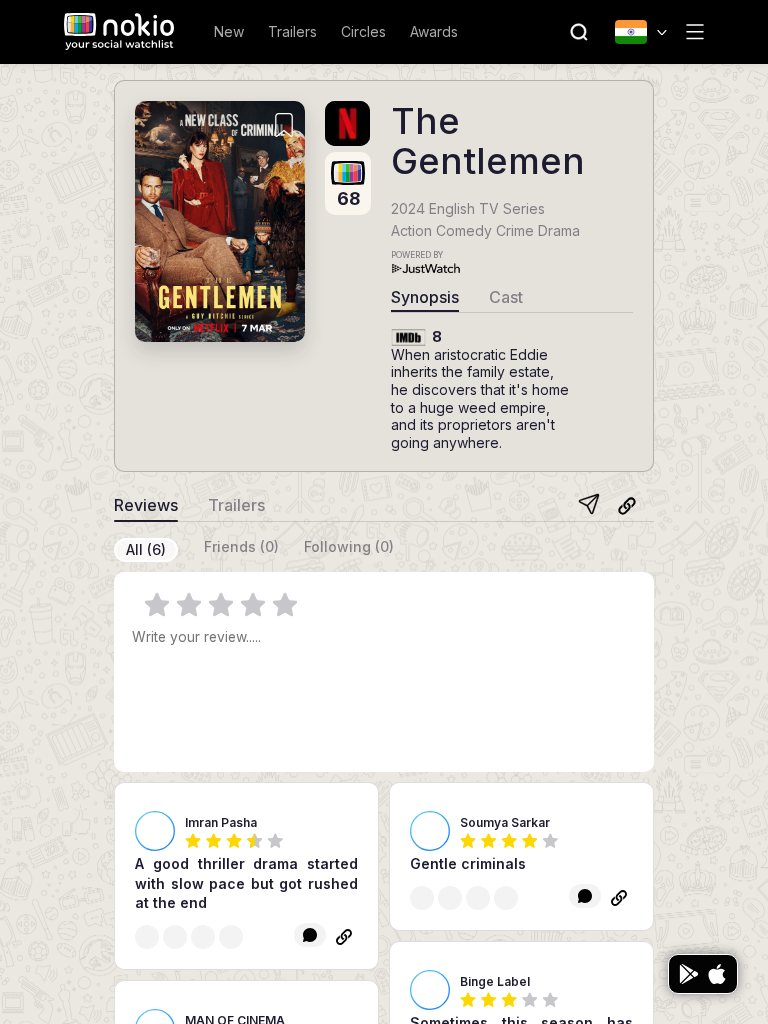
Movie reviews phone-390
390×844 · ~19.5:9 · CSS mobile ≤480
Movie reviews tablet-port
768×1024 · 3:4 · CSS tablet ≤960
Movie reviews desktop-16-9
1440×810 · 16:9
Other aspect ratios (4)
phone-360
360×800 · 9:20 · CSS mobile ≤480
phone-land
844×390 · landscape · CSS tablet ≤960 at phone height
tablet-land
1024×768 · 4:3 land · CSS small ≤1280 (desktop chrome)
desktop-fhd
1920×1080 · 16:9 FHD

Improvements

P0

Fix RateInput click

See My reviews.

P0

Phone: composer in the fold

Hero + synopsis currently push it down.

P1

Following (0) after follows is a lie

Either fetch following reviews or explain “none of the people you follow reviewed this”.

Movie trailers

/movie/the-gentlemen-2024/trailers · Movie

Job: Play a trailer for this title.

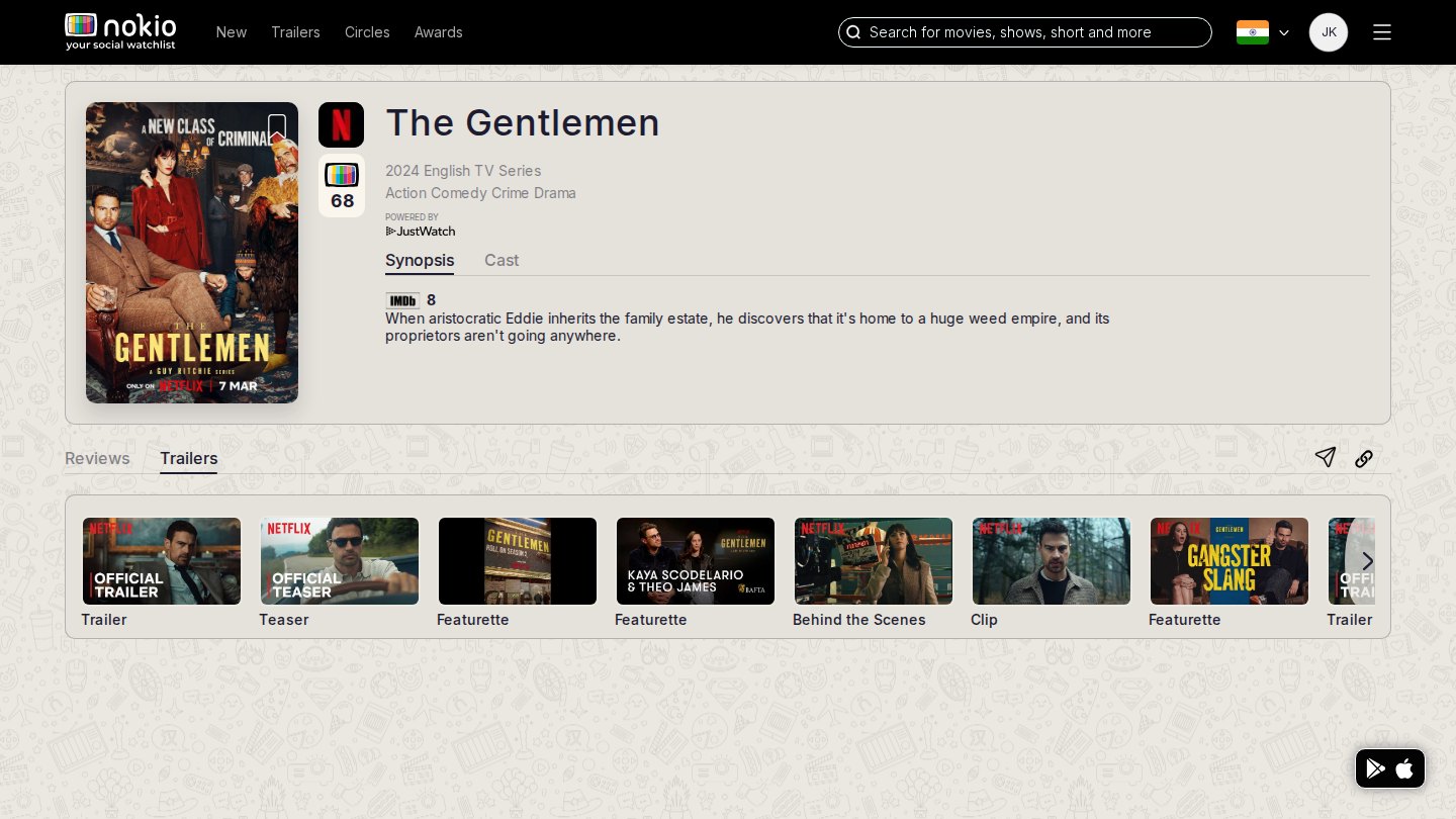
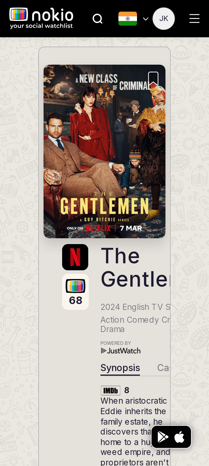
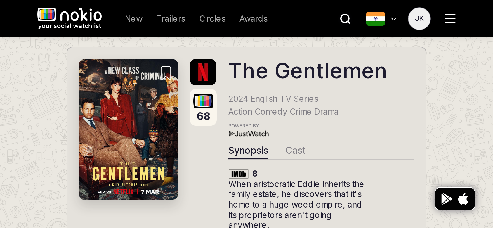
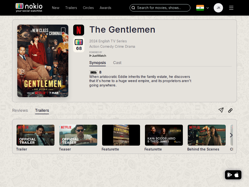
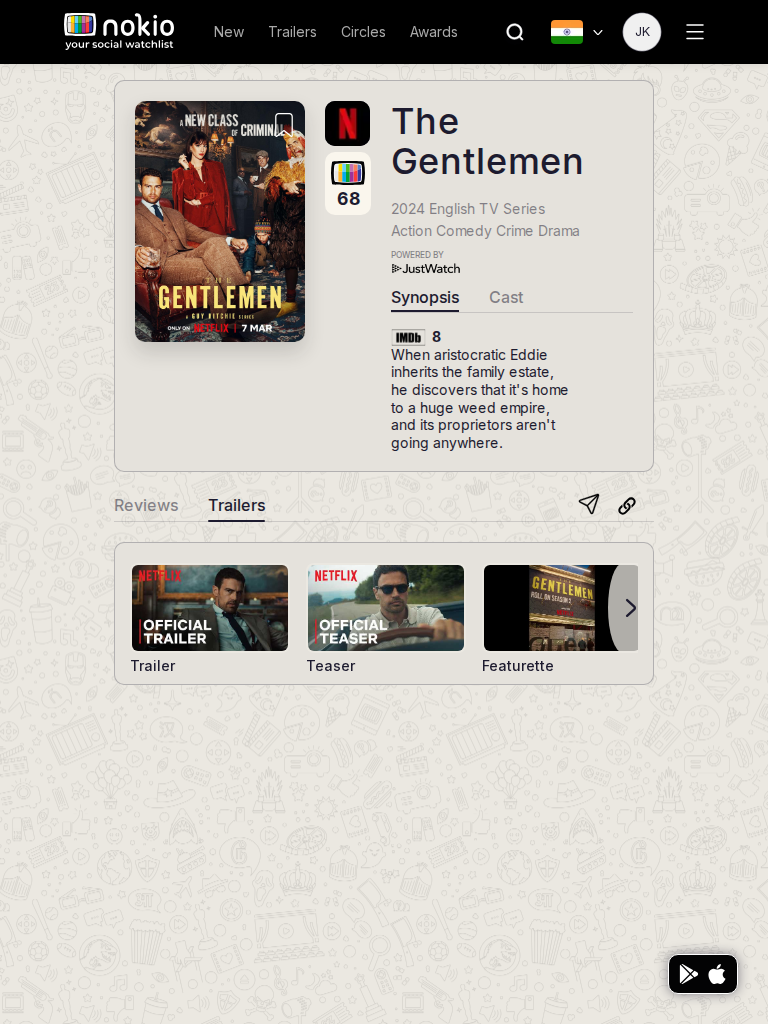
Opened Earle Meets World /trailers?trailerId=2096932 — Netflix official trailer selected (blue border) with a large still. Gentlemen /trailers had 0 YouTube iframes in the automation pass (player may be a still, not an embed). Header Trailers link intercepted an in-page Trailers click.
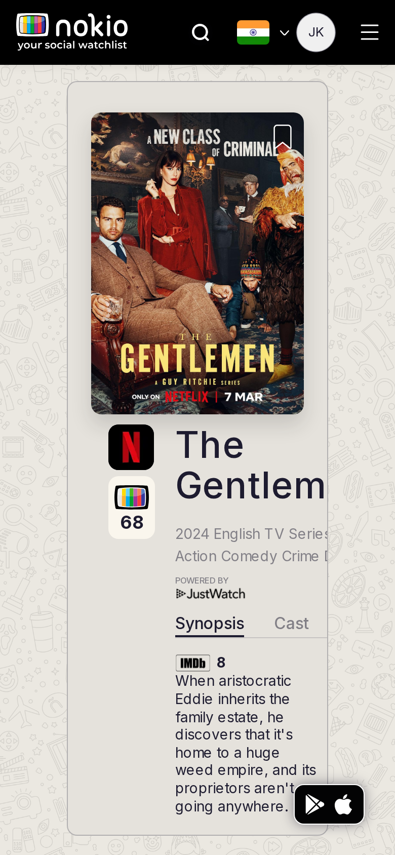
Movie trailers phone-390
390×844 · ~19.5:9 · CSS mobile ≤480
Movie trailers tablet-port
768×1024 · 3:4 · CSS tablet ≤960
Movie trailers desktop-16-9
1440×810 · 16:9
Other aspect ratios (4)
phone-360
360×800 · 9:20 · CSS mobile ≤480
phone-land
844×390 · landscape · CSS tablet ≤960 at phone height
tablet-land
1024×768 · 4:3 land · CSS small ≤1280 (desktop chrome)
desktop-fhd
1920×1080 · 16:9 FHD

Improvements

P0

In-page Trailers tab must not be the header link

More specific selector / nested tab.

P1

Autoplay muted or a real play control

A still with a blue border is not watching.

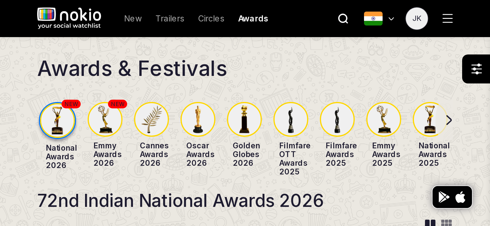
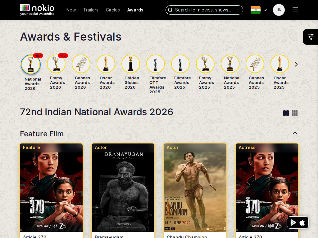
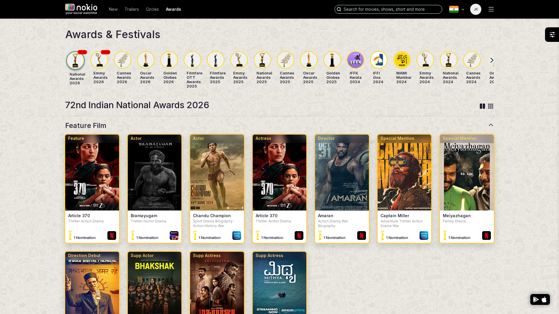
Festival

/festivals/72th-indian-national-awards-2026 · Festivals

Job: Browse an awards slate and save titles.

Opened National Awards 2026 slate.
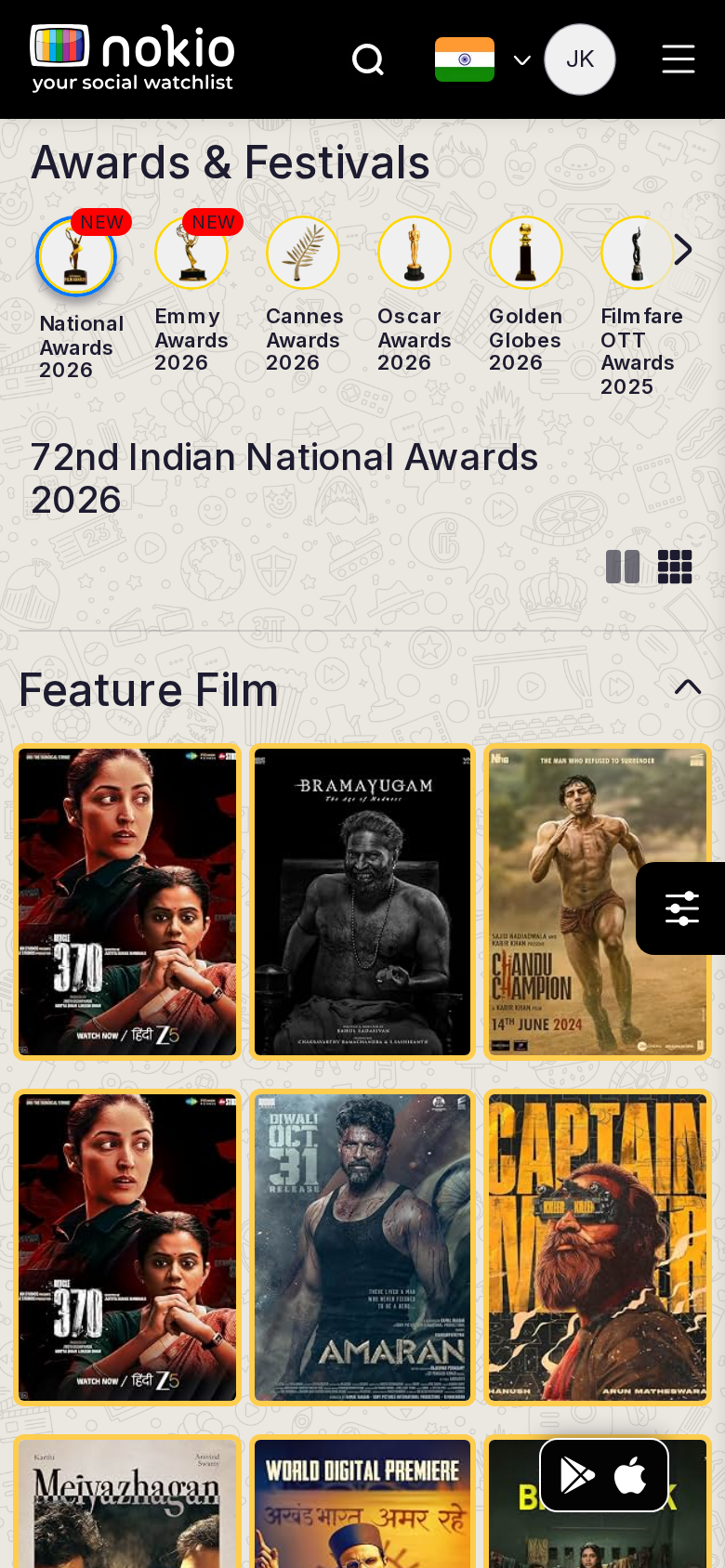
Festival phone-390
390×844 · ~19.5:9 · CSS mobile ≤480
Festival tablet-port
768×1024 · 3:4 · CSS tablet ≤960
Festival desktop-16-9
1440×810 · 16:9
Other aspect ratios (4)
phone-360
360×800 · 9:20 · CSS mobile ≤480
phone-land
844×390 · landscape · CSS tablet ≤960 at phone height
tablet-land
1024×768 · 4:3 land · CSS small ≤1280 (desktop chrome)
desktop-fhd
1920×1080 · 16:9 FHD

Improvements

P1

2-col posters on phone; fade on award scroller

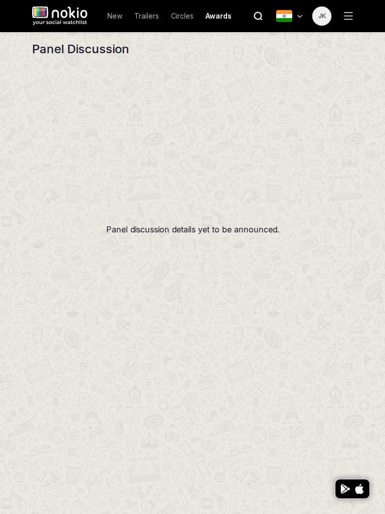
Festival panel

/festivals/72th-indian-national-awards-2026/panel-discussion · Festivals

Job: Watch a festival panel.

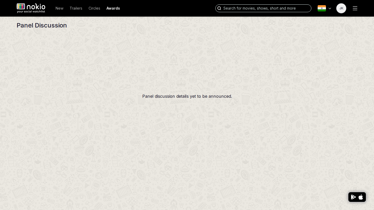
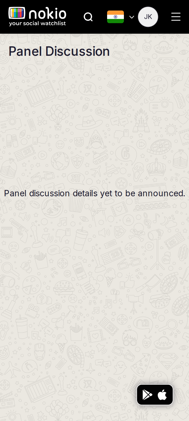
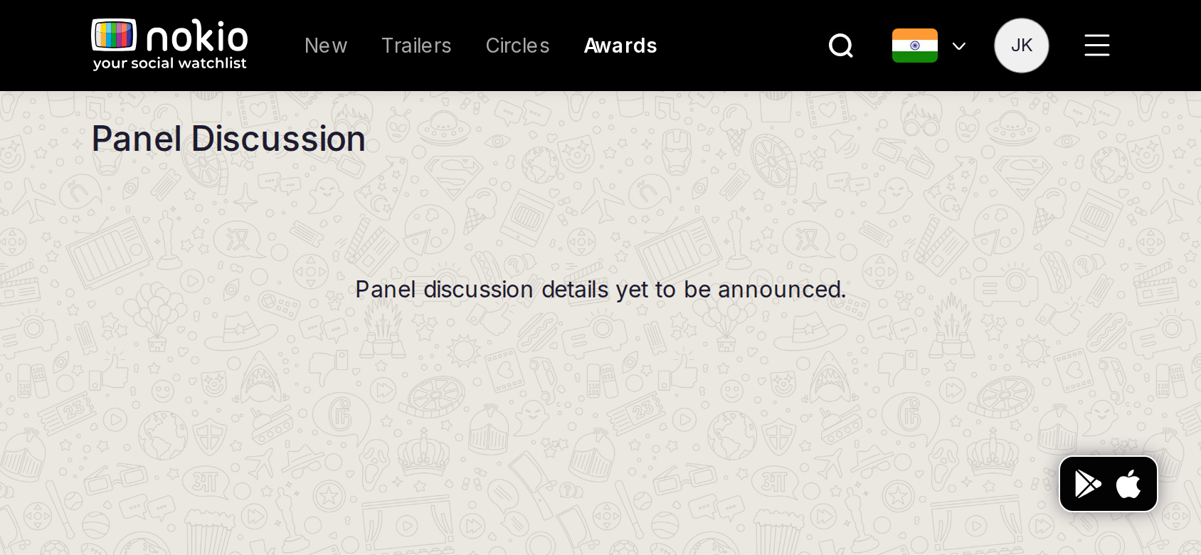
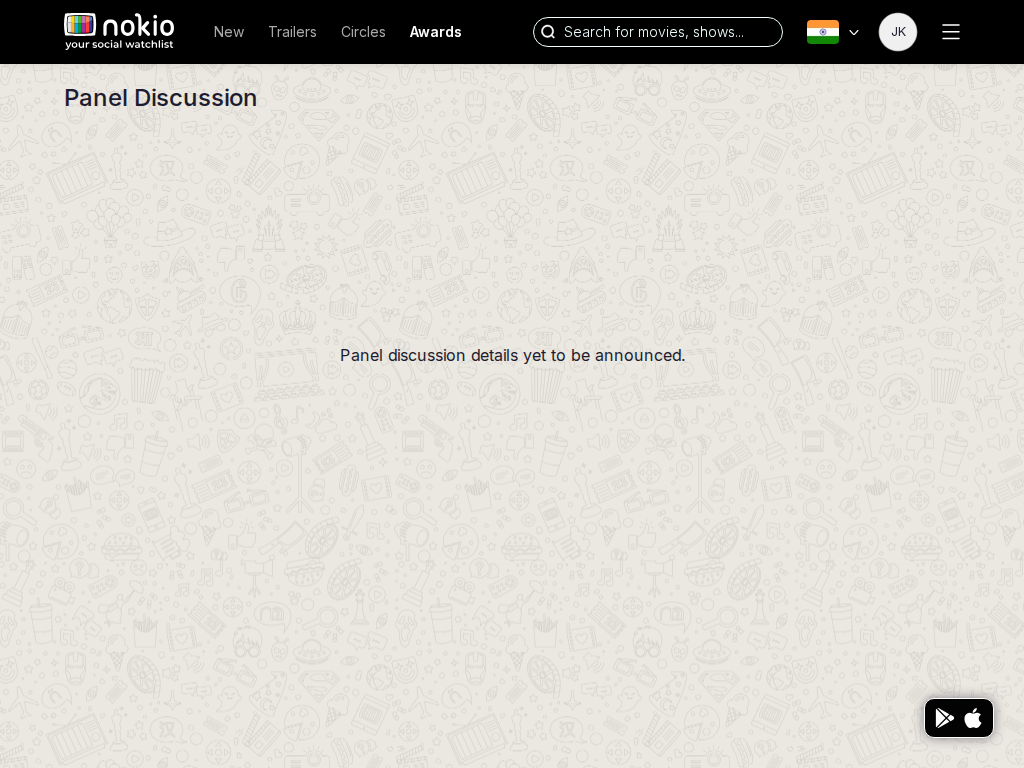
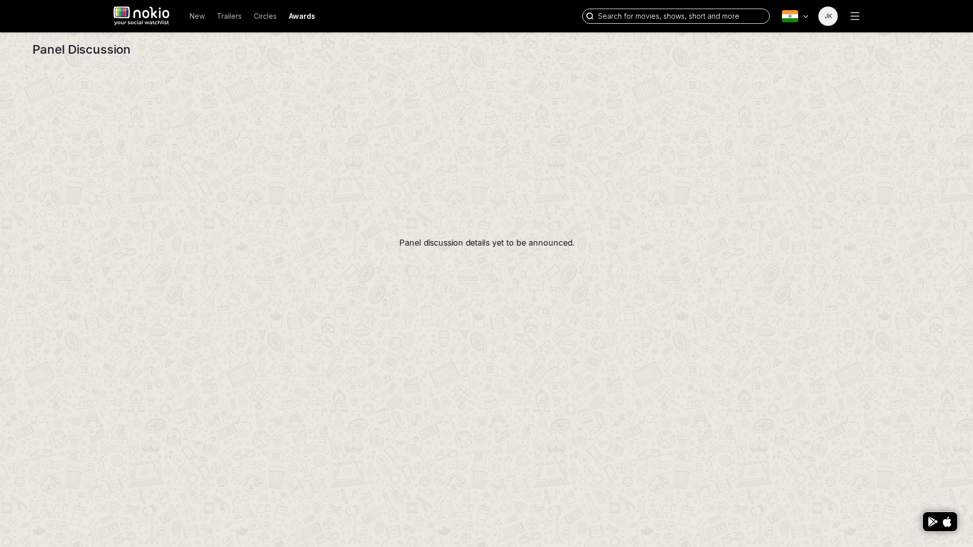
Empty coming-soon.
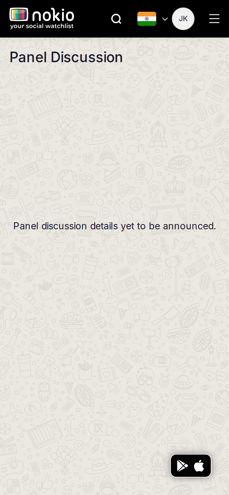
Festival panel phone-390
390×844 · ~19.5:9 · CSS mobile ≤480
Festival panel tablet-port
768×1024 · 3:4 · CSS tablet ≤960
Festival panel desktop-16-9
1440×810 · 16:9
Other aspect ratios (4)
phone-360
360×800 · 9:20 · CSS mobile ≤480
phone-land
844×390 · landscape · CSS tablet ≤960 at phone height
tablet-land
1024×768 · 4:3 land · CSS small ≤1280 (desktop chrome)
desktop-fhd
1920×1080 · 16:9 FHD

Improvements

P1

Coming-soon card with festival name + notify

Public profile

/profile/sugilsg · Social

Job: Evaluate a critic and follow them.

Follow from the grid then opened /public-profile/22582. Signed-in public profile had been empty in the previous pass — confirm this capture shows a grid.
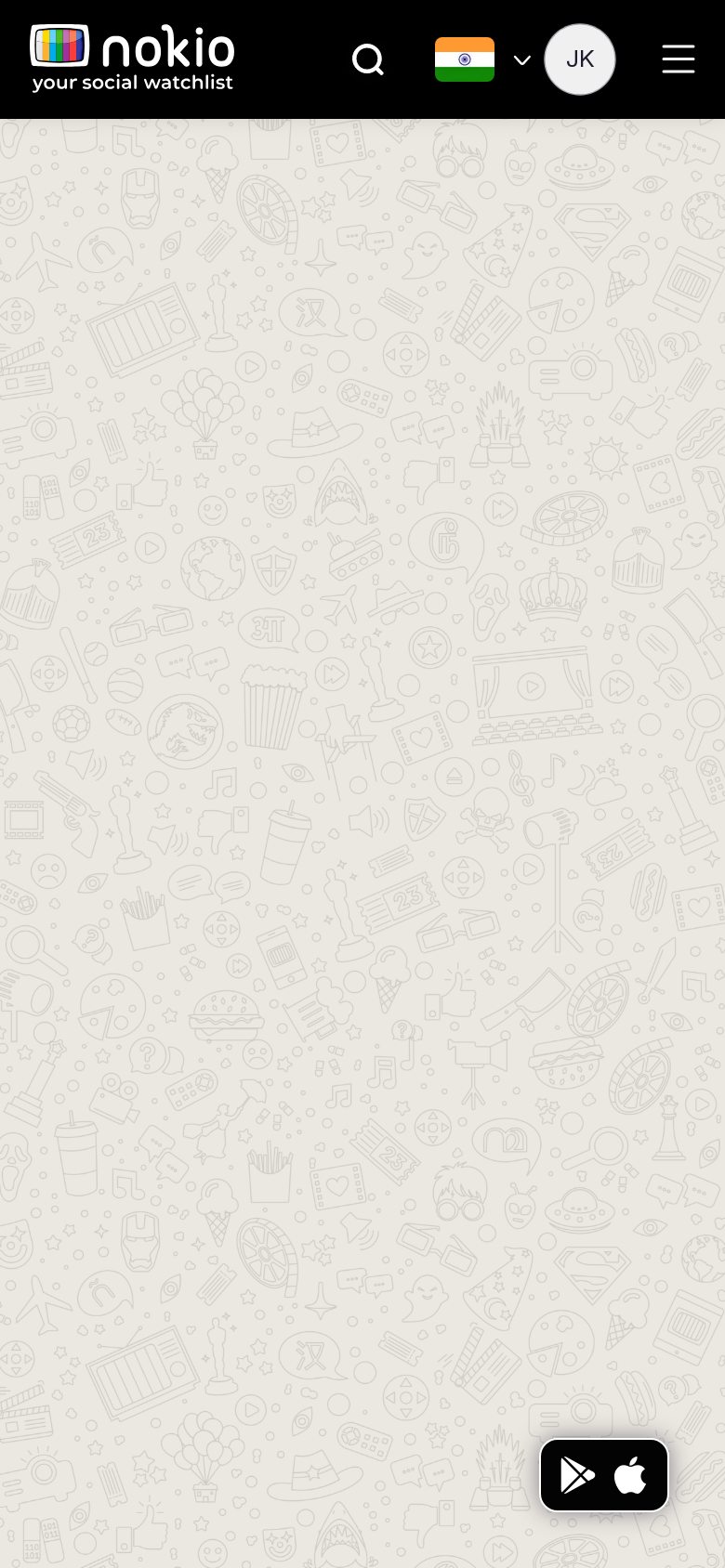
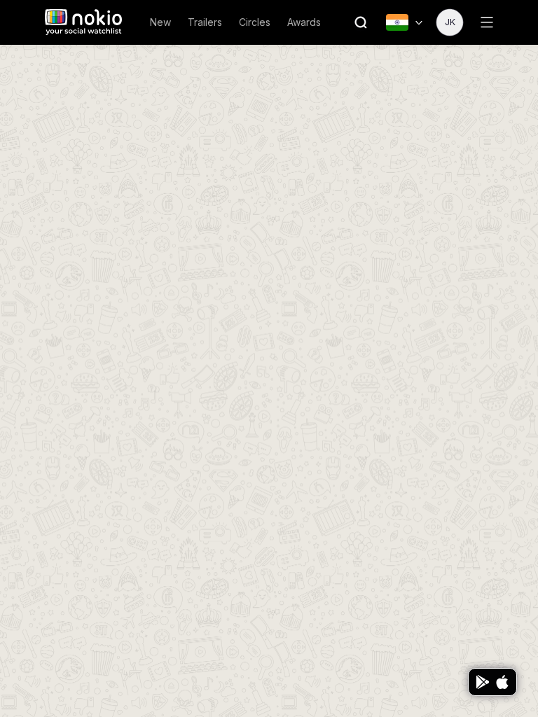
Public profile phone-390
390×844 · ~19.5:9 · CSS mobile ≤480
Public profile tablet-port
768×1024 · 3:4 · CSS tablet ≤960
Public profile desktop-16-9
1440×810 · 16:9
Other aspect ratios (4)
phone-360
360×800 · 9:20 · CSS mobile ≤480
phone-land
844×390 · landscape · CSS tablet ≤960 at phone height
tablet-land
1024×768 · 4:3 land · CSS small ≤1280 (desktop chrome)
desktop-fhd
1920×1080 · 16:9 FHD

Improvements

P0

Never empty-doodle a public profile

Fall back to public payload.

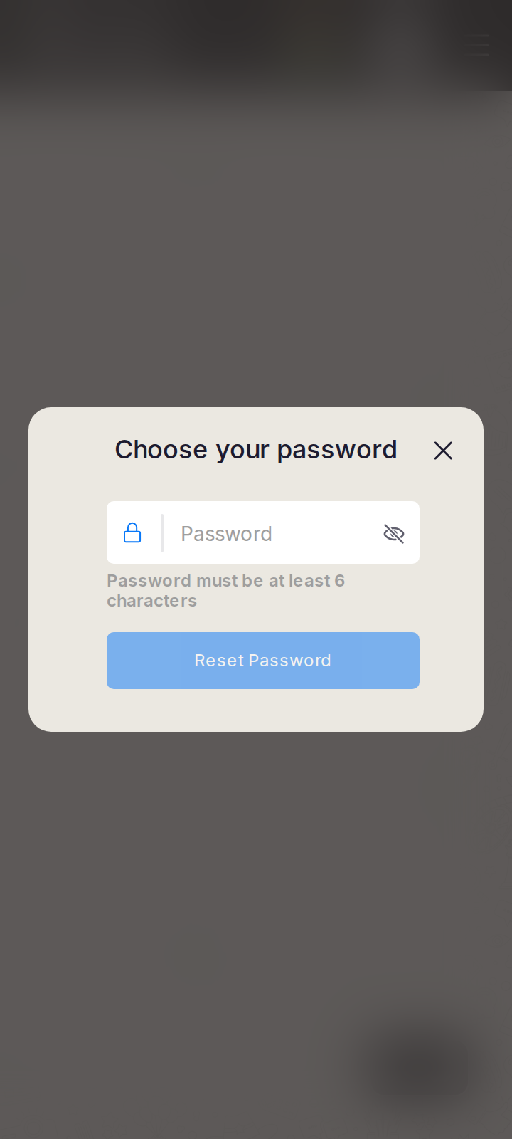
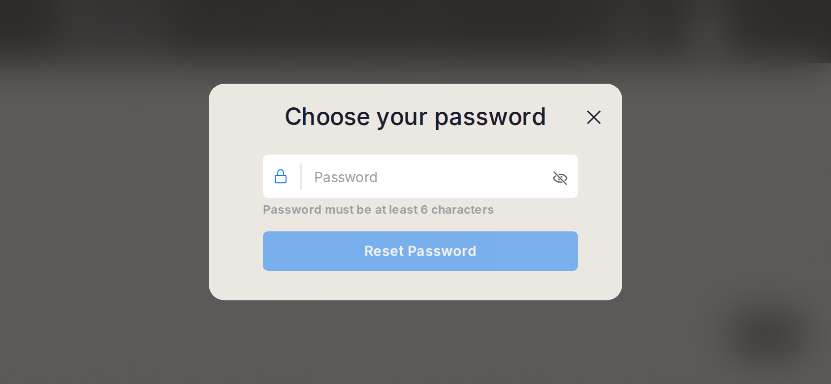
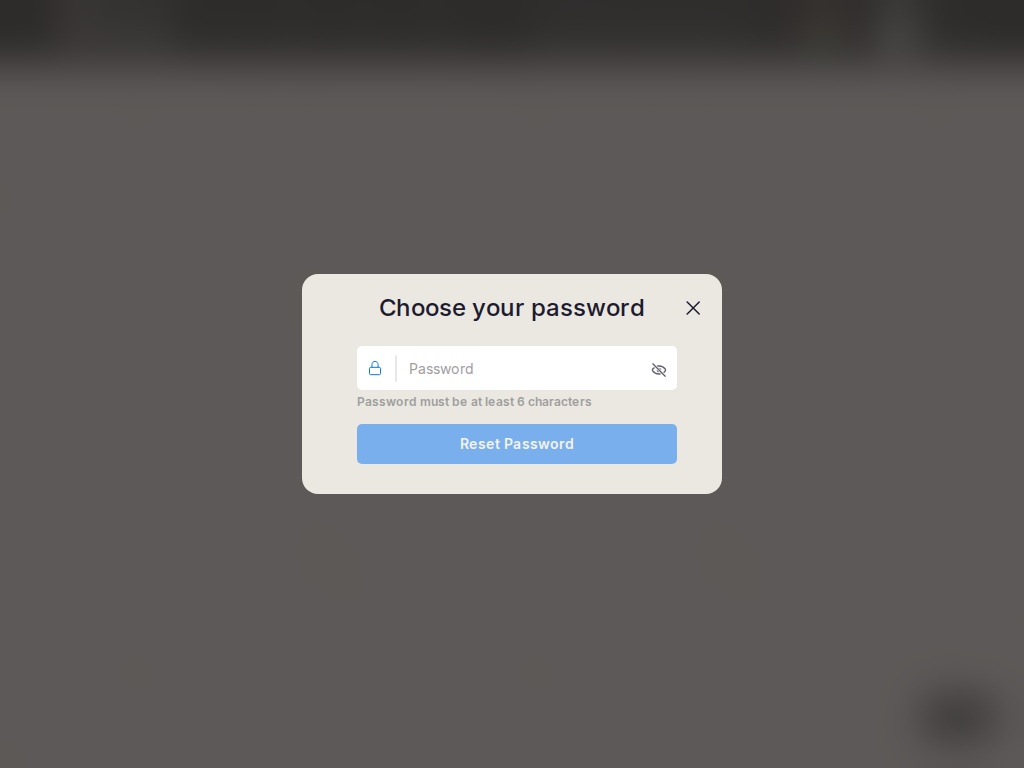
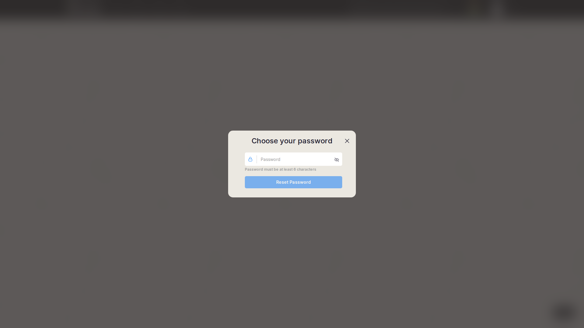
Reset password

/reset-password · Auth

Job: Set a new password.

Auth utility; not used in the session.
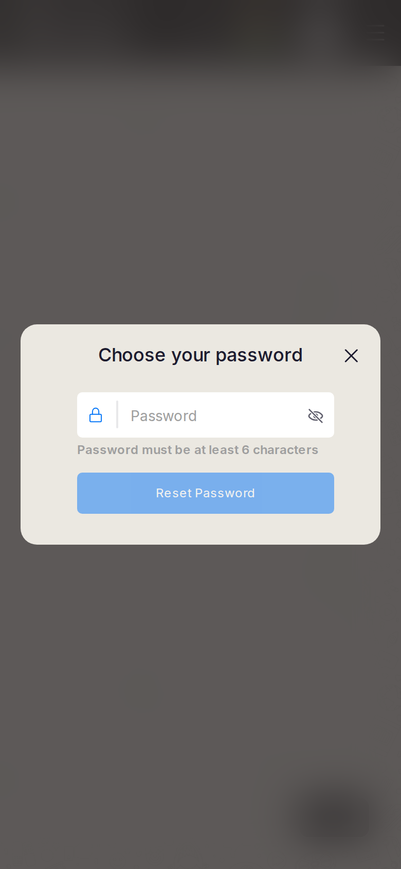
Reset password phone-390
390×844 · ~19.5:9 · CSS mobile ≤480
Reset password tablet-port
768×1024 · 3:4 · CSS tablet ≤960
Reset password desktop-16-9
1440×810 · 16:9
Other aspect ratios (4)
phone-360
360×800 · 9:20 · CSS mobile ≤480
phone-land
844×390 · landscape · CSS tablet ≤960 at phone height
tablet-land
1024×768 · 4:3 land · CSS small ≤1280 (desktop chrome)
desktop-fhd
1920×1080 · 16:9 FHD

Improvements

P1

Disable submit until 6 characters; phone bottom sheet

Previous Device report Next Member session